Framer Web Design & Development
Farida Amin
$1.5K+ earned
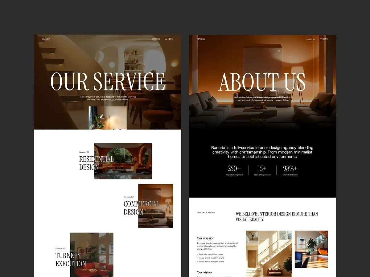
✨ Renoria — Framer Website Design & Development
Premium Interior Design Website Experience
Renoria was designed as more than just a website. The goal was to create a digital experience that feels cinematic, editorial, and emotionally immersive — reflecting the same elegance and atmosphere found in high-end interior spaces 🖤✨
The project involved complete UX strategy, UI design, and Framer development for a modern interior design studio focused on luxury residential and commercial spaces. Instead of building a traditional agency website, the experience was crafted to feel like a premium architecture magazine combined with a modern interactive portfolio.
🧠 The Challenge
The brand needed a stronger online presence that communicated sophistication, trust, and design expertise.
The existing experience lacked:
• Strong visual storytelling
• Modern interaction design
• Emotional brand presentation
• Smooth user flow
• Premium visual hierarchy
Most importantly, the website did not truly reflect the quality of the studio’s work.
🚀 The Approach
The strategy focused on creating a calm, spacious, and visually immersive experience where users could naturally explore projects, services, and brand philosophy.
The design direction combined:
• Editorial inspired layouts
• Cinematic interior imagery
• Elegant serif typography
• Minimal UI elements
• Smooth Framer animations and transitions
Every section was intentionally paced to create a refined browsing experience rather than overwhelming users with content.
🎨 UX & Visual Experience
The website was structured around storytelling and emotional engagement.
Key focus areas included:
• Large typography for strong visual presence
• Full-width imagery to showcase interior projects
• Spacious layouts with intentional whitespace
• Smooth scrolling and interaction design
• Clear navigation and service structure
Instead of treating projects like static galleries, each section was designed to feel immersive and atmospheric.
🎬 Framer Development & Interactions
The website was fully developed in Framer with a strong emphasis on smooth interactions and performance optimization.
Features included:
• Scroll-based animations
• Interactive transitions
• Responsive layouts across all devices
• CMS setup for blogs and projects
• Performance optimization for fast loading
• SEO-friendly structure and hierarchy
The animations were kept subtle and elegant to maintain a premium luxury feel throughout the experience.
📱 Responsive Experience
Special attention was given to responsiveness to ensure the same elegant experience across desktop, tablet, and mobile.
This included:
• Responsive typography scaling
• Optimized image layouts
• Smooth mobile interactions
• Consistent spacing and hierarchy
🛠️ Tools & Technologies
• Figma for UI UX design and prototyping
• Framer for website development
• CMS integration for dynamic content
• SEO optimization and performance setup
📦 Deliverables
• Complete Framer website design
• Full Framer development
• Responsive desktop and mobile layouts
• Interactive animations and transitions
• Blog and portfolio CMS setup
• 404 page design
• SEO and performance optimization
Power BI Reporting Engagement
📈 Final Outcome
The final result is a modern luxury website that feels:
✨ Editorial
🖤 Cinematic
⚡ Interactive
🏛️ Premium
🎯 Purposeful
Renoria now has a digital presence that not only showcases projects beautifully but also communicates trust, sophistication, and high-end design expertise through every interaction.
Turning Manual Reporting into Automated Decision Intelligence
Overview
Many growing companies struggle with fragmented reporting across departments. Data lives in different tools, reporting is handled manually, and leadership lacks a unified view of business performance.
This project focused on transforming manual, time-consuming reporting into a streamlined Power BI reporting ecosystem that provides leadership with real-time insights.
The engagement included identifying reporting gaps, designing clear dashboards, and implementing automated reporting workflows to improve visibility across departments.
The Challenge
The client’s reporting process relied heavily on manual work. Each department maintained its own spreadsheets and reports, which created delays, inconsistencies, and limited visibility.
Key Pain Points
Manual Excel reporting across departments
Inconsistent KPI definitions and tracking
Limited visibility into cross-department performance
Significant time spent compiling weekly reports
Manual Reporting Burden
Teams were spending 10–20 hours per week consolidating data manually.
This created several issues:
Delayed decision-making
Increased risk of reporting errors
Lack of real-time business visibility
Departments Impacted
The reporting challenges affected multiple teams:
Finance
Operations
Sales
Leadership needed a centralized solution that could bring together all reporting into a single system.
Project Goal
The goal of the engagement was to design and implement a Power BI reporting system that would:
Centralize business reporting
Provide real-time data visibility
Reduce manual reporting work
Enable leadership to make faster, data-driven decisions
Instead of manually compiling reports, teams would rely on automated dashboards updated directly from data sources.
Solution
We designed a structured reporting system built around Power BI dashboards tailored to each department's needs.
The solution included:
1. Executive Performance Dashboard
A high-level view for leadership providing visibility into:
Revenue trends
Operational KPIs
Sales performance
Cross-department metrics
This allowed executives to monitor company performance in real time.
2. Sales & Pipeline Dashboard
Designed to help sales teams track:
Pipeline growth
Lead conversion
Revenue forecasting
Sales performance by rep or region
This replaced manual pipeline spreadsheets and improved forecasting accuracy.
3. Inventory & Operations Dashboard
This dashboard focused on operational efficiency by tracking:
Inventory levels
Stock movement
Operational metrics
Supply chain indicators
It helped operations teams quickly identify bottlenecks or inventory risks.
Design Approach
The reporting system was designed around three key principles:
1. Decision-Focused Dashboards
Each dashboard was designed to support real business decisions, not just display data.
2. Simplified Data Visualization
Complex data was transformed into clear visual insights using:
KPI cards
Trend charts
Performance comparisons
Visual alerts
3. Scalable Reporting Framework
The system was designed to scale easily as the business grows, allowing additional dashboards to be added over time.
Implementation
The engagement followed a structured workflow:
Phase 1 — Data Access
Access to existing data sources and reporting databases.
Phase 2 — KPI Definition
Working with stakeholders to identify the most important metrics.
Phase 3 — Dashboard Design
Designing reporting dashboards tailored to leadership and operational teams.
Phase 4 — Automation Setup
Connecting dashboards to live data sources to automate reporting.
Phase 5 — Training & Support
Providing documentation and training to ensure teams could effectively use the dashboards.
Results
Within the first 30–60 days, the new reporting system delivered measurable improvements.
Key Outcomes
Automated Cross-Department Reporting
Reports that previously required manual compilation were now automatically generated.
Single Source of Truth
All teams now accessed the same centralized reporting dashboards.
Significant Time Savings
Teams reduced reporting preparation time by up to 80%.
Improved Decision Speed
Leadership gained immediate access to weekly performance insights.
Client Impact
The new reporting system enabled the organization to move from reactive reporting to proactive decision-making.
Leadership could now:
Monitor performance in real time
Identify issues earlier
Align teams around shared KPIs
Make faster strategic decisions
Testimonial
“The new dashboards gave us the clarity we were missing. Instead of spending hours compiling reports, we now focus on making decisions based on the data.”
Engagement Model
The project was delivered through a structured reporting partnership that included:
Power BI dashboard development
Data automation and integrations
Ongoing maintenance and improvements
Weekly reporting support
This ensured the reporting system continued to evolve as the business scaled.

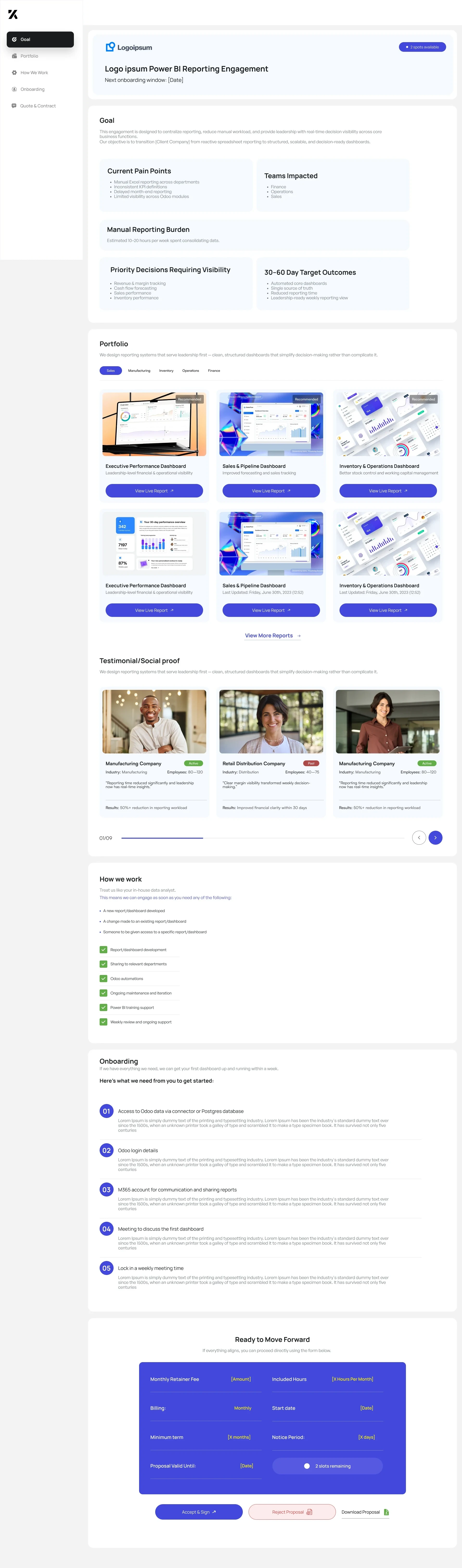
BI Reporting Engagement Portal
Designing and Developing a Client Proposal Experience with Framer
Overview
Traditional consulting proposals are often delivered through static documents such as PDFs or slide decks. While these formats communicate pricing and scope, they fail to clearly demonstrate the value of the solution or guide clients through the decision-making process.
This project involved designing and developing an interactive client engagement portal built in Framer that replaces static proposals with a structured, visual experience.
The portal allows potential clients to:
Understand the reporting engagement goals
Review current business challenges
Explore dashboard examples
See expected outcomes
Understand onboarding requirements
Accept or reject proposals digitally
By presenting the proposal in an interactive format, the experience becomes more engaging, transparent, and easier for clients to navigate.
The Problem
Business intelligence consulting projects often involve complex reporting systems and multiple stakeholders. However, traditional proposal formats struggle to communicate this complexity clearly.
Common issues include:
Long PDF proposals that clients rarely read fully
Difficulty visualizing dashboard outcomes
Lack of clarity around implementation steps
Delays caused by back-and-forth communication
Friction during proposal acceptance
As a result, potential clients may hesitate to move forward due to uncertainty or lack of clarity.
The goal was to design a clear and structured proposal experience that simplifies understanding and speeds up decision-making.
Project Goals
The portal needed to achieve several objectives:
1. Replace Static Proposals
Create an interactive experience that communicates the engagement clearly.
2. Demonstrate the Value of BI Reporting
Show real dashboard examples so clients can visualize the final outcome.
3. Simplify the Decision Process
Provide clear information that allows clients to confidently approve the proposal.
4. Streamline Client Onboarding
Outline the required steps to begin the project immediately after approval.
Platform Choice: Framer
The portal was developed using Framer, a modern web design and development platform that enables designers to build interactive websites with powerful animations and responsive layouts.
Framer was selected because it allows:
Rapid development without complex backend infrastructure
Highly interactive UI experiences
Smooth animations and transitions
Responsive design across devices
Fast deployment and iteration
Using Framer allowed the project to move from design to production quickly while maintaining a polished user experience.
Product Structure
The portal was designed as a guided engagement journey, helping clients move from understanding the problem to accepting the proposal.
1. Engagement Goal
The first section introduces the engagement and explains the purpose of the reporting solution.
It highlights:
The need for centralized reporting
Leadership visibility into business performance
Automation of manual reporting workflows
This section ensures the client understands why the project matters.
2. Current Pain Points
The portal outlines the challenges the organization is facing with their current reporting systems.
Key pain points include:
Manual Excel reporting across departments
Inconsistent KPI tracking
Limited cross-department visibility
High time investment for report preparation
This establishes context for the proposed solution.
3. Expected Outcomes
The next section communicates the results the client can expect within the first 30–60 days.
These include:
Automated reporting dashboards
Real-time performance visibility
Cross-team KPI tracking
Leadership-level reporting insights
By clearly defining the outcomes, clients can visualize the value of the engagement.
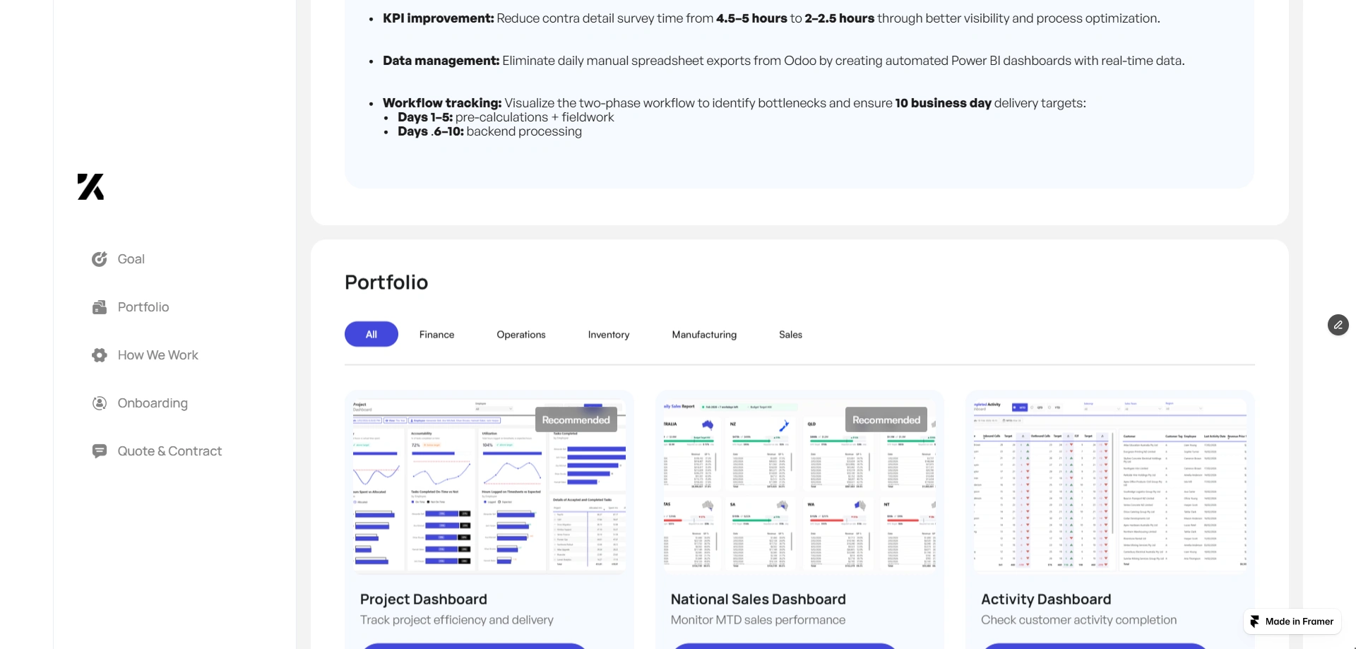
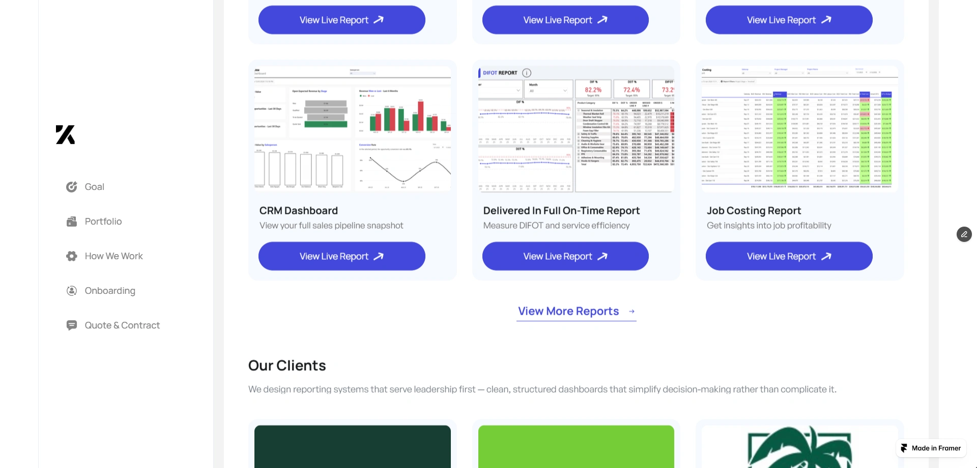
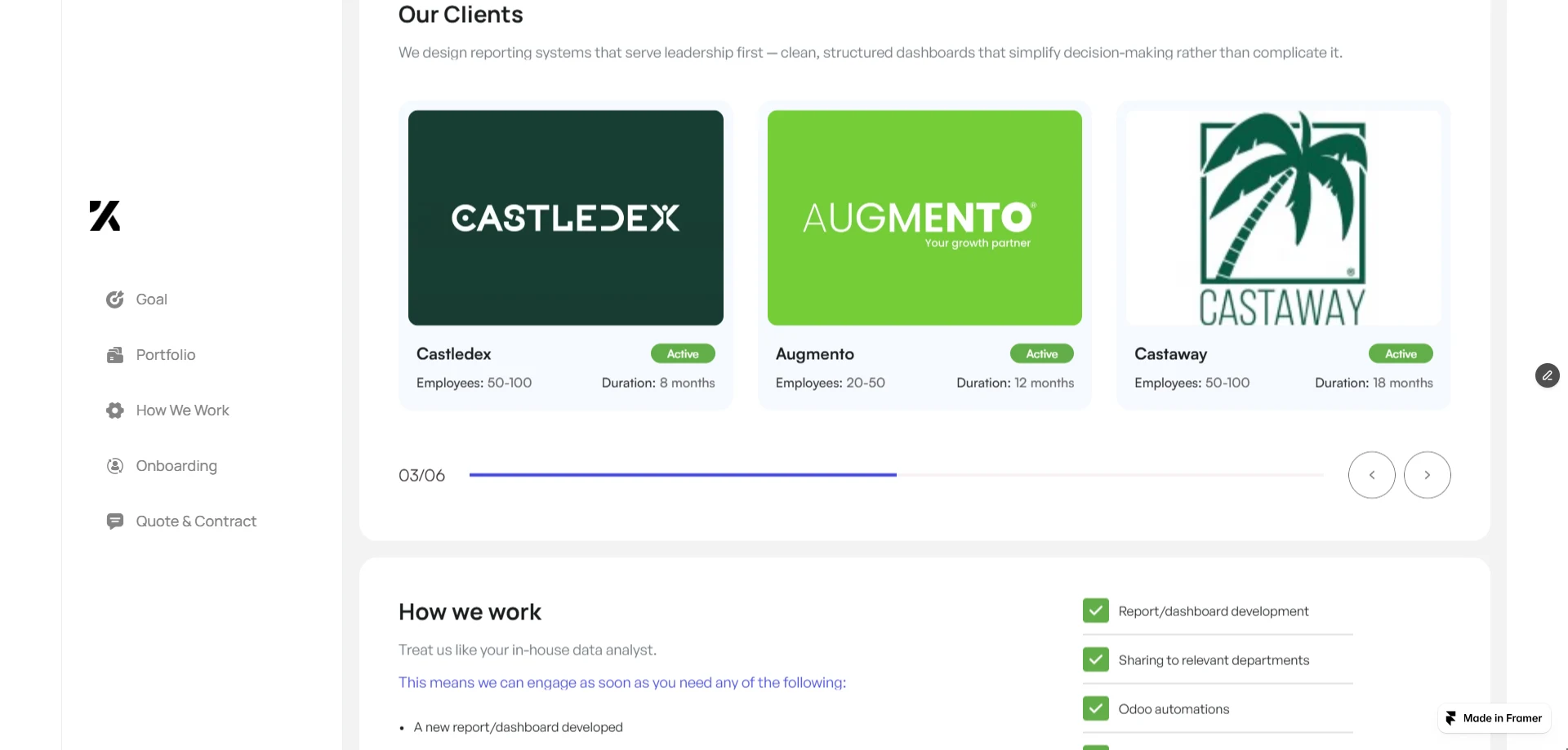
Dashboard Portfolio
A central part of the portal showcases example dashboards created using business intelligence tools.
These examples demonstrate the type of reporting systems clients will receive.
Executive Performance Dashboard
Provides leadership with a high-level overview of company performance.
Sales & Pipeline Dashboard
Tracks deal flow, revenue forecasting, and sales performance.
Inventory & Operations Dashboard
Offers visibility into operational metrics and inventory management.
Displaying these examples helps clients understand what the final reporting system will look like.
Social Proof
To build credibility, the portal includes testimonials from previous clients across industries.
Each testimonial highlights:
Company type
Company size
Measurable reporting improvements
These examples show how other organizations benefited from similar reporting systems.
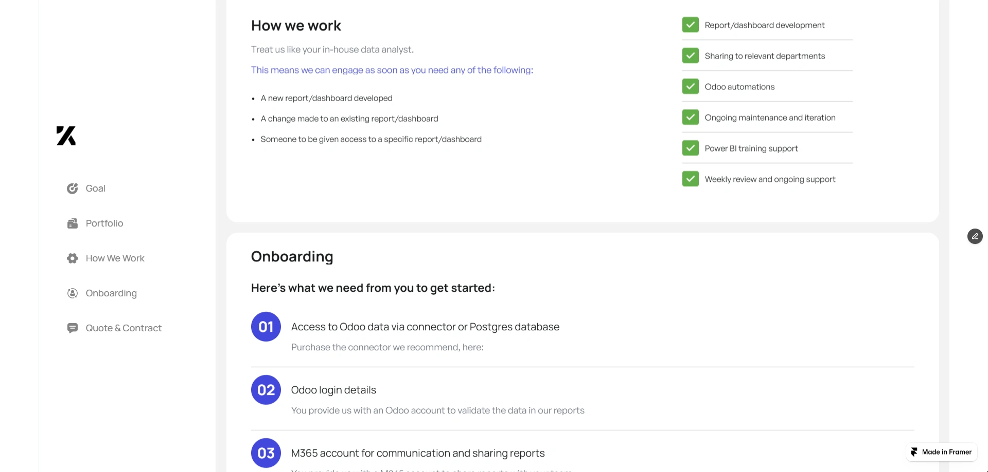
How We Work
The portal explains how the reporting engagement operates.
Clients can request support for:
New dashboard development
Enhancing existing reports
Connecting new data sources
Automating reporting workflows
The engagement includes:
Dashboard development
Cross-department reporting integration
Data automation
Ongoing reporting support
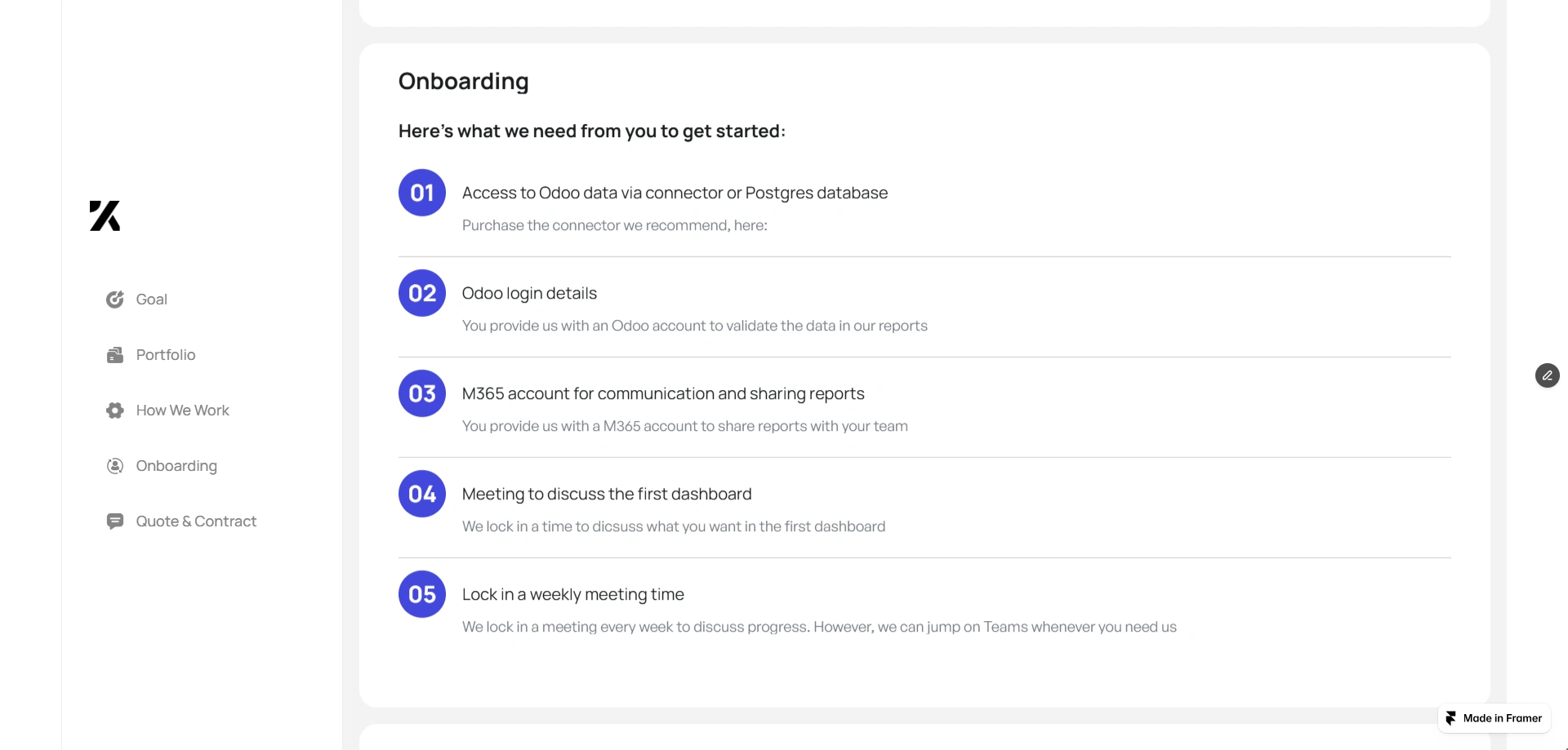
Onboarding Process
To ensure a smooth start, the portal outlines the onboarding requirements needed to begin development.
These include:
Access to data connectors or reporting databases
Login credentials for reporting tools
Communication platform access for collaboration
Kickoff meeting to align reporting goals
Weekly check-in meetings for progress updates
Providing these details upfront helps accelerate the implementation process.
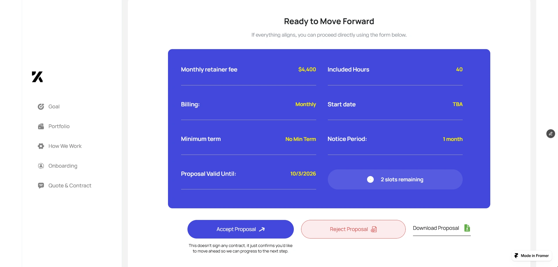
Proposal Acceptance
The final section presents the engagement terms in a clear and transparent format.
This includes:
Monthly retainer fee
Included reporting hours
Billing schedule
Minimum engagement period
Proposal validity timeline
Clients can then choose to:
Accept and sign the proposal
Reject the proposal
Download the proposal
This removes friction from the decision-making process.
Design Approach
The design focused on three core principles.
Clarity
Information is organized into structured sections that guide the user step by step.
Visual Communication
Dashboards, cards, and structured layouts replace long text descriptions.
Decision Confidence
Portfolio examples, testimonials, and outcomes help clients feel confident in moving forward.
Impact
By transforming a traditional proposal into an interactive portal, the project helps consulting teams:
Communicate BI solutions more effectively
Reduce proposal confusion
Improve client engagement
Shorten decision cycles
Instead of static documents, clients now experience a guided proposal journey built with Framer.
Conclusion
The BI Reporting Engagement Portal modernizes the consulting proposal process by combining design, storytelling, and interactivity.
Built using Framer, the platform delivers a polished experience that helps clients clearly understand the value of the reporting solution and confidently move forward with the engagement.
Like this project
Posted Mar 6, 2026
Interactive proposal portal built in Framer to present automated Power BI reporting solutions, showcase dashboards, and help consultants close deals faster now.
Likes
2
Views
19
Earned
$1.5K+
Timeline
Feb 17, 2026 - Feb 28, 2026
Clients
Keeping It Simple