Content Heavy Framer Web Design & Development

Farida Amin
$1.5K+ earned


Telegenix: Custom Framer Website Design & Development
A Trust-First, Conversion-Focused Telehealth Website Built from Scratch in Framer
Telegenix is a doctor-led health and performance clinic offering hormone, weight loss and peptide programs delivered at home. They needed a website that could do something hard for any telehealth brand: build trust with first-time visitors in seconds, explain a multi-step medical process simply, and turn interest into started treatments. The brief was a custom Framer website that feels clinical but approachable, premium but not intimidating, and drives every visitor toward “Get Started.” No templates. No shortcuts. Every section designed to answer a question before the visitor asks it.
The project covered the full scope of Framer web design and development, from UX strategy and information architecture through final build and deployment. The result is a responsive telehealth website that combines strong credibility signals, clear product presentation and a single conversion path across every device.
The Brief
Telegenix had a clear offering and a defined audience of high-performing men looking to improve energy, weight and performance. What they needed was a digital experience that could:
Establish medical credibility and trust right away
Present several treatment categories (Testosterone, Weight Loss, Peptides, ED, NAD+) without confusing visitors
Explain the full patient journey, from intake to ongoing monitoring, in a simple, reassuring way
Set Telegenix apart from competitors that feel transactional or automated
Handle common objections around pricing, insurance, legality and commitment
Drive visitors to start their intake from any point on the page
Perform well on mobile, where most telehealth traffic arrives
The goal was a website that felt like talking to a trusted clinic rather than browsing an online pharmacy.
Homepage Hero: Authority at First Glance
[Telegenix Homepage Hero]
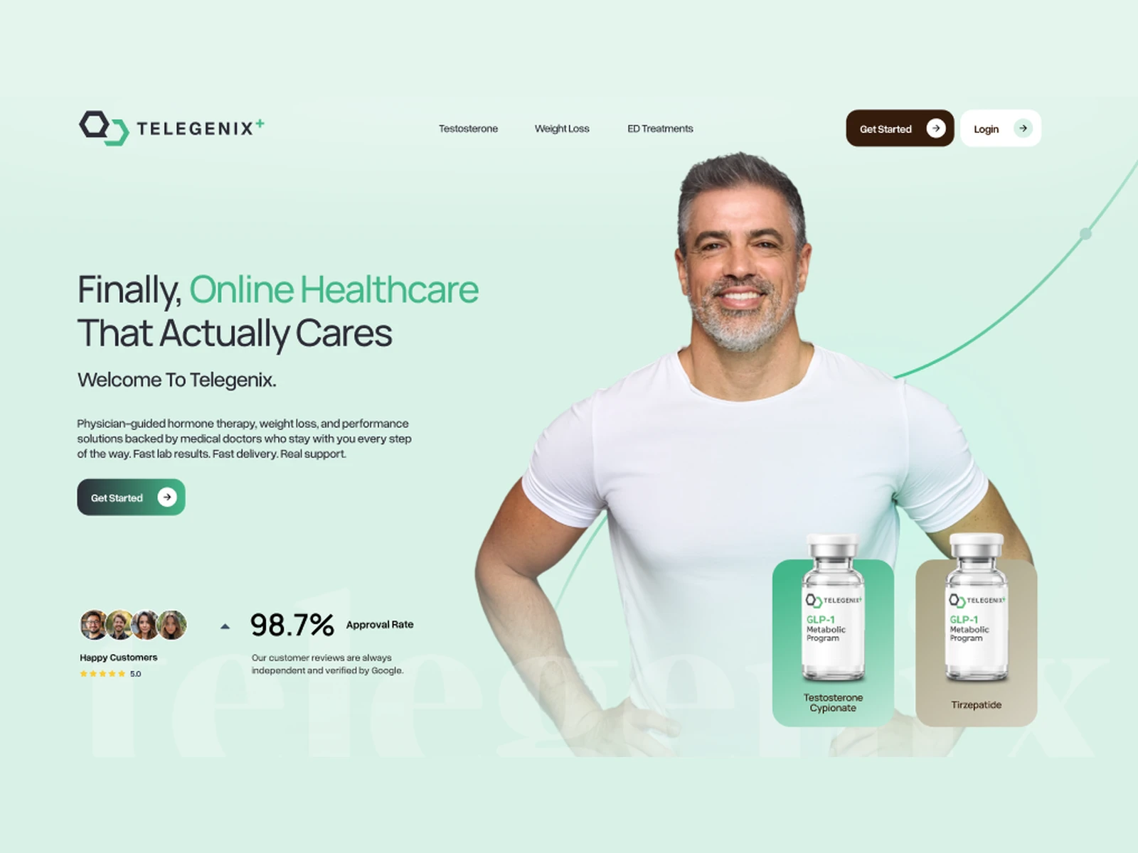
The hero states the brand’s position directly: “America’s Premier Doctor-Led Health & Performance Optimization Clinic.” Supporting copy explains physician-guided hormone and peptide protocols delivered from home, so the visitor understands what Telegenix does within a few seconds.
Lifestyle photography of a confident, smiling patient sits alongside real product imagery, connecting the outcome to the treatment.
Key design decisions for the hero:
An authority-driven headline that positions Telegenix as a doctor-led clinic, not a pill shop
Patient photography that puts a human face on the brand
Product visuals that make the offering concrete
A primary “Get Started” CTA above the fold to capture intent early
Trust signals placed right beneath the fold, so credibility is built before the visitor scrolls far
Trust Bar: Credibility Before Commitment
In healthcare, trust drives conversion. Directly under the hero, a dedicated trust strip shows the brand’s strongest proof points.
Trust section highlights:
A 5.0-star customer rating, verified by Google
A 98.7% approval rate stat
Icon badges for U.S. Licensed Pharmacies, Board-Certified Physicians, Telemedicine Consultation, HIPAA Protected and HSA/FSA Eligible
A clean, consistent icon style that makes each badge quick to read
The trust bar answers the visitor’s first question: “Is this legit?” It does that before they’ve read a single paragraph of body copy.
Problem Framing: Speaking to the Real Pain Point
The “This Isn’t About Getting Older” section reframes the problem with empathy. It links low energy, weight gain and declining performance to modern life, including chronic stress, poor sleep and hormonal strain, rather than age alone.
The section was designed to:
Build an emotional connection through relatable, non-clinical language
Make the problem feel solvable rather than inevitable
Lead naturally into the treatment options that follow
Include a CTA for visitors who are ready to act

HomePage
Products Section: Structured Clarity for Every Treatment
Telegenix offers several treatments, each with different eligibility and use cases. The product section presents them as clean, consistent cards: Testosterone Cypionate, GLP2 + B6, Tri-NAD+ and Sermorelin.
The product section was designed with these principles:
A card-based layout with product imagery, a short description and a clear link to each treatment page
Consistent formatting so every product reads the same way
Visible “requires physician consultation” notes that support compliance and trust
A “State-Regulated 503A Compounding Pharmacy Medications” heading that reassures visitors about sourcing
Responsive stacking from a multi-column grid on desktop to a swipeable or single-column layout on mobile
Differentiation: “We Optimize and Provide Ongoing Support”
Most telehealth clinics look the same. This section sets Telegenix apart with the headline “Most Clinics Prescribe and Walk Away,” followed by five clear value pillars:
Fast labs and delivery
Dedicated physicians who stay through treatment
High-performer protocols
Transparent pricing with no hidden fees
A complete ongoing process, from prescriptions to monitoring
The “Why Telegenix?” section builds on this with a direct comparison graphic: competitors average 5.6 days to respond, while Telegenix responds in under 24 hours. Turning a service promise into a visual stat makes the difference easy to see and easy to remember.
Social Proof: Real Patients, Real Stories
[Telegenix Testimonials]
Testimonial cards show real patients with their first name, age, a 5-star rating and a “Real Telegenix Patient” label.
Testimonial design highlights:
Including the patient’s age (42 to 44) helps visitors in the same demographic see themselves in the stories
Short, outcome-focused quotes that are easy to scan
Verified labels that add authenticity
A consistent card style that matches the rest of the design system
How It Works: Making a Medical Process Feel Simple
[Telegenix How It Works]
The patient journey has five steps, and each one could be a point where visitors drop off. The “How Telegenix Works” section turns it into a clear, numbered flow:
Medical intake (under 10 minutes)
Blood panel (kit in 2 business days, 19 biomarkers)
Video consultation with a board-certified physician
Medication shipment in discreet packaging
Ongoing monitoring and support
The section was designed to:
Show specific timeframes at each step to reduce uncertainty
Use a step-by-step visual flow that’s easy to follow on any screen size
Ease concerns before they become objections (for example, “upload existing labs,” “discreet packaging”)
End with a “Get Started” CTA at the moment of highest clarity
FAQ & Closing CTA: Removing the Last Objections
A detailed FAQ handles the questions that usually stop someone from converting: legality and safety, prescription requirements, insurance and HSA/FSA, timelines for results, switching from another clinic, side-effect support and cancellation.
FAQ and closing highlights:
An accordion layout that keeps a long list of answers compact and scannable
Answers written in plain language
A closing CTA section, “Ready To Feel Like Yourself Again?”, that brings the visitor back to one clear action
A repeated “Get Started” button throughout the page, so the next step is always one click away
Navigation & Footer: Built for Scale
The navigation organizes the full product range (Testosterone, Weight Loss, Peptides, ED, NAD+ and the OTC Store) so visitors can go straight to the treatment they care about.
The footer was designed as a trust and compliance hub, with:
Every required legal and policy page, including Terms, Privacy Policy, Notice of Privacy Practices, Telemedicine Informed Consent, Refund Policy and the Compounding Pharmacy Disclosure
Affiliate Program and Affiliate Login links
Affiliation logos and LegitScript certification
Social links to Facebook and Instagram
Framer Development: Performance Meets Polish
The entire site was designed and built natively in Framer, using the platform’s capabilities without compromising on performance or design fidelity.
Technical implementation included:
A custom component architecture (product cards, trust badges, testimonial cards, step blocks, CTAs) built for reuse across the homepage and treatment pages
Scalable page templates for each treatment category, so new products can launch quickly
Scroll-based animations and micro-interactions that add depth without slowing load times
Responsive breakpoints tuned for desktop, tablet and mobile, with a mobile-first approach for telehealth traffic
Accordion FAQ components for clean, scannable content
Framer CMS setup for managing products, FAQs and content
An SEO-friendly page structure with proper heading hierarchy, meta tags and semantic markup
Performance optimization, including image compression and lazy loading
The client can update products, swap imagery, edit FAQs and manage pages on their own through Framer, without touching code.
Design System & Visual Language
Every visual choice supports trust and clarity:
Color palette: Telegenix green (
#43B889) as the main brand and CTA color, suggesting health, vitality and growth, paired with clean whites and dark neutrals for a clinical, trustworthy feelTypography: bold, confident headlines for authority, with clean sans-serif body copy for readability across long-form content
Imagery: lifestyle photography of confident, active men alongside real product shots, so the outcome and the treatment are both visible
Iconography: consistent trust badges, star ratings and step icons that support scanning
Spacing: generous whitespace between sections so each block has room to breathe, which improves readability and perceived quality
Components: rounded cards and buttons that feel approachable and modern while staying professional
Tools & Technologies
Figma for UI/UX design, wireframing and prototyping
Framer for full website development and deployment
Framer CMS for dynamic content management
Custom animations and interaction design within Framer’s native toolset
Deliverables
Complete custom Framer website design (homepage plus treatment pages)
UX strategy, information architecture and sitemap
Wireframes and high-fidelity UI design
Full Framer development and deployment
Responsive layouts across all breakpoints (desktop, tablet, mobile)
Reusable component library (product cards, trust badges, testimonials, process steps, FAQ, CTAs)
Treatment page templates for scalable product launches
Scroll-based animations and interactive transitions
Framer CMS setup for content management
Compliance-ready footer and legal page structure
SEO optimization and performance tuning
Post-launch support documentation
The Result
Telegenix now has a website that looks and feels like a premium, doctor-led clinic. Visitors see credibility in the first scroll, understand the treatments in seconds, follow a simple five-step journey and always have a clear path to get started.
This project shows what happens when Framer web design is treated as a trust-building, conversion-focused tool for healthcare: a responsive telehealth website that works as a growth engine, not just an online brochure.
Ready to build a website that earns trust and drives conversions? Start your Framer project today.

Telegenix
Like this project
Posted Mar 6, 2026
Custom Framer website design and development for Telegenix, featuring conversion-focused layouts, responsive design, scroll animations & Framer CMS integration.
Likes
6
Views
146
Earned
$1.5K+
Timeline
Feb 17, 2026 - Feb 28, 2026
Clients
Keeping It Simple