VERANO — Ice Cream Brand Identity & Packaging Design

Akshay Arul


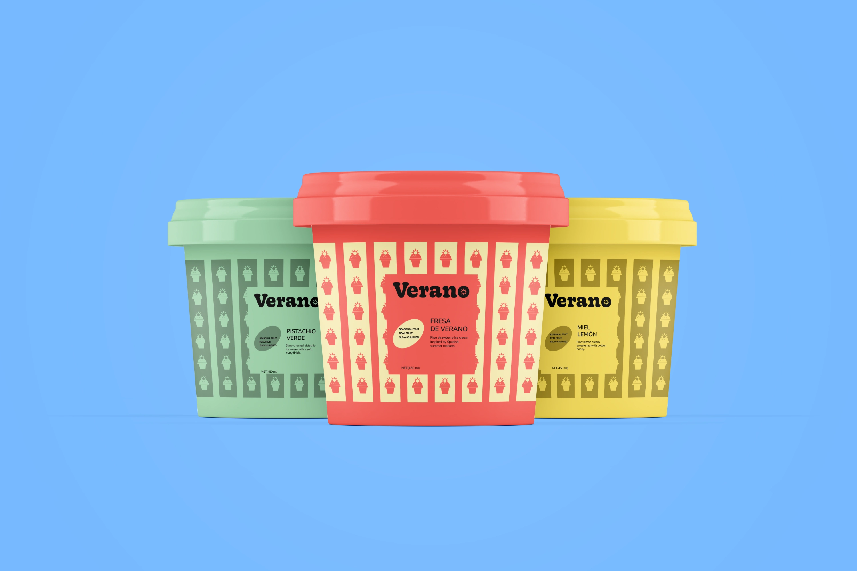
VERANO — Playful Summer Ice Cream Brand
Brand Identity + Packaging Design
Keywords: Playful, Nostalgic, Vibrant, Summery
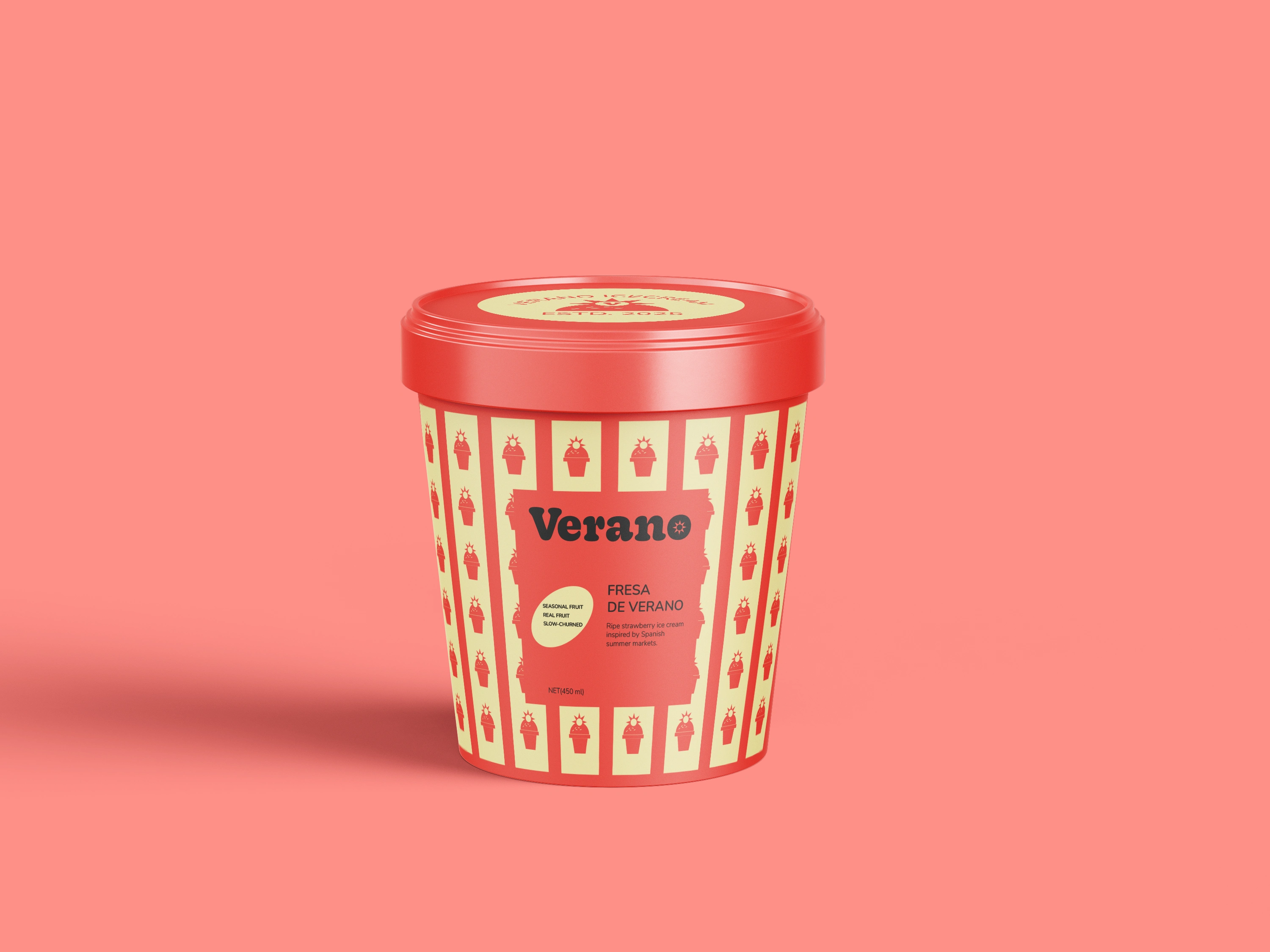
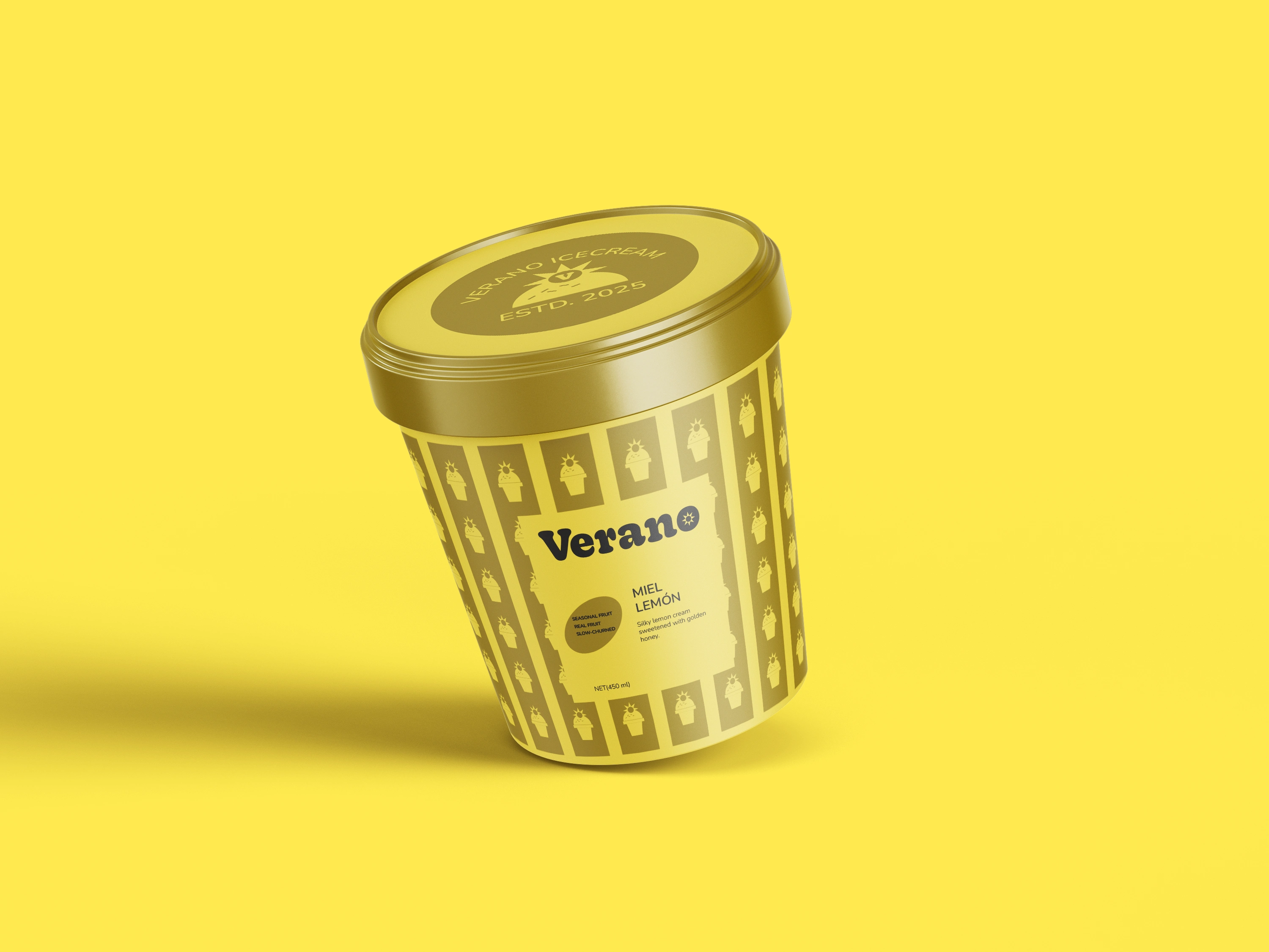
VERANO is a conceptual ice cream brand inspired by the energy and nostalgia of summer — drawing from sunlit streets, seasonal treats, and simple moments of joy. The brand is designed to feel cheerful, playful, and full of character, turning ice cream into a memorable summer experience.
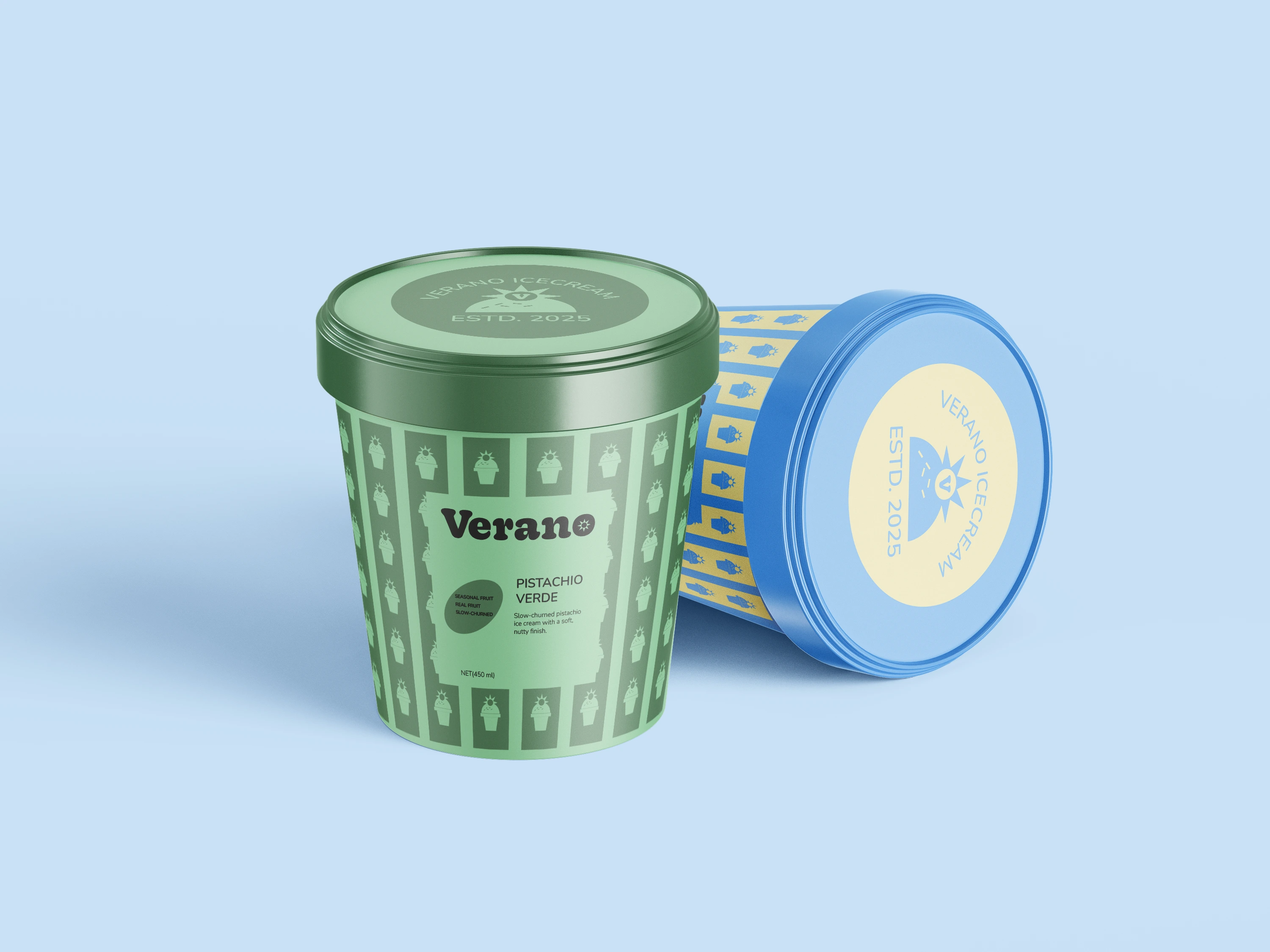
The Challenge
The challenge was to create an ice cream brand that captured the warmth and joy of summer while developing a distinctive visual identity that could stand out on shelf.
VERANO needed to feel playful and expressive without becoming visually chaotic, creating a system where different flavours could each have their own personality while still belonging to the same brand.
The Concept
The core concept behind VERANO is the energy and nostalgia of summer.
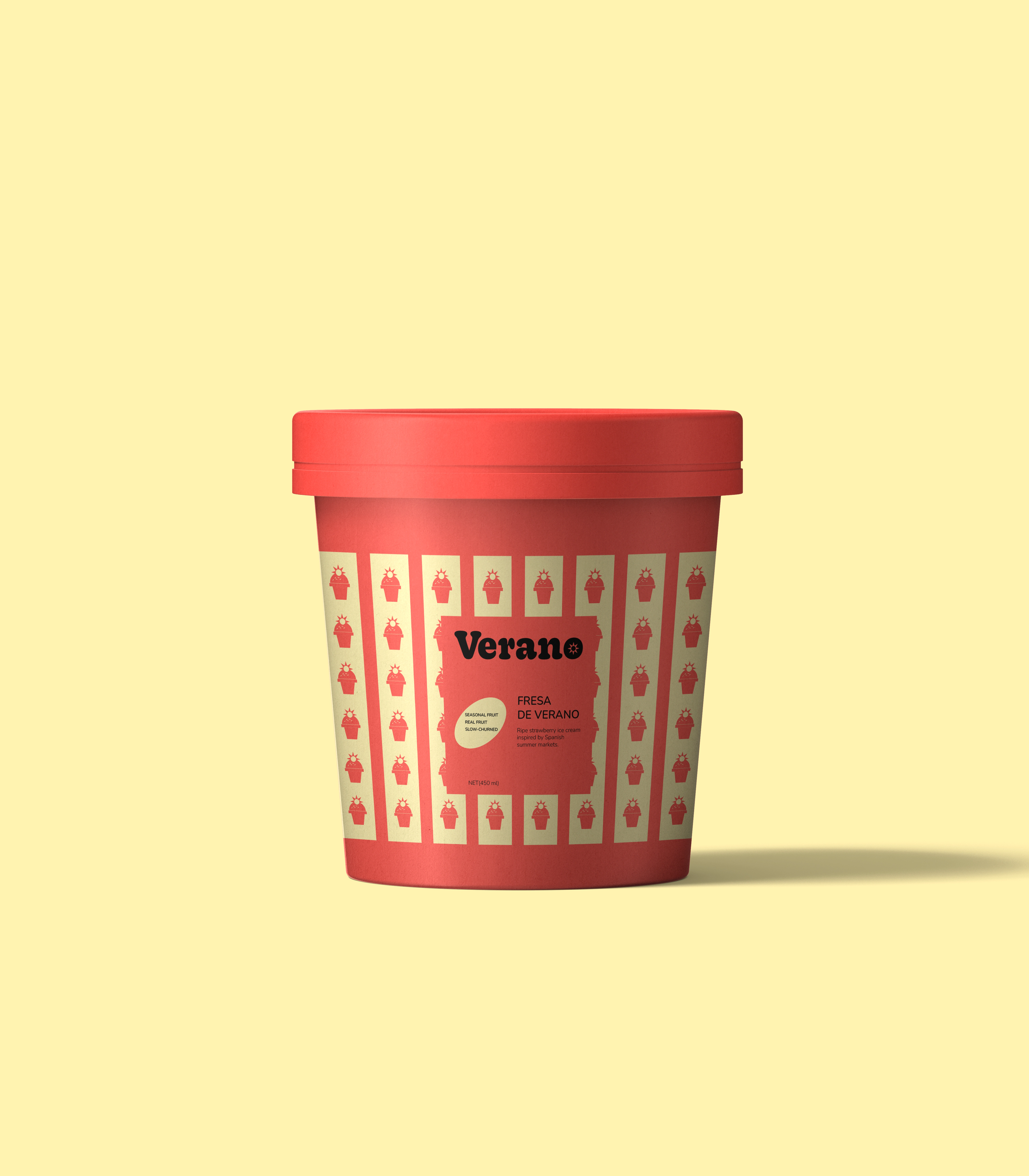
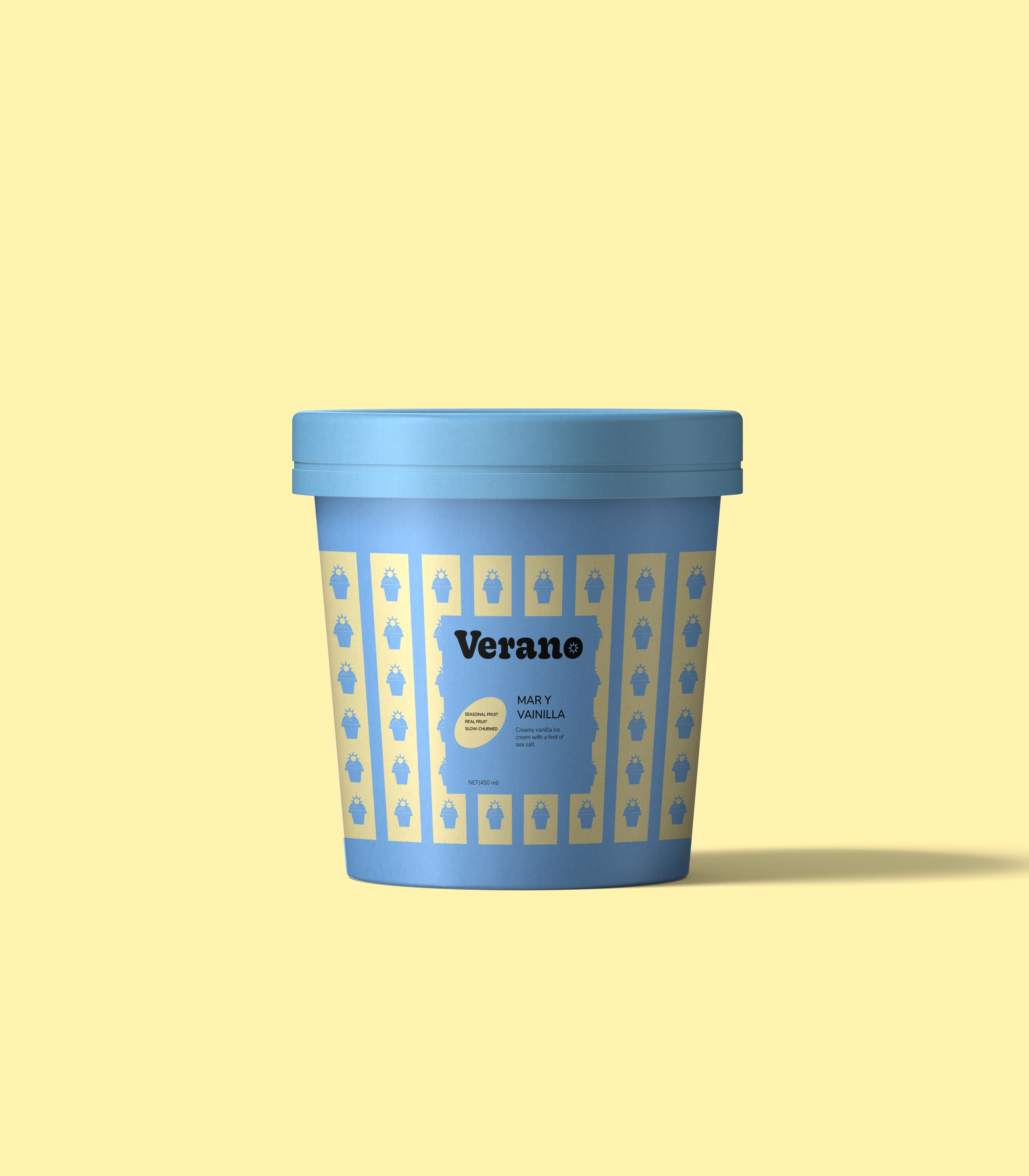
The identity draws from colourful summer moments, seasonal treats, sunlit streets, and playful visual memories. Instead of relying on a single illustration or graphic, the concept is expressed through a system of repeating forms, bold colours, and rhythmic compositions.
This creates a visual language that feels lively, nostalgic, and full of movement.
Visual Identity
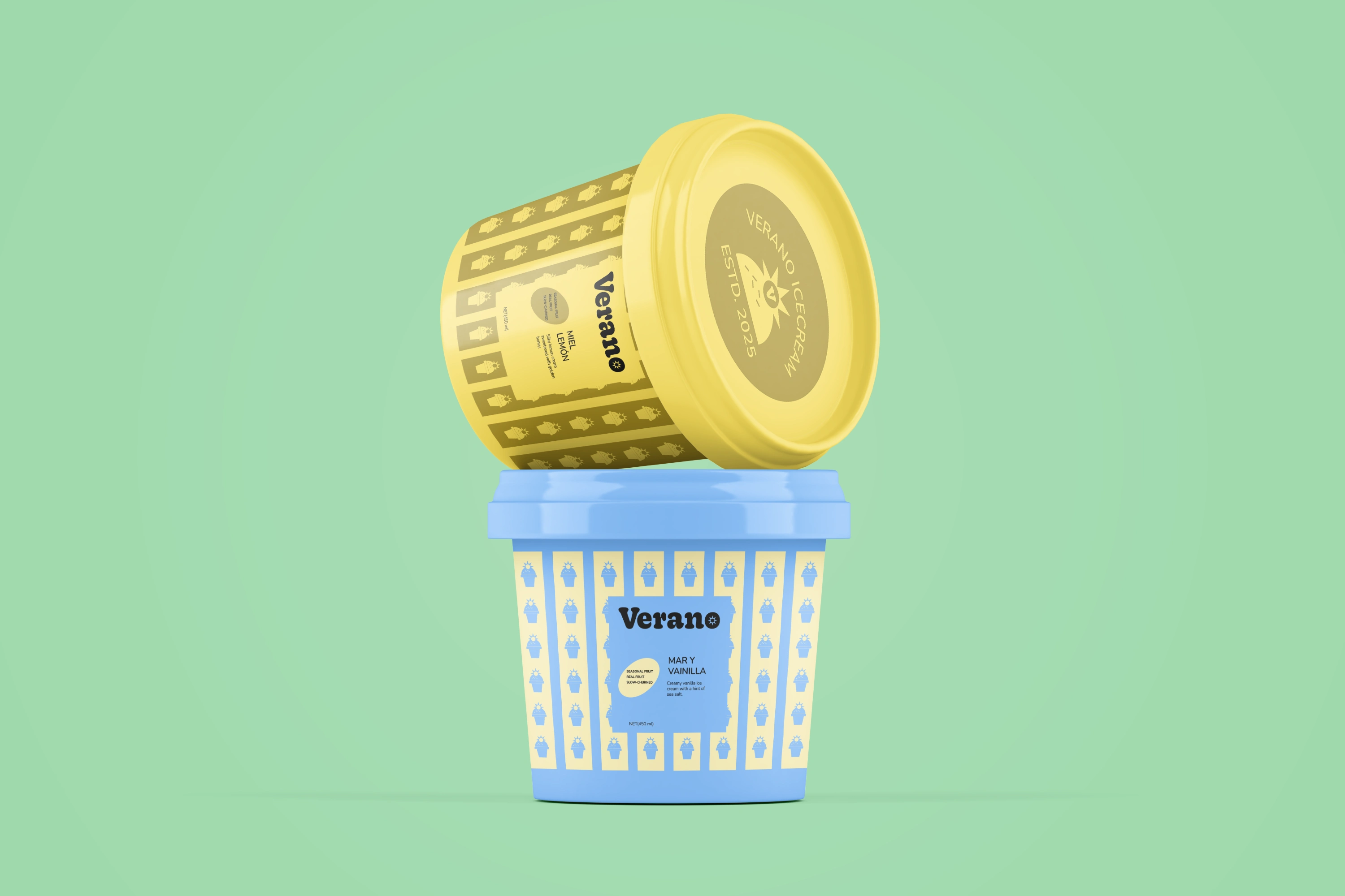
The identity is built around a distinctive wordmark and a system of repeating graphic elements inspired by ice cream forms and playful motifs.
These elements are used rhythmically across the brand to create movement and visual richness while maintaining a consistent visual language.
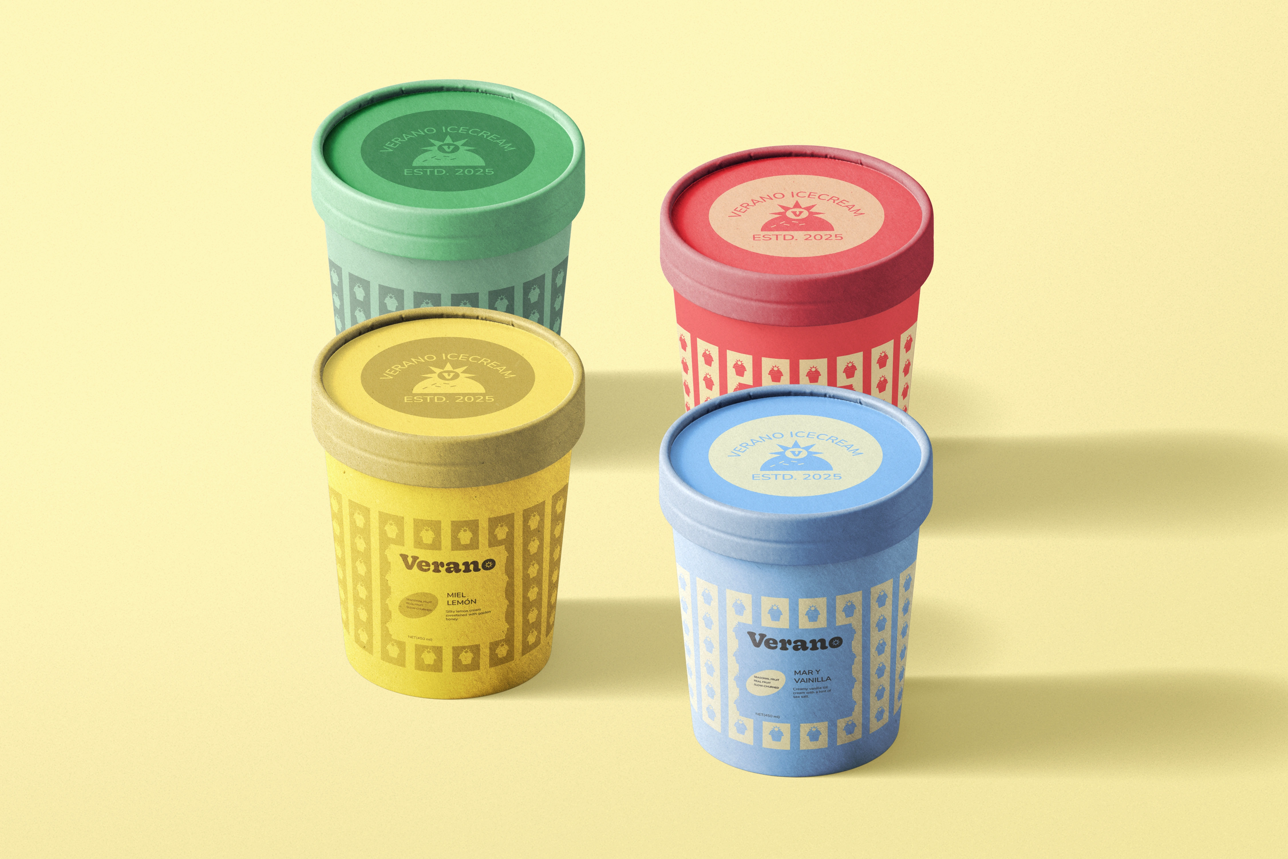
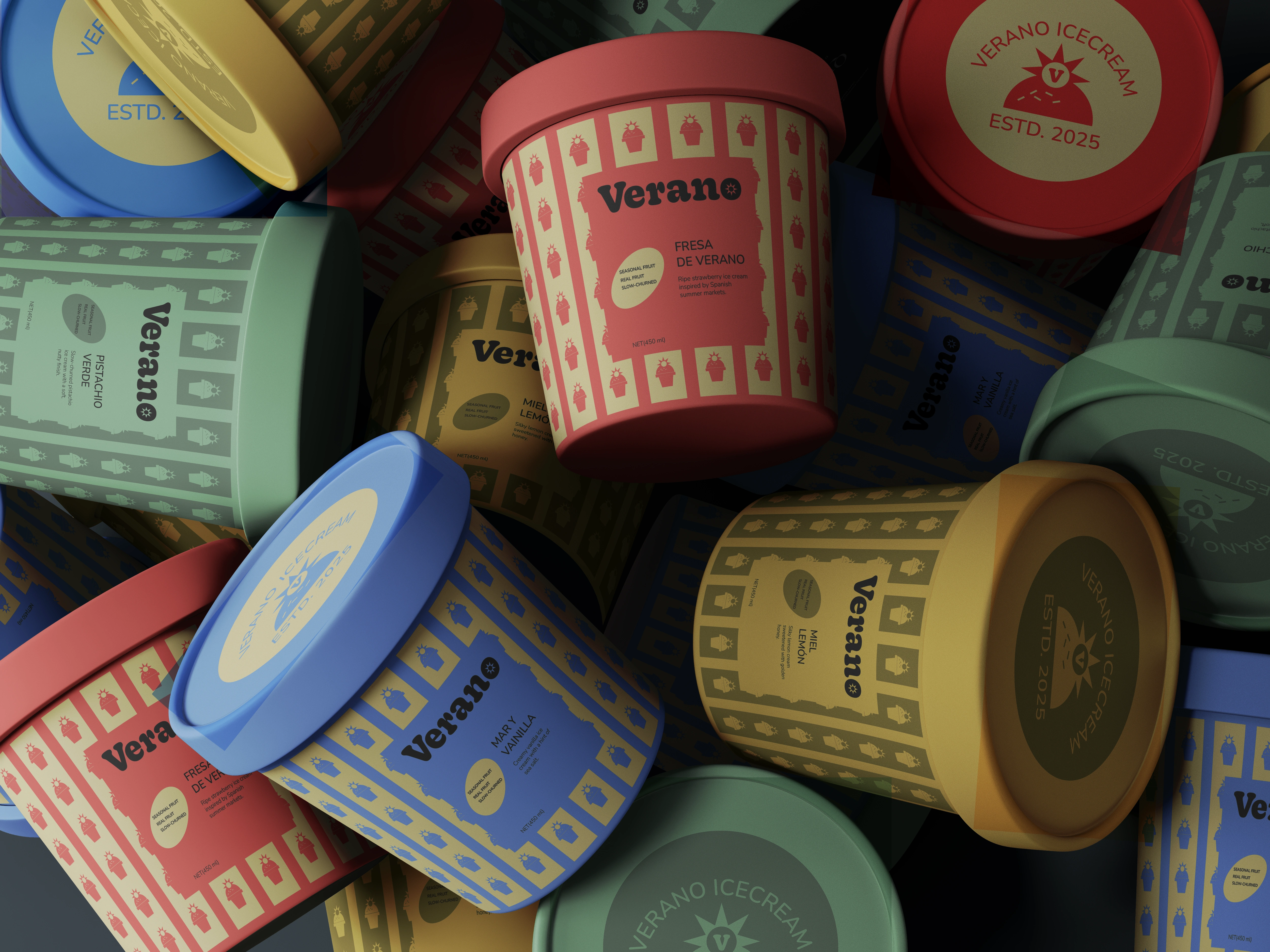
The colour palette uses warm reds, soft yellows, cool blues, and fresh greens, with each colour helping distinguish different flavours while contributing to the overall summer-inspired personality of the brand.
Packaging System
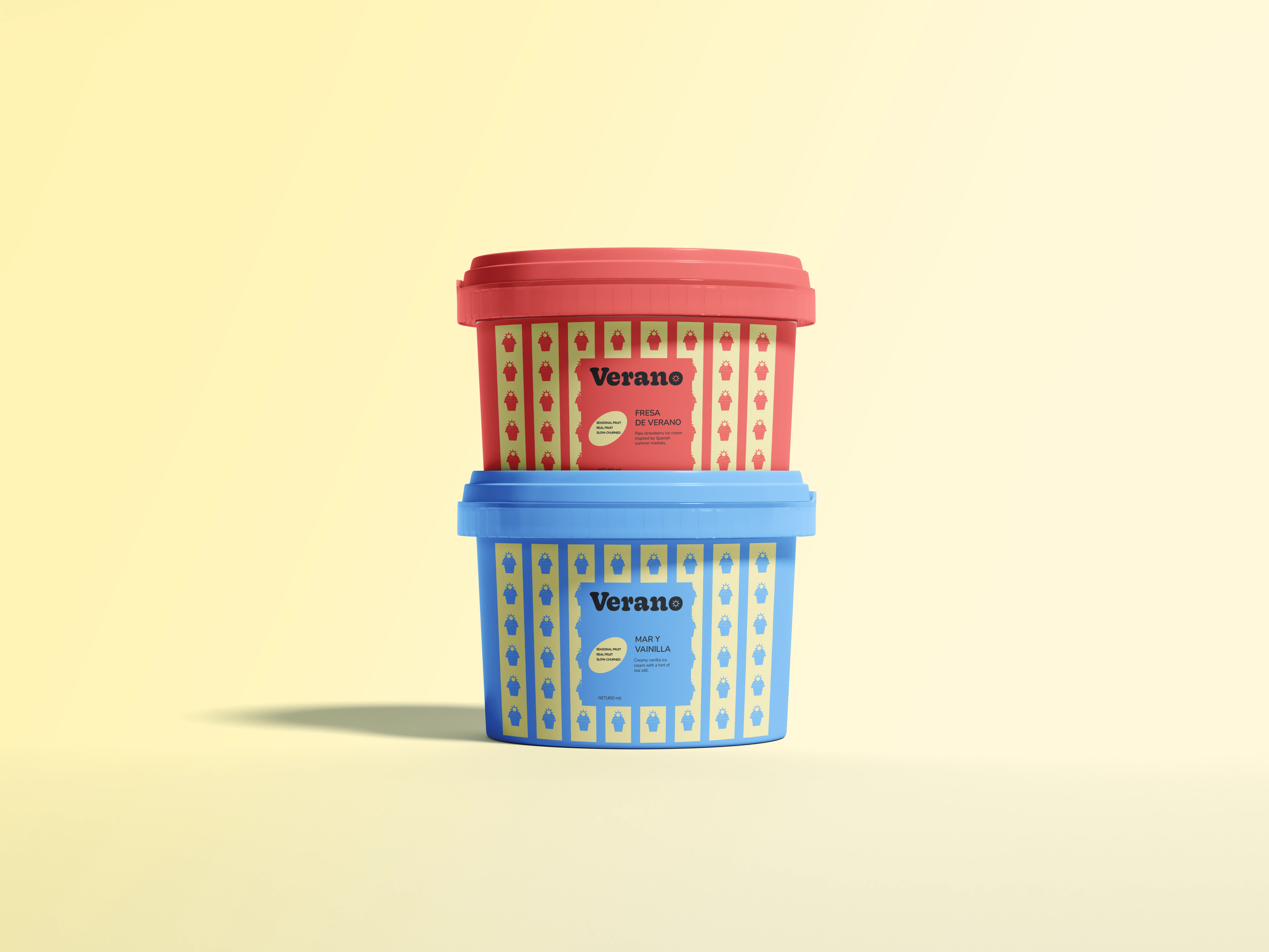
The packaging translates the expressive identity into a flexible system across different ice cream flavours.
Bold colour combinations and repeating graphic elements create strong shelf presence, while a consistent structure keeps the range cohesive.
Each variant has its own colour and personality, but the shared typography, graphic language, and layout system ensure that every product is immediately recognizable as part of VERANO.
Brand Applications
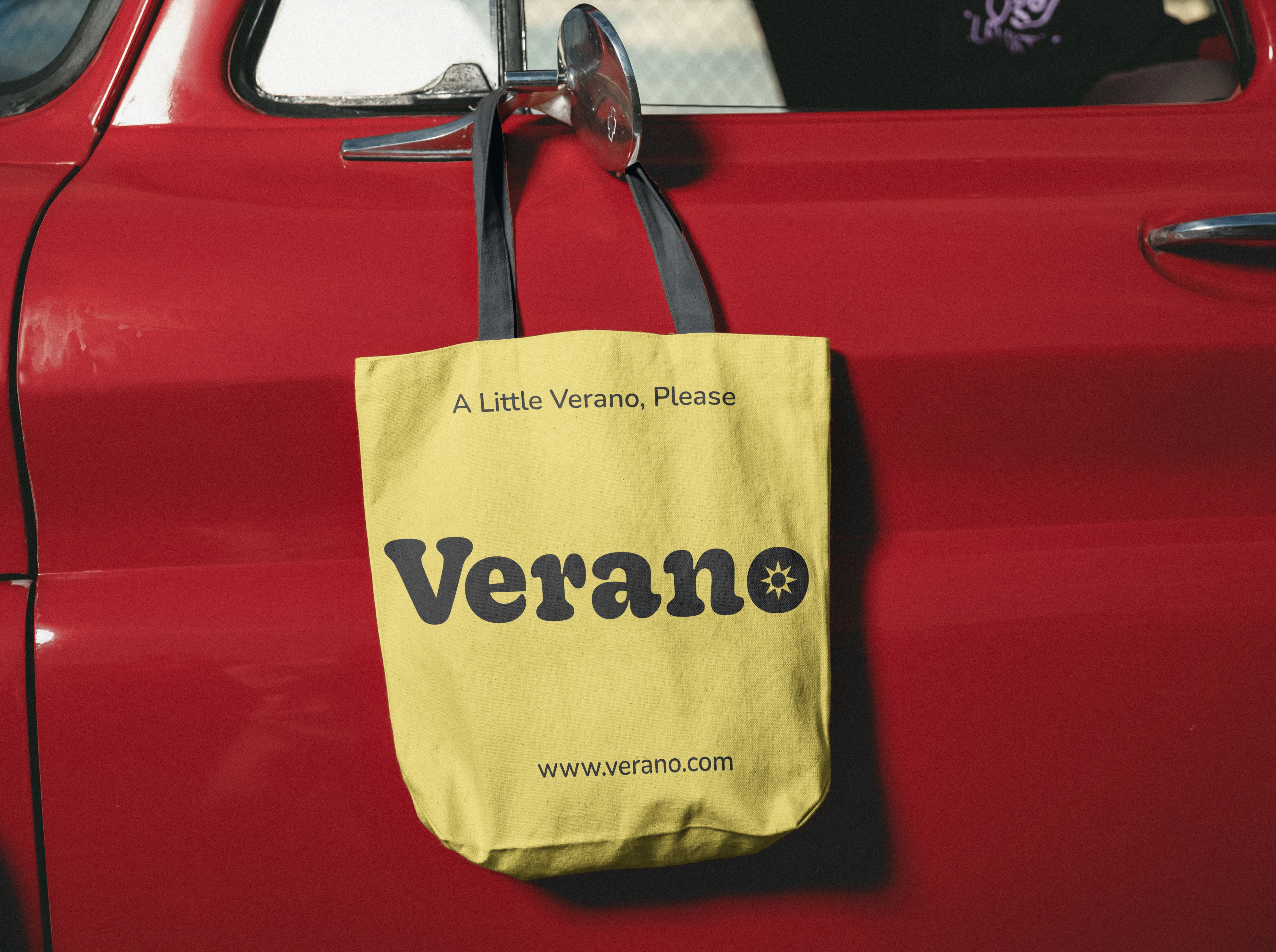
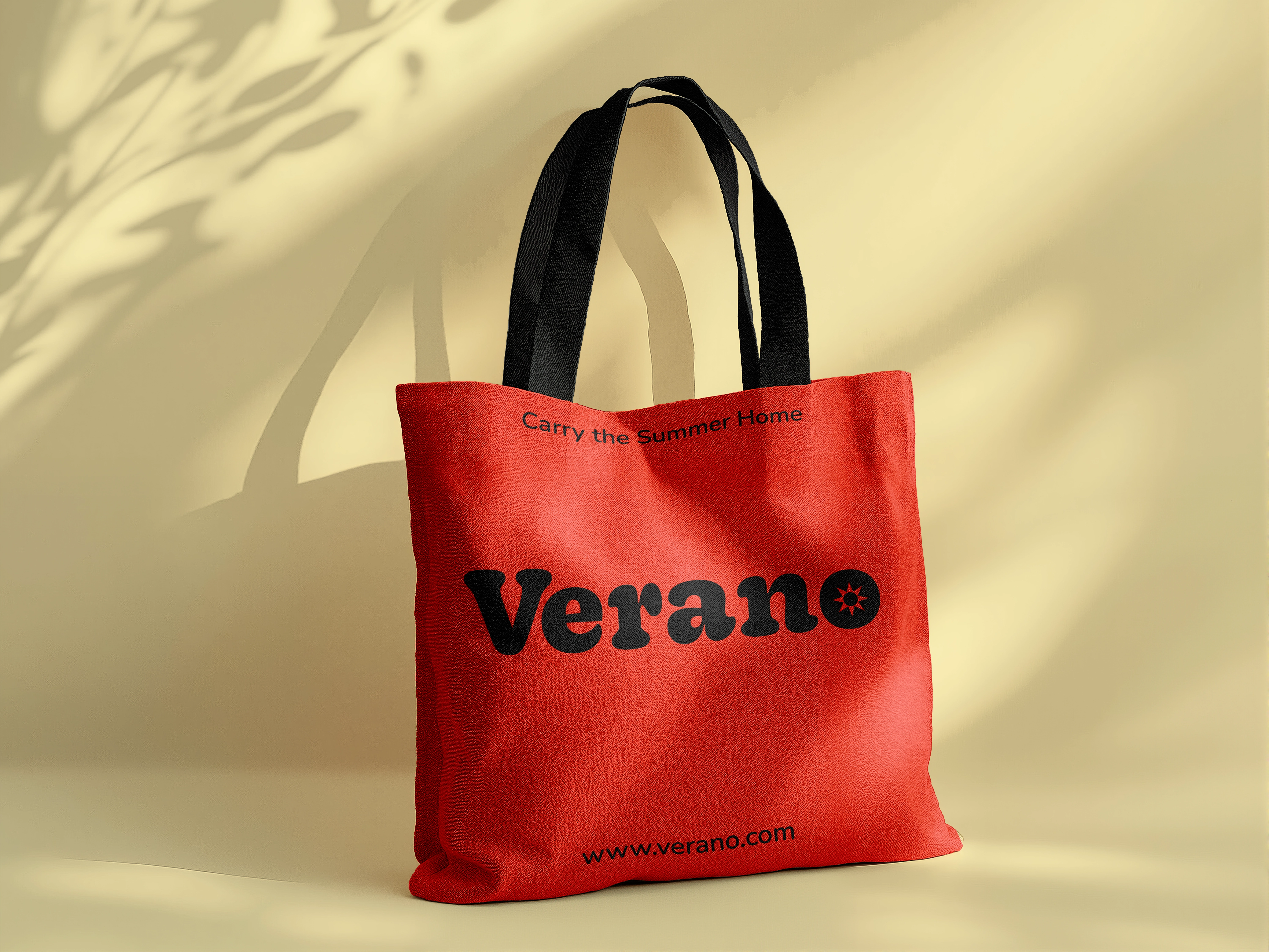
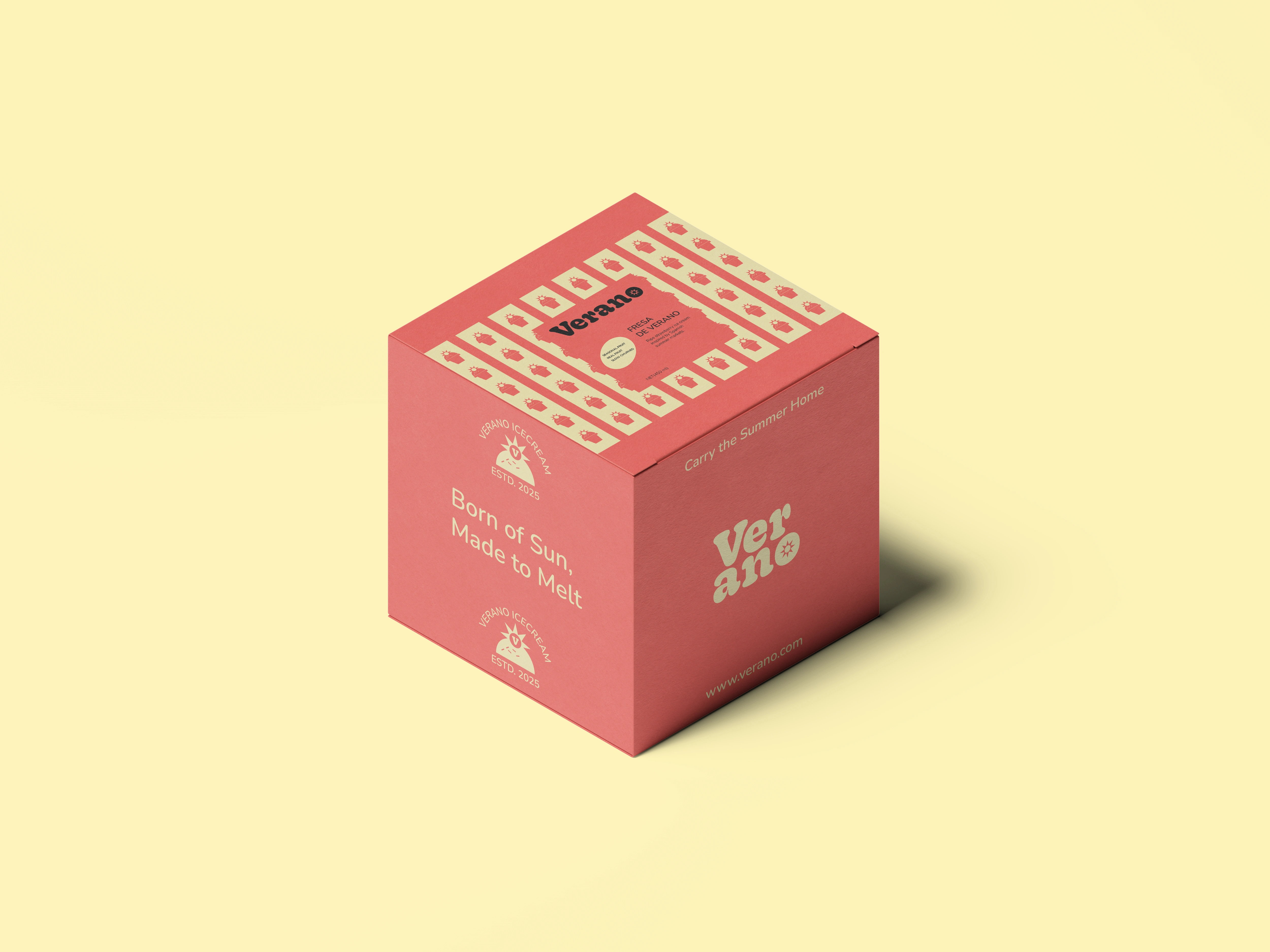
The VERANO identity extends beyond the core ice cream packaging into a wider collection of brand touchpoints.
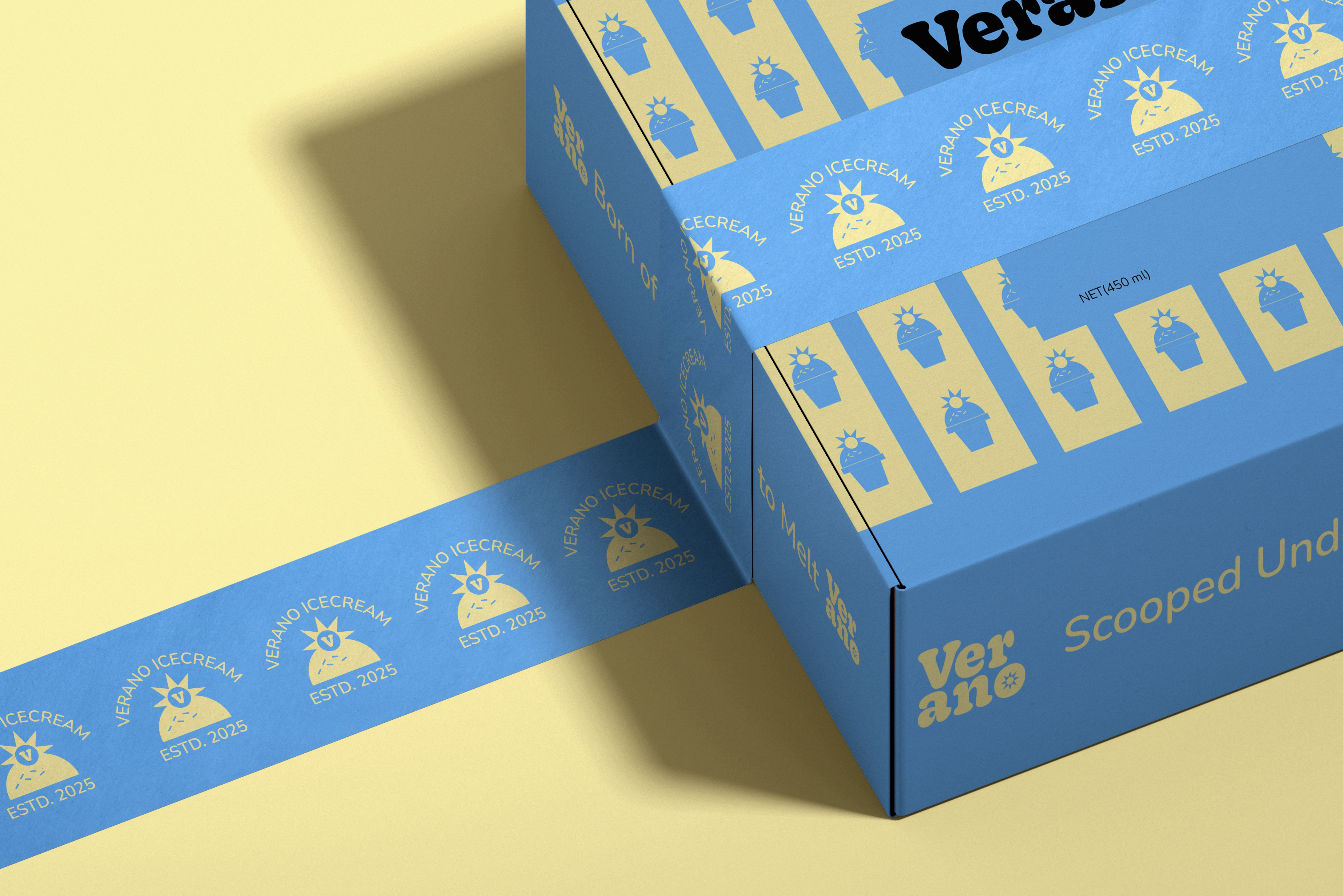
The visual system is applied across ice cream tubs, multipacks, takeaway packaging, shopping bags, promotional materials, and lifestyle applications, allowing the playful summer identity to remain consistent across different environments.

The Outcome
VERANO translates the joy and nostalgia of summer into a vibrant and character-driven brand identity.
The result is a flexible visual and packaging system that balances playfulness with structure, allowing each flavour to feel unique while creating a cohesive brand presence that feels lively, distinctive, and full of personality.
Want to create something distinctive?
If you're building a brand and need a thoughtful visual identity or packaging system, I'd love to hear about it.
Let's work together.
Like this project
Posted Sep 19, 2026
Developed a playful and nostalgic brand identity and packaging system for VERANO, a vibrant ice cream brand inspired by summer.