NORM — Soda Brand Identity & Packaging Design

Akshay Arul


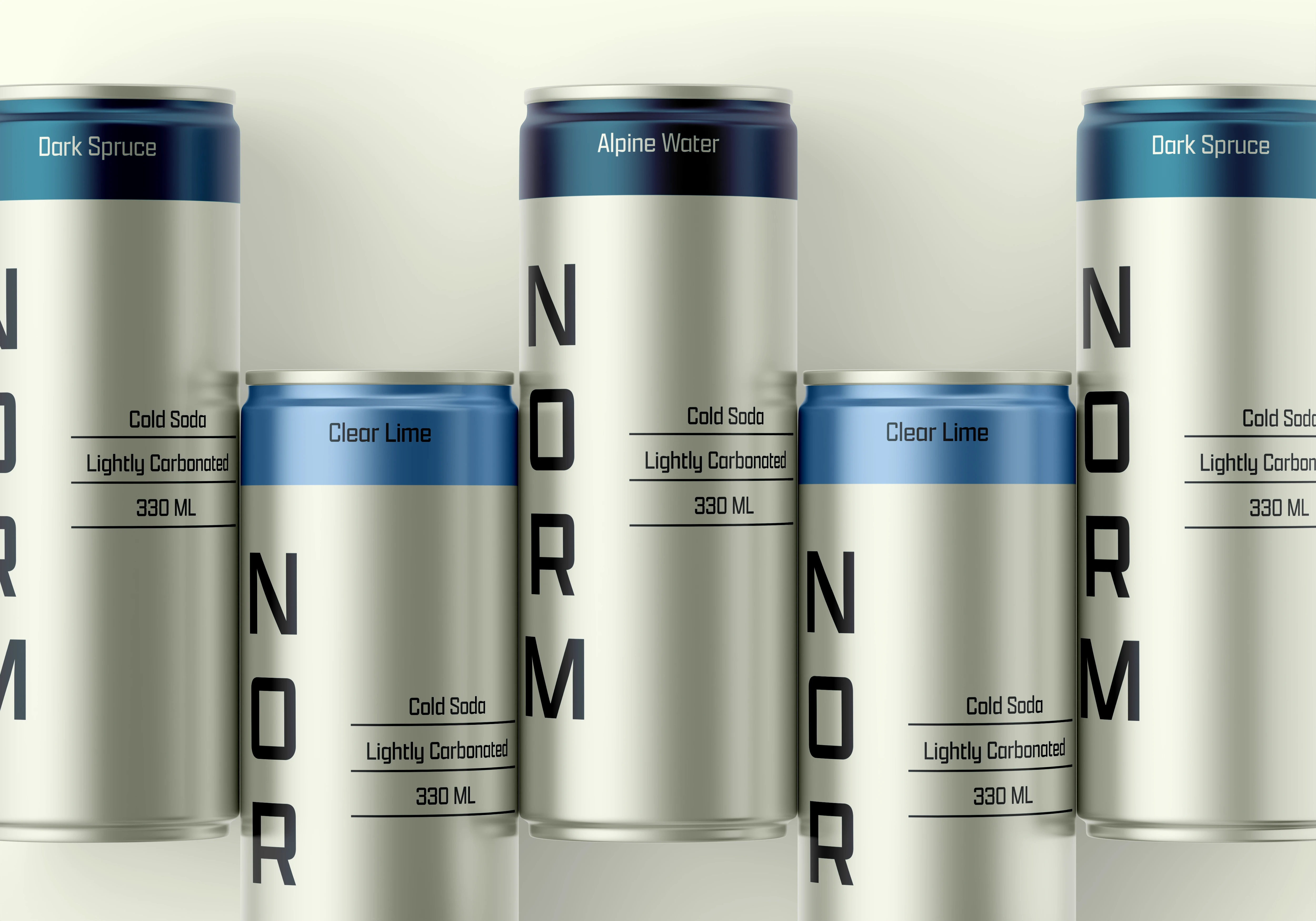
NORM — Alpine-Inspired Flavored Soda
Brand Identity + Packaging Design
Keywords: Minimal, Crisp, Alpine, Refreshing
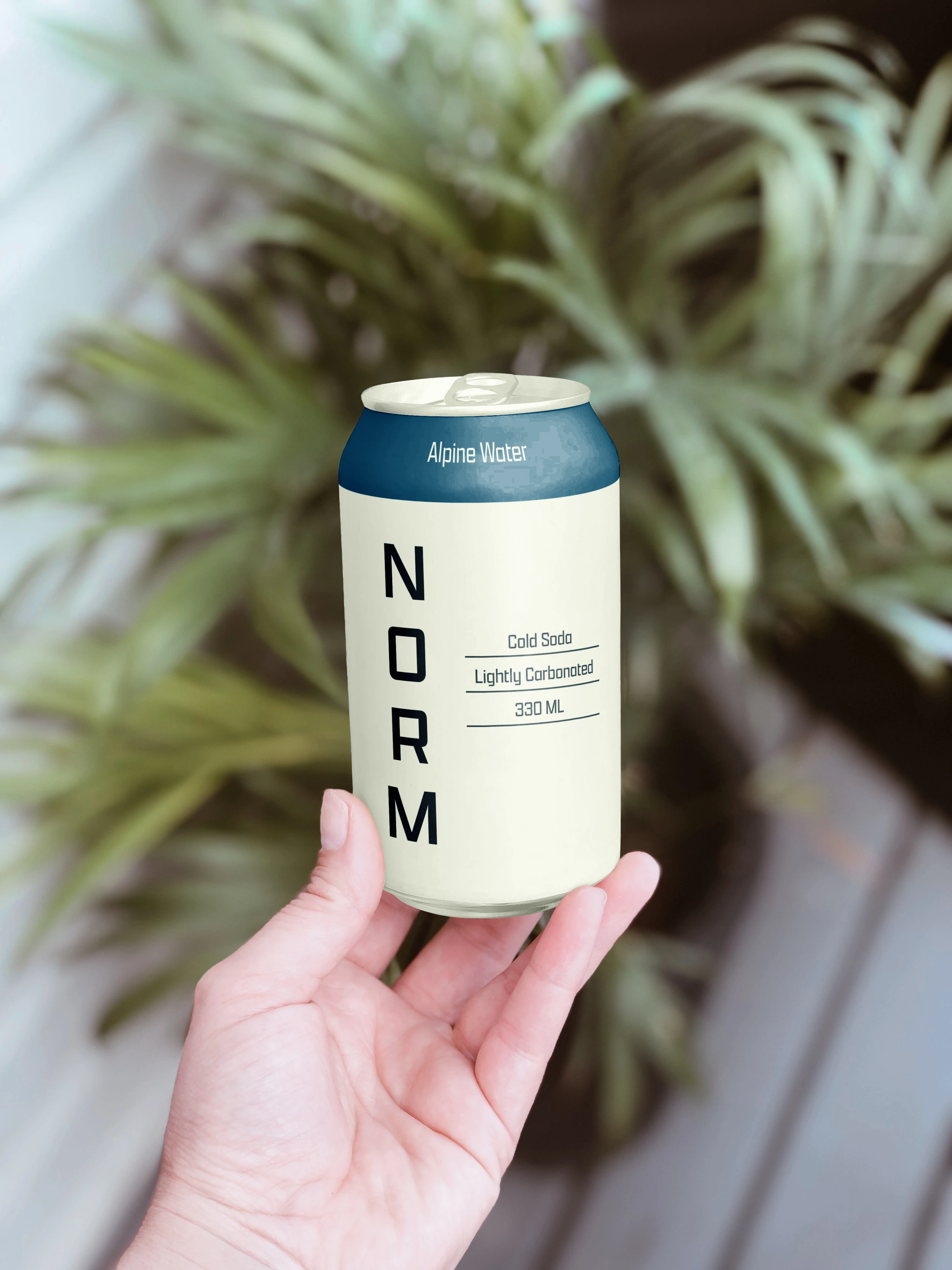
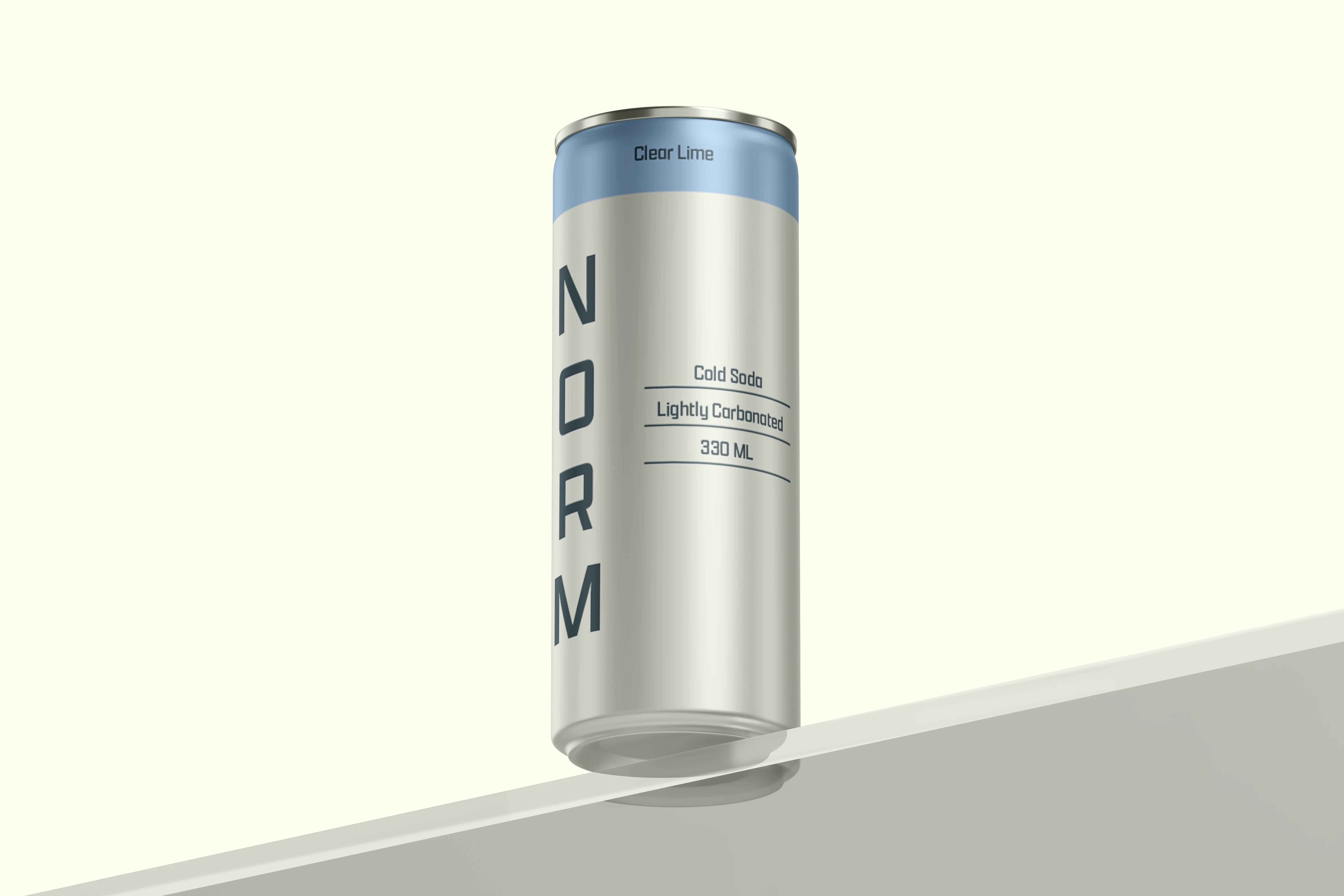
NORM is a conceptual flavored soda brand inspired by the purity and stillness of cold alpine environments. Built around clarity, freshness, and restraint, the brand offers a clean and refreshing soda experience with a contemporary visual identity.
The Challenge
The challenge was to create a soda brand that could communicate freshness and clarity without relying on the loud, heavily graphic visual language often associated with the category.
NORM needed an identity that felt distinctive while remaining minimal and restrained — creating enough character to stand out while maintaining a sense of calm and simplicity.
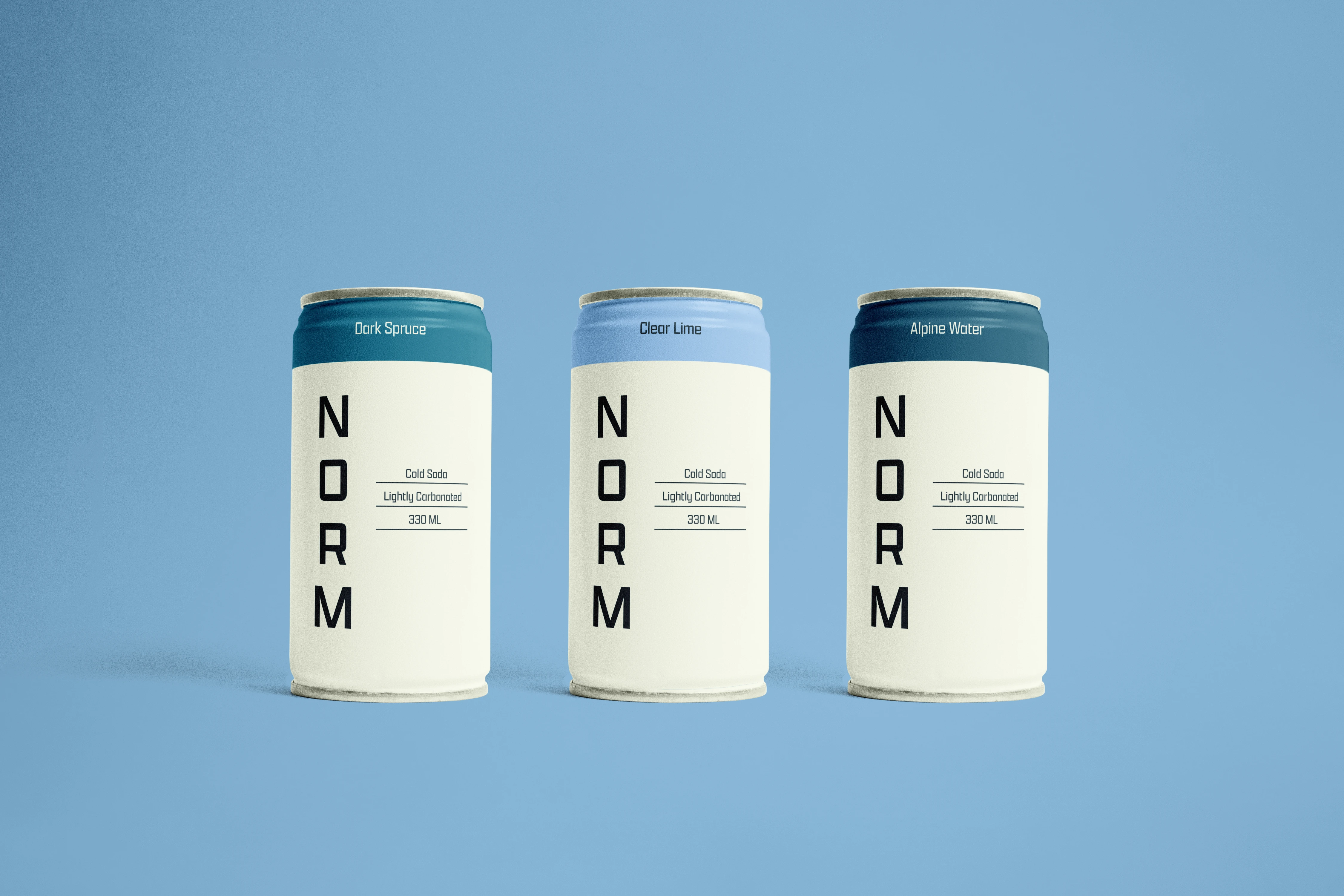
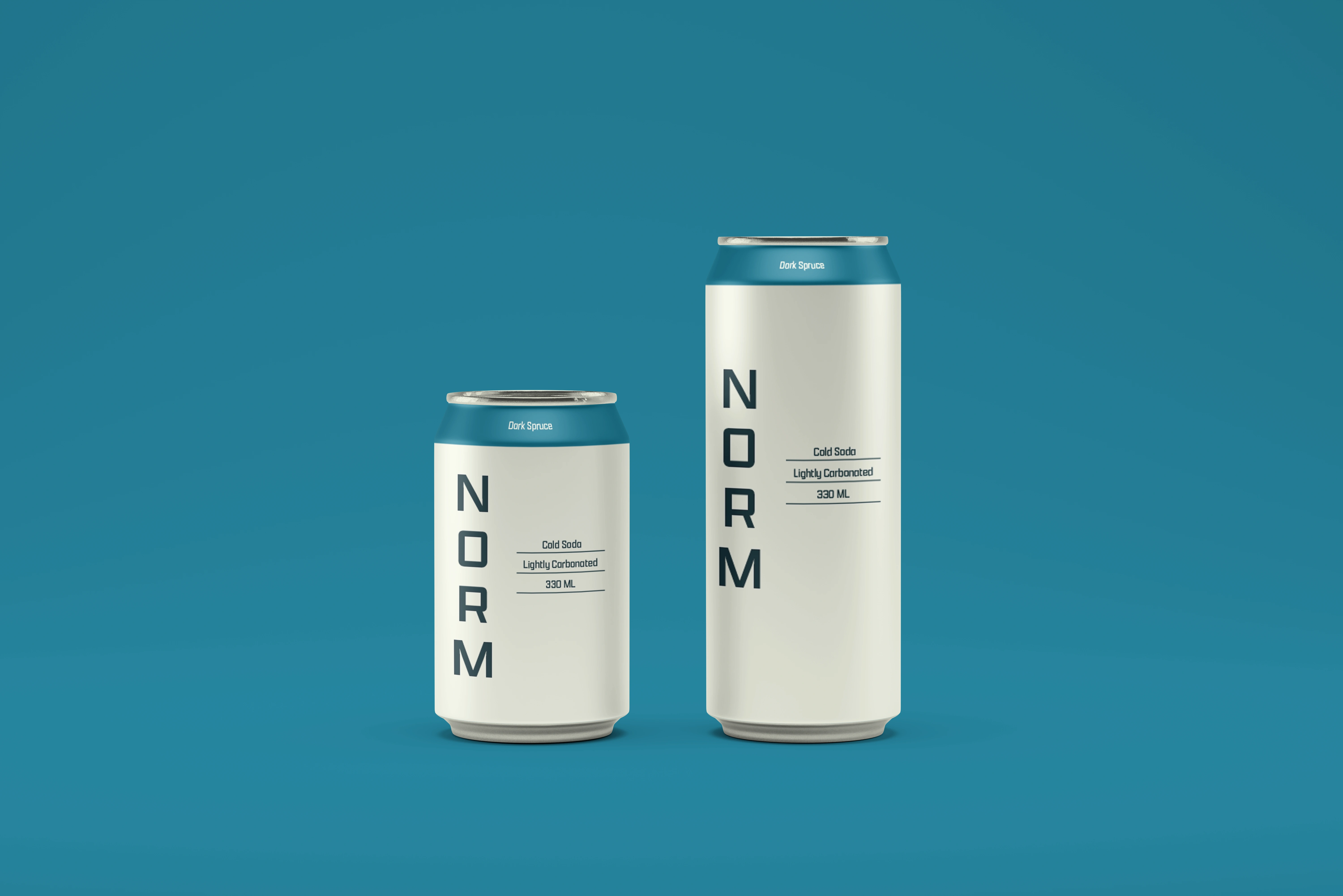
The Concept
The core concept behind NORM is clarity and restraint, inspired by the purity and stillness of cold alpine landscapes.
Rather than directly illustrating mountains or relying on obvious outdoor imagery, the design translates the feeling of the environment through negative space, cool colours, structured typography, and a clean visual system.
The result is a brand language that feels crisp, light, and quietly confident.
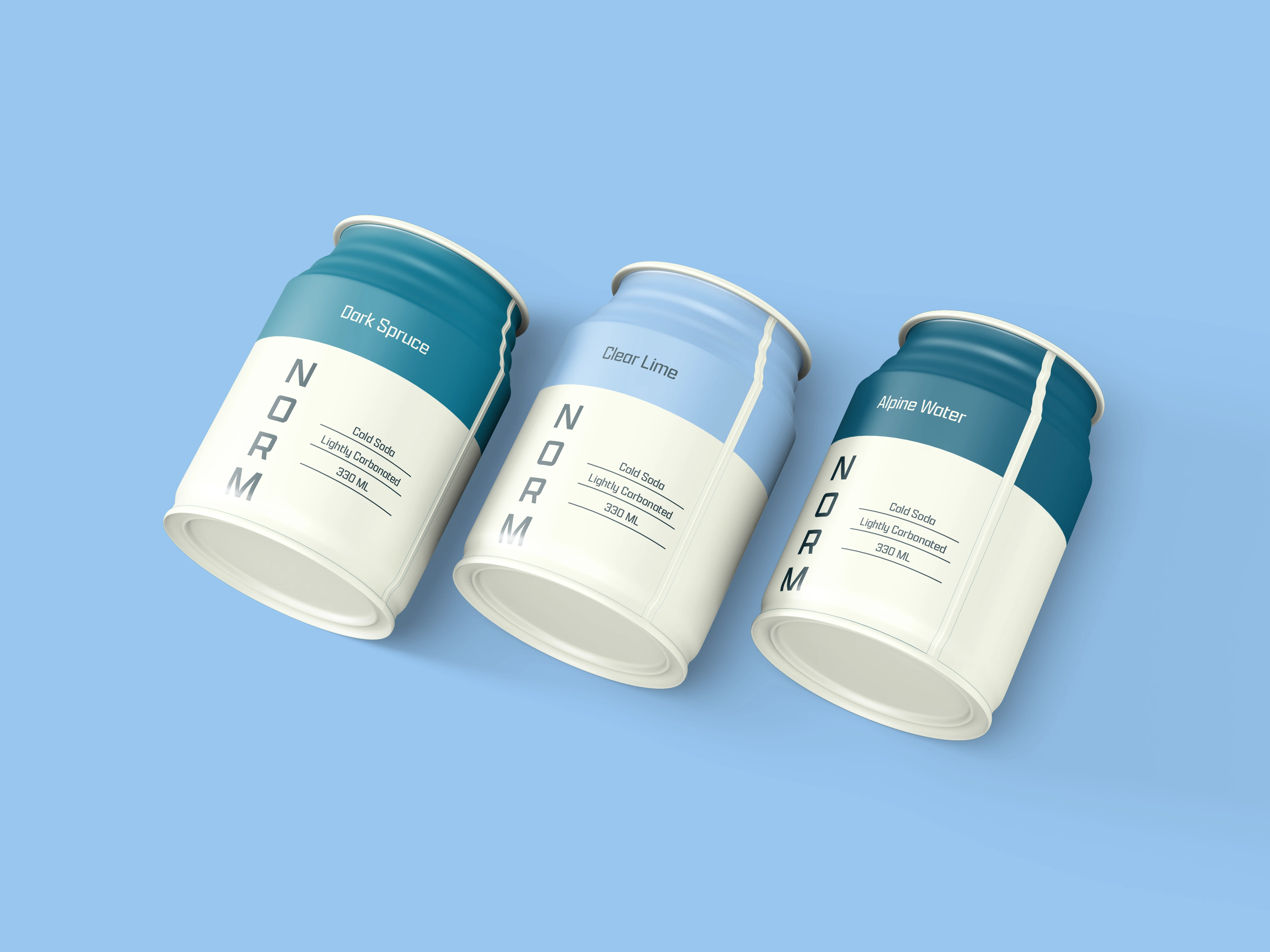
Visual Identity
The identity is built around a highly minimal visual approach, with typography and spacing acting as the primary visual tools.
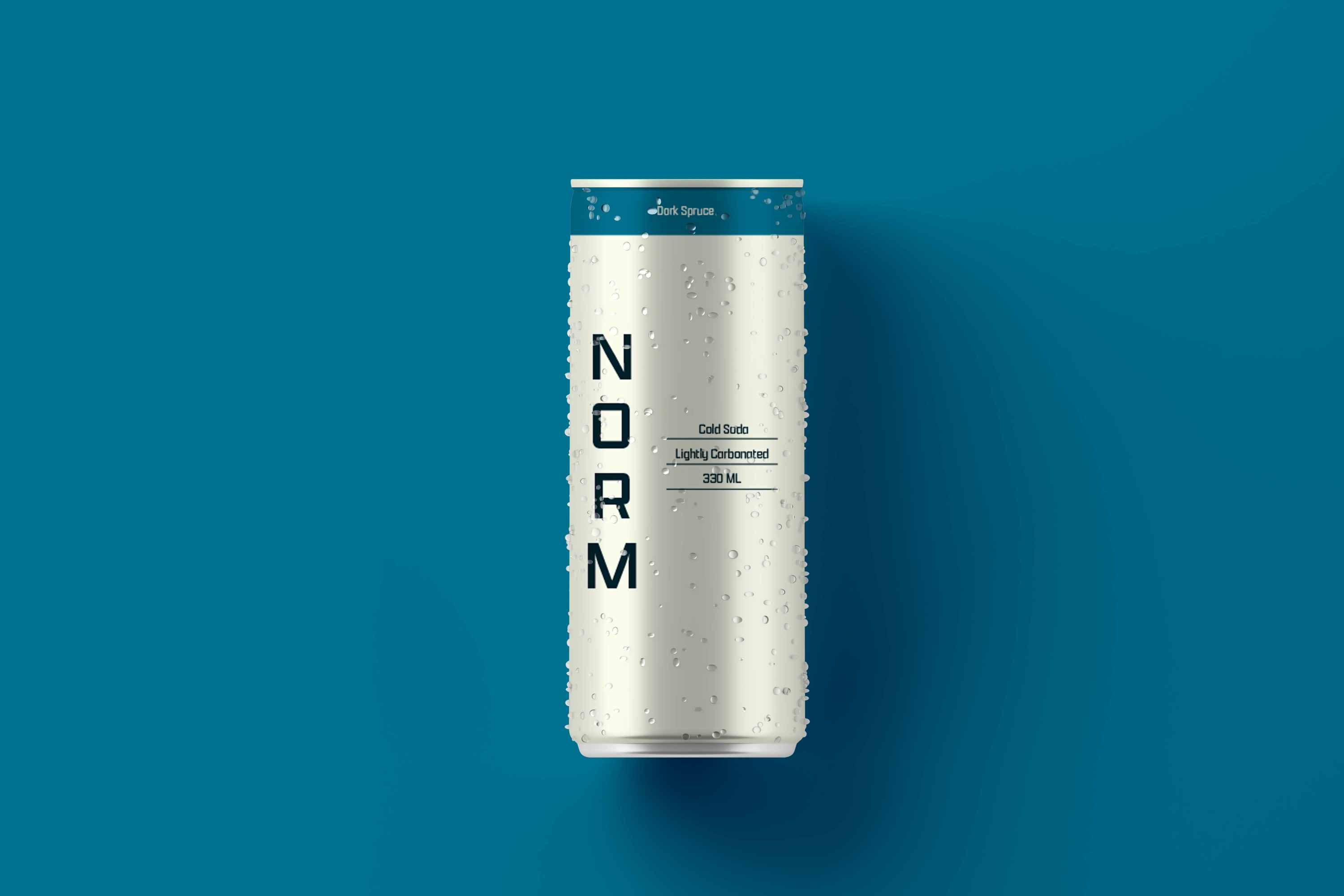
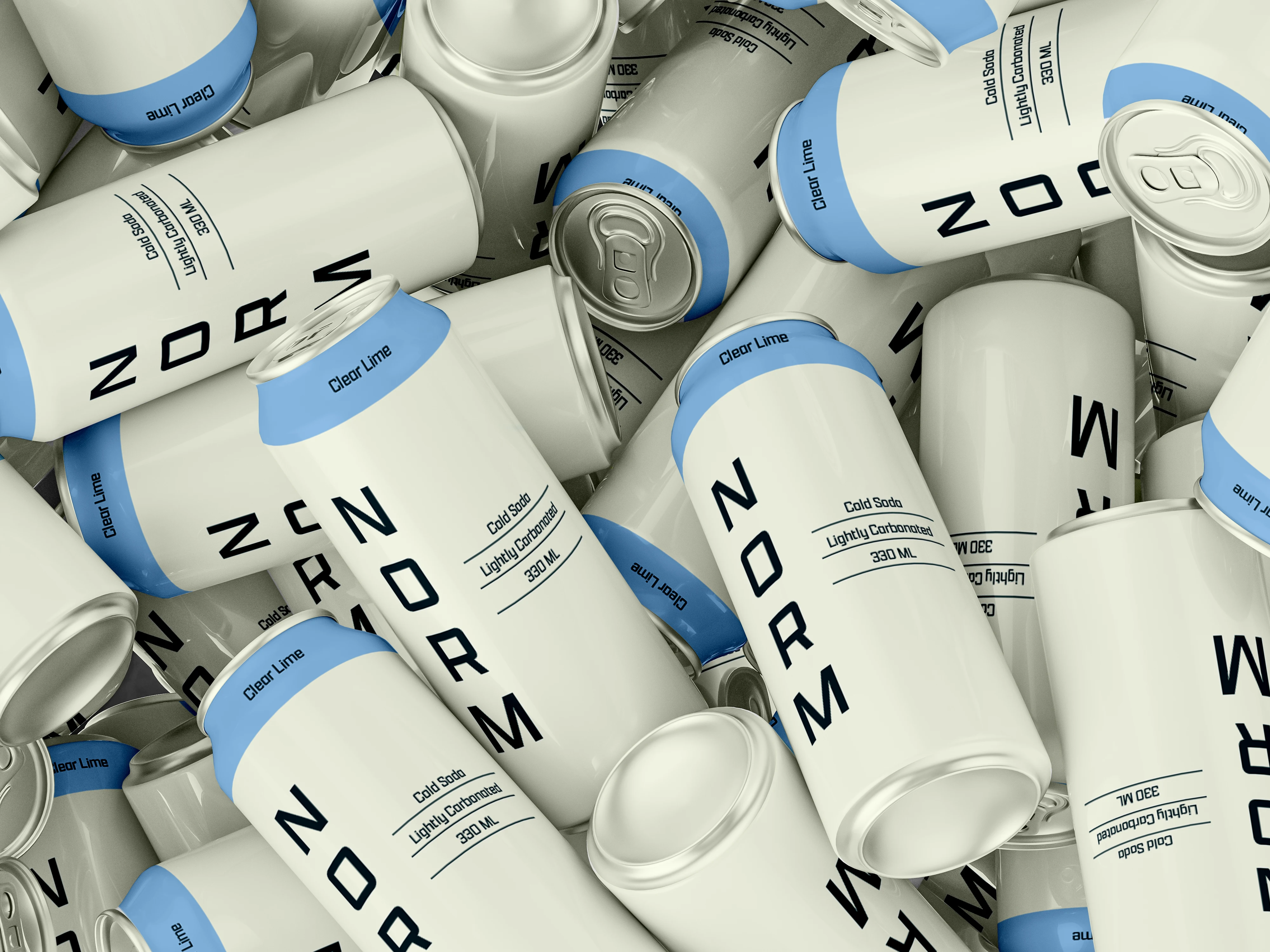
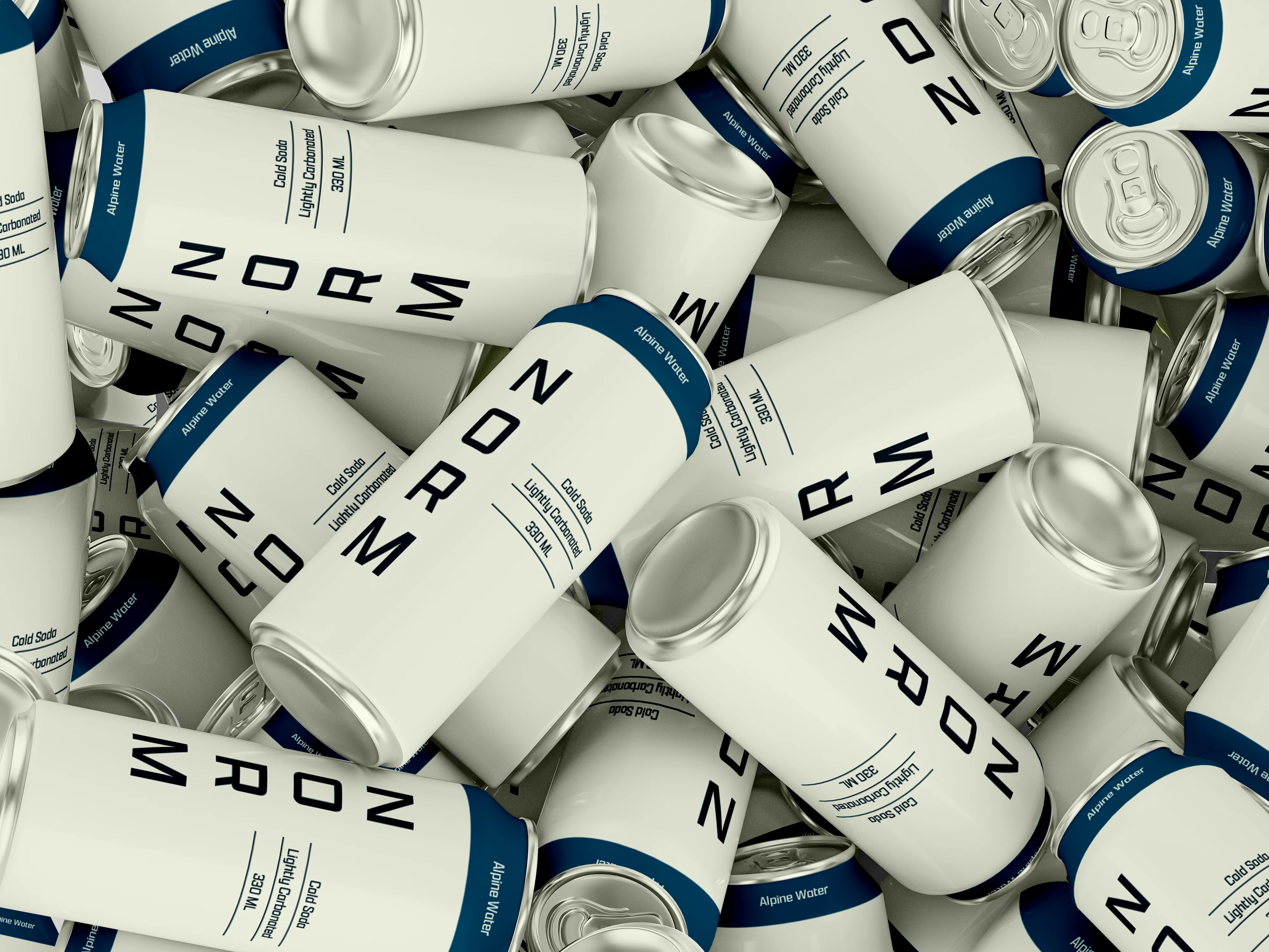
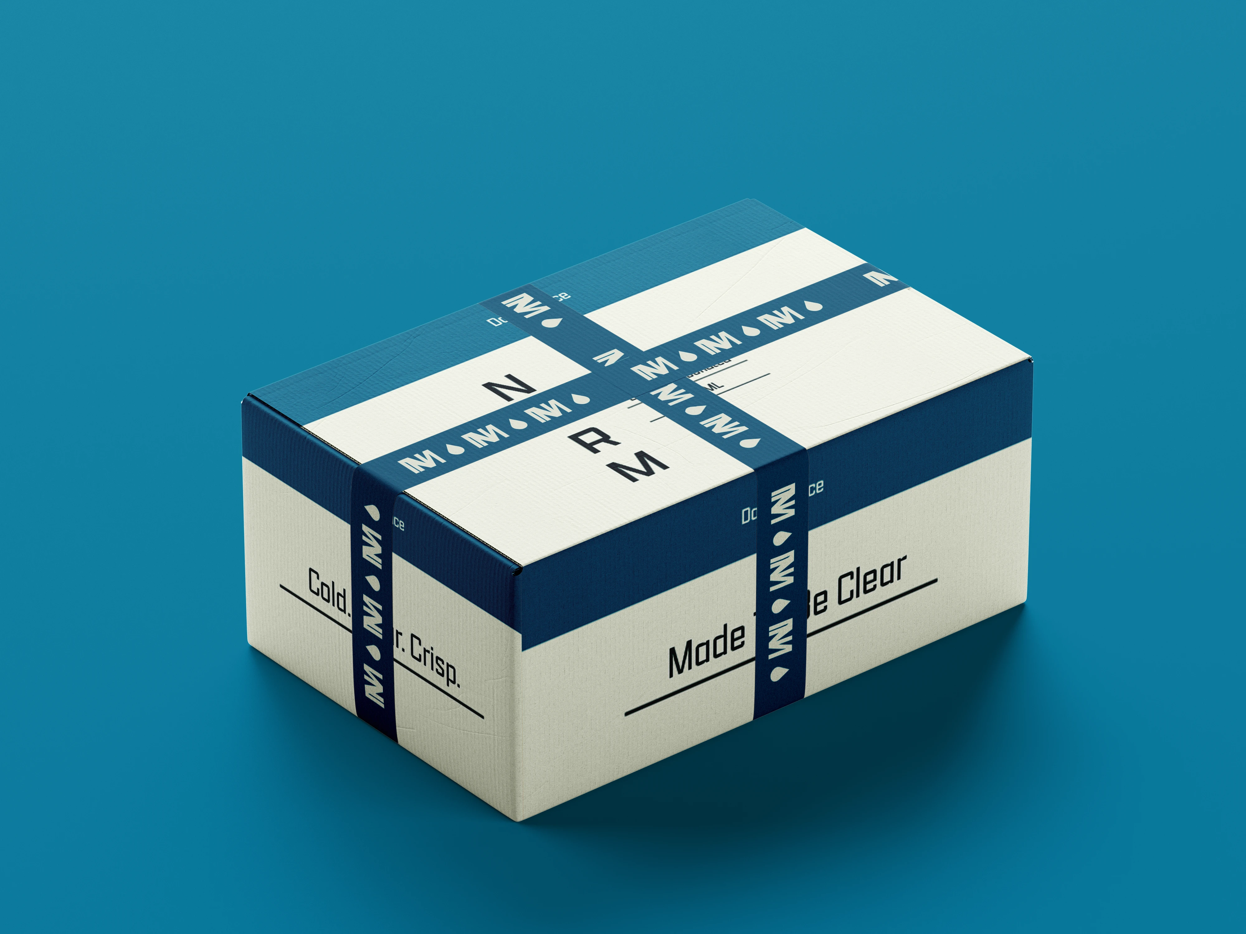
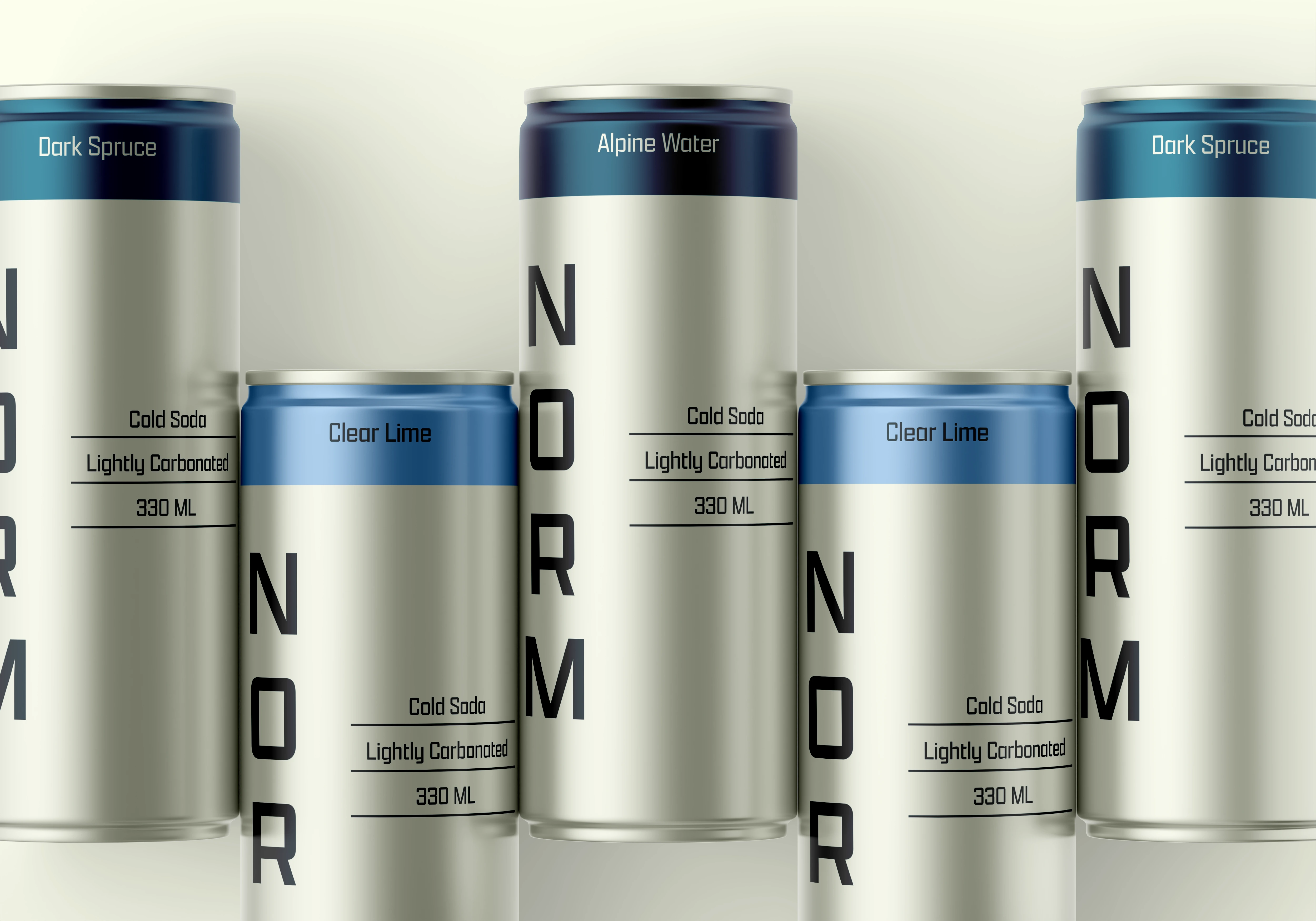
A bold wordmark is vertically structured across the packaging, creating a distinctive brand signature while maintaining the overall sense of restraint. Generous negative space gives the identity room to breathe and reinforces the feeling of clarity.
The colour palette draws from alpine environments through cool blues, soft neutrals, and subtle contrasts, creating a visual language that feels fresh, clean, and contemporary.
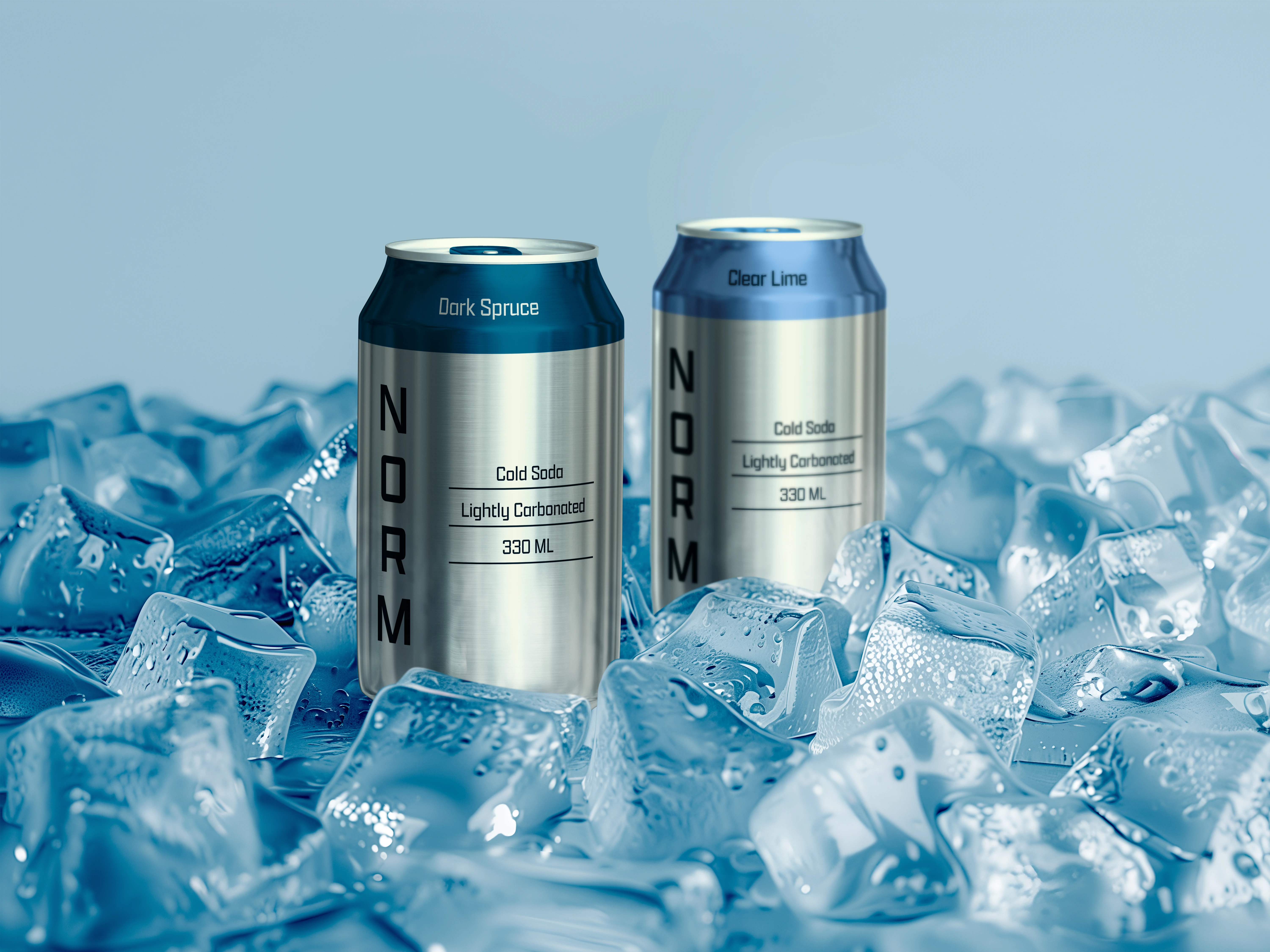
Packaging System
The packaging system carries the same principles of clarity and restraint across the product range.
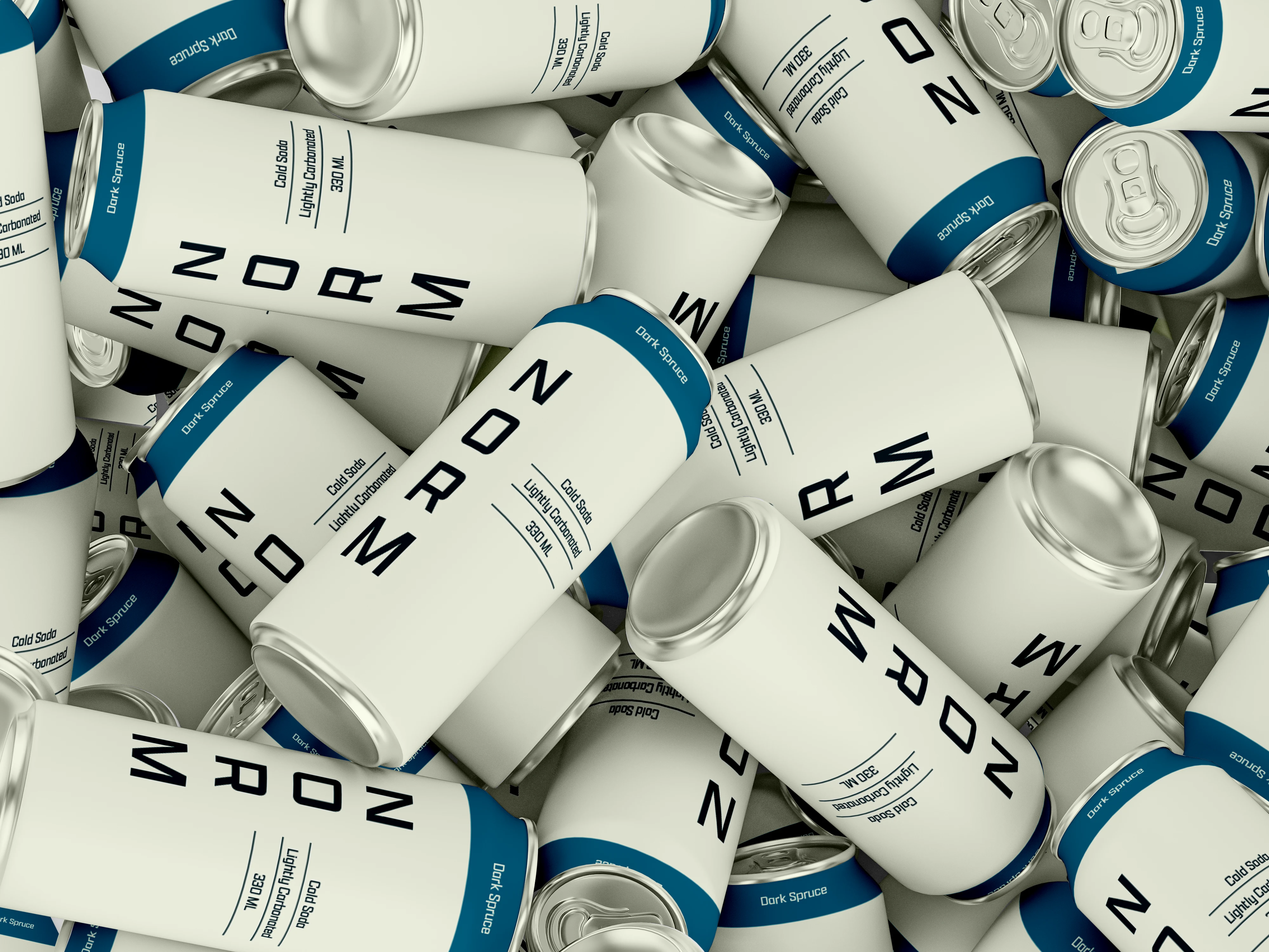
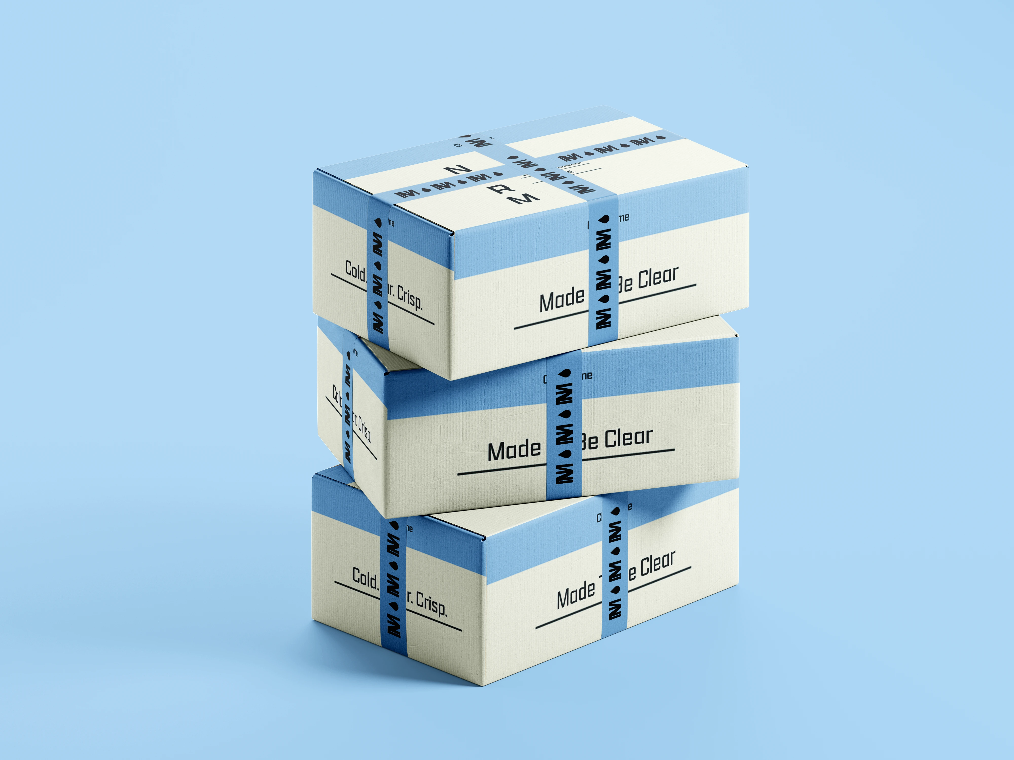
A consistent typographic structure and visual hierarchy create recognition across different flavours, while the colour system allows each variant to feel distinct within the larger brand family.
The result is a flexible system that maintains consistency without making every product feel identical.
Brand Applications
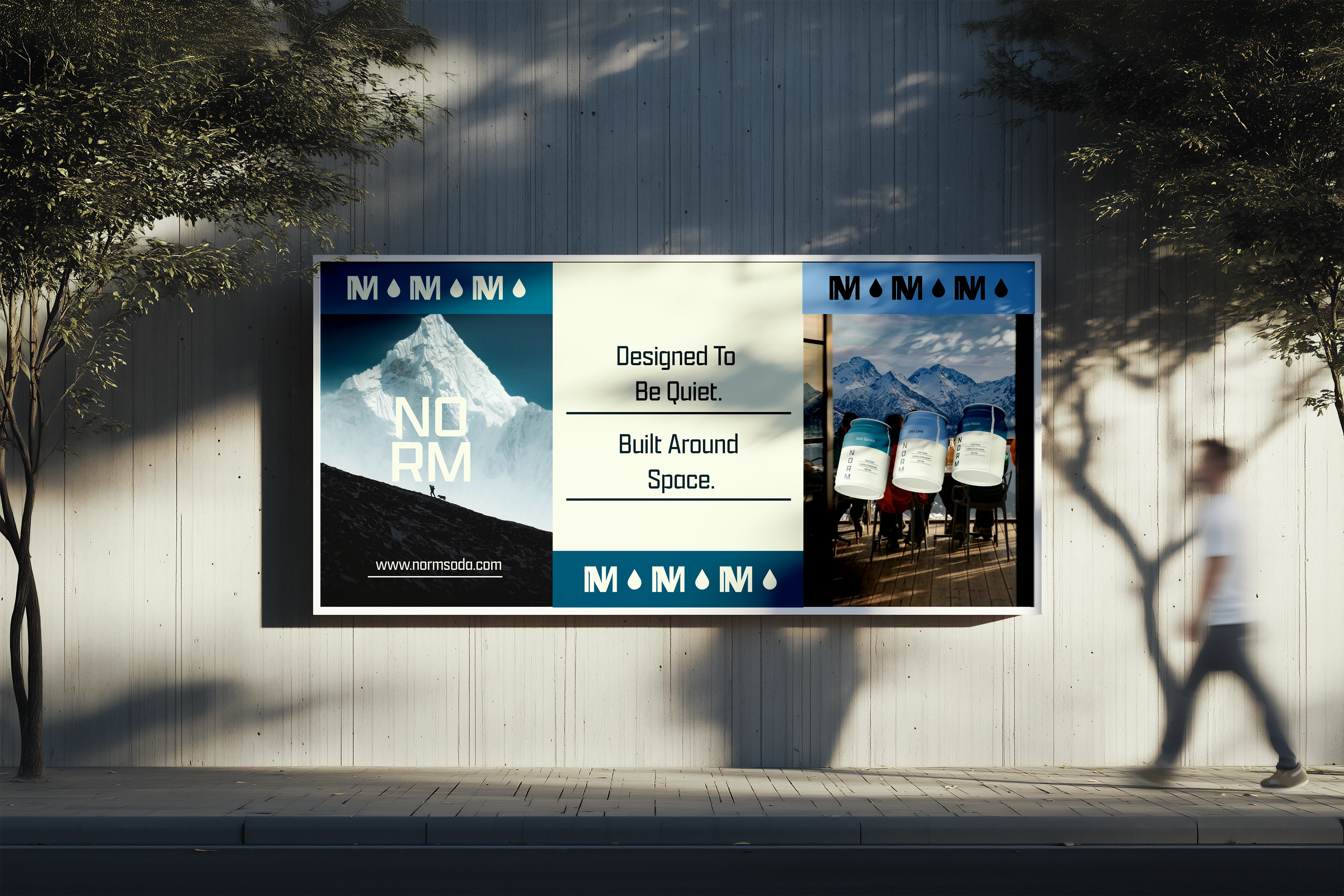
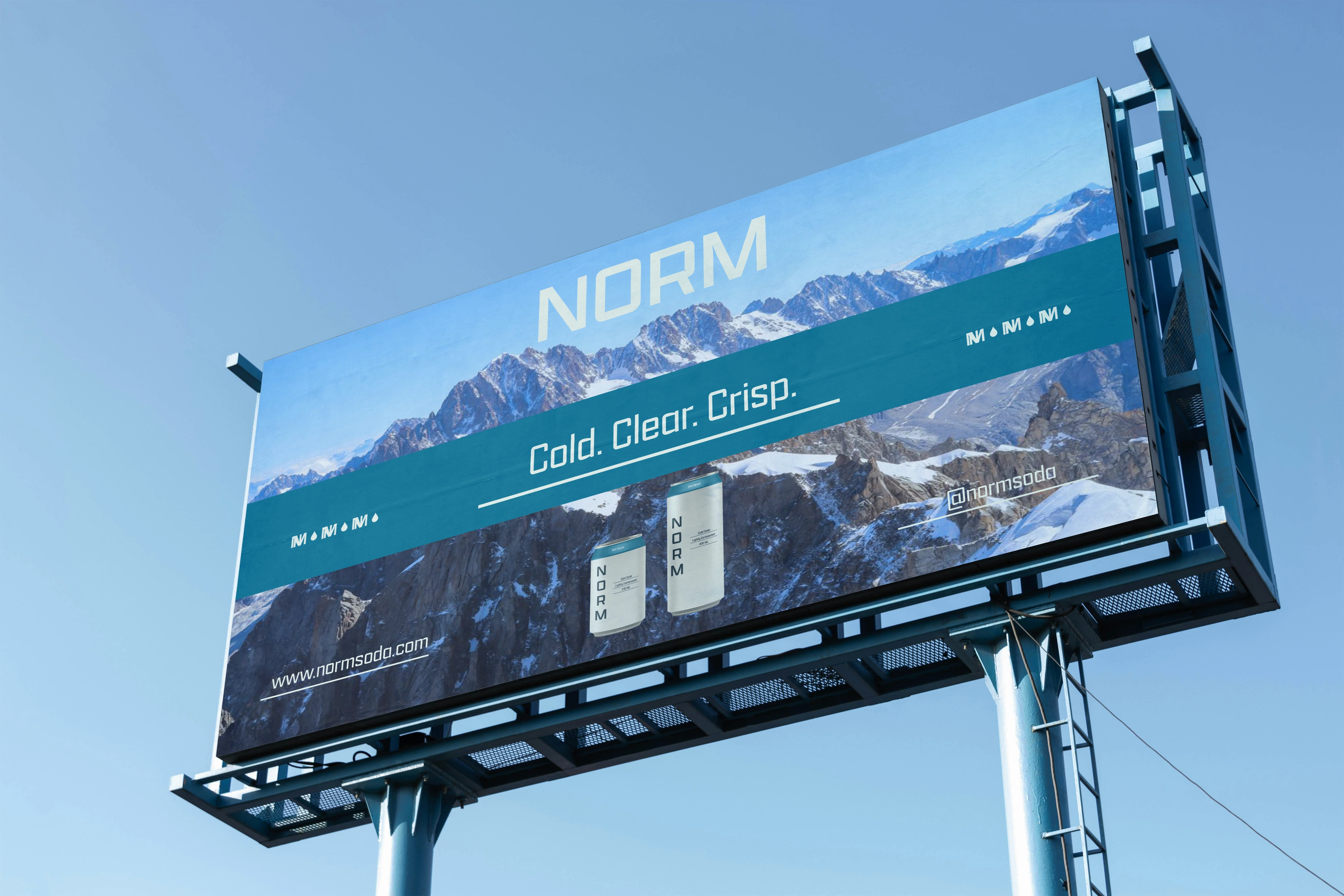
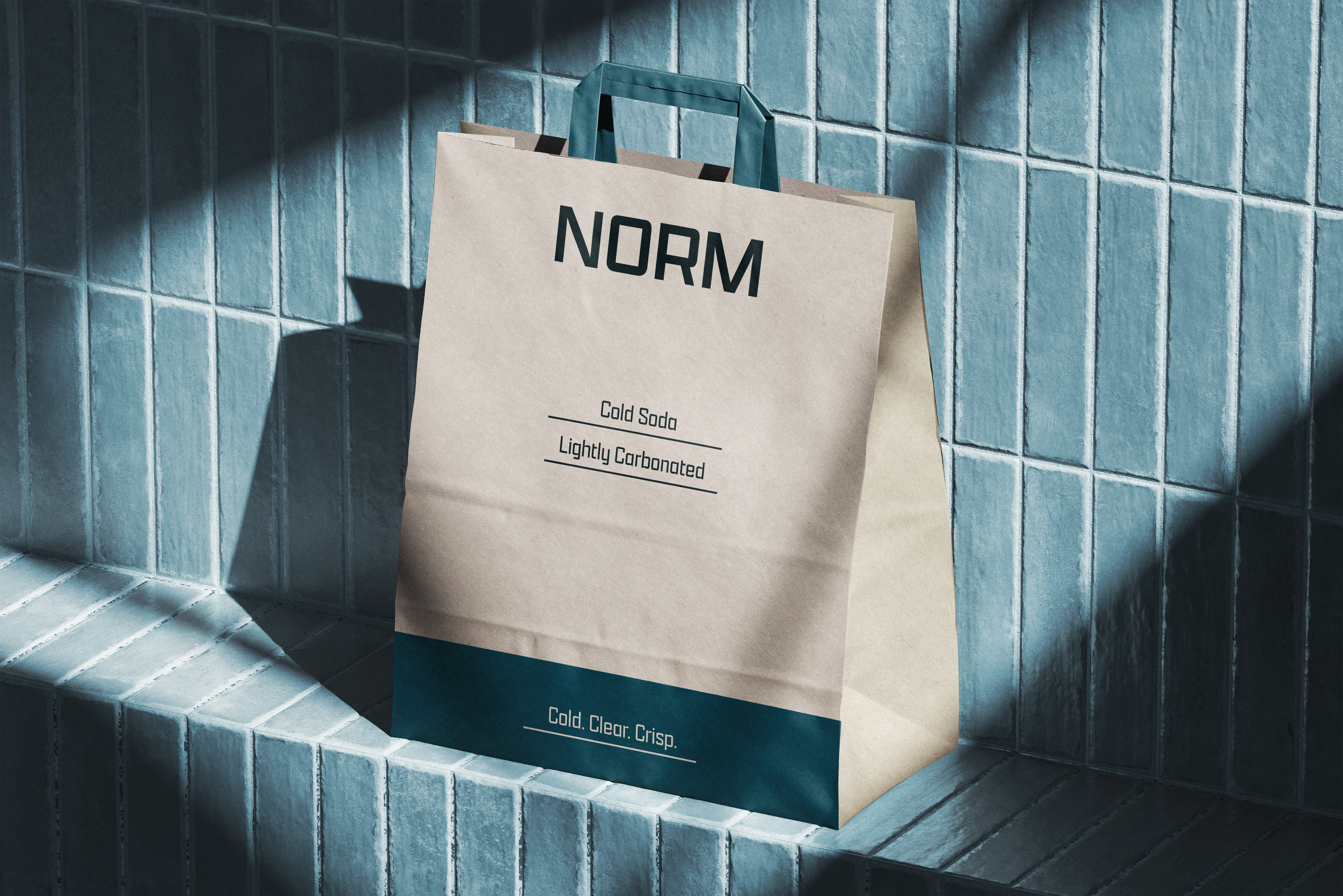
The identity extends across cans, multipacks, boxes, retail applications, and promotional touchpoints.
Across each application, typography, spacing, colour, and composition work together to maintain the same crisp and minimal visual language.
The system is designed to remain recognizable whether NORM appears as an individual product or as part of a larger brand environment.
The Outcome
NORM translates the feeling of crisp mountain air into a contemporary soda identity built around minimalism, clarity, and character.
The result is a clean and distinctive visual system that feels refreshing without being overly loud — giving NORM a strong presence while maintaining its quiet, effortless personality.
Want to create something distinctive?
If you're building a brand and need a thoughtful visual identity or packaging system, I'd love to hear about it.
Let's work together.
Like this project
Posted Sep 19, 2026
Developed a crisp, minimal brand identity and packaging system for NORM, an alpine-inspired flavored soda brand.