Your title slide decides if investors keep reading. Right no...

Vladyslav Stadnyk


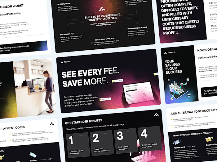
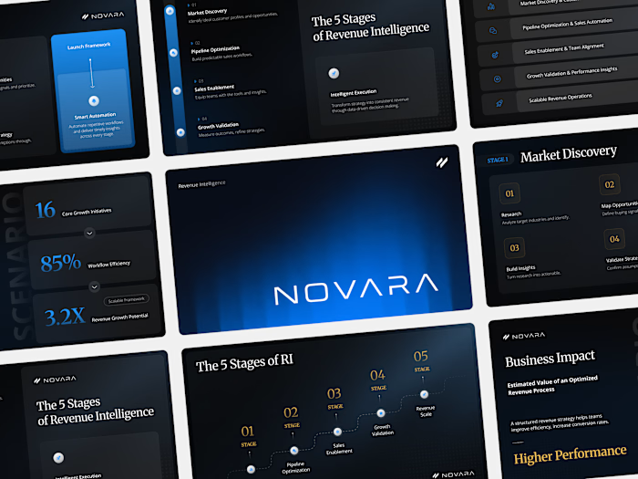
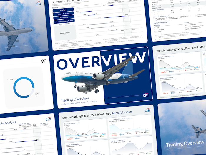
Your title slide decides if investors keep reading. Right now, it looks like an AI generated it in 2 minutes.
Investors open dozens of files a week. Every second deck starts with the exact same AI-generated layout... same default fonts... same generic "Company Update 2026"... 🤖
When you ask for millions to fund commercial properties, aesthetics equal trust. A lazy title slide sends a clear message. It says you cut corners. It shows a massive lack of attention to detail. You burn your credibility before the investors even see your financial models.
I recently redesigned a deck for a real estate investment group. They used a basic AI template with a low-quality stock photo of a skyline. We scrapped it entirely. We built a custom grid, added a single high contrast architectural shot, and wrote a one-sentence value proposition. That simple shift instantly framed them as top-tier institutional players.
What is the biggest red flag you see on a pitch deck title slide? 🚩
Like this project
Posted Sep 15, 2026
Your title slide decides if investors keep reading. Right now, it looks like an AI generated it in 2 minutes. Investors open dozens of files a week. Every s...