Everest Biolab Brand Identity Design

Tamires Lietti

Bringing exosomes to new heights. 🔬 🧪
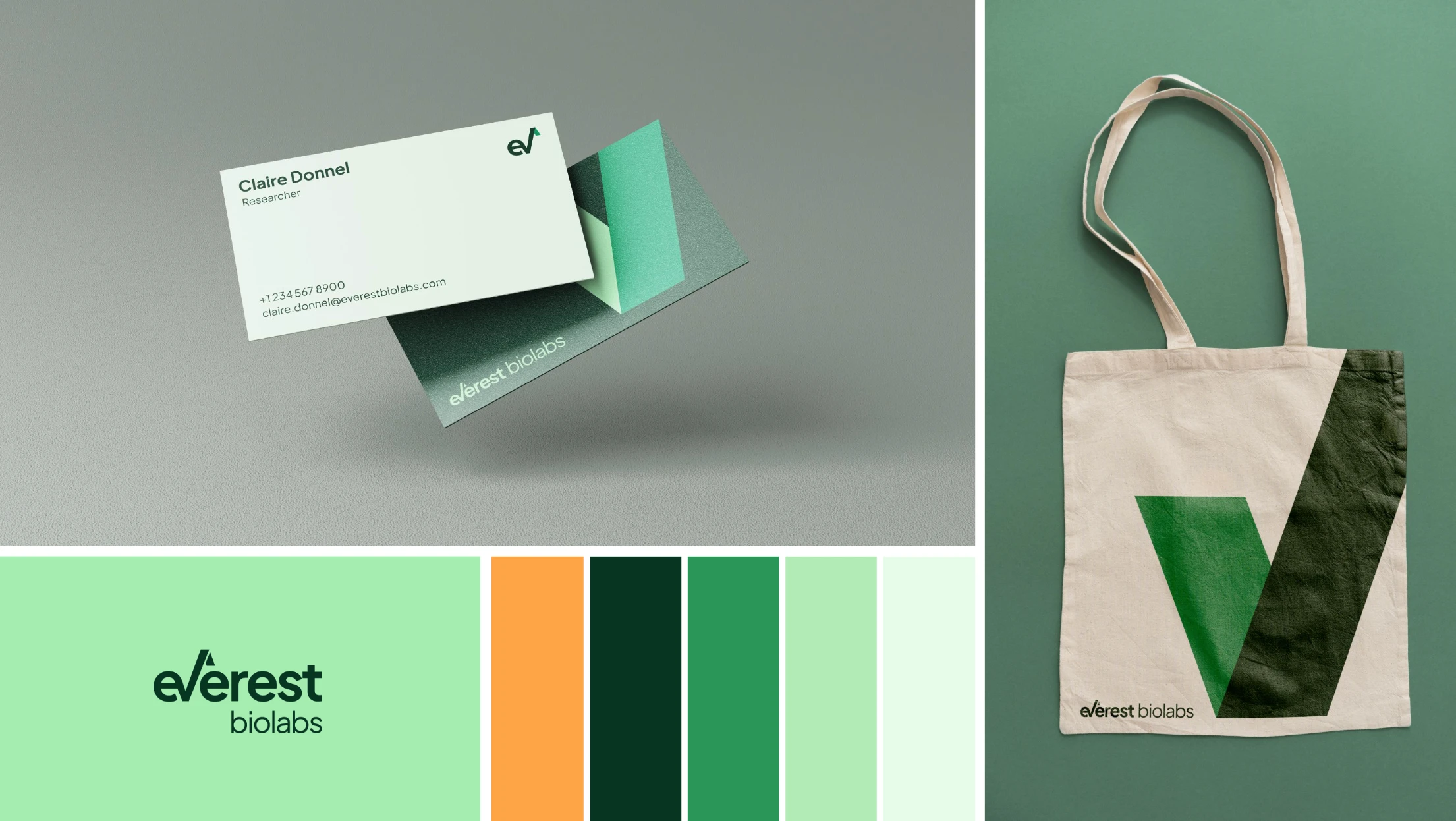
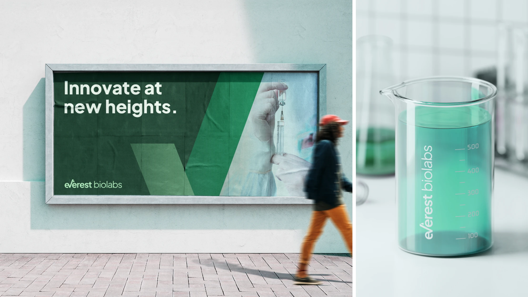
Everest Biolab's brand identity was designed to capture the company's innovative spirit and expertise in providing instruments for research and testing within the extracellular vesicle field. Central to the identity is the angular shape of the logo, which creates a sleek and cohesive visual language. The distinctive 'v' and arrow shape, representing both a mountain peak and upward movement, is used to create dynamic masks and outlines that enhance and highlight various design elements.
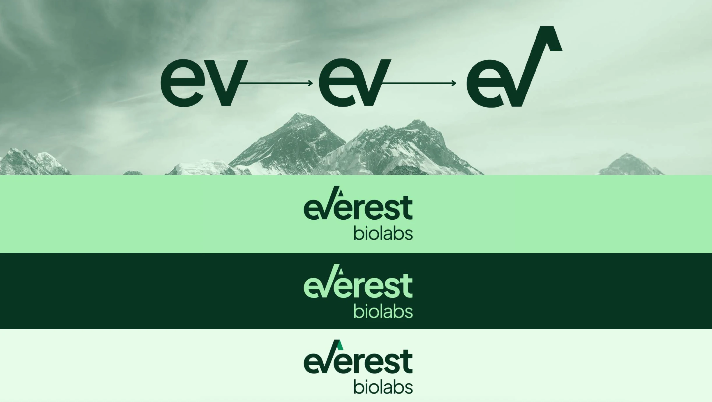
The chosen color palette ranges from dark to bright greens, accented with a vibrant yellow-orange, representing both natural elements and scientific advancement. The visual identity encapsulates the brand's mission and vision, making a lasting impression in the scientific community.
Like this project
Posted Jun 3, 2025
Designed a cohesive brand identity and brand collaterals for Everest Biolab in the extracellular vesicle field.
Likes
1
Views
4
Timeline
Mar 3, 2024 - May 3, 2024