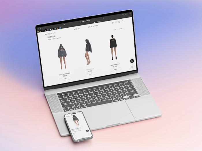
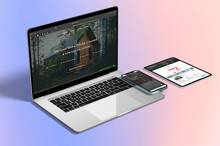
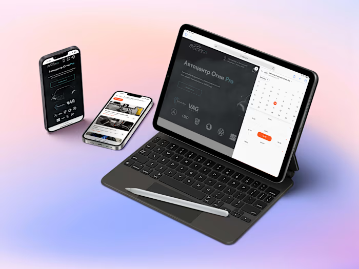
Mishka Beauty Lab | Corporate web-site
Project overview
Mishka Beauty Lab is modern beauty salon providing variety of beauty services. The Mishka team hired me to create the whole web infrastructure including: a corporate portal for internal schedule management, web-site with for clients and search engines with, online education platform, several landings for offline courses, loyalty and marketing automation system.
CRM as the main part of ecosystem
To manage all processes in the company we choose YClients - it is a cloud-based CRM for beauty salons which is actually the ecosystem, including online schedule, customer base, analytics module, customers and employee notifications, accounting, and many more all in one interface. As YClients certified partner I have configured this software for Mishka for the owner and 30+ employees.
This CRM systematizes and automates most of the routine processes of a beauty salon, freeing up staff resources to provide services at a higher quality level. It was extremely important to start with this integration, because all the following parts of this project will be inextricably linked with the CRM ecosystem.
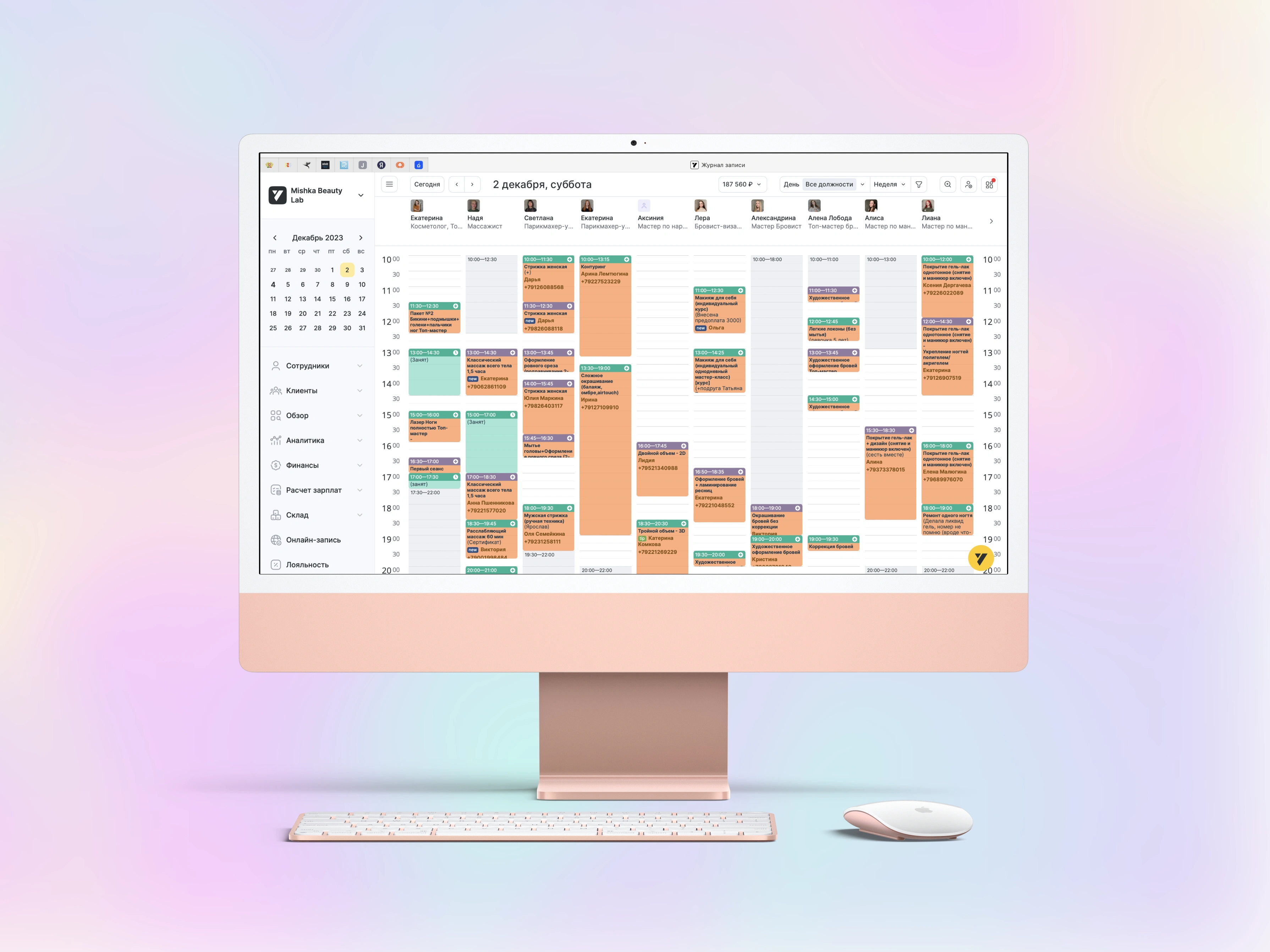
Cloud-based ecosystem for Mishka team
Web-site design
When creating the Mishka Beauty Lab website a really great job was done: The site consists of 50+ pages with original content. The site offers easy navigation between the sections of beauty salon services, online storefront and school for beauty industry professionals with subsections of online and offline courses. The sections of the site are organised in a logical way, allowing the user to quickly find the information they need and make purchases.
The most common function of the site is online booking for salon services. This module has native connection to CRM system which allows to have up-to-date and accurate information about the services, their prices and descriptions on the website. And, for sure, it is important for clients to find free slot online and book it with no contact to salon administrator.
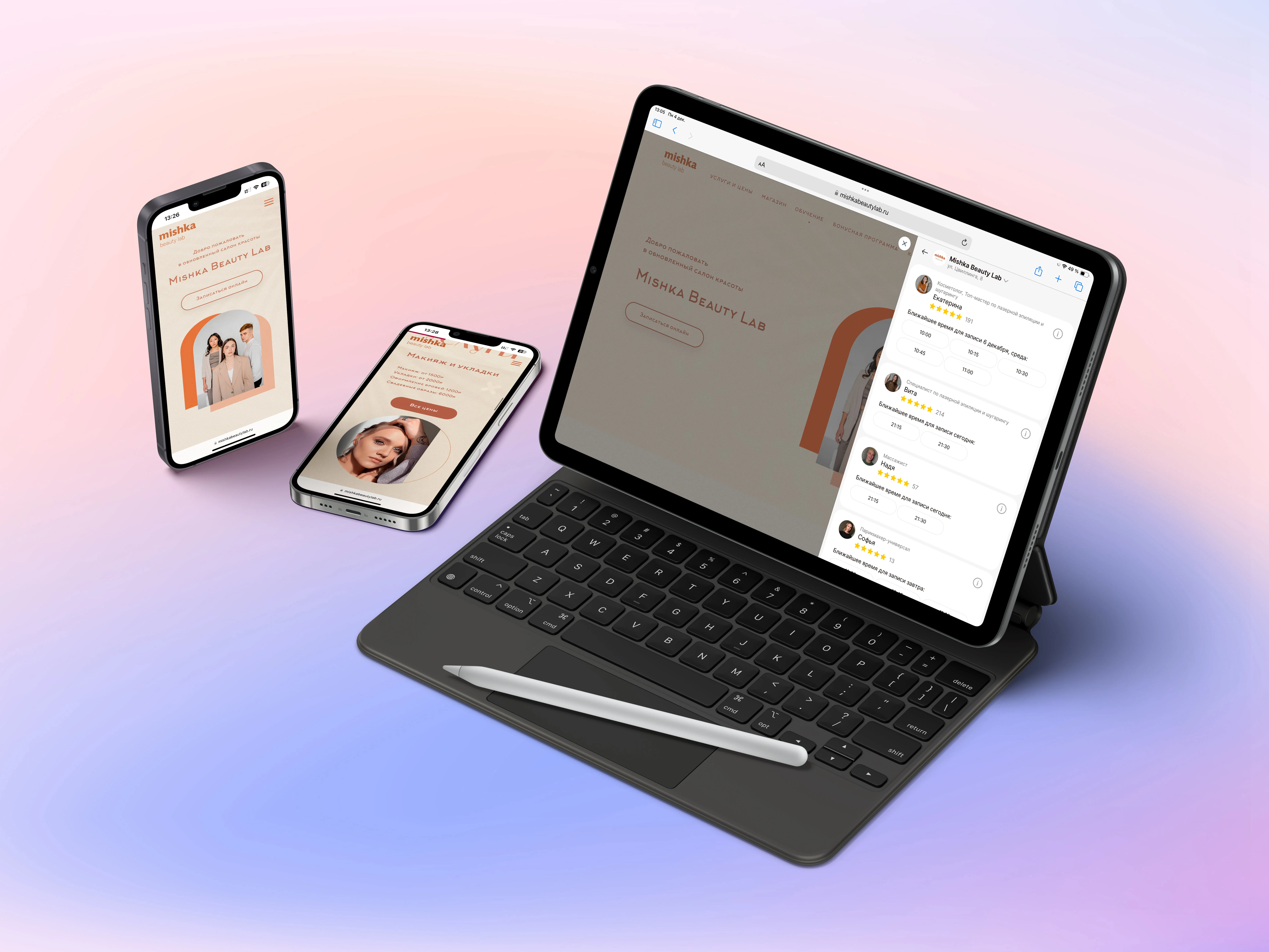
Web-site design on mobile platforms
Online store
Mishka Beauty Store is an e-commerce platform driven by Ecwid and it is the easiest way to sell Mishka's products. The store administrator manages everything in one place, from the desk and on-the-go through mobile app — without coding, developers, designers. It is a fine way to save resources and focus on service and stock.
Visual content such as product photos and web banners are presented in high quality and professionally designed. Product pages contain useful information about products, their characteristics and possible uses. The ability to add items to cart and place an order is clearly highlighted and easily accessible on all pages of the site.
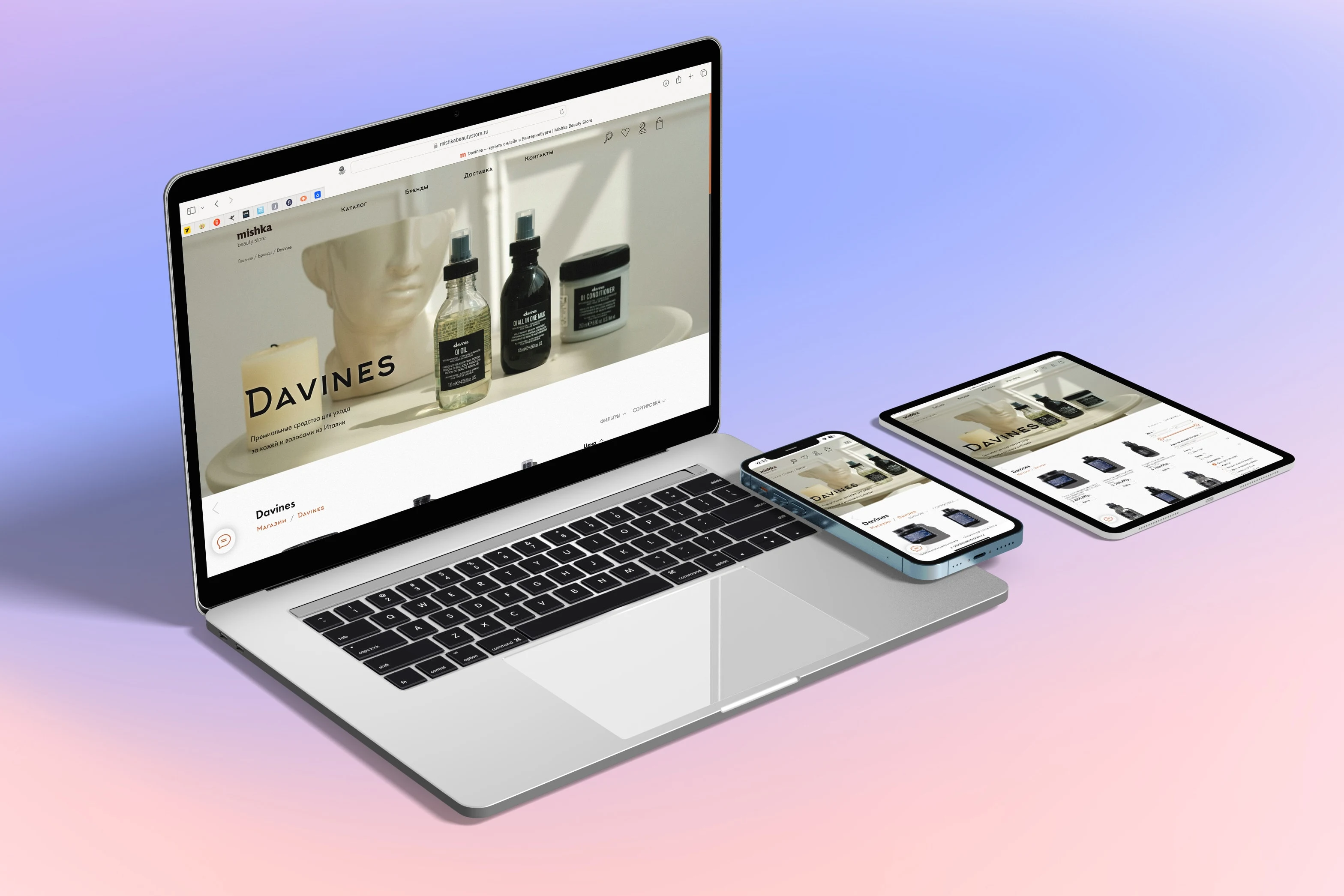
Online shop brand-filtered page on some resolutions
Online courses
The site sells several online courses. Each online course consists of a landing page with the function of accepting online payment, a course table of contents page containing links to the lessons, and directly pages with video lessons, as well as containing text materials for studying, quizzes and other...
In addition, the site has implemented the functionality of a student's personal cabinet for buyers of online courses. The personal cabinet consists of a profile page and a page with a list of available courses. In addition, there is an additional page for the site administrator, who can open/close access to courses, correct errors made by the buyer during registration, and in general, administer the section of online learning
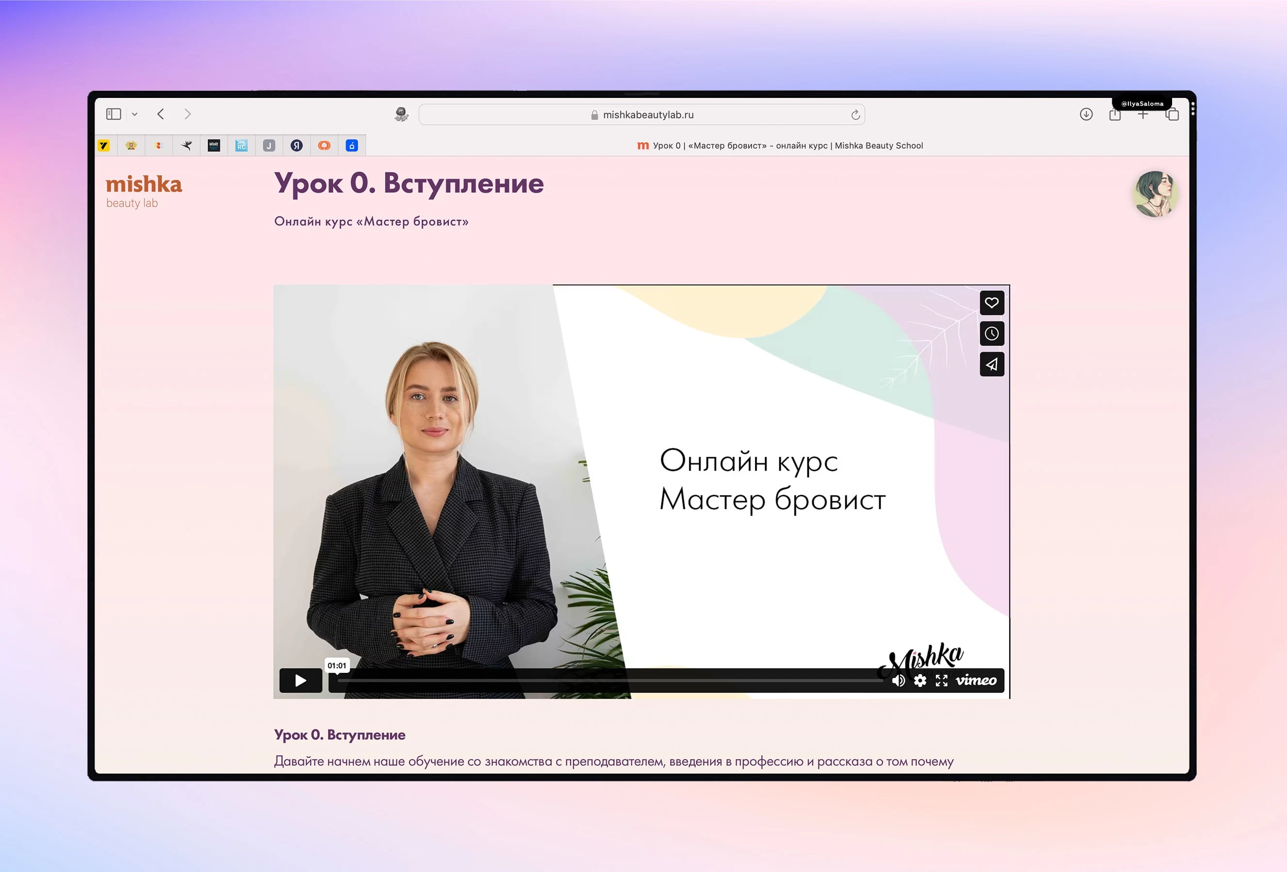
Online lesson page
Offline courses landing pages
To land the traffic for selling offline beauty courses for professionals I created several landing pages. These pages have a modern and stylish look, which reflects on the target audience who prefer quality services in the beauty industry. The main colour scheme of the site is neutral shades, which creates a sense of luxury and elegance. This choice of colours, combined with a minimalist design, helps to maximise focus on the information presented, and does not distract the user from the content.
Offline courses landings provide thorough information about the course, including its duration, curriculum, available dates, and any prerequisites. This helps potential students understand if the course aligns with their learning goals and availability, and convert traffic into leads. Also, these landing pages are well SEO-optimized, which is important to search engines and provides Mishka Beauty Lab with addition free traffic.
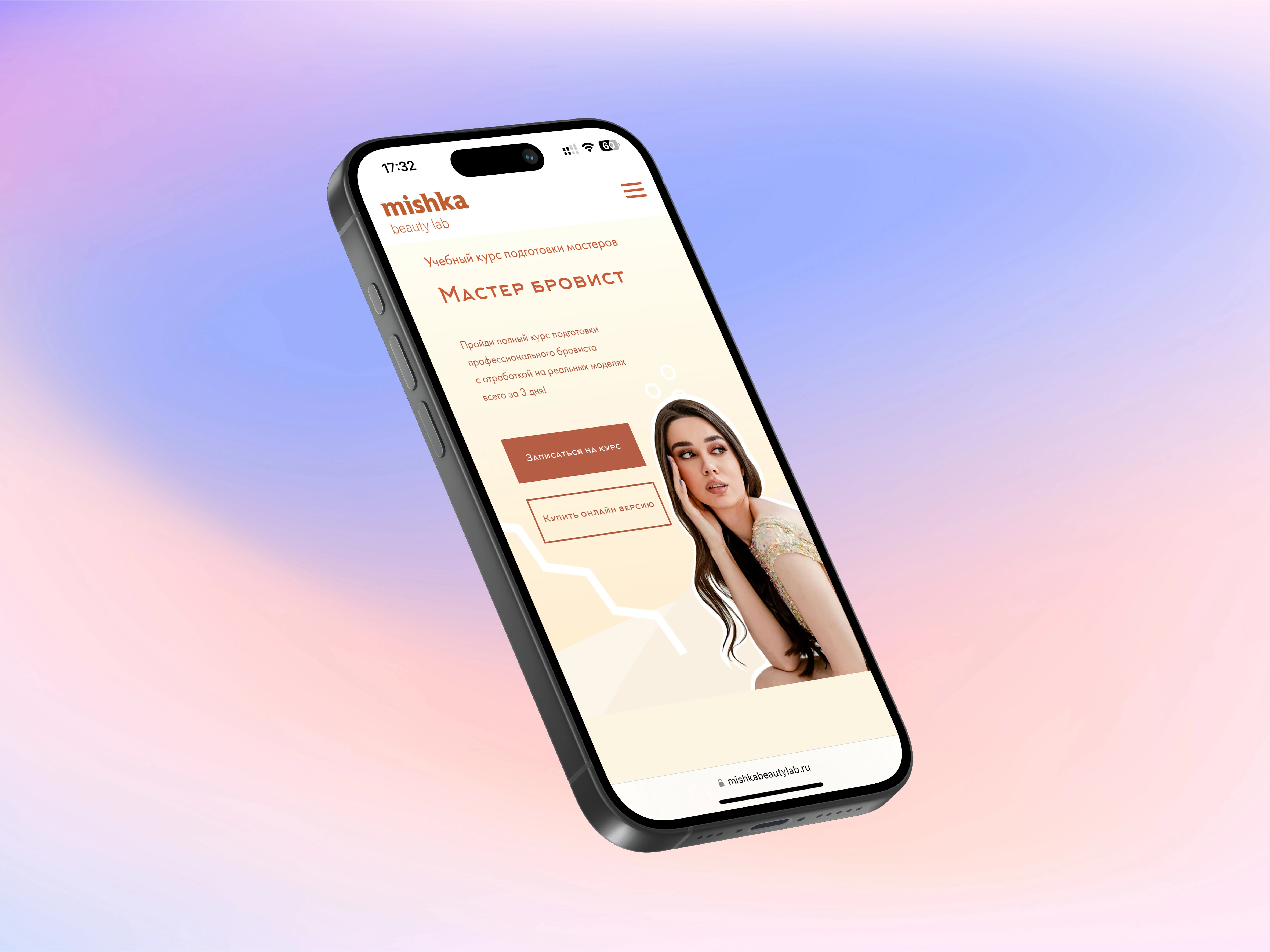
Offline course landing page start screen
Loyalty and marketing automatization
A loyalty programme is accumulative bonus system. It allows clients to receive rewards in the form of bonus points for each purchase or service. Each client is given a virtual loyalty card, filling short form on the registration page. The client can check the available balance of bonus points on his virtual card in the wallet app on a smartphone, in his online account on the salon's website as well as in telegram bot. When a client accumulates a sufficient number of bonus points, he can use them as a discount on future purchases or services.
The client can also receive notifications about new promotions, offers and the status of their loyalty program via wallet notifications, e-mail and WhatsApp bot. A loyalty system in a beauty salon rewards regular clients, encourages them to use the salon's services more often, and keeps clients from switching to competitors.
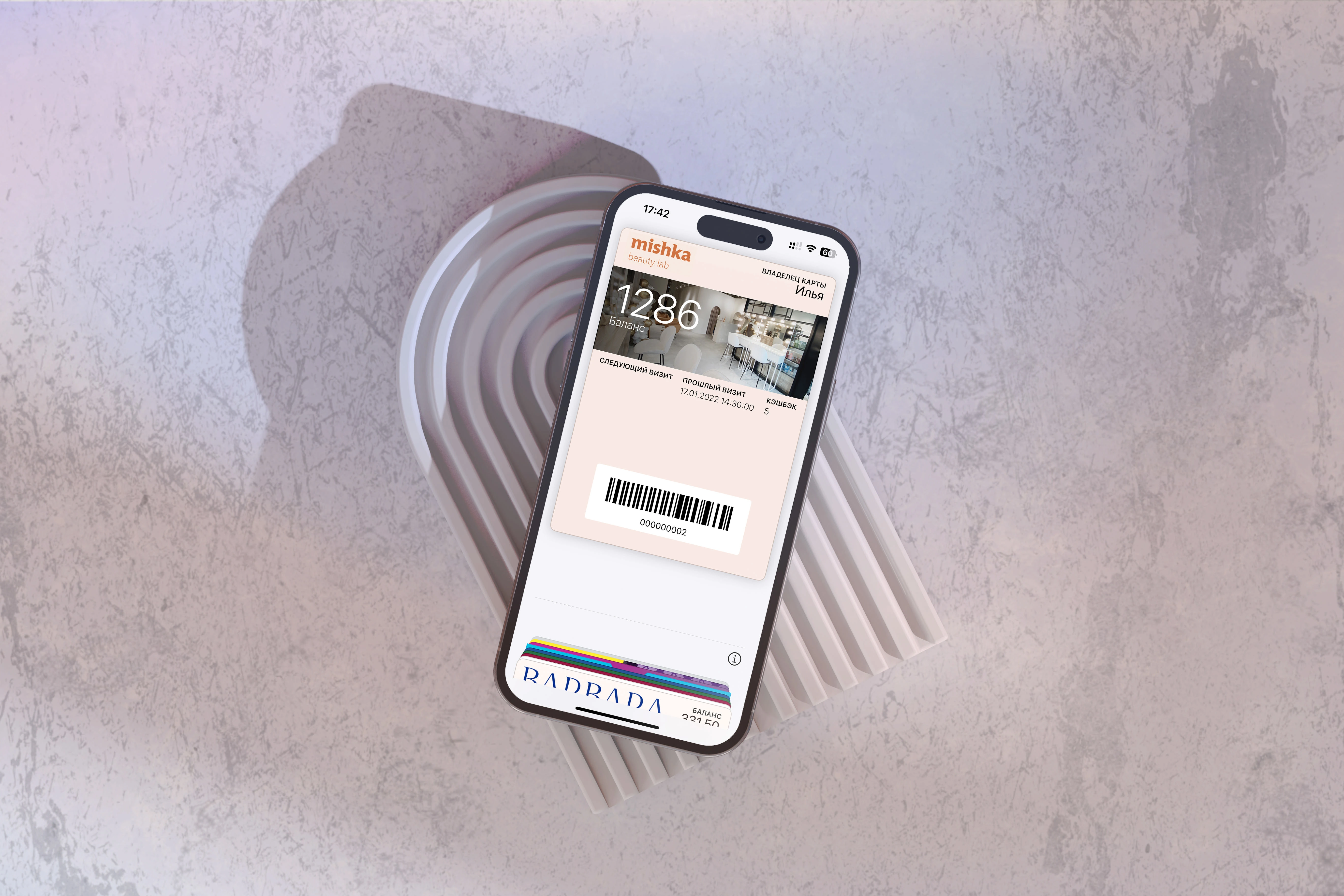
Apple wallet virtual loyalty card
Visit mishkabeautylab.ru to explore how can your beauty salon web-site look like 👇
Like this project
Posted Nov 30, 2023
Corporate web-site with online booking system, CRM integration, offline and online courses catalogues and e-learning platform from the scratch.

