Tuna Brand Logo Concept
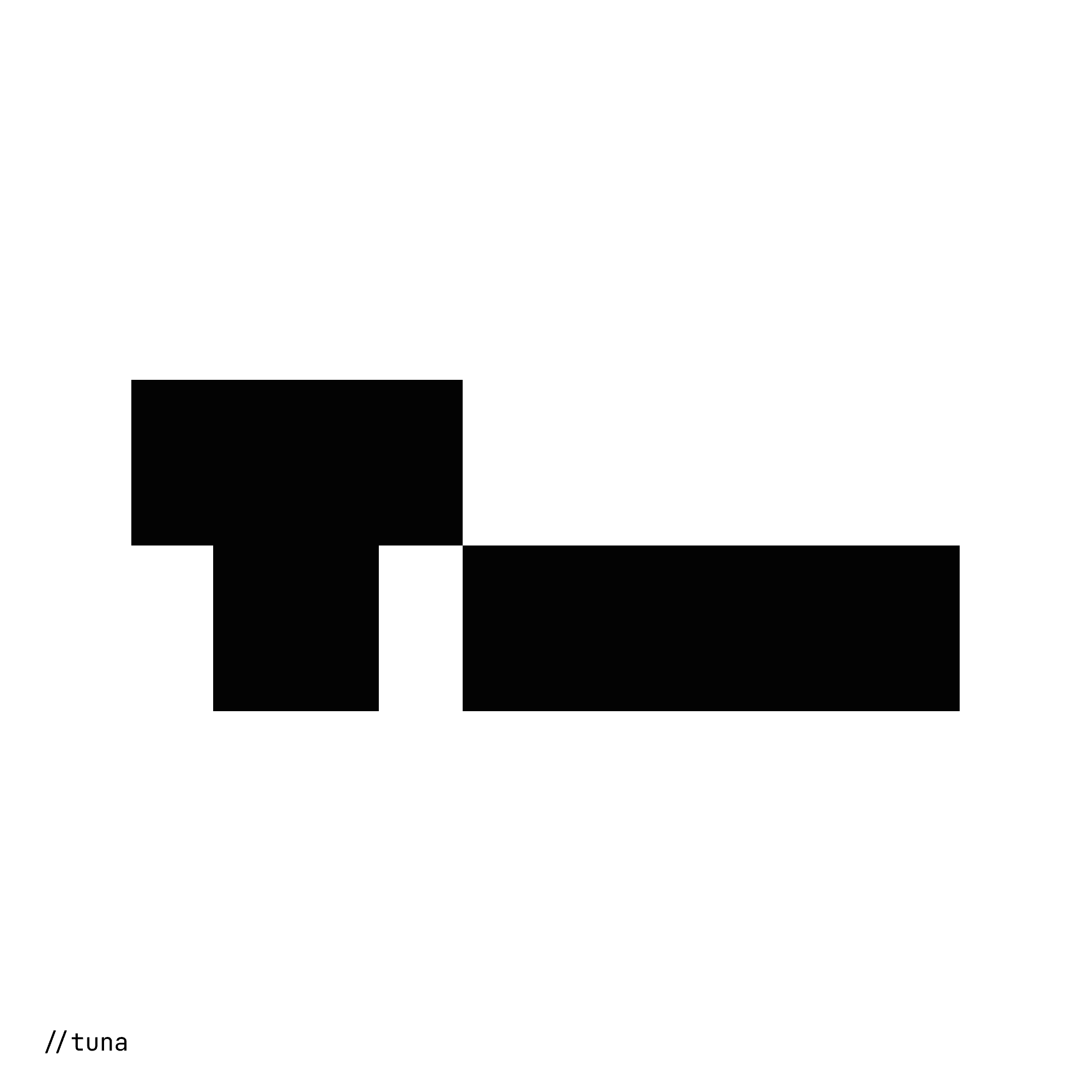
Project Overview: In one of my first logo design projects, I created a minimal and geometric logo for a personal brand called Tuna. The logo consists of multiple equal-sized squares arranged to form a large T, followed by a long block. This block not only represents the "una" part of the name but also subtly alludes to a Tuna roll, tying in with the brand’s theme. The design balances simplicity with meaning, making it both modern and versatile.
Like this project
Posted Dec 20, 2024
Created a minimal logo for the personal brand "Tuna" using geometric shapes to form a "T" and a long block, symbolising both the name and a Tuna roll.
Likes
0
Views
5

