Center: An Emotion Tracker App
Alexa Quinn Madrid
Overview
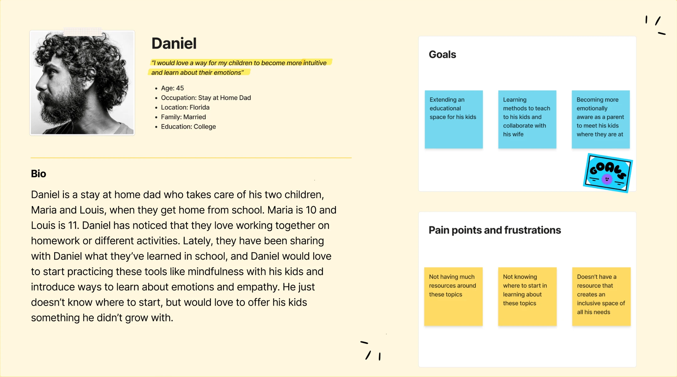
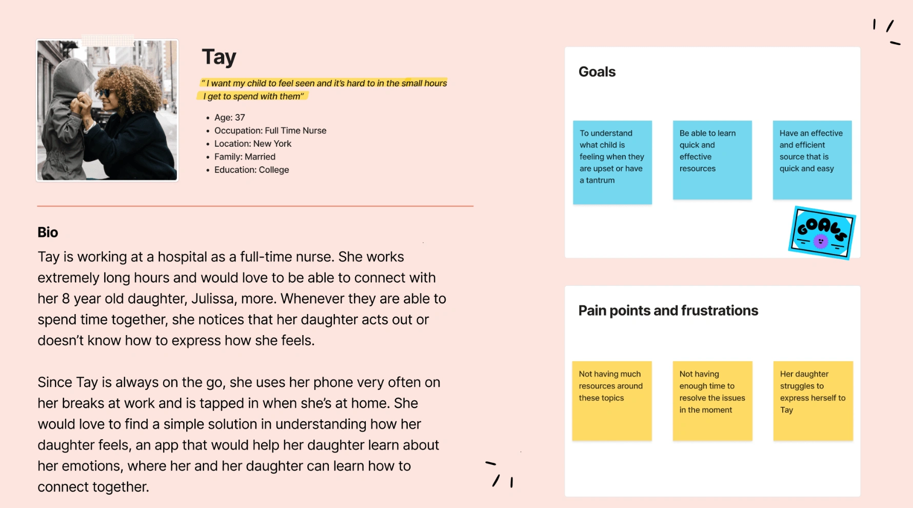
The app Center is aimed to create a user-friendly and engaging experience for parents and kids to track their child's emotions. Center features a simple interface for easy navigation, with personalized emotion tracking and progress visualization. Additionally, it provides access to informative articles and videos to help parents better understand their child's emotional development. The app's design also includes interactive features, such as games and quizzes, to promote learning and engagement. Overall, the Center app provides a comprehensive solution to help children gain emotional awareness and parents to support their child's growth.
Problem & Solution
The problem addressed by the Center app is the need for parents to better understand and manage their child's emotions. Center helps parents track their child's emotional state, providing resources to better understand their child's development and offer helpful tips and activities to support their emotional wellbeing. With Center, parents can monitor their child's progress and intervene when necessary, leading to better communication and a healthier emotional connection between parent and child.
Goals/Requirements:
• To provide an easy-to-use and engaging platform for parents and kids to track and manage the child's emotions, as well as providing a space for parents as well.
• To offer informative resources, such as articles and videos, to help parents understand their child's emotional development and support their growth. On the other hand, provide informational resources for children too.
• To promote emotional awareness in children and improve communication between parents and their child, expand their understanding of empathy, and build emotional intelligence.
Process
Define: User Personas
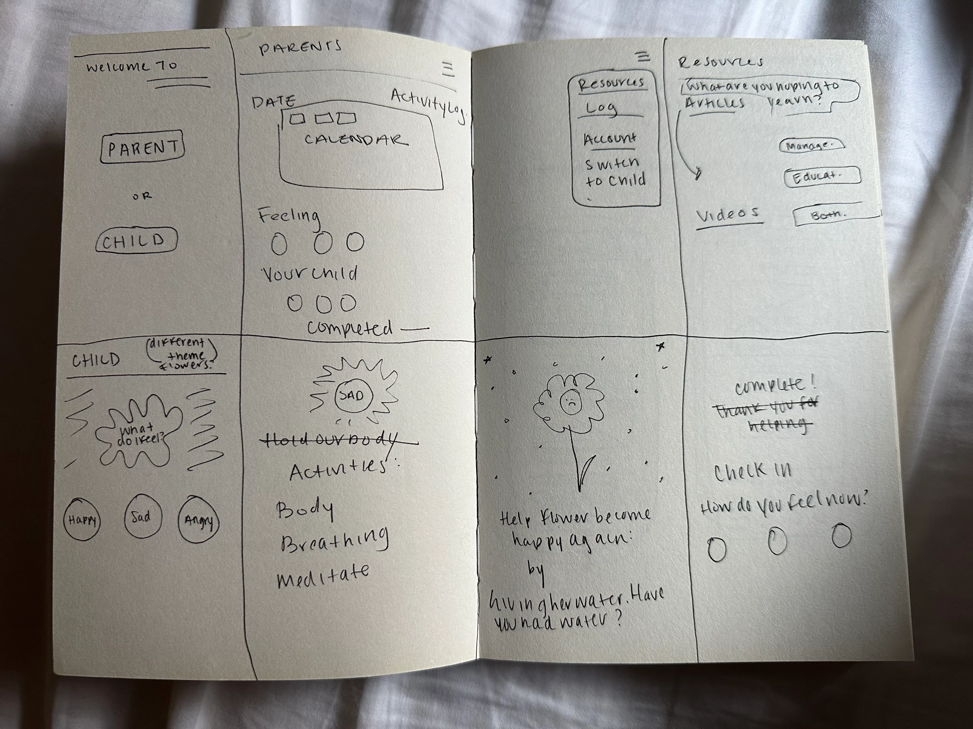
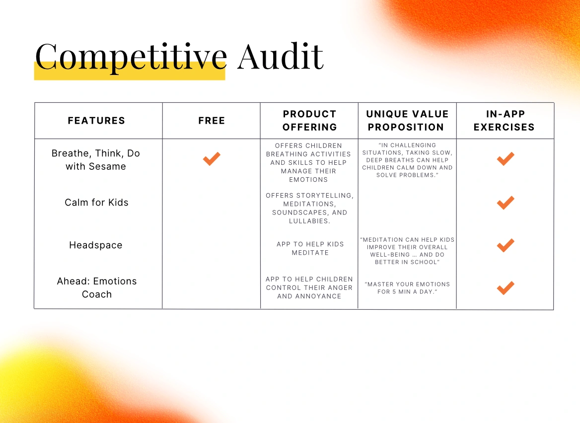
Ideation: Crazy Eights, Sketches & Competitive Audit
During the beginning stages, I completed a Crazy Eights exercise to generate multiple rapid sketches of potential app layouts and features. These sketches were used to spark creativity and explore various design possibilities quickly. Afterward, paper wireframes were created, mapping out the structure and layout of the app's main screens and features. The paper wireframes allowed for quick iterations and changes to the app's design based on feedback and testing. Overall, the ideation process was an essential step in the app's development, to explore different design ideas and create a solid foundation for the final product.
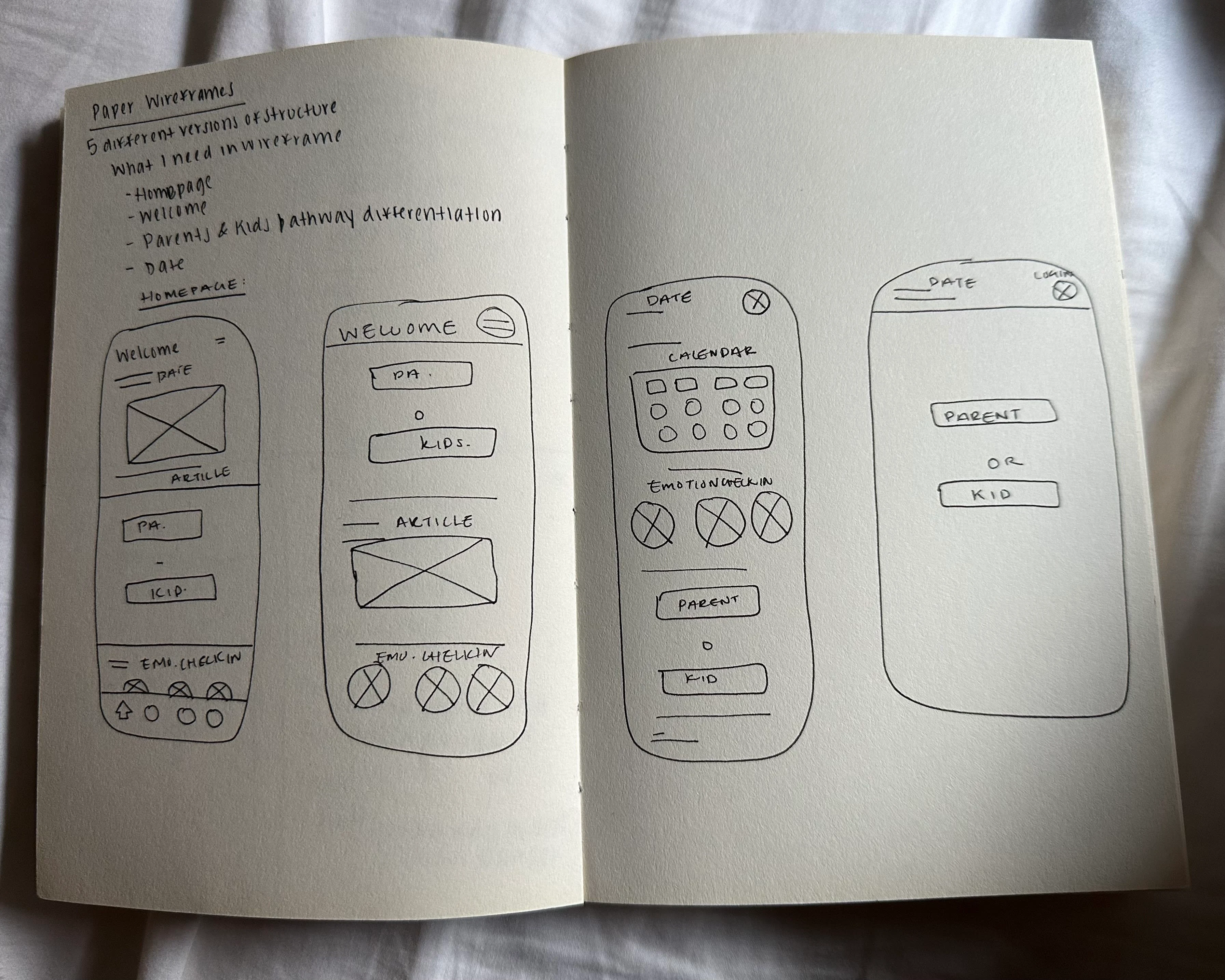
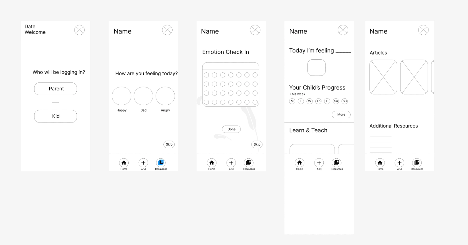
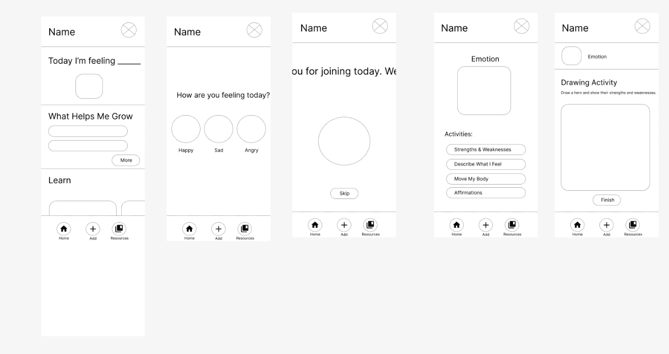
Wireframes & Prototypes
Testing
I performed two rounds of a moderated usability study with 5 participants. For my Key Performance Indicators (KPIs) I wanted to focus on Time on Task, User Error, and Conversion.
Please start off by logging into the app. Complete the activity. What are your initial thoughts? Where does the login page take you to? Was the task easy or hard to complete? Is there anything you would like to add?
After you complete this, if you can click on the Emotion Check In portion. What are your initial thoughts? Was the task easy or hard to complete? Is there anything you would like to add? After you clicked onto the Emotion Check In page, what did you see?
Now, click on the Happy smiley face to enter the landing page for the Emotion Check In. What are your initial thoughts? Was the task easy or hard to complete? Is there anything you would like to add?
After you completed these tasks, can you click on the resources button in the navigation menu. You are welcome to scroll through the sections and click on the first article. What are your initial thoughts? Was the task easy or hard to complete? Is there anything you would like to add?
Now, can you try to navigate to the kids profile? What are your initial thoughts of the Kids homepage in comparison to the Parent homepage? Was the task easy or hard to complete? Is there anything you would like to add?
When you entered the kids profile and complete the emotional check in. Can you click that you are feeling sad and nervous. Was there anything confusing? Anything you think is beneficial to add?
After completing this, can you return to the homepage and click on the Breathing Exercise. You can Complete the exercise as well. Note, click on the box won’t allow you to type. What are your initial thoughts? Was the task easy or hard to complete? Is there anything you would like to add?
Lastly, can you click on the resources button in the navigation menu? What are your initial thoughts? Was the task easy or hard to complete? Is there anything you would like to add?
Results
After the usability studies and speaking with users, I received positive feedback regarding how the app functioned, completing tasks, and navigating through each prompt. Users shared that the app was really intuitive and had really fun activities for both parents and children to engage with in order to make progress towards emotional regulation and tracking good days and bad days.
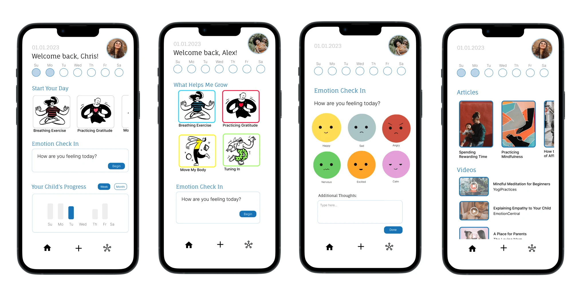
Below is the high fidelity prototype for Center:
Takeaways
My main takeaways from this project include the importance of visual design and being very clear with what your goals are when starting an app or website from scratch. Throughout the research process, I had an idea of the direction I wanted to go in. However, after completing various activities, performing numerous sketches, and gaining substantial feedback, I was able to really zoom into what I wanted Center to look like and focus on. I learned that my process begins at the macro level and zooms into the micro level, I was able to envision a lot of my direction with the help of my competitive audit and researching similar resources and how they functioned. Since I have experience creating more than one mobile app, I’ve learned how to do so more successfully now than before. What I’d like to work on moving forward is creating responsive design and finish creating my Desktop and iPad version of this app!
Next Steps
Complete another study based on the new iterations I’ve created.
Polish my responsive designs as well for the Desktop and iPad portion.
Work on adding more color to the Kids version of the app! Make the app more accessible to children under the age of 7 to be able to interact with the app too.
Finding more ways to apply accessibility principles to the app as well.
Like this project
Posted Apr 19, 2023
Center is a fun and interactive app for kids and parents to track their emotions. Easily record, visualize, and manage feelings to promote emotional wellbeing.
Likes
0
Views
101
Tags