WOOSH Studios: Squarespace Redesign for a Comic Book Collective
Overview
I accomplished redesigning a comic book blog for WOOSH Studios. WOOSH is a comic book collective that creates content based on comics, movie releases, experiences at comic con, opinions on superheroes and their stories, and so much more.
The website redesign was aimed at improving the user experience, making it easier for users to navigate and find the collective's content. The project involved a complete overhaul of the website's design, with a modern and minimalist approach that puts the focus on the content. The website features a clean layout that showcases the collective's comics, artwork, and blog posts. The redesign also includes improvements to the website's mobile responsiveness, ensuring that users can enjoy the collective's content on any device. With the Squarespace platform, the WOOSH Studios website is now easier to manage and update, allowing the collective to focus on creating and sharing their unique content with comic book fans around the world.
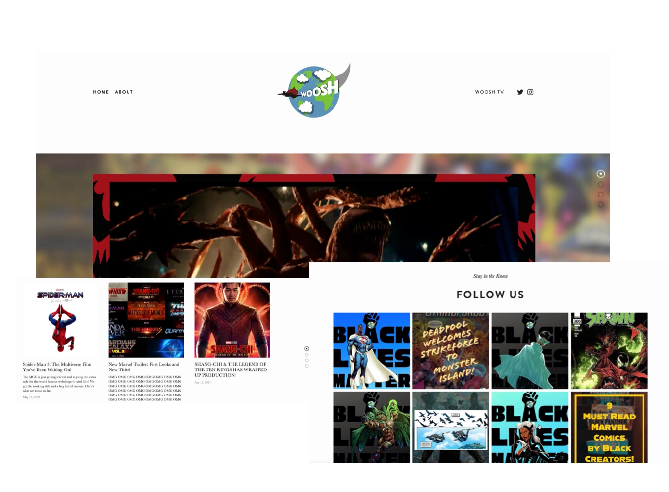
WOOSH Studios Original Website
Goals
The main goal of this project was to gain more traction for the website and create an aesthetically pleasing experience for users by having them interact with all the channels that WOOSH creates content on and have them engage more with the blog.
Process
I collaborated with the founder on several occasions to ask what he wanted the website to look like, he envisioned a specific color palette which I created and enabled throughout the website. He also wanted a softer look, so rounded edges and circular shapes throughout the website to create a fun and inviting space rather than a rigid and technical site. Additionally, I created more pathways for users by adding more buttons throughout the homepage that users can click on and distinguish what parts they wanted to interact with more. I also expanded the header by adding more social media links and pages that redirects users to shorts on Youtube, exposes users to the about page to meet the WOOSH team, show users WOOSH TV which is a Youtube series created by the founder, and much more.
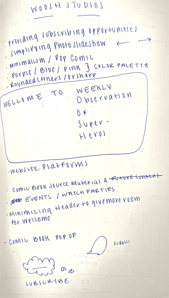
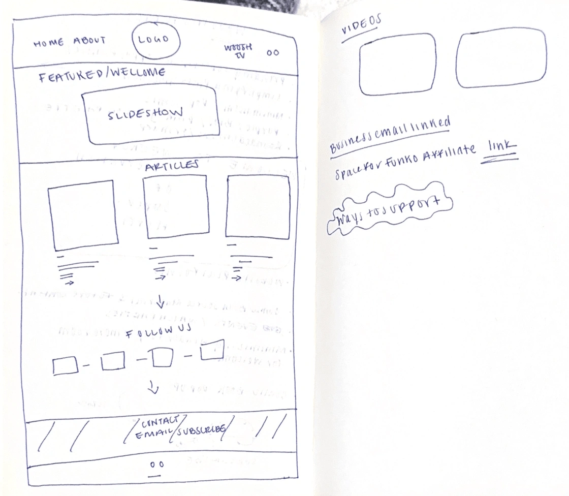
Notes & Sketches
Results
I was able to redesign the website successfully and have the founder tune up fine details for his team and blog. I'm glad to have created a format that speaks to their work and bring to life the vision they had! The WOOSH Studios website is about to be live soon so please check it out!
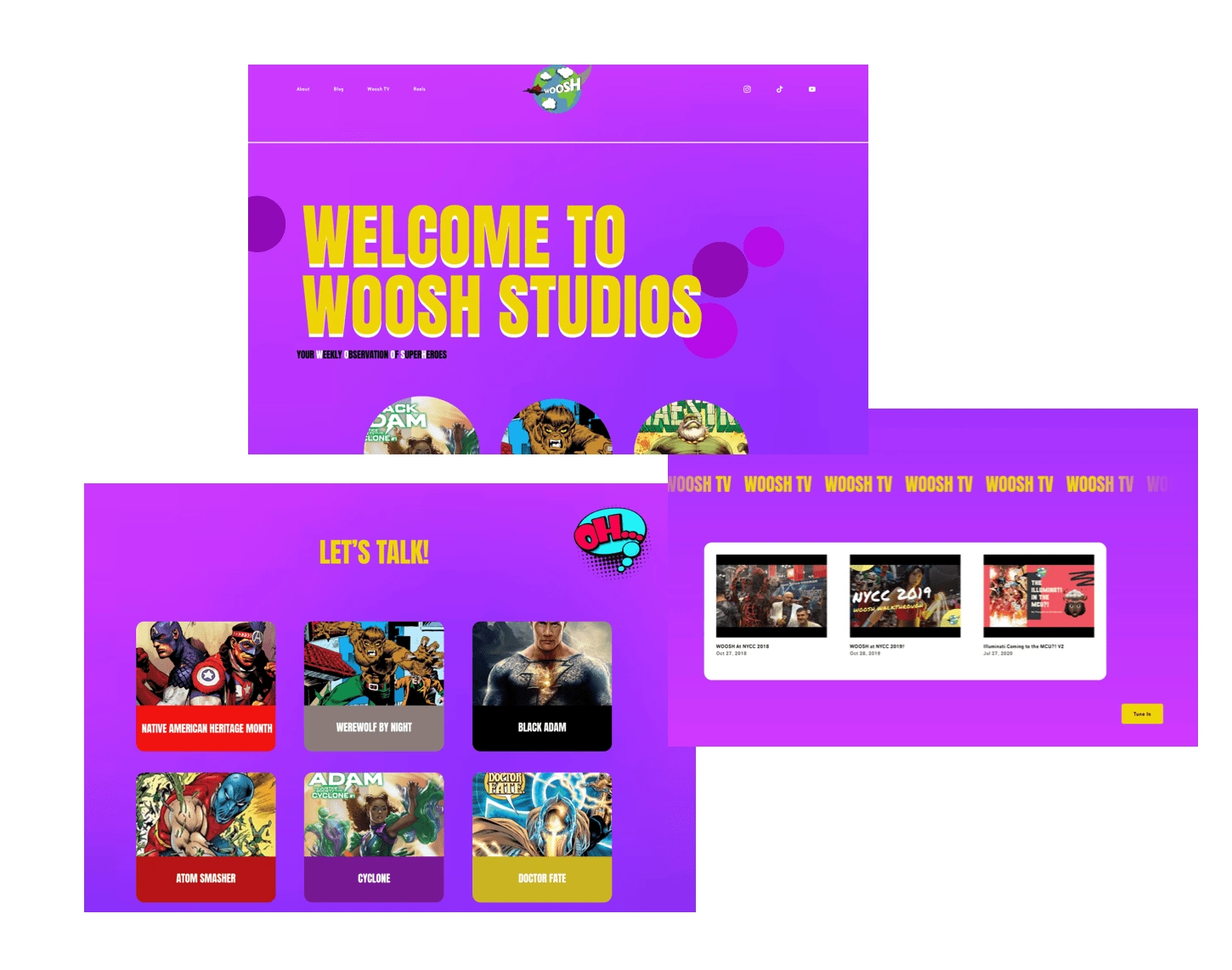
WOOSH Studios Homepage Redesign
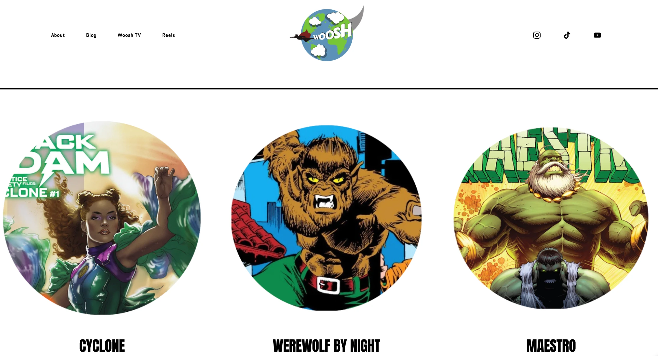
Blog Page
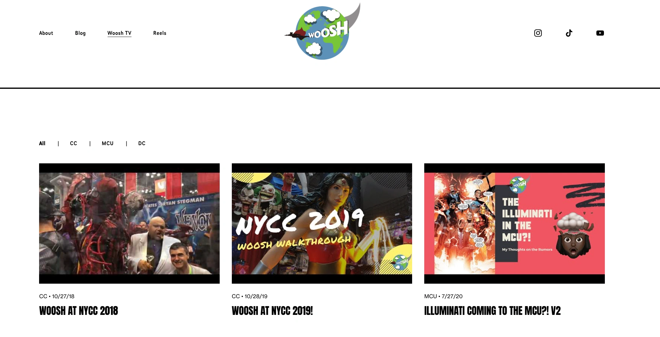
WOOSH TV Page
This looks amazing! I wanted you to really incorporate your style and design this website based off of your instincts and you did just that. I love it.
Jeremi
Founder
Takeaways
I learned to think outside of the box. While Jeremi and I collaborated a lot, I updated him on the work I completed and more ideas I wanted to bring to life, he also wanted me to really breathe life into this project with visions I had within WOOSH and outside of WOOSH. I had about three different designs before reaching to the final design and I knew once I came closer to the end product that it was the one that aligned the most. I also kept in mind, as a user, what would engage me the most about a website? How can I interact with it more rather than just look at what is being posted and never return to it again? This thought process was in the forefront of my mind a lot of the time while working on this project. I'm excited to see how others enjoy it and interact with it soon.
Like this project
Posted Nov 12, 2022
Squarespace website redesign project for WOOSH Studios, a comic book collective that creates and shares content related to comics.
Likes
0
Views
109
