For the Queue: A Music Collaboration and Sharing App
Alexa Quinn Madrid
Overview
As a user having subscribed to many music apps in the past, I noticed that some apps had features that I enjoyed but that didn’t all exist in one app. More often than not, when I subscribed to one app, I was missing the qualities another one. Therefore, I began to ask the question of whether or not other users experienced this as well. Turns out, they did! So, my goal was to design an app that can allow for sharing music, creating inspiring playlists with friends, and create a better experience for users to discover music and create their own unique playlists.
Problem & Solution
Users need a music app that has a balance of sharing music socially and casual listening.
Some users enjoy the basic act of listening to music while others like the interactivity of sharing their playlists, being able to collaborate with other users, and personalize their music experience. Why not create an app that is a home for both?
Goals/Requirements:
The goal of the case study was to create an app that combines features from popular music apps (E.g. collaborative playlists, reliable queue building, etc.) to exist on one.
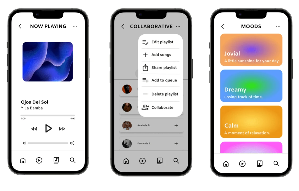
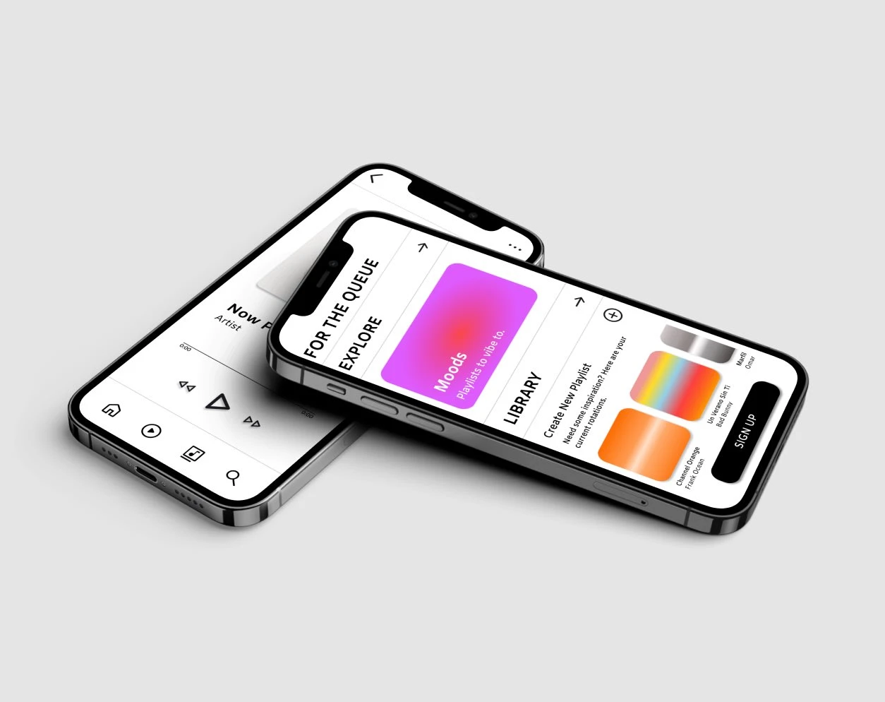
Final Designs of App
Process
During the define stage, I organized a competitive audit to understand what the major differences are between large-scale music apps, including but not limited to Apple Music, Spotify, Soundcloud, and Youtube. Additionally, I created user journey maps, user personas, and identified problem statements to solidify what users could potentially be experiencing throughout their journeys. A primary user group identified through research was avid or casual music listeners that preferred a basic functioning app that acquired diverse features of music listening and sharing that co-exist on one app.
User Personas
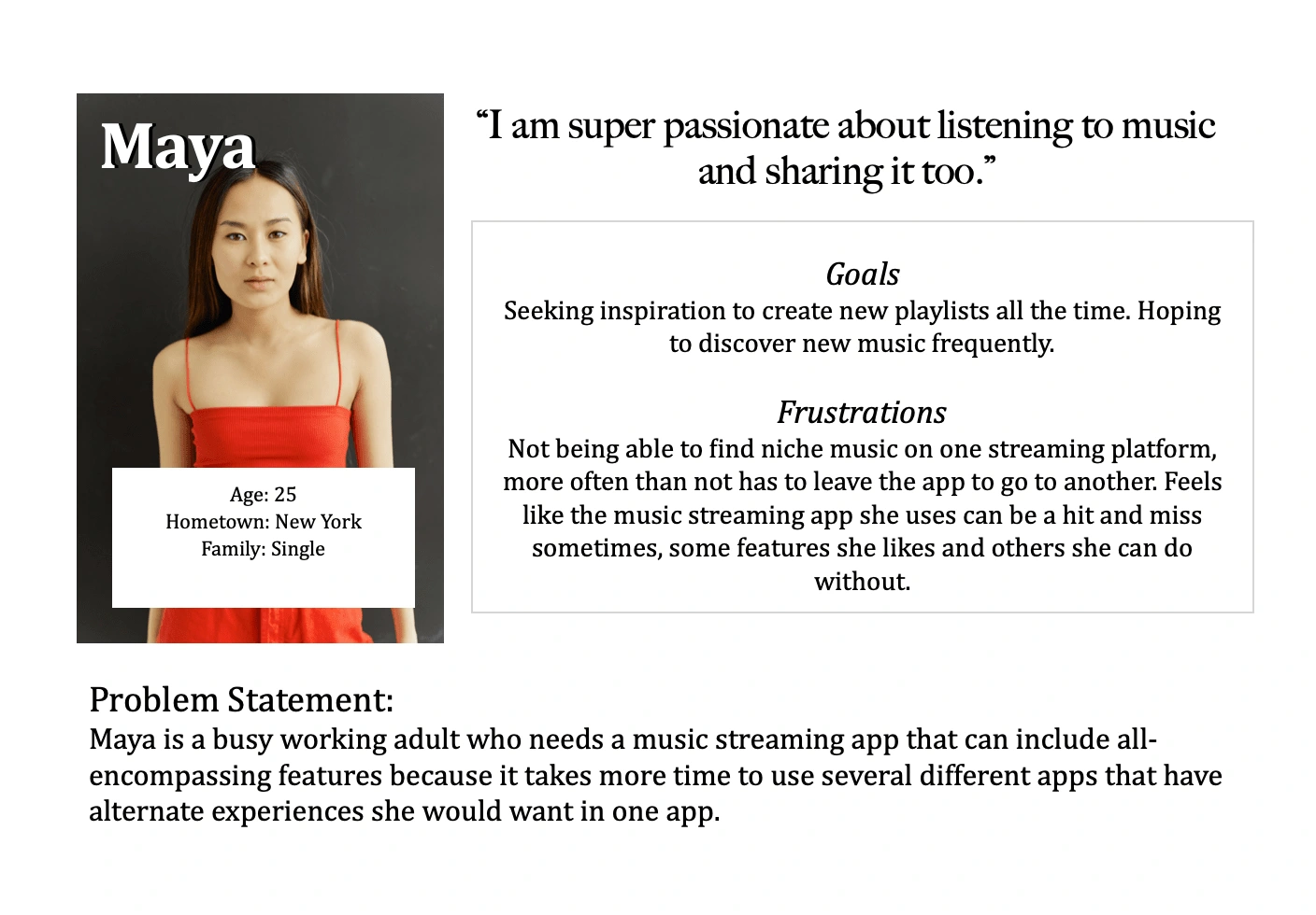
Maya's User Persona
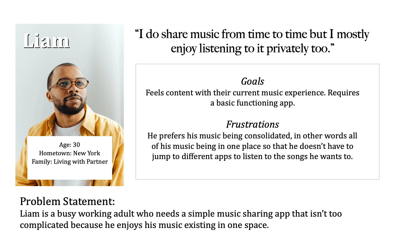
Liam's User Persona
User Journey Maps
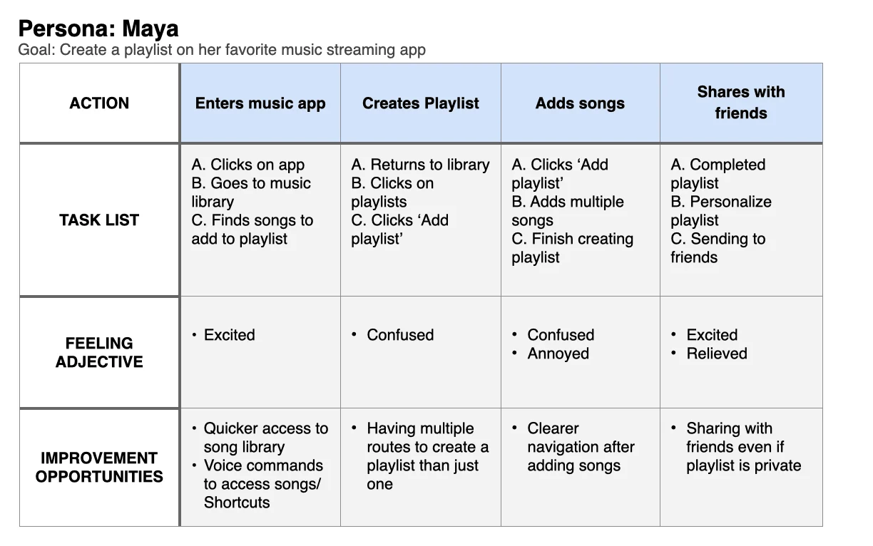
Maya's User Journey Map
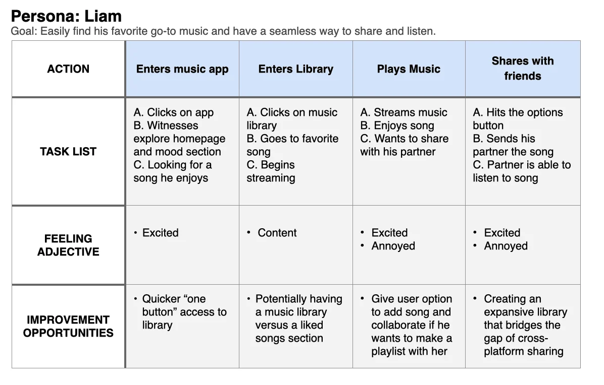
Liam's User Journey Map
Wireframes & Prototypes
During the prototype stage, I sketched wireframes and then created digital wireframes to build on my low-fidelity prototype.
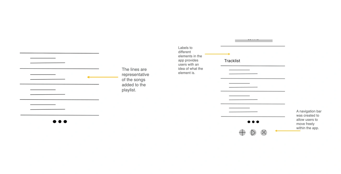
Digital Wireframes
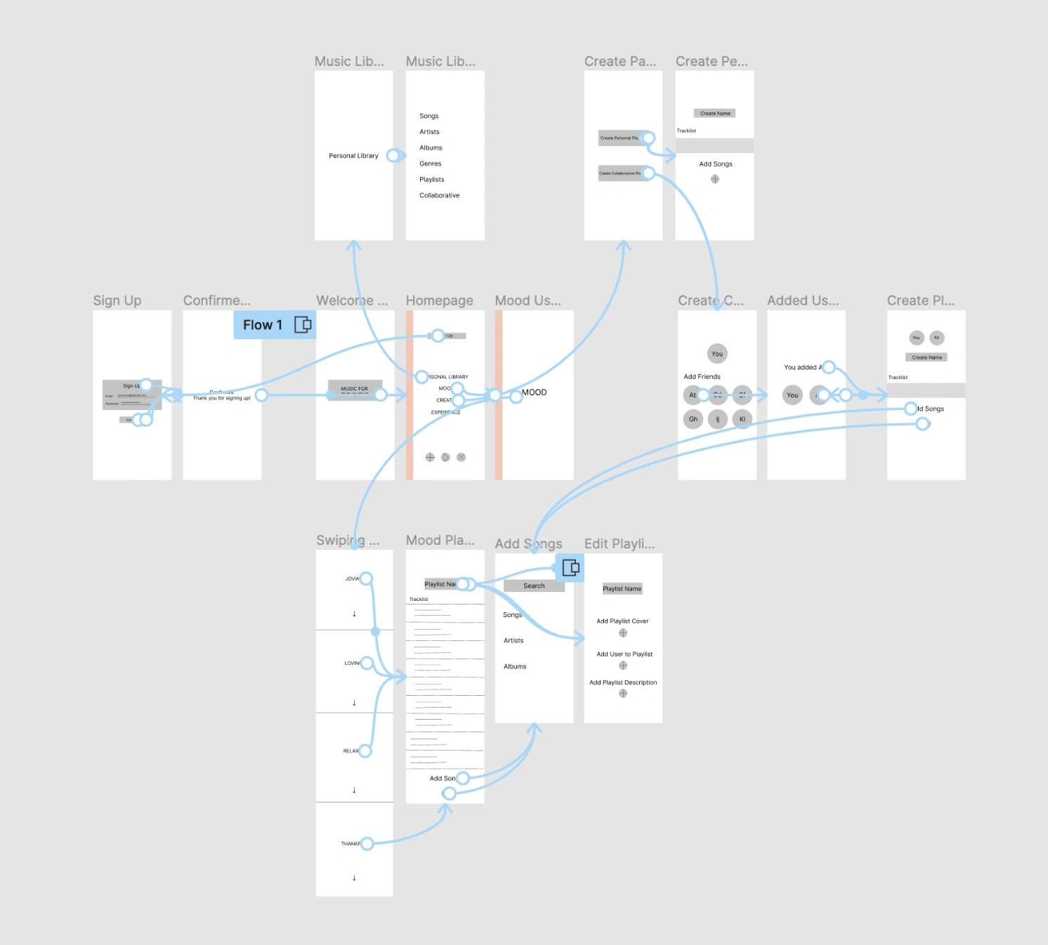
Lo-Fi Prototype
Testing
I performed two rounds of usability studies with 5 participants each round. I was able to identify what was lacking in the app, how to create more effective pathways, and personalization for the user experience.
Usability Study Findings
Round 1 - Low Fidelity
User needs a way to access a full music library.
User needs simpler and effective pathways, functioning back buttons.
User needs more ways to personalize their music so it can feel more unique.
Round 2 - High Fidelity*
Users find that having the sign up button on the bottom is more intuitive.
Users understand symbols more when pop ups define what it does.
Users would like to see more customization in the app’s theme.
*Notes from my second round of usability studies can be found here.
User Pain Points
Playlist Collaboration
Innovative Music Finding
Cross-Platform Sharing
Personalization & Interactivity
Results
I addressed user needs by enhancing creating more intuitive user pathways (E.g. a sign up and login pop-up when on the homepage of the app), adding accessibility to the same page by giving the user more than one option to get there, and allowing for users to navigate easily throughout the app user a navigation menu at the bottom.
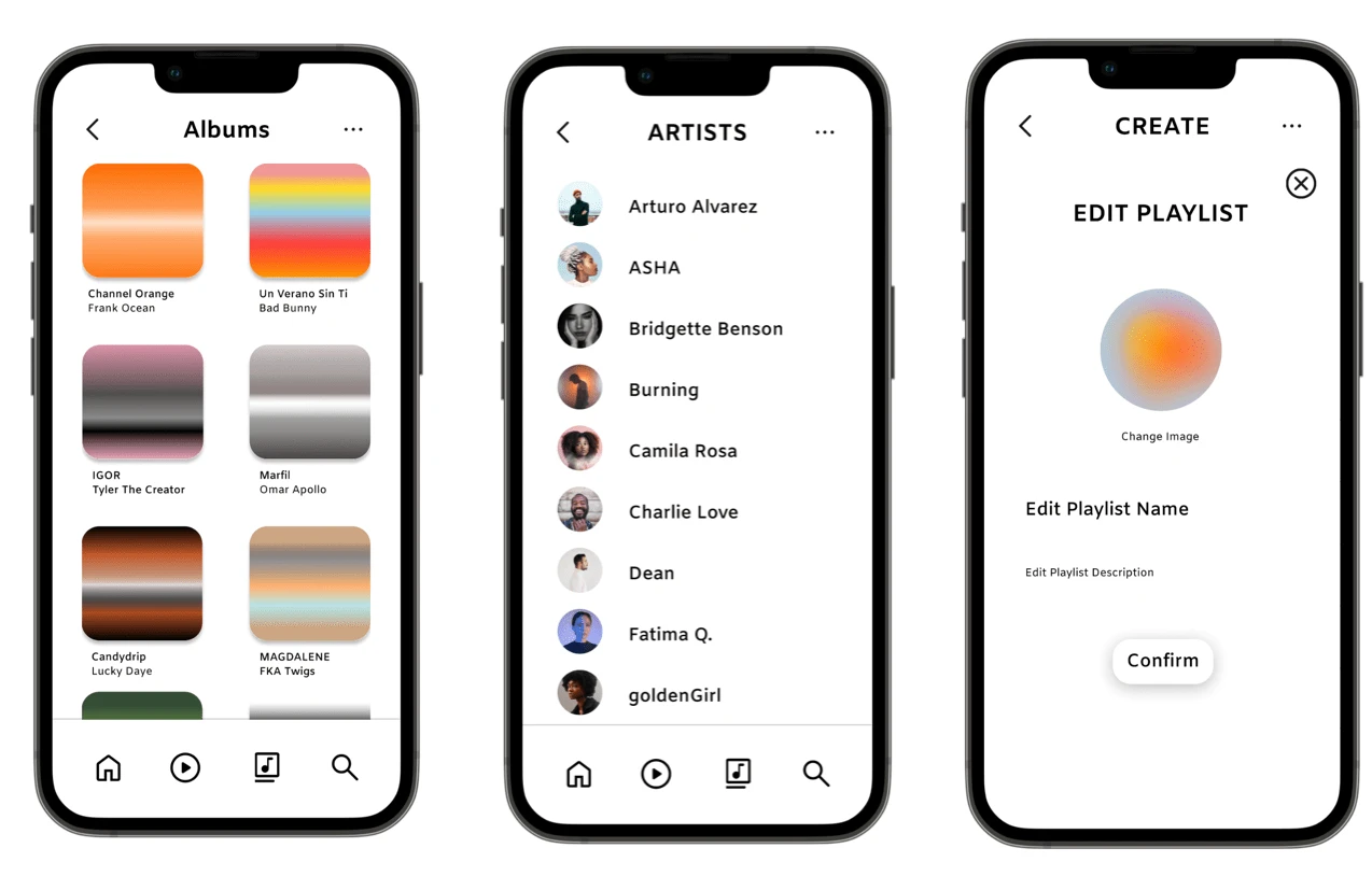
Final Mockups
Artboards
Takeaways
Throughout this project, I learned that conducting usability studies is one of the most crucial components when designing. During my process, I had to zoom in and out of different areas that required my attention due to user feedback. The most rewarding part was being able to build on that feedback and apply it to the app itself to reduce pain points and allow for a more seamless user flow.
Next Steps
Conduct another round of usability studies to validate whether the pain points users experienced have been effectively addressed.
Expand some user pathways that I have begun on the app.
Conduct more user research to identify new areas of need.
Thank you for your time!
Like this project
Posted Oct 3, 2022
Designed the user interface of a music streaming mobile app, focusing on intuitive navigation and visually appealing design to improve user experience.
Likes
0
Views
103
Tags