Magazine Spread Design for Gauge Magazine, Emerson College
Project Overview
For this bold and quirky edition of Gauge Magazine at Emerson College, a graduate student-run print magazine that publishes creative writing, photography, and visual art based on a theme each semester, the design was heavily inspired by the raw, unfiltered sentiments of the poetry and photography featured.
Featuring a spiral-bound format reminiscent of journals and diaries, the magazine embraced an anything-goes aesthetic, allowing the content to take on an organic, expressive form.
Think 90s nostalgia — sticker books, washi tape, childhood dreams, fears, and emotions.
Working closely with the poets and photographers, the design aimed to amplify the emotional resonance of each piece, creating a layout that mirrored the intensity of the themes — sadness, hope, and everything in between. The goal was to not only to highlight the diversity of student creativity and talent on campus, but to push the boundaries of the magazine format itself.
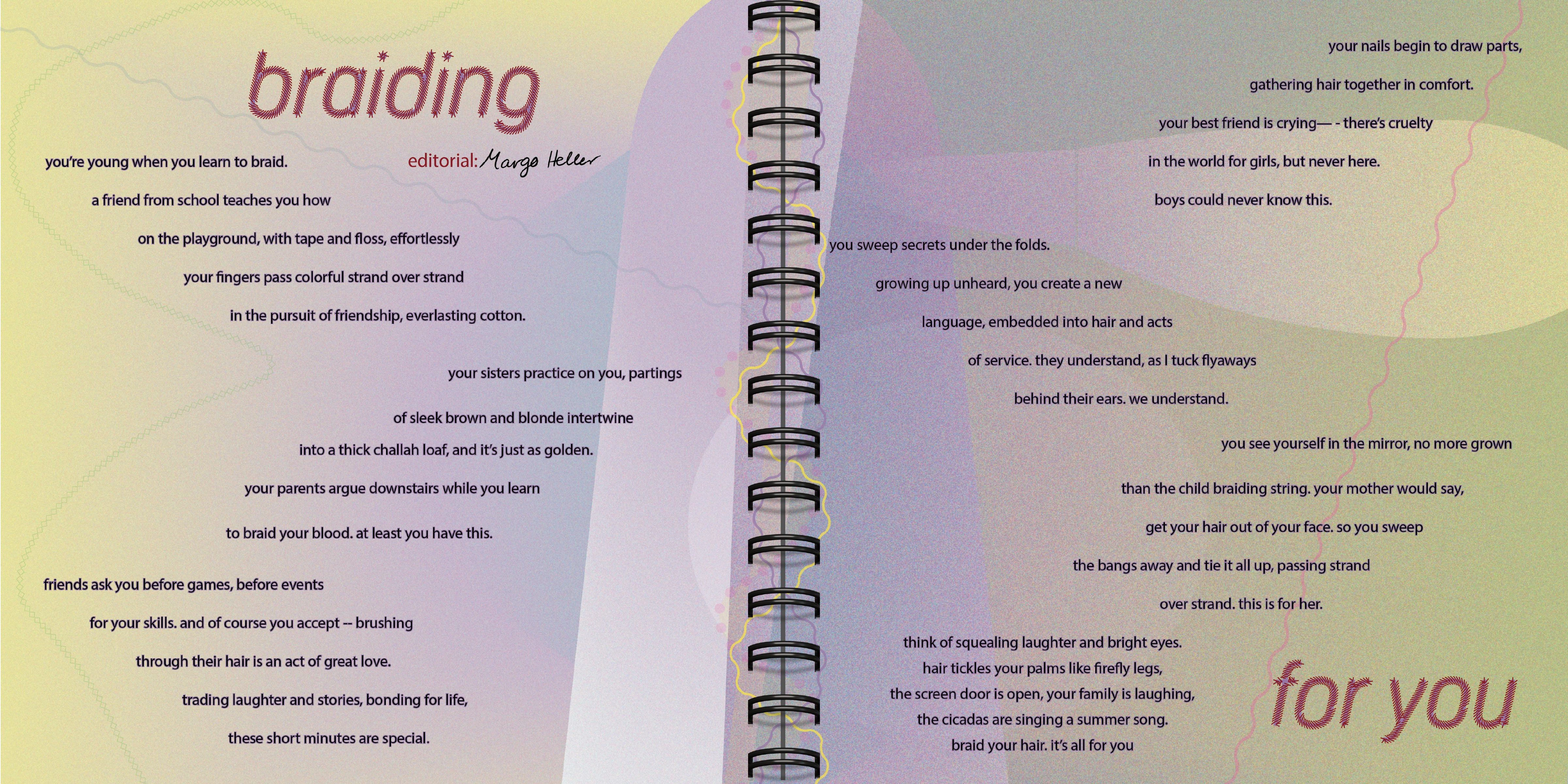
Design spread, featuring the poem braiding for you, by margo heller
Project Focus
This project was a deeply collaborative effort, involving ongoing communication with the poets and photographers to translate their visions into the magazine’s design. As one of the designers, my goal was to ensure the layout, typography, and imagery echoed the spirit of their work.
The overall design embraced chaotic beauty. It was a visual representation of the messy, hopeful, nostalgic, and deeply human emotions captured in the poetry. It was decided to print the edition as a spiral-bound book to evoke the feeling of a personal journal, making each page feel like a diary.
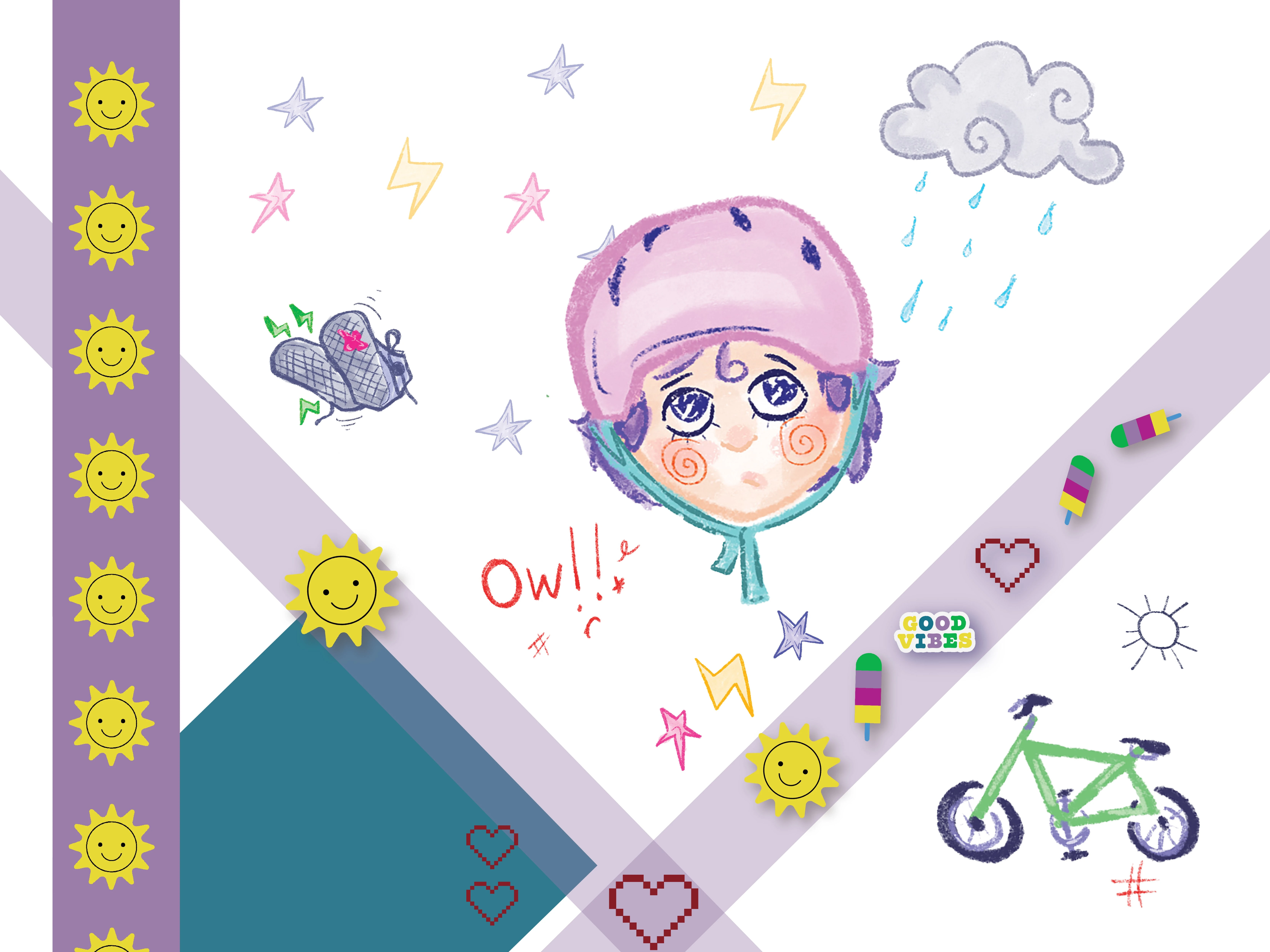
Washi tape, sticker, and hand-drawn illustration elements
Design Approach
Typography & Text Layout:
The typography was deliberately imperfect, mimicking the style of journals and diaries. Handwritten-style fonts, text that appeared “scratched” or “taped” into place, and playful use of spacing reflected the raw, often fragmented nature of the poetry itself. The layout was free-flowing, with text sometimes colliding or wrapping around images to echo the spontaneous flow of thoughts and emotions.
Visual Elements & Imagery:
Washi tape effect, torn paper textures, stickers, and more were integrated into the design to give each spread a tactile, handmade feel.
Color Palette:
The color palette was inspired by childhood sticker books and journal doodles, with pastel hues, bold neon accents, and soft gradients. This vibrant yet emotional palette reflected the ups and downs of the poetry’s themes, balancing moments of hope with sorrow.
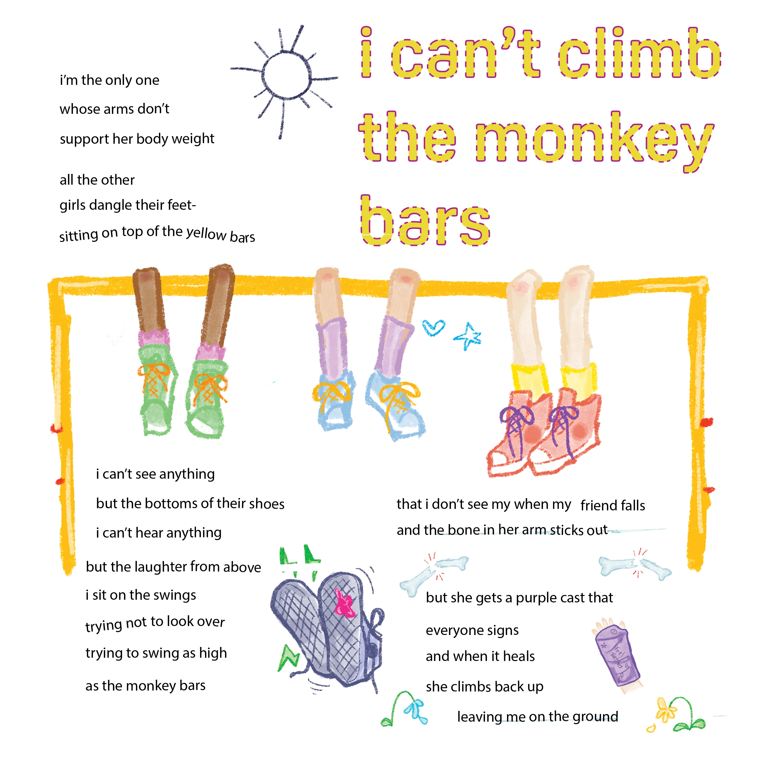
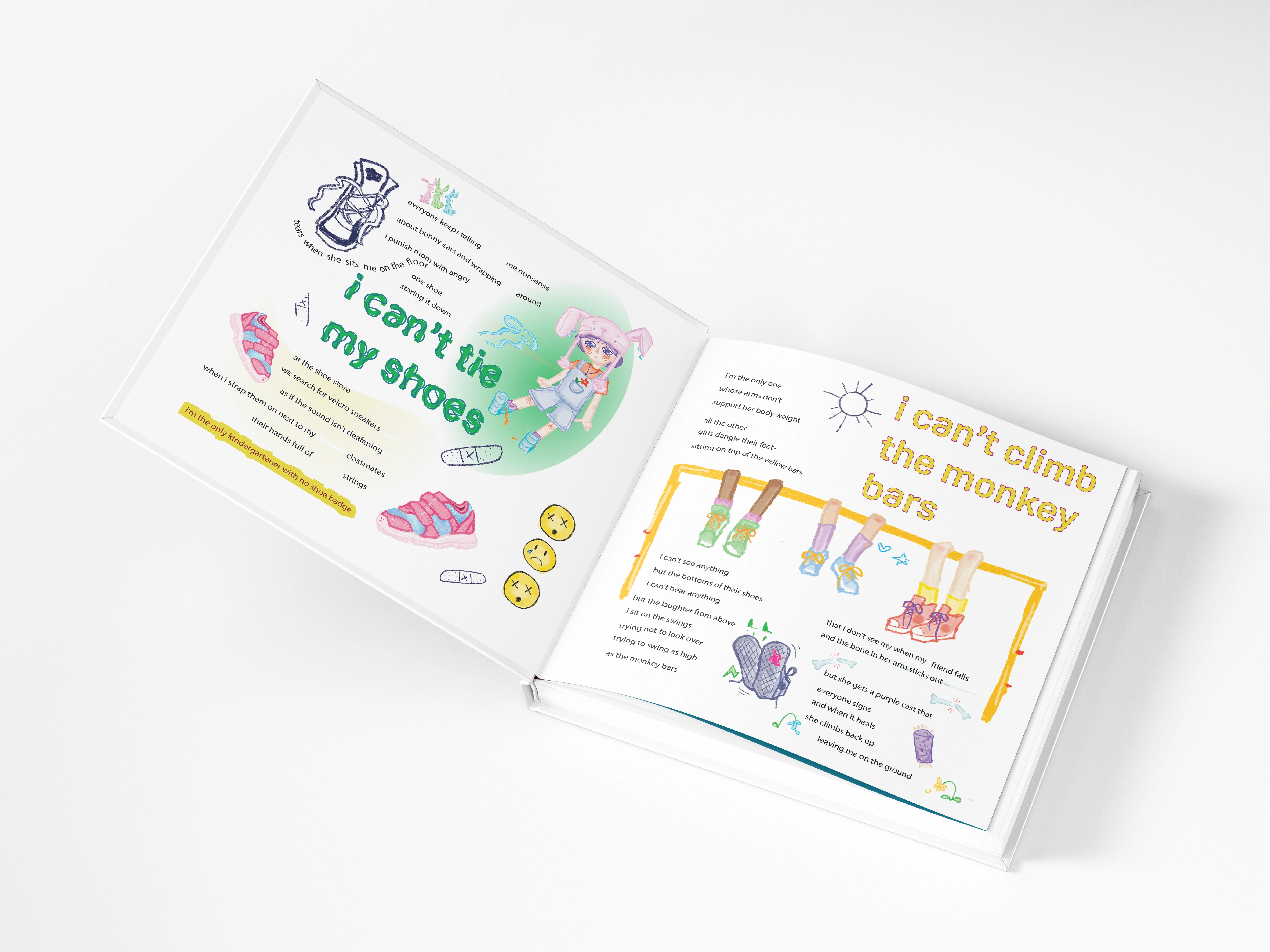
Design spread, featuring the poem i can't climb the monkey bars, by ily suckow ziemer and
visual art by khatima bulmer
Collaboration & Process
Throughout the process, close collaboration with both the poets and photographers ensured that the design was in harmony with the emotional depth of each piece. Regular feedback sessions were held to refine the layout, adjust visual elements, and maintain consistency throughout the magazine.
This edition of Gauge Magazine was a true labor of love, blending design, poetry, and photography to create something raw, real, and completely unique.
Like this project
Posted Oct 10, 2025
Designed a journal-style edition of Gauge Magazine with expressive typography and a 90s diary aesthetic.
Likes
0
Views
13

