Squarespace Website Redesign & Branding
Abigail Nash
Design Brief
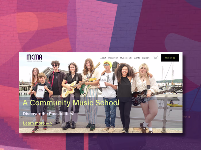
Meet Dan. He is is a warm, open, and deeply skilled music therapist. Known for his ability to make people feel accepted and safe, Dan creates a space where clients can explore their emotions and meet their therapeutic goals. His old website was functional but flat — it lacked personality, storytelling, and structure.
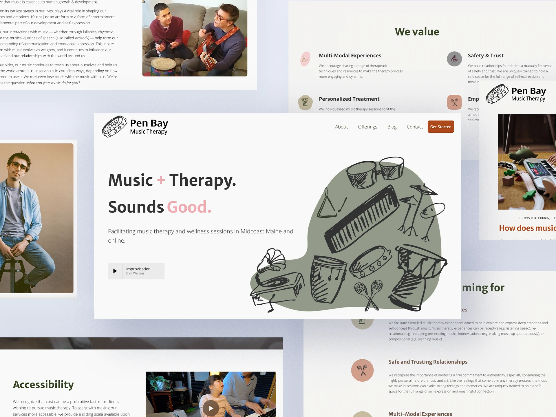
Original website
Project Goals
The project involved a full website redesign and complete branding refresh. Upon completion the site needed to:
Invite new clients into his practice
Educate visitors on music therapy without sounding clinical or overly academic
Appeal to kids, teens, and adults alike
The result? A site that feels human, clear, and uniquely Dan.
By mixing a calm and mature color palette with hand-drawn illustrations for a touch of fun and whimsy, utilizing UX Design strategies and Information Architecture, the result was a welcoming, peaceful website that educated and welcomed all visitors.
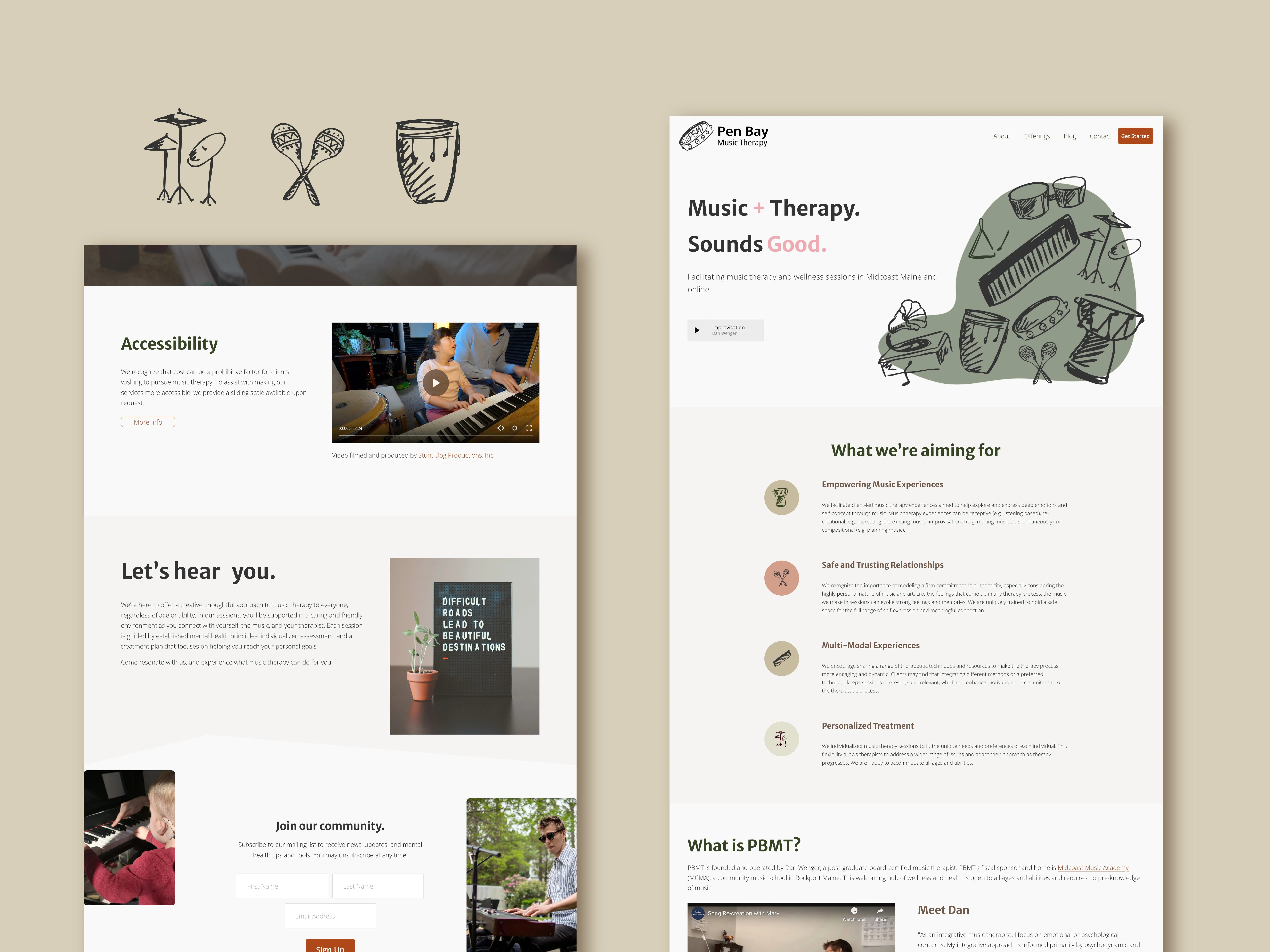
Redesigned website with illustrations
Design Solutions
Dan’s brand needed to reflect the same warmth, calm, and openness he brings to his sessions without feeling too clinical or too kiddy. The design had to walk a fine line: be approachable for kids and teens, but still grounded enough to feel professional and trustworthy to adults.
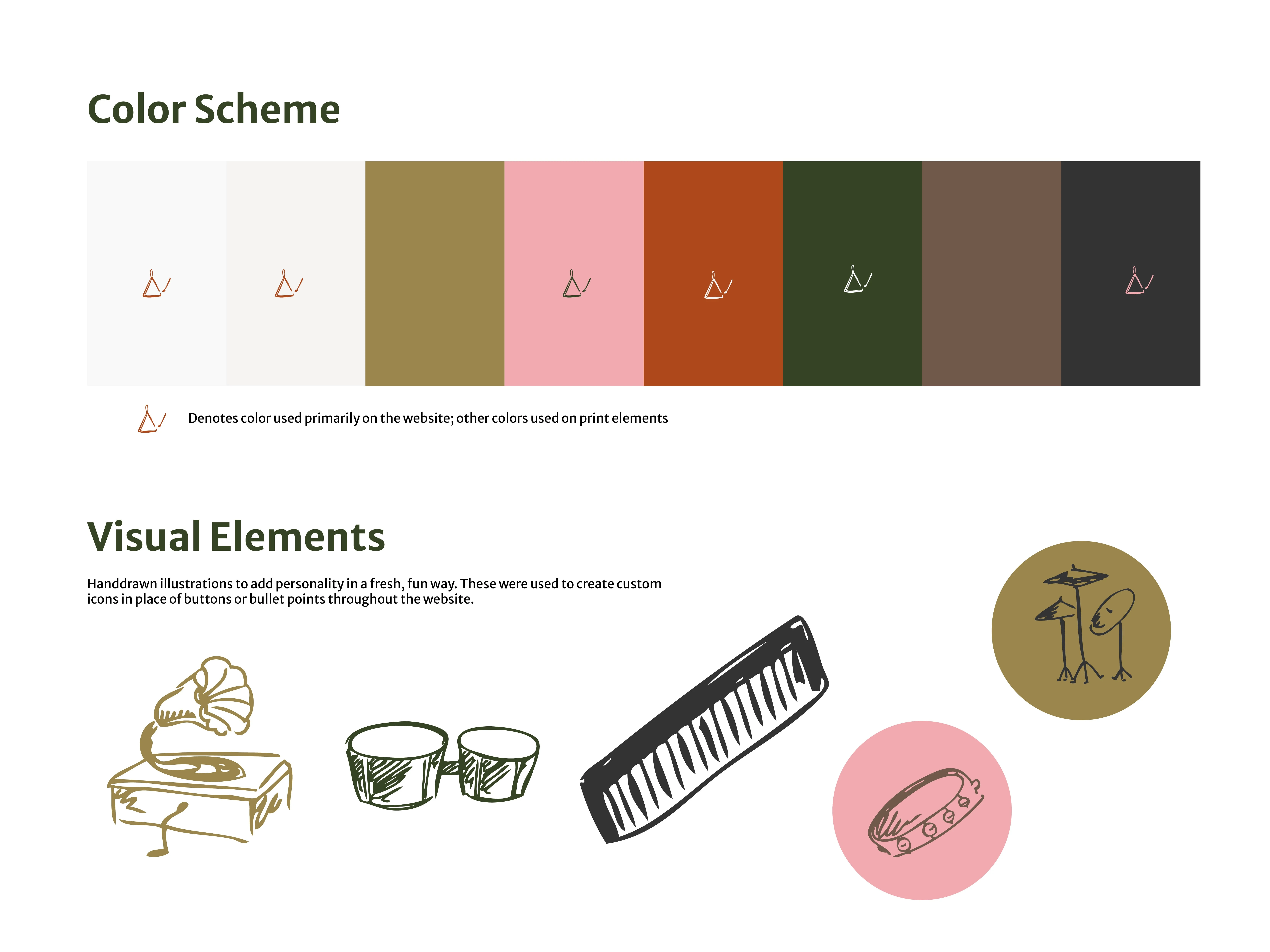
Color Palette: We built a soft, accessible palette that feels welcoming without being cheesy. Muted tones were chosen to evoke calm and creativity, steering clear of overly bright or childish colors while ensuring readability and contrast across devices.
Illustration & Identity: To subtly reference Dan’s work without leaning into clichés, we used hand-drawn illustrations of musical instruments. These became key visual elements across the site adding warmth and personality without feeling childish.
Logo Design: The logo was built around a hand-drawn tambourine, a private nod to Dan’s first meaningful experience with music as a child. Using the same line style, the initials PBMT in the middle of the tambourine tied the brand together. The result is a logo that is deeply connected to Dan’s story, feels visually identifiable, and is scalable to any size.
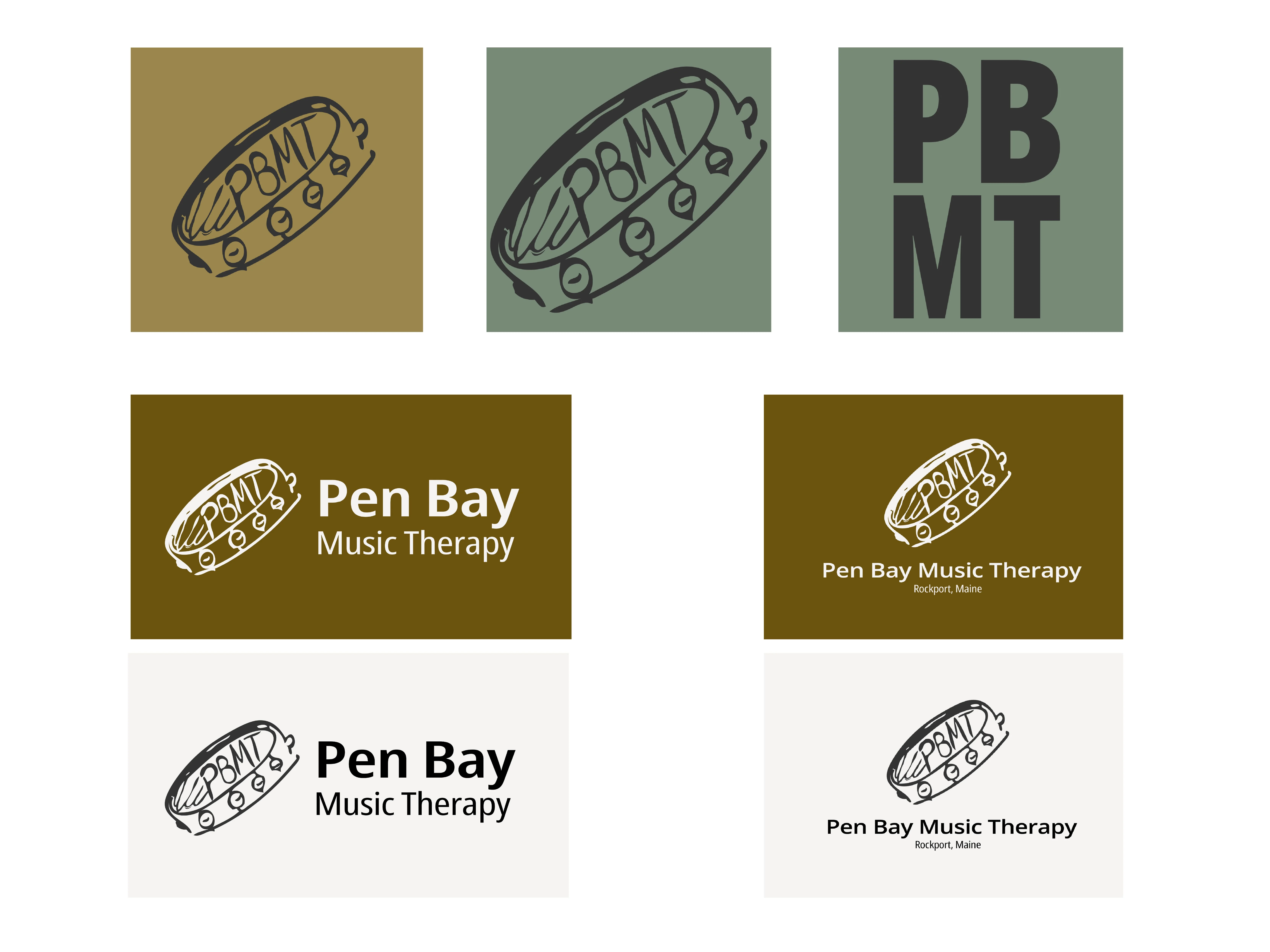
Instagram icon, favicon options, light/dark vertical and horizontal logo marks
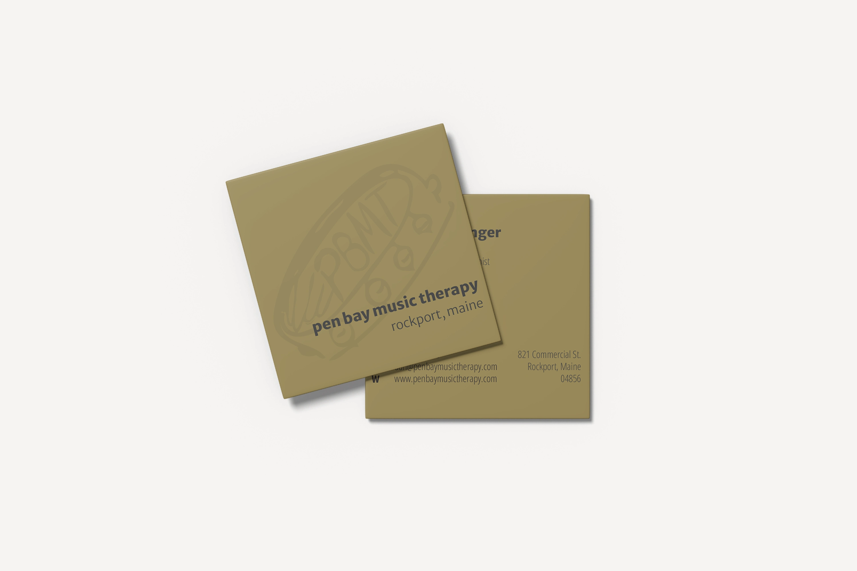
Business cards
Design Strategy
The site was designed on Squarespace, the platform Dan was familiar with and had built the original website on. Iteration began with with wireframes built in Miro to map out user flow and information hierarchy. Feedback was gathered at each stage to ensure the site truly reflected Dan’s personality and practice.
Key Features
Custom UX & Structure: Thoughtful information architecture made the site easy to navigate across audiences and devices.
Full Branding System: A complete brand package was developed, including typography, color use, iconography, and a flexible visual system for future expansion.
Design Iteration: Frequent collaboration and testing ensured every detail served both clarity and emotion.
Performance & Maintainability
User-Friendly Backend: Dan can easily make updates without needing a developer.
Scalable Design System: The branding and layout are built to grow as his practice does — across mediums, materials, or future services.
Like this project
Posted Aug 7, 2025
Led a full rebrand and web redesign for a music therapist: crafted clear visuals, custom icons, new layout, and a cohesive brand identity.
Likes
0
Views
28
Timeline
Sep 20, 2024 - Dec 20, 2024