Nonprofit Website Redesign to Improve User Flow & Retention
Abigail Nash
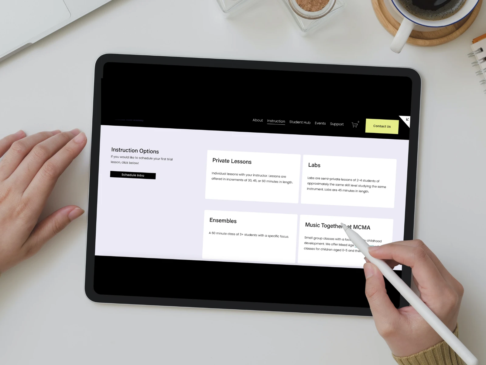
Re-designed music instruction option page
Nonprofit Website Redesign: Improving User Flow & Reducing Administrative Burden
👱♀️ My Role
Role: UX Designer | Web Redesign
Process:
Conducted user research (interviews, surveys) to understand pain points.
Mapped user journeys and identified bottlenecks in the registration process.
Created wireframes and prototypes to simplify user flows.
Implemented form automation and integrated an online registration system to reduce manual data entry.
🟣 Project Background
Midcoast Music Academy (MCMA) is a nonprofit community music school based in Maine, offering private lessons, group classes, and ensemble opportunities to students of all ages. Their mission is to provide accessible music education to all regardless of financial status.
As the organization expanded from a small one-room studio to a growing business with hundreds of students and multiple faculty, its website no longer reflected its professionalism or operational needs. While MCMA had an existing website, it struggled to support both users and staff.
🎯 The Design Challenge
The task was to redesign a website that was functionally outdated and difficult to navigate, with low conversion and high drop-off rates, into a user-friendly website that converted visitors into students or donors.
The new design needed to do more than just look better. It had to clearly communicate complex information, allow users to take meaningful action (like registering for a music lesson or making a donation), and reflect the organization’s mission and growth.
At the same time, it needed to reduce the burden on staff by streamlining intake, providing accessible answers to common questions, and automating when possible.
🧩 My Role & Approach
I led the full redesign effort, from UX strategy to final design and implementation. The process began with a thorough review of the existing site content and structure, alongside conversations with stakeholders to understand the biggest pain points, both for users and staff.
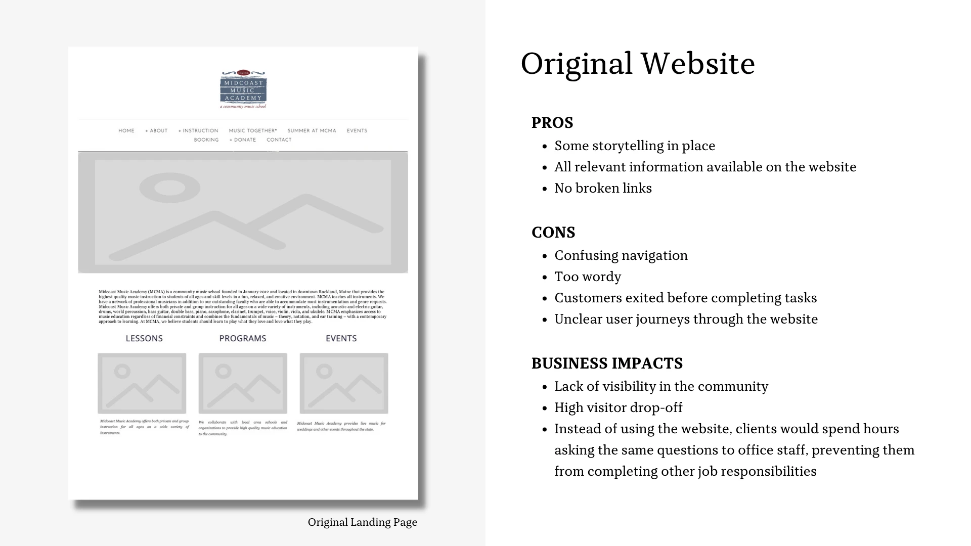
Original landing page
Research Findings
My research surfaced several opportunities for improvement, both from the user’s perspective and the organization’s operational needs.
Through a combination of direct observation, user interviews, and usability testing, I identified four key areas where users consistently encountered friction and needed clearer guidance.
In parallel, a deeper look into internal challenges revealed two core business issues that could be significantly improved through thoughtful UX and structural redesign of the website.
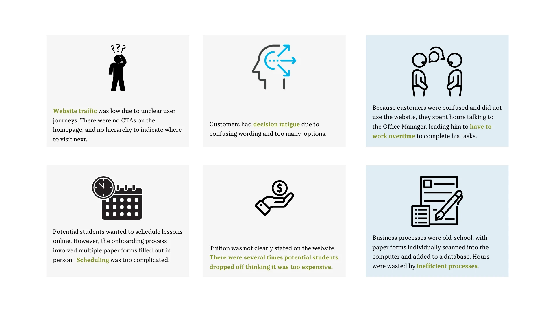
Grey boxes indicate usability issues; blue boxes indicate internal business model issues causing inefficiencies
🔄 User Journey & Simplified Flow
Focusing on the four key user experiences (navigation, simplified options, transparent pricing, and online registration), I redesigned the website to make the user journey as seamless as possible.
After analyzing the user pain points, I simplified the original eleven-page site (which all ultimately ended at a contact form) into a streamlined four-page flow. The goal was to reduce friction at every step and make it easier for users to find the information they needed, while encouraging key actions such as registering for classes and understanding pricing.
While business practices and logistics prevented full online self-scheduling for students, I significantly shortened the registration process and digitalized it. What was once a manual, paper-heavy process became much more efficient, saving staff time and user frustration.
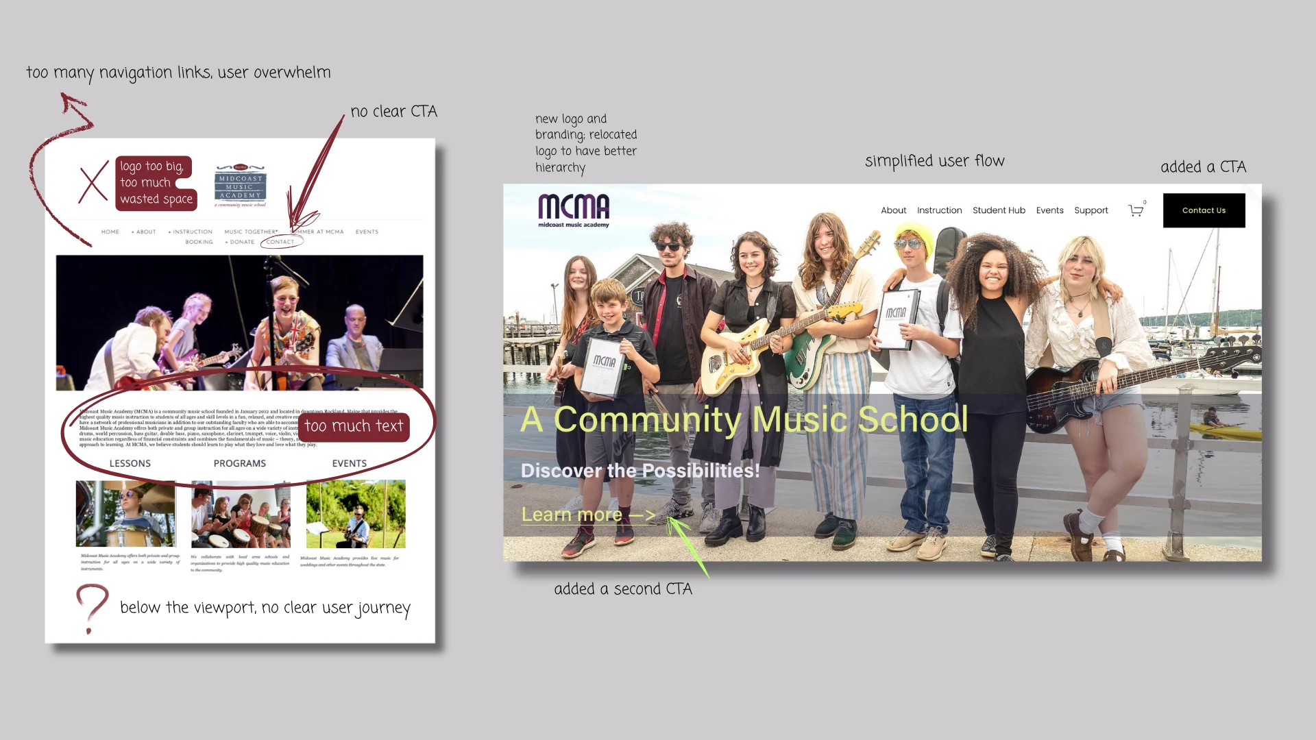
Homepage, before (left) and after (right)
From there, I restructured the site’s information architecture to better support key user paths, such as registering for programs, applying for financial aid, or making a donation. Content was rewritten and reorganized for clarity, and visual hierarchy was introduced to guide users toward action.
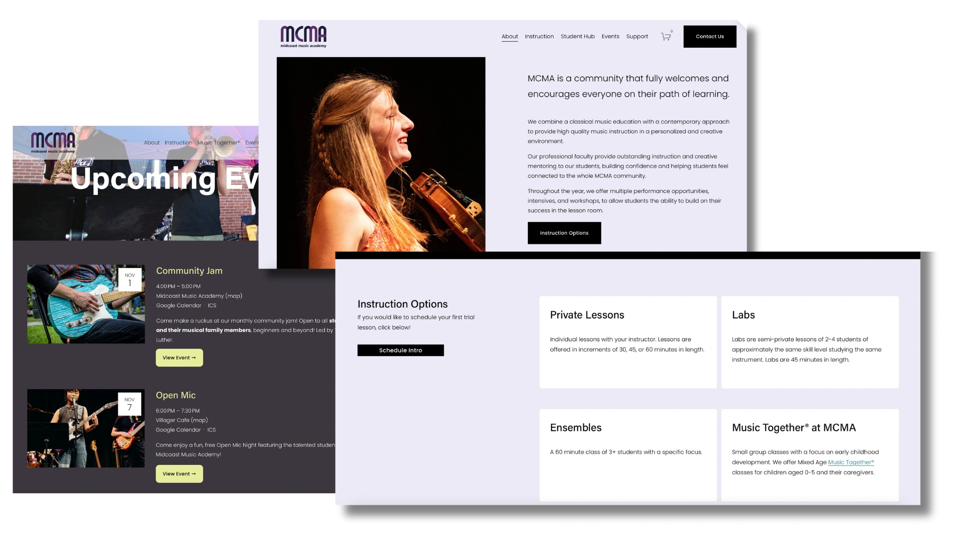
Screenshots of other pages; events page (left), instruction overview (top right), instruction options (bottom right)
The final design emphasized clarity, accessibility, and warmth, aligning with the organization’s values while improving functionality.
✅ Results & Outcomes
The redesigned website led to significant improvements across the board:
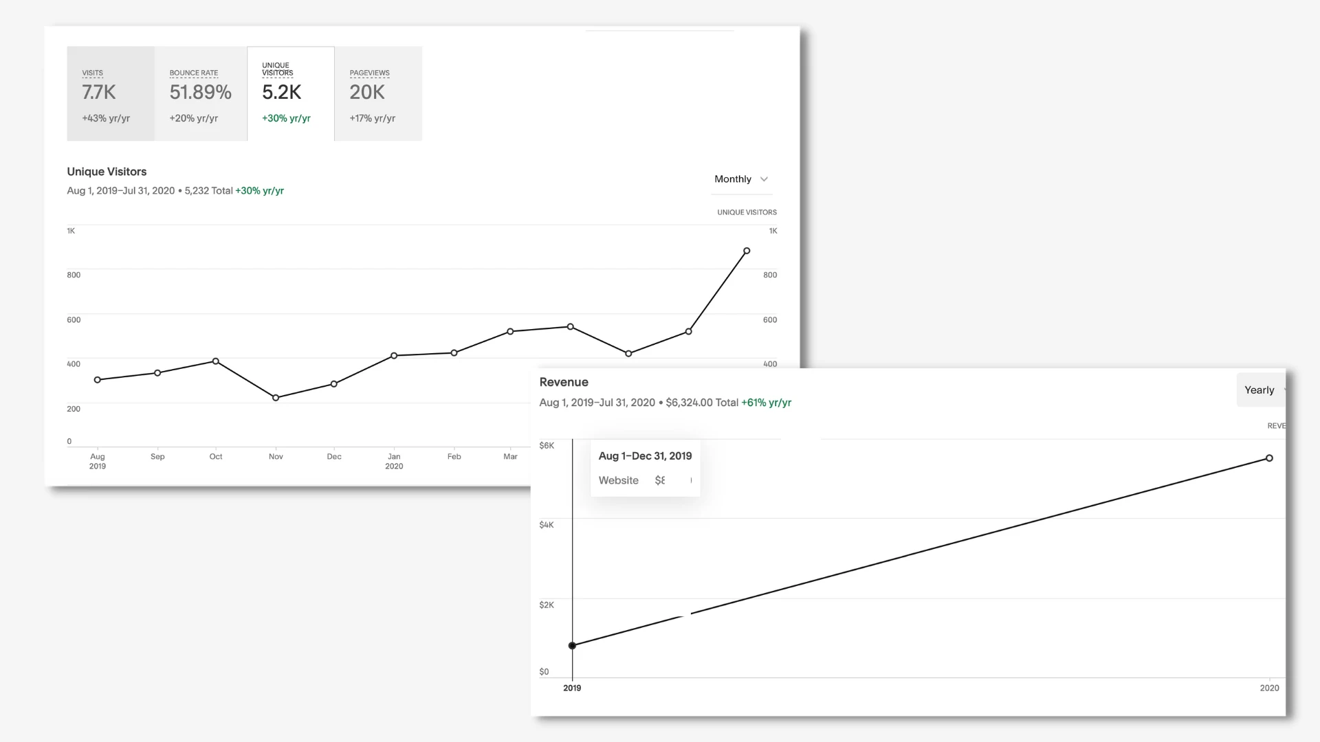
Unique visitors increased by 30% year-over-year, reflecting higher traffic and greater interest in the academy’s offerings.
Bounce rate improved by 51%, indicating a more engaging user experience and better content alignment with user needs.
Revenue growth saw an impressive 61% year-over-year increase, highlighting the direct financial impact of the website improvements and the introduction of new online marketing efforts.
These stats demonstrate not only the success of the redesign but also how it helped transform the user experience, drive engagement, and boost revenue.
Website stats
🔁 Reflection
This project highlighted the value of user testing in aligning design with both user needs and business objectives. By addressing key friction points, we saw measurable improvements in traffic and revenue.
Next time, I’d expand usability testing and involve a broader audience, including those less familiar with music or MCMA. Additionally, more focus on accessibility and mobile-first design would help ensure the site remains user-friendly as the organization grows.
You can visit the full website at www.midcoastmusicacdemy.com.
Note: The website has been maintained and updated by MCMA' since October 2021. As such, it no longer completely reflects the work shown here in this case study.
Like this project
Posted Apr 5, 2023
A UX redesign that streamlined user registration, reduced drop-offs, and eliminated manual data entry through a more intuitive and automated web experience.