QuickStem Bridal Bouquets: Minimal Identity, Bold Idea
Rabiah Mo
About QuickStem
QuickStem is a soon-to-launch brand offering beautifully fresh bridal bouquets at a remarkably accessible price point. While the specific mechanics behind the product are confidential until launch, affordability through innovation is at the heart of the brand’s offering. With an inventive approach to production and a simplified range of styles, QuickStem reimagines the traditional wedding bouquet for the modern, practical bride.
Project Outline
My role on this project was to develop both the visual and verbal identity of the brand, in close collaboration with the founder. I also supported the early stages of brand strategy, helping to define the brand’s core values, tone of voice, and visual positioning.
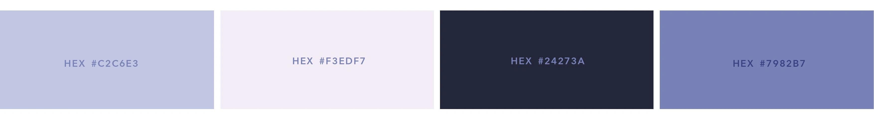
Primary colour palette intentionally diverging from overused wedding tones to create a distinctive presence within the market.
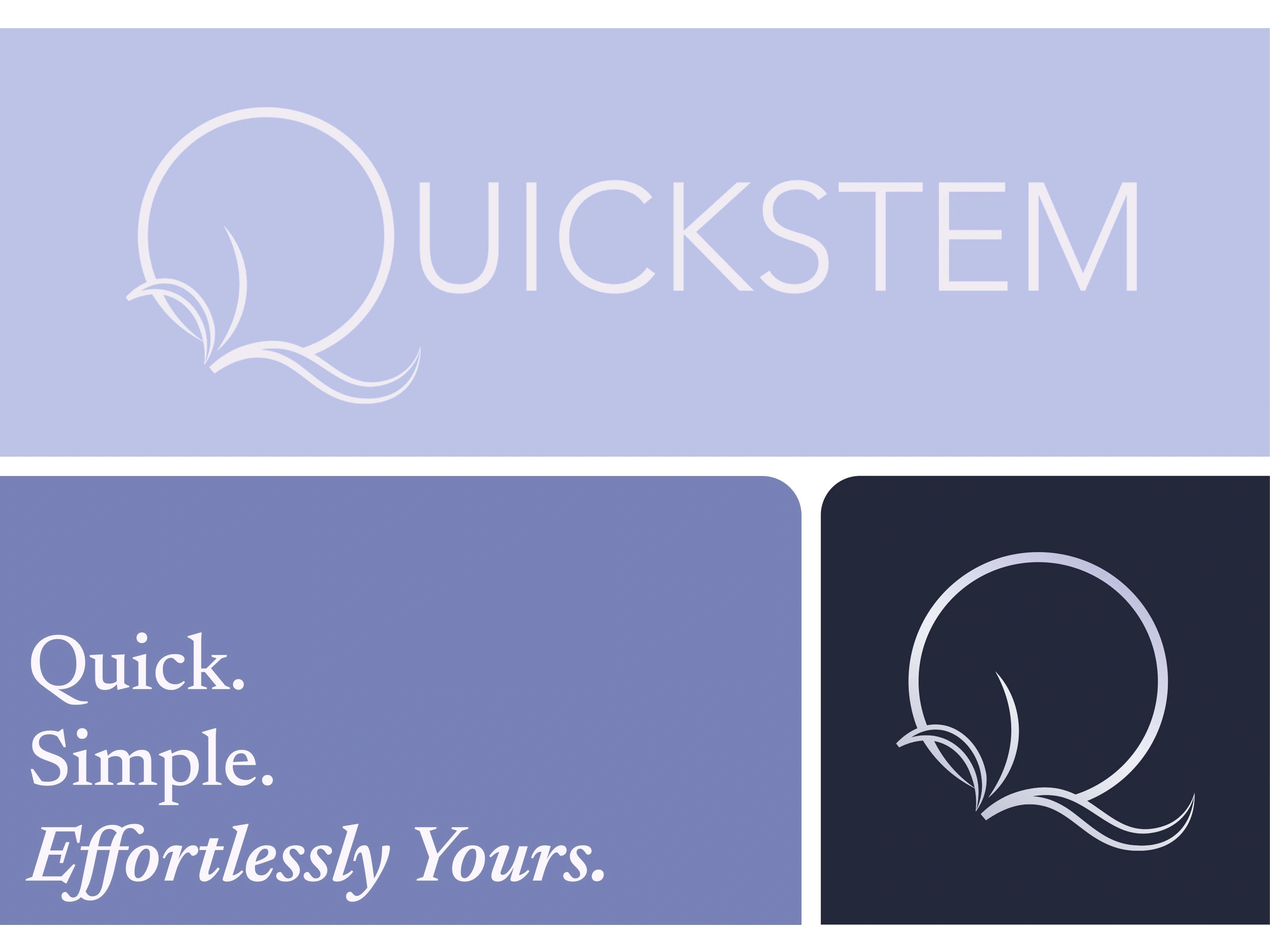
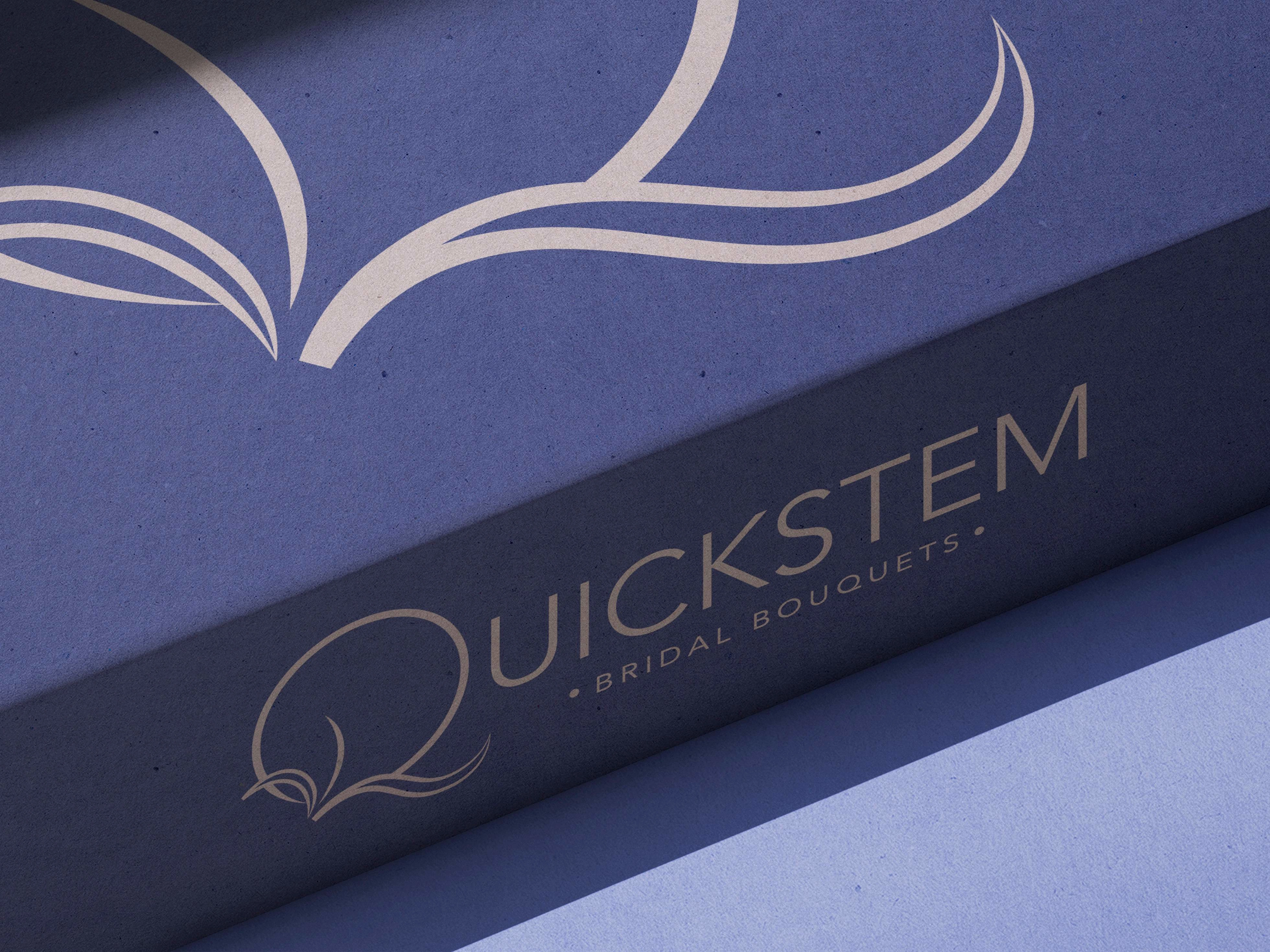
Secondary Logo (top), Sub-mark (bottom right) and Tagline (bottom left).
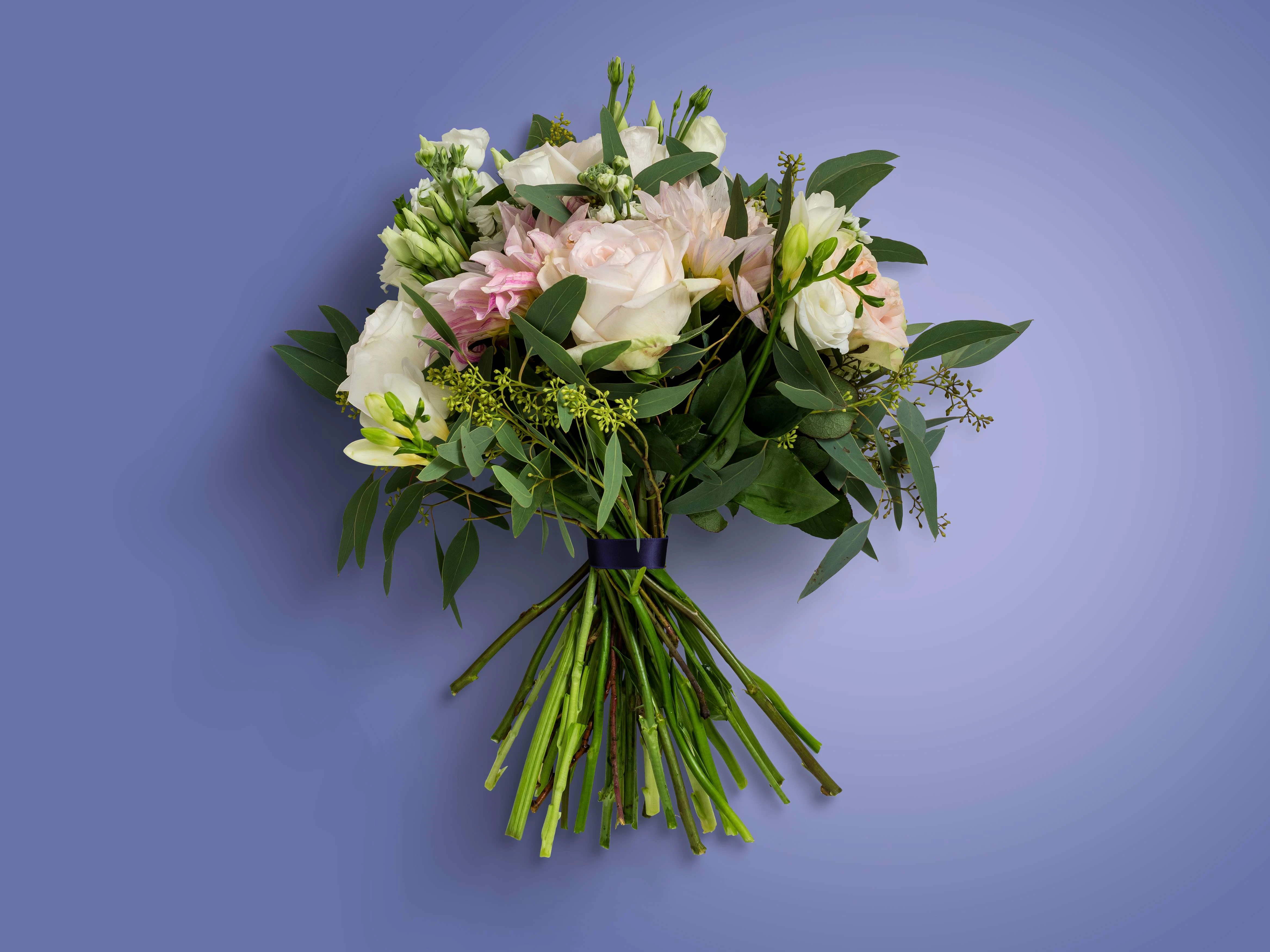
Visual Asset created for QuickStem's pre-launch brand toolkit.
Visual Identity
Visually, the identity strikes a careful balance—maintaining the elegance expected in the wedding market without leaning into overt femininity. This decision reflects the dual priorities of beauty and practicality, creating a look that feels both refined and refreshingly pared back. The design system supports QuickStem’s mission by being easily replicable across touch points while still feeling distinctive within its space.
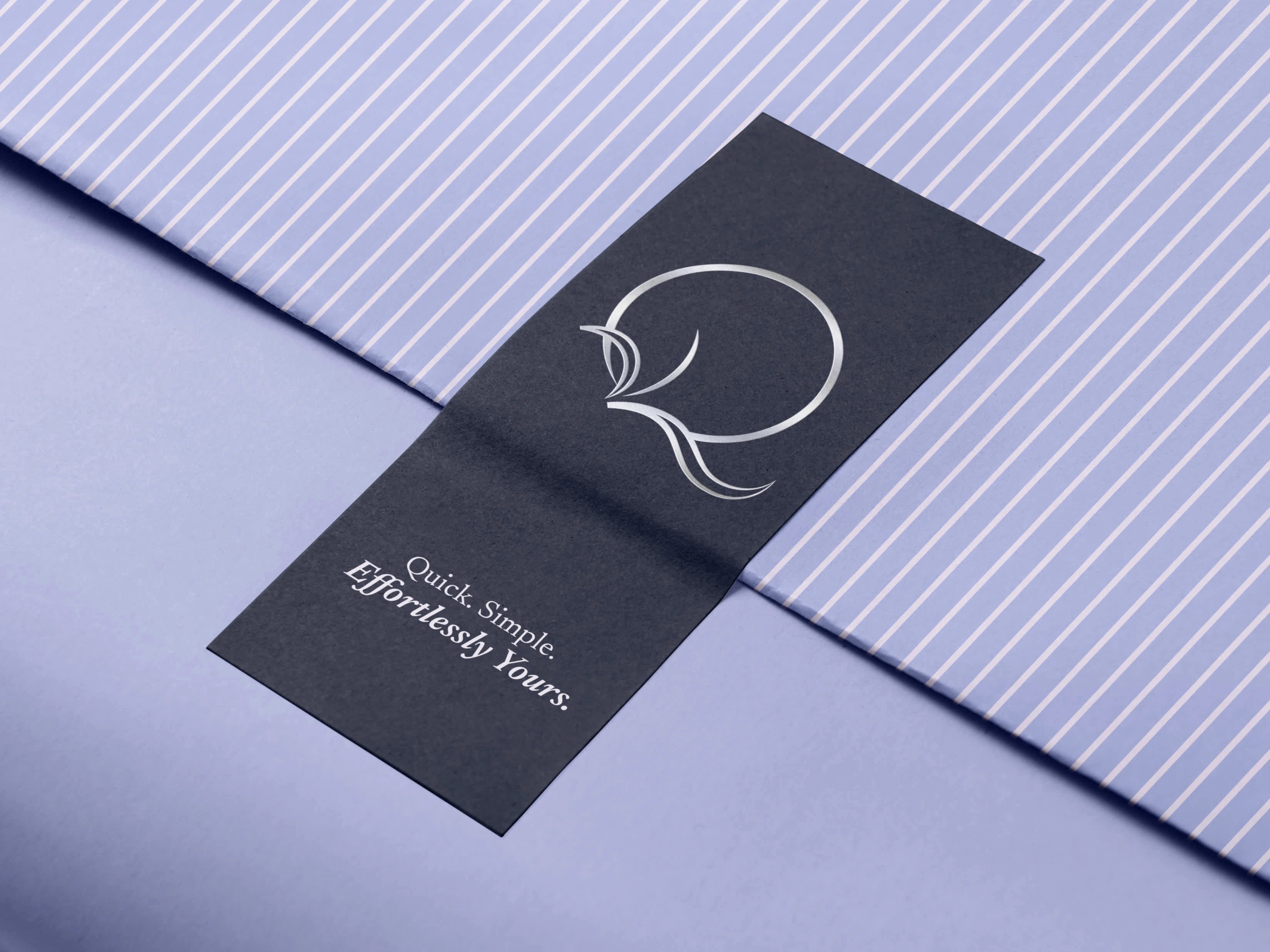
Mockup showcasing translation of visual identity across packaging touch points.
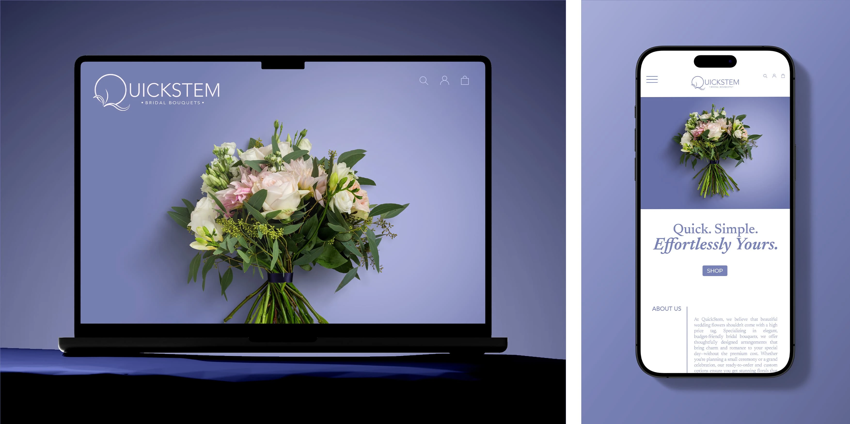
Website mockup showcasing QuickStem’s visual identity across desktop and mobile.
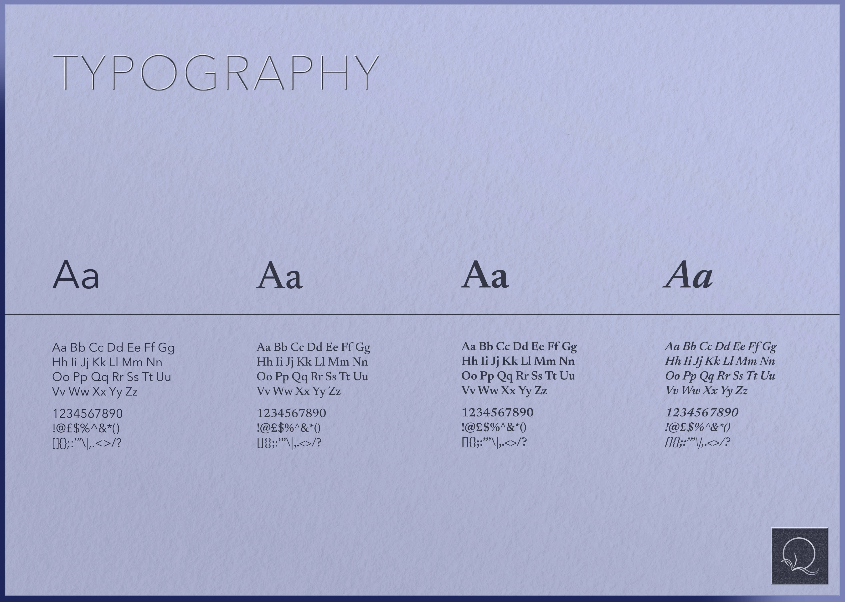
Typography system supporting QuickStem’s digital presence and brand tone - modern and unfussy while maintaining a 'wedding-appropriate' sophistication.
In Summary
From a messaging perspective, this brand speaks directly to a new generation of brides—those who value achieving traditional results in non-traditional ways. The brand appeals to individuals who want to skip the faff and expense of conventional wedding planning without compromising on quality or sentimentality. This is a brand rooted in smart simplicity, meeting its audience where they are: thoughtful, discerning and ready to rewrite the rules.
Like this project
Posted May 4, 2025
Branding project to develop visual identity, verbal identity and collaborating on strategy to create a modern, affordable bridal brand with elegant simplicity.
Likes
1
Views
8
Timeline
Feb 1, 2025 - Ongoing