Enesselle: Heritage Based Luxury Skincare
Rabiah Mo
Enesselle is a luxury skincare brand rooted in heritage, care and quiet elegance. Inspired by ancestral beauty rituals and shaped by contemporary sensibilities, it offers skincare formulations that carry forward the wisdom of the past with the refinement of today. This project showcases the early visual and verbal identity work that laid the foundation for Enesselle’s brand presence as it prepares for launch.
My role was to define Enesselle’s brand identity — shaping both its visual direction and verbal expression. This included establishing its core values, visual language, tone of voice and strategic positioning.
The Core of Enesselle
Enesselle began with two sisters. The idea that is deeply rooted into the brand’s identity is one of ancestry and legacy, the act of passing down knowledge to a loved one in the hope that it will continue to be passed down - so far down that the one who’ll carry that knowledge, despite being someone you’ll never meet, will still hold that connection to you - a connection that speaks of compassion, wisdom and family, ultimately birthing the tagline 'Kin of Care'.

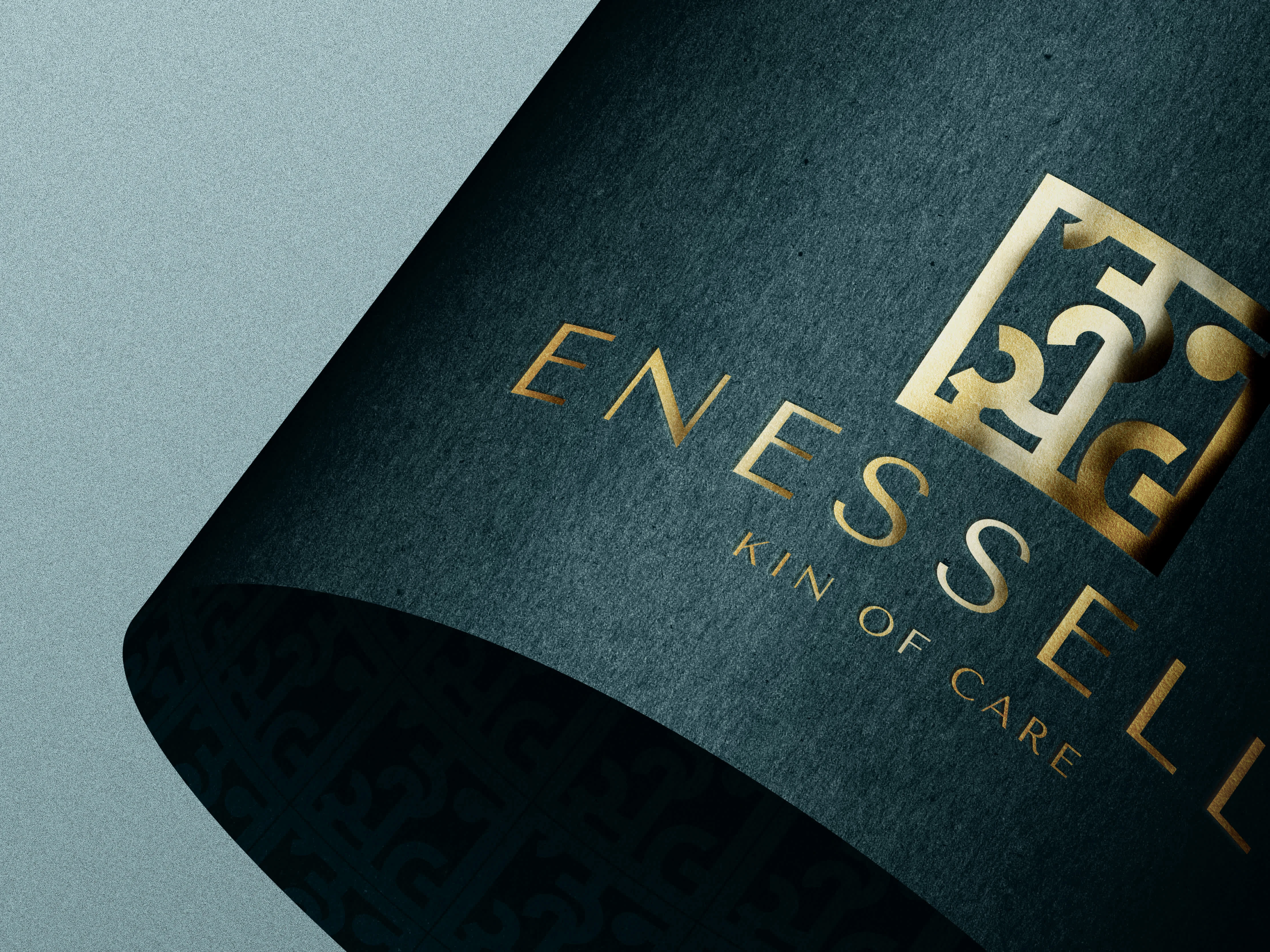
Brand guidelines showcasing primary logo and logo variations.
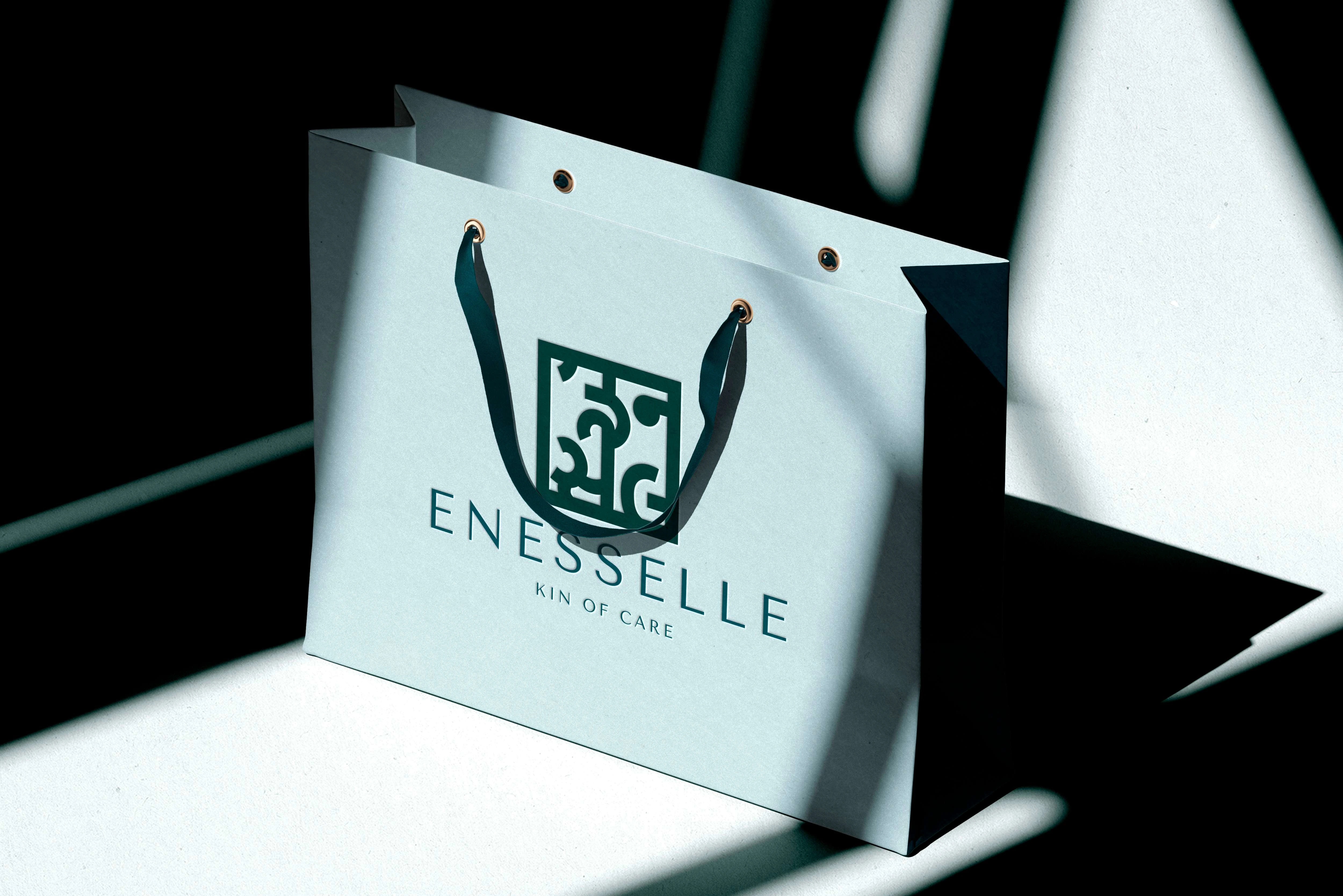
Primary logo in use: A branded shopping bag mockup to help the client envision how Enesselle’s elegance translates into packaging.
Visual Identity
Logo Development
...embodying legacy through form.
The brand’s logo underwent a long reiterative process, with each draft tested against the core values of Enesselle. It needed to be minimal and sleek, conveying refinement without excess. At the same time, it had to subtly reflect the founders’ Indian heritage—without leaning too far into traditional motifs—while harmonising with a contemporary Western aesthetic. The final mark achieves this balance with intention: the logomark is a refined abstraction inspired by characters from the Gujarati script, a quiet nod to the sisters’ ancestry. It offers a sense of rootedness without overt symbolism, embodying legacy through form.
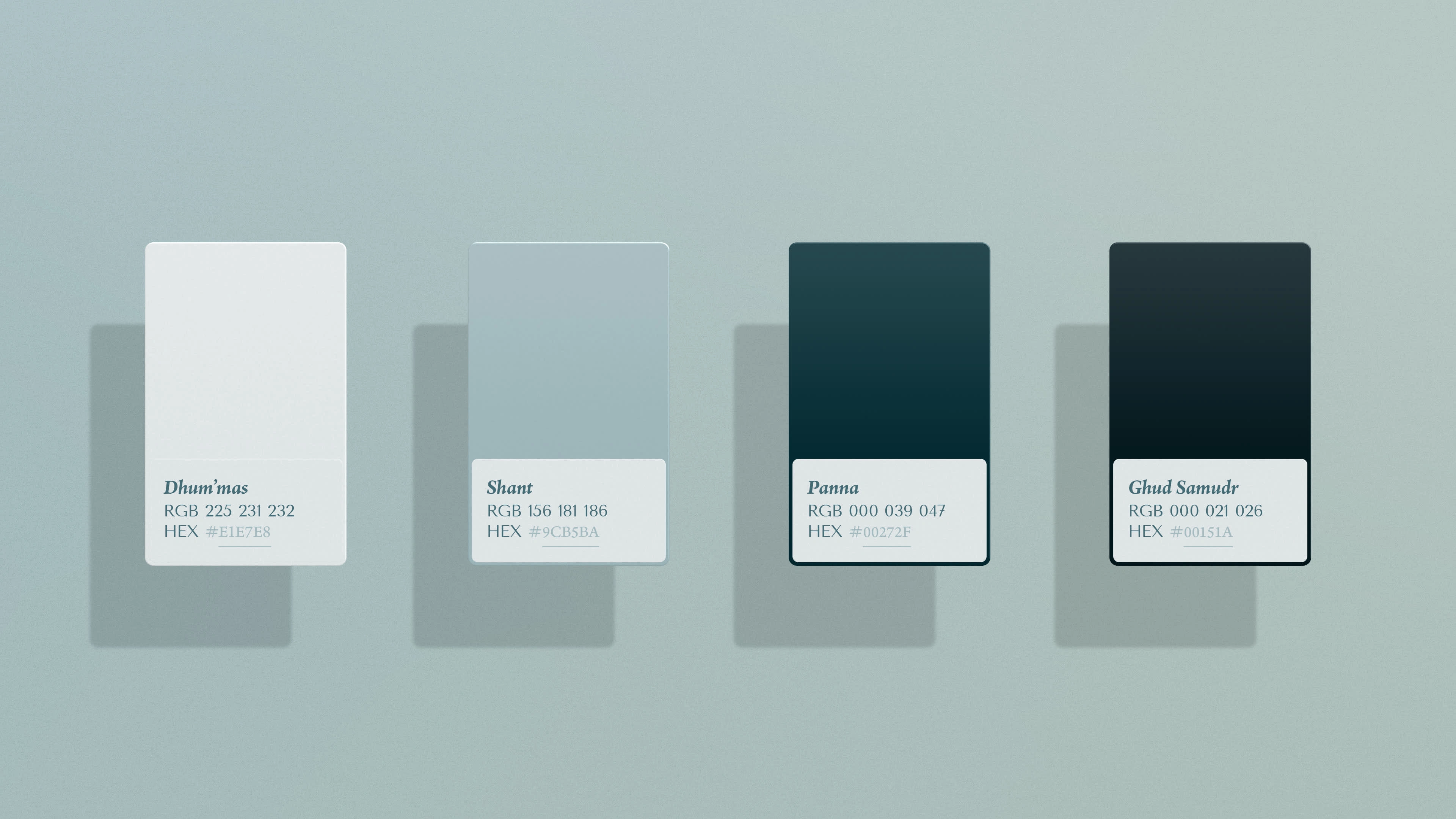
Primary colour palette designed to express understated luxury and leave space for future evolution.
Colour Palette
This thoughtfully restrained monochromatic palette intentionally leaves space...
The primary colour palette of Enesselle is anchored in a sophisticated range of four shades of green, each with a cool, almost blue undertone. Ranging from a very light, near-white shade to a deep, almost black hue, this gradient offers a contemporary and dynamic take on the usual luxury colours. While the client initially considered the classic black and gold pairing to evoke luxury, we chose to deviate from the overused combination, instead opting for a deeper, more thoughtful palette. The result is a set of colours that feel both fresh and elevated—distinctly luxurious without relying on clichés.
The lightest and darkest shades of green serve as the brand’s “black and white,” yet these shades are far from typical. Infused with emerald undertones, they give depth and warmth, reflecting the brand’s core values of legacy and richness while avoiding the flatness that often comes with stark contrasts. Gold accents are used sparingly throughout, offering refined touches that complement the green hues and further enhance the brand's luxurious yet understated identity.
This thoughtfully restrained monochromatic palette intentionally leaves space for the introduction of secondary colours in the future. These colours will not only contrast but complement the current greens, allowing the palette to evolve and introduce new dimensions. This approach ensures that the visual identity remains dynamic and full of potential, evolving alongside the brand's growth while maintaining its foundational elegance.
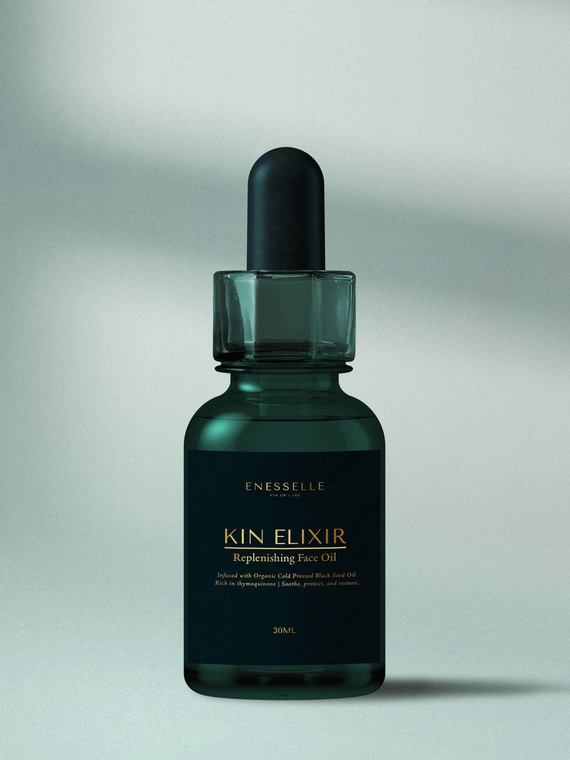
A visual mockup of 'Kin Elixir', designed to offer the client a tangible preview of their product’s future presence.
Typography
The typography system blends modern refinement with classical elegance. A sleek, sans-serif primary typeface conveys clarity and sophistication, while the secondary serif typeface introduces a sense of tradition. A tertiary style—italicised serif—adds emphasis with a poetic lilt. This trio ensures visual consistency across brand touchpoints while offering enough flexibility.
Summary
The development of Enesselle’s brand identity laid the groundwork for its future evolution. From the logo to the colour palette and typography system, every element was carefully crafted to reflect the brand’s core values of ancestry, legacy and luxury. As the brand moves toward its full launch, this cohesive yet adaptable visual system will continue to evolve, ensuring Enesselle’s story and values remain at the heart of every touchpoint.
Like this project
Posted Apr 24, 2025
Established Enesselle’s brand core, voice, visuals, and positioning to lay the foundation for its evolving identity.
Likes
4
Views
30
Timeline
Jan 1, 2024 - Ongoing