Internship Projects at Aevice Health
Overview 🔎
As a UI/UX Designer intern in the Product Design team, I was given the opportunity to work on various tasks and was involved in different aspects of the product. As an overview, the following are some of the tasks I worked on:
Conduct usability studies, both internal and with external participants
Design mobile screens (Android and iOS) for various user stories
Work on maintaining a robust design system
Build the product's help center web app on Webflow
📌 Unfortunately, as the product has not been launched and a Non-Disclosure Agreement has been signed, the details of the project, features of the product and screenshots of any screens designed will be kept confidential.

Usability Studies
Problem & Solution 🤝
Aevice Health's monitoring system for patients consists of a physical medical device as well as an accompanying mobile application. For a particular feature of the medical device and monitoring system, the Product Design team wanted to:
test if the physical device was intuitive enough for first time users,
whether the users would be able to use the device accurately, and
whether users were able to use the device together with the mobile application for follow-up actions.
Goals:
• Participants would be able to complete the tasks required without any/much guidance from the moderators.
Process 🛣
The first step was to craft the usability study plan, to decide on the scope of the usability test and brainstorm appropriate questions that could allow us to get a better understanding of the participants' ease of completing the tasks. It was important to ensure no leading and closed questions were asked, such as "Do you interpret (a particular feature) as (the intended meaning of the feature)?", but instead "Could you tell me what you understand about this (feature)?".
To ensure the smooth execution of our usability study, we conducted a pilot study internally, with colleagues from the other teams. Through this process, we were better able to gauge if there was any designer bias in our questions and whether any improvements could be made to the study.
Results
For the first batch of testing, a total of 10 participants were recruited. Based on observations and post-interview questions, the team and I synthesized our findings and were able to identify a few main user pain points. These pointers were brought up with the R&D team for discussion on design solutions that are not only feasible to develop, but also aligned with the requirements of the medical device.
Changes implemented:
Re-designed an instructional illustration that improved user experience in figuring out how to use the device.
Introduced a new screen that improved users' visibility of system status.
Replaced call-to-action microcopy to align users' expectations with the designed user journey.
Success of these changes were measured through the task completion rate and post-task questions.
Takeaways 📣
Leveraging product packaging as another avenue for microcopy for instructions, such as film covers, which would help the users in their first contact with the product.
The issue was how to give users more context or instructions on how to use the device without compromising on the aesthetics of the device and readability of the instructions.
Being flexible in asking questions and asking participants to think aloud.
As designers who have a clear understanding behind the rationale of the design and how users should behave when interacting with the product, it is all the more important to understand users' thought process when using the product to reduce any gap between designers' and users' mental models.
Designing Screens
Designing screens is another main aspect that I worked on, both designing screens from scratch and reiterating designs from previous sprints - for Android and iOS interfaces. In the Product Design team, we are always looking back on existing screens to either:
improve on the user experience, or
edit the design due to changes in business or software requirements.
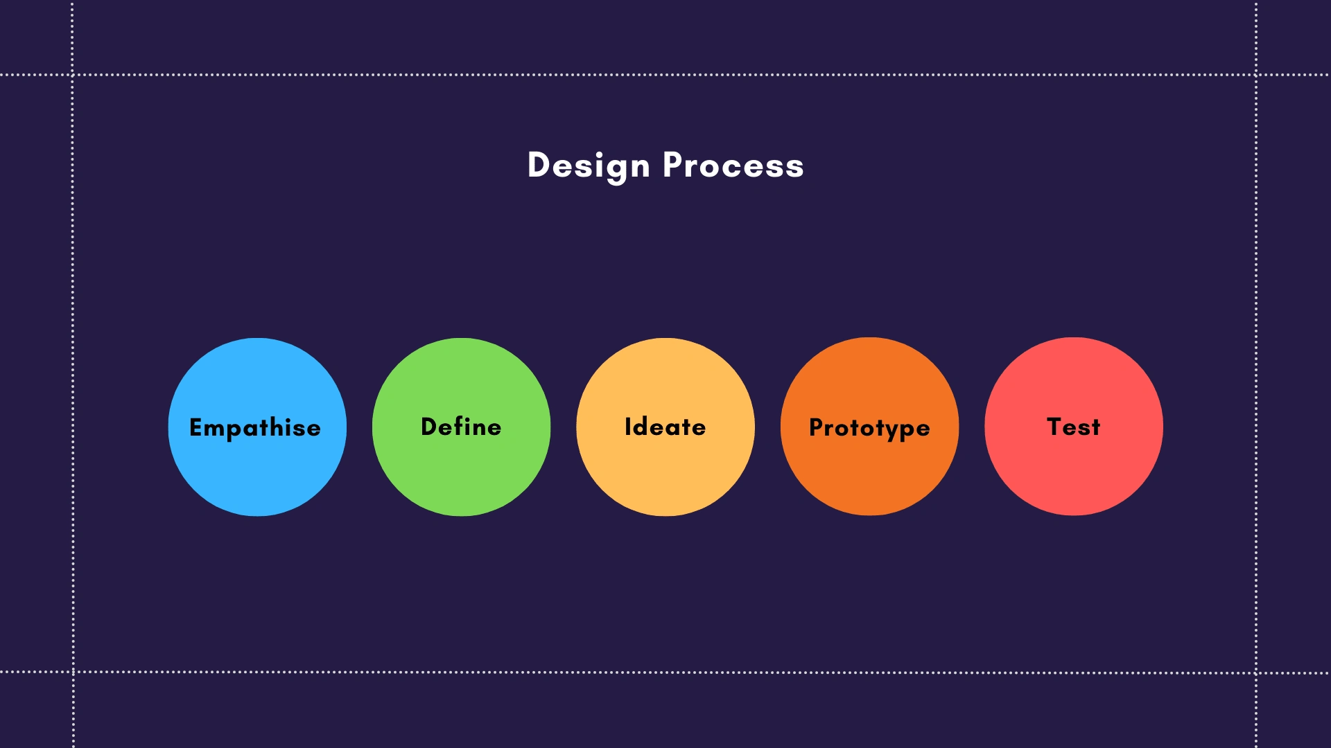
In theory, the design process is an iterative process between 5 steps.

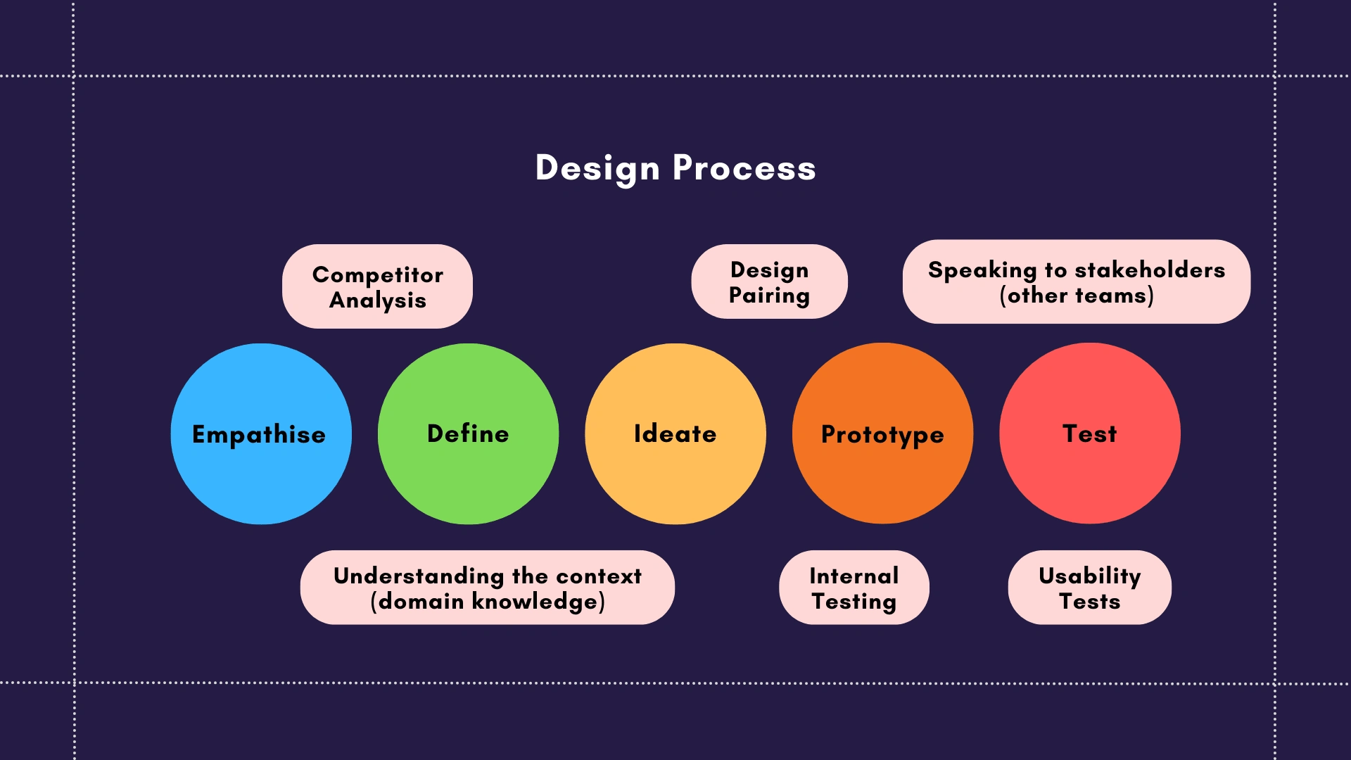
However, working on a real design problem taught me that there is so much more to the design process.

In the medical device industry, it would be hard to design without some domain knowledge due to FDA regulations and industry standards (such as medication measurements). Due to the nature of the medical industry, there are very specific terminology that can be confusing and new to users, such as the various medication forms and vital signs measurements. It was an important consideration to provide the most accurate information while making the interface user-friendly and easy for users to understand.
Competitor analysis and industry research were thus key first steps to creating a good design for our target users - patients, healthcare professionals and system administrators. Many other healthcare apps have similar features and we based our design on user flows we found intuitive, integrated with our Design System elements.
I assisted the process of designing interfaces to facilitate user input and editing of medication details, recording of vitals measurements, and instructional screens for using the physical device for measurements.
Design System
One of the main changes I executed in the design system was to integrate the new Figma updates that were introduced in May. With the new feature, I updated the existing components to include component properties and downsized the design system to be much cleaner and user-friendly. Documentation was added and the robustness of the design system was tested when a new intern joined the team and was tasked to design a screen using the existing components.
It was a continuous effort to keep the designs consistent and to ensure that screens designed by previous designers were updated with the new components. I learnt the importance of cleaning up existing designs to maintain a consistent design across not only different platforms, but also across designs created by various designers.
Side Projects
Copy Management System
While the team has a Design System for all the design components we use, we did not have a copy management system. Due to many batches of designers working on the design files, it was a challenge to track all the copy that had been written and to keep a consistent copywriting style.
I collaborated with another designer to create our own copy management system without the use of a third-party software, using Google Sheets. We ensured that each copy could be easily accessible by searching for the user story, type of microcopy (such as error messages, empty states, etc.) and the type of UI component (such as placeholder) and built the repository of all copy used for easy reference.
Help Center
I was tasked with building the Help Center using a no-code or low-code solution. The first step was to find a suitable platform that would fulfill the business, software and design requirements. To which, I researched on and tested out various website builders / CMS builders before deciding that Webflow was the most appropriate platform. In the process of deciding the platform, I had to talk to different stakeholders such as the Project Manager, developers and the business team to gain a clear understanding of their requirements such as budget constraints, domain, and security requirements.
Even though there was an initial learning curve using a new platform, it was definitely a rewarding experience turning the Figma designs into an actual interactive website.
Although the website has not been made public, I worked closely with another designer to document the building process for future maintenance of the website.
Concluding my experience
I've learnt so much on the job and grew so much as a designer during my 15 weeks in Aevice Health, from improving my Figma skills to gaining more confidence in showcasing and storytelling my designs. Check out my post concluding my internship experience on LinkedIn:
Like this project
Posted Sep 16, 2022
Projects I have participated in at Aevice Health, a MedTech company aiming to address chronic respiratory disease by developing a monitoring system.


