chopchop: A remote queuing application
chopchop is a mobile application that allows you to queue for your favourite food from the comfort of your own home! It was designed as a one-stop platform for hungry individuals to check out the real-time crowd levels and estimated queue times of their favourite restaurants.

Both interviews and observational studies were conducted for the Empathy phase of our project. On-site observations were conducted at F&B stalls to observe how people behaved when they were queuing and to identify pain points that they were met with in the process of queuing to get their food. Customers' activity throughout the process from queuing until they finished their intended activity were observed. However, solely observations are not enough as in-depth insights cannot be obtained. As such, the team conducted additional interviews which could provide us with deeper findings as we could ask follow up questions.
Breakdowns Identified
Participants lacked knowledge on crowd levels of specific stores they wanted to patronise/other options available to them
Participants faced long queue times, resulting in unnecessary time wasted and increased exposure to human contact
Queue length may not be reflective of actual waiting times

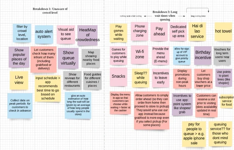
In brainstorming, quantity trumps over quality and our objective in this exercise was to come up with as many diverse ideas as possible. For each breakdown, the team penned down every idea we had, regardless of whether it was feasible. We bounced ideas off one another and only converged to a few ideas for each breakdown after.

Idea Brainstorming
Solutions
Lack of knowledge of crowd levels. Solution: Display store capacity limit so that customers can better gauge expected crowd levels and waiting times for the specific store they want to patronise.
Long waiting times/ wasting time to queue up. Solution: Create an electronic queue system where user can queue via an application and present the EQ number to the counter staff upon arrival.
Queue length may not be reflective of actual waiting times. Solution: Have a display for users to see exactly how many orders are there currently, which includes those from food delivery providers, as well as exact group sizes/ number of people queuing in front of them.
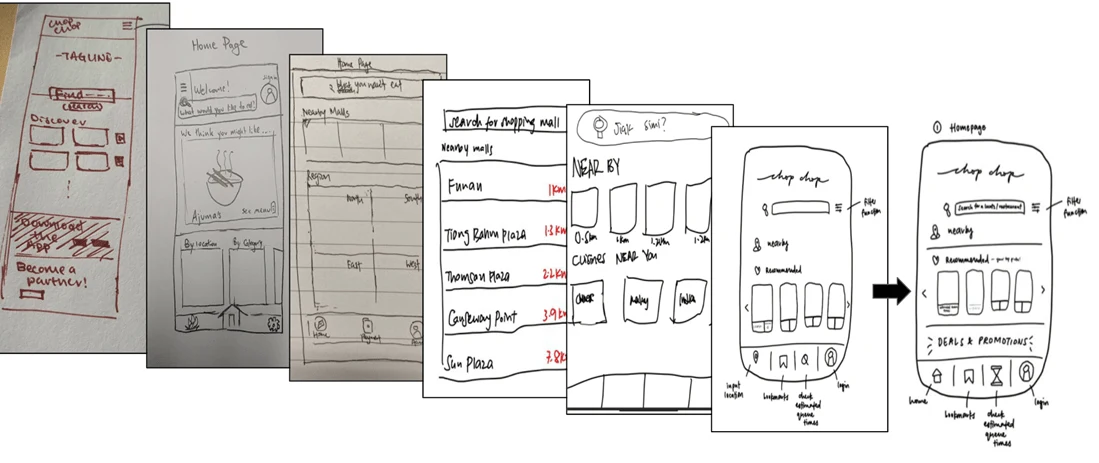
After identifying the solutions targeted for each breakdown, the team proceeded to the Prototyping phase, in which ideas discussed would be translated into features that make up the application prototype. We explored parallel prototyping, in which each team member came up with their own design independently, before coming together to combine aspects of each person's design for the final design. This is a useful practice as different people have diverse ideas on which layout would be best for user experience.

Example of parallel prototyping by the team
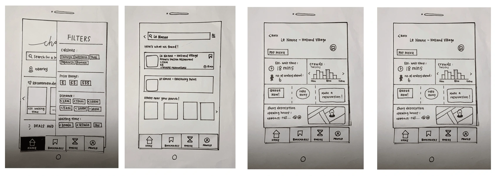
After rounds of parallel prototyping, the team came up with our low fidelity prototype which was done on paper. This prototype was then used for heuristic evaluation.

Low Fidelity prototype
Jakob Nielsen's 10 heuristics were used to evaluate our low-fidelity prototype. The team compiled the results of our evaluation from our peers and discussed the severity of each evaluation received. Some evaluations had easy fixes, while other evaluations required more discussion on the severity of the problem identified. Changes to make were based on how much the problem affects the usability of the application. As part of the iterative process, the team made changes along the way to both the layout and our solution.
After much discussion, the team converged the ideas and finalised primary details of the application. Orange, a blend of red and yellow, is seen as an appetising colourbecause these colours areattention-grabbing, andstimulate the appetite. Two shades of orange (Dark Orange: #FF5C00 & Lighter Orange: #FF7A00) were selected as the colour theme.

A lab study was first conducted to evaluate and improve the prototype's user flow. Tasks were set for participants to check if they were able to complete the tasks with ease, which would be an indicator that the flow of the application was intuitive enough.
Results
All participants gave a rating of 4 or 5, with half of the participants rating the ease of finding the crowd levels as 5 (5 being the easiest).
"Queue now" button and the process to sign in before queuing was intuitive and easy to follow.
The live view button is too lightly coloured, and it was easy for participants to skip past it. Solution: Make the live view button more obvious by inverting the colour scheme.
The filter function is not obvious/intuitive enough, participants thought that it was the search button. Solution: Add a small indicator "Filter" below the filter button
Partcipants mentioned that the live view pop up was too small to properly evaluate the current capacity of the restaurant. Solution: Popup was changed to a horizontal view to fully take advantage of the phone screen’s real estate.


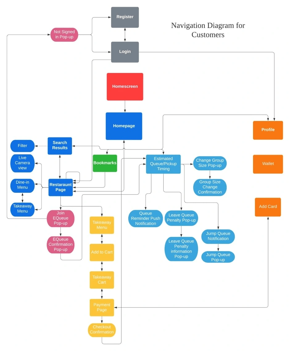
Navigation Diagram

Design is for the people, and when a product or an interface is designed well, not only does it allow for ease of usage, but it can even empower people.
Prototyping does not stop when the designers have completed the interface. The success of a good design lies in empathising with the user and it is important to test the prototype with users or even experts, because we never know what insights they can provide, and whether the interface is user-friendly.
Like this project
Posted Dec 7, 2021
Likes
0
Views
40


