Print Package Portfolio
Leandro Oliveira
Project Spotlight: Designing the Flavours of Dublin
In the food and beverage world, a menu is more than a list of prices—it’s the first "bite" a customer takes. Whether it’s high-energy Brazilian fusion or elegant organic coffee, the design has to match the taste. Here’s a look at how I’ve been helping Dublin’s food scene translate its flavours into visual branding.
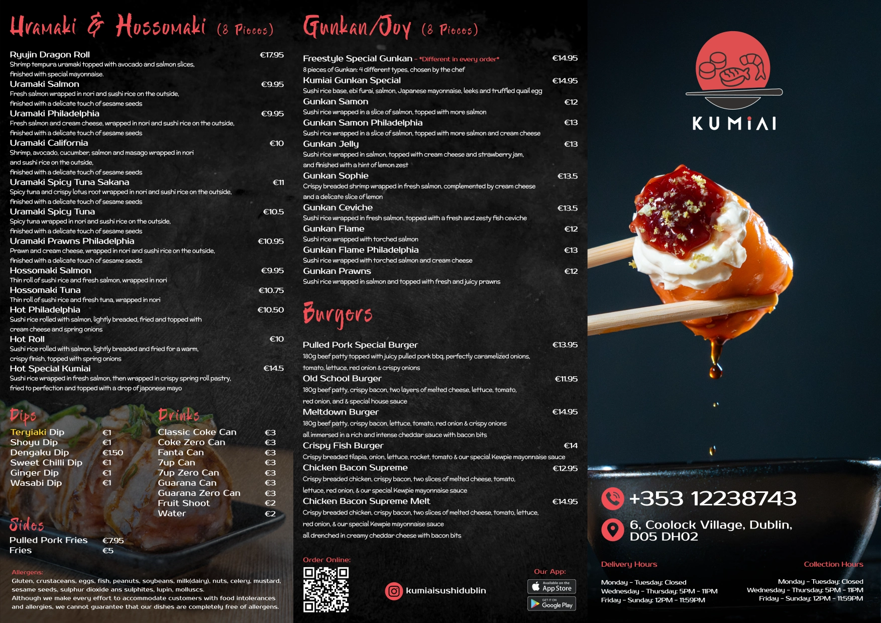
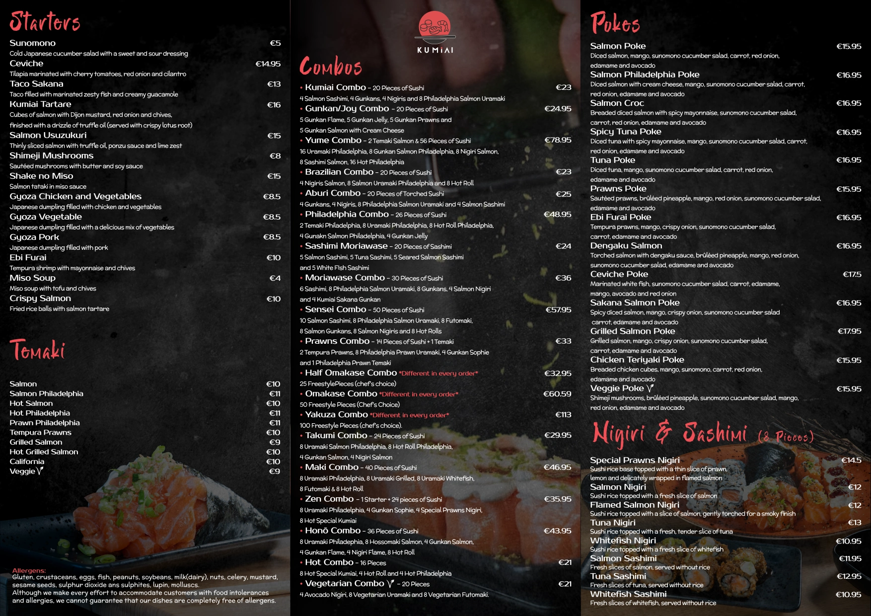
Kumiai Sushi | Minimalist Precision
Sushi is all about detail and freshness, so the menu needed to feel just as "clean."
The Focus: I prioritized a diverse but easy-to-navigate layout for their A3 and A4 menus, ensuring the "Incredible Selection" didn't feel overwhelming for the customer.
Format: Scaled specifically for high-speed takeaway environments where clarity is key to driving sales.
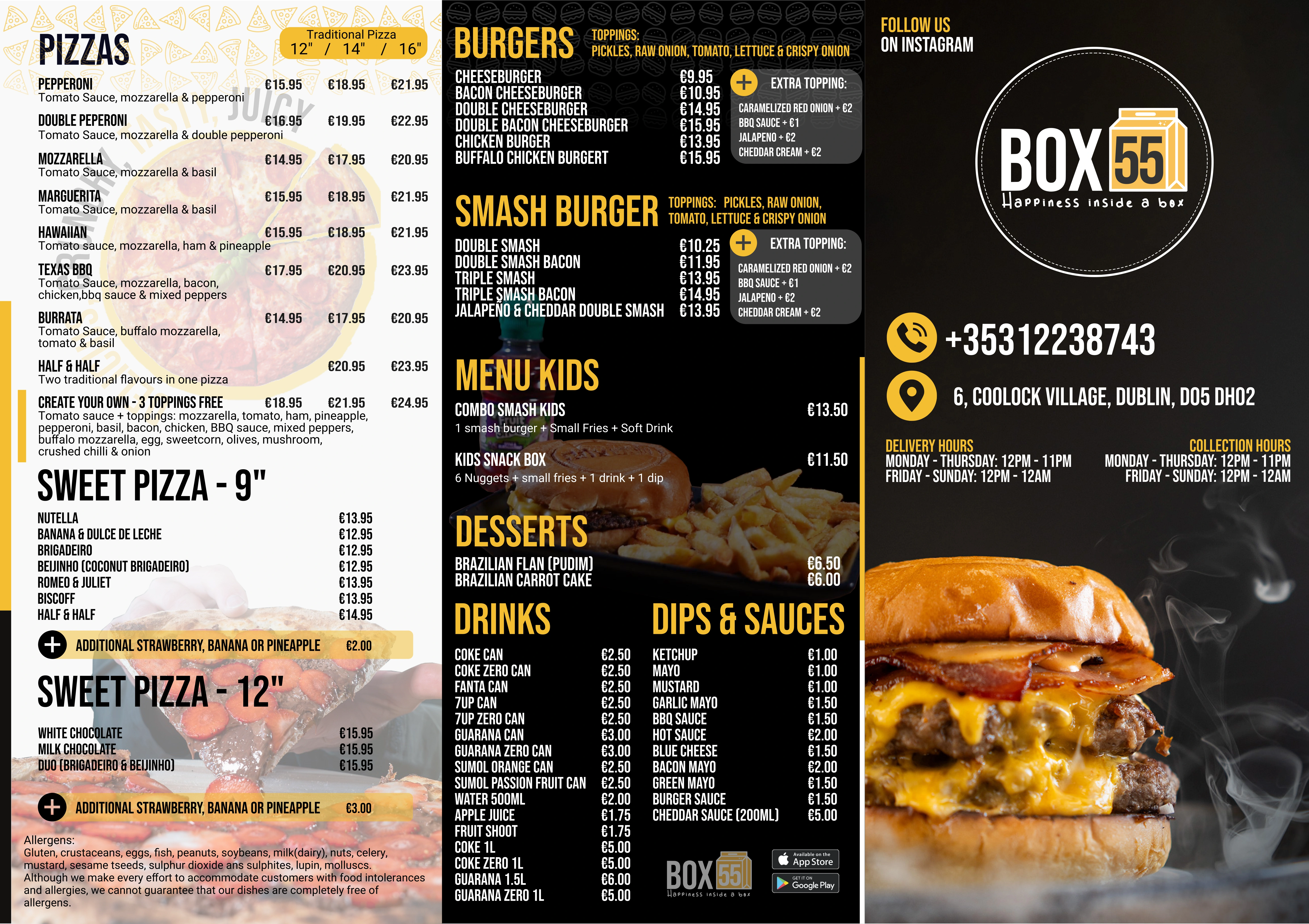
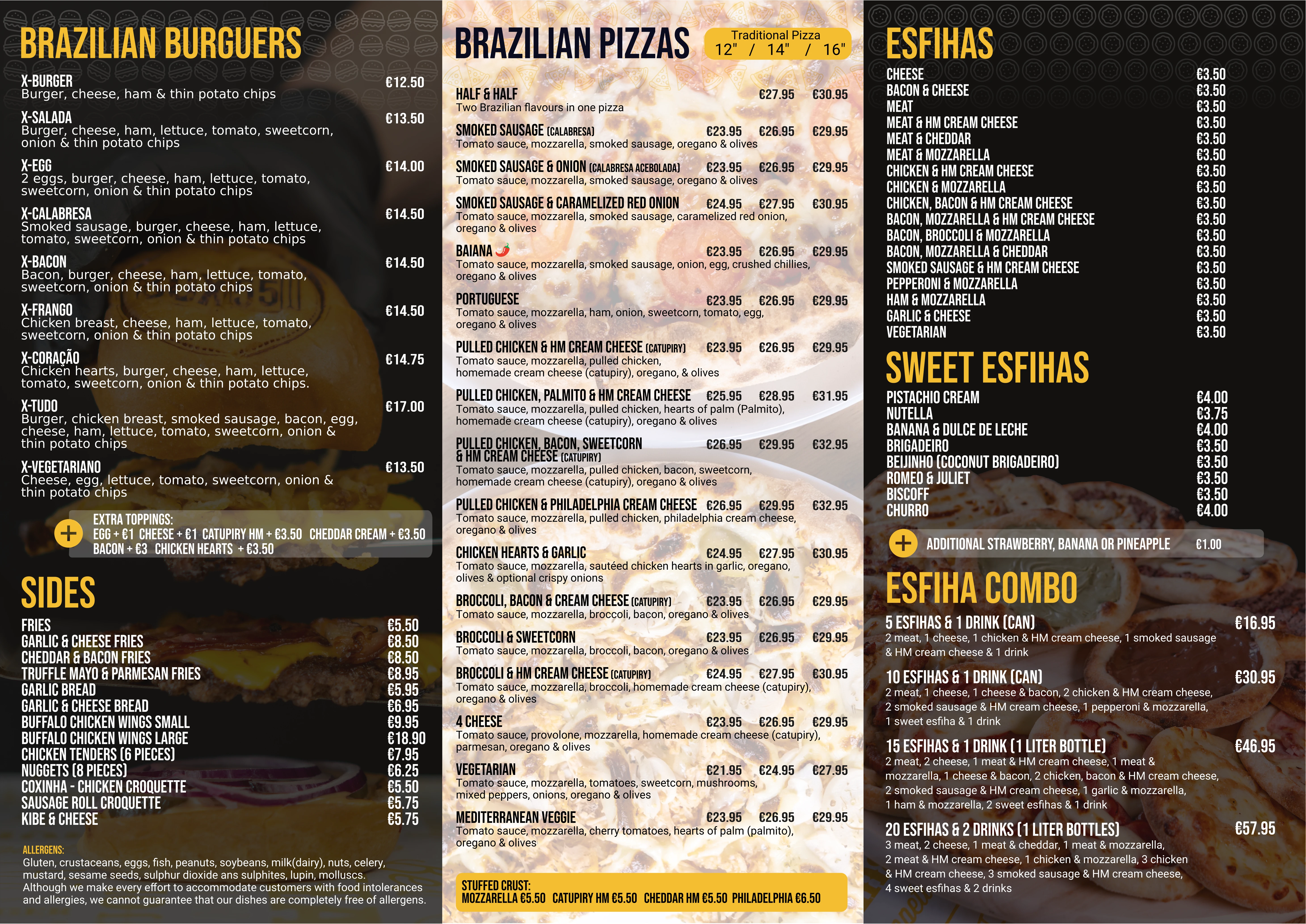
Box 55 | The Art of the Fusion Menu
Working with Box 55 in Dublin was a masterclass in brand alignment. The goal was to create a cohesive experience between their physical space and their takeaway service.
The Strategy: I integrated custom photography with a colour palette that mirrors the restaurant’s high-energy branding.
The Assets: We developed a dual-format system: a large-scale A3 in-store menu and a foldable A4 version designed specifically for delivery orders.
The Result: A seamless transition from "scrolling on Instagram" to "ordering at the counter." And yes, their burgers are just as good as they look in my photos!
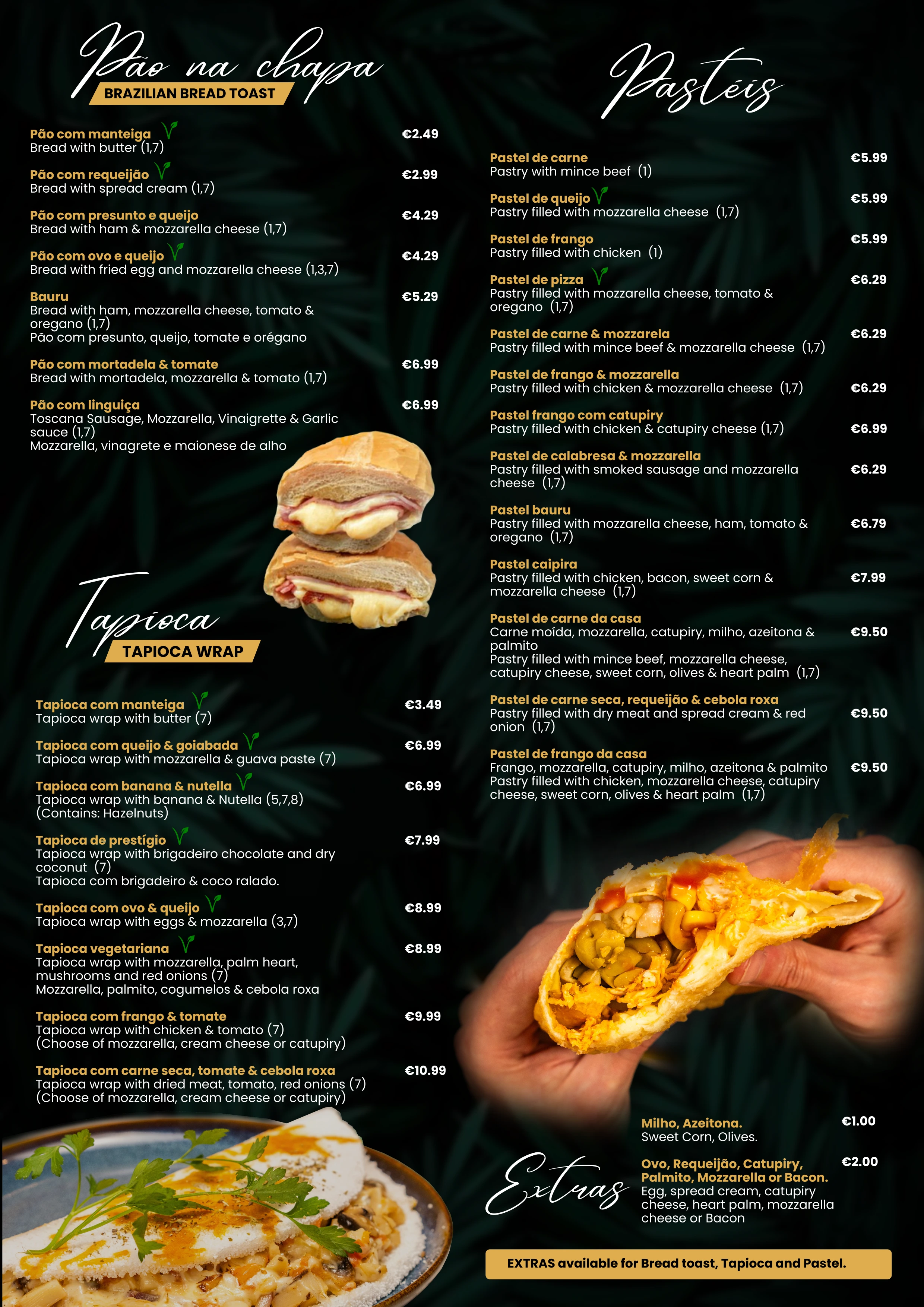
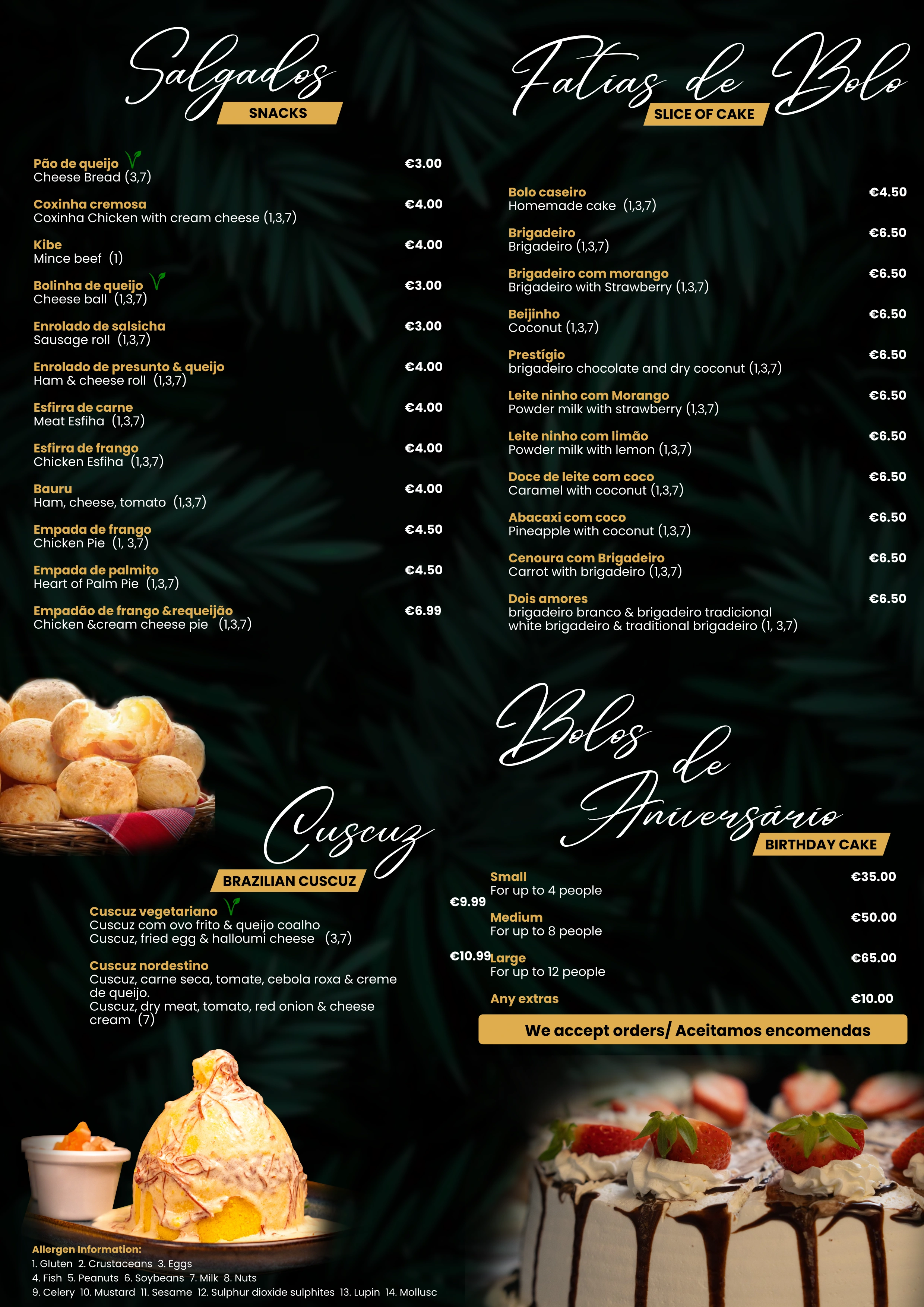
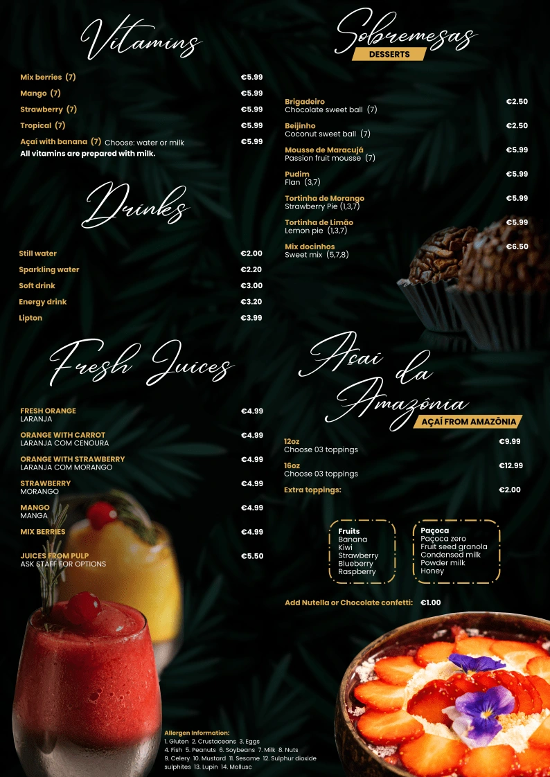
Crunchy Brazilian Taste | Party-Ready Branding
When your business foscuses on "confraternization" and parties, your menu needs to be shareable.
The Concept: I designed a foldable A4 "party menu" specifically to be tucked into delivery bags, acting as a silent salesman for the customer’s next big event.
Visual Impact: A bold A3 layout for the shopfront ensures that even a quick glance tells the customer exactly what the "Traditional Brazilian Taste" is all about.
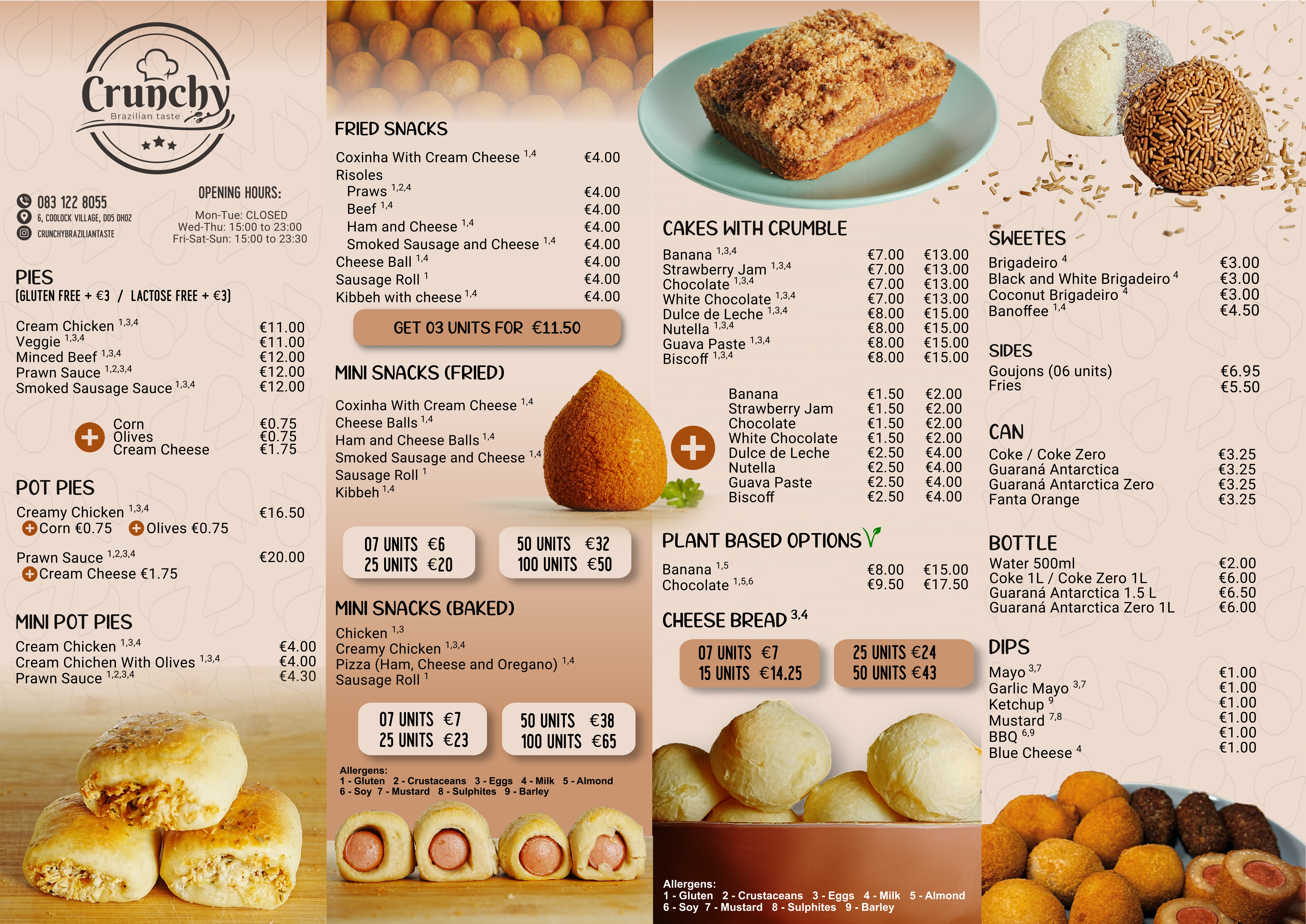
Menu A3
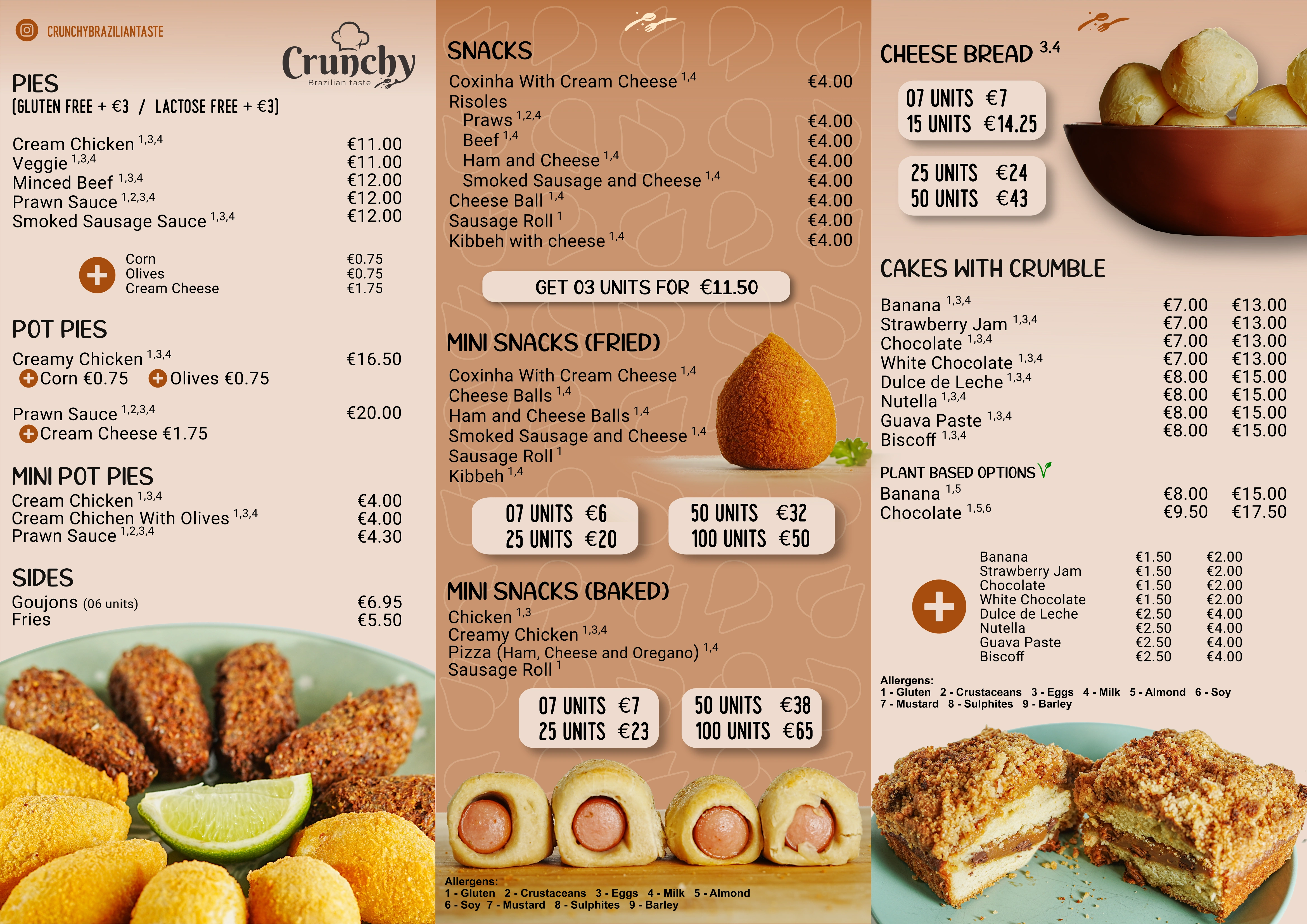
Menu A4 Foldable - Inside
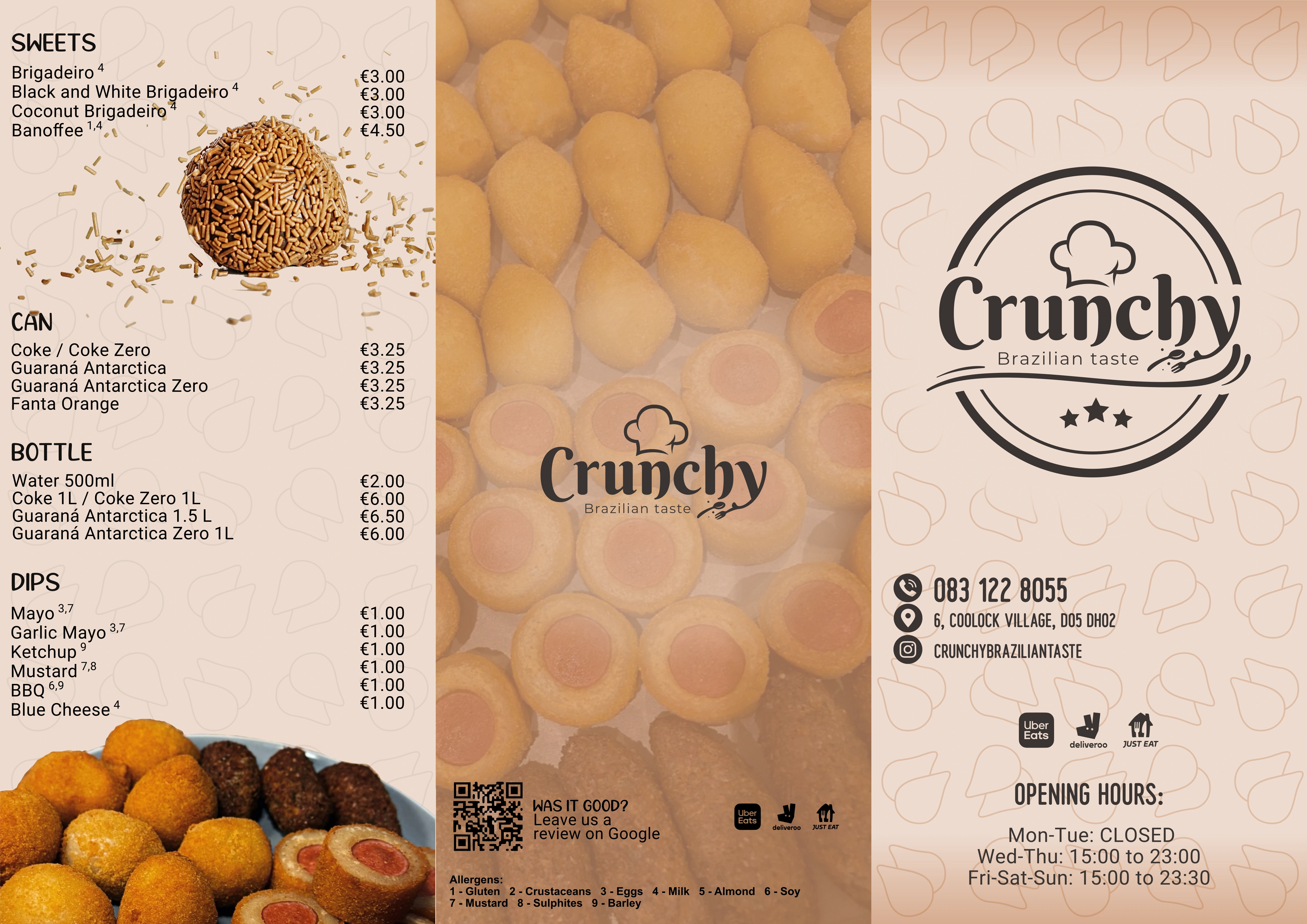
Menu A4 Foldable - Inside
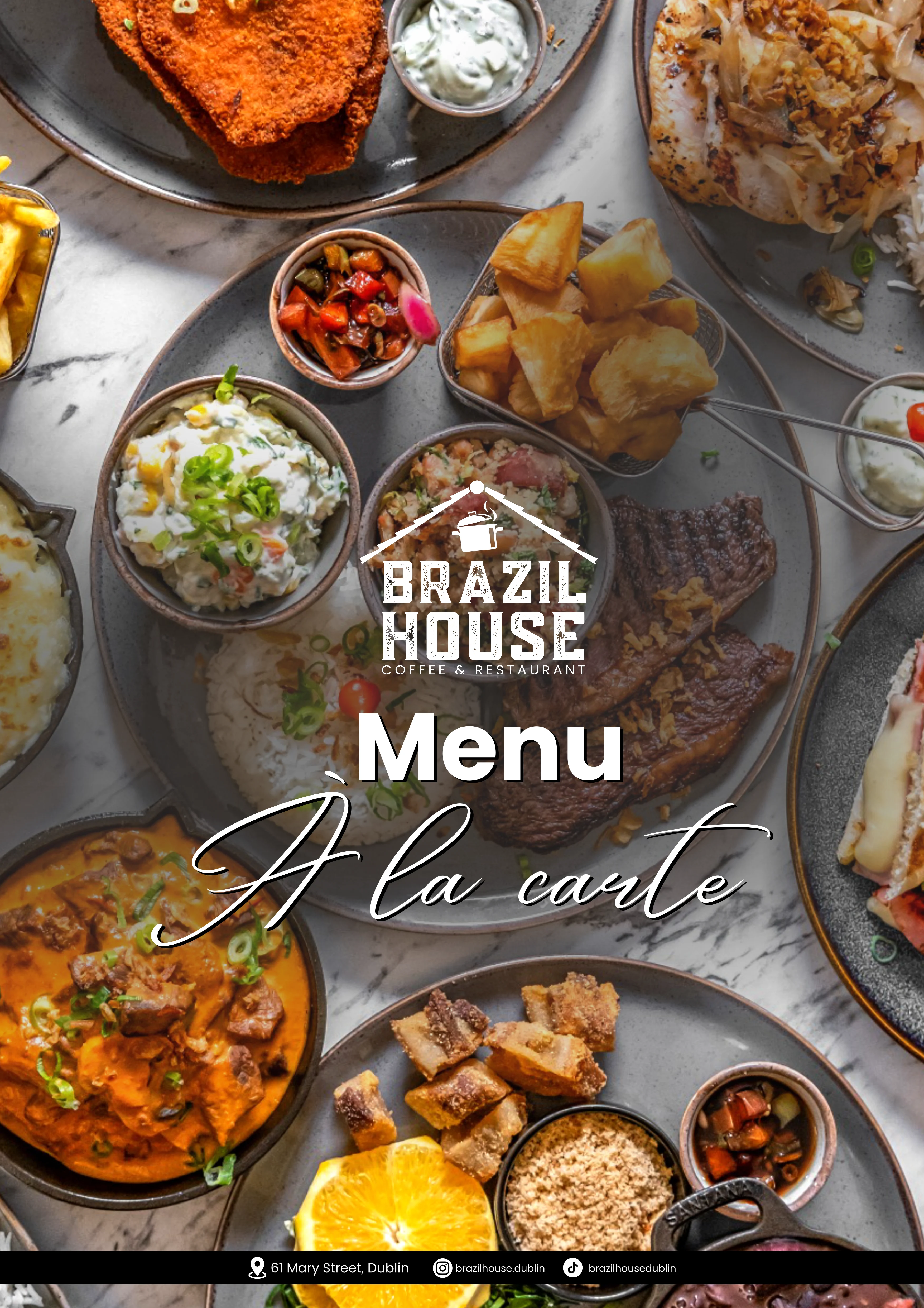
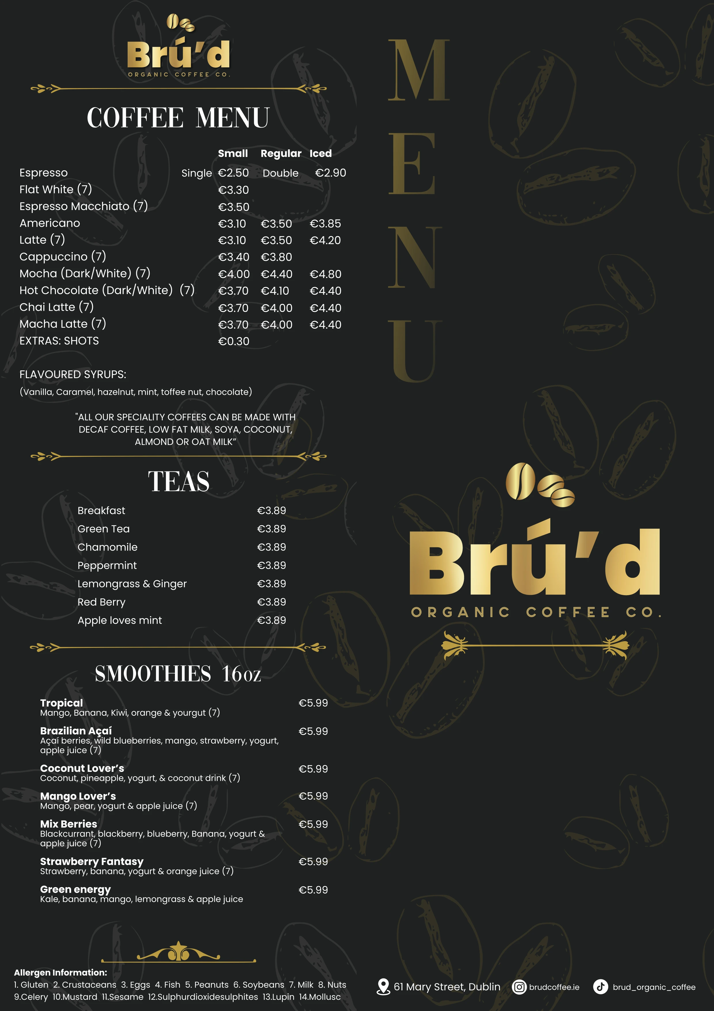
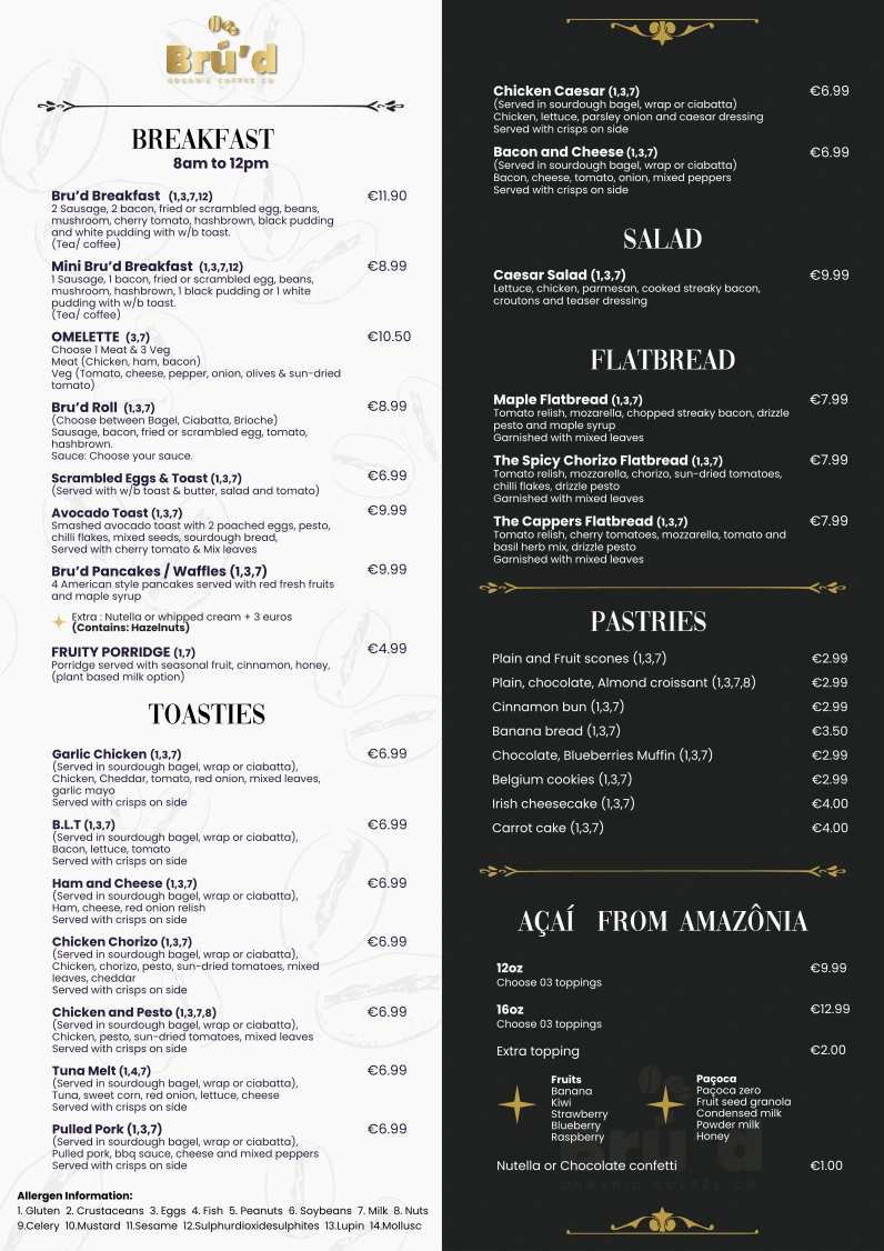
Bru’d Coffee & Brazil House | One Space, Two Personalities
This was a unique challenge: managing two distinct brand identities under one roof. Brazil House needed a traditional, welcoming "à la carte" feel, while Bru’d Organic Coffee required something more charming and elegant.
Design Contrast: For Brazil House, the menus (A3 and A4) followed a consistent, robust line for breakfast and dinner. For Bru’d, I pivoted to a more sophisticated, "boutique" style to match the organic coffee vibe.
The Layout: I utilised vertical A3 for the café walls and foldable A4 for customers to take home, ensuring the brand stayed in their kitchen long after the coffee was gone.
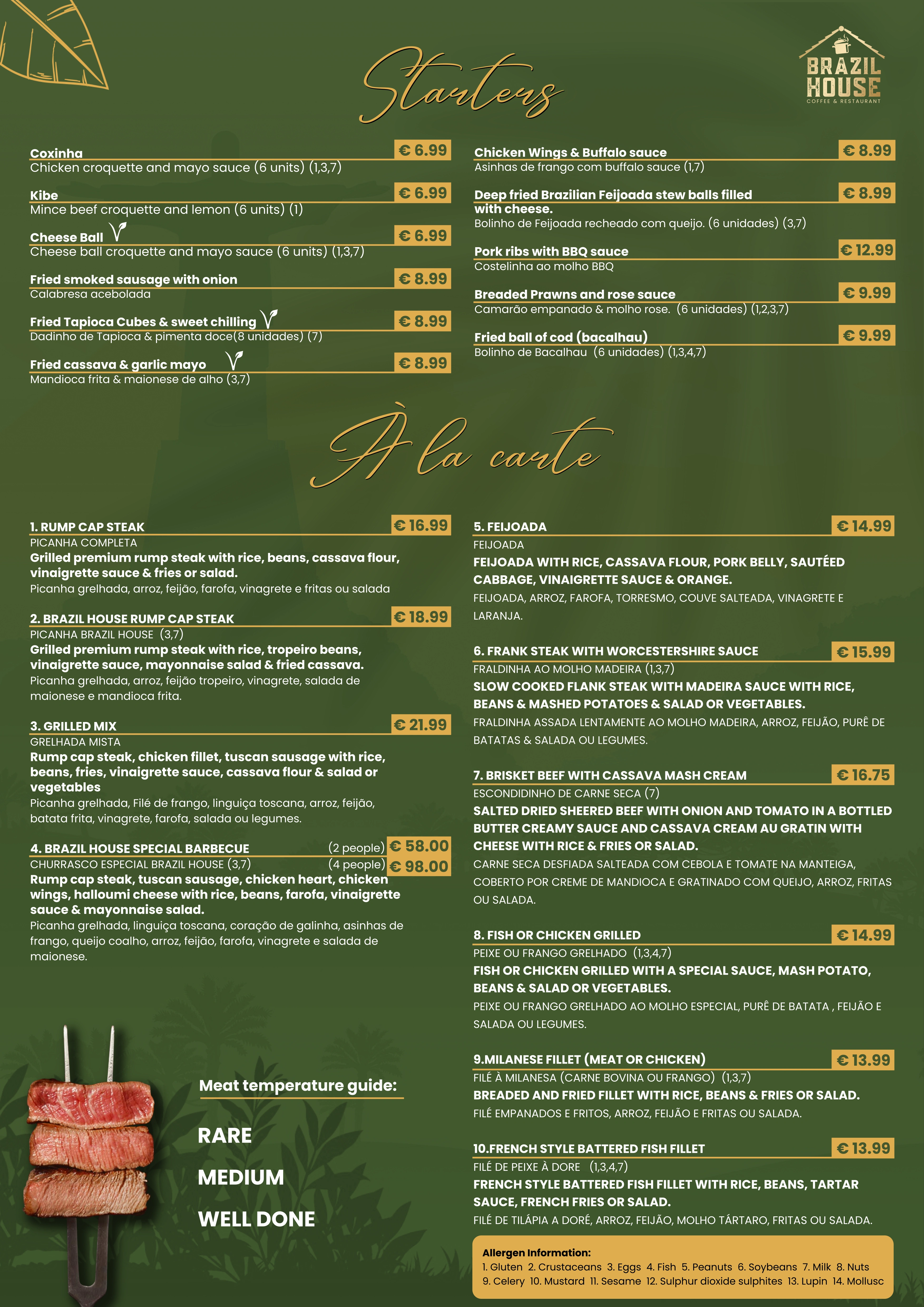
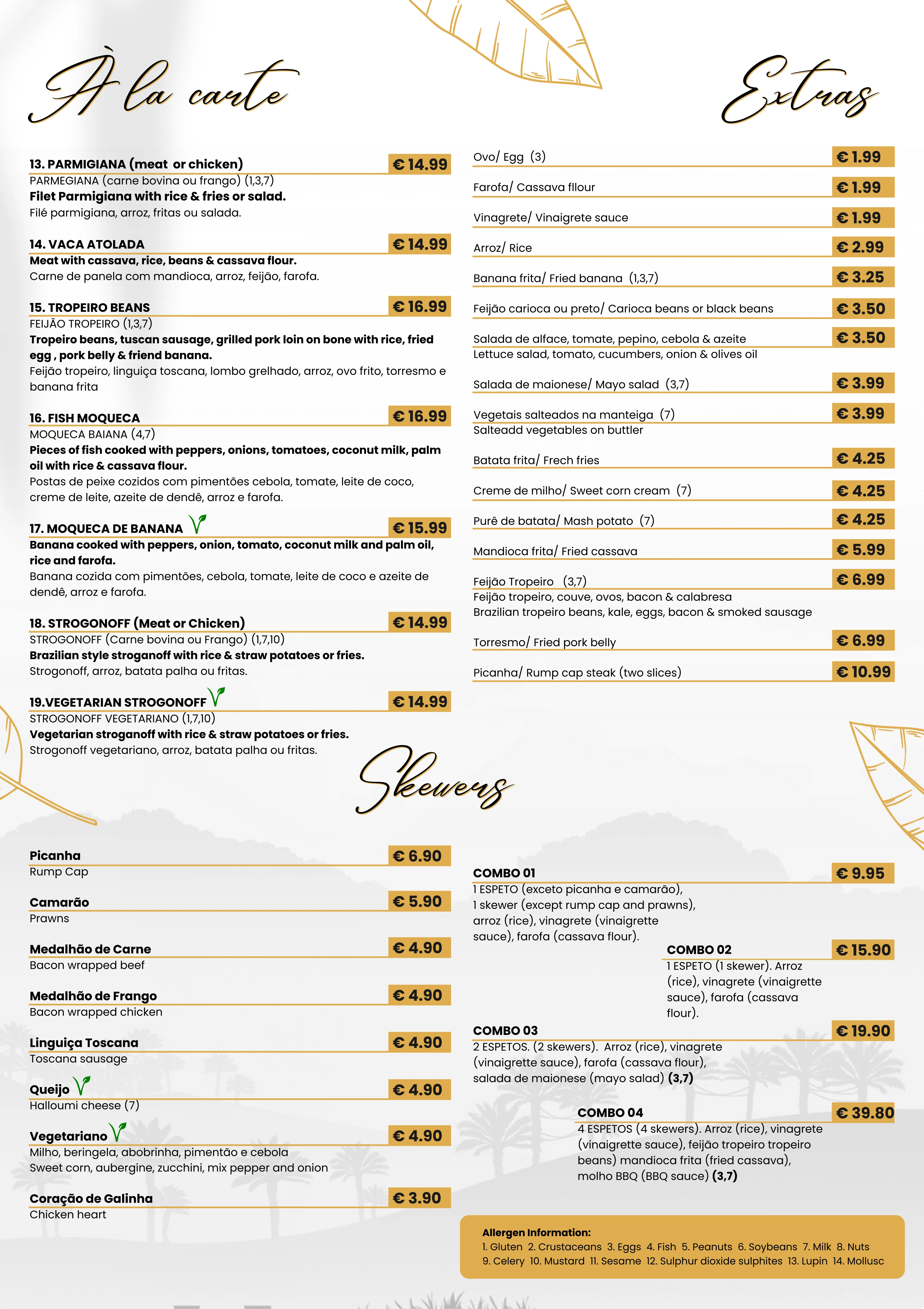
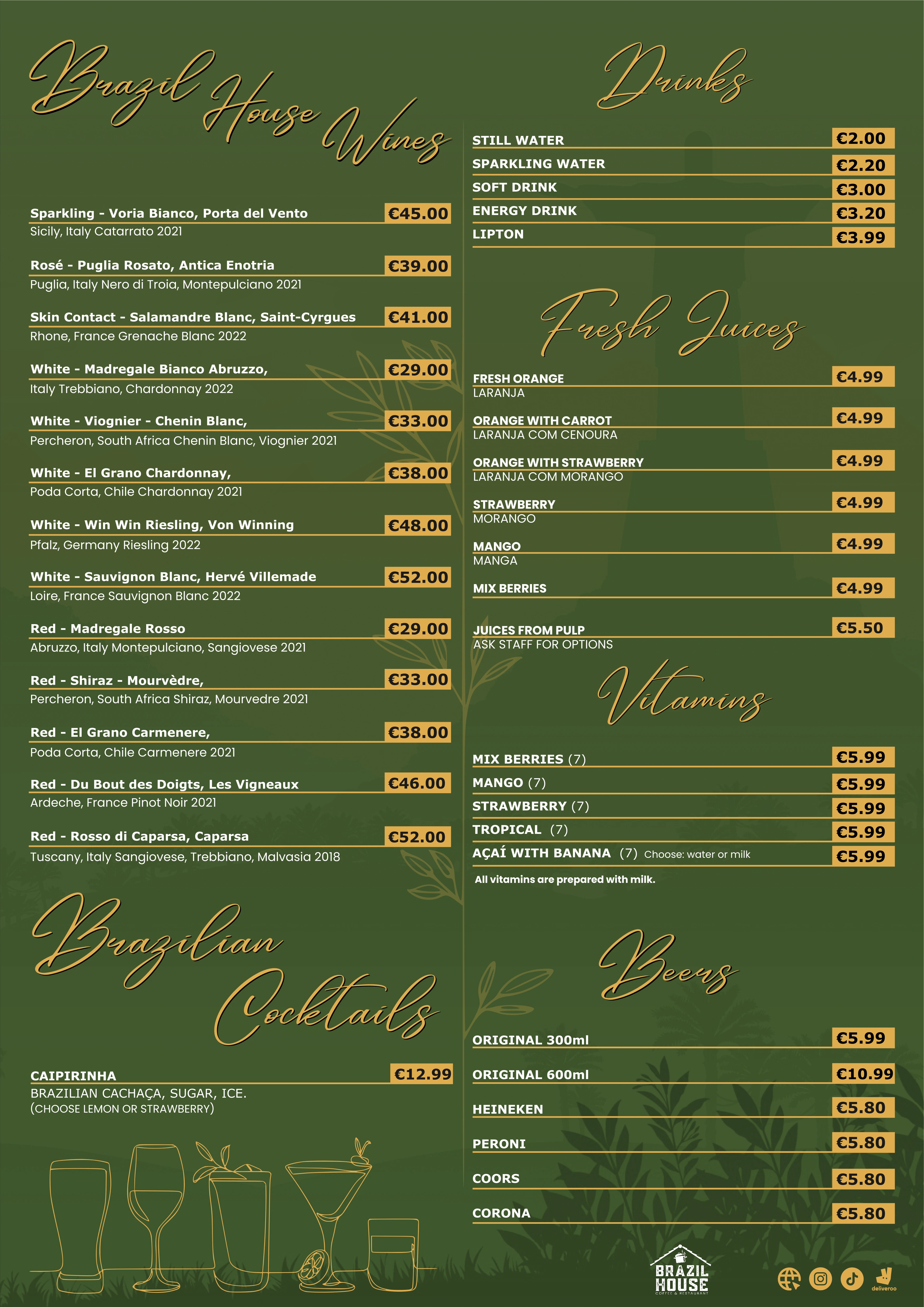
Brazil House Menu A La Carte:
Brazil House Menu Breakfast:

Bru'd Organic Coffee:
Why this matters for your brand
As I discussed in my [recent coffee chat about Personal Branding], choosing to show the process behind these menus - not just the final printable - is what builds trust with future clients.
Whether I’m shooting B-roll for Box 55 or designing a layout for Kumiai, the goal is always the same: High-energy visuals that sell.
Like this project
Posted Sep 9, 2024
Professional design for menus, brochures, flyers, and printed marketing materials created for restaurants, cafés, and hospitality brands across Dublin.
Likes
1
Views
28