Website Redesign for Xoria

Emmanuel Bliss
1 collaborator


A website that needed a clearer direction.
When the founder of Xoria spoke to me about their website, I saw an opportunity to help.
Xoria was building a platform designed to turn revenue signals into coordinated action across a team's tools. The product had a clear purpose, but there was an opportunity to make that purpose come through more effectively in its online presence.
I decided to conduct a free UX audit to explore what could be improved.
I wasn't approaching it as a case of simply making the website look better. I wanted to understand how the existing experience presented the product and how a different design direction could help Xoria communicate its value.

Finding the direction.
The audit became the starting point for a deeper exploration of the website.
I looked at the existing interface and explored ways to make the experience feel more distinctive, intentional, and connected to the product itself.
From there, I began rethinking the landing page's visual direction, from the hero section and typography to the layout, calls to action, and product presentation.
Making the product stand out.
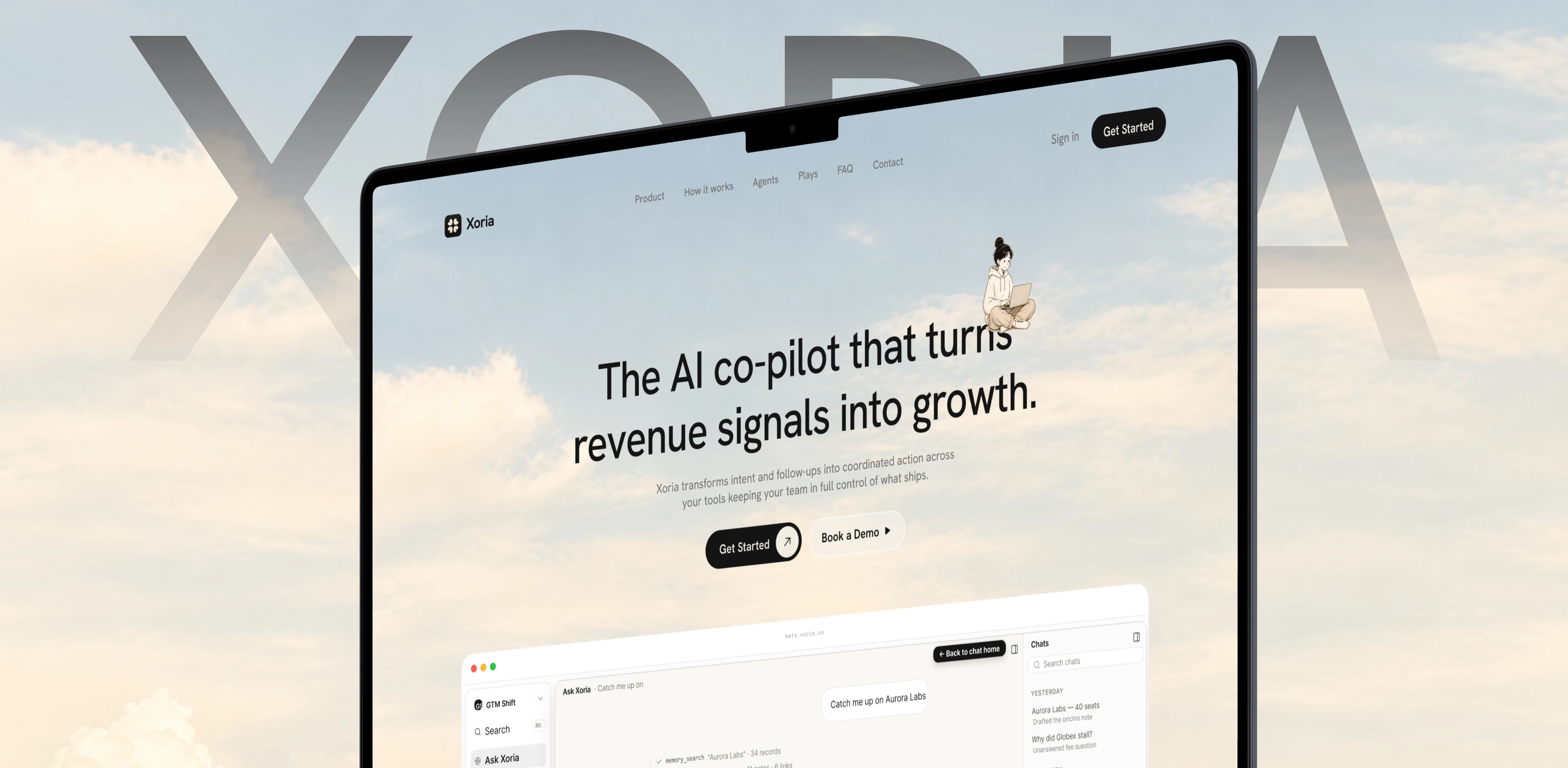
For the redesign, I explored a softer, sky-inspired visual direction that gave Xoria a more distinctive look.
I reworked the hero section to create a stronger focal point, refined the typography and content hierarchy, and brought the product interface into the composition so visitors could see more of what they were being introduced to.
The idea was to move beyond a conventional SaaS landing page and give Xoria a visual presence that felt more considered and recognisable.
Each change contributed to a more cohesive presentation of the product, with the interface and visual atmosphere working together rather than feeling like separate pieces.
The difference.
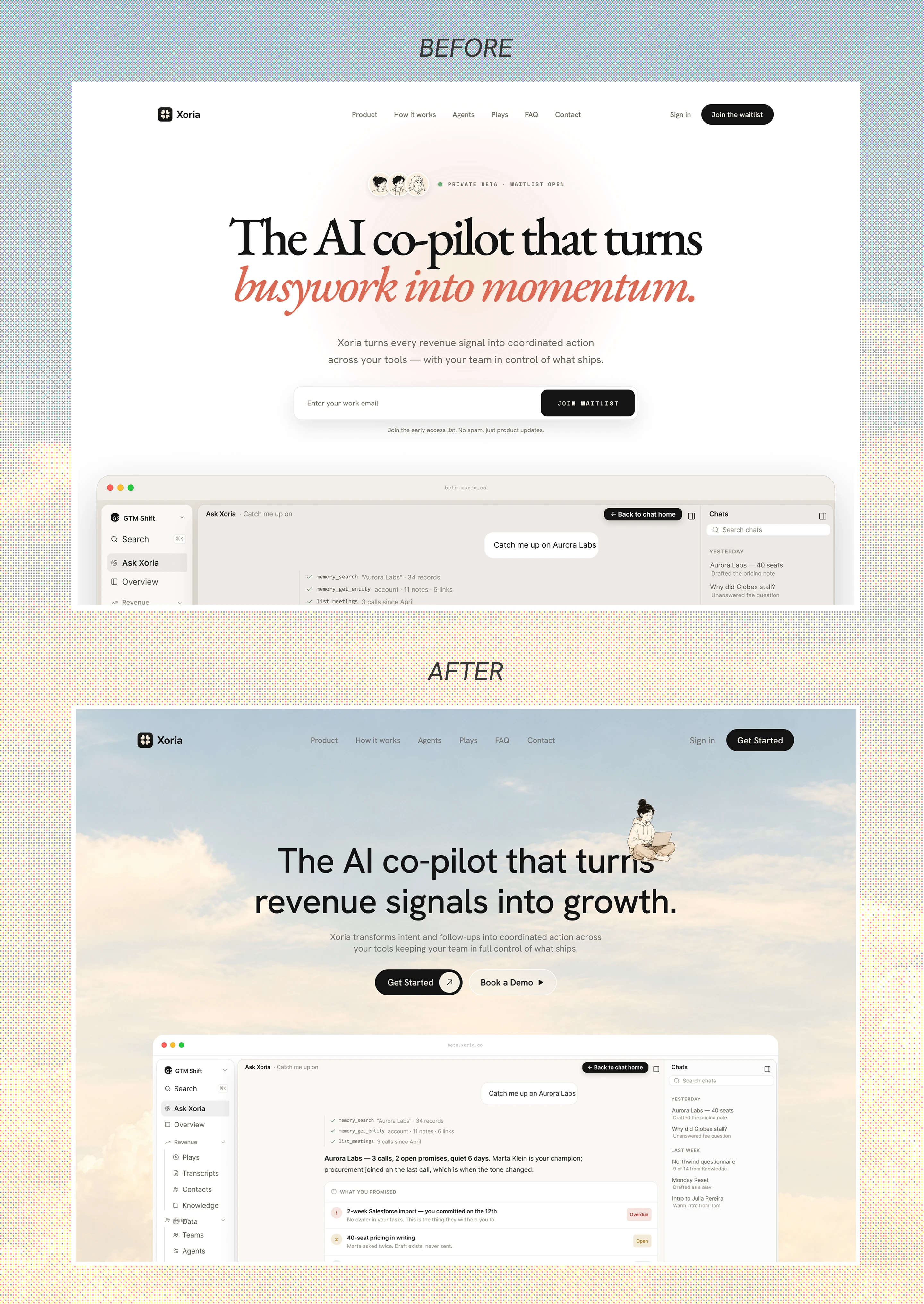
The before-and-after comparison shows how the direction evolved.
The original website had a simpler, predominantly white presentation. The new direction introduced a more expressive visual atmosphere, stronger hierarchy, and a more integrated product preview.
More importantly, the redesign gave the team a clearer direction for presenting Xoria online.
And that was the part that mattered most to me: helping the team move from uncertainty about the design to a direction they felt good about.
Hearing it from the team.
The feedback from Xoria meant a lot because it spoke directly to the reason I took on the project in the first place.
“We we're kinda lost on where to go design wise, after Emmanuel stepped in everything became more clear. With the help of Kre8mind, we at xoria were able to create a better website to better display our product in a way that it becomes clear what we're trying to sell.”
Rafael Ribeiro
For me, this was a reminder that design work doesn't always begin with a screen. Sometimes, the most valuable thing you can bring to a project is direction.
More than a redesign.
What started as a free UX audit became an opportunity to help Xoria rethink how it presented its product to the world.
I'm glad we could turn that initial conversation into a clearer visual direction and a website the team felt more confident about.
Because good design isn't just about how something looks. It's also about helping people understand what they're looking at, why it matters, and what makes it worth their attention.

Like this project
Posted Oct 9, 2026
Redesigned Xoria's website to improve product presentation and communication.
Likes
2
Views
1
Clients
Xoria, Inc.
Collaborators