BOLD

About the Brand
Bold is a platform built around one central belief: audacity is a catalyst for growth. The brand exists to empower individuals to take courageous steps in uncertain moments, recognize progress, and transform challenges into opportunities. Positioned as a global movement rather than a single product, Bold speaks to trailblazers—students, young professionals, creatives, and community builders—who want to grow, be seen, and make meaningful impact.
The Challenge
Bold had a strong mission and a broad ecosystem of tools, from educational content and community forums to challenges and recognition initiatives. The challenge was not ambition, but clarity. The brand needed an identity that could unify these offerings under one clear idea—bold enough to inspire action, refined enough to build trust, and flexible enough to scale across platforms without losing meaning.
The Direction
The strategic shift was to position Bold as both a call to action and a point of elevation. Audacity was framed as intentional courage—something to practice, develop, and celebrate. This reframed Bold from a motivational concept into a system for growth, recognition, and empowerment, where individuals are encouraged not just to feel inspired, but to actively rise, participate, and progress.
Identity Concept
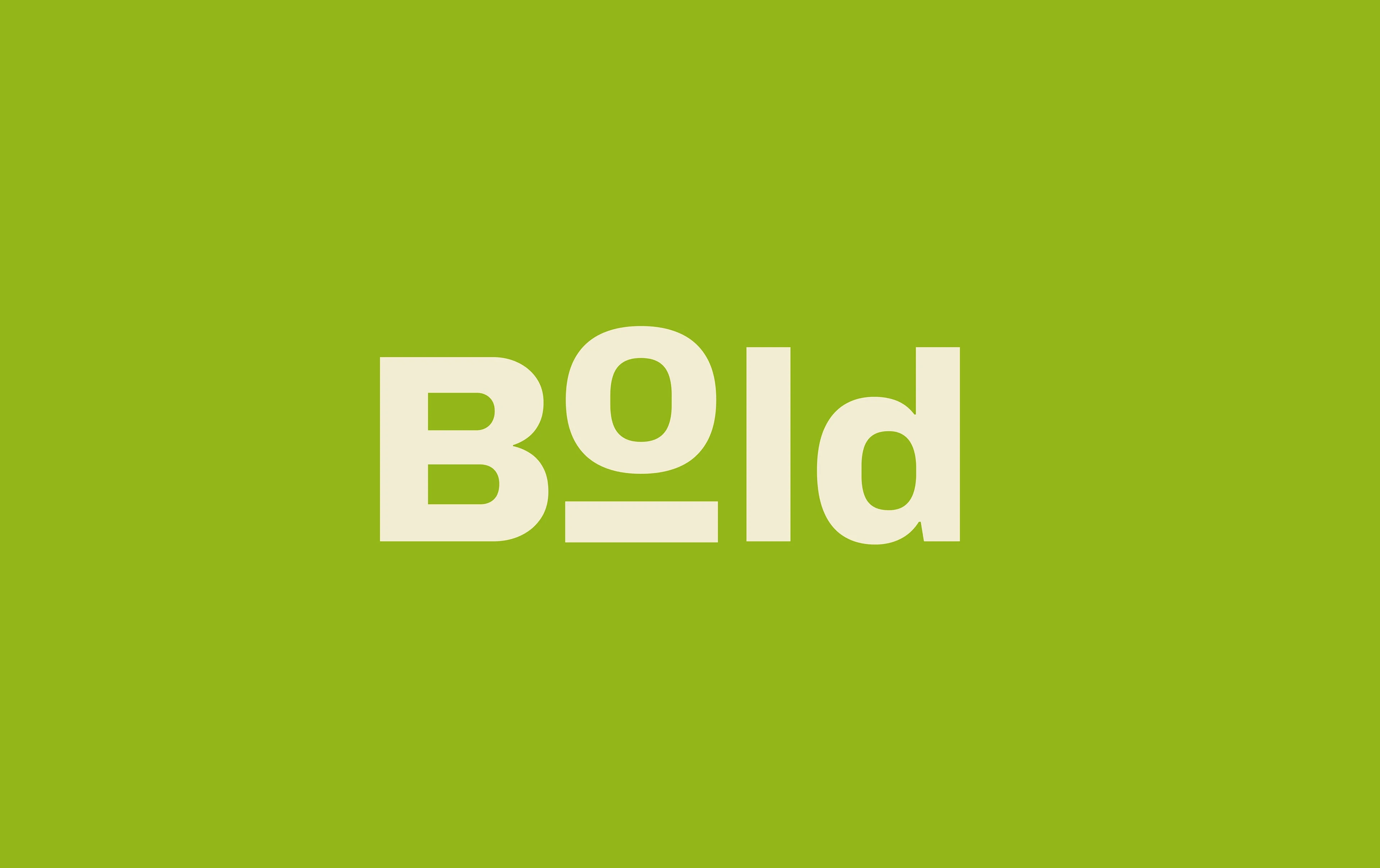
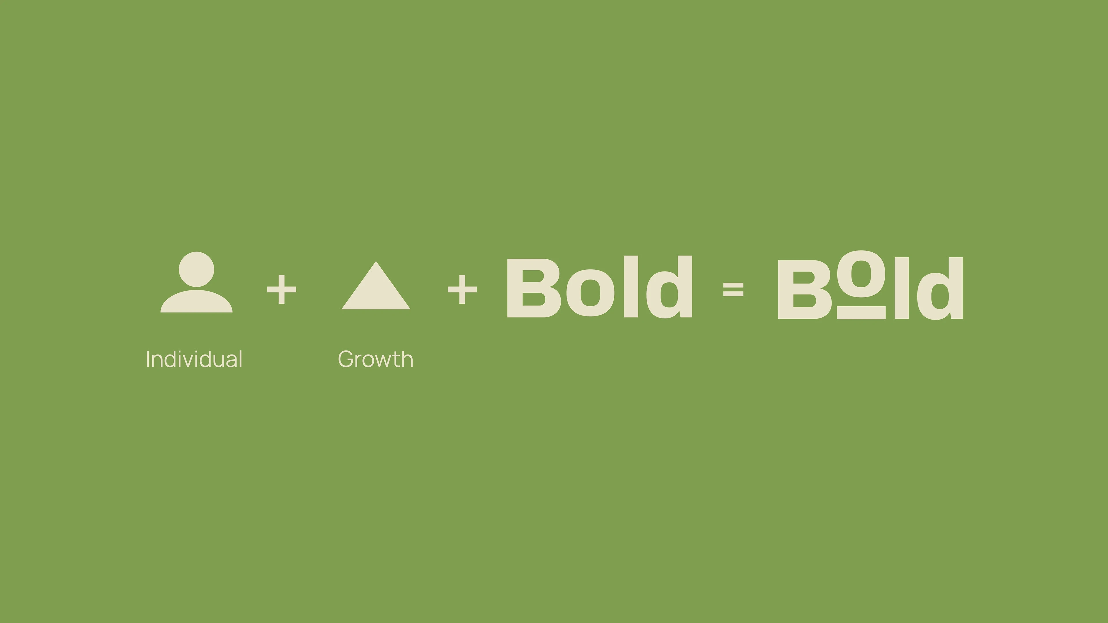
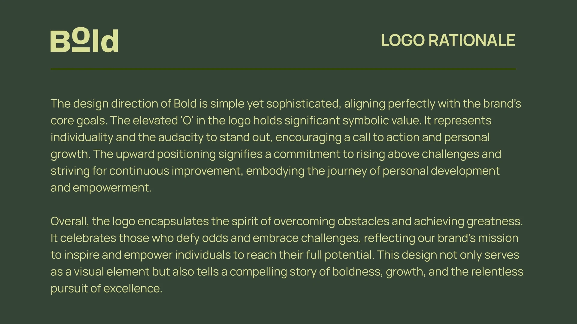
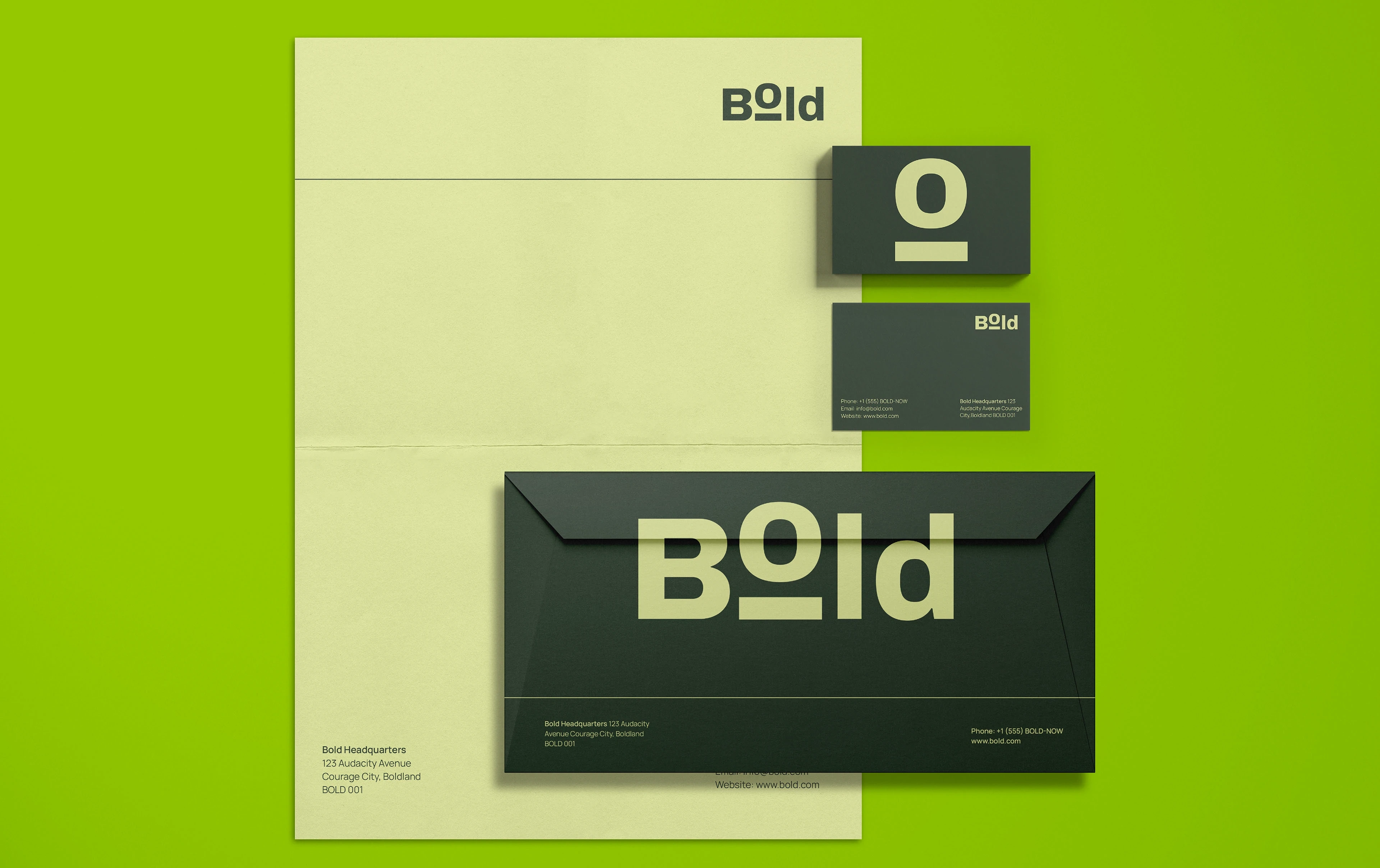
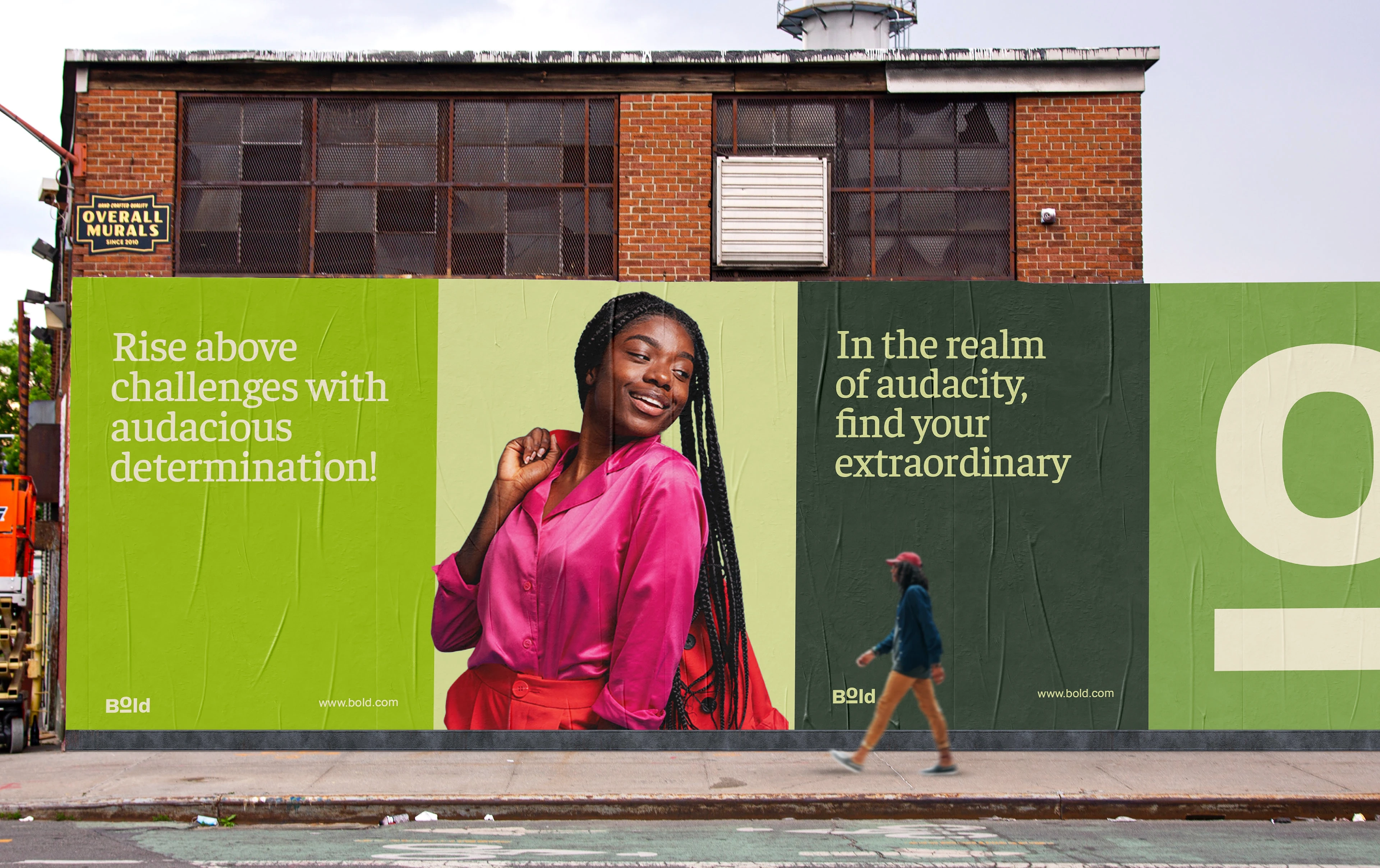
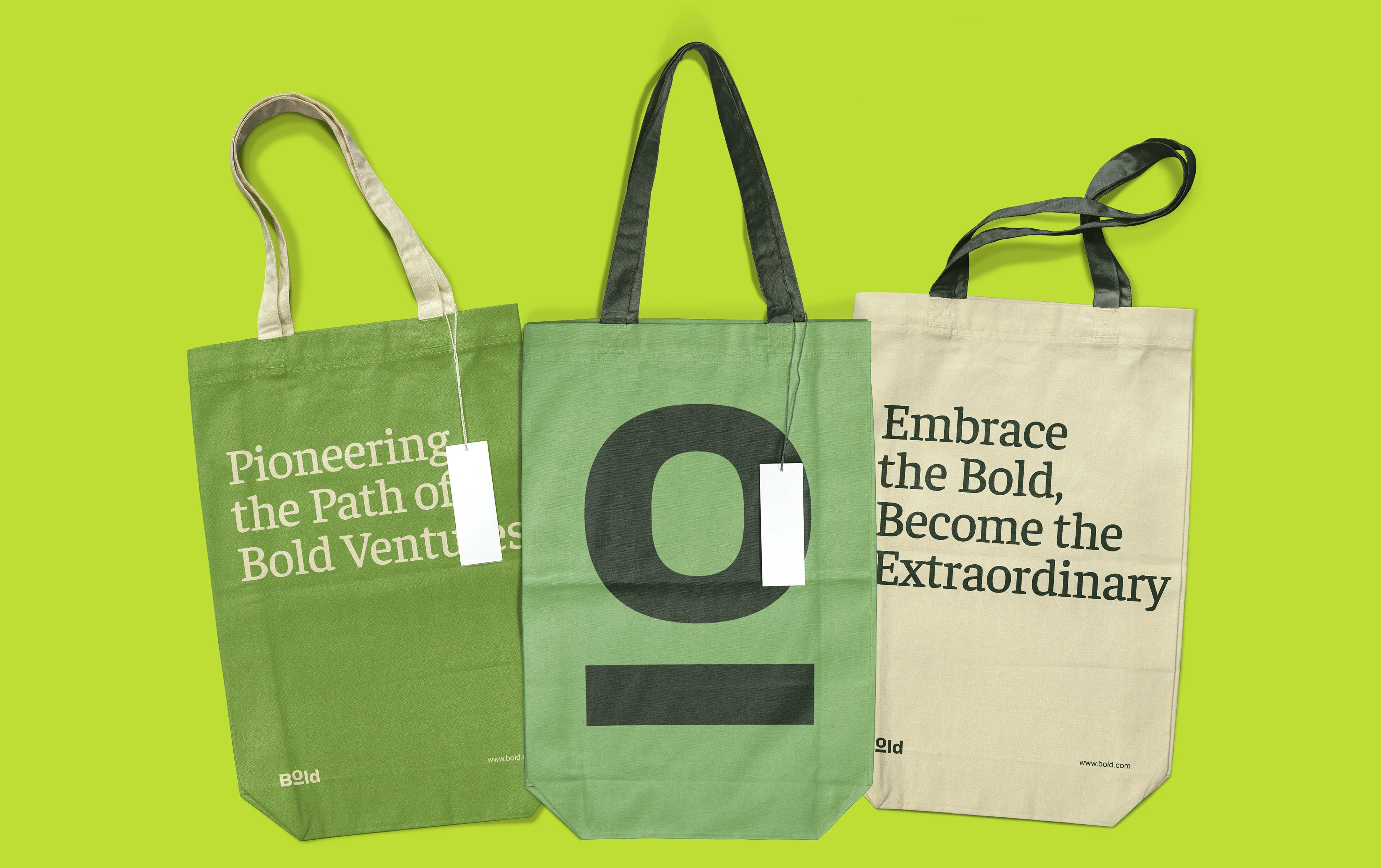
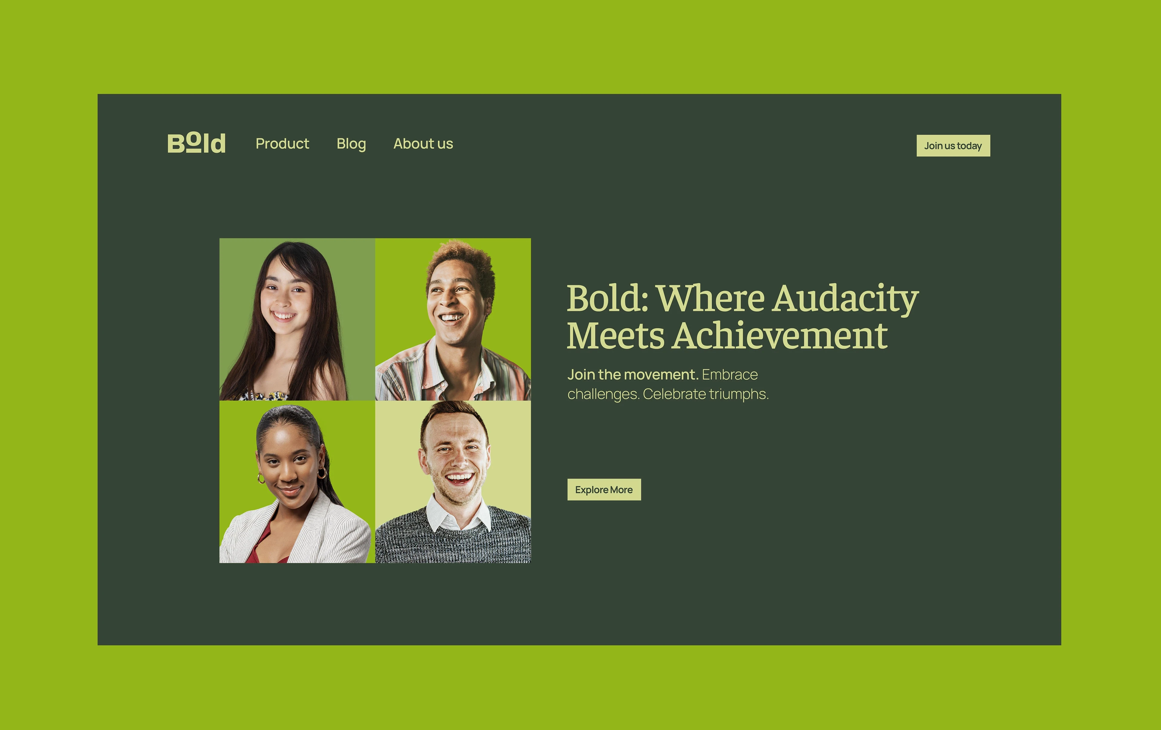
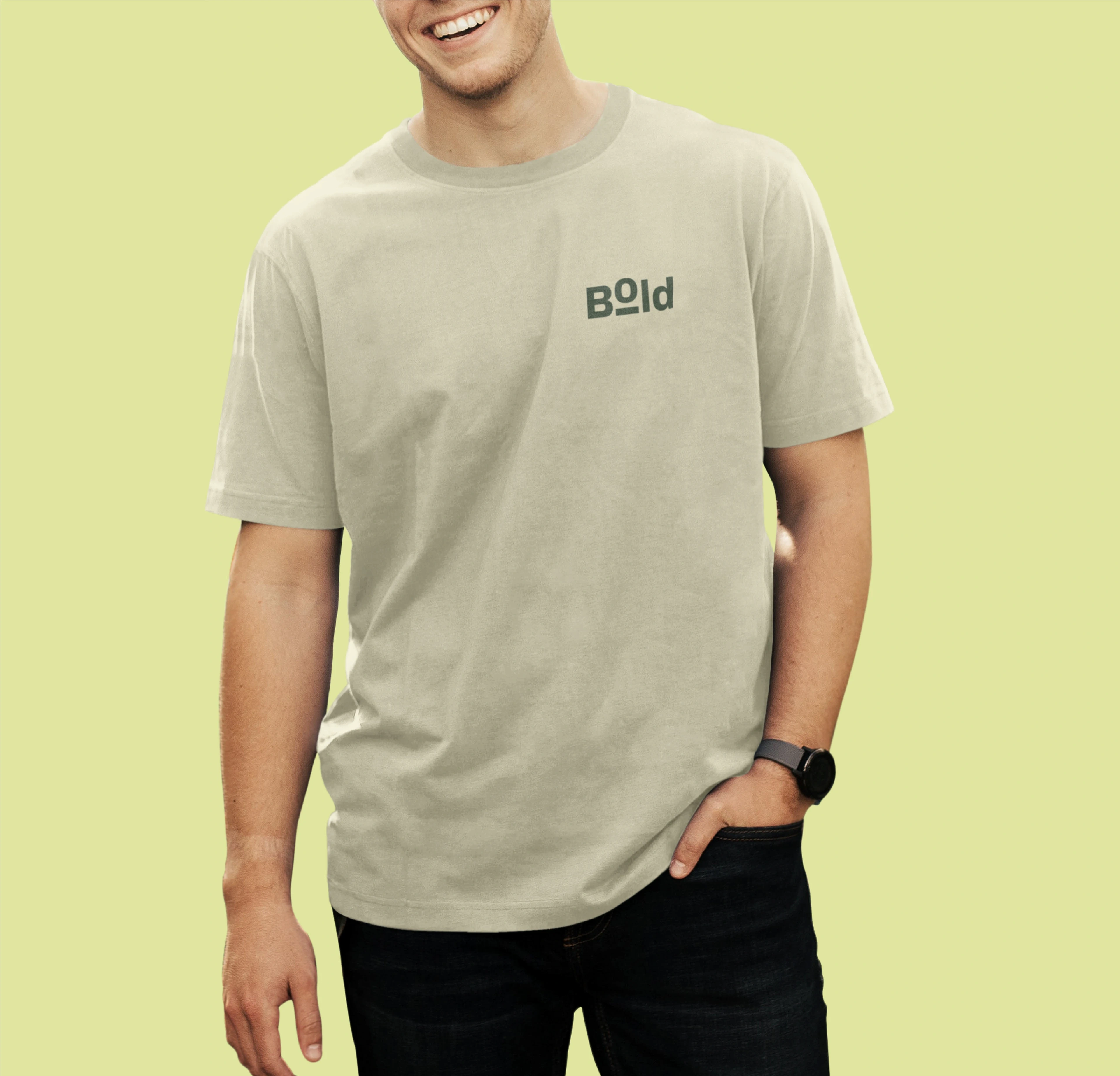
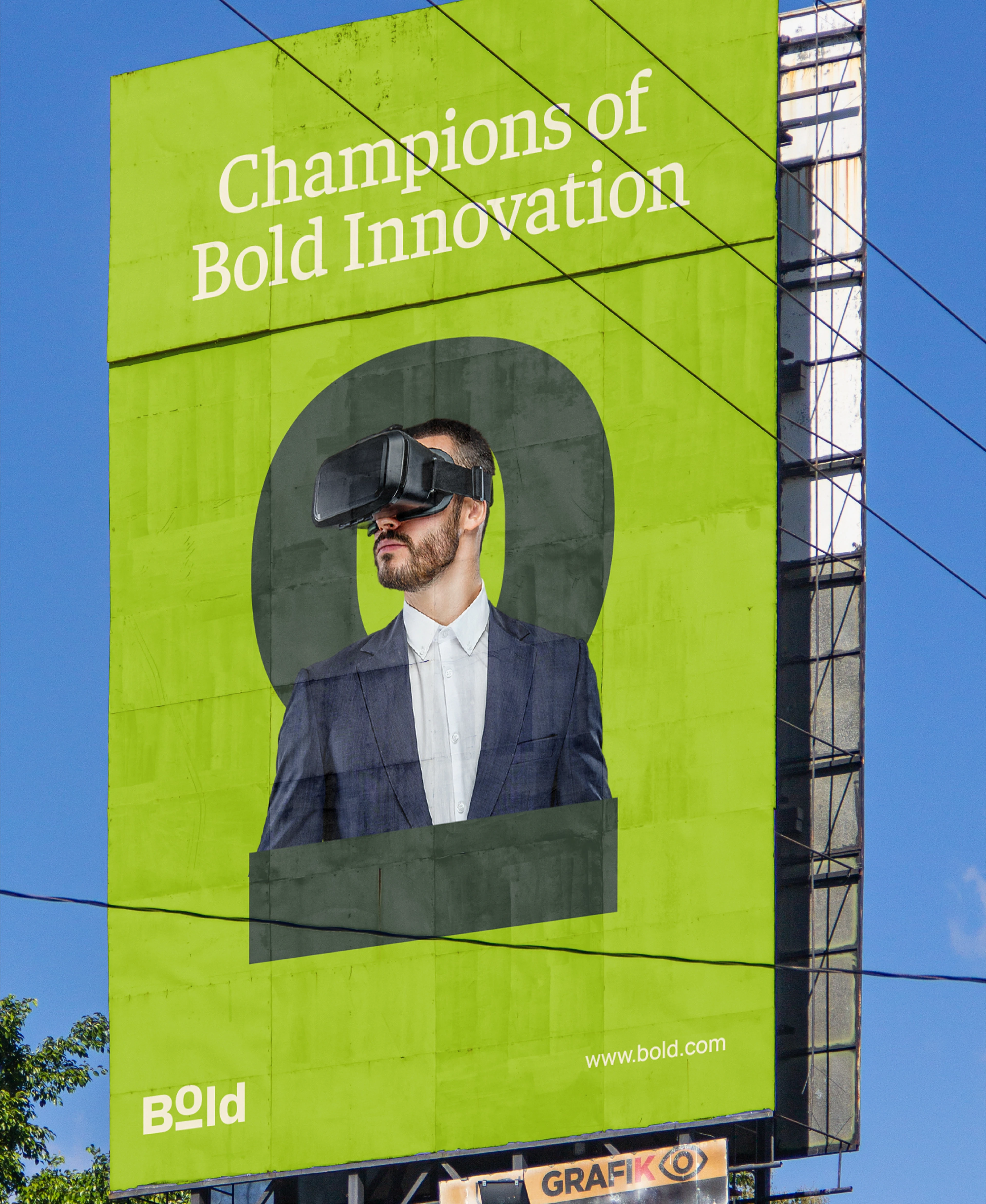
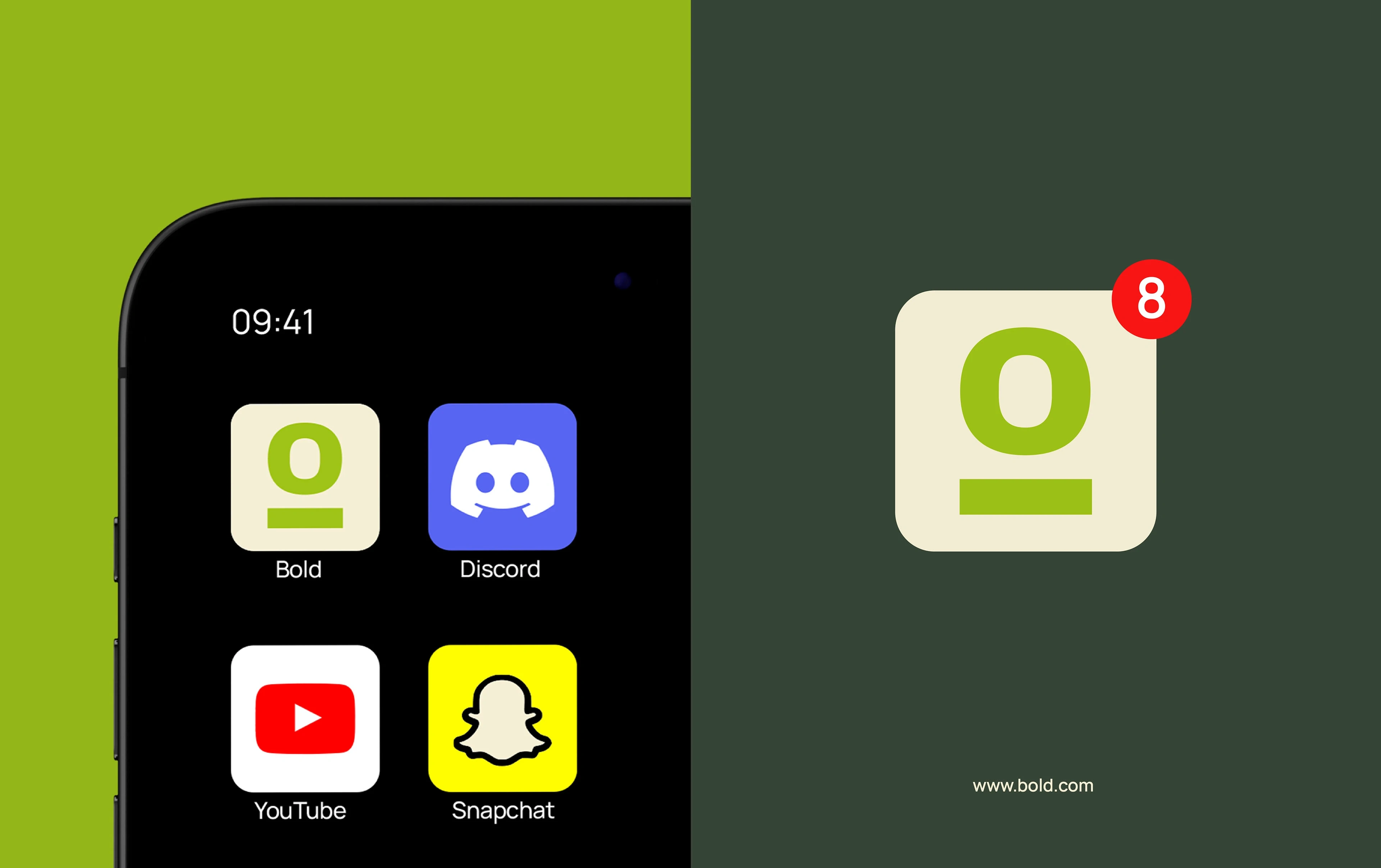
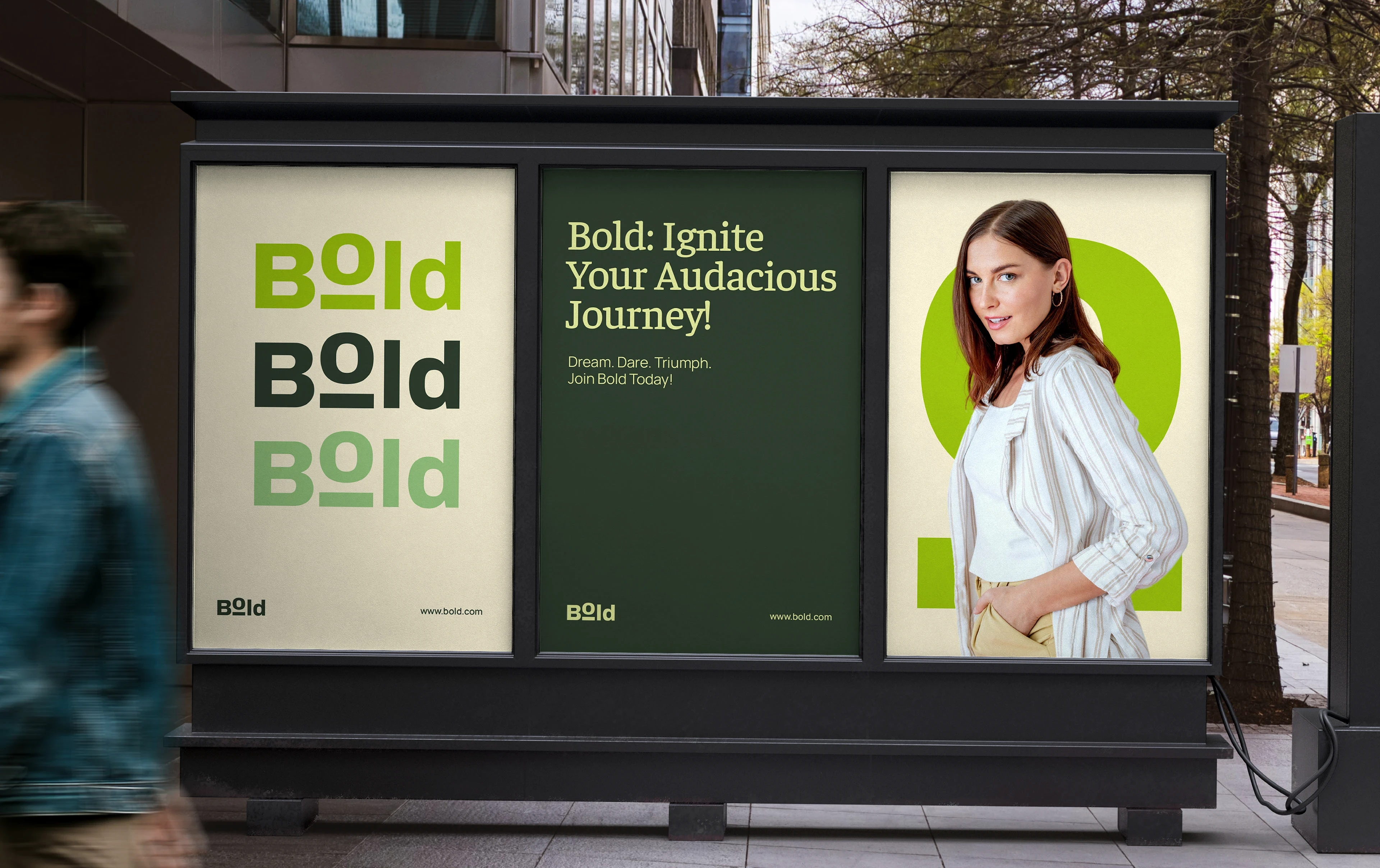
The identity was designed to be simple yet sophisticated, allowing the message to lead. At the center of the logo is the elevated “O,” a deliberate symbol of individuality, upward movement, and the decision to stand out. Its raised position represents growth, momentum, and the courage to rise above limitations. More than a visual feature, the mark acts as a constant reminder of Bold’s purpose: to encourage progress, self-belief, and the pursuit of excellence.
Typography & Color
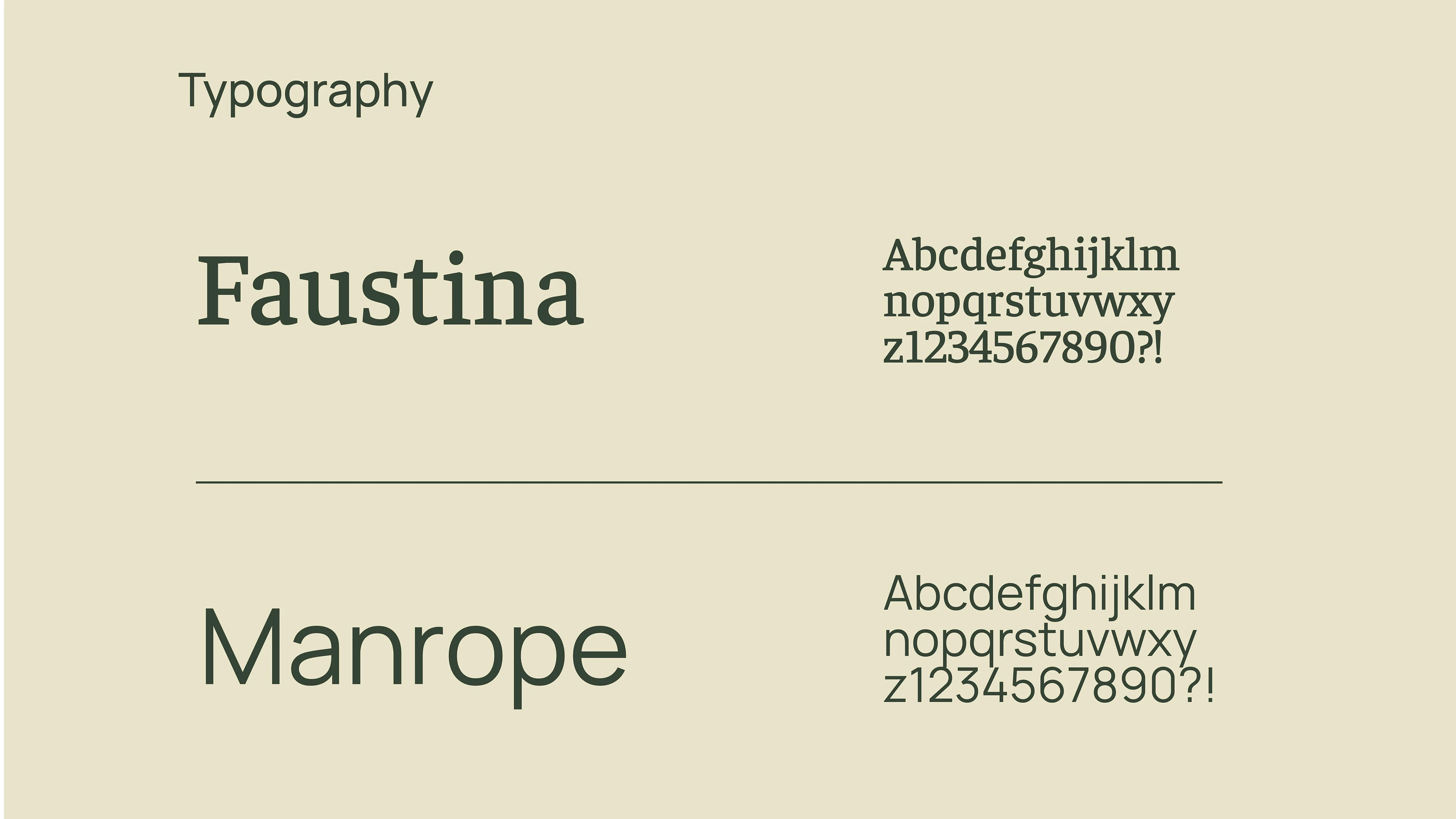
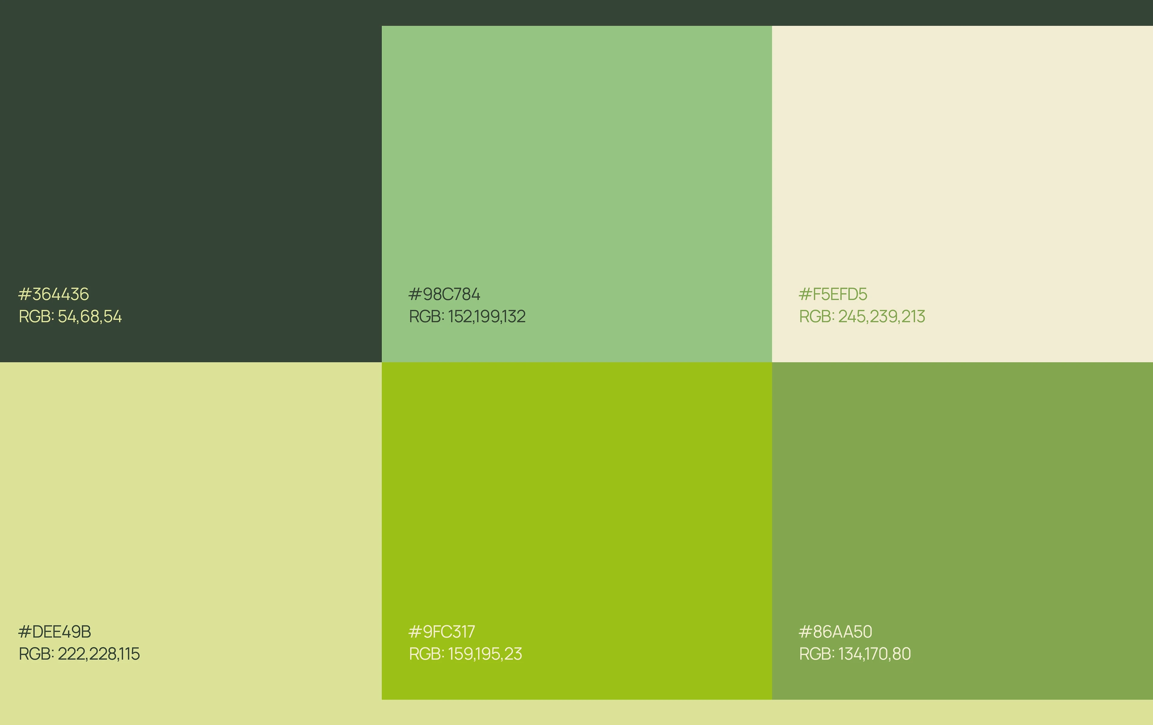
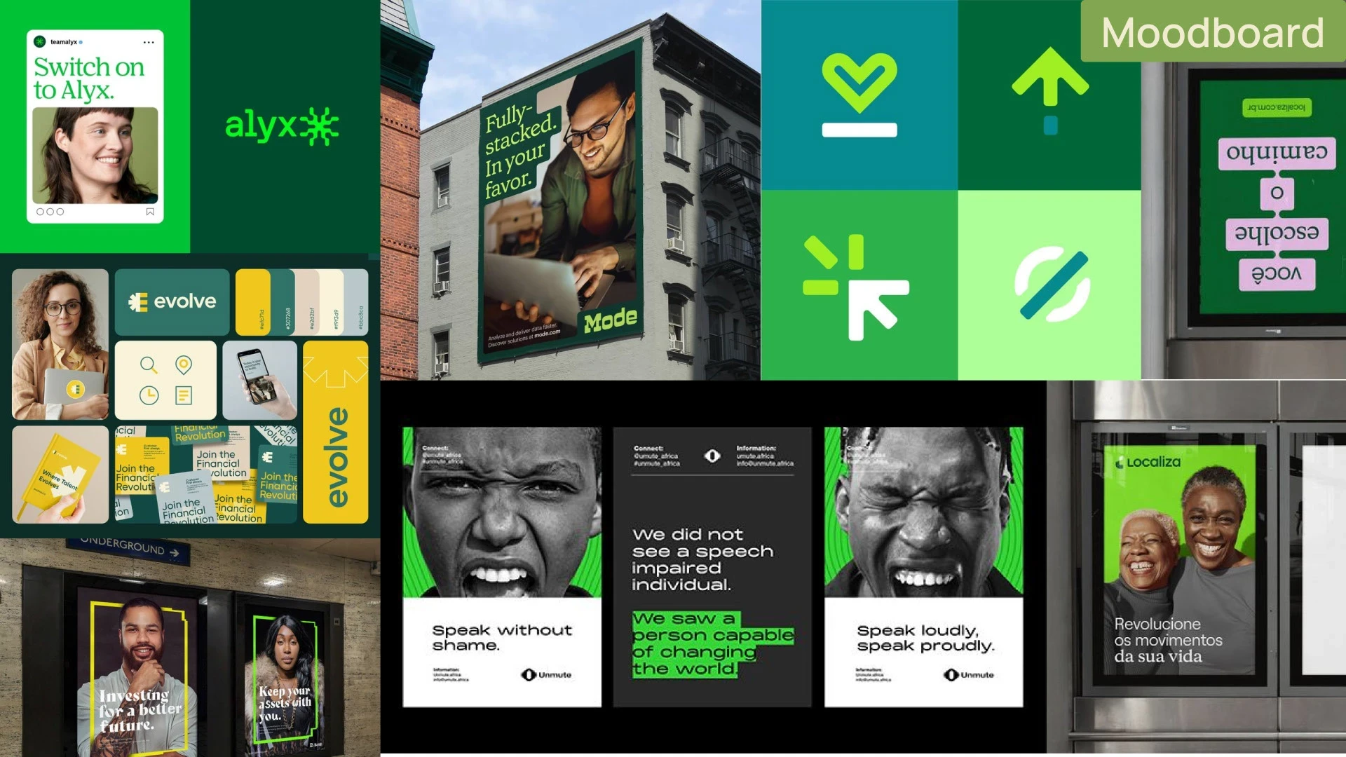
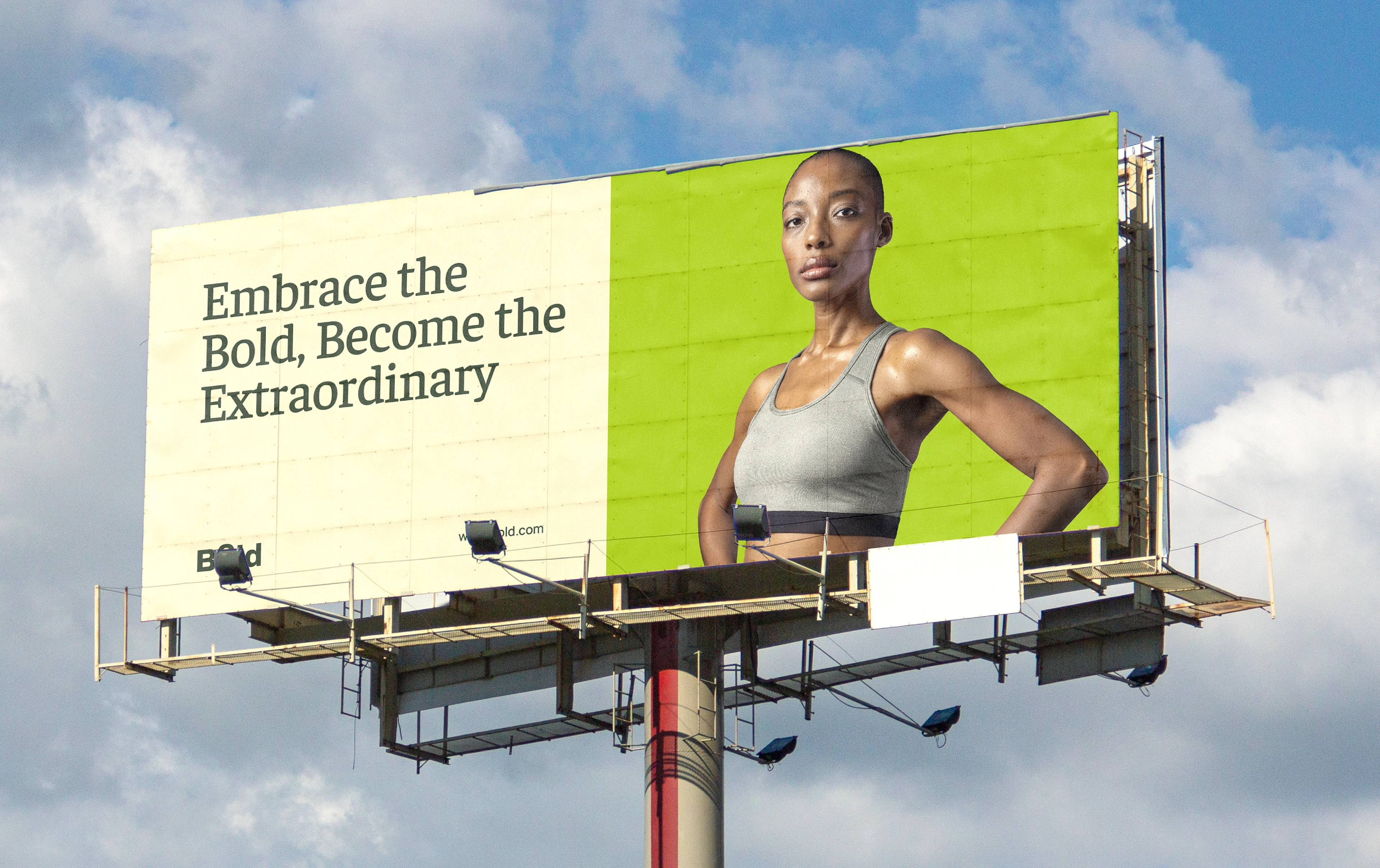
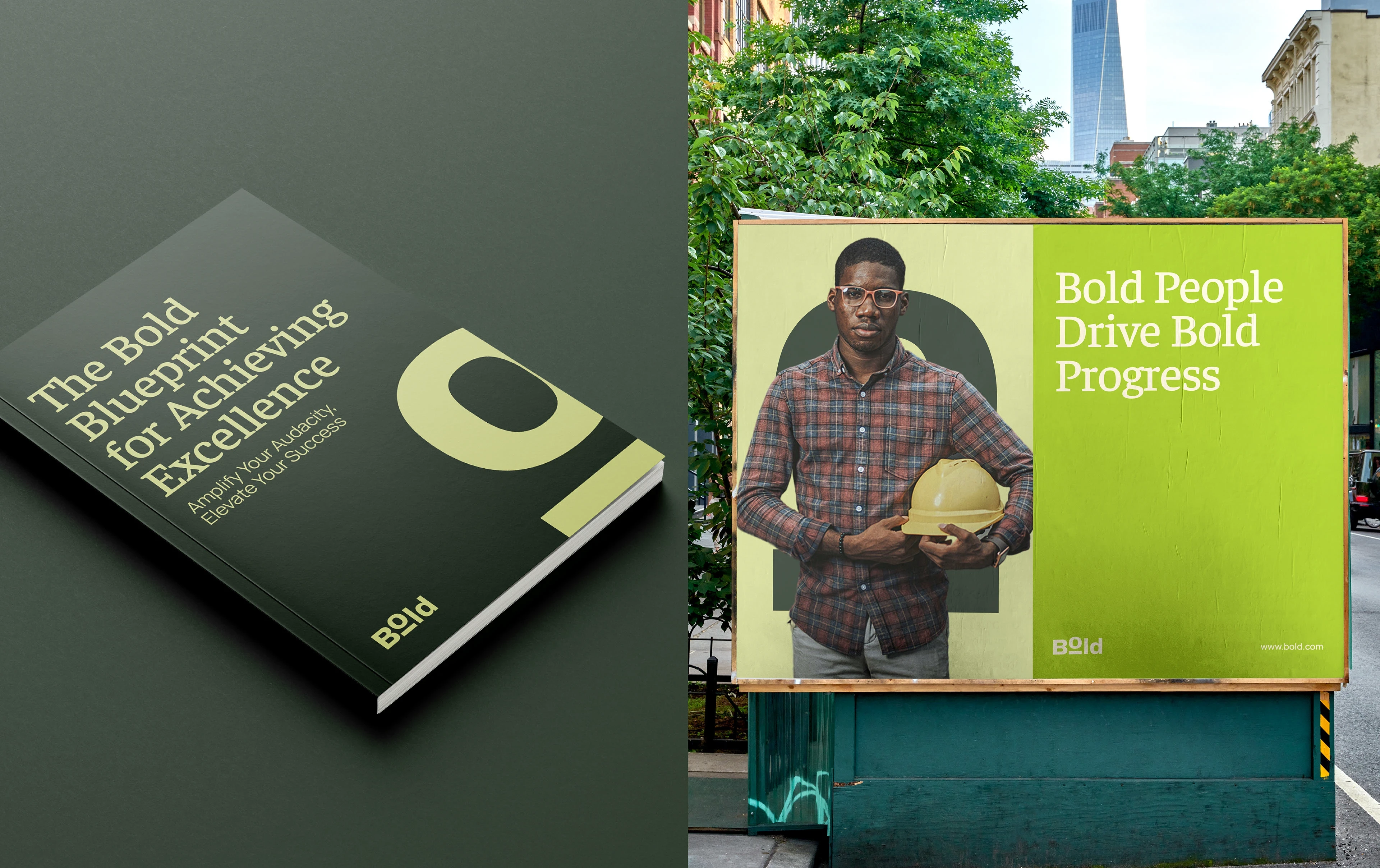
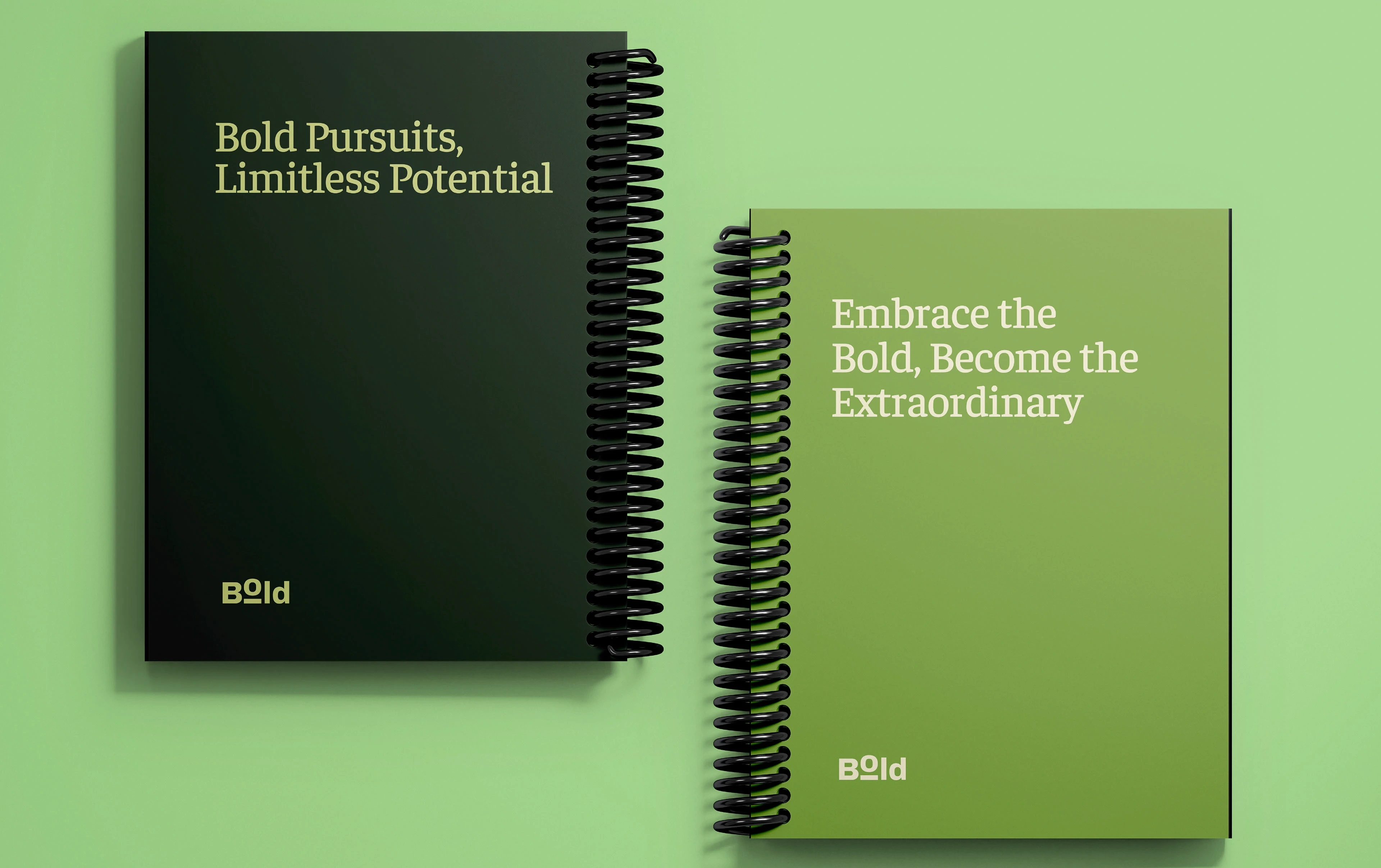
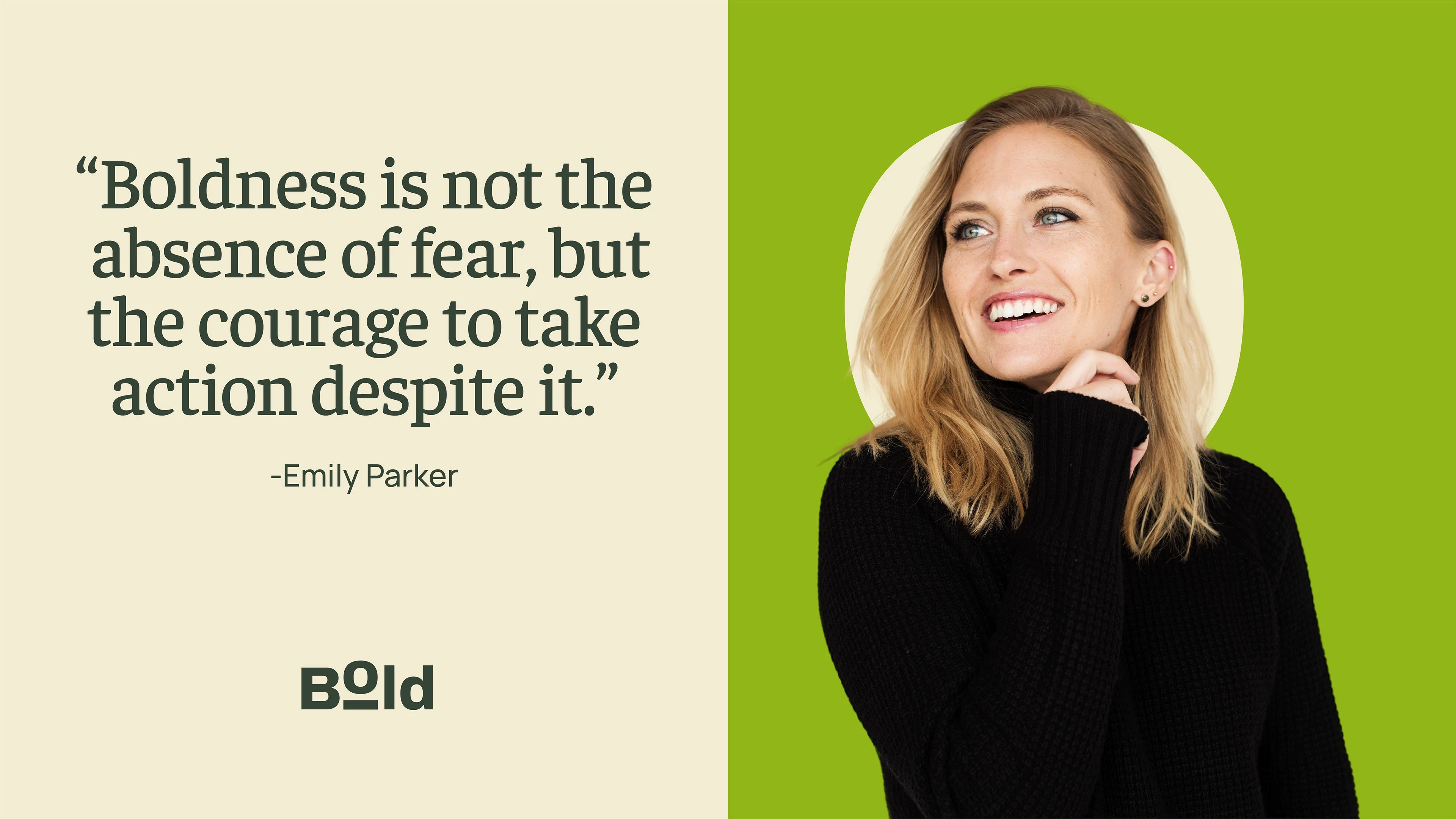
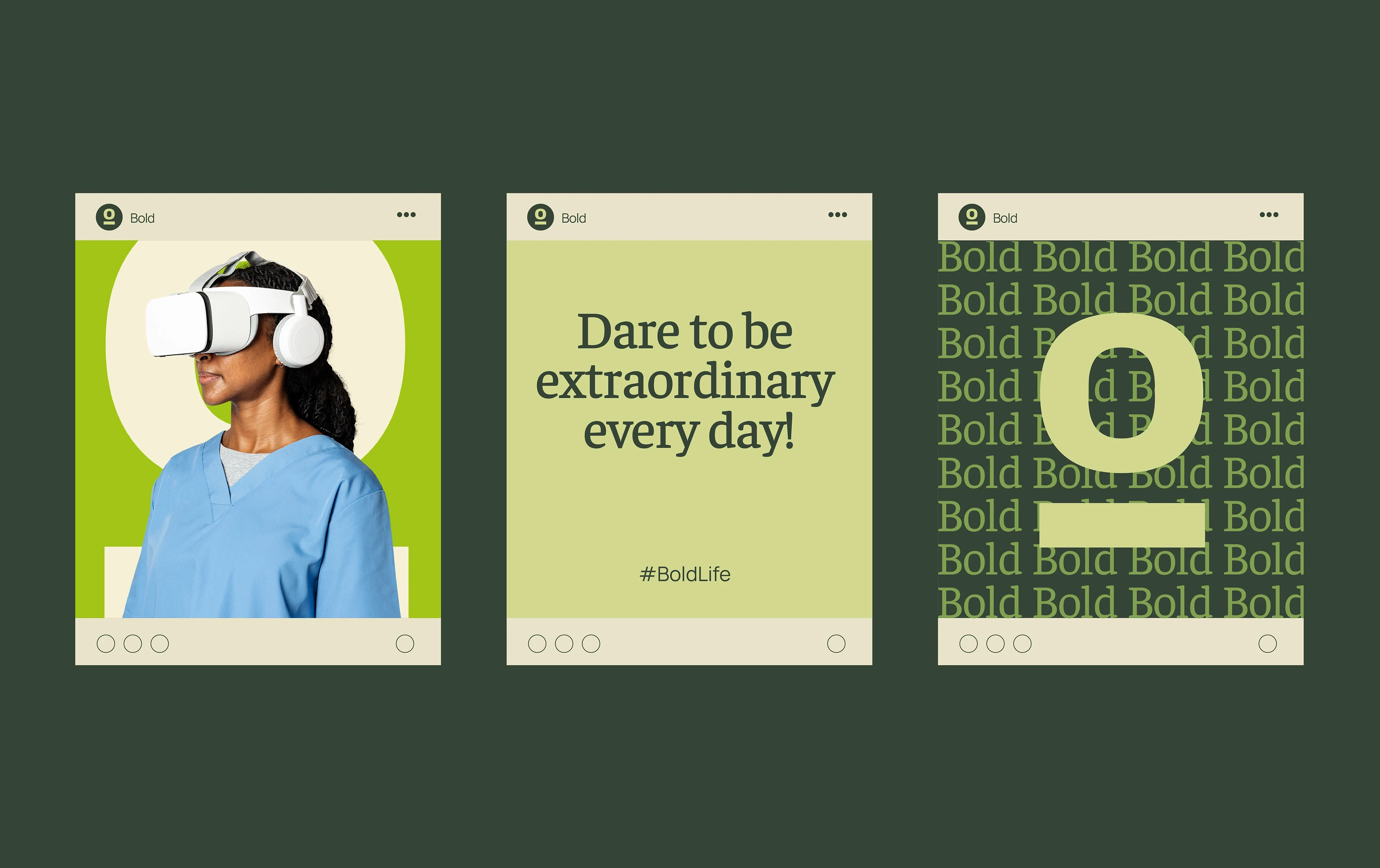
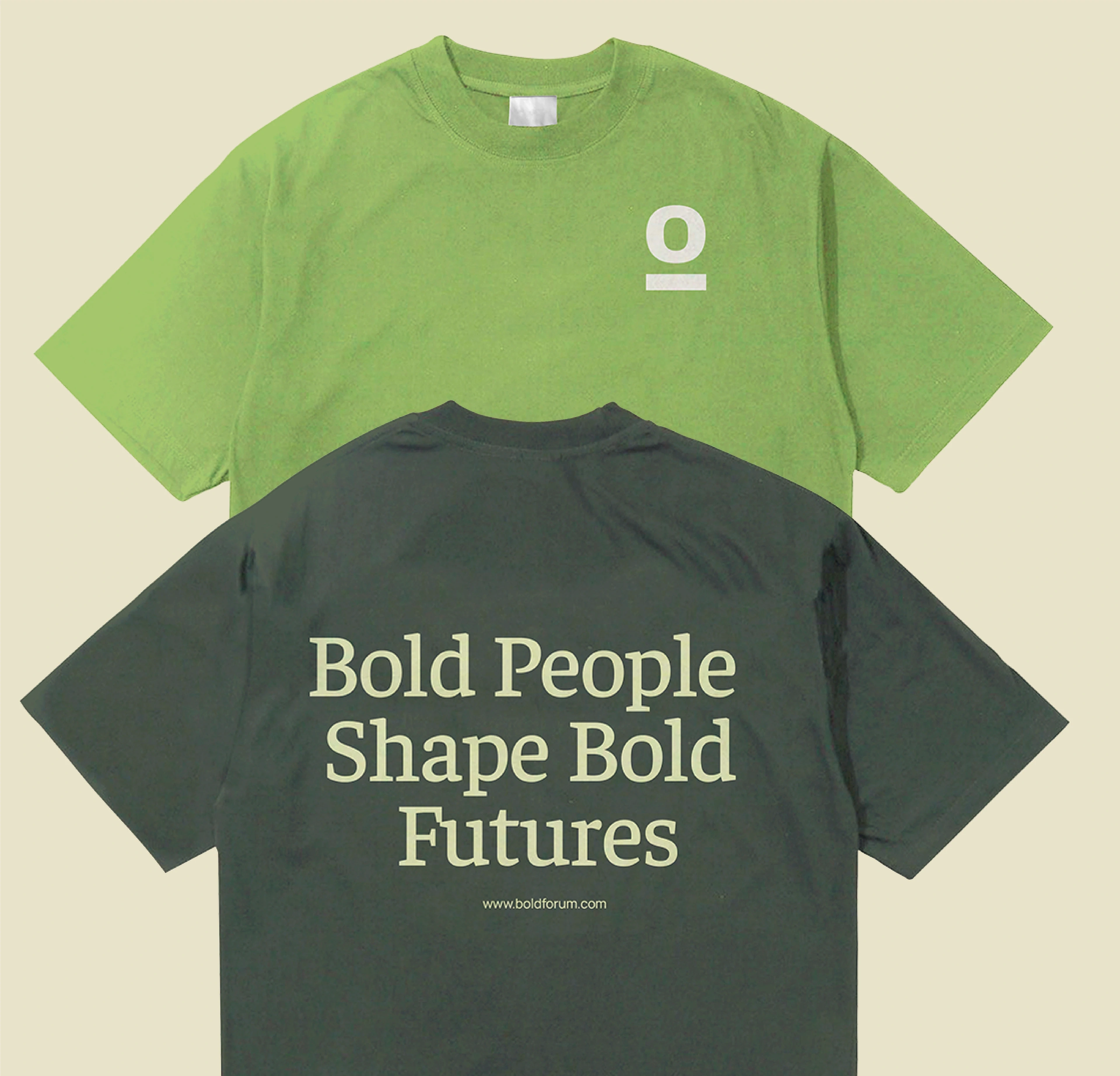
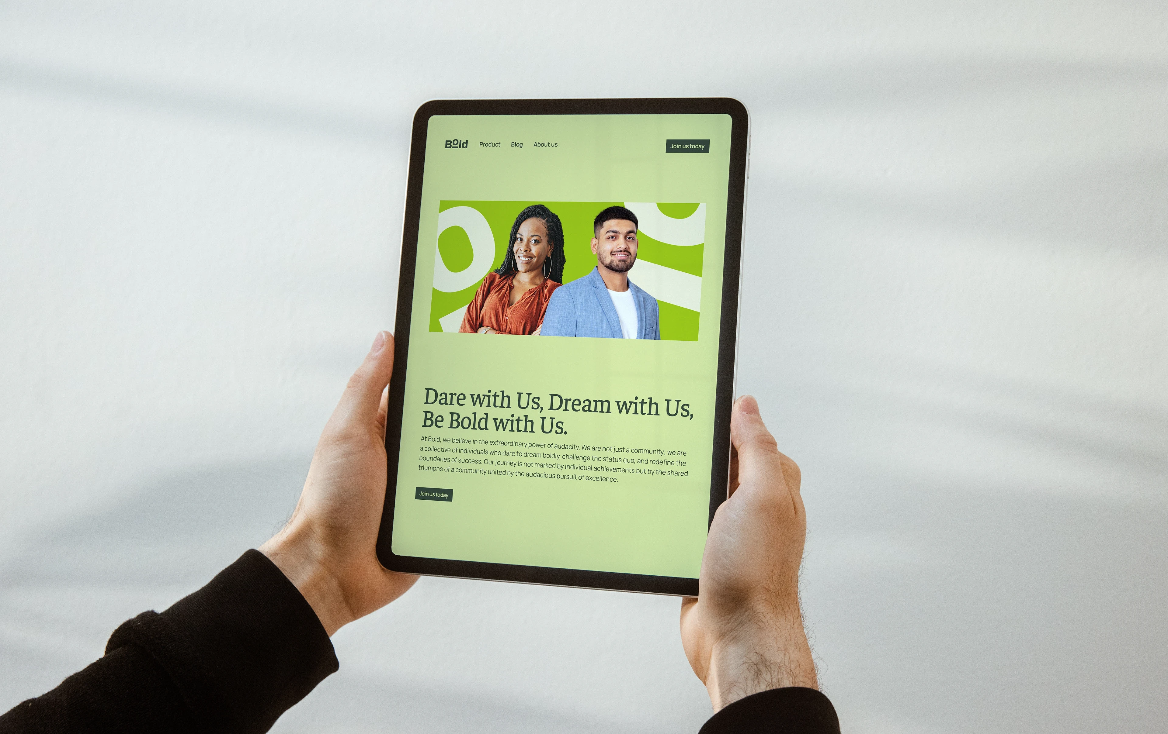
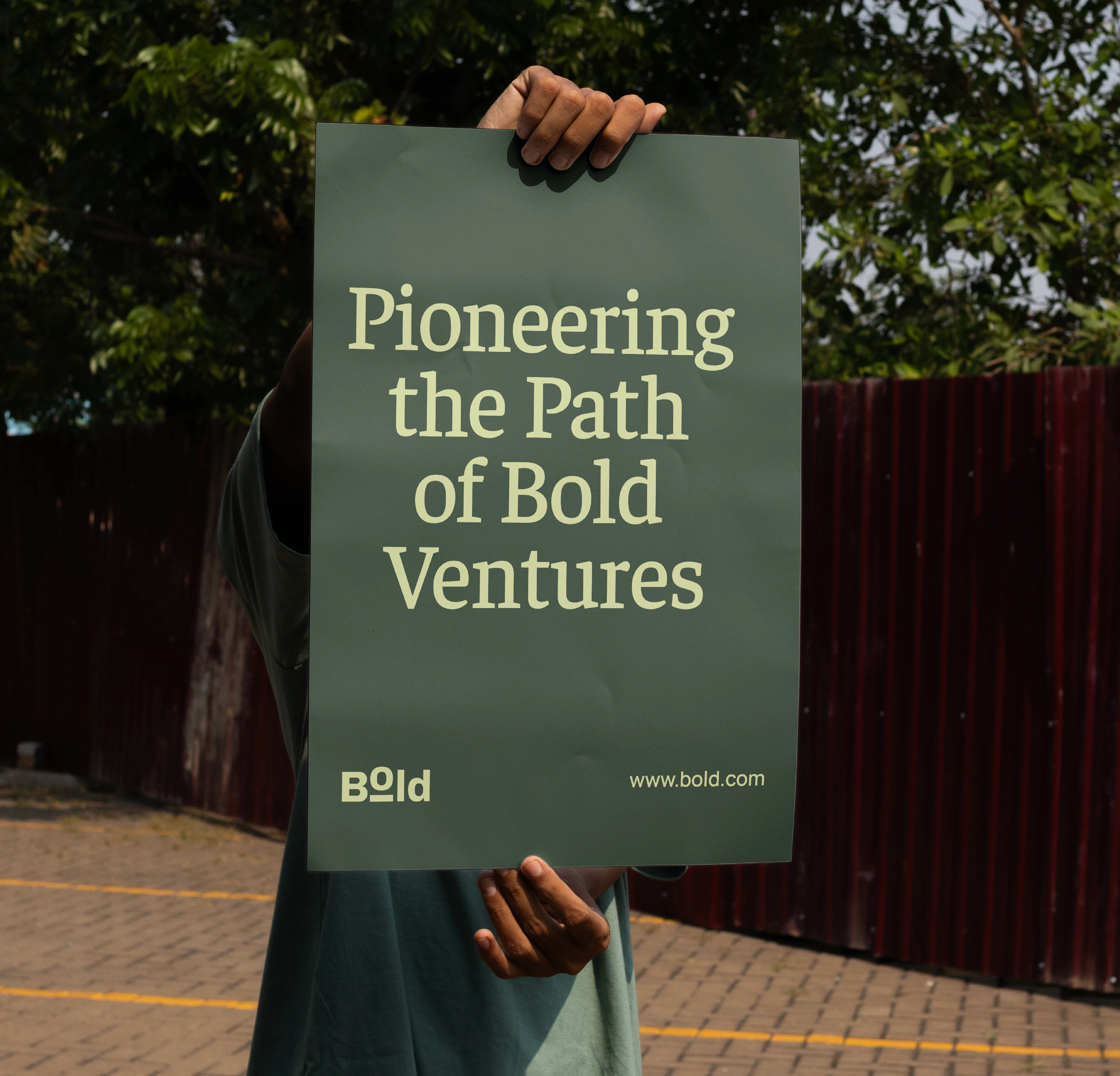
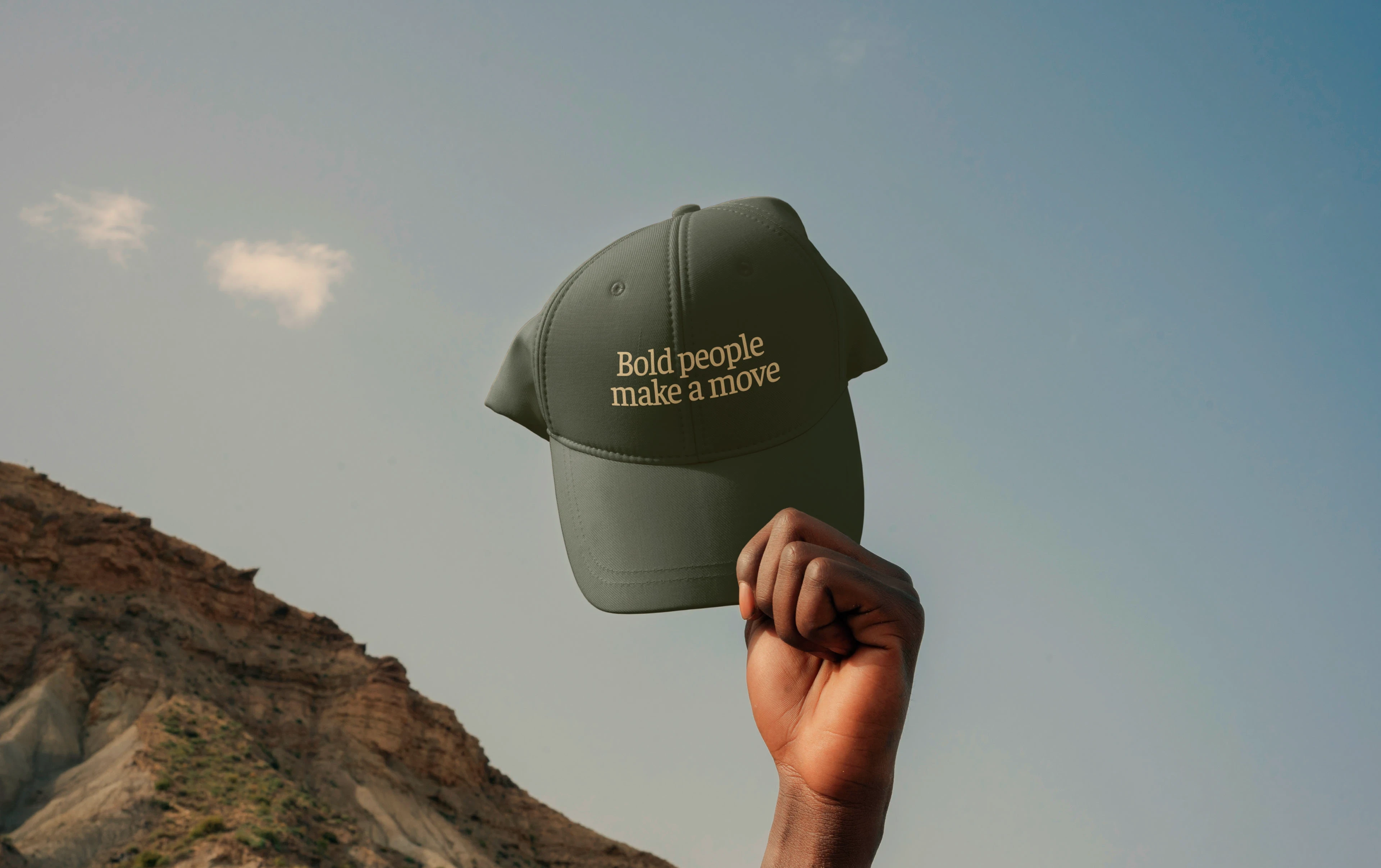
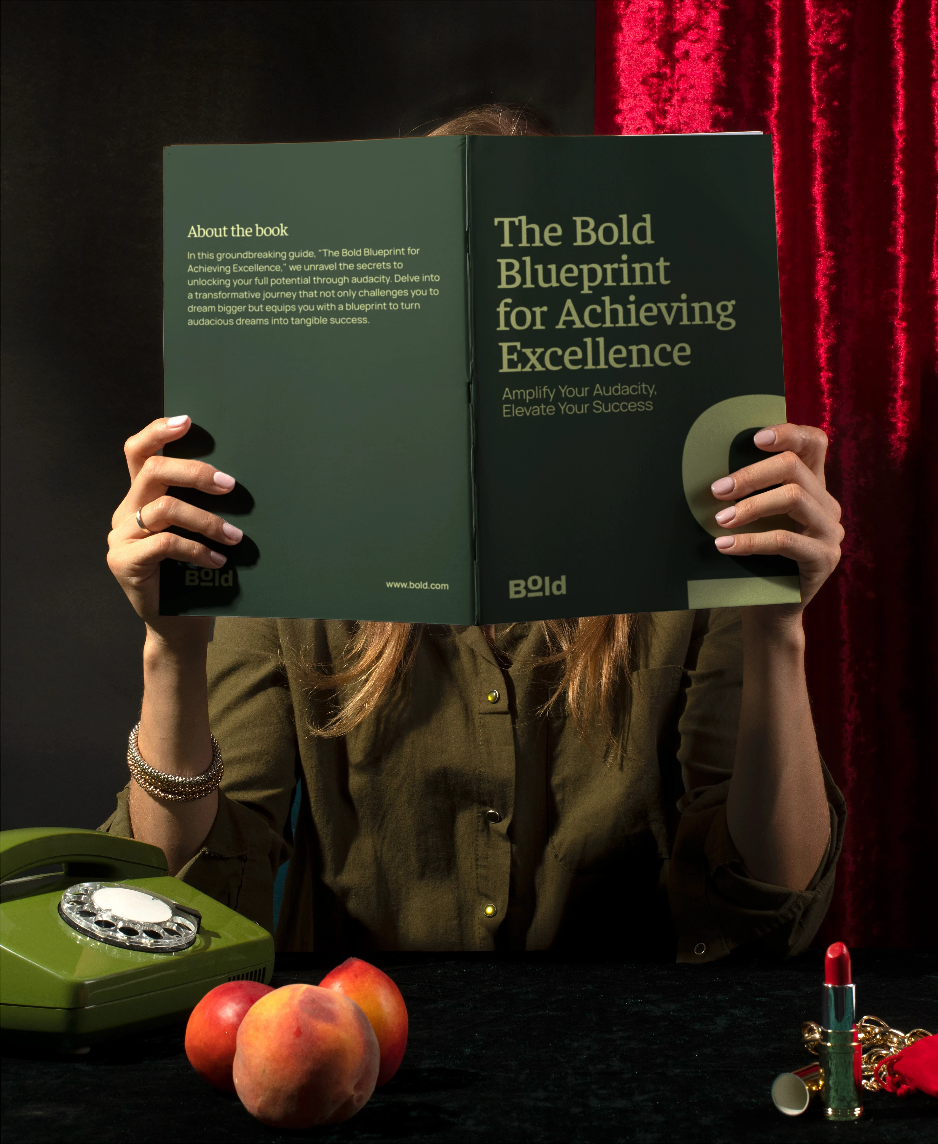
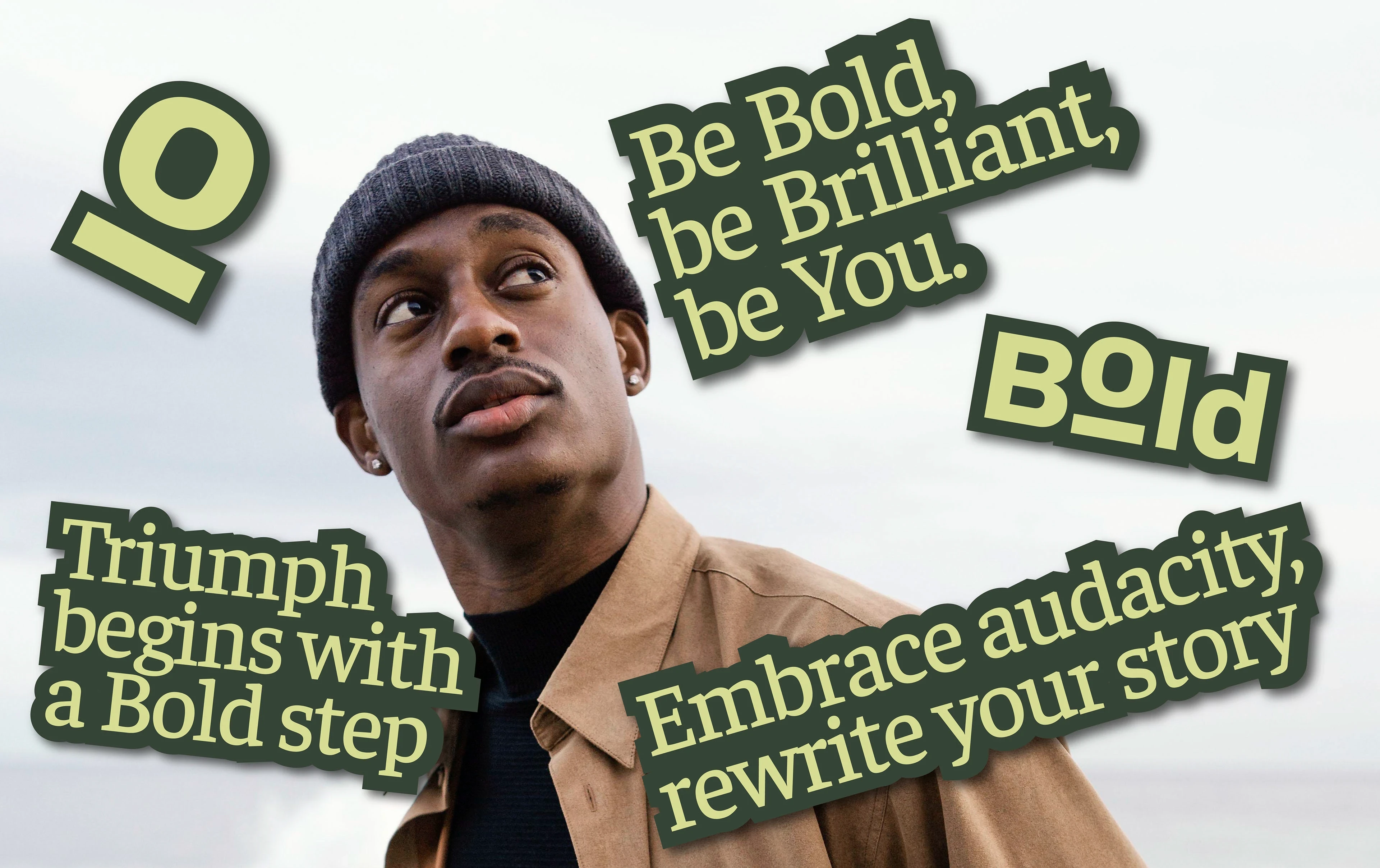
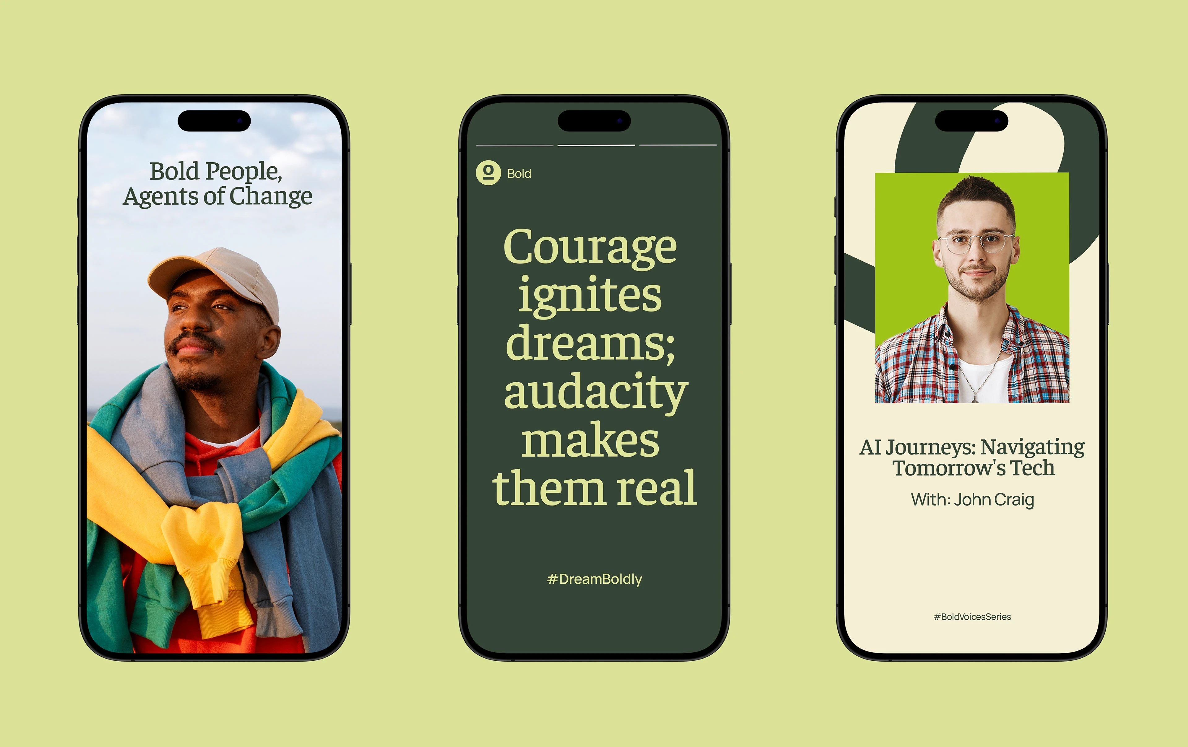
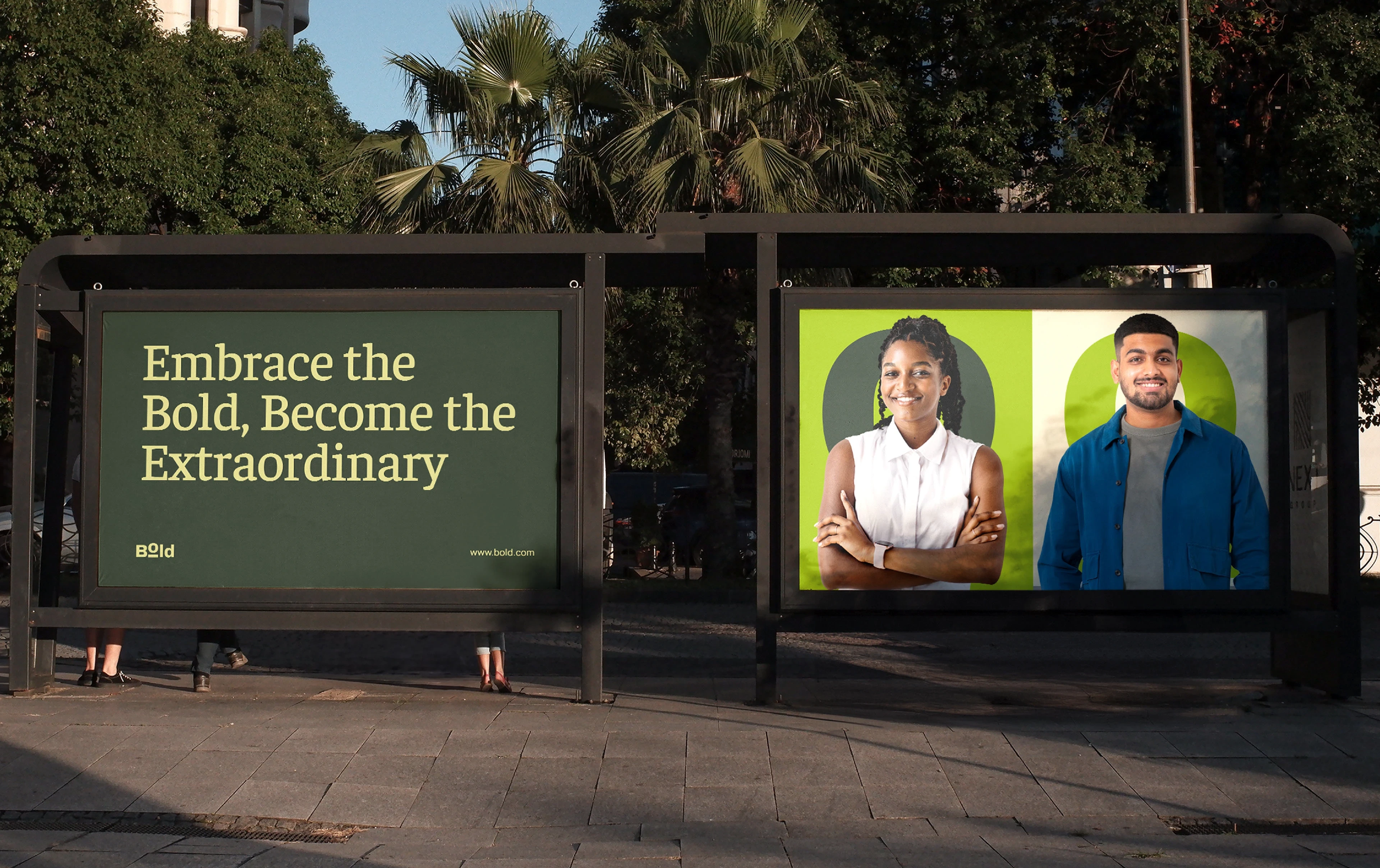
Typography and color were chosen to support clarity, confidence, and emotional warmth. Faustina serves as the primary typeface, bringing a sense of depth, reflection, and authority to headlines, while Manrope balances the system with modern clarity and readability for body text. The color palette blends grounded greens and soft neutrals with energetic accents, symbolizing growth, renewal, and forward motion. Together, the system reinforces Bold’s core values—audacity, empowerment, innovation, recognition, and community—while remaining versatile across digital platforms, educational tools, and brand touchpoints.


Like this project
Posted Jan 16, 2026
Brand identity for Bold, a global empowerment platform built to inspire audacity, growth, and purposeful action through community and recognition.
Likes
0
Views
0
Timeline
Feb 5, 2023 - Feb 28, 2023

