COCO'S LUXE
David Fabunmi
About the Brand
Coco’s Luxe is a luxury brand specialising in carefully curated jewlery and perfumes that embody elegance, sophistication, and timeless beauty. Each item in the collection is selected to enhance personal style and create a memorable, luxurious experience. Coco’s Luxe appeals to individuals who value refinement, grace, and the subtle power of high-quality craftsmanship, offering products that leave a lasting impression.
The Challenge
The luxury market is crowded with brands promising elegance, but many fail to convey both sophistication and accessibility simultaneously. Coco’s Luxe needed an identity that communicated premium quality, timeless beauty, and exclusivity while remaining approachable to a discerning audience. The challenge was to create a visual system that could consistently embody luxury across packaging, digital platforms, and promotional materials without feeling generic or overstated.
The Direction
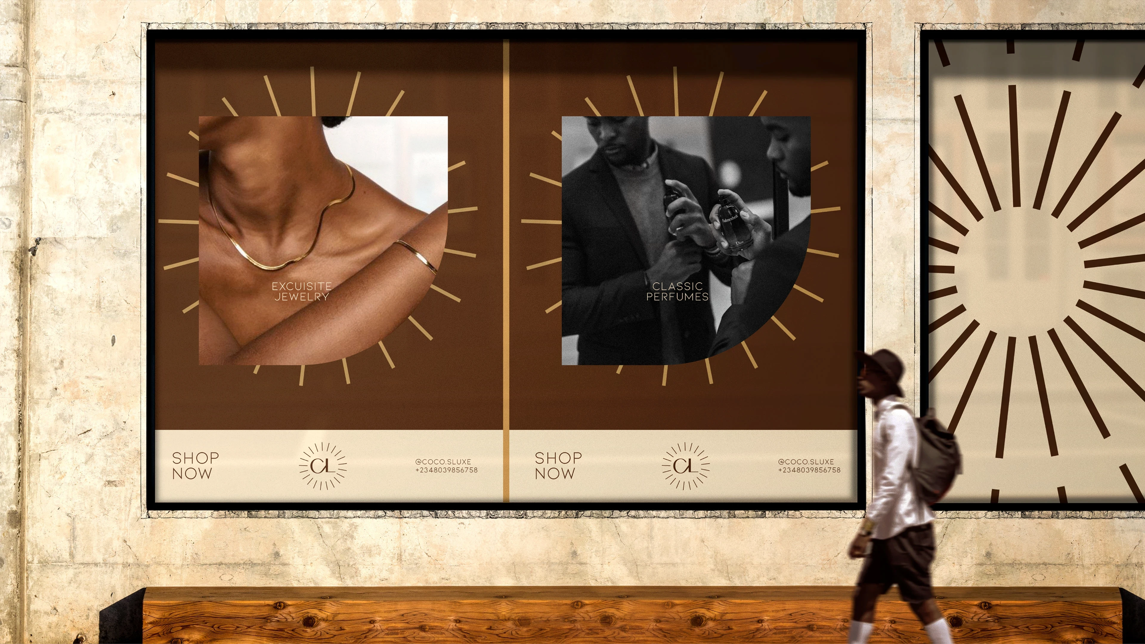
The brand was positioned around curated refinement—luxury as a thoughtful, intentional experience rather than mere extravagance. Coco’s Luxe emphasises elegance, confidence, and sophistication, turning each product into a statement of personal style. This approach frames the brand not just as a retailer, but as a guide to premium living, where every detail—from jewelry sparkle to fragrance essence—is an expression of taste and refinement.
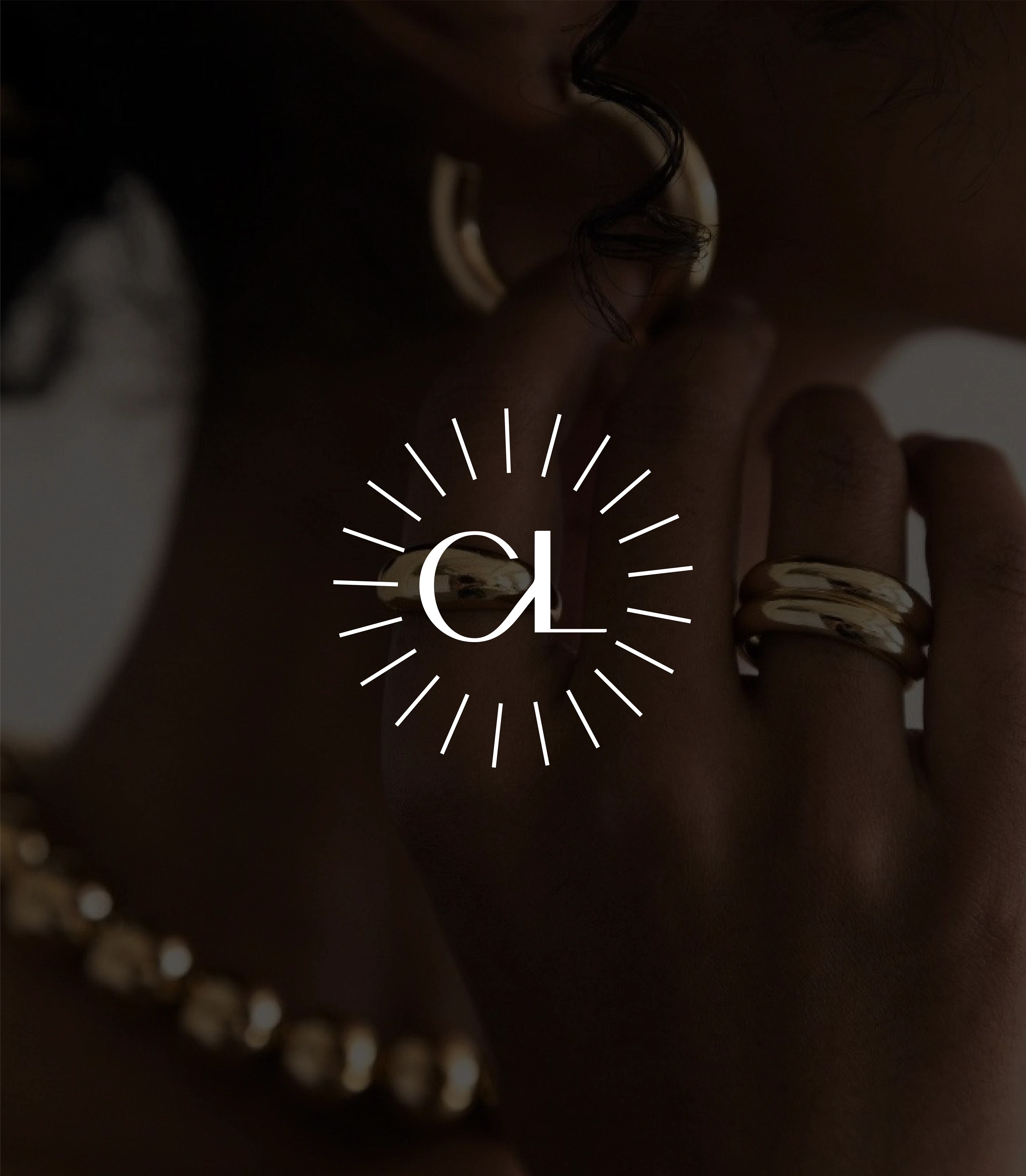
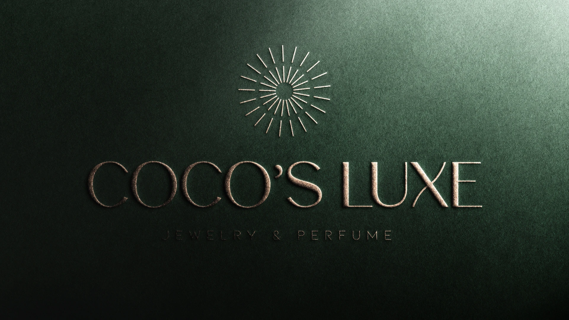
Identity Concept
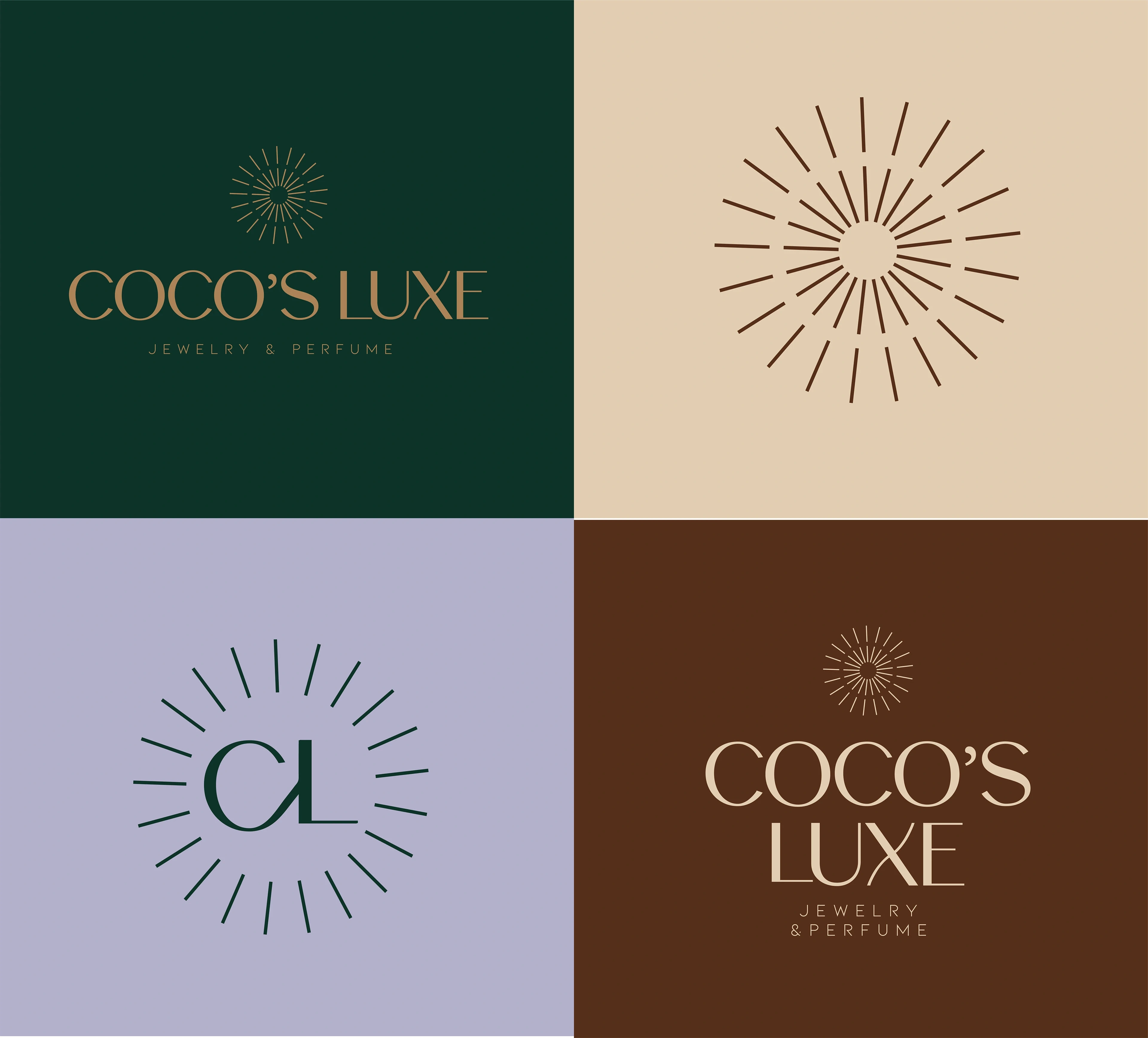
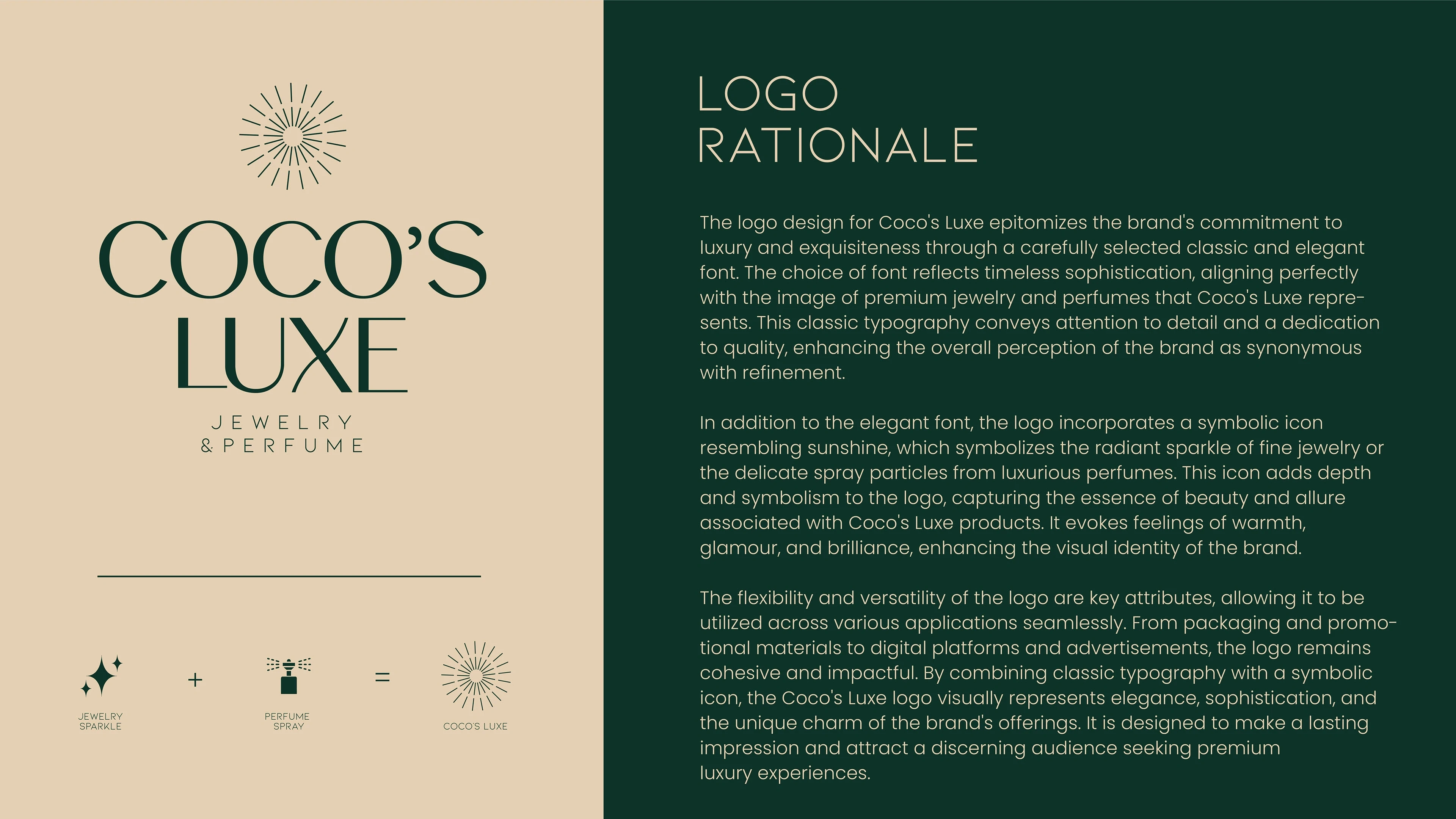
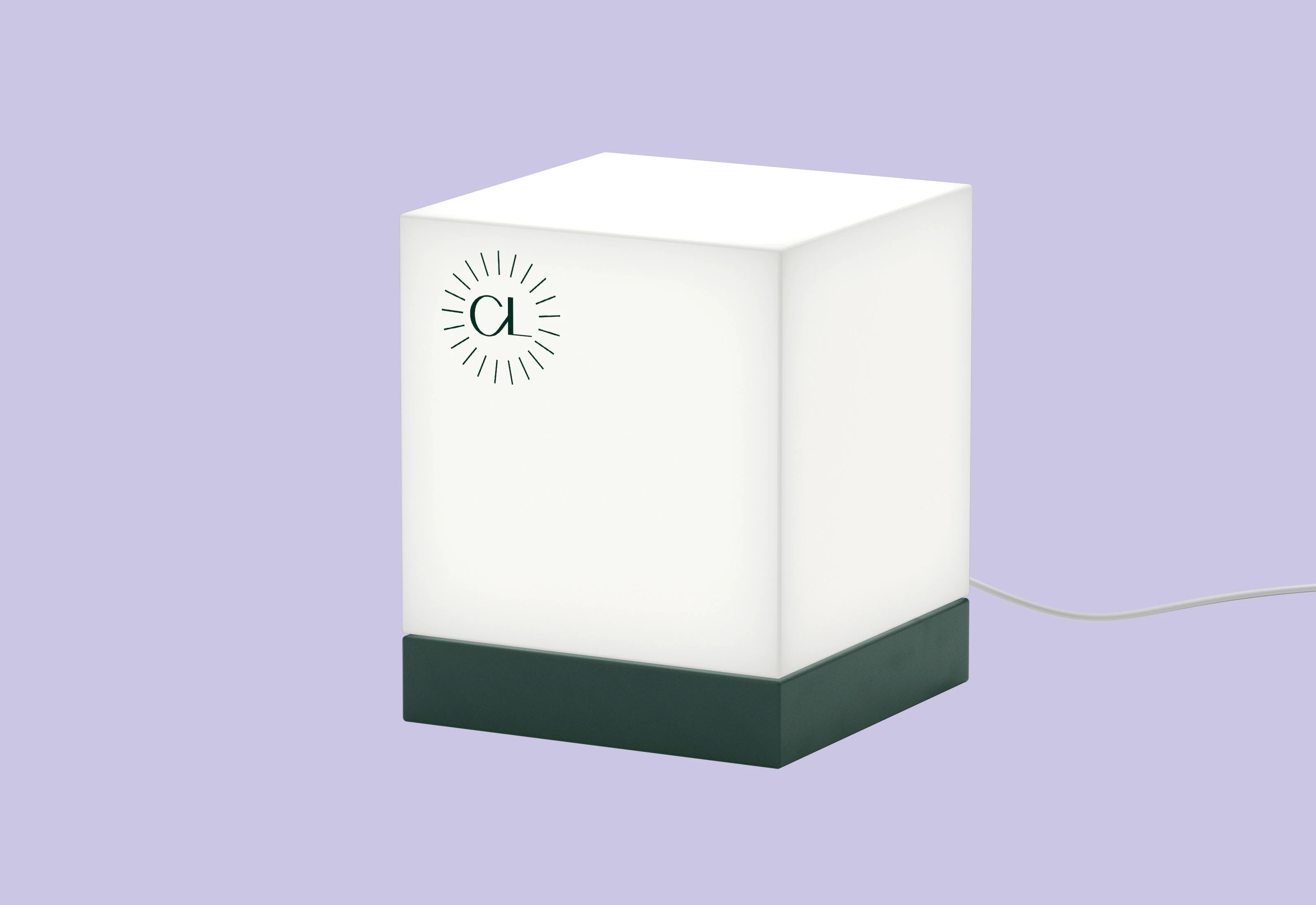
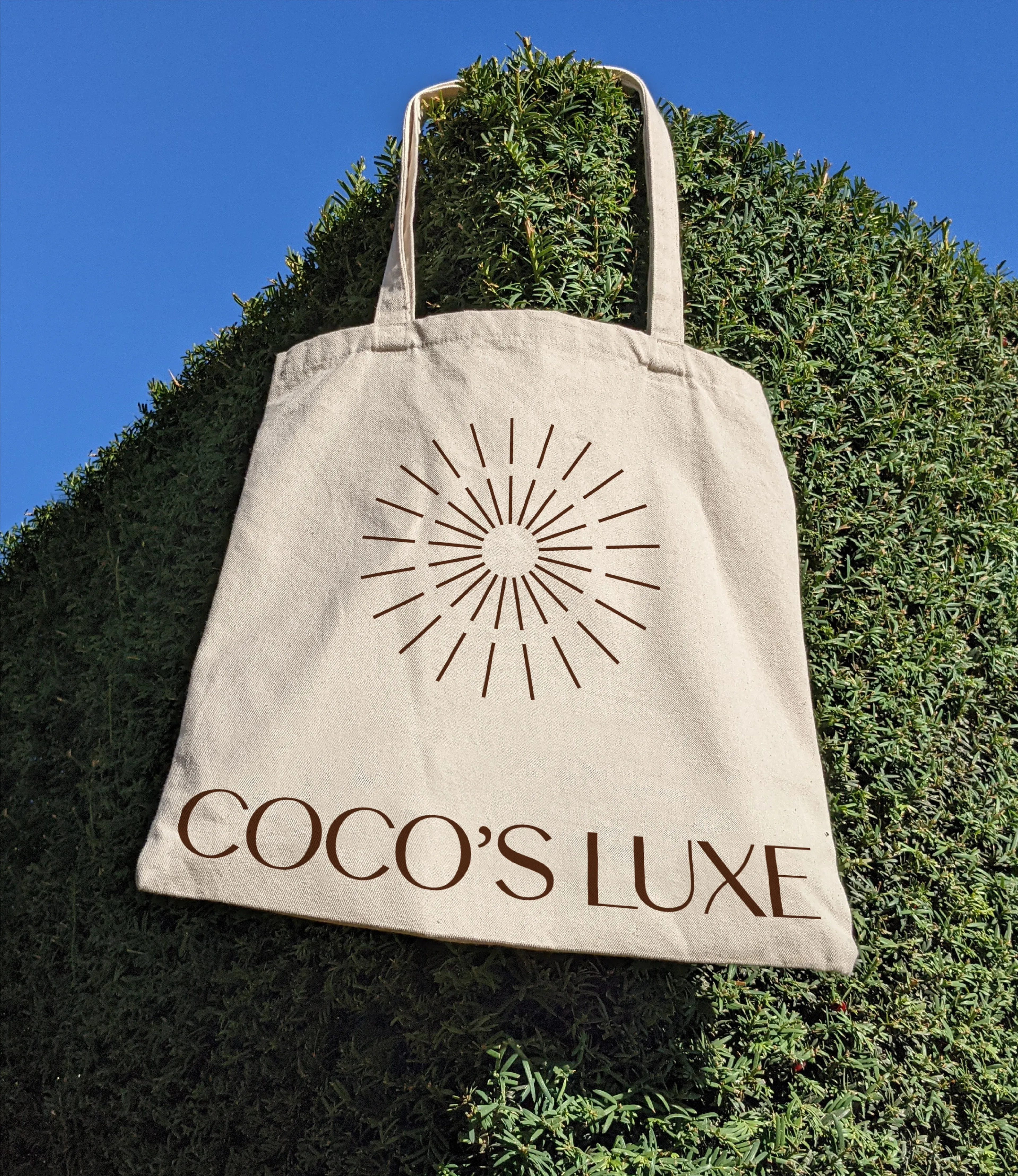
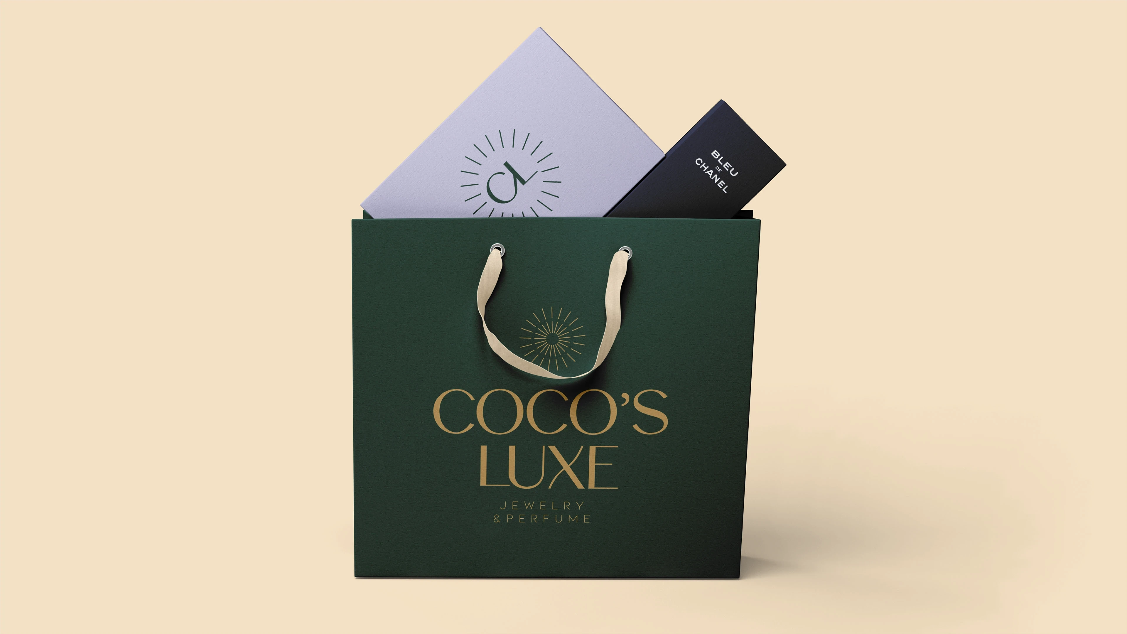
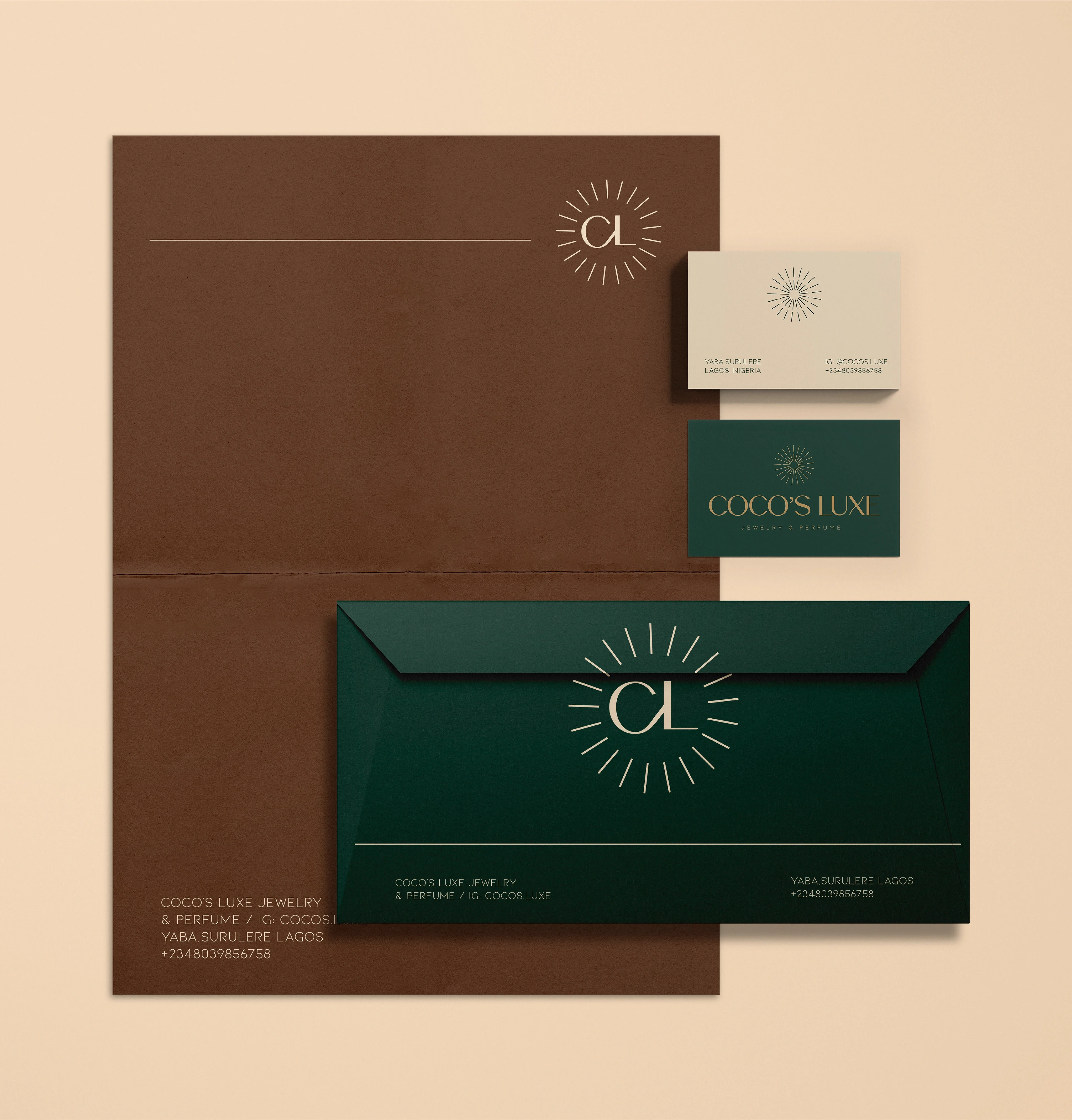
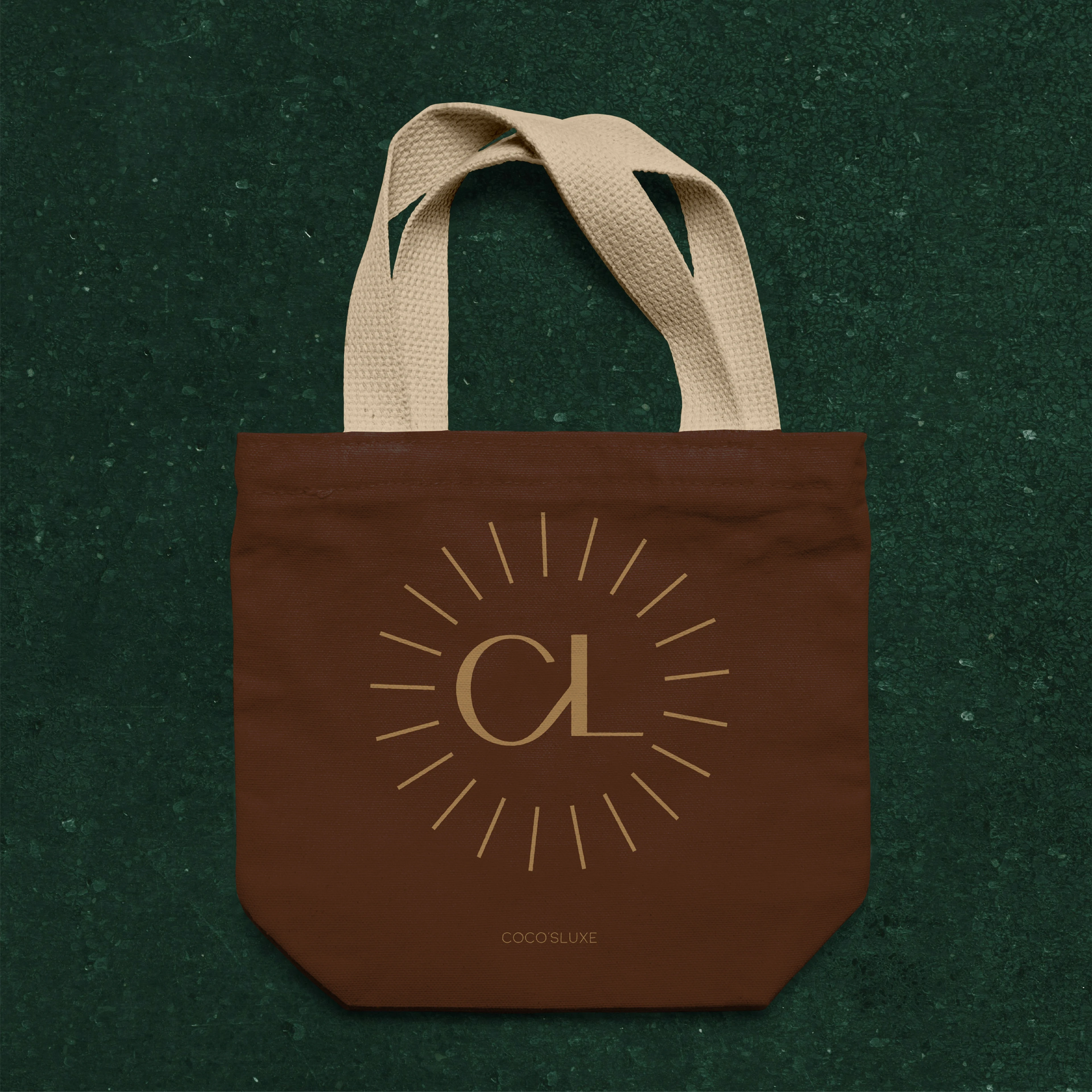
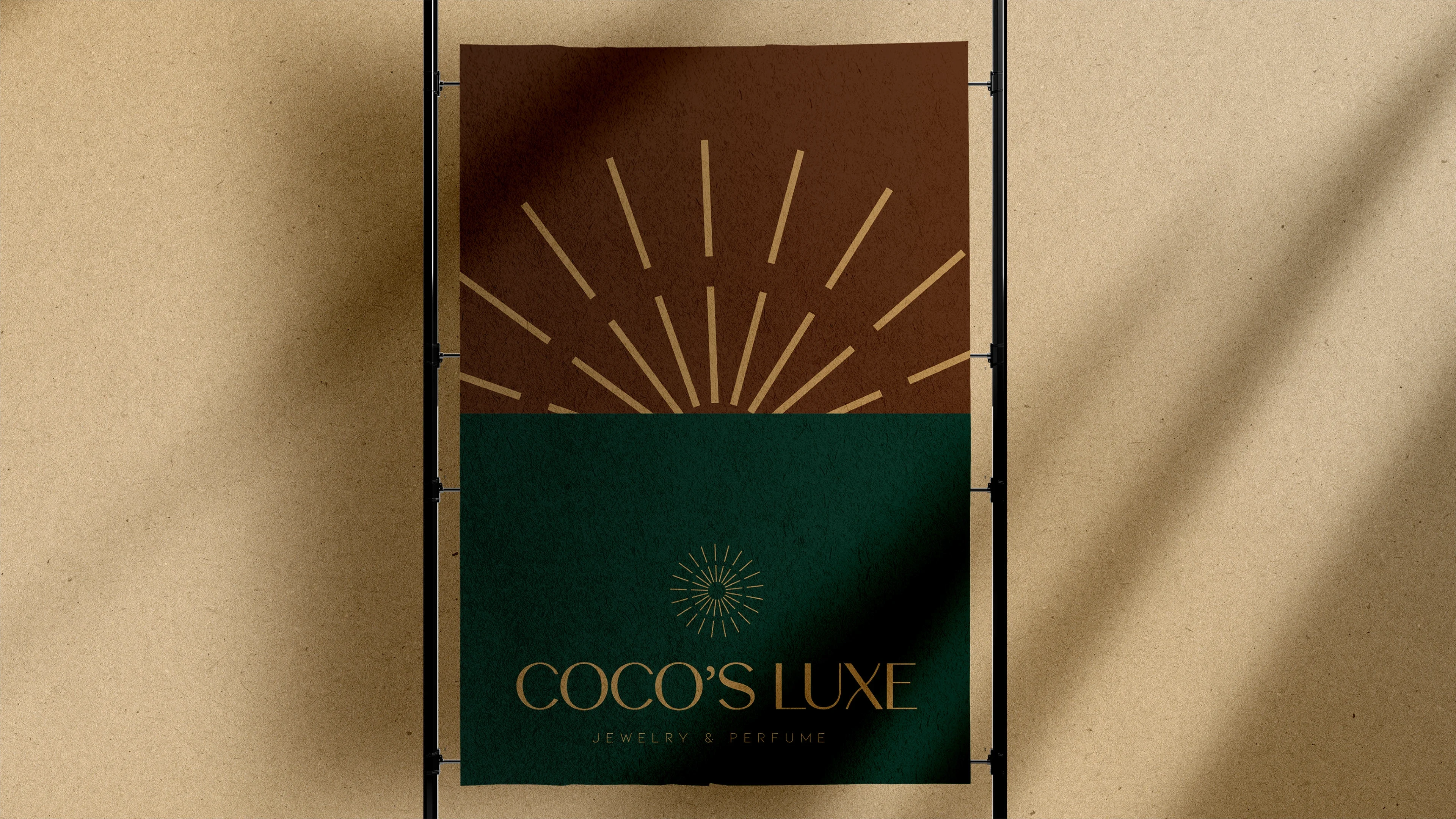
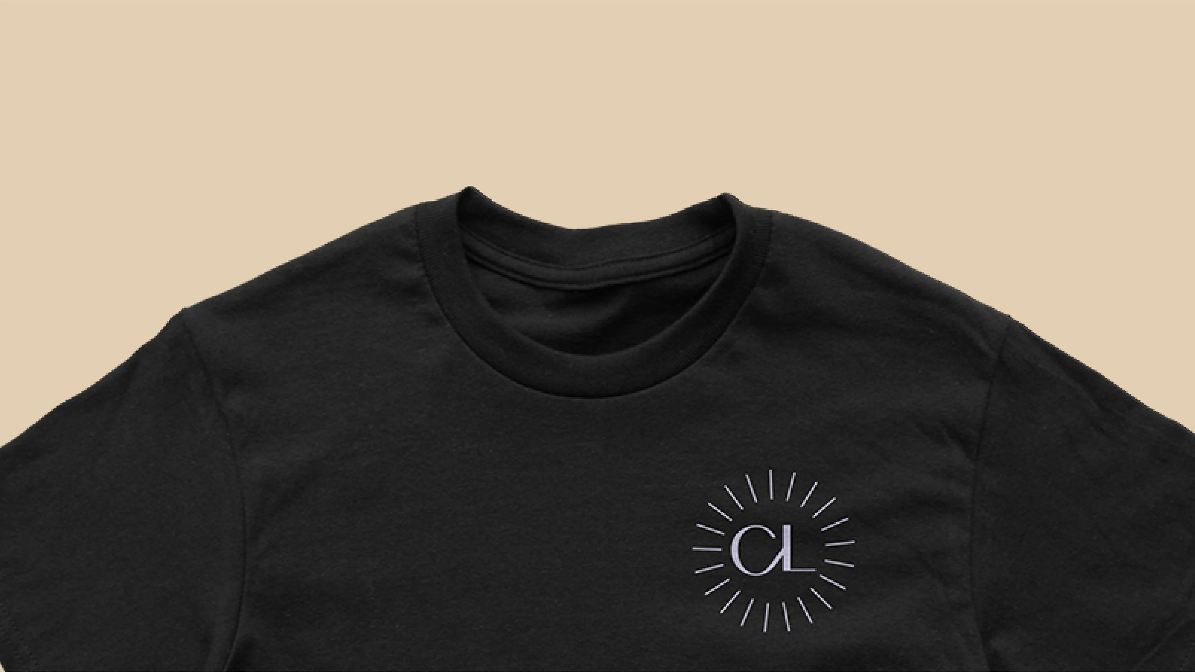
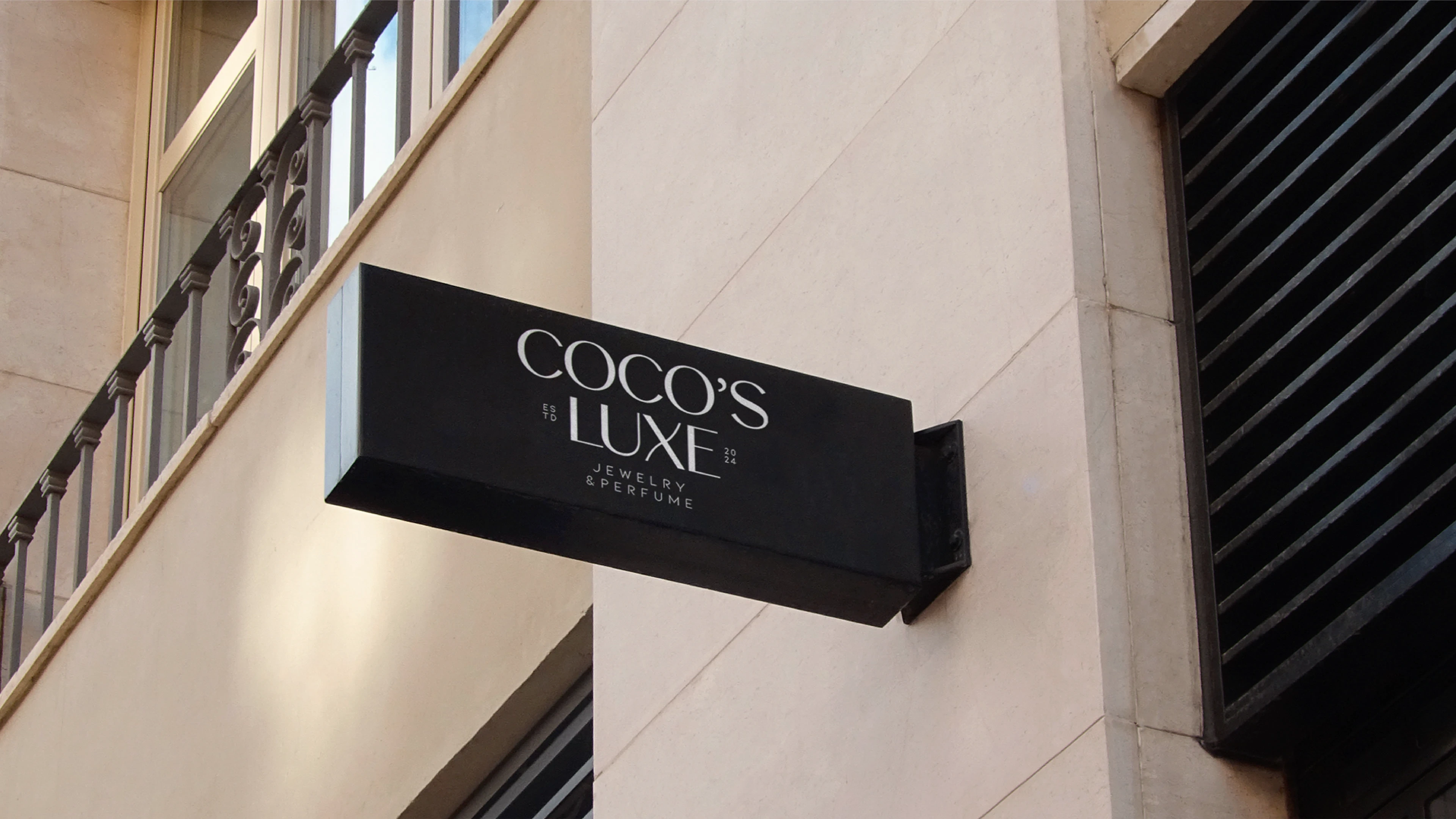
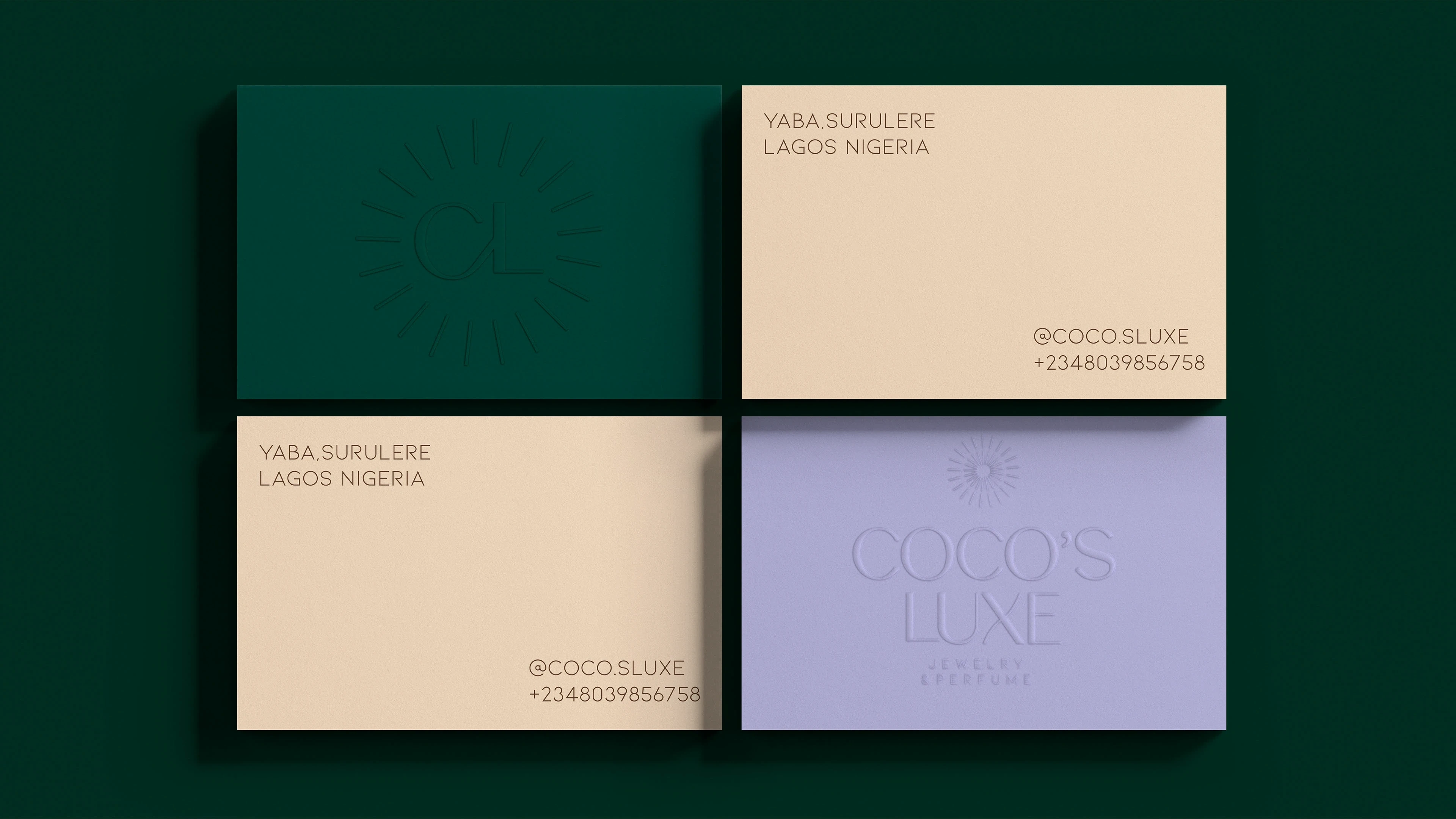
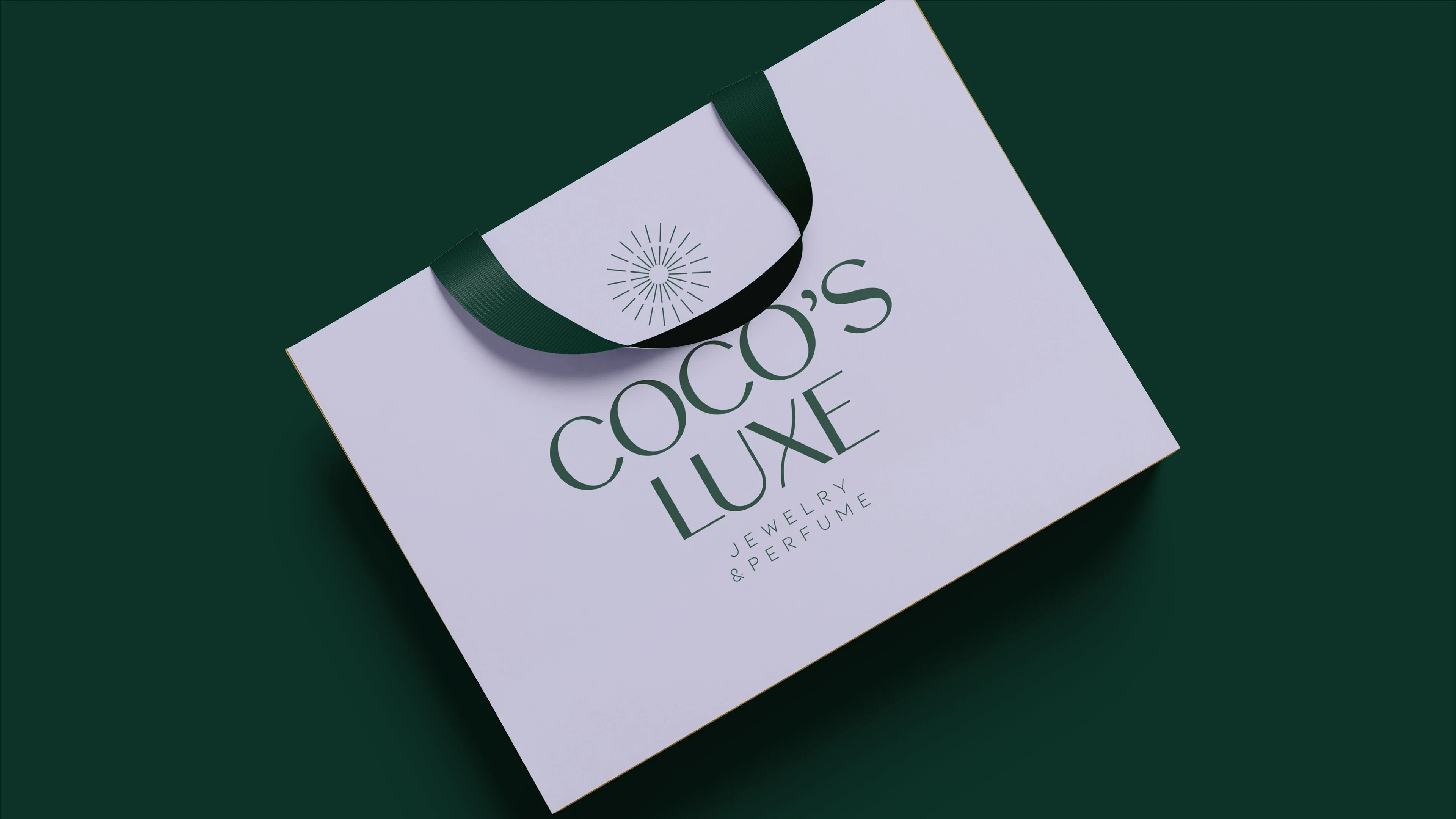
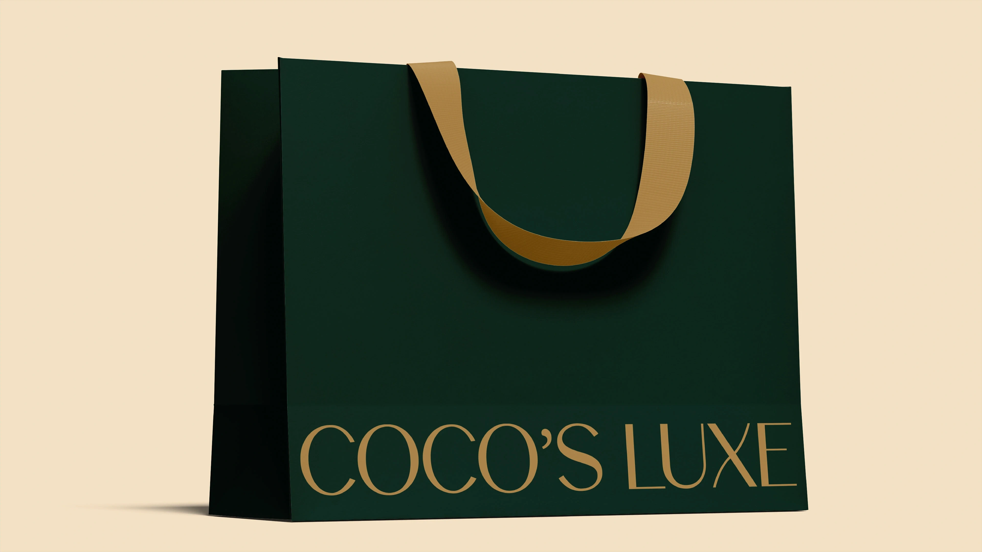
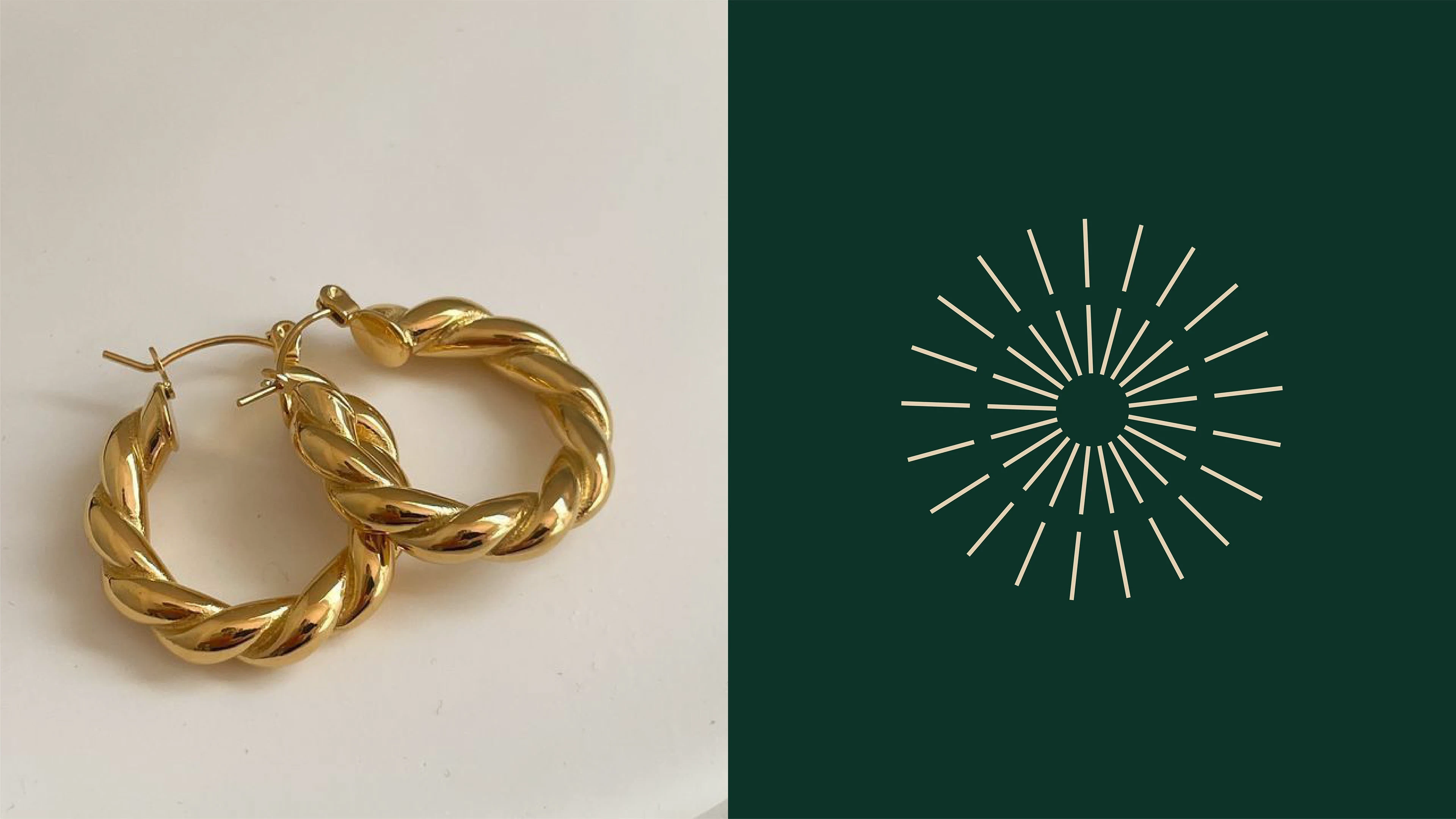
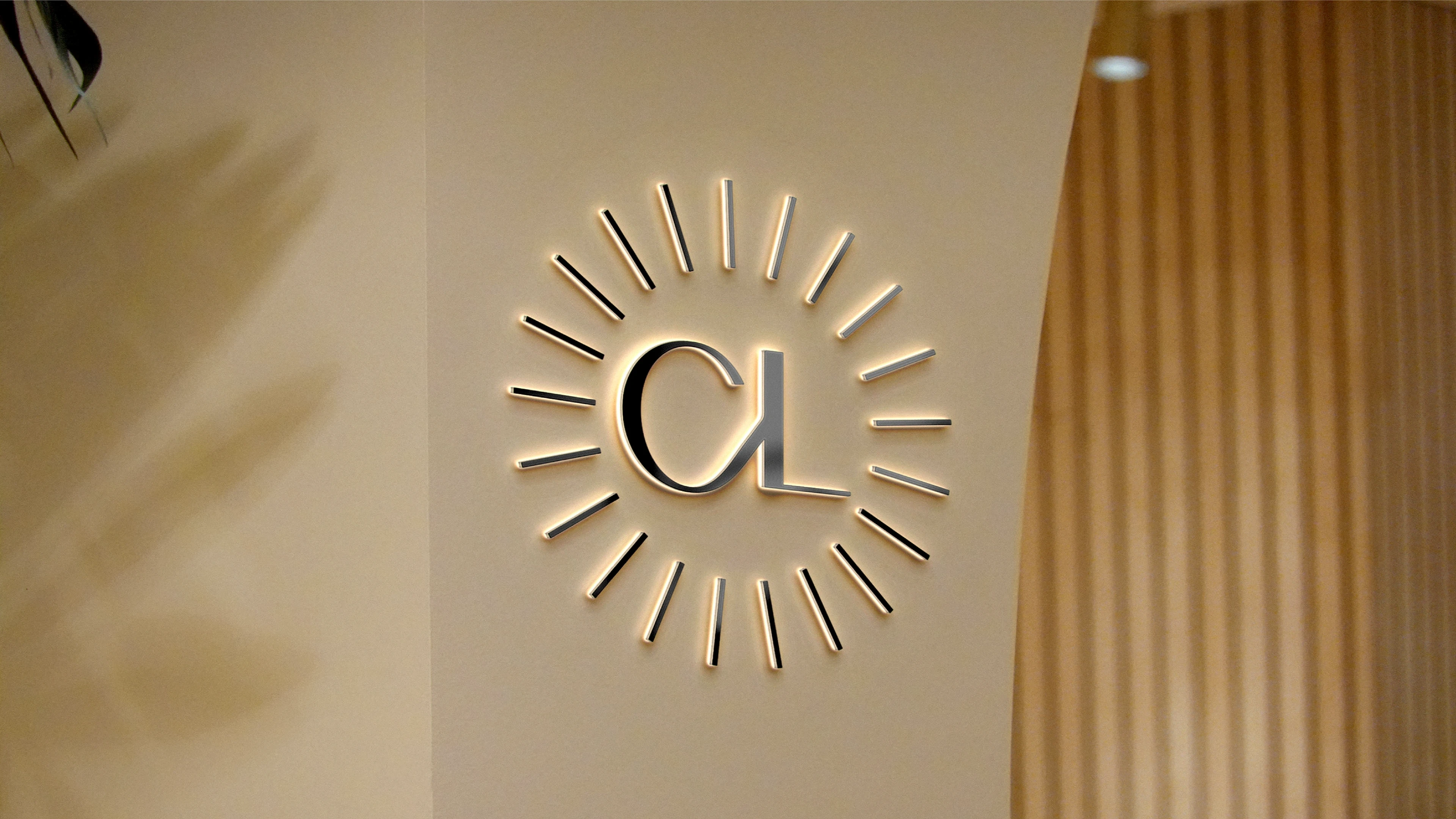
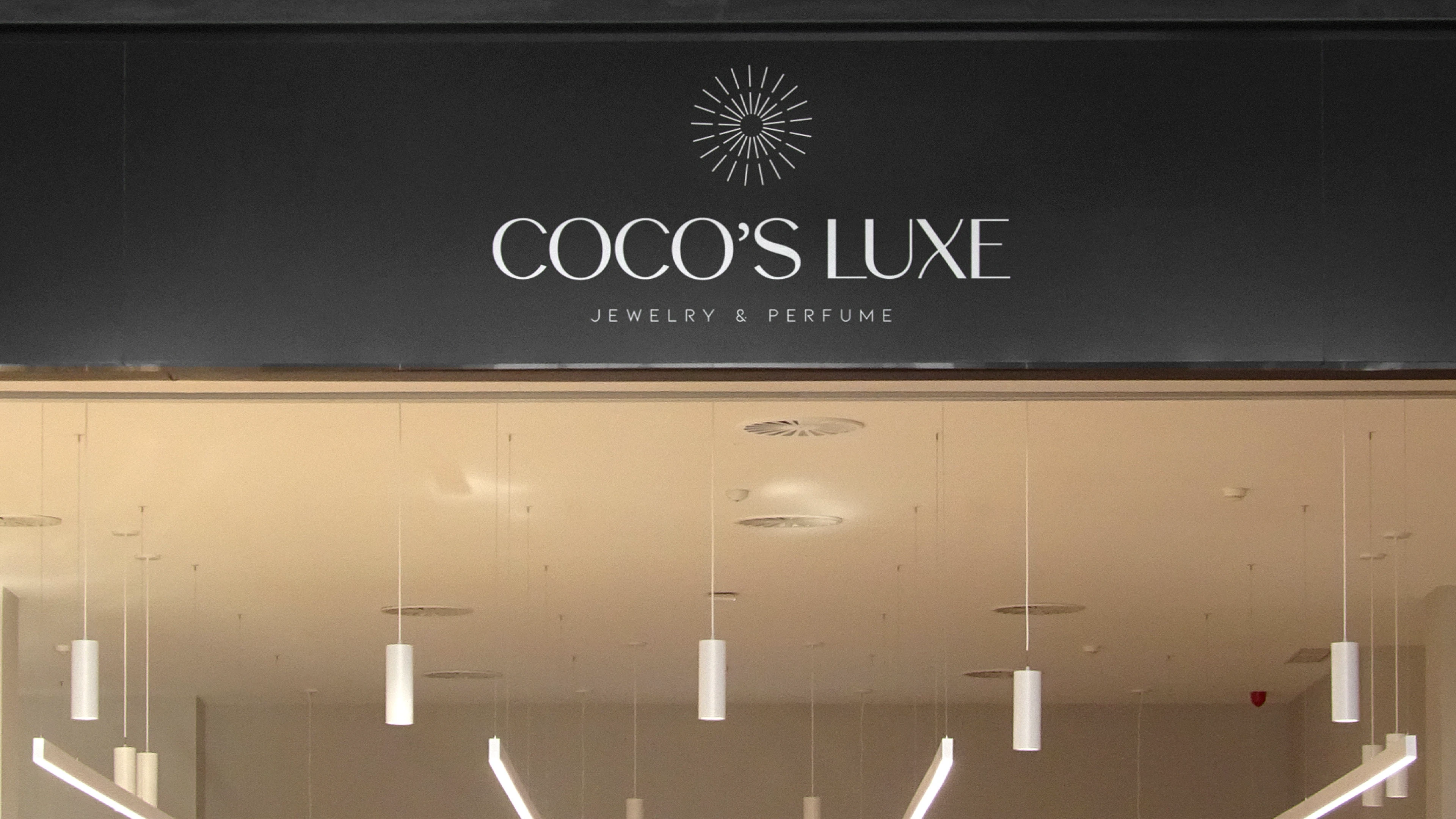
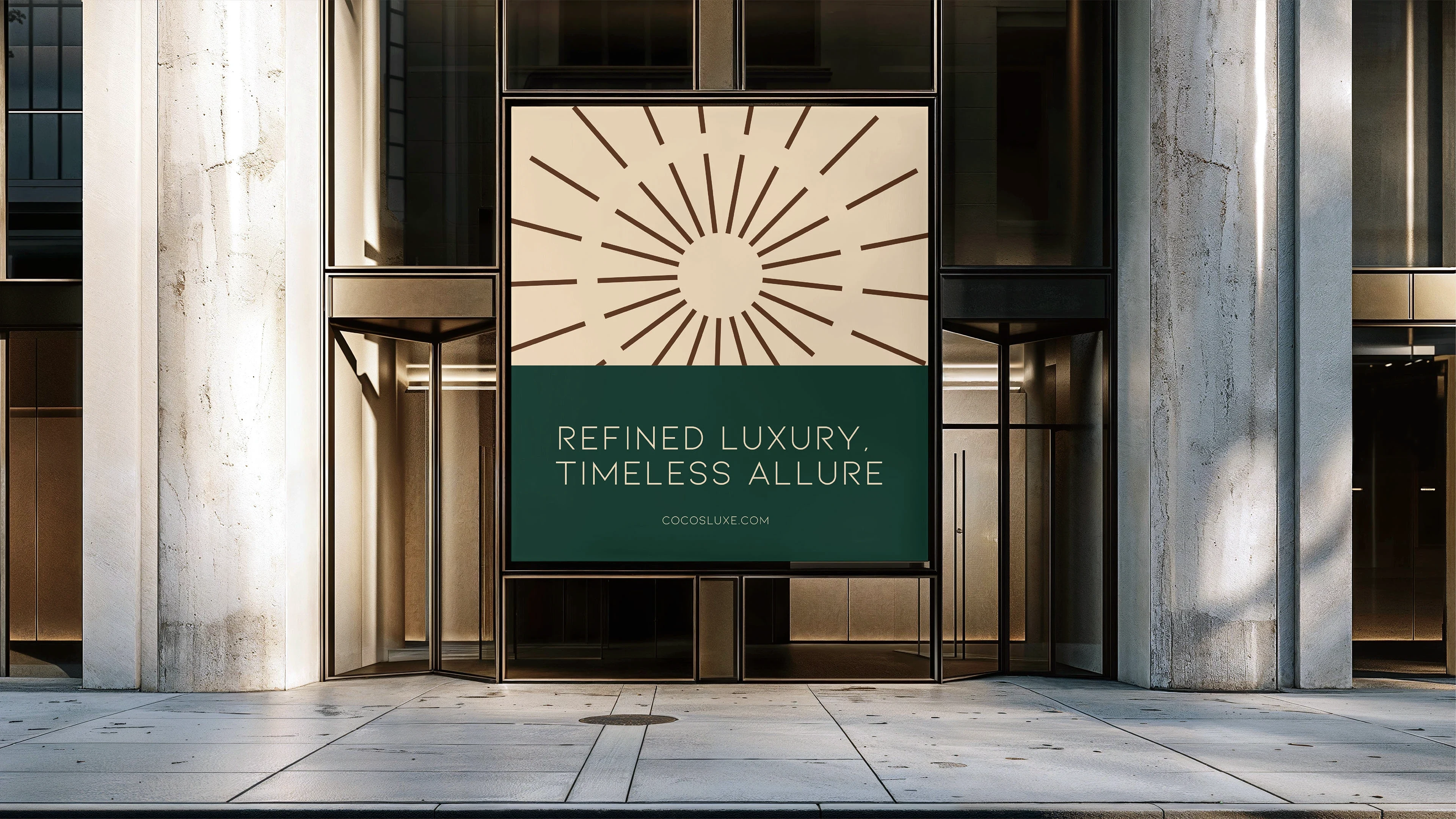
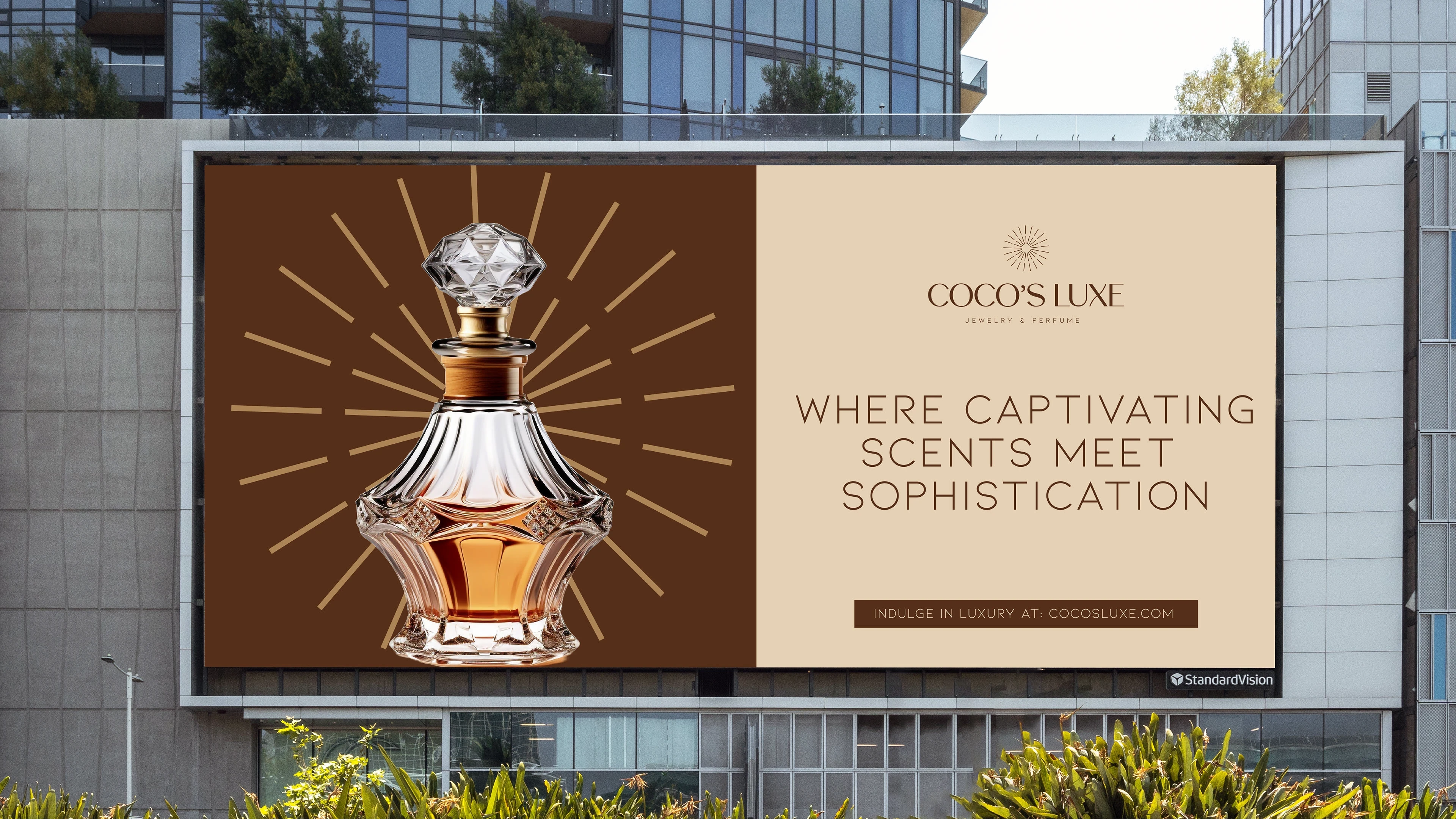
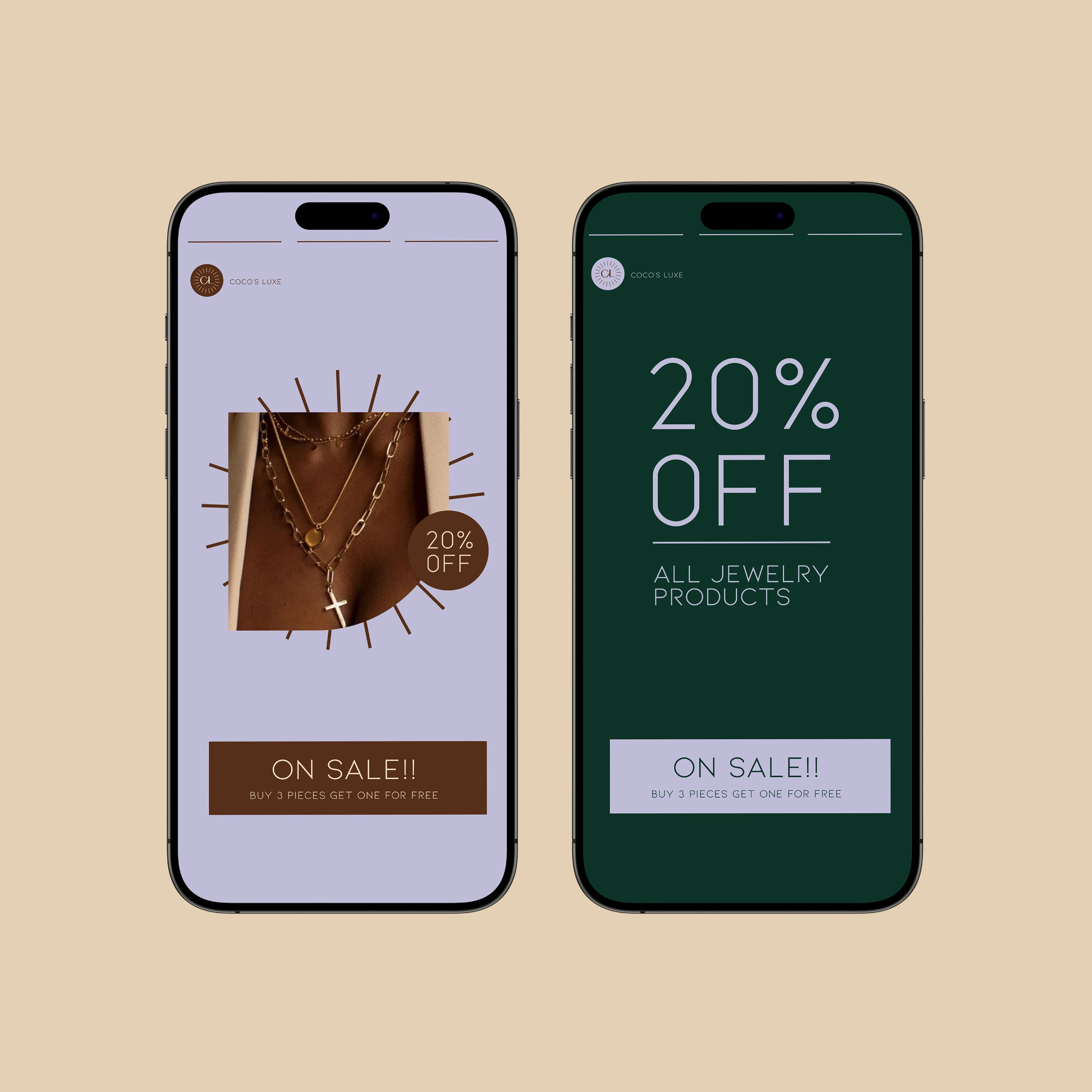
The logo reflects Coco’s Luxe’s dedication to timeless sophistication through a classic, elegant font paired with a symbolic icon. The icon evokes the sparkle of fine jewelry or the delicate spray of a perfume, adding depth, allure, and a subtle sense of glamour. This combination communicates warmth, beauty, and brilliance while remaining modern and versatile. Designed for flexibility, the identity works across digital, print, and packaging applications, ensuring the brand consistently conveys elegance, luxury, and lasting charm to its audience.
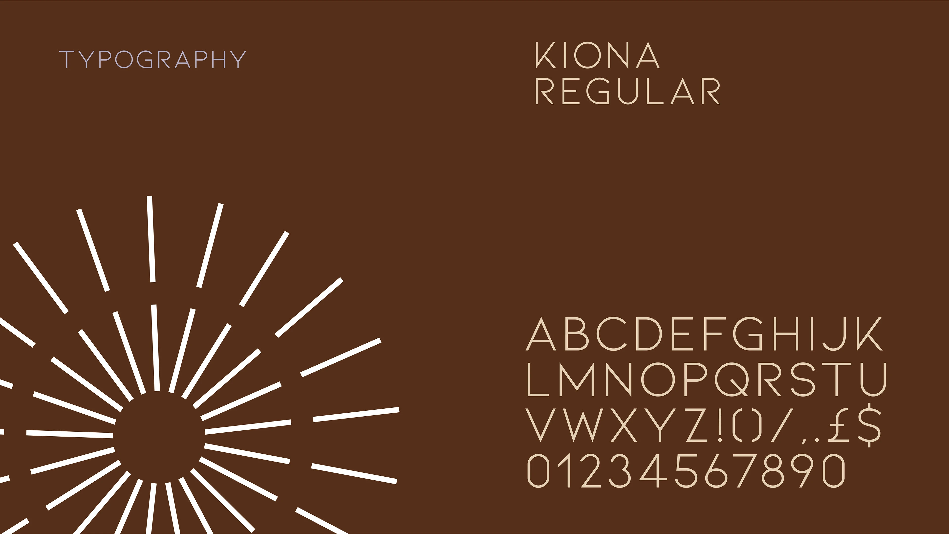
Typography & Color
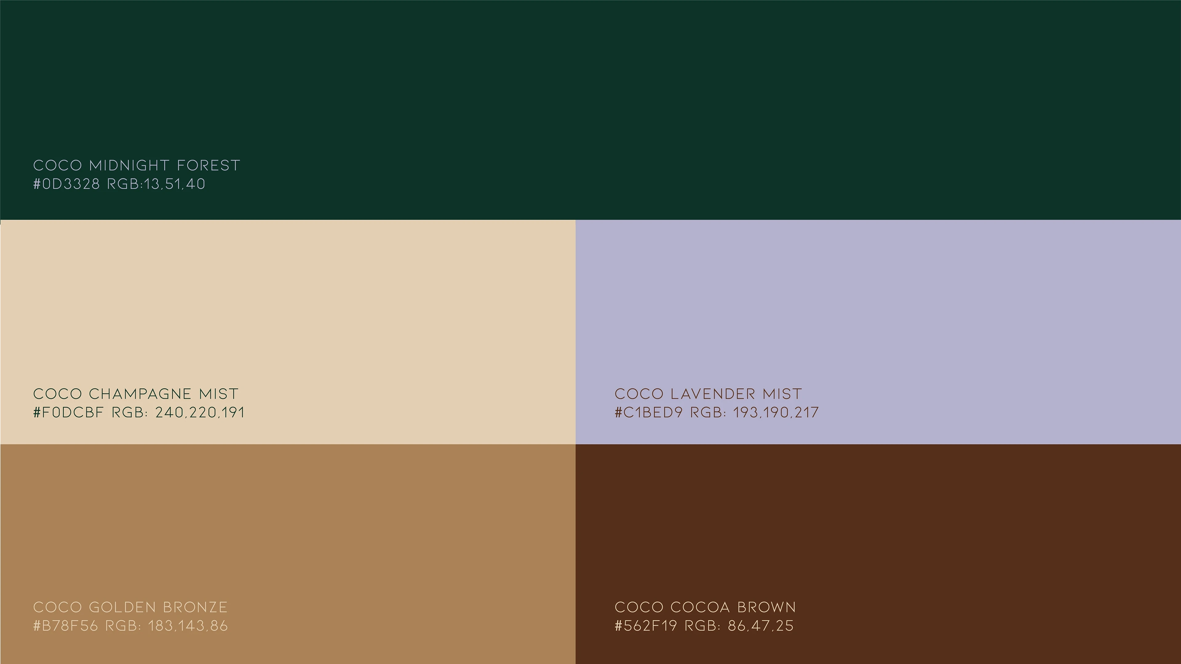
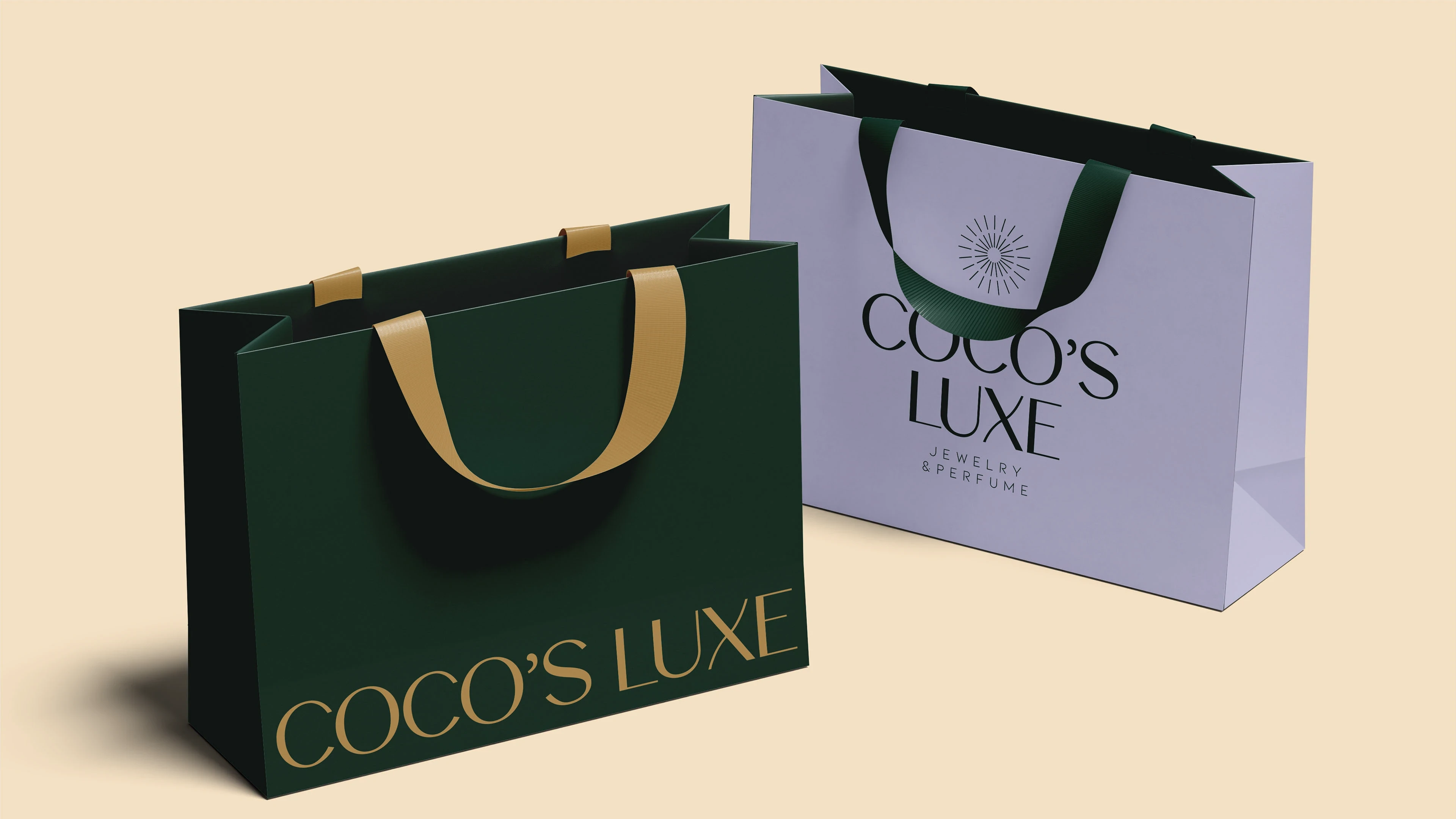
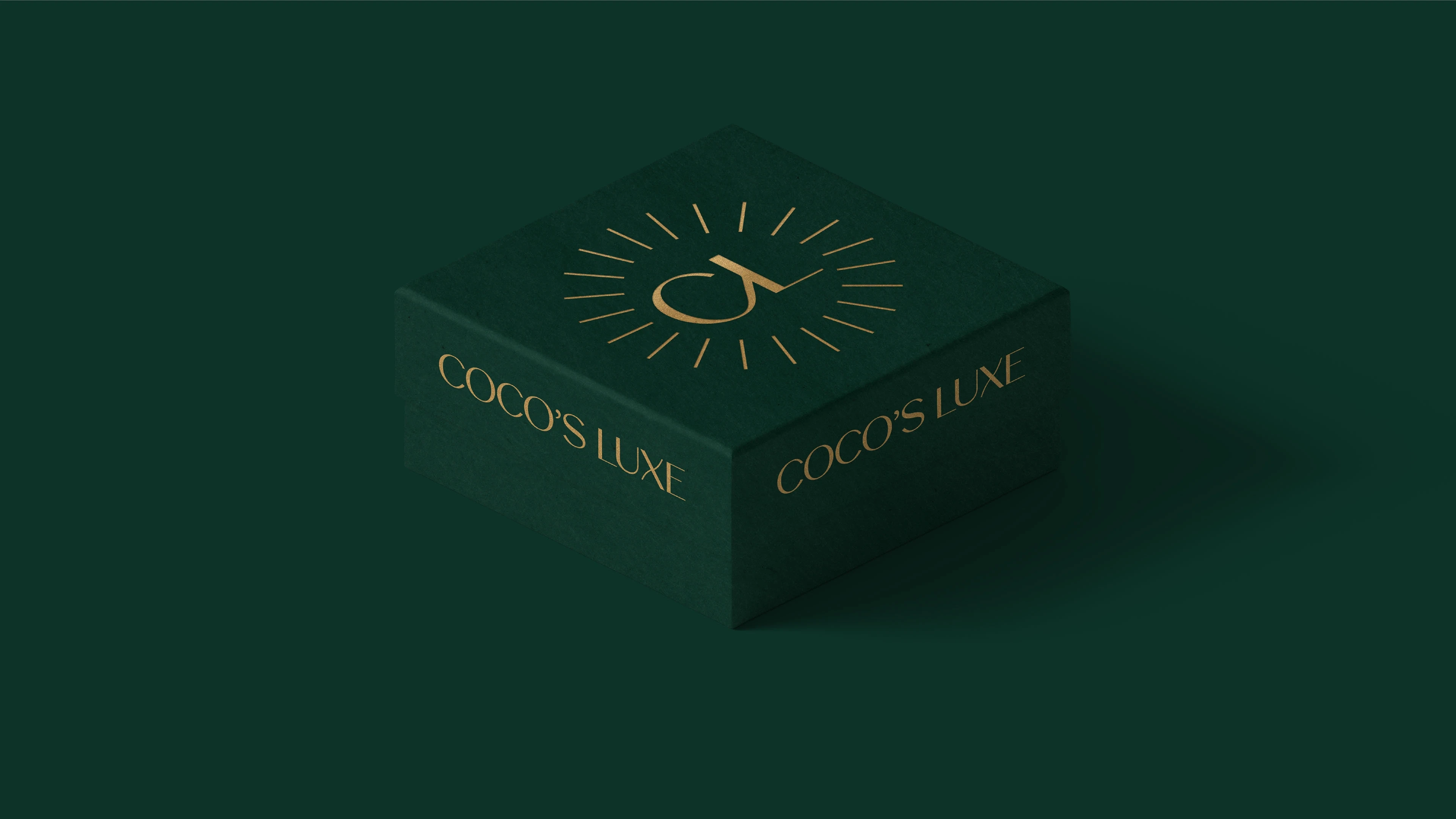
Typography and colour were chosen to reinforce Coco’s Luxe’s premium positioning. Kiona, a clean sans-serif, communicates modernity and refinement, balancing readability with elegance. The colour palette blends deep forest greens, champagne and lavender tones, rich golden bronze, and cocoa brown—evoking luxury, warmth, and sophistication. Together, typography and colour create a cohesive, versatile identity that supports the brand’s promise of curated elegance and elevated experiences across all touchpoints.

Like this project
Posted Jan 15, 2026
Developed a luxury brand identity for Coco's Luxe, emphasising elegance and sophistication.
Likes
0
Views
2
Timeline
May 7, 2024 - May 22, 2024