Deesnpohub
David Fabunmi
About the Brand
Deesnpohub is a forward-thinking creative and management agency dedicated to empowering small and medium-sized enterprises (SMEs). By combining branding, strategic management, web development, and digital marketing solutions, the agency helps businesses discover their unique voice, strengthen their market presence, and achieve measurable growth. Rooted in inspiration and innovation, Deesnpohub thrives on collaboration and forward-thinking solutions, guiding SMEs to make a meaningful impact in a competitive marketplace.
The Challenge
SMEs often struggle to communicate their value and compete effectively due to limited resources or unclear positioning. Deesnpohub needed a visual identity that could communicate expertise, creativity, and guidance while demonstrating approachability and flexibility. The challenge was to create a brand system that could unify its broad range of services—branding, digital, and management—into a cohesive identity that inspires confidence and engagement.
The Direction
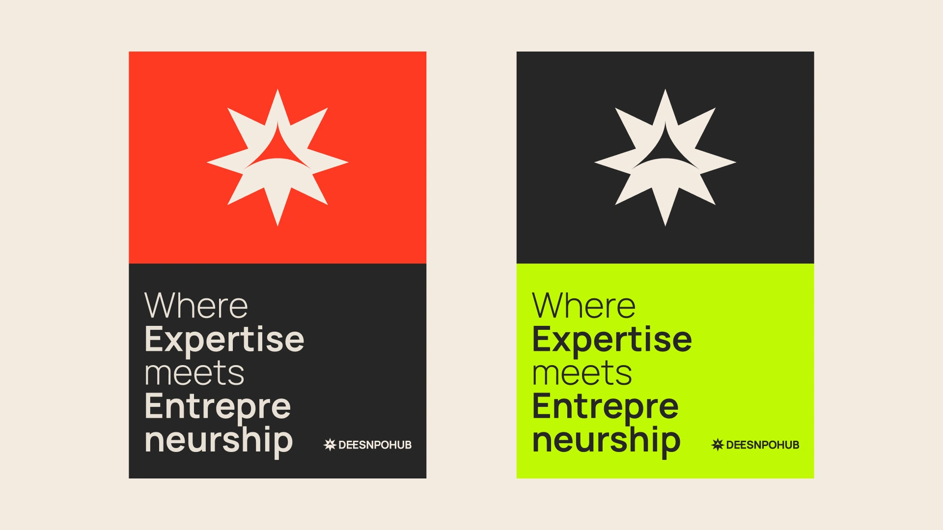
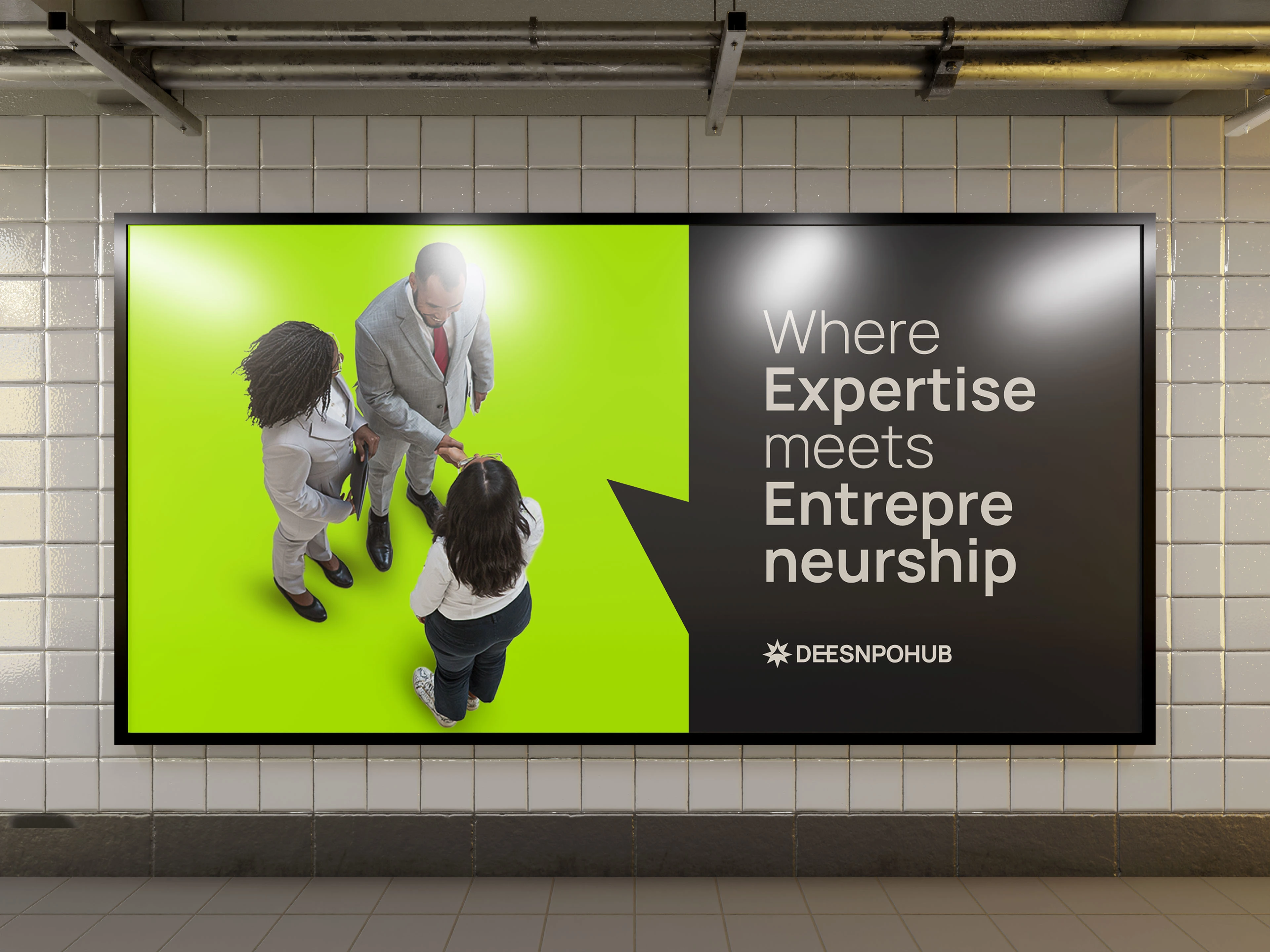
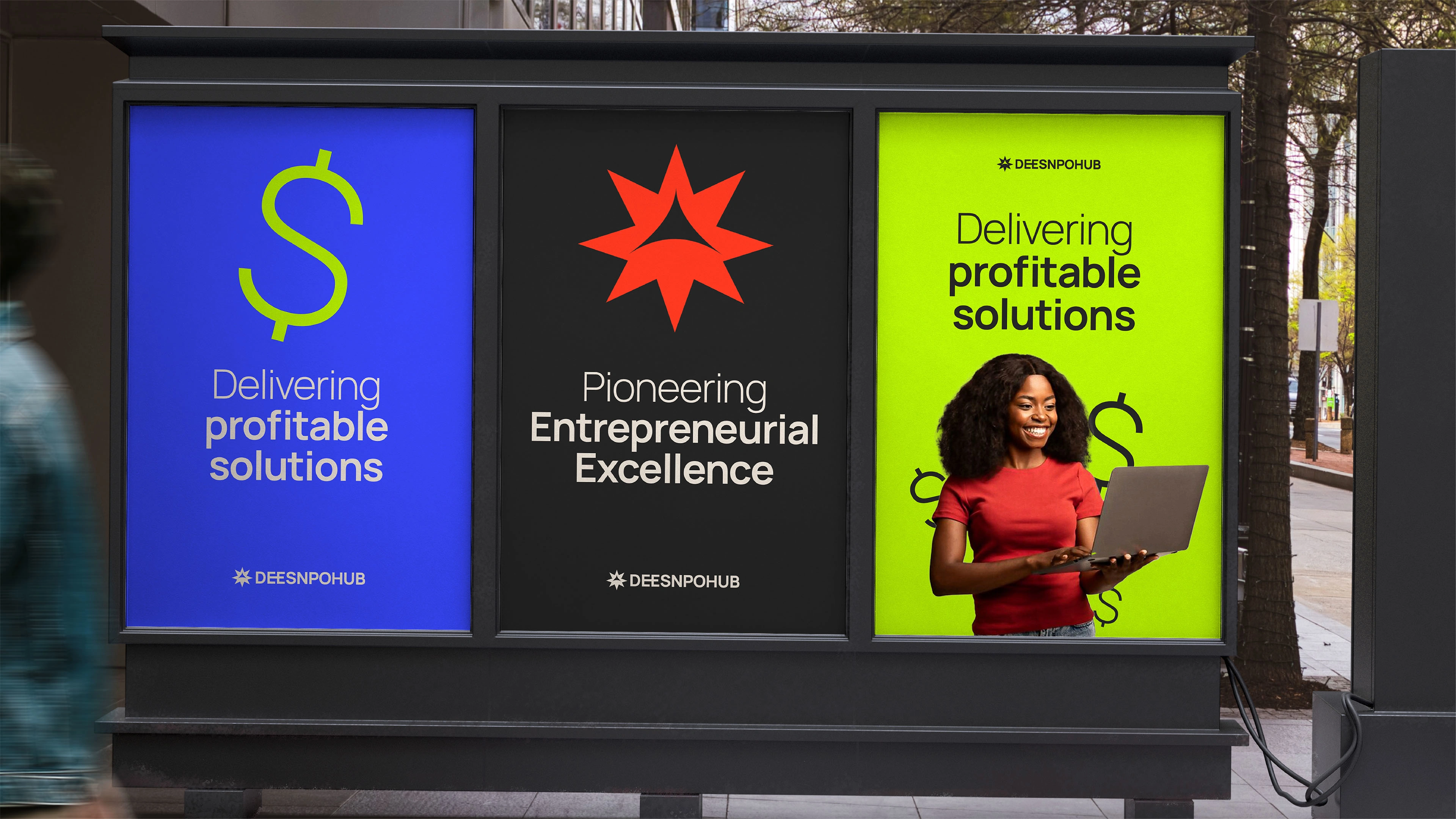
The brand was positioned around inspiration, guidance, and growth. Deesnpohub’s identity needed to embody the spark of ideas, collaboration, and forward momentum. The focus was on visually translating the agency’s role as a partner in progress—helping SMEs navigate their growth journeys through innovative, tailored solutions that balance creativity with strategic precision.
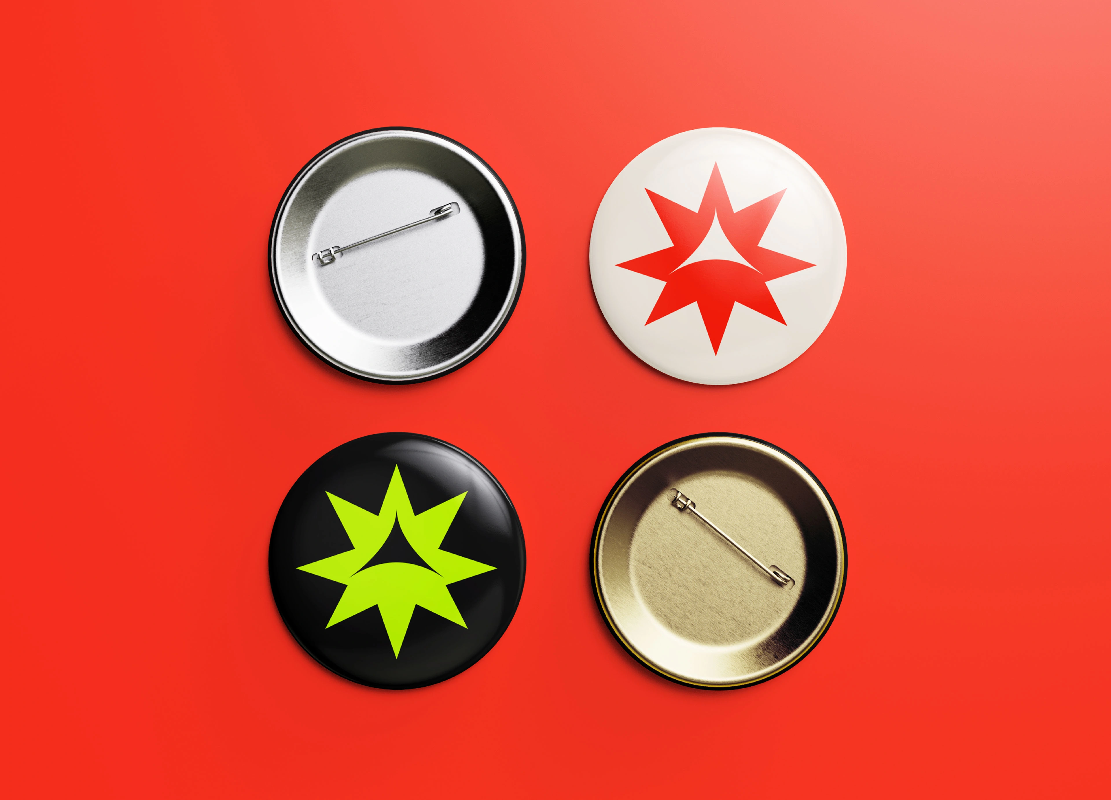
Identity Concept
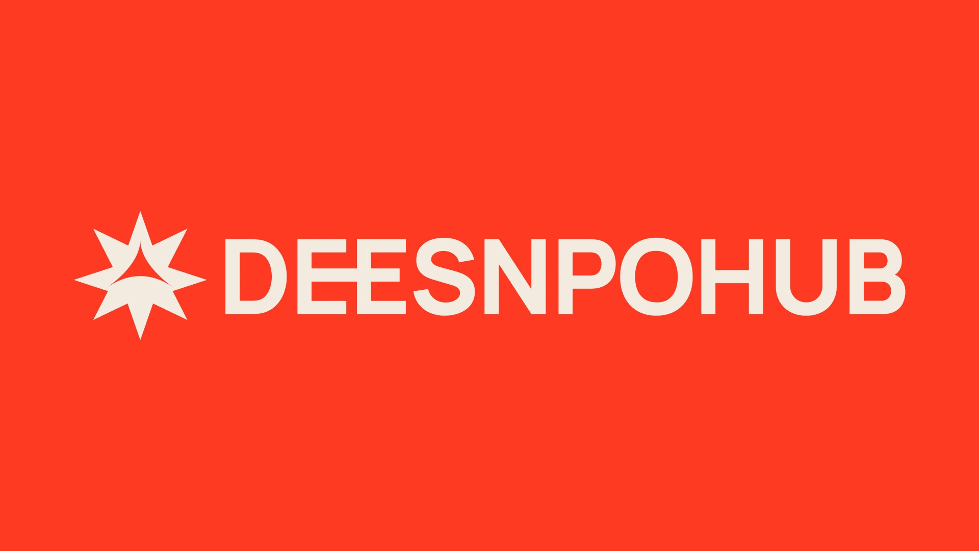
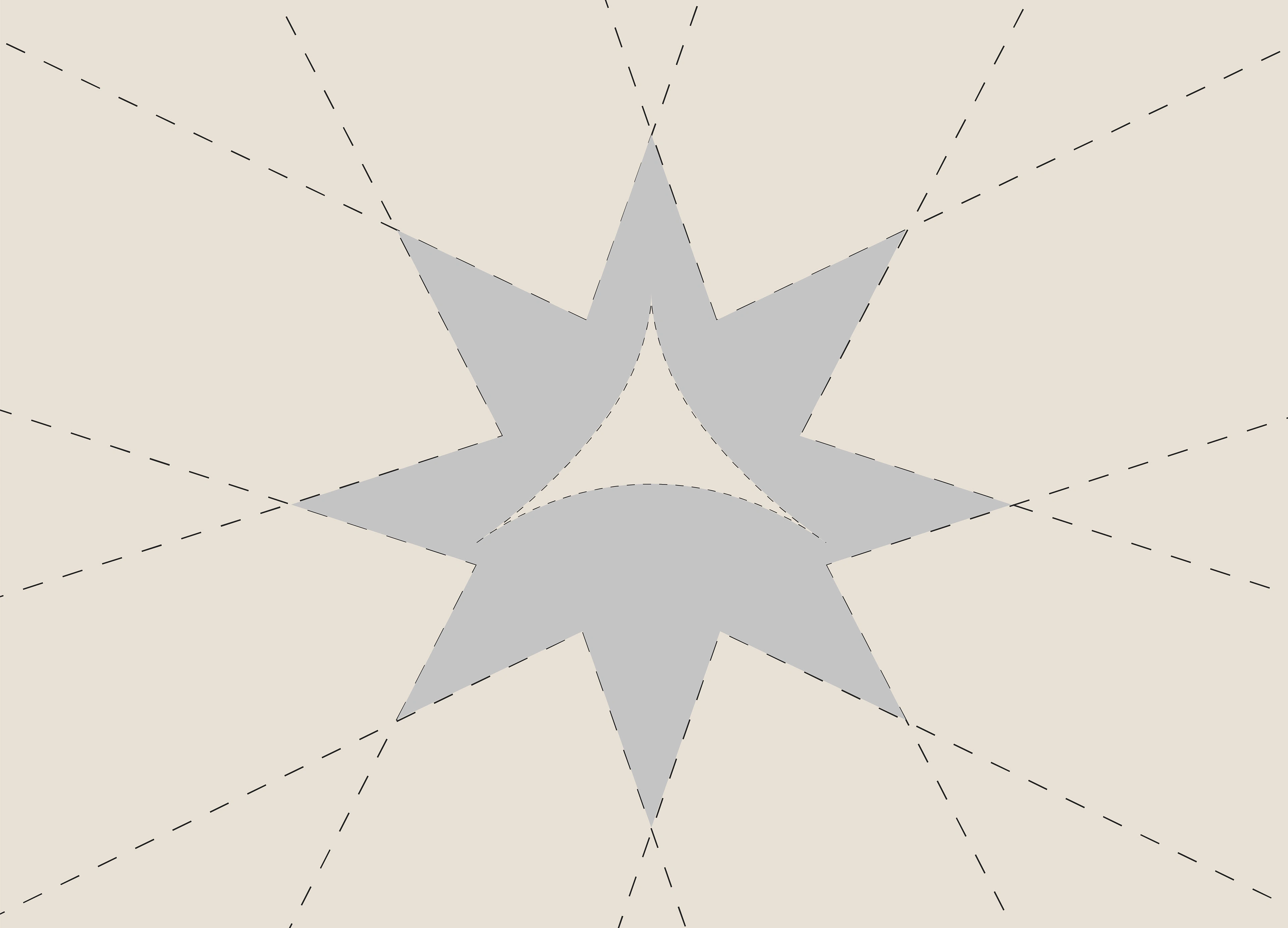
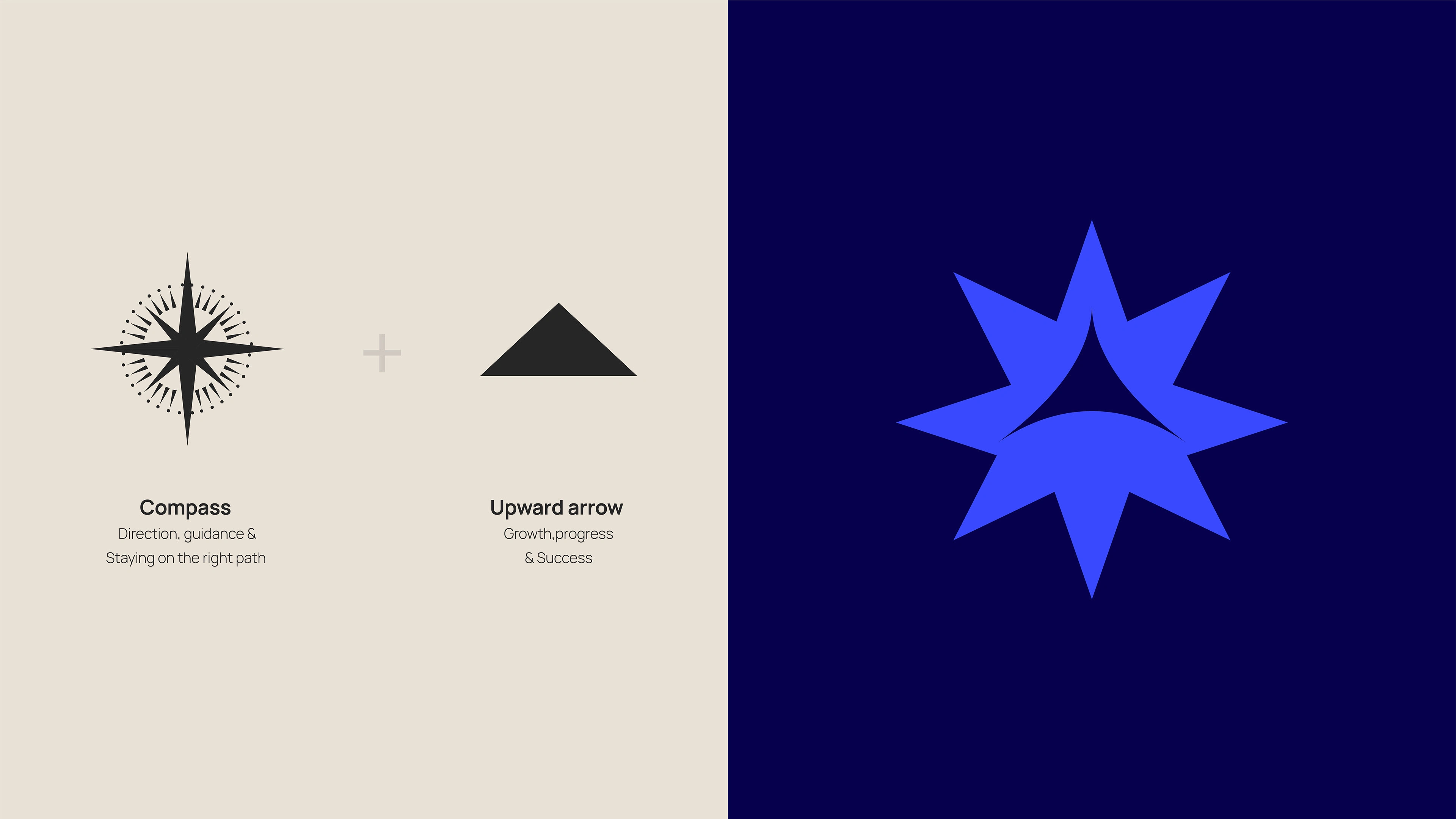
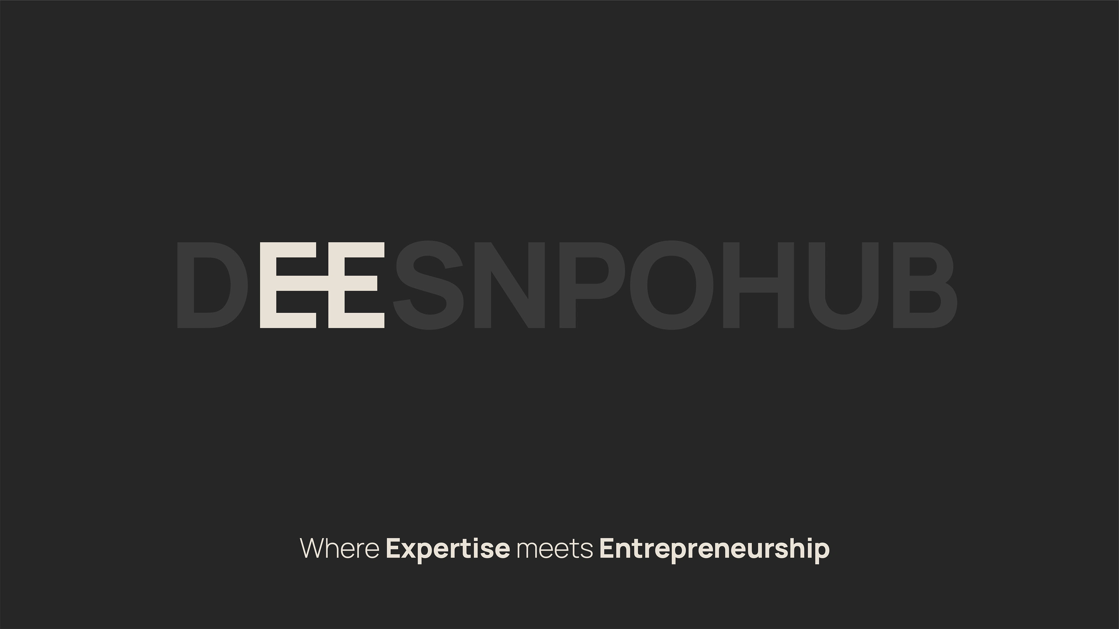
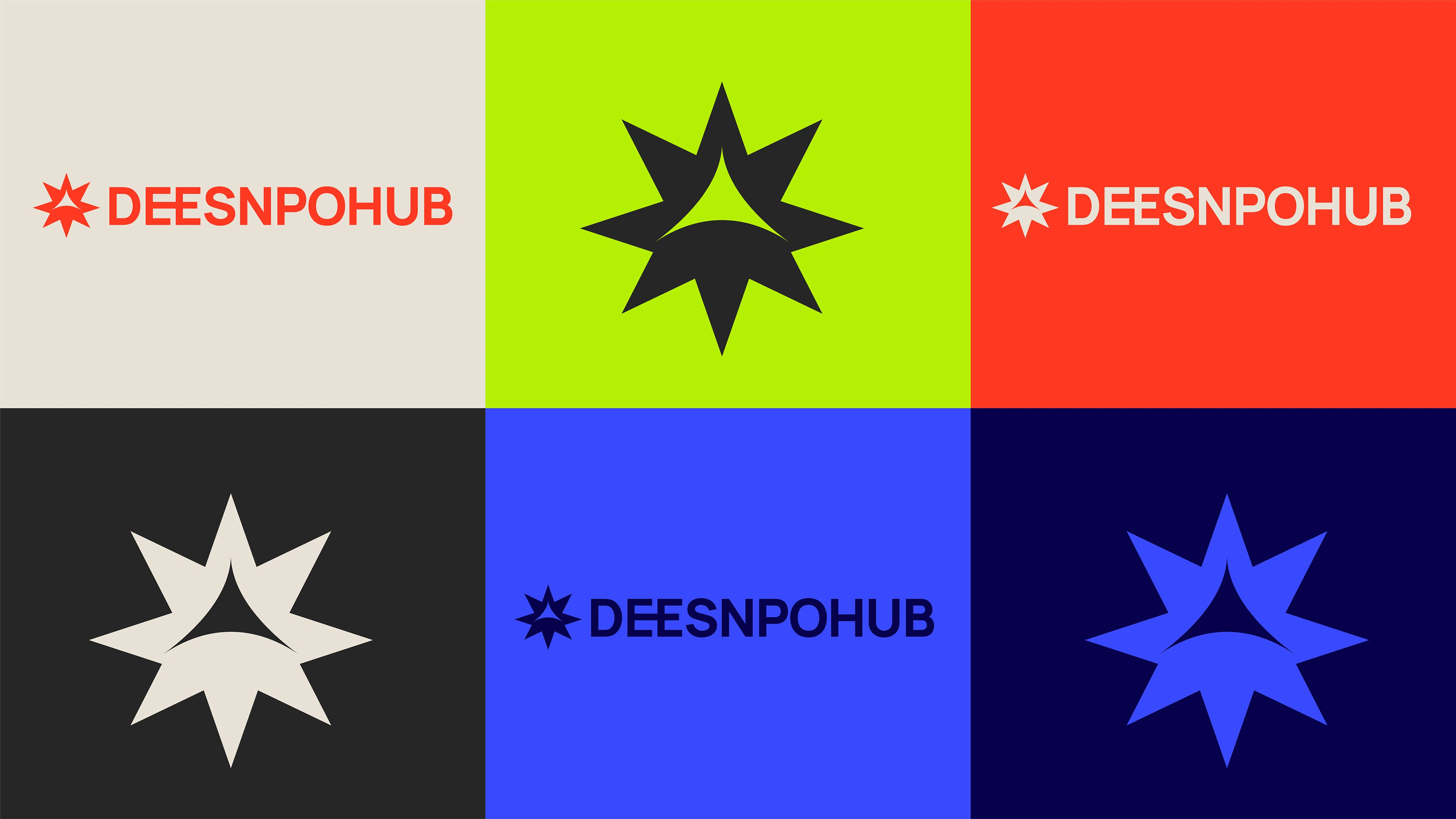
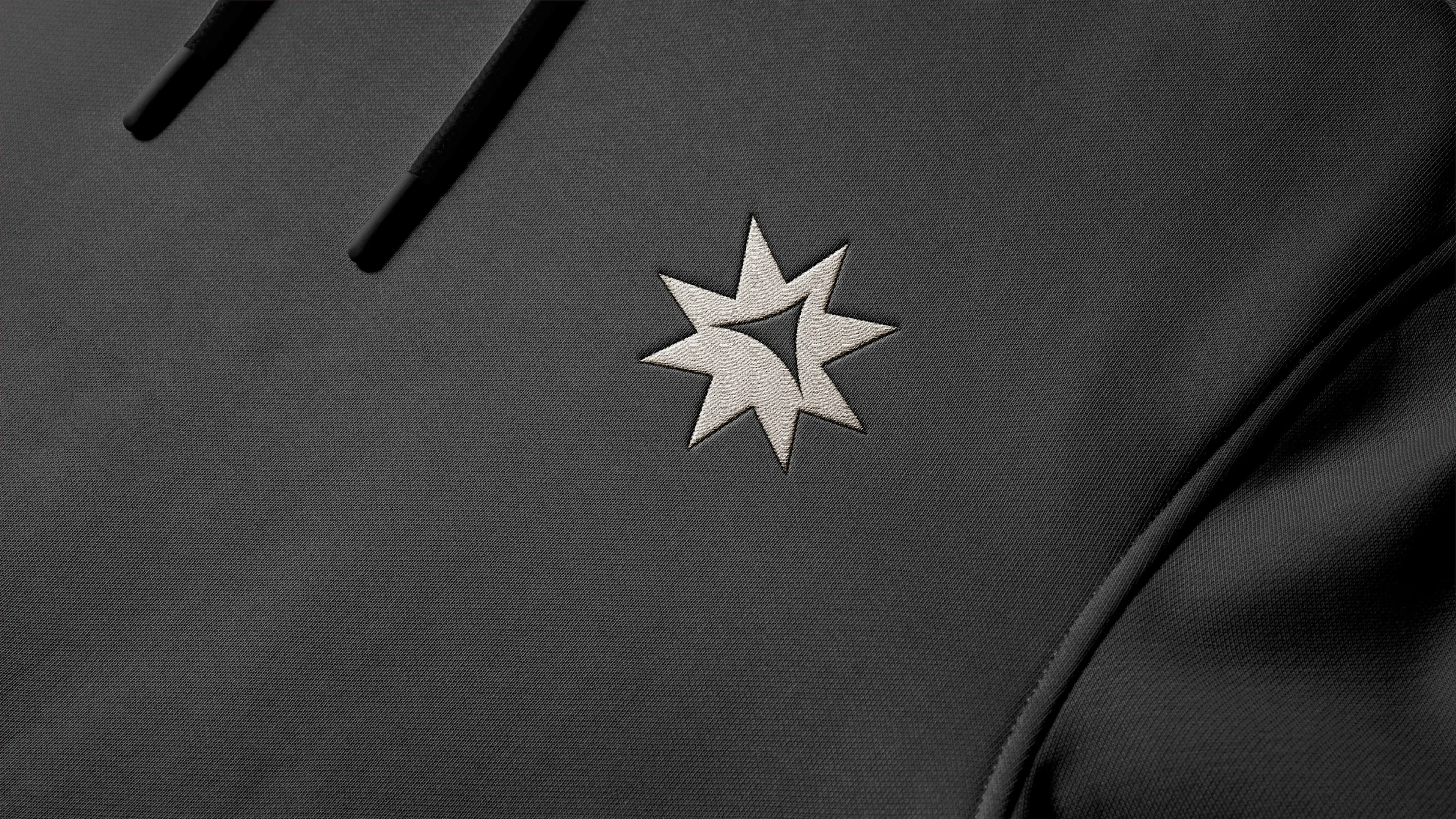
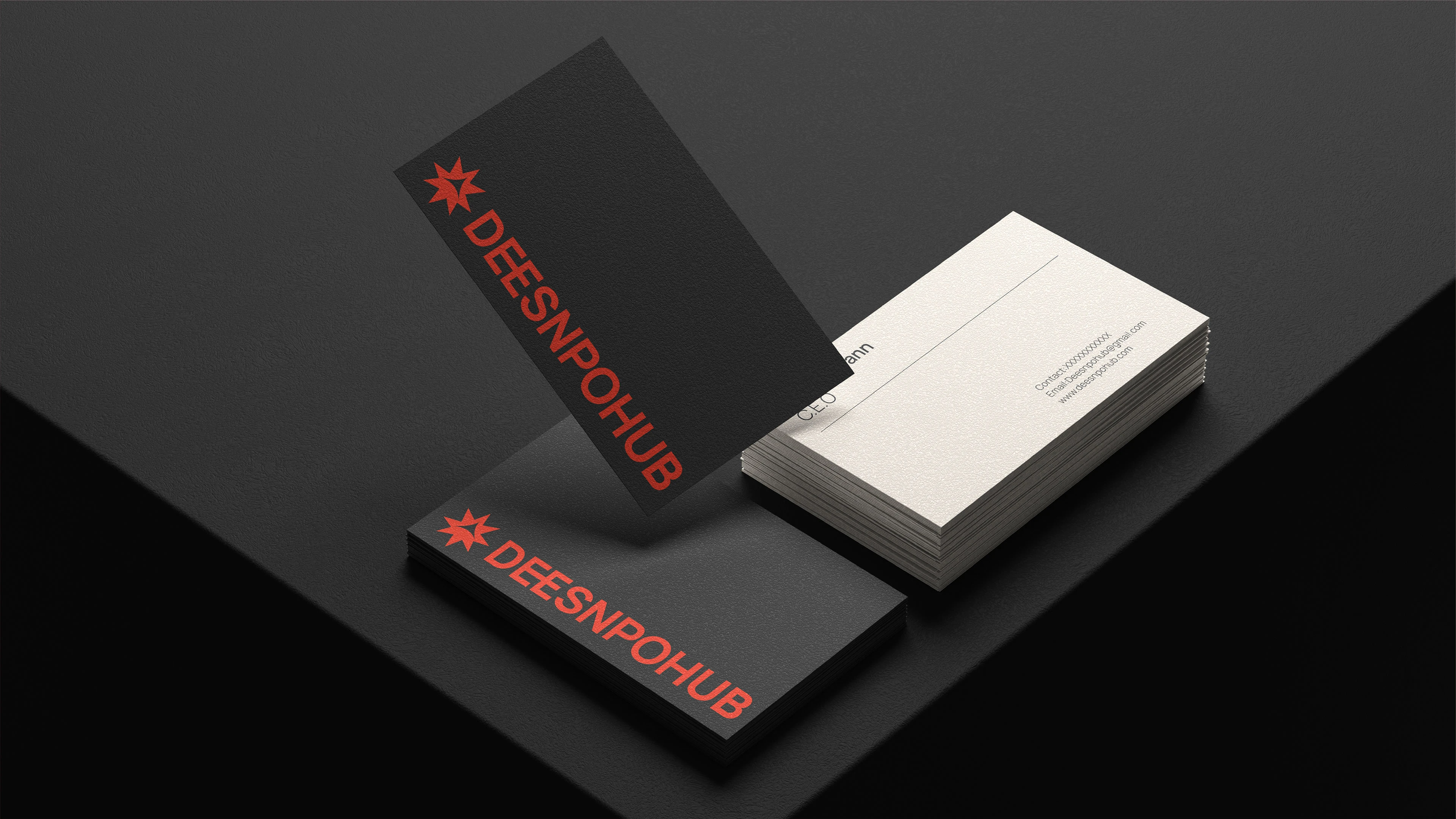
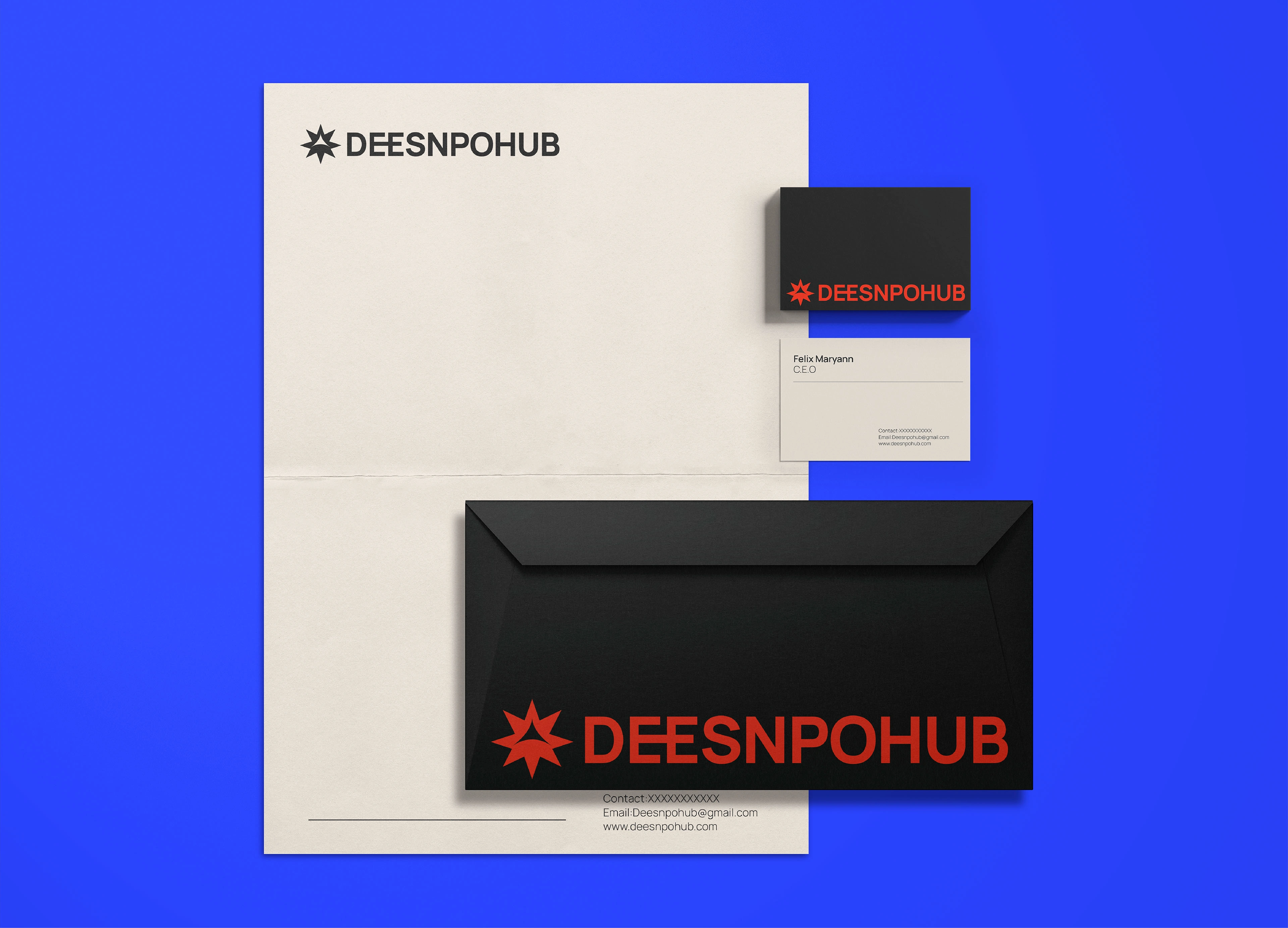
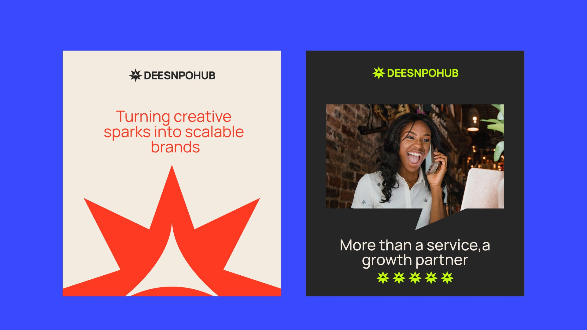
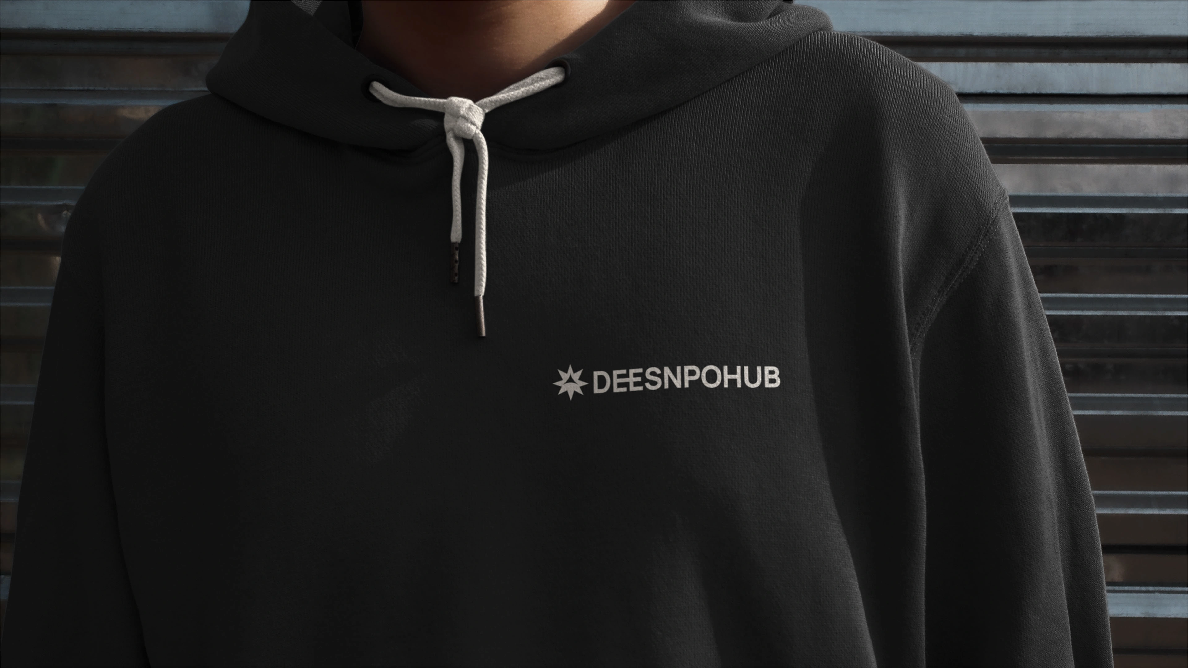
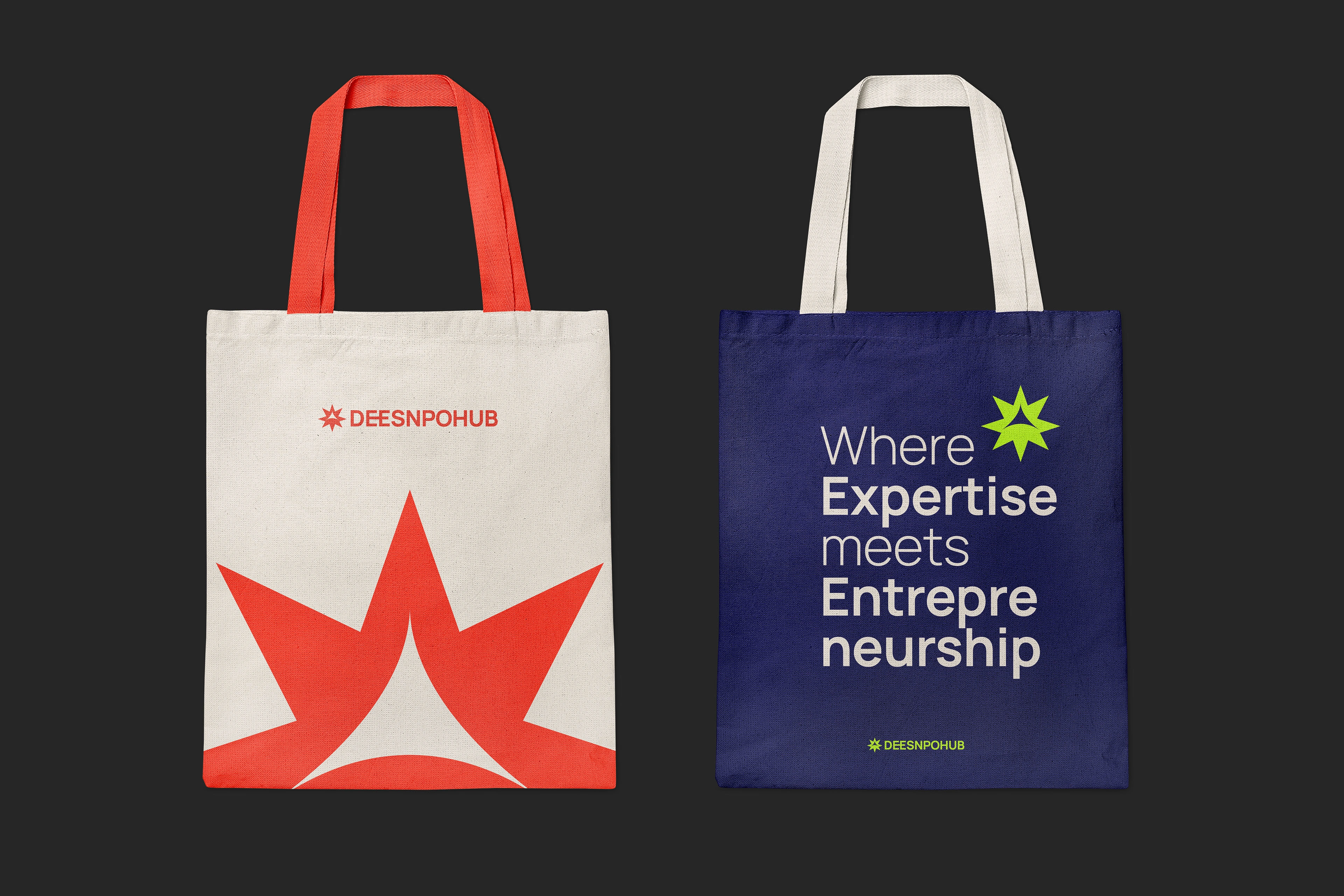
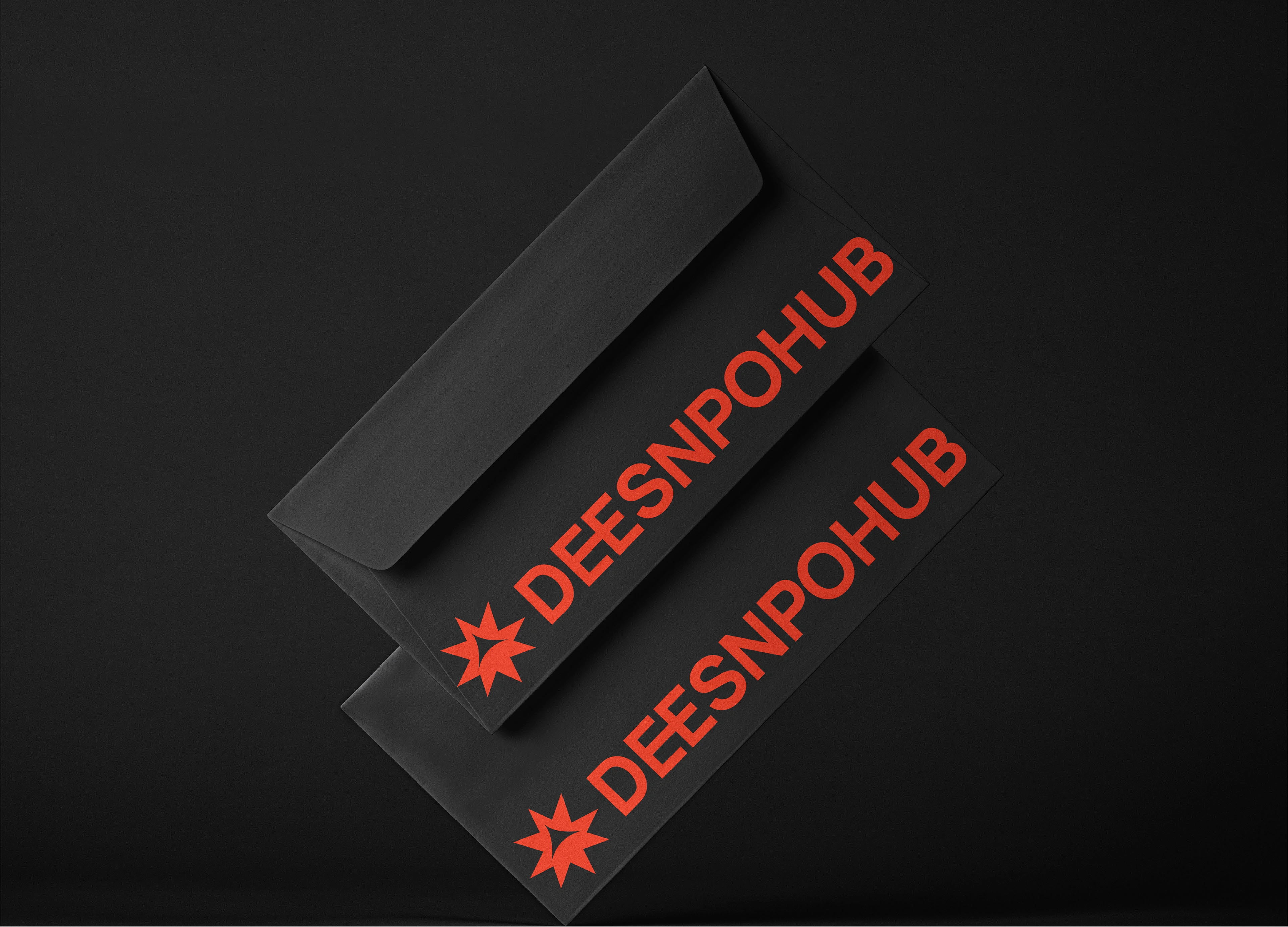
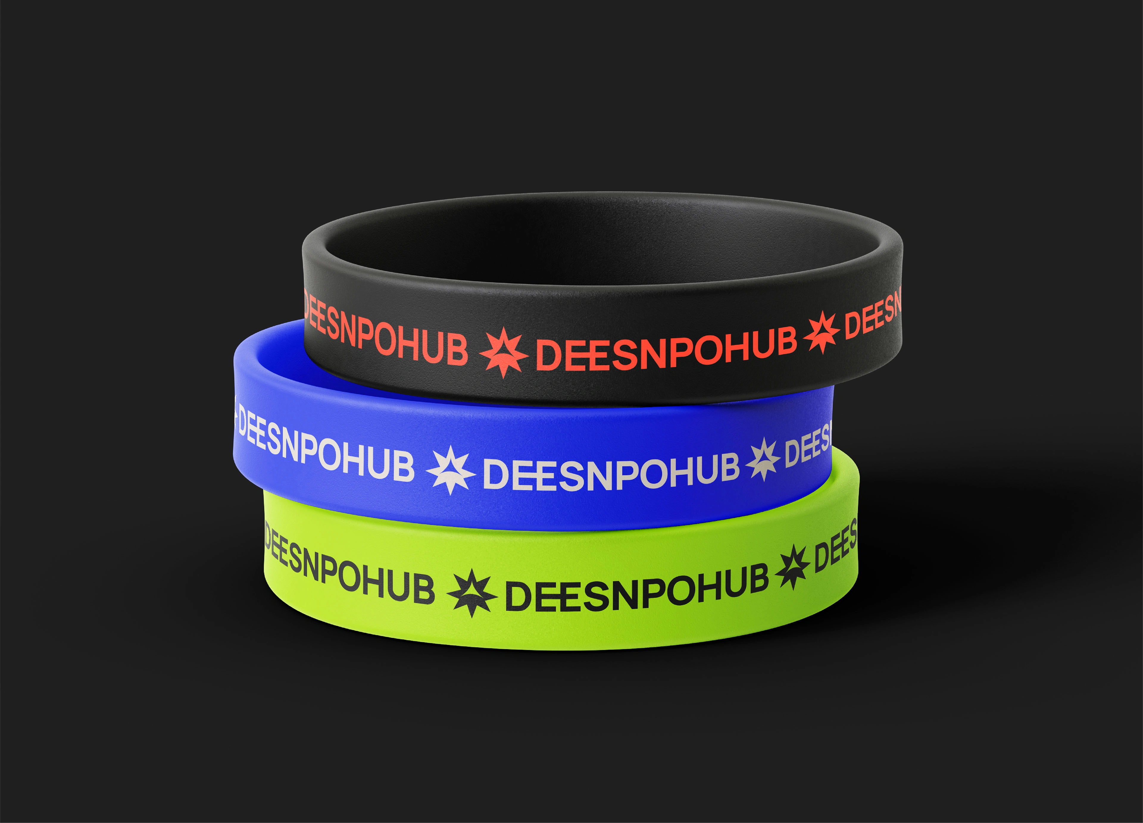
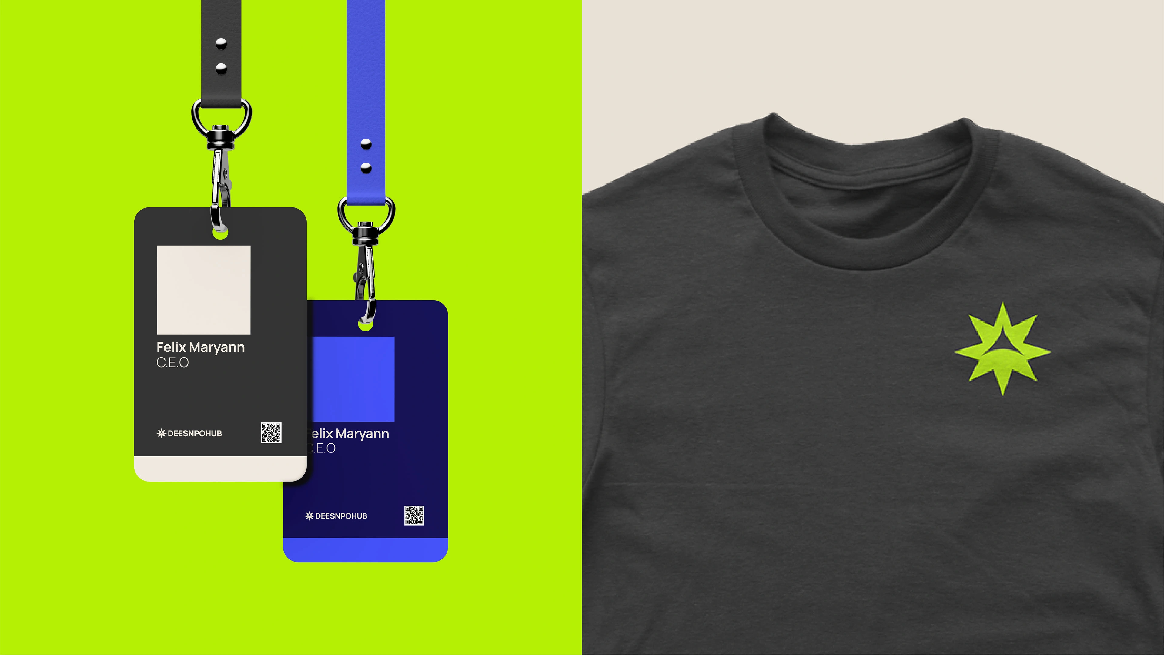
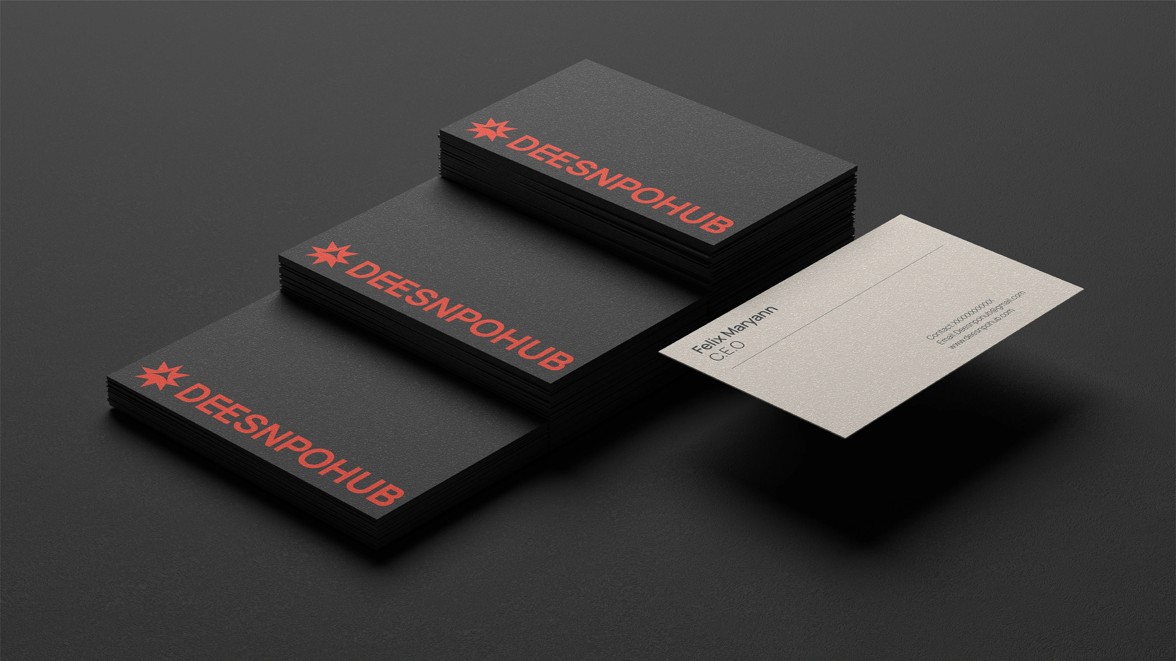
The logo draws inspiration from the compass rose, symbolising direction, guidance, and the spark of creative thinking. Each angle represents the diversity of services offered, while the upward arrow reflects growth, progress, and innovation. The connected “EE” in the name visually reinforces collaboration, highlighting the dynamic partnership between Deesnpohub and its clients. Together, these elements form a flexible, versatile mark that communicates expertise, creativity, and trust while remaining distinctive and memorable across all platforms.
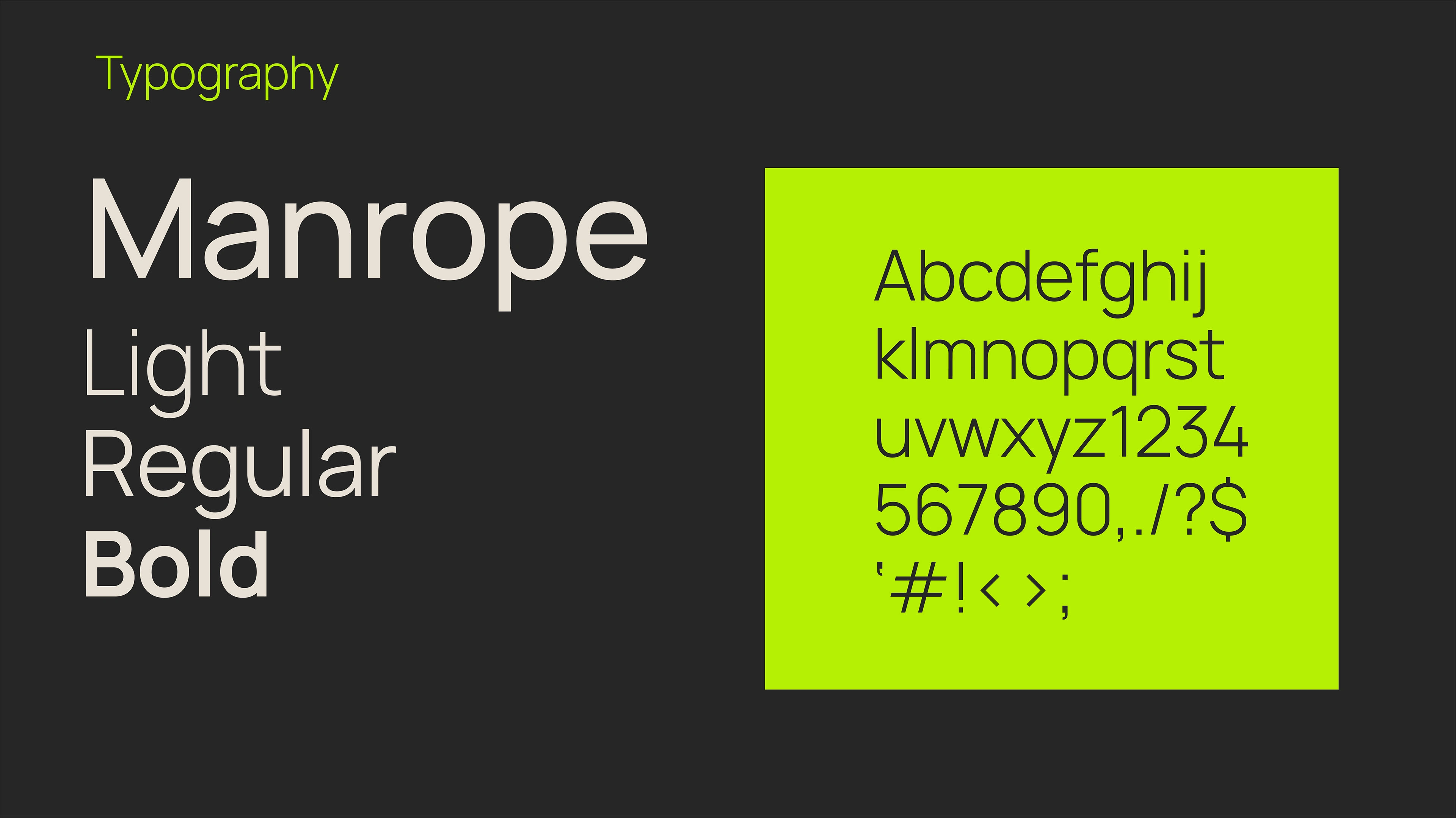
Typography & Color
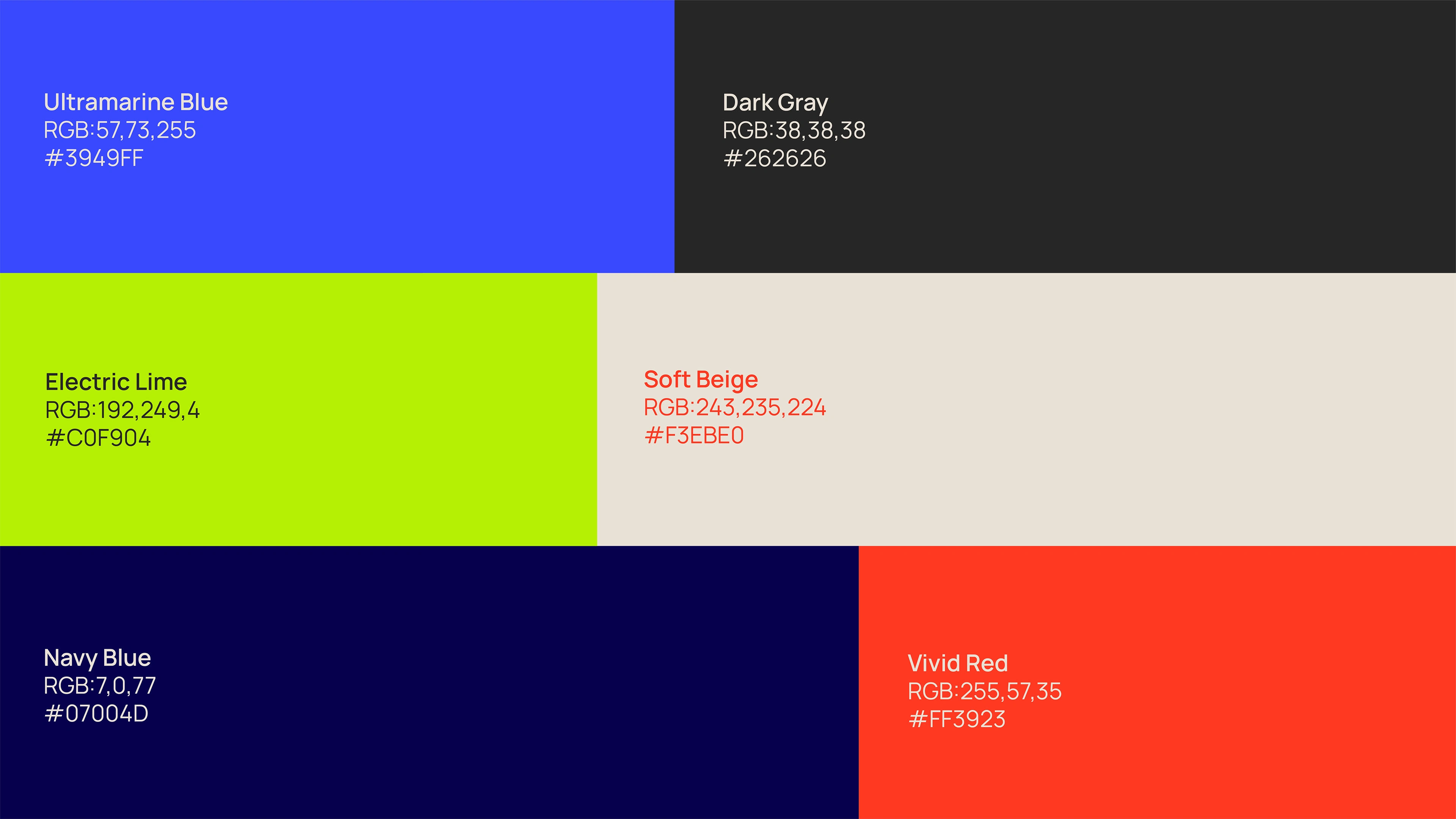
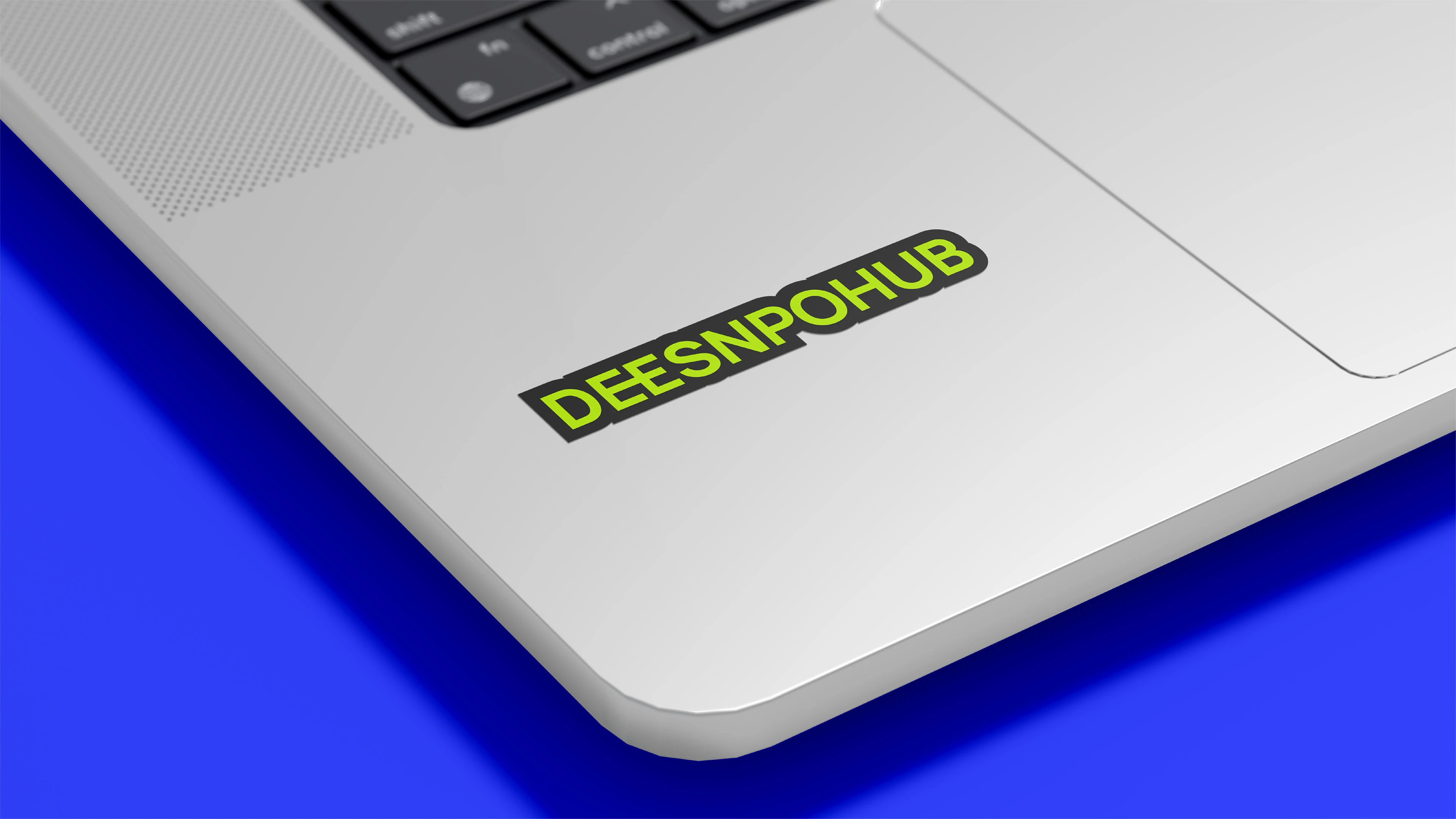
Typography and colour were chosen to convey clarity, professionalism, and energy. The Manrope family strikes a balance between modernity and readability, providing a clean foundation for both digital and print applications. The colour palette combines Ultramarine Blue for confidence, Electric Lime for creativity, Vivid Red for impact, Dark Grey for stability, Navy Blue for depth, and Soft Beige for warmth. Together, these choices create a versatile and cohesive visual system that reflects Deesnpohub’s mission to inspire growth, foster collaboration, and deliver strategic excellence.
Like this project
Posted Jan 15, 2026
Brand identity designed to help Deesnpohub guide SMEs with clarity, confidence, and a cohesive visual system that supports growth and credibility.
Likes
0
Views
0
Timeline
Aug 15, 2023 - Sep 7, 2023