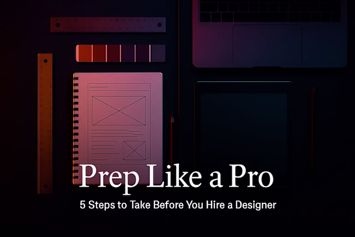
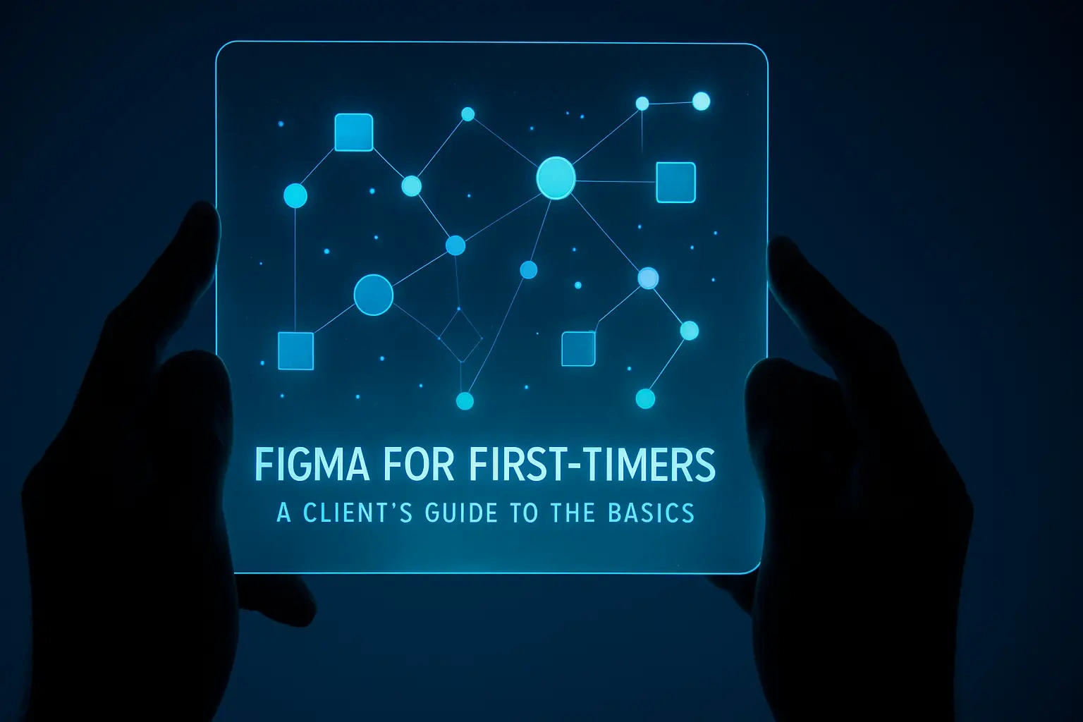
Figma for First-Timers: A Client’s Guide to the Basics
Randall Carter
Figma for First-Timers: A Client's Guide to the BasicsWhat is Figma and Why Do Designers Love It?It's All in the CloudReal-Time CollaborationYour Figma Survival Guide: The Three Views You Need to KnowNavigating the Canvas: Zooming and PanningThe Comment Tool: Your Feedback SuperpowerPresentation View: Bringing Prototypes to LifeBest Practices for Giving Great Feedback in FigmaBe Specific and ContextualFocus on the 'Why,' Not the 'How'Batch Your FeedbackBeyond Comments: Understanding Pages and VersionsUsing the Pages PanelA Quick Look at Version HistoryWrapping Up Your Figma JourneyReferences
Figma for First-Timers: A Client's Guide to the Basics
So your designer just sent you a Figma link, and you're staring at your screen wondering what to do next. Don't worry—you're not alone. Many clients feel intimidated when they first encounter Figma, but here's the truth: you don't need to be a design expert to use it effectively. Think of this guide as your friendly introduction to navigating design files and giving feedback like a pro.
Whether you're hiring a Figma designer for the first time or working with an established team, understanding the basics of Figma will transform your collaboration experience. Just like following the steps to take before you hire a designer helps set your project up for success, knowing how to navigate Figma ensures smooth communication throughout the design process. And if you're still decoding designer roles, don't stress—this knowledge applies regardless of which type of designer you're working with.
What is Figma and Why Do Designers Love It?
Figma isn't just another design tool—it's revolutionized how designers and clients work together. At its core, Figma is a cloud-based design platform that lets you view, comment on, and interact with designs right in your web browser. No special software needed, no massive files to download, and definitely no design degree required.
The magic happens because everything lives online. Your designer creates in Figma, and you can jump in to review their work instantly. It's like having a window into their creative process, but one where you can actually participate. This transparency and accessibility explain why Figma has become the go-to tool for modern design teams.
It's All in the Cloud
Remember the days of emailing design files back and forth? Or worse, trying to figure out which version was the latest? Figma eliminates all that confusion. Since everything exists in the cloud, there's only one version of the truth—the current design that everyone sees.
Here's what this means for you: When your designer shares a Figma link, clicking it opens the most up-to-date version of your project. No downloads, no installations, no compatibility issues. Whether you're on a Mac, PC, or even a tablet, if you have a web browser, you can access your designs.
This cloud-based approach also means your designer can make updates in real-time. They might fix that typo you spotted while you're still on a call with them. You'll see the change happen instantly, right before your eyes. It's this immediate, seamless experience that makes collaboration feel effortless.
Real-Time Collaboration
If you've ever used Google Docs, you already understand the power of real-time collaboration. Figma works the same way. Multiple people can be in the same file simultaneously, and you can actually see their cursors moving around as they work.
Picture this: You're reviewing a new homepage design while your designer is on the other side of the world. You can watch as they adjust the layout based on your verbal feedback during a video call. You might see your marketing manager's cursor hovering over the headline while your developer examines the navigation menu. Everyone's literally on the same page.
This collaborative environment extends beyond just viewing. You can leave comments, tag team members, and have discussions right inside the design file. It's like having a virtual conference room where the design is always front and center. No more screenshot confusion or trying to describe which button you're talking about—you can point directly at it.
Your Figma Survival Guide: The Three Views You Need to Know
Now that you understand what Figma is, let's get practical. As a client, you'll primarily use three features: navigating the canvas, leaving comments, and viewing prototypes. Master these, and you'll handle 95% of what you need to do in Figma.
Think of Figma's interface like a digital whiteboard. Your designer has placed their work on this whiteboard, and you need to know how to move around, zoom in on details, and interact with what you see. The good news? It's much simpler than it looks.
Navigating the Canvas: Zooming and Panning
When you first open a Figma file, you might feel overwhelmed by the vast canvas. Designs can sprawl across what seems like endless space. But moving around is intuitive once you know the tricks.
Zooming is your best friend. Use your mouse wheel or trackpad to zoom in and out. Need to see the big picture? Zoom out. Want to examine that button text? Zoom in. You can also use keyboard shortcuts: hold Cmd/Ctrl and press + to zoom in, or - to zoom out.
Panning lets you move around the canvas. Hold down the spacebar and your cursor turns into a hand. Click and drag to move the view. It's like sliding a piece of paper around on your desk. This spacebar trick works in most design tools, so it's a handy one to remember.
Pro tip: If you ever get lost, press Shift+1. This magical shortcut zooms out to show everything on the canvas. It's your "help, I'm lost" button that instantly gives you the bird's-eye view.
The Comment Tool: Your Feedback Superpower
The comment tool is where the real collaboration happens. Look for the speech bubble icon in the toolbar—that's your gateway to giving feedback. Click it, then click anywhere on the design to drop a comment pin.
Here's the beautiful part: your comment attaches to that exact spot. No more writing "the blue button in the header"—you literally pin your feedback to the blue button. Your designer sees exactly what you're referring to, eliminating confusion and speeding up revisions.
When leaving comments, you can tag team members using @ followed by their name. This sends them a notification, ensuring important feedback doesn't get missed. Once an issue is resolved, either you or the designer can mark the comment as resolved, keeping the file clean and organized.
Comments also support threads, so discussions can happen naturally. Your designer might respond with clarifying questions, you can answer, and before you know it, you've solved a design challenge together—all documented in one place.
Presentation View: Bringing Prototypes to Life
Static designs only tell half the story. That's where Figma's prototype feature shines. When your designer creates a prototype, they're showing you how the design will actually work. Buttons become clickable, pages flow into each other, and suddenly you're experiencing your future website or app.
To view a prototype, look for the play button (▶️) in the top-right corner of the Figma interface. Clicking it opens presentation mode, where the design fills your screen and becomes interactive. Now you can click buttons, fill forms, and navigate through screens just like a real user would.
This is incredibly powerful for understanding user flow. You might realize that getting from the homepage to the contact form takes too many clicks. Or you might discover that the checkout process feels smooth and intuitive. These insights are hard to grasp from static images but become obvious when you're clicking through a prototype.
Don't be shy about exploring every clickable element. Your designer wants you to experience the full journey. If something doesn't work as expected, that's valuable feedback. Maybe a button should lead somewhere different, or perhaps a navigation element is missing. Prototypes help catch these issues before any code is written.
Best Practices for Giving Great Feedback in Figma
Giving feedback is an art, and doing it well can dramatically improve your project outcomes. The goal isn't just to point out what you don't like—it's to help your designer understand your vision and create something even better than you imagined.
Great feedback is specific, contextual, and focused on goals rather than solutions. It respects the designer's expertise while clearly communicating your needs. Let's explore how to master this balance.
Be Specific and Contextual
Vague feedback is the enemy of progress. "I don't like this" leaves your designer guessing. "This headline doesn't convey urgency for our limited-time offer" gives them direction. See the difference?
When you drop a comment pin, take advantage of its precision. Pin it directly on the element you're discussing. Then, in your comment, be specific about what's not working and why. Instead of "Wrong color," try "This green might not provide enough contrast for users with visual impairments."
Context matters too. Explain the reasoning behind your feedback. If you're asking for a change, share what problem it solves. "Can we make the CTA button larger? Our analytics show mobile users are having trouble clicking it" is infinitely more helpful than just "Make button bigger."
Remember, your designer can't read your mind. They might not know that your CEO hates orange, or that your brand is shifting toward a more playful tone. The more context you provide, the better they can align their designs with your vision.
Focus on the 'Why,' Not the 'How'
This might be the most important feedback principle: explain problems, not solutions. You hired a designer for their expertise, so let them do what they do best—solve design problems creatively.
Instead of saying "Move the logo to the left," explain "I'm concerned the logo isn't prominent enough for brand recognition." Your designer might move it left, or they might suggest making it larger, adding more whitespace around it, or using a different background color. By focusing on the problem, you open the door to solutions you hadn't considered.
This approach respects the designer's expertise while ensuring your concerns are addressed. It's collaborative rather than prescriptive. You're partners working toward the same goal, not a boss dictating orders.
Here's a practical example: Rather than "Use red for the error messages," try "Users need to immediately recognize when they've made an error in the form." Your designer might use red, but they might also suggest an icon, animation, or different positioning that's even more effective.
Batch Your Feedback
Imagine trying to cook dinner while someone keeps popping into the kitchen with new ingredients to add. That's what scattered feedback feels like to designers. Instead, review the design thoroughly and leave all your comments in one session.
Batching feedback has several benefits. First, it's more efficient for everyone. Your designer can address all concerns in one focused work session rather than constantly context-switching. Second, it helps you see the design holistically. Issues that seem major in isolation might feel minor when you view the complete picture.
Set aside dedicated time for design reviews. Pour yourself a coffee, eliminate distractions, and go through the design methodically. Start with the big picture—does the overall direction feel right? Then zoom into details—are all the buttons labeled clearly? This systematic approach ensures nothing gets missed.
When you batch feedback, you might also notice patterns. Maybe you're consistently asking for more whitespace, or perhaps certain colors keep bothering you. These patterns can lead to broader discussions about design principles for your project, making future iterations smoother.
Beyond Comments: Understanding Pages and Versions
As you get comfortable with basic navigation and commenting, two additional Figma features will enhance your collaboration: Pages and Version History. These aren't essential for every project, but knowing about them helps you navigate larger, more complex design files.
Think of these features as the organizational backbone of your project. They keep everything tidy and ensure nothing gets lost, no matter how many iterations your design goes through.
Using the Pages Panel
Large projects rarely fit on a single canvas. That website redesign might include desktop layouts, mobile versions, component libraries, and user flow diagrams. Figma's Pages feature organizes all these pieces into a logical structure.
Look for the Pages panel on the left side of the interface. It works like tabs in a web browser or sheets in a spreadsheet. Your designer might organize pages by device type (Desktop, Mobile, Tablet), by project phase (Wireframes, Mockups, Final Designs), or by feature (Homepage, Product Pages, Checkout Flow).
Clicking between pages is instant, and each page can contain multiple frames or artboards. This organization helps you find what you need quickly. If you're looking for the mobile version of the contact page, you'll likely find it in the "Mobile" page rather than hunting across a massive canvas.
Don't hesitate to ask your designer about their page organization. Understanding their system helps you navigate independently and leave feedback in the right places. Some designers even create a "Start Here" page with project overview and navigation instructions.
A Quick Look at Version History
Here's something reassuring: Figma automatically saves everything. Every change, every iteration, every experimental idea—it's all preserved in the version history. This means you never have to worry about losing work or not being able to reference an earlier design.
Access version history through the dropdown menu next to the file name. You'll see a timeline of saved versions, often with descriptive names if your designer has been labeling major milestones. "Homepage v2 - After Client Feedback" tells you exactly what you're looking at.
This feature is particularly useful when you want to compare options. Maybe you asked for a bolder header, but now you're not sure if it's better than the original. Version history lets you flip between both versions quickly, making informed decisions easier.
You can even restore previous versions if needed. Had second thoughts about that major redesign? No problem—your designer can bring back the earlier version while keeping the new one saved. It's like having an unlimited undo button that spans days or even weeks.
Wrapping Up Your Figma Journey
Congratulations! You now have the essential knowledge to navigate Figma confidently. You understand why designers love this tool, how to move around and leave effective feedback, and even some advanced features for managing complex projects.
Remember, you don't need to master every Figma feature. Focus on viewing designs, leaving clear comments, and experiencing prototypes. These core skills will serve you well in 99% of client scenarios. As you get more comfortable, you might explore additional features, but there's no rush.
The most important thing is communication. Figma is just a tool—a really good one—but it's the collaboration between you and your designer that creates great results. Be clear about your goals, specific with your feedback, and open to creative solutions.
Your designer chose Figma because it makes collaboration easier. By embracing these basics, you're not just learning a tool; you're becoming a better creative partner. And that's what leads to designs that truly serve your business goals.
Next time you receive that Figma link, you won't feel intimidated. You'll click it confidently, navigate smoothly, and contribute meaningfully to the creative process. Welcome to the world of modern design collaboration—you're going to do great.
References
Like this project
Posted Jul 6, 2025
Your designer uses Figma, but you don't know where to start? This guide for clients covers the basics of viewing designs, leaving feedback, and collaborating effectively.