Bright Path Solar Website Design
Natalie Nguyen
My Design Approach
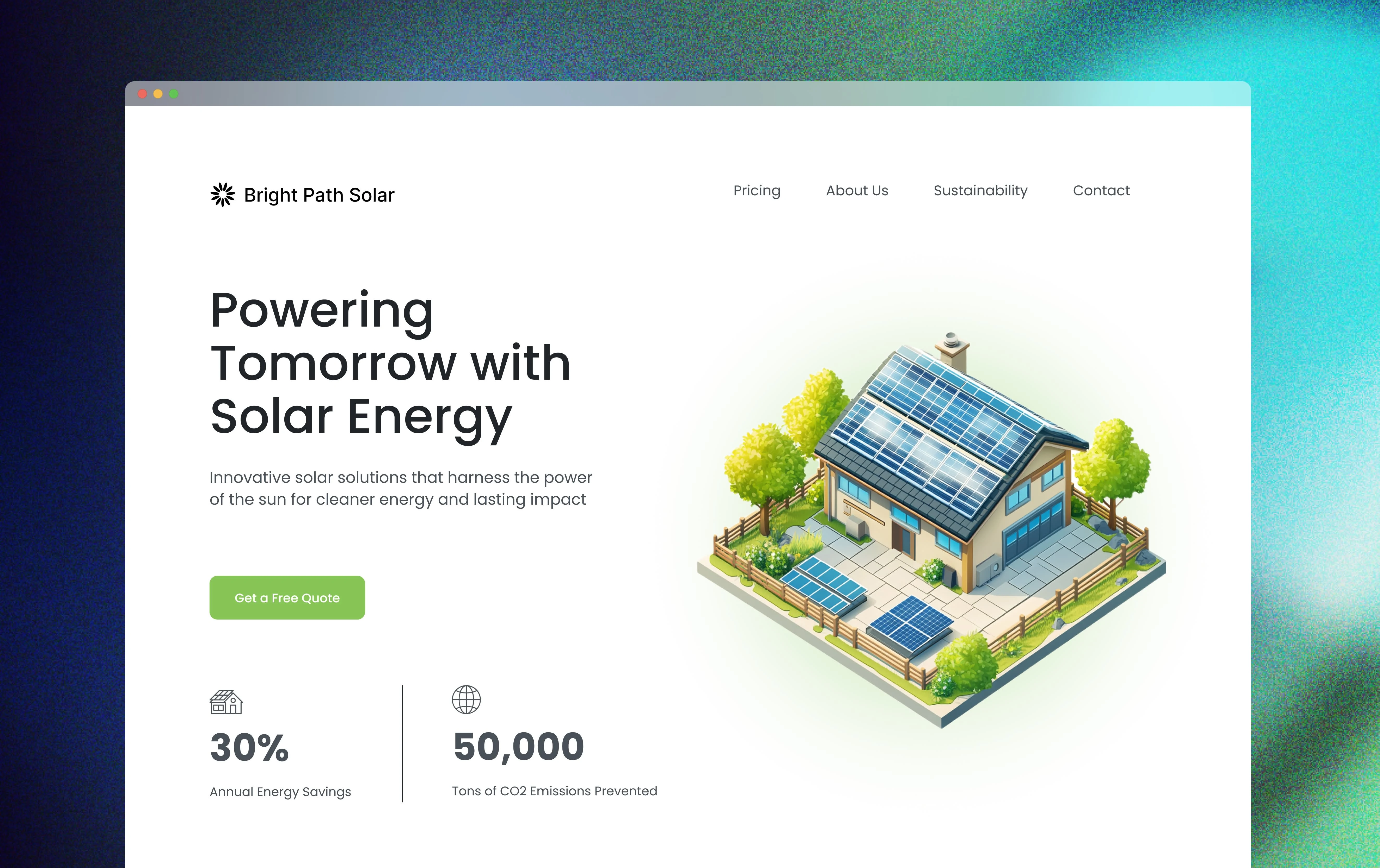
I kept things really clean and minimal - lots of white space, simple lines, and colors that feel inspired by nature. The goal was to create a calm, trustworthy vibe. But where I really wanted to grab attention was with the data. I built these high-contrast, interactive graphs and infographics that actually show people the real impact their solar investment could have on carbon reduction. Everything's laid out so users can quickly get to what they're looking for, whether that's energy savings info or carbon offset details.
What I Built In
Making the Data Pop: Instead of burying the important numbers, I put carbon offset metrics and solar savings front and center with visuals that actually move and respond. People can see exactly what switching to solar means for the environment - and that's pretty powerful.
Guiding People Forward: I placed call-to-action buttons where they make the most sense in the user journey. Whether someone's ready to dive into solar options or just wants to chat with an expert, the path is clear.
Content That Works: Beyond the design, I made sure the site would actually get found. All the educational content about solar and carbon offsetting is optimized for search, but more importantly, it's written for real people who care about the environment - whether they're homeowners or running a business.
Like this project
Posted Oct 5, 2024
The goal of this project was to create a visually engaging platform that effectively communicates the company’s sustainability mission while driving engagement.
Likes
0
Views
3