SoundsCommerce: Redesign Inspired by Seattle's Puget Sound
Sheryl Tamayose
Redesign Inspired by Seattle’s Puget Sound
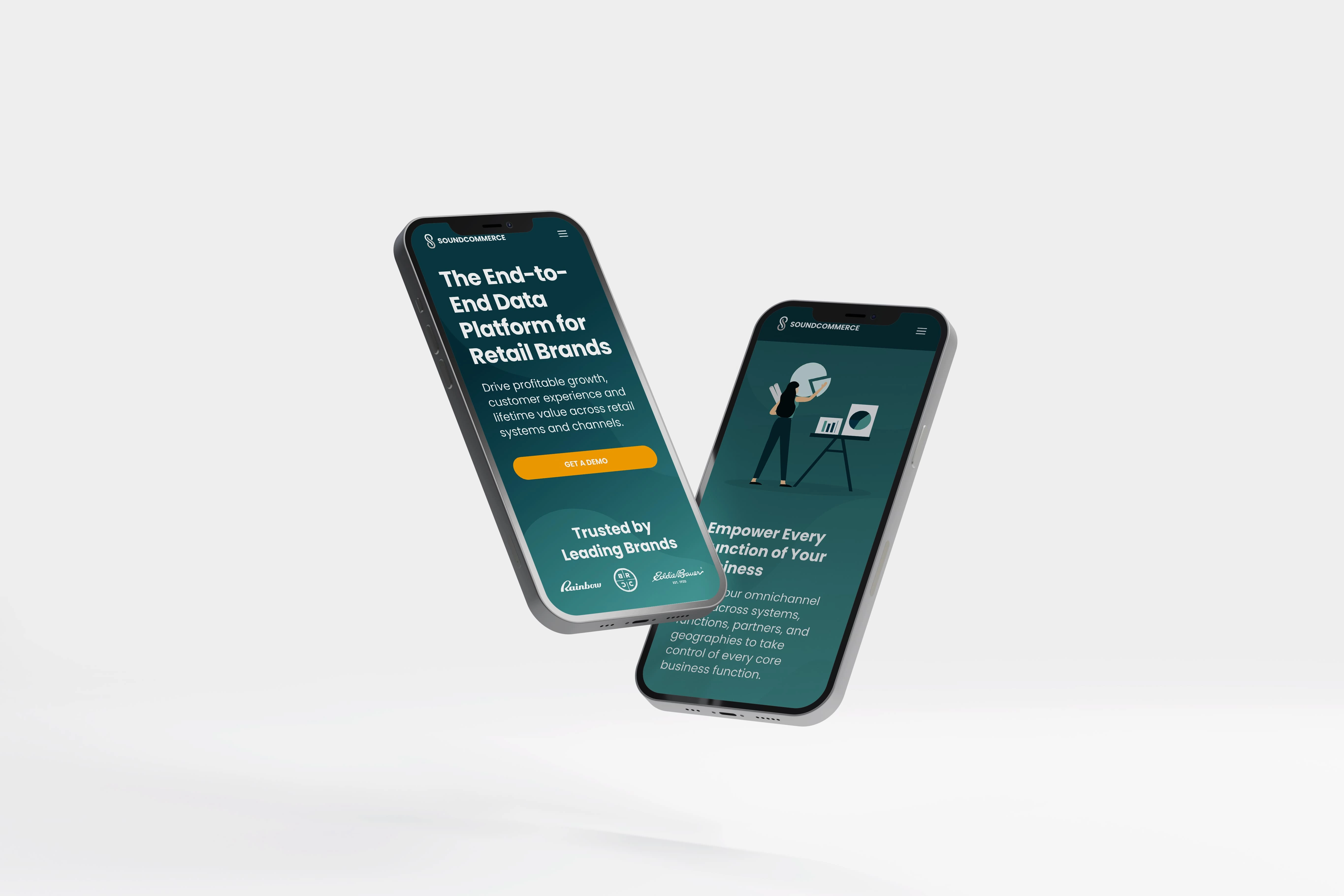
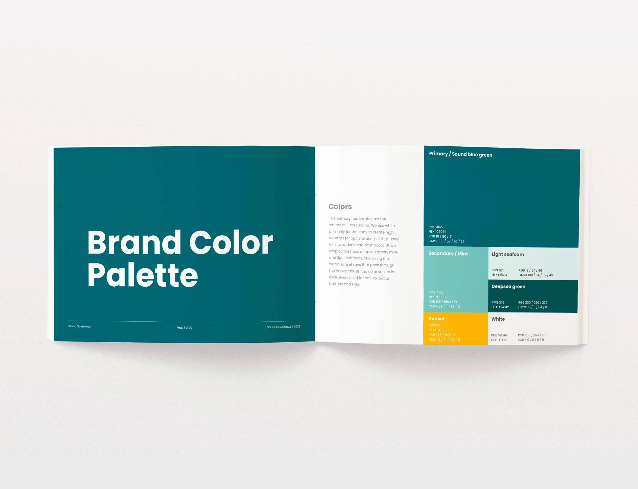
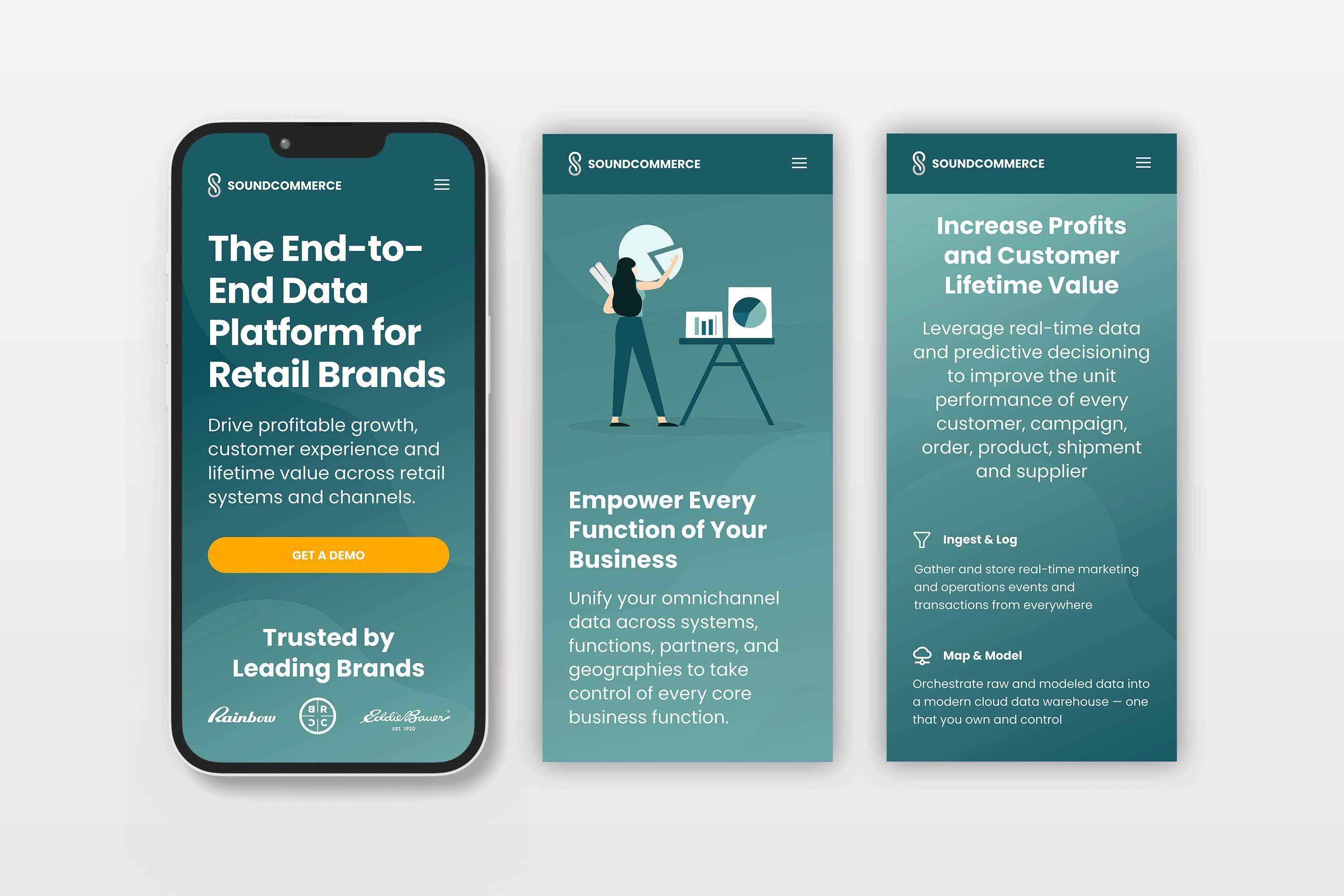
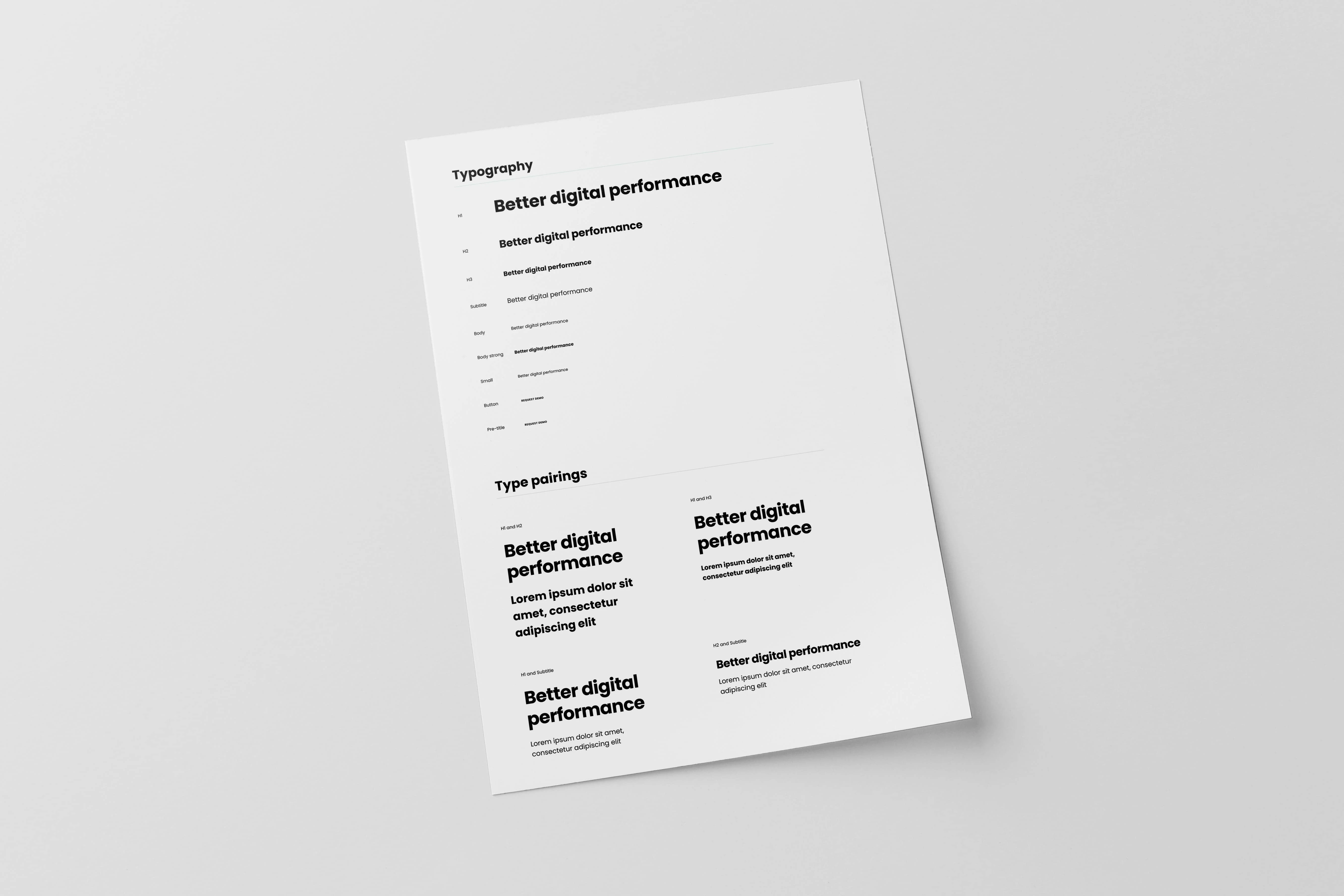
This proof-of-concept redesign for SoundCommerce reflects the company’s Seattle roots with Puget Sound-inspired visuals. The design incorporates cool tones with a warm accent hue, evoking sunlight breaking through the clouds. A typographic study enhanced content hierarchy across online experiences, while simple iconography provided clarity for dashboard elements. This branding concept ties the company’s identity to its origins, blending functionality with a sense of place.


A Bold Foundation for Growth
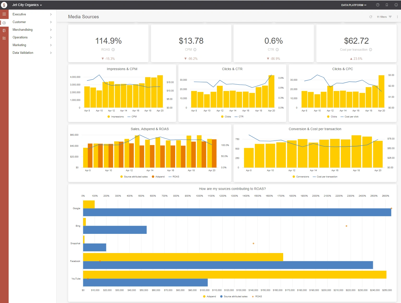
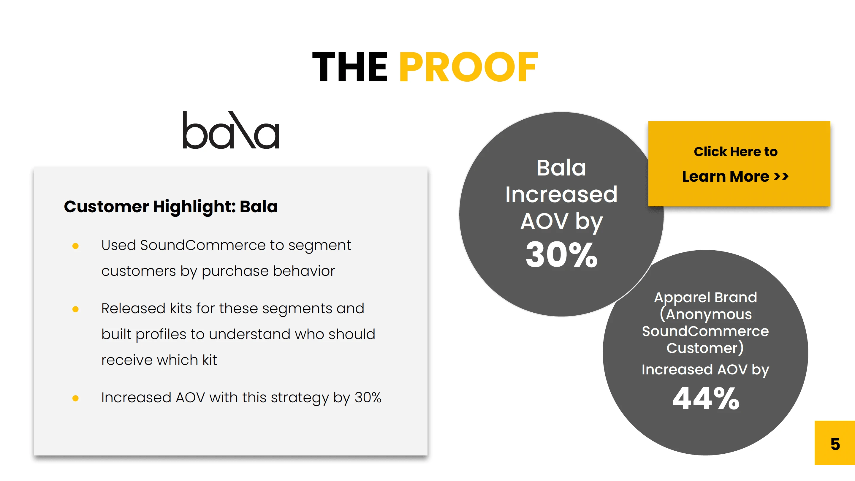
Here’s a look at SoundCommerce’s original branding, which featured a bold palette of yellow, black, orange, and red, paired with black-and-white photography. While distinctive, the visual language lacked a direct connection to the company’s name and Seattle roots. These examples provide context for the redesign, showcasing the foundation from which I built a more cohesive and location-inspired brand identity.


Like this project
Posted Mar 22, 2025
Redesigned SoundCommerce with Puget Sound-inspired visuals, clear hierarchy, and iconography—blending function with a strong sense of place.