The first digital remittance solution in Latam
Overview
Remittance users from the Dominican Republic will no longer need to physically go to a bank to withdraw their remittances in cash or make payments, which is dangerous and time-consuming. With this new digital solution users can receive/send their remittances and pay their utilities wherever they are.
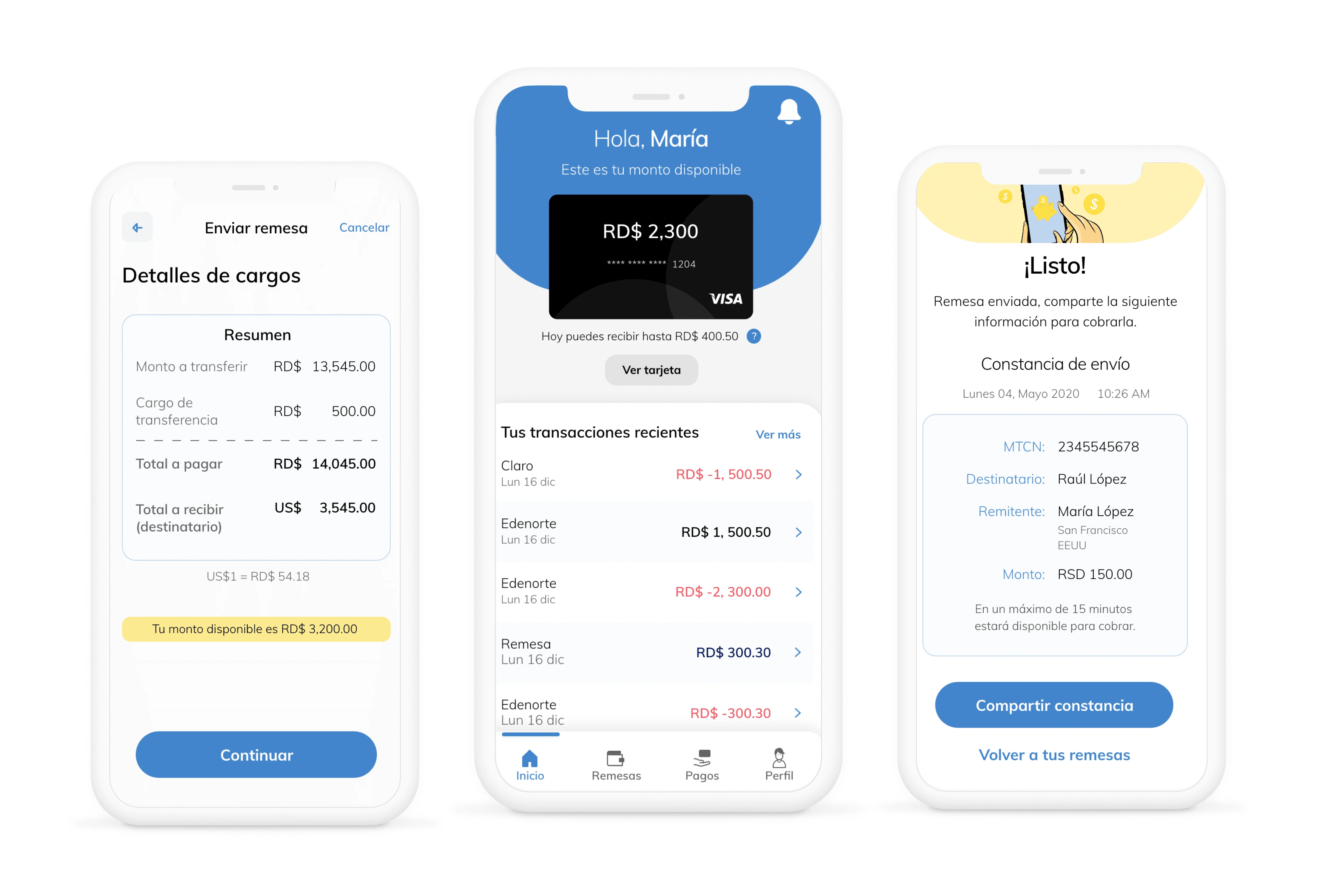
Final designs
Problem
Currently, remittance users in the Dominican Republic are not part of the banking system. They need to go to a bank to withdraw their remittances in cash.
The idea was to create the first digital remittance solution in LATAM to convert those users and make them part of the (online) banking system. The challenge was to create an easy-to-use, trustful, and meaningful experience, taking into consideration the user profile, context and specific needs.
Understanding the business processes
In the beginning, I held daily meetings along with the PM and client to understand the different blueprints and processes the bank has already mapped out for the project.
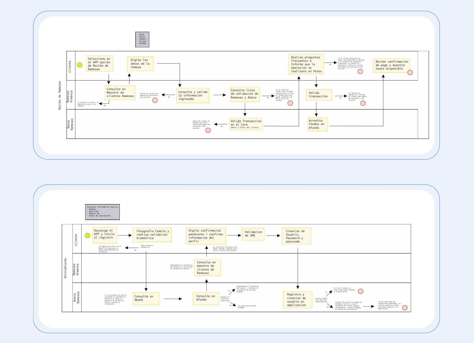
Flows and blueprints
Learning about the users
I also needed to deeply understand the users I was designing for, so I created a user profile card with the main characteristics and behaviors so we all could always refer to it.
To do that I relied on the interviews and field study results, desk research, and documentation from the client. This tool also helped to define the communication and illustration style during the design phase.
Wireframes
In the following days, I created mid-fidelity wireframes of the different screens taking into mind user and business needs. The main challenge was to provide an easy-to-use, trustful, and meaningful experience.
I created all the screens for the home, remittance, payment, and profile sections. I had weekly meetings with the stakeholders to validate the information being sent/received on each screen. Based on the feedback and the joint work with their team to finalize the copy, I made a second iteration and finalized all the error screens, empty states, and alternative flows.
Once a set of main features was finalized and approved, I created an interactive prototype to test the interaction of the app. I started with the onboarding/validation and remittance flow as those were the most complex ones because of all the interrelations, validations, and alternative results they had.
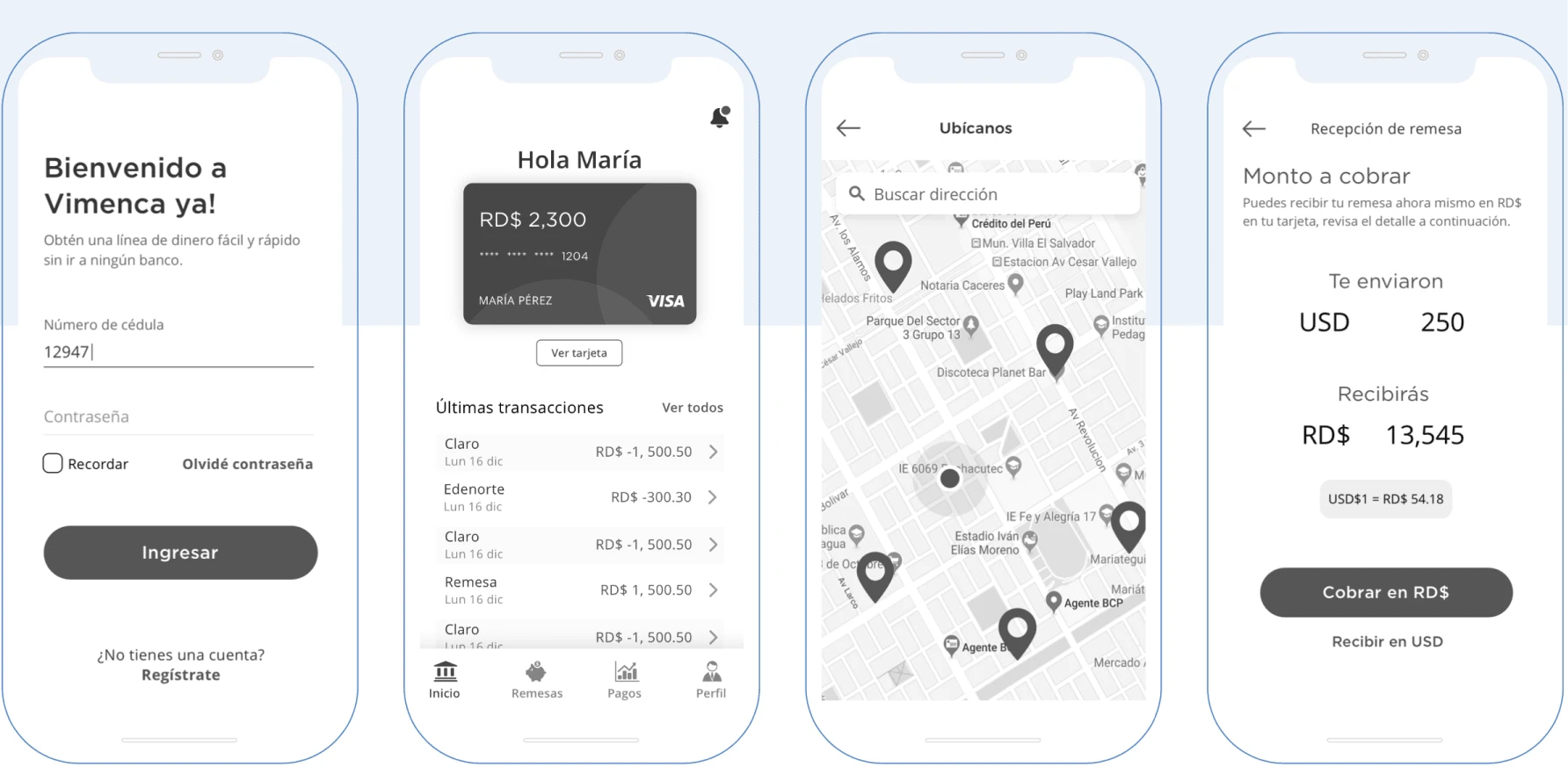
Wireframes
UI Design
At the same time, I started working with the UI designer who created high-fidelity screens to propose to the client. I shared all the insights from the first phases of the project and the importance of onboarding these new users and building empathy and trustworthiness with them.
We decided it was a good idea to use a set of illustrations for the project not only to serve as a visual guide or as an extension of the graphic style but also to bring personality to the app and a smooth sense of reliability to the users. Facial expressions are used to help emphasize emotions so users can relate and understand what is happening easily. Also, embracing diversity through different types of characters to represent the brand's values.
Developer Handoff
I had several meetings with the development team to show the user flows and interactive prototypes. I also created annotations in my designs to explain the business rules and logic to take into consideration while implementing the features.
I also mapped out all the different empty states and errors, I included the copy for each of them and made sure the UI designer created illustrations for each scenario. We also created a UI style guide showing the different component states.
Results
01
The app was launched 6 months after we finished the design phase. Just the Android version of the app has more than +5K downloads so far. It has multiple positive reviews such as “Love this app! Receiving money just got easier...”
02
The client was able to create a huge launching campaign as it is the first Latam digital solution for remittances. They were really happy with the design phase, the communication we had, and the result, which resulted in more projects for the company I worked for because of this project’s success.
Learnings
One of the biggest challenges during this project was working with many stakeholders from the financial services corporation and the bank. Being able to make everyone’s ideas respected in such a big group was tough, especially when there was no consensus.
Working with the PM was essential to successfully manage the teams, as well as showing my different design drafts/options to show my thought process and to make them trust my decisions.
Like this project
Posted Jan 11, 2024
UX Design | Mobile App | 0 to 1 | An app for users to receive/send their remittances and pay their utilities wherever they are.
Likes
0
Views
31
Tags

