"Your content, their way"
Passion.io is a platform that enables creators to build their own apps without needing to know how to code. As the Design Lead, my responsibility was to represent the voices and needs of the creators during discussions.
Our main goal for the Q was increasing the lifetime value (LTV) of our clients (creators). Therefore, the product team needed to focus on increasing platform engagement. One of the highest-voted creator requests caught my attention, as it seemed like a quick win that was closely linked to our business objective
Problem
Our creators currently face a challenge in optimizing their content due to a lack of personalized tools. There are different types of creators, such as personal trainers, fitness instructors, and wellness coaches, so the current course and lesson layout is not always the best way to list all their content.
Solution
This case study delves into a project where a deep dive into customer data, market research, and community engagement led to the successful implementation of a new feature.
Our platform now has a favorite feature that allows users to create a list of their preferred workouts, meditations, lessons, and/or recipes. This feature helps users stay motivated by catering personalized content that aligns with their personal goals. It aims to improve overall engagement, satisfaction and increase long-term success for all parties involved by offering a more focused and enjoyable experience.
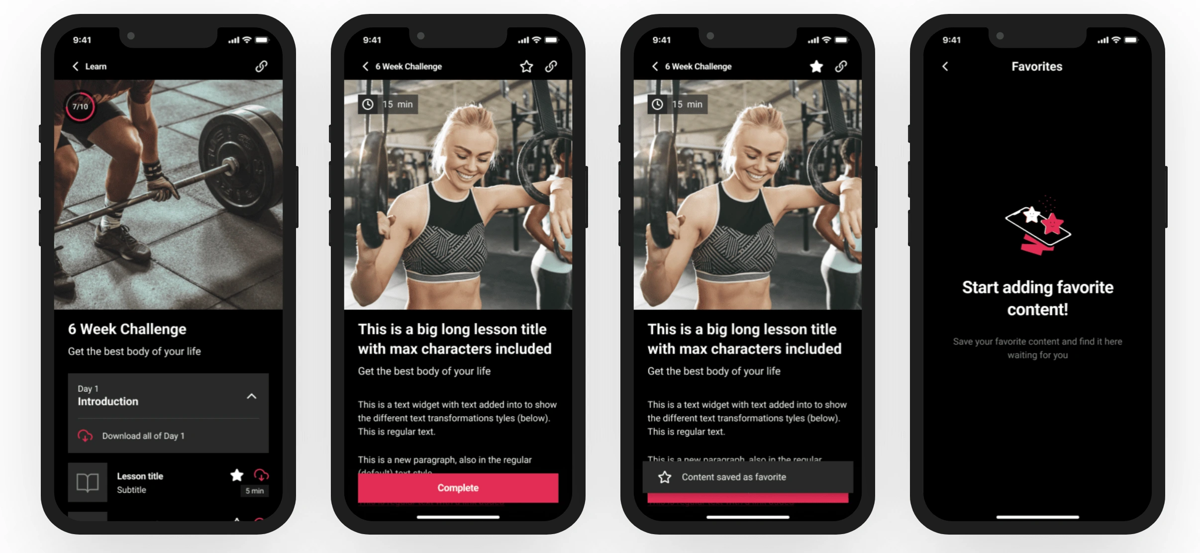
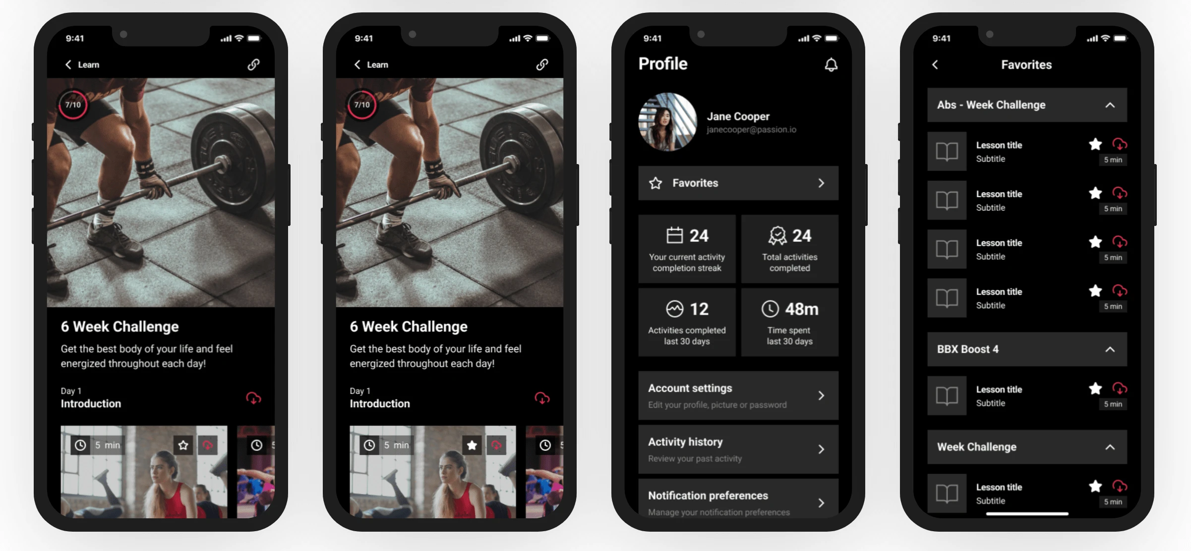
Favorite feature (mobile version)
Data analysis
I started the project with a thorough analysis of user data. By leveraging customer feedback and behavioral data, I gained valuable insights into their needs and expectations.
To further refine the feature, I conducted a comprehensive review of existing applications with similar features. This comparative analysis provided a broader perspective on industry standards and user preferences.
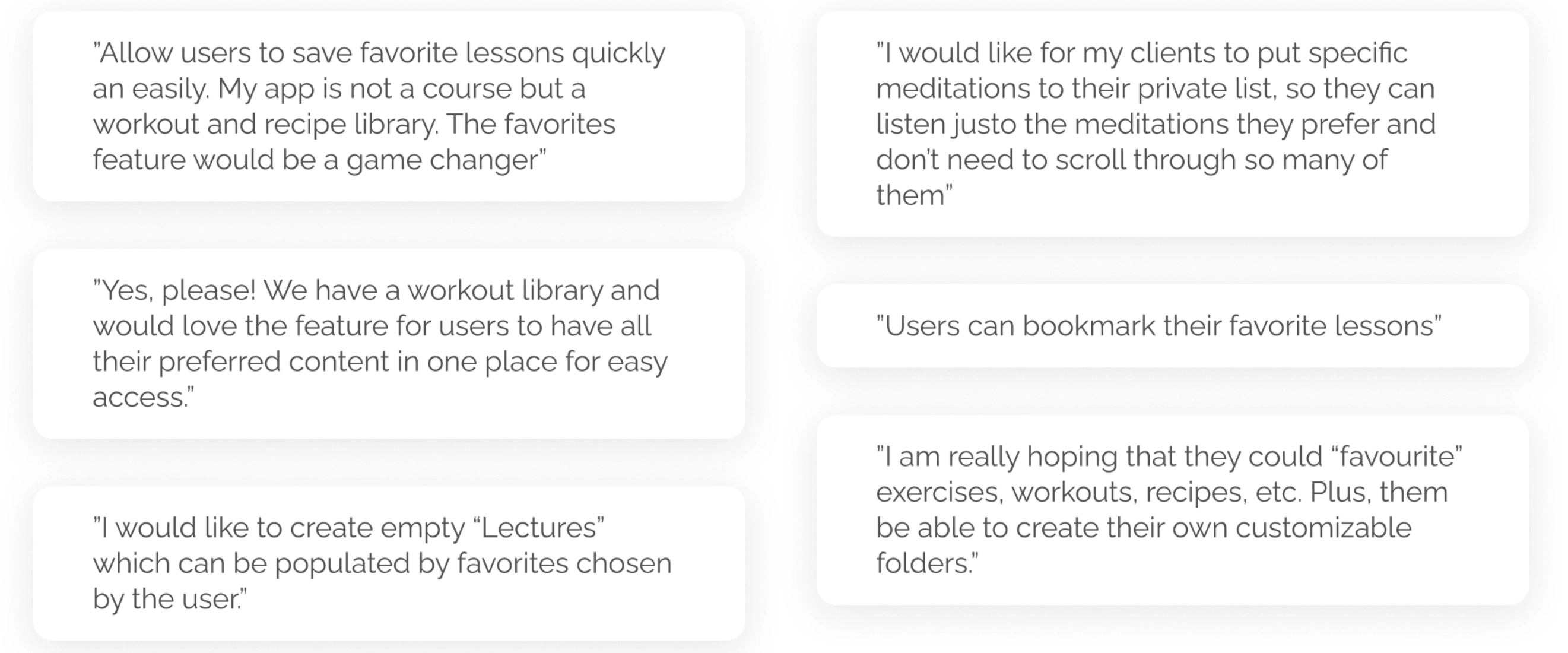
User insights from Canny.io
Wireframes
With a clear understanding of user requirements and market trends, I began the design process. Using Figma, I translated my ideas into mid-fi designs. Then, I improved them by adding a few relevant stock images and copies provided by the marketing team.
However, one challenge arose during the naming and icon selection for the new feature. Naming and icons play a crucial role in conveying functionality and ensuring intuitive user interaction. Especially because in Passion.io we create software for creators to build their own apps, so this would have a direct impact on their business and relationship with their end users. To address this dilemma, I decided to harness the power of our creators' community.
Community engagement
I reached out to the user base for their opinions. In just a few days, we received 150+ interactions on our post, which let me gather preferences from a diverse and wider user group. This collaborative approach not only engaged the community but also ensured that the final choice resonated with the majority.
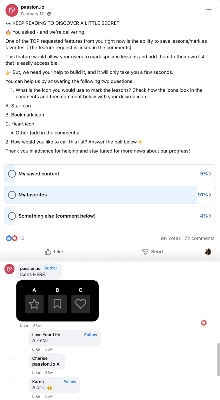
UI Design
Once the icon, name, and scope were defined, I moved on to design the final screens in Figma adhering to our established design system. My goal was to ensure a seamless blend between the existing experience and the new feature.
I designed all screens for mobile apps, as well as the Desktop and responsive versions, taking into consideration the learnings I got from the survey and conversations with our creator community.
Handoff and communication
I worked closely with the PM to ensure that the experience and interaction were understood correctly and clearly explained in the user stories, so the development team could implement it. I also joined the Planning call to show a demo and answer questions.
During the finalization of the design and throughout the implementation process, I made sure to keep the community informed about the progress of this feature by updating the status of the various posts on Canny related to this topic.
Like this project
Posted Jan 16, 2024
Product Design | Mobile App | Desktop App

