Bloom Psychotherapy🌻: Brand identity & Website design
karan Jalal
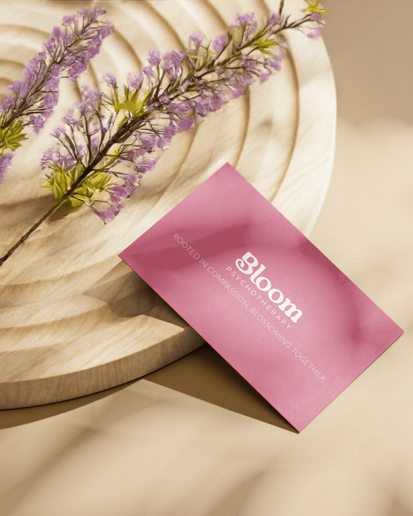
"A nurturing and professional brand identity for Bloom Psychotherapy"
A practice focused on emotional healing and personal growth. The goal was to build a cohesive identity and user-friendly website that reflects the practice’s mission of offering compassionate therapy and support to individuals seeking emotional well-being.
Brand words: Healing, supportive, professional, compassionate, empowering
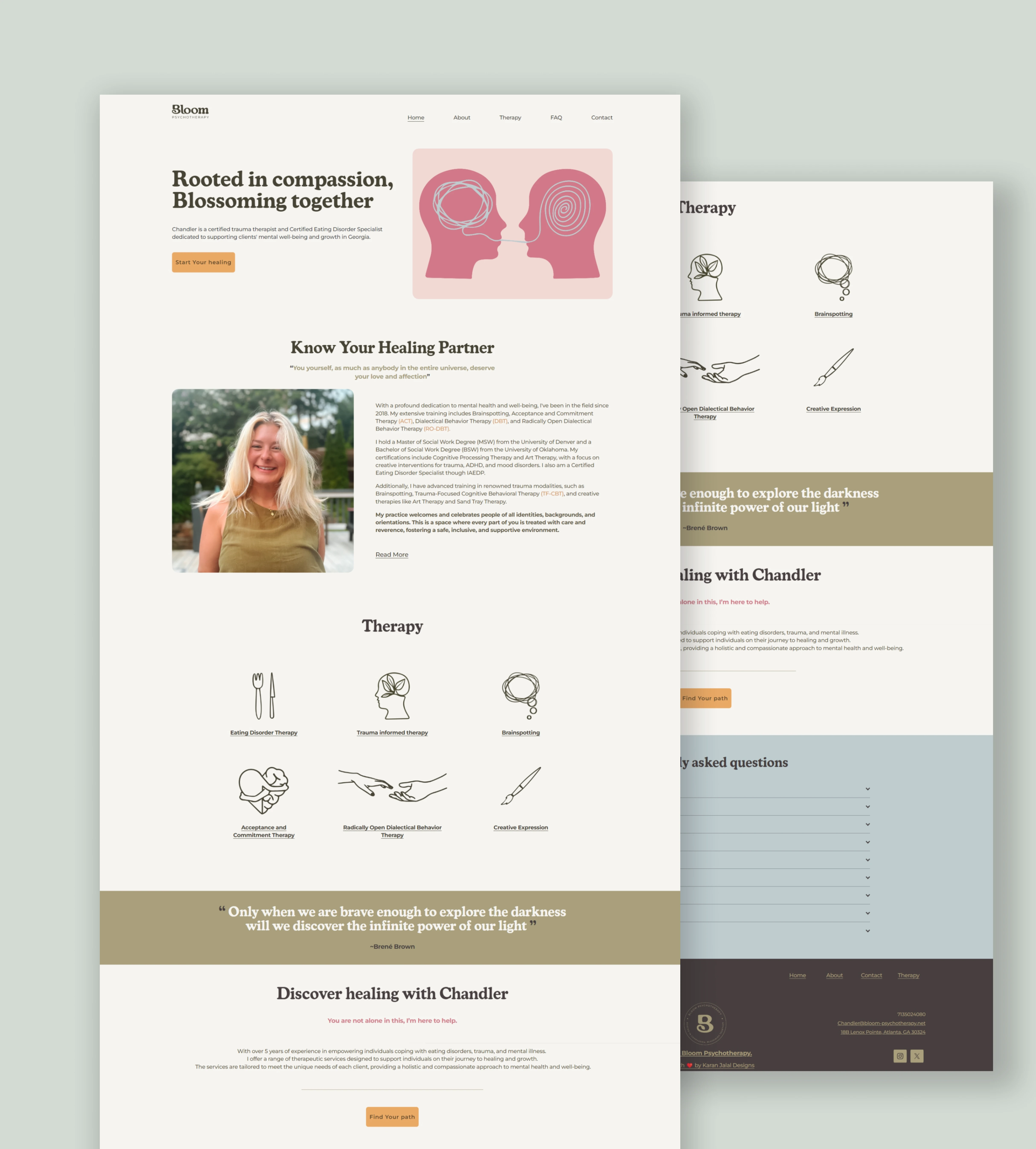
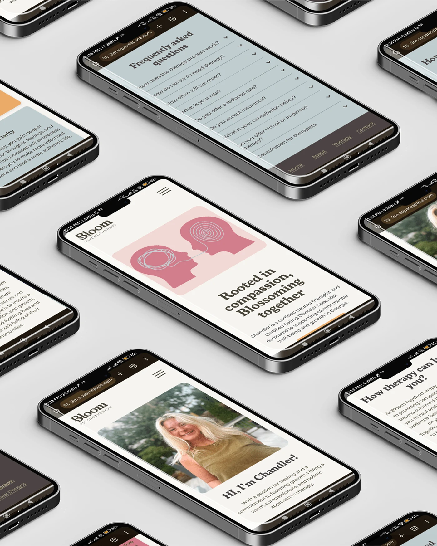
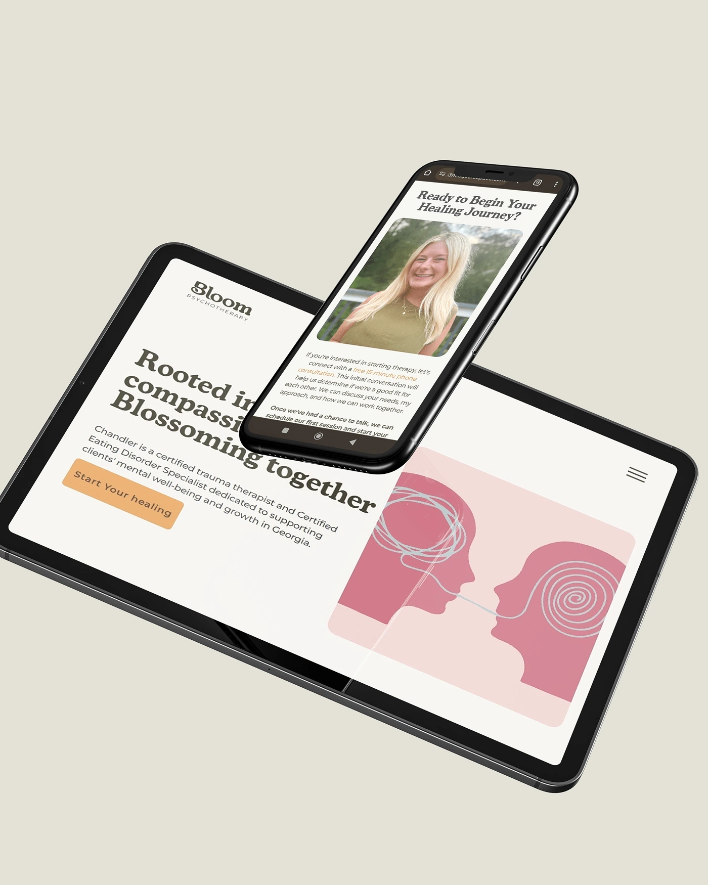
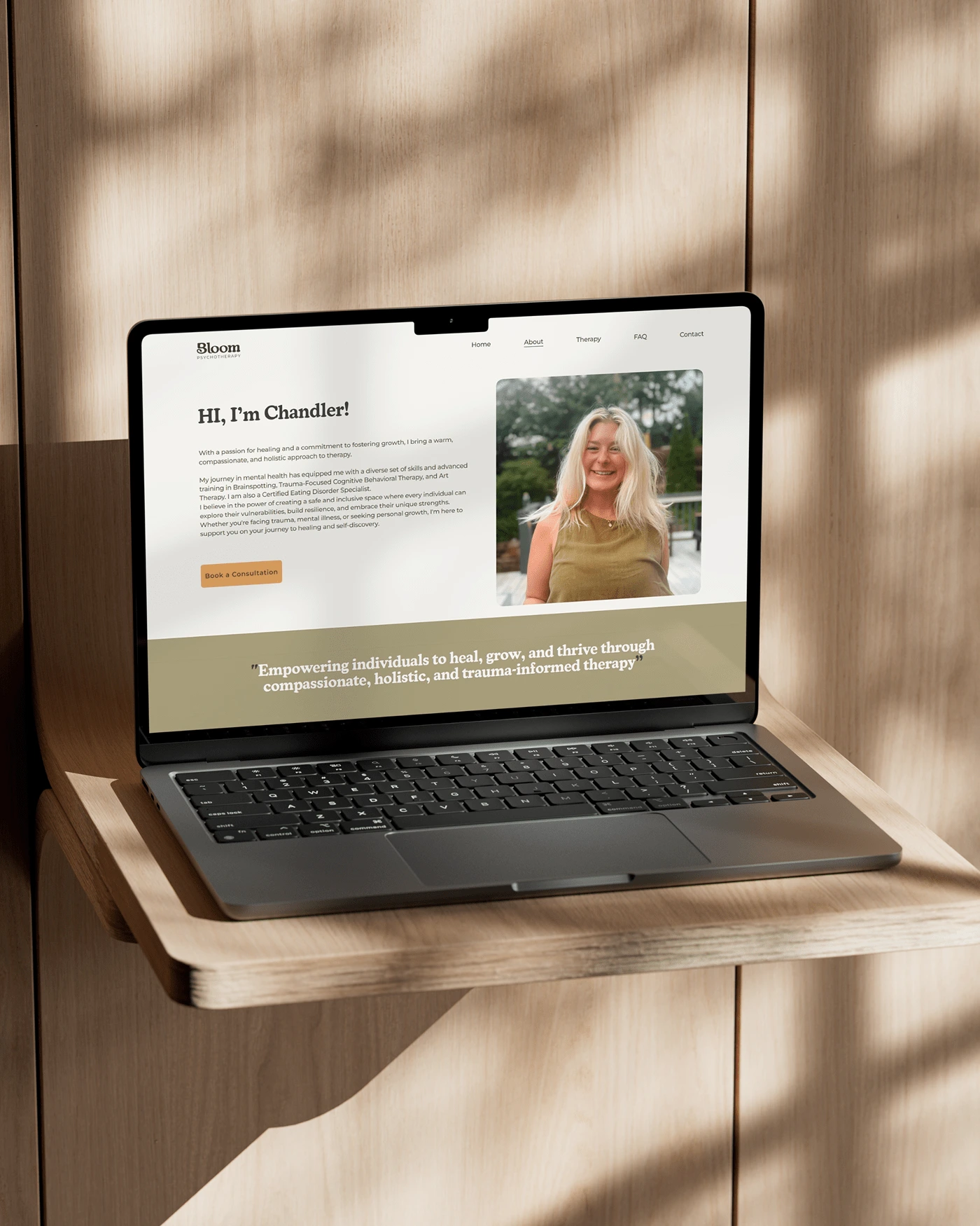
Website
The website was designed to be approachable and easy to navigate, with a clean layout that guides users through key areas like services, resources, and contact information. The color palette and imagery were applied strategically to reinforce a sense of healing and emotional well-being.
Like this project
Posted Sep 13, 2024
A Playful and approachable brand identity paired with a clean, user-friendly website. The design reflects emotional well-being.