Beimago🦋 - Brand Identity

karan jalal


Create a playful and transformative brand identity for Beimago
A women’s emotional well-being service focused on empowering women through personal growth programs. The branding reflects the transformative journey women experience through their career and relationship programs, with a vibrant and organic visual language.
Brand words: Empowering, playful, transformative, organic, feminine
About the Brand
Beimago offers transformative programs aimed at helping women navigate challenges in their professional and personal lives. Inspired by the metaphor of a butterfly's journey—from cocoon to flight—Beimago helps women unlock their full potential. The brand stands for personal growth, empowerment, and emotional well-being.
Goals & Scope
Beimago required a visual identity that:
Resonates with women seeking transformation in their careers and relationships.
Communicates themes of growth, self-empowerment, and transformation.
Stands out from competitors with a playful yet professional and high-end design.
Scope of Work:
Develop a brand identity that symbolizes personal transformation.
Create a mood board to define the visual direction.
Design a logo that incorporates the butterfly metaphor and distinguishes "Be" from "imago."
Define a color palette, typography system, and brand guidelines for consistent application.
Deliver custom illustrations for visual storytelling
Logo Design Concepts
The logo concept was centered on transformation, using an abstract butterfly wing to symbolize growth and freedom. The design reflects the stages of development from the cocoon (personal struggles) to flight (self-realization and empowerment).
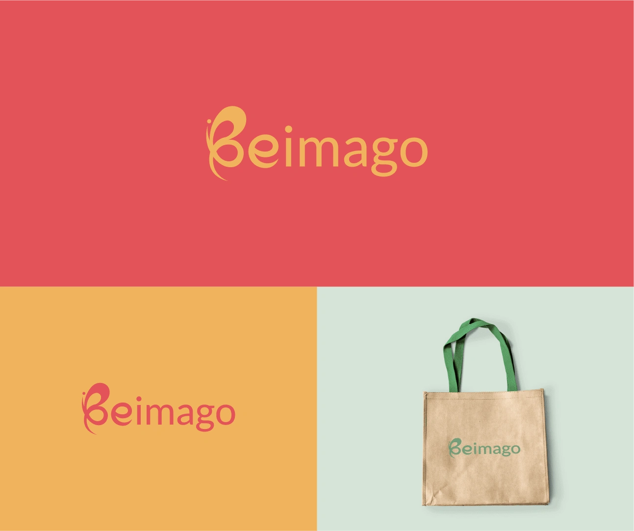
Primary Logo: An abstract butterfly wing coupled with the name "Beimago", where the "Be" is slightly separated from "imago" to represent the process of becoming.
Logomark: For use in various contexts such as social media and printed materials.
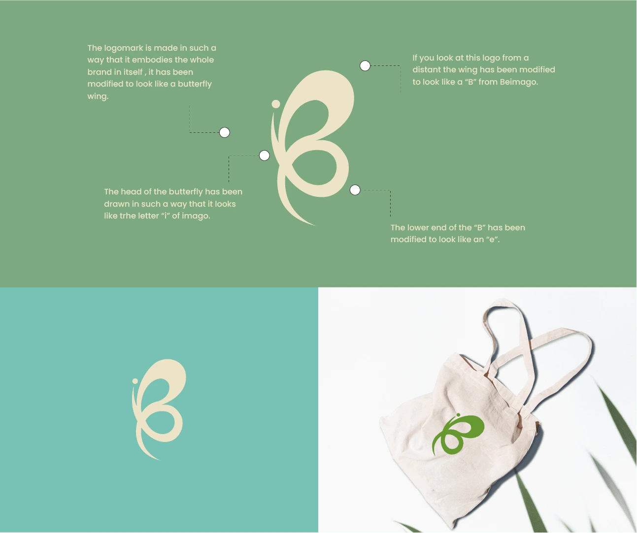
Creative process behind the logo 🦋
Primary logo
Colors & Typography
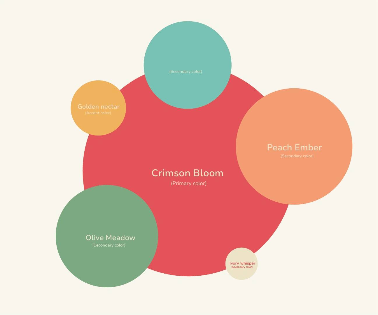
Color Palette: Soft, nature-inspired tones with warm, earthy shades, contrasted with vibrant accents. This conveys a balance between calm, approachable tones and the vibrancy of transformation.
Muted greens and Red, warm neutrals, and bright coral for accent.
Typography: The modern and playful Marcellus font was chosen for its friendly and approachable look, while maintaining a professional and clean structure.
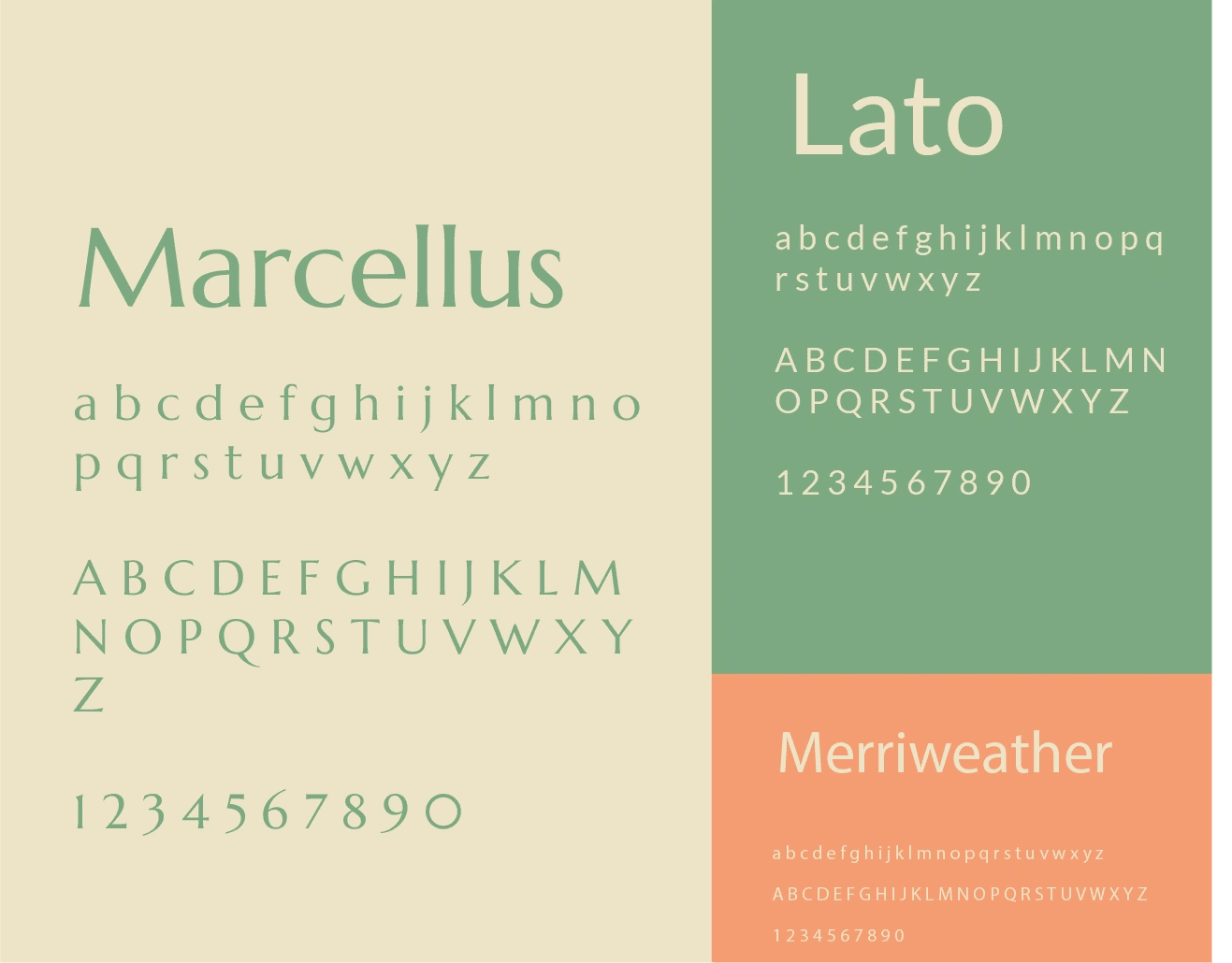
Primary-Secondary-Tertiary fonts
Illustratrions

Like this project
Posted Sep 11, 2024
Beimago offers career and relationship programs that help women grow and unlock their potential. The brand’s visual identity symbolizes personal transformaton.