Brand Identity Design for Construction Company
Gaby Davalos
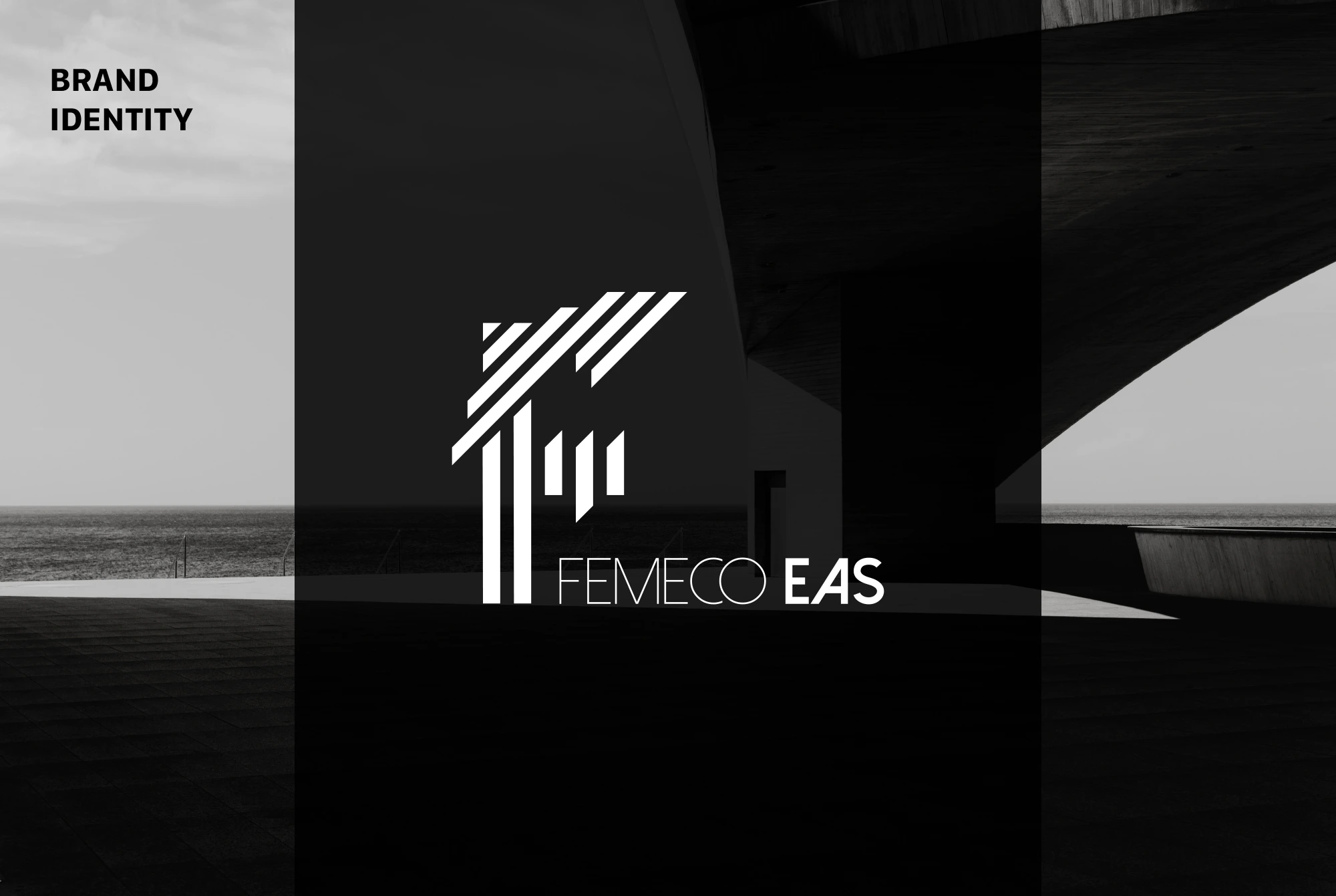
Identity design for a construction company.
Created around the owners' initials, this identity blends clean lines, geometric balance, and an industrial feel. The only requirement was that the logo somehow include the letter "F"—a challenge that became a central design feature.
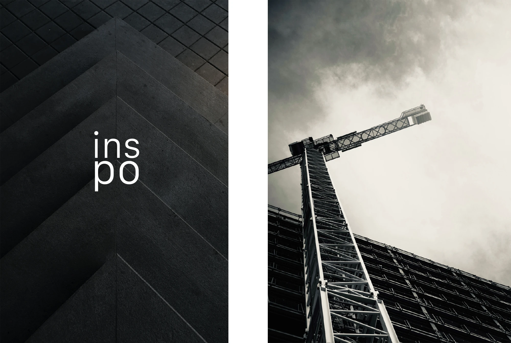
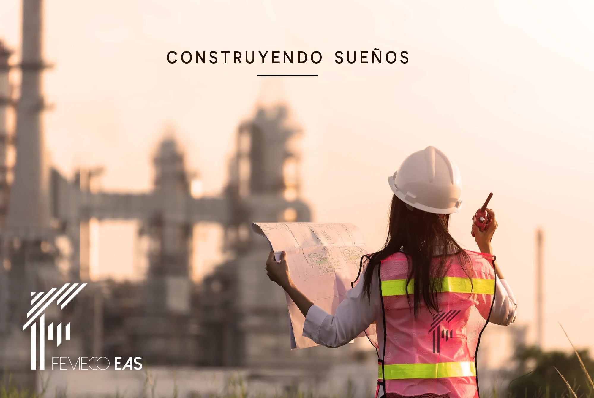
The client shared that the company specializes in large-scale civil engineering projects — bridges, viaducts, and other urban structures built with concrete and metal. With that in mind, and inspired by industrial visuals, I developed this concept. After a few minor adjustments, the final result felt aligned — and the client was very happy with it.
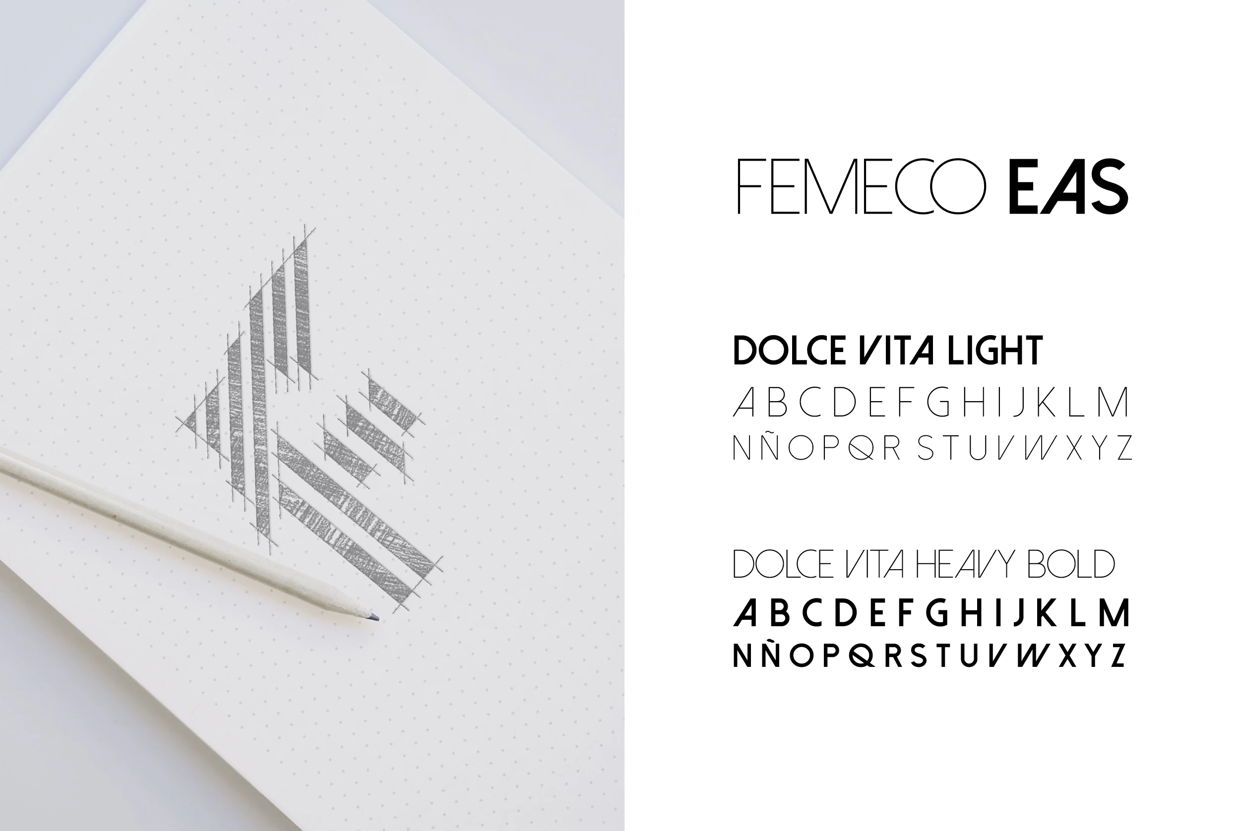
The typography chosen brings balance to the weight of the isologo, using varying thicknesses to create a necessary contrast. It reinforces the geometric structure and minimalist approach, while staying true to the sleek, industrial aesthetic of the design.
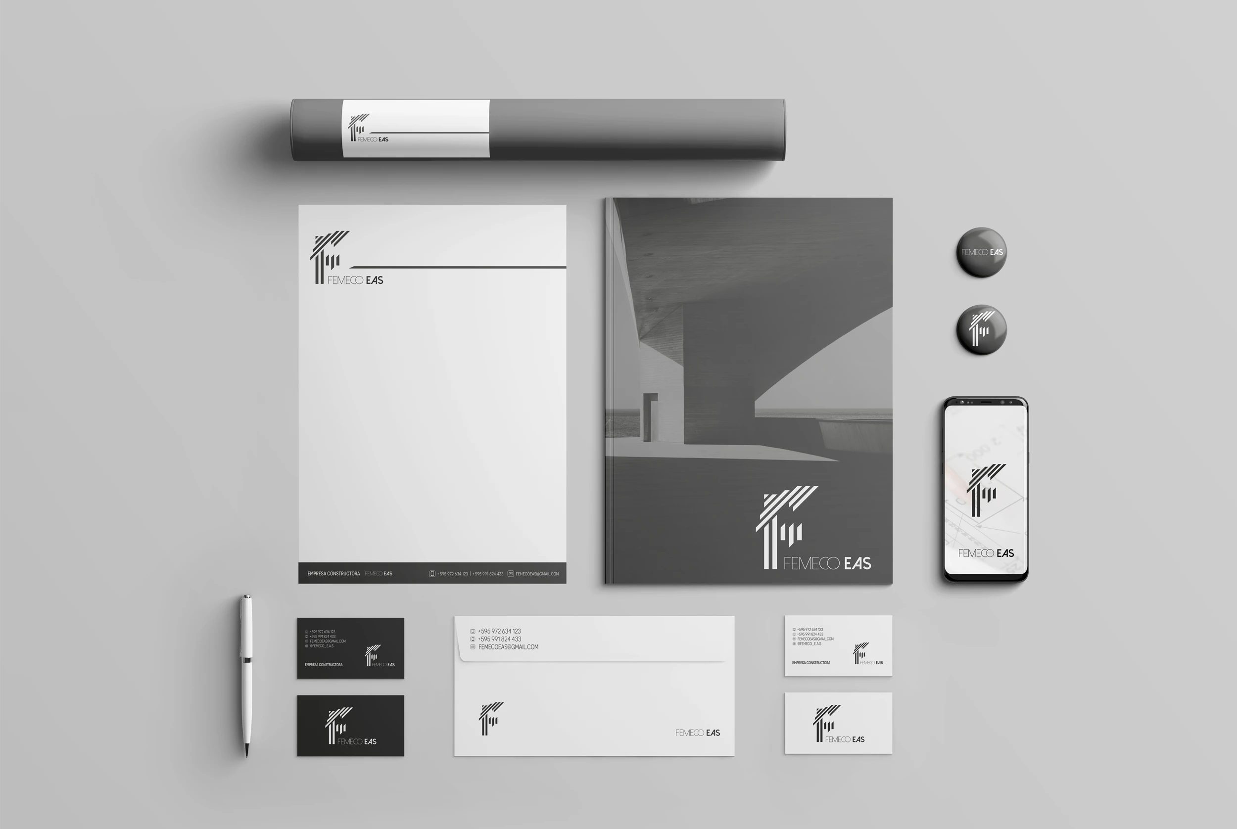
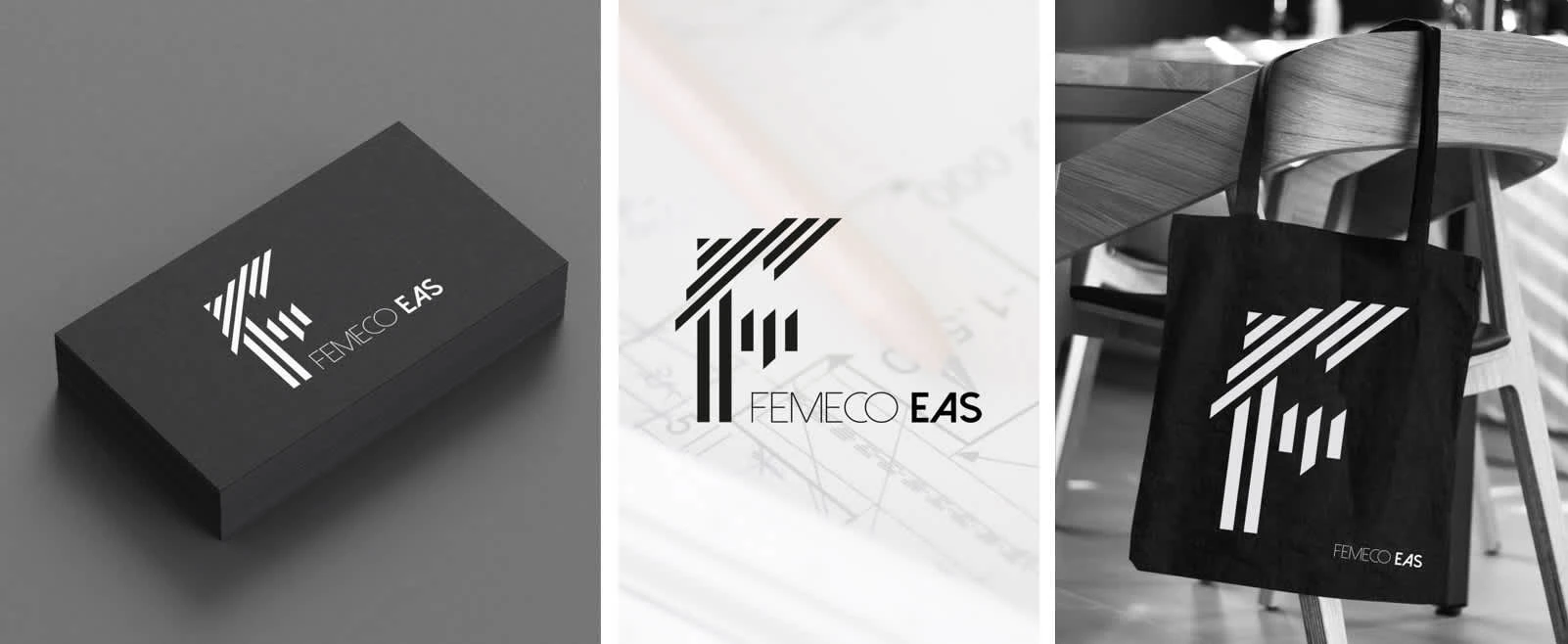
The logo is highly versatile, adapting seamlessly across all applications — from stationery to merchandise and beyond. Its clean structure ensures strong scalability and easy recognition across both digital and physical formats.
Beyond delivering quality, I aim to create work that supports a brand’s growth and stands the test of time. This project was especially meaningful — the clients were expressive and generous with their appreciation, and I’m deeply grateful for that. Collaborations like these remind me why I do what I do — and they truly nourish the soul.
Like this project
Posted Jun 7, 2025
Designed a logo for a construction company using industrial aesthetics.
Likes
0
Views
25
Timeline
Sep 12, 2023 - Sep 22, 2023