Contra Landing Pages
Building landing pages has been my passion. It is an opportunity to showcase ingenuity and technical expertise. Therefore, I was happy to work on contra.com landing pages. In this case, I was working with our super talented designers Erin and Ry, which made the experience so much more rewarding.
Awards and Conversion
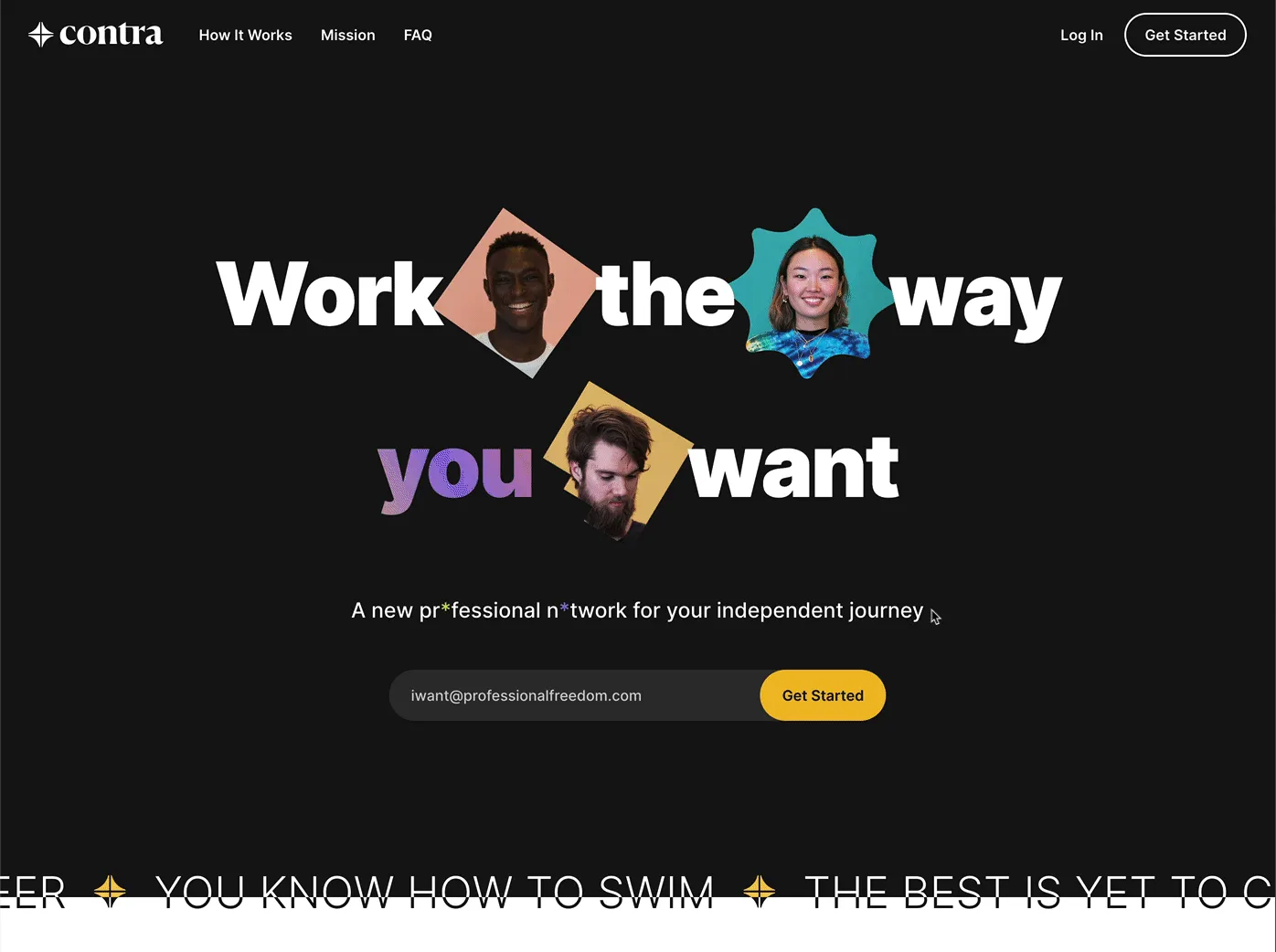
Not only did we build something that is good looking (we received an honorable mention by the Awwwards committee and many other awards websites), but it also converted extremely well. That "Get Started" input you see in the GIF above was used by 27% of users who visited our landing pages during our ProductHunt launch. 🤯
Telling the Story of the Future of Work
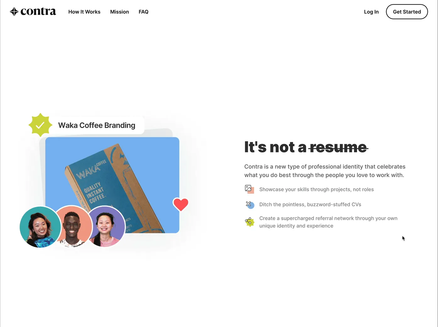
One of the challenges in designing, animating and building these landing pages is that there is a lot to say about Contra. It is no small feat to describe what the future of work looks like, esp. as everyone are used to the old ways. So we used story telling – a journey describing the entire process from creating projects, adding collaborators, and how it results in new opportunities. All of these elements are introduced to the user at their own pace as they scroll through the website.
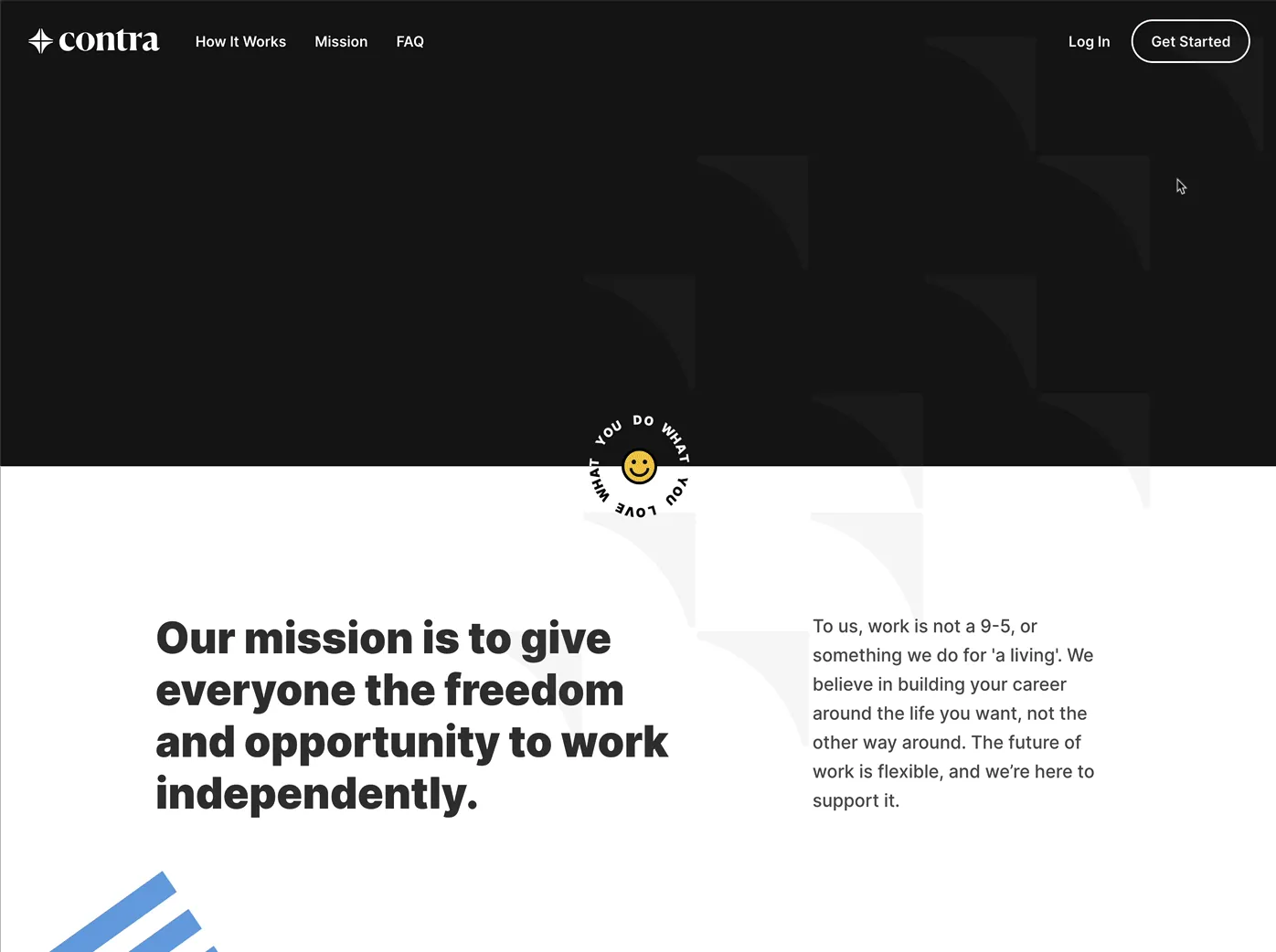
What you see above has been built using hand crafted CSS transitions, and with the help of Lottie and Framer animation frameworks.
Introducing the Team
Perhaps my favorite part of the landing pages is the team section (pictured below). It is a tradition at the Contra that everyone who joins our team are assigned their own custom emoji. In similar way, every member of our team is assigned an animated emoji reflecting some unique trait of theirs.
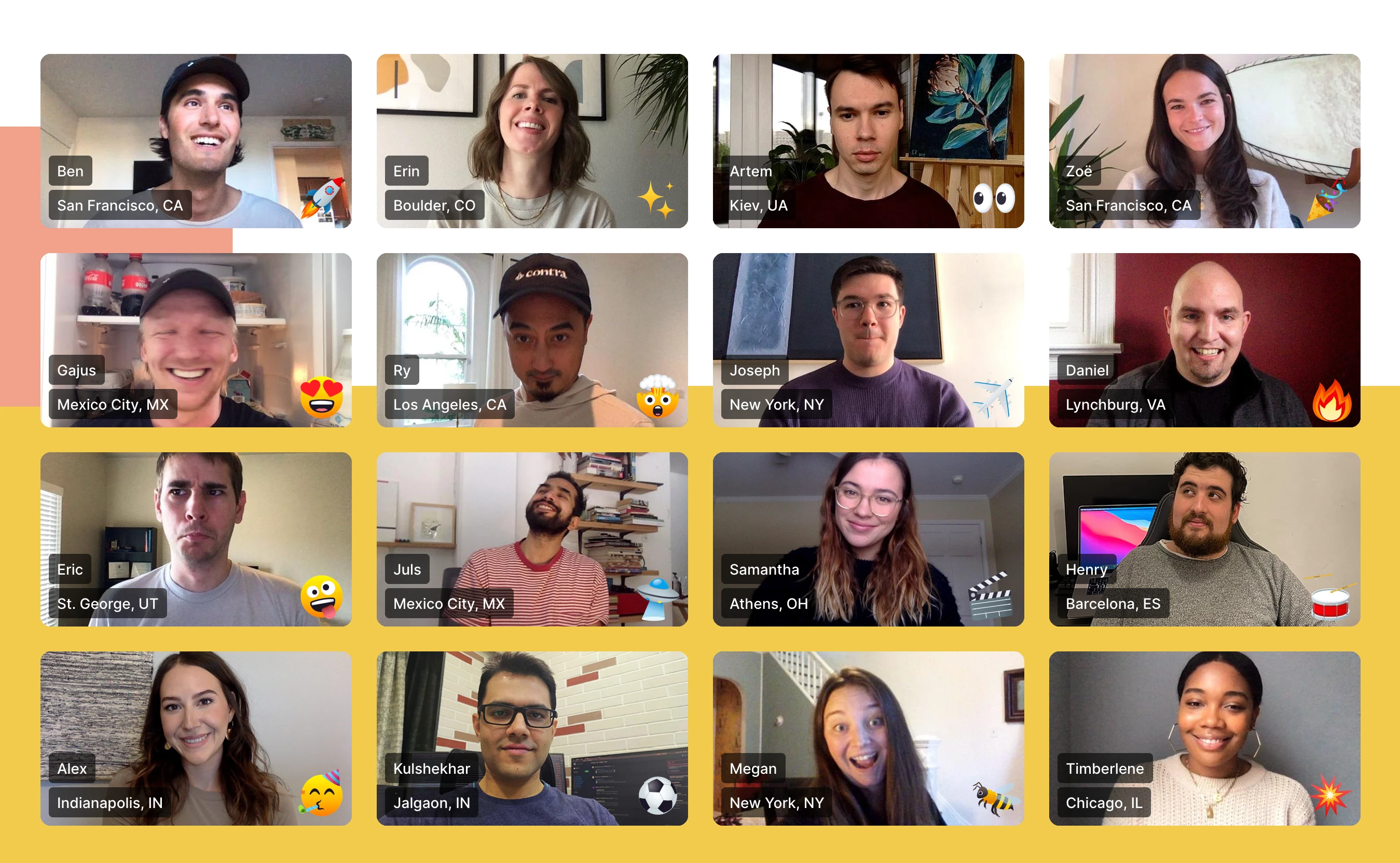
All of the team mentions are interactive. If you have not already, visit https://contra.com/mission to try interacting with them and learning something new about our team.
Responsive Designs
Last but not least, we wanted to make this website accessible to everyone.
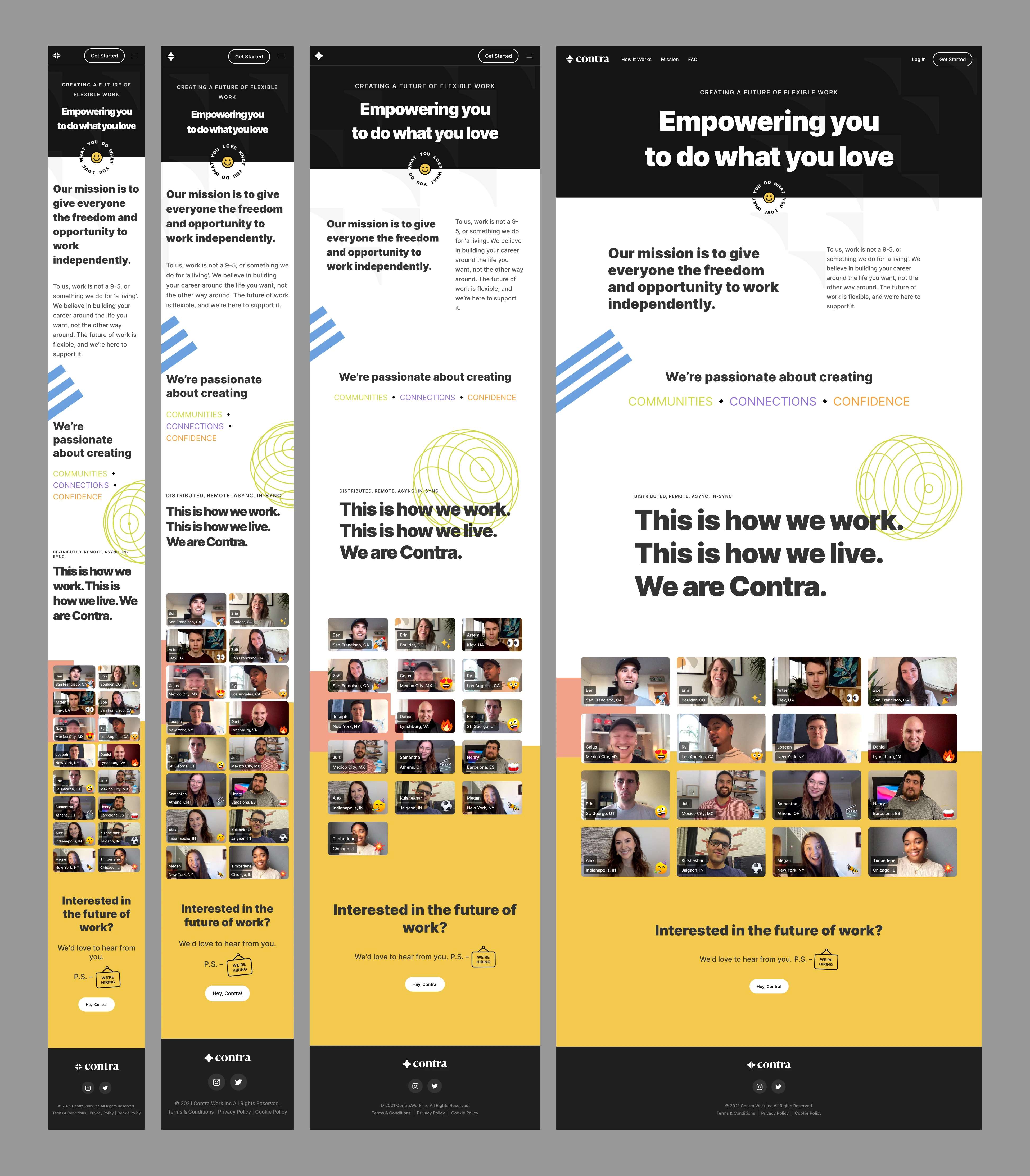
The joke was that we wanted to leave a good impression to everyone, ranging from VCs checking contra.com on their Apple Watch to designers viewing the website on their 32-inch Retina 6K displays.
Like this project
Posted Mar 9, 2021
Built the website and animations collaborating with Contra's talented design team.


