Develop for Good: Create The Space
Caroline David
Develop for Good
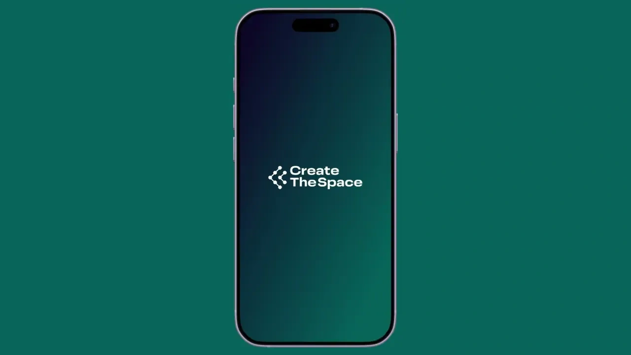
Create The Space
ROLE
Design Manager
DURATION
October 2025 - February 2026
(5 months)
TOOLS
Figma
Notion
Slack
TEAM
Aidan Gleason
Amina Ari
Brandi Nichols
Cindy Hansen
Michael Agbesi
Context
Designing a mobile application for a platform of 8.9k+ members
With over 164 community driven events and an existing network of members, Create The Space (CTS) needed a cohesive mobile experience to better connect users. As the Design Manager, I collaborated with our Project Manager, client, and led the design team to hand off a scalable design system and prototype of a new mobile application.
How do we design a minimalist and culturally reflective mobile app for Black men to discover wellness resources and events without the overwhelm of algorithm-driven search tools that ignore lived experience and context?
???
From Scope to Insight
After our initial client meeting, I collaborated with the PM to construct our roadmap and start research.
To better understand what users need from a community-centered wellness app, my team and I began research through interviewing active members, conducting surveys, and constructing a competitive audit of 14 community apps.
Clear, centralized way to discover events
Simple and intuitive way to connect communities
Relevant information easily accessible across platforms
User Needs
!!!
We synthesized the results of our interviews, surveys, and audit using affinity mapping and thematic clustering to construct user personas, consolidate our data into key user insights, and structure design goals to guide the rest of our project.
Sketching, Wireframing, & Prototyping
We started wireframing to establish core flows and designs
Low-Fi
Sketches for all flows prioritized within our PRD
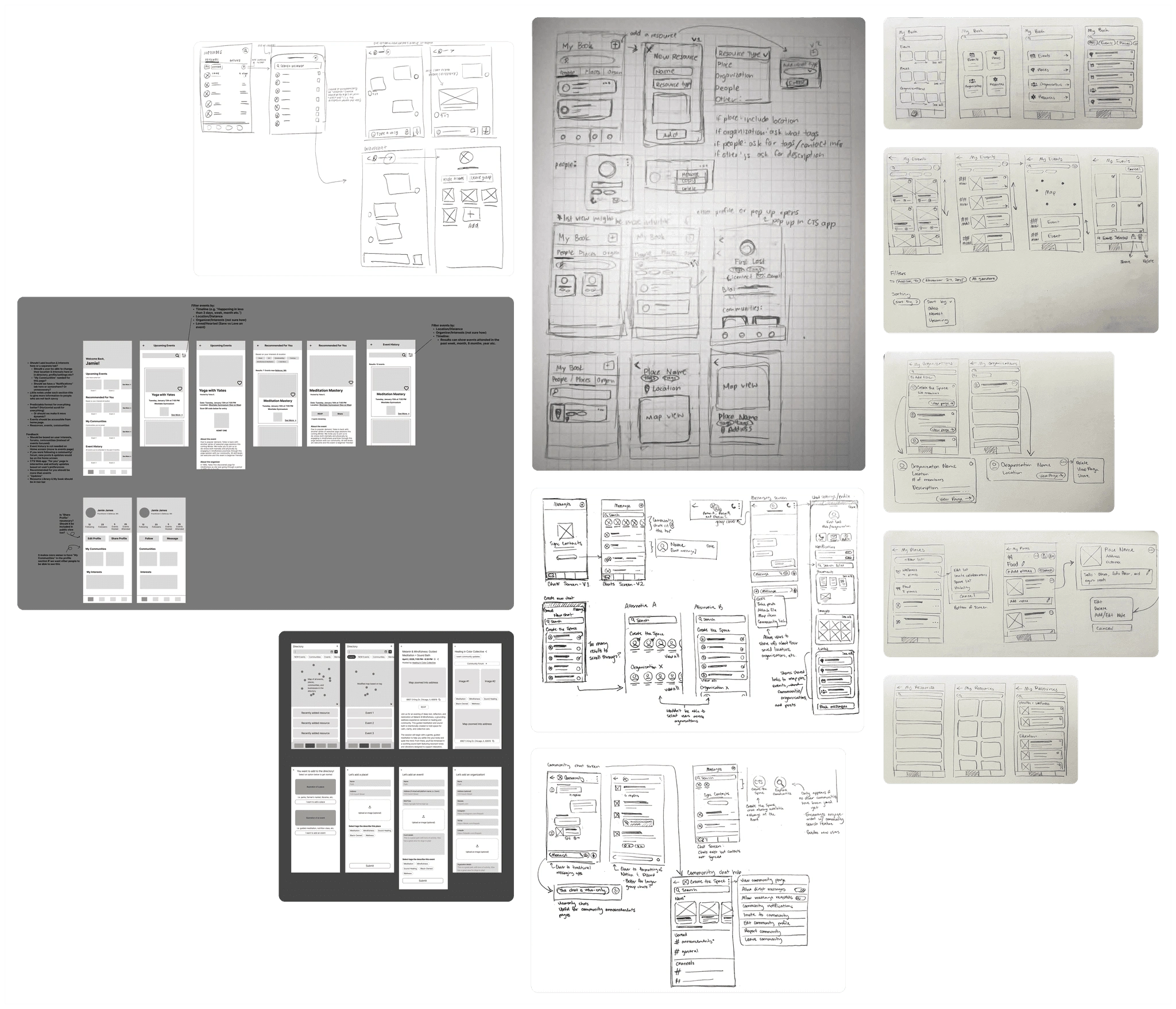
Mid-Fi
We reworked and expanded large portions of our designs throughout mid-fidelity wireframing.

Mid-Fi Design
Mid-Fi Design 2
Client feedback, particularly around the navigation bar, pushed us to rethink some of our earliest assumptions into more innovative solutions
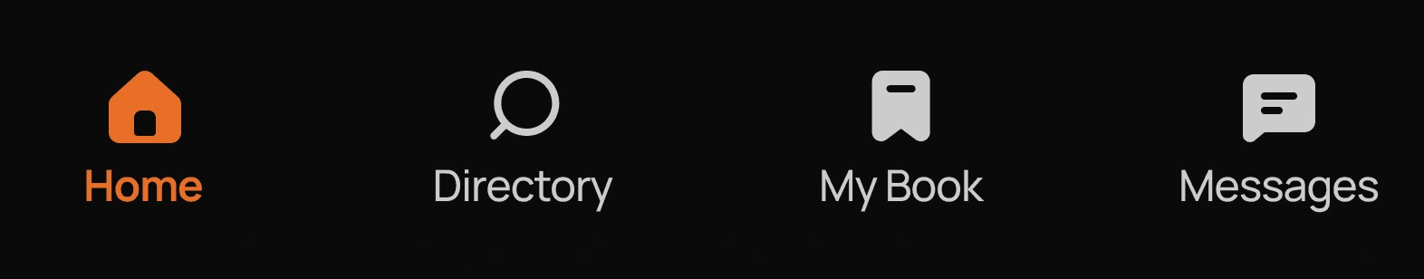
Client Feedback: Wanted profile to be more accessible and page placements to be more intuitive
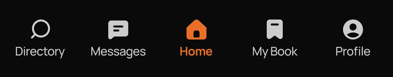
Iteration: Added profile and restructured navigation layout to optimize logical flow
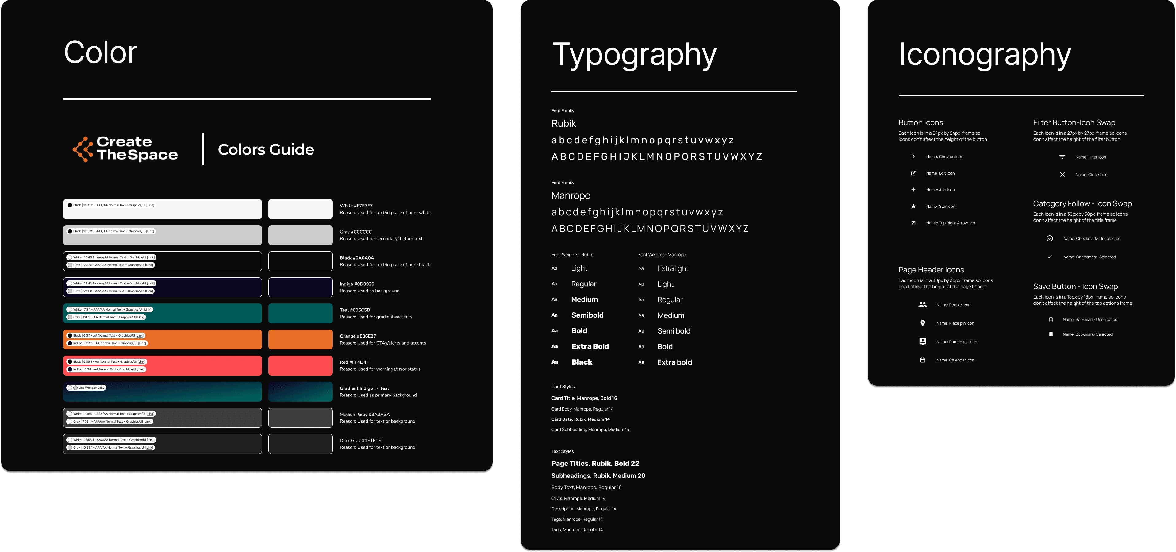
We iterated our design system alongside our mid-fidelity wireframes, continuing to refine components throughout high-fidelity into a developer-ready foundation.
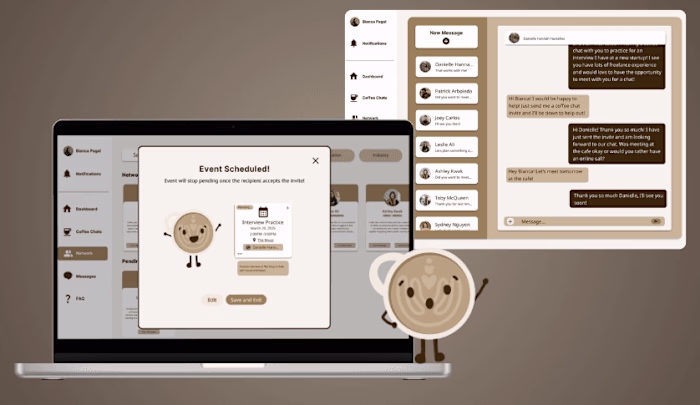
We connected key screens into interactive prototypes to test complete user flows, polish interactions, and validate the app’s end-to-end experience before developer hand-off.
Interactive Prototypes
Interactive Prototypes 2
Interactive Prototypes 3
User Testing
We interviewed 4 CTS members and conducted 11+ user tests
Our testing goals were to ensure our functional requirements were met with clear component designs, frictionless flows, and an experience to foster community connection.
User Feedback
Too much focus on iconography/not accessible
Redesigned buttons to be textual = more accessible for screenreaders
Feature Spotlight
Introducing… CREATE THE SPACE'S MOBILE APP
Feature #1
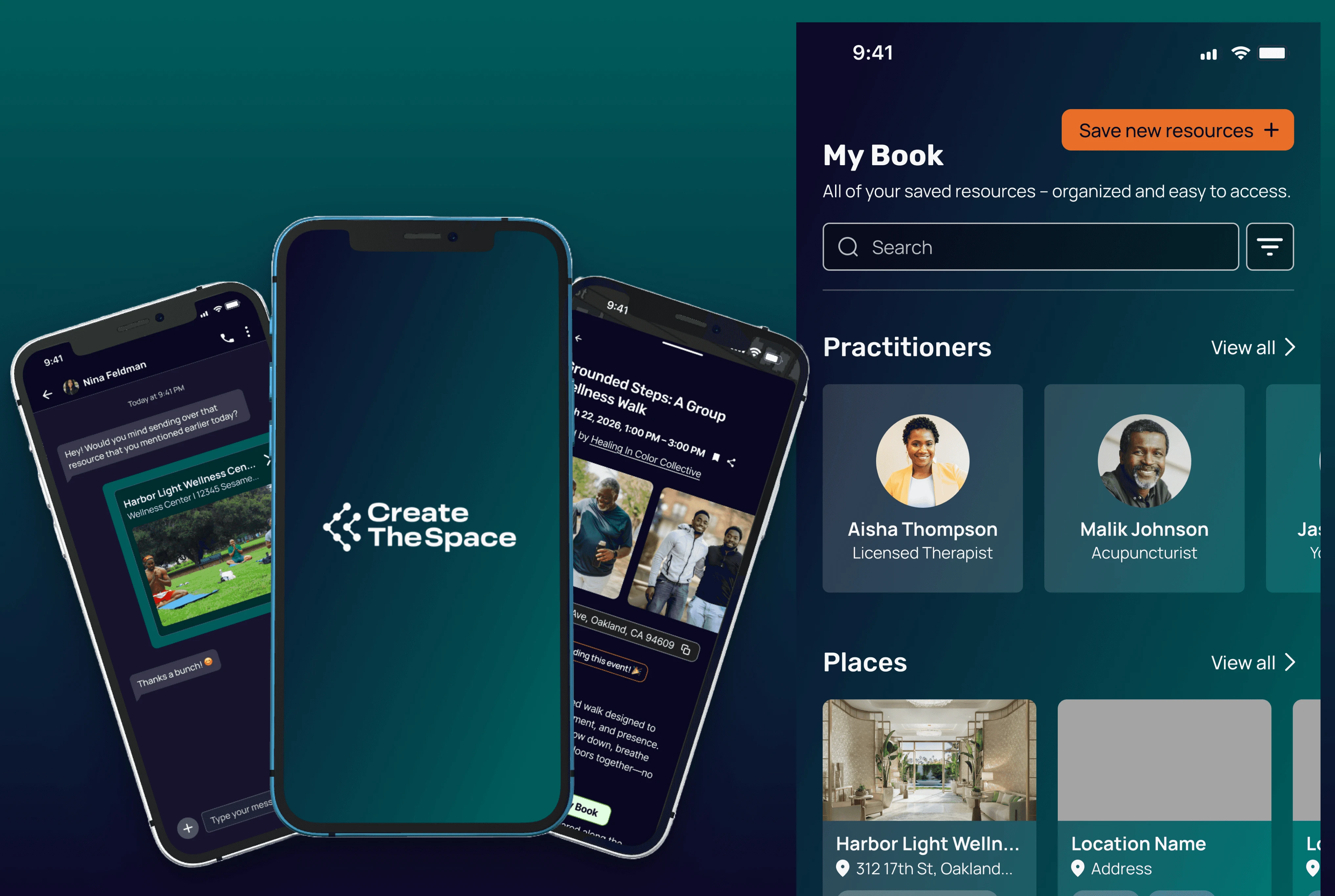
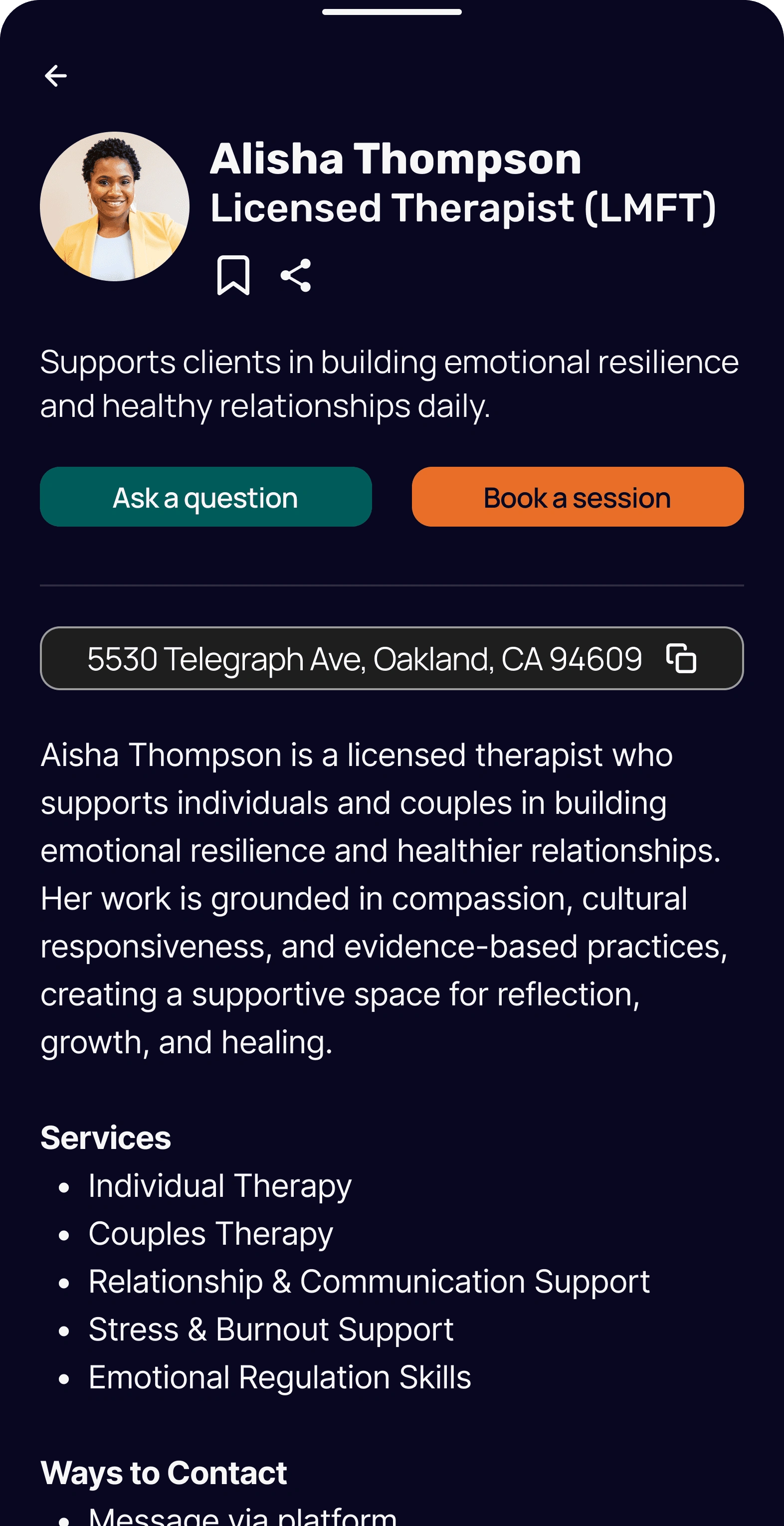
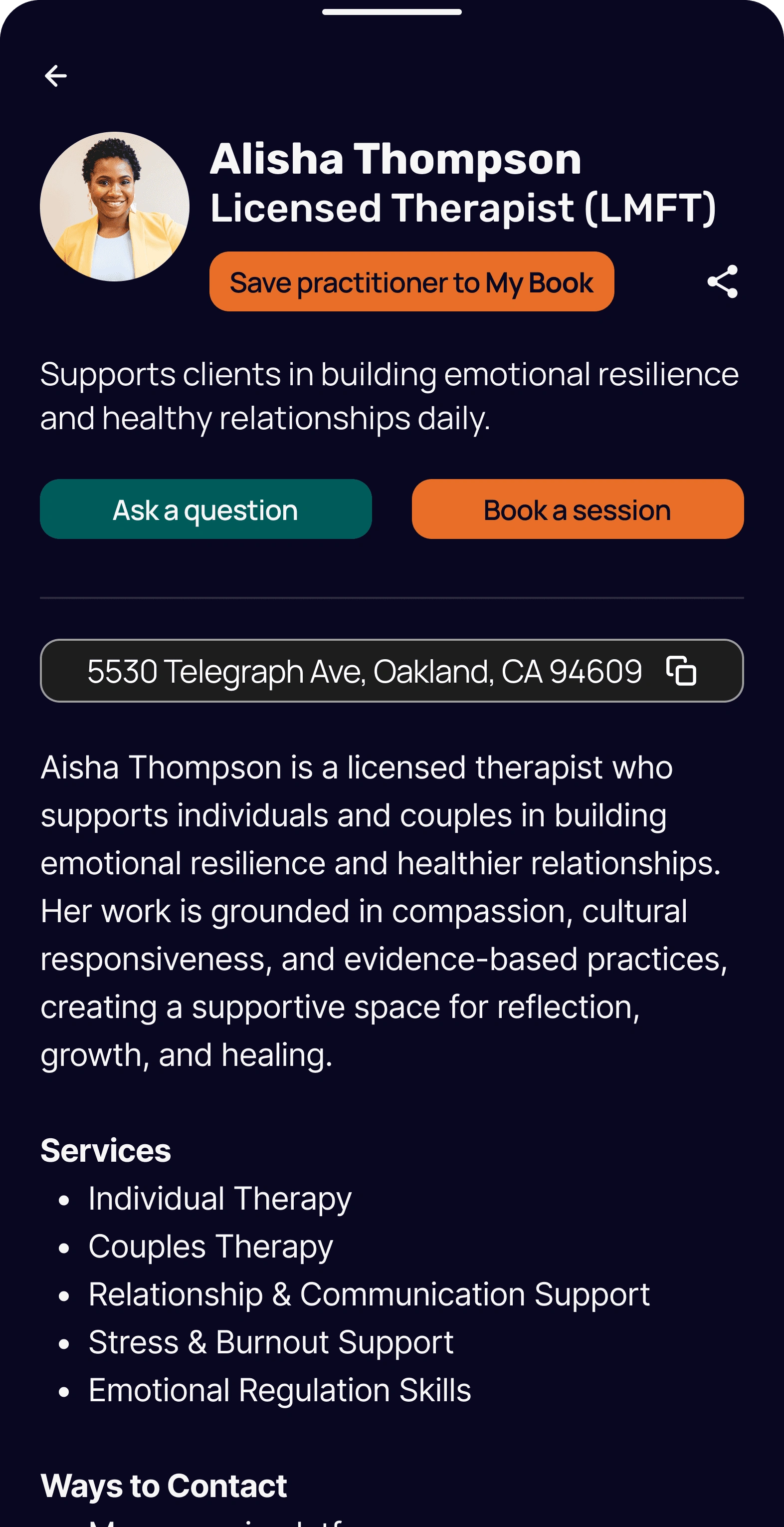
MY BOOK
The page where a user’s saved practitioners and resources (e.g. places, organizations, etc.) are stored. User can add private notes to each item saved for more personalization
We centralized information about practitioners, places, organizations, etc. in one place to account for the user need of wanting to easily access information. This feature stores all of users saved resources in one place, while also allowing users to edit what they have saved for a seamless experience.
Viewing Saved Practitioner Flow
Feature #2
PROFILE
A page for basic user information collected during new user onboarding. Includes:
App related user details (e.g. friend count, number of events both attended and hosted).
Share/edit profile features
Settings (e.g. user activity status, other details)
This section was designed to highlight core user details such as events and communities, allowing members to easily view and manage these sections. Displaying these details on profiles also allows users to find more shared connections, further strengthening community networks.
Profile Feature Walkthrough
We then wrapped up our project, finalized design documentation, and handed it off to our client for development.
Outcome
Our prototype increased overall user task success rate by 82%
User flows from the beginning that were confusing and difficult to use were more intuitive to use and successfully completed when users tested our final prototype.

“I challenged them to really take ownership of the project and they did a great job of collaborating, asking questions, and incorporating feedback. At the end of the experience I was more than delighted by our high-fidelity mockups and the designs the team created. They did that!”
- Denzel Herrera-Davis (Founder of Create The Space)
!!!
Reflection
Prioritizing users and team input
Takeaway #1: User-First, Always
More than once, I was faced with the decision of scrapping a large portion of screens in response to user feedback. Initially, these decisions were discouraging as it felt we were taking major steps backwards rather than progressing. However, I realized scrapping work is all a part of iteration and a majority of the decisions I made resulted in more effective designs. I learned although big changes may set back deadlines, a team can still quickly adapt and deliver with clear prioritization and alignment.
Takeaway #2: Utilize Your Team
As the Design Manager, I was responsible for major decisions around design direction and feedback. I initially didn’t ask individual members in my team for help on decisions and only asked for their thoughts and feedback during weekly syncs. However, as our project progressed, I noticed one of our team members was highly skilled in organizing design components and I wanted to learn from her. I scheduled a one-on-one with her and gained hands-on experience in redlining and design documentation. This taught me that confident leadership isn't about having all the answers, it's about recognizing what your team can teach you.
It was such a great learning and growth experience to work on this project. I would like to thank Aiden Gleason for being a great PM to work with and Denzel Herrera-Davis for all the constructive feedback and opportunity to design!
Thank you for stopping by!
٩(^v^)
´-♡
༘*.゚
Like this project