Elizabeth Seton Children's Hospital



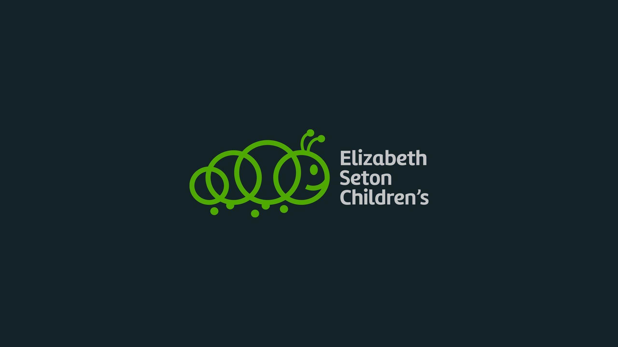
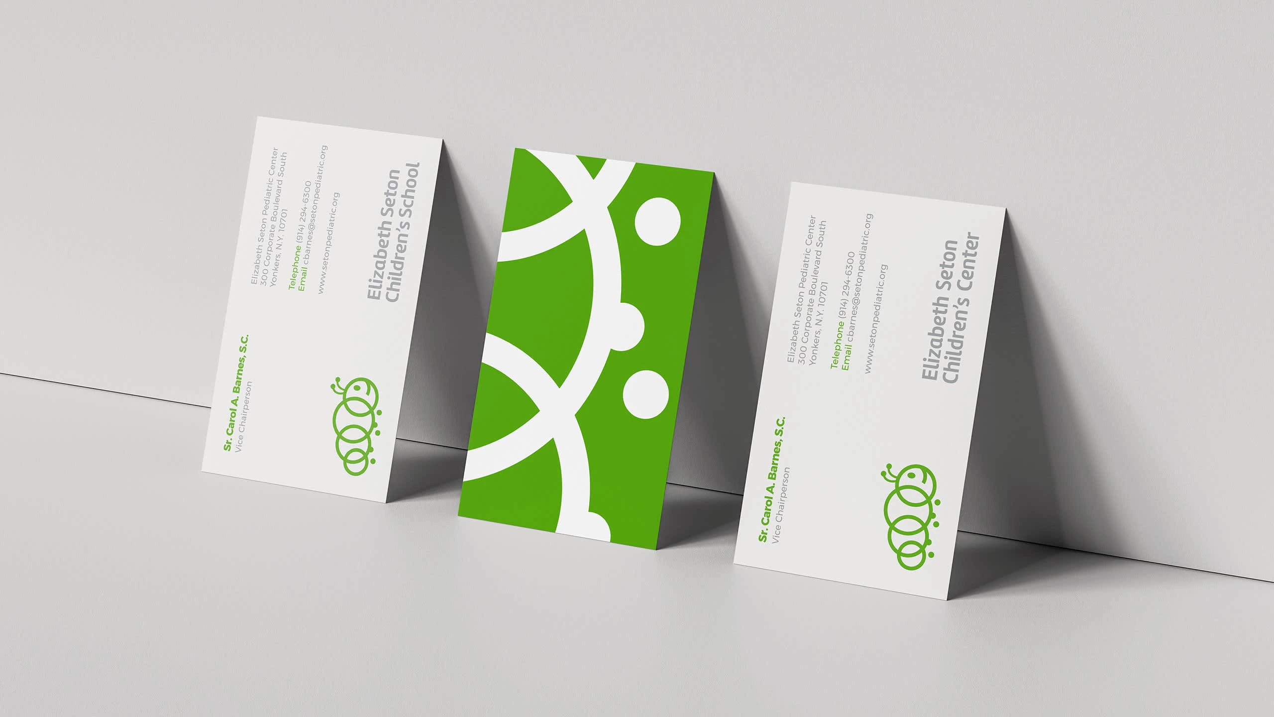
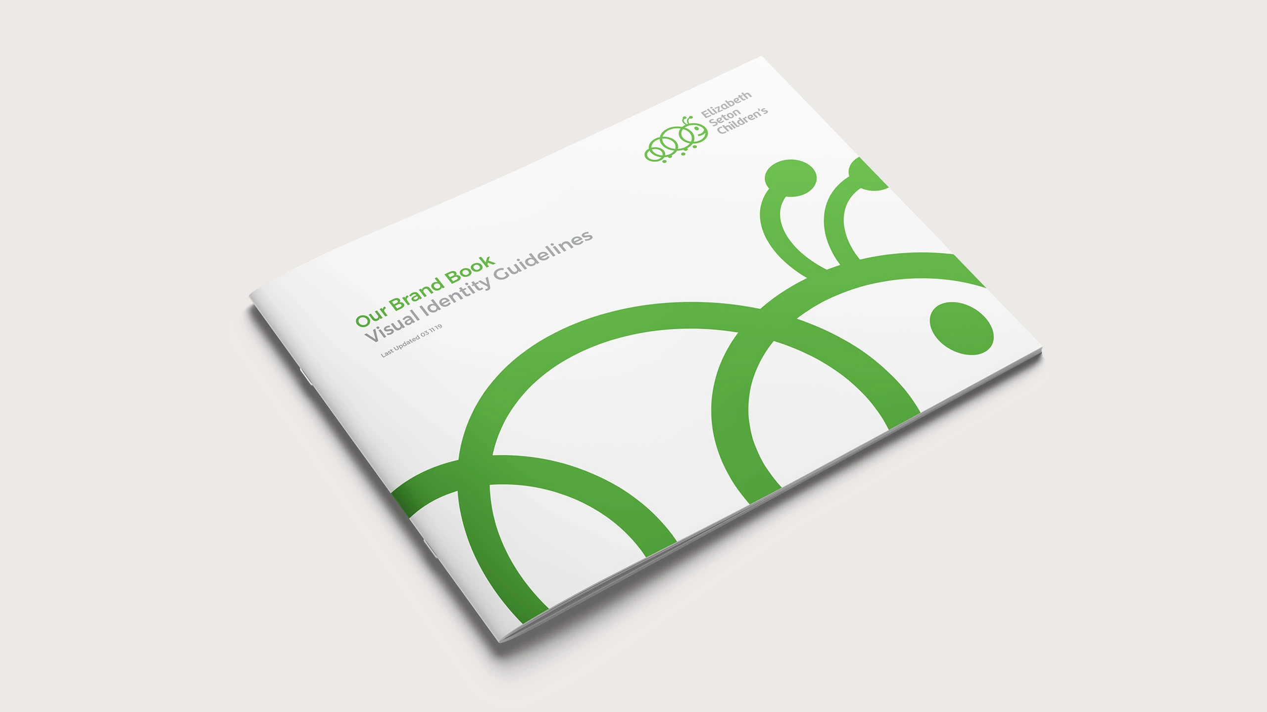
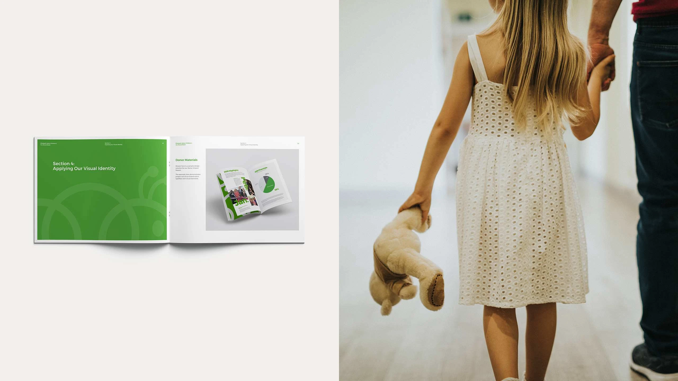

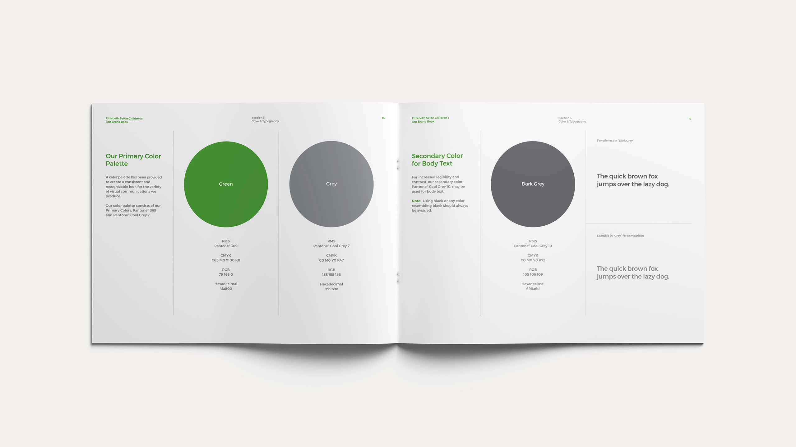

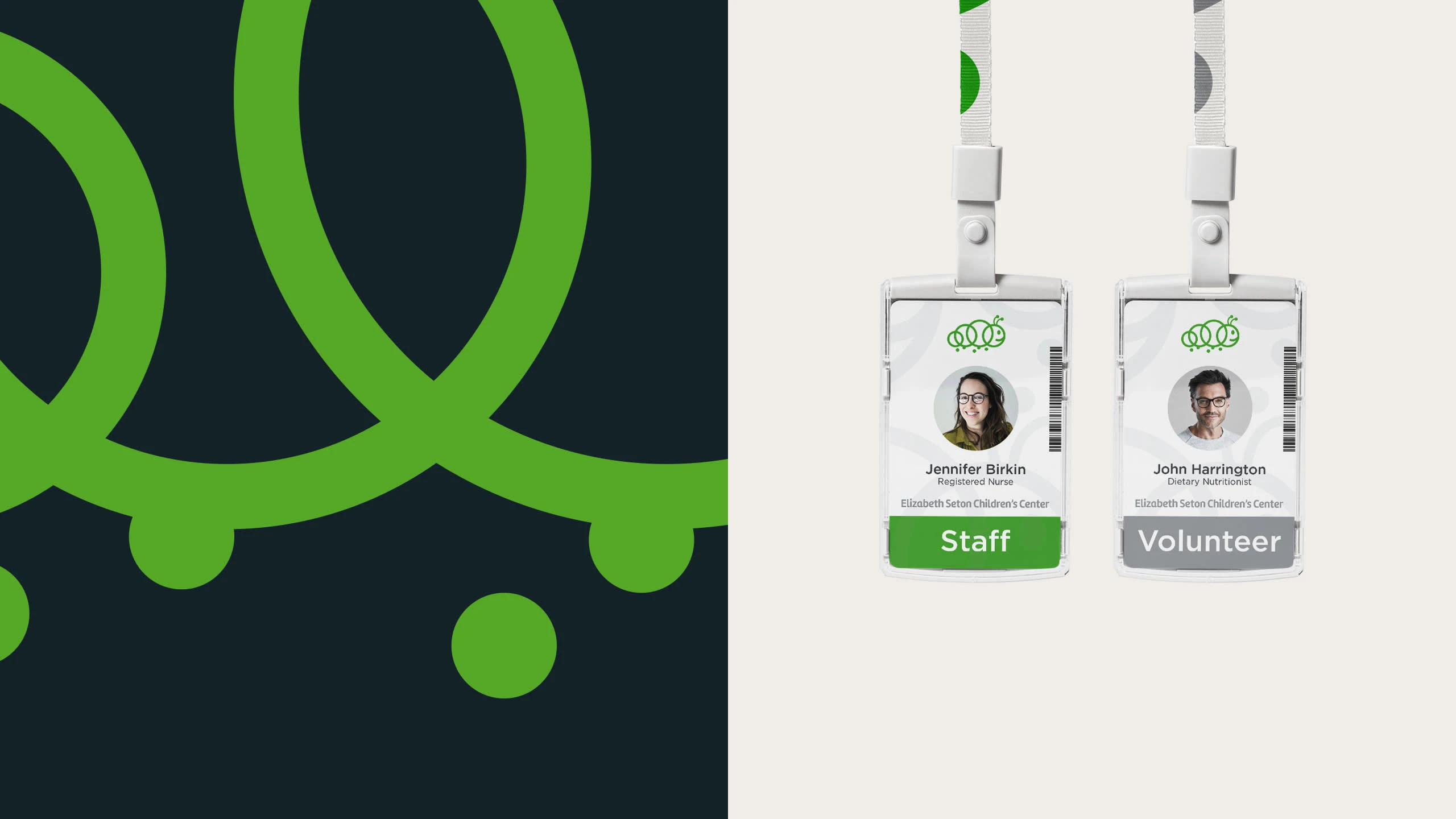

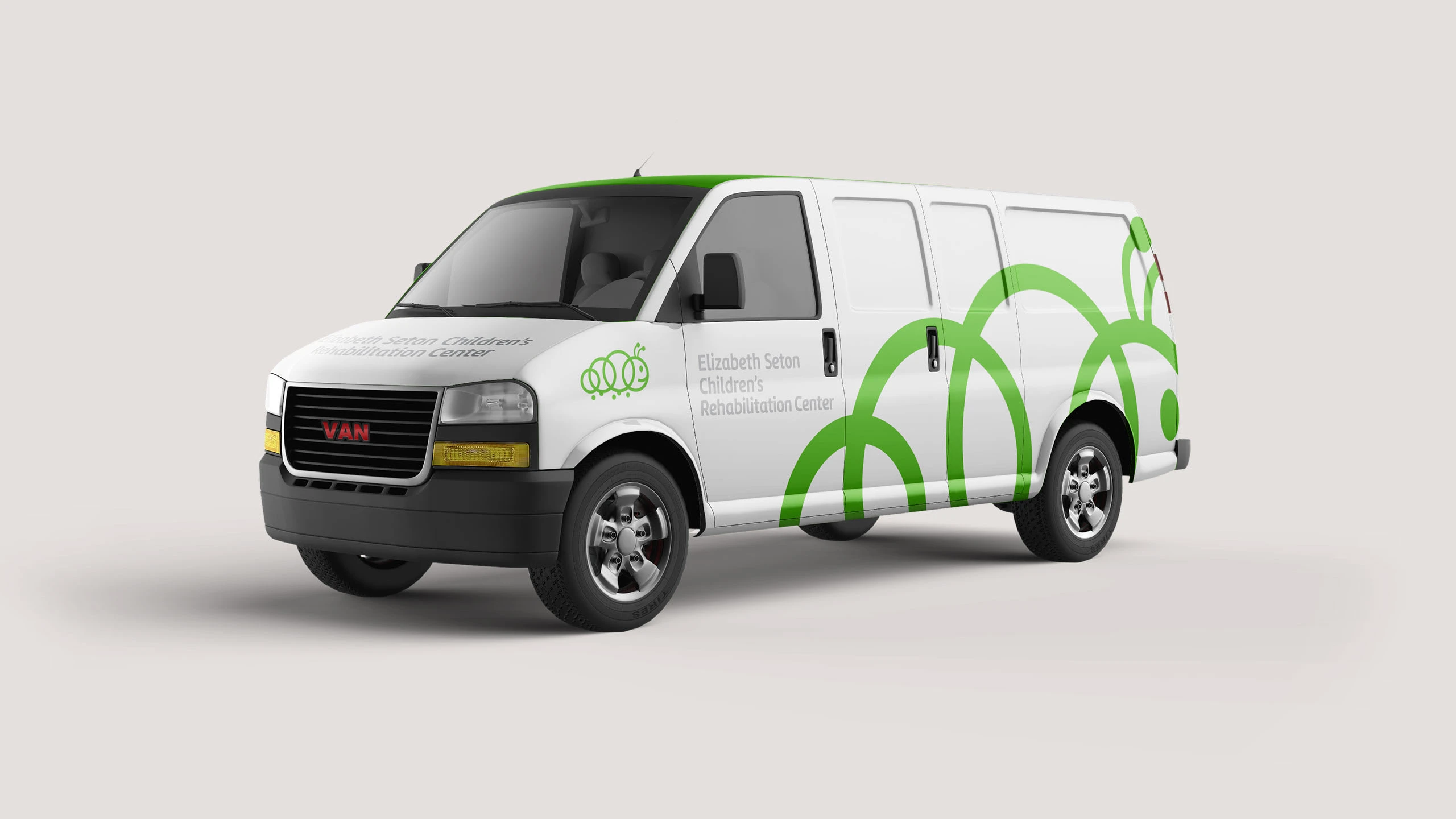

Elizabeth Seton Children’s has a long legacy of serving the children and families of New York—both in health care and education. The redesign of the organization’s identity and brand visual language posed a particular challenge in that they requested more of an evolution than something entirely new, and in particular, requested to retain their logo concept, a caterpillar affectionately referred to as Betsy. The result was a reinterpreted, simplified, elevated and refined mark and brand system, providing Elizabeth Seton Children’s with a future-forward visual identity.
Like this project
Posted Jul 19, 2024
Branding and visual identity for a children's hospital.
Likes
0
Views
0

