WattlePay: Premium Fintech Experience Design
Irene Porro
Context
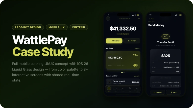
WattlePay is a personal concept project I built to explore what a premium fintech experience could look like when every design decision is intentional — not inherited from a template or a default component library.
The starting point was simple: two color swatches. Wattle #CFD457 and Bunker #040810. Everything else — surfaces, depth, hierarchy, interactions — derives from that constraint.
Problem
Most banking apps look the same. Blue, white, safe. Trust through familiarity. But familiarity isn't the only way to signal credibility. I wanted to prove that a dark, premium aesthetic could feel just as trustworthy — and significantly more considered.
The secondary challenge: build it as a working prototype, not a static mockup. Designs that can't be interacted with hide their flaws.
My Role
Solo project — concept to prototype.
I handled the full product design process: visual identity, color system, glassmorphism layer structure, component design, UX flows, and interaction states. I then built the entire prototype in Figma Make with zero UI libraries — every margin, radius, and animation written explicitly.
The result is 12 screens, 7 complete flows, and 8 interactive settings sub-screens.
Like this project
Posted Mar 4, 2026
A personal exploration of premium fintech design. Full UI/UX concept and interactive prototype, using AI to bring the vision to life.
Likes
0
Views
6
Timeline
Mar 4, 2026 - Mar 4, 2026