London Crime Rates Dashboard Design

Alex Spelucin


This project showcases a Looker Studio dashboard I've designed to analyze and visualize London's crime rates over time and across boroughs. It's a powerful example of how I can take complex datasets and present them in a way that's both informative and actionable. Let's break down its features and discuss how my agency can bring this clarity to your clients' data.
Temporal Analysis of Crime Incidences
Overall Trend Analysis (Time Series): The primary chart on this page is a time series graph showing crime incidences by month and year from 2008 to 2016. Notice the trend line – a key feature I incorporate to immediately reveal the overall direction of crime rates (in this case, a slight downward trend). This allows for quick identification of long-term patterns.
Contextual Information: I've included descriptive text to guide the user's interpretation. For example, it highlights specific months with the highest and lowest incidences and notes that the trend has been generally decreasing since January 2008. This narrative context is crucial for ensuring that the data isn't misinterpreted.
Monthly Incidence Breakdown: Below the main time series, you'll find a breakdown of average incidences per month. This allows for the identification of seasonal patterns – are there certain months where crime is consistently higher or lower? This insight is critical for resource allocation and preventative measures.
Crime Type Distribution: The bar chart at the bottom displays the distribution of crime types as a percentage. I've specifically called out "Theft and Handling" as the largest category and highlighted the increase in "Violence against the person" and the decrease in "Burglary" over the years. This granular detail provides a deeper understanding of the changing nature of crime.
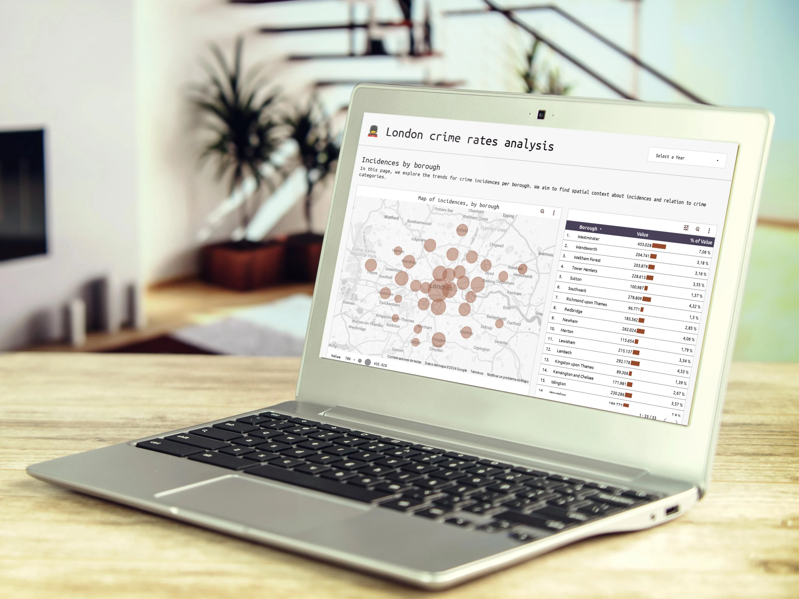
Geospatial Analysis of Crime by Borough
Interactive Map Visualization: This page features a map of London with markers representing crime incidences in each borough. The size of the markers likely corresponds to the number of incidences, providing an immediate visual understanding of crime hotspots. While static in the PDF, this map is interactive in the live dashboard, allowing for zooming, panning, and potentially filtering by crime type.
Borough-Level Table: A table to the left lists the boroughs and their corresponding incidence values. This table often acts as a filter in the live dashboard, enabling users to select specific boroughs and see how they contribute to the overall trends. I've also included the percentage of total value for each borough.
Borough Trend Over Time: The time series chart on the right shows crime incidences for a selected borough over time. This allows for comparison of trends across different areas of London. The PDF highlights that central boroughs show a stagnation or decline in crime, while outer boroughs are starting to see an increase.
In-Depth Analysis of Crime Types
Share of Incidences by Category: This section provides a detailed breakdown of crime incidences by major and minor categories. The donut chart provides a high-level overview, while the accompanying text highlights key relationships, such as "Theft" comprising 41.28% of incidences, and "Violence against the person" representing 24.16%.
Pivot Table of Percentage of Categories Across Boroughs: This table shows the percentage distribution of major and minor crime categories across different London boroughs. This allows for a detailed comparison of crime type prevalence in different areas.
Heatmap Potential: The description suggests the use of a heatmap to visualize crime category prevalence across boroughs. While not explicitly shown in the PDF, this is a powerful visualization technique I often employ to quickly identify patterns and correlations.
My Promise:
I'm dedicated to crafting data experiences that drive results. We handle the technical complexities of data analysis and visualization, allowing you to focus on what you do best. Let's connect and discuss how we can transform your clients' data into a strategic asset.
Like this project
Posted Apr 19, 2025
Designed a Looker Studio dashboard for analyzing London's crime rates.
Likes
0
Views
0


Looker Studio Dashboard for Marketing Performance
Retail Store Performance Dashboard Design