Agricultural Cooperative Finow
Rebranding and Corporate Design for Agricultural Cooperative Finow
Objective:
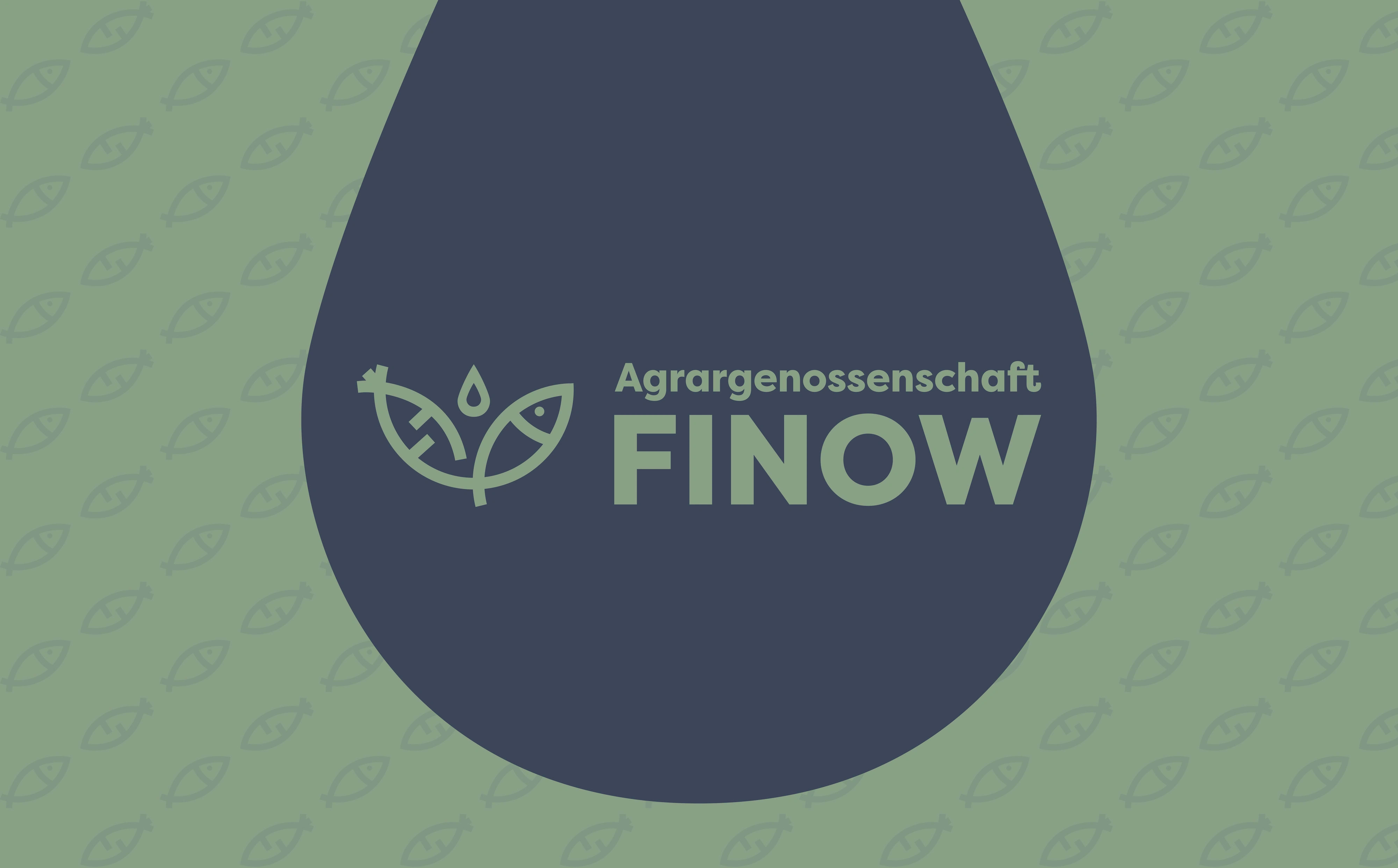
To revitalize the brand identity of Agricultural Cooperative Finow, reflecting their innovative aquaponic farming methods and commitment to sustainability through a comprehensive corporate design.
Role:
As the lead designer, I spearheaded the development of a new brand identity, creating a suite of design assets including a refreshed logo, color palette, typography, and various promotional materials.



Approach:
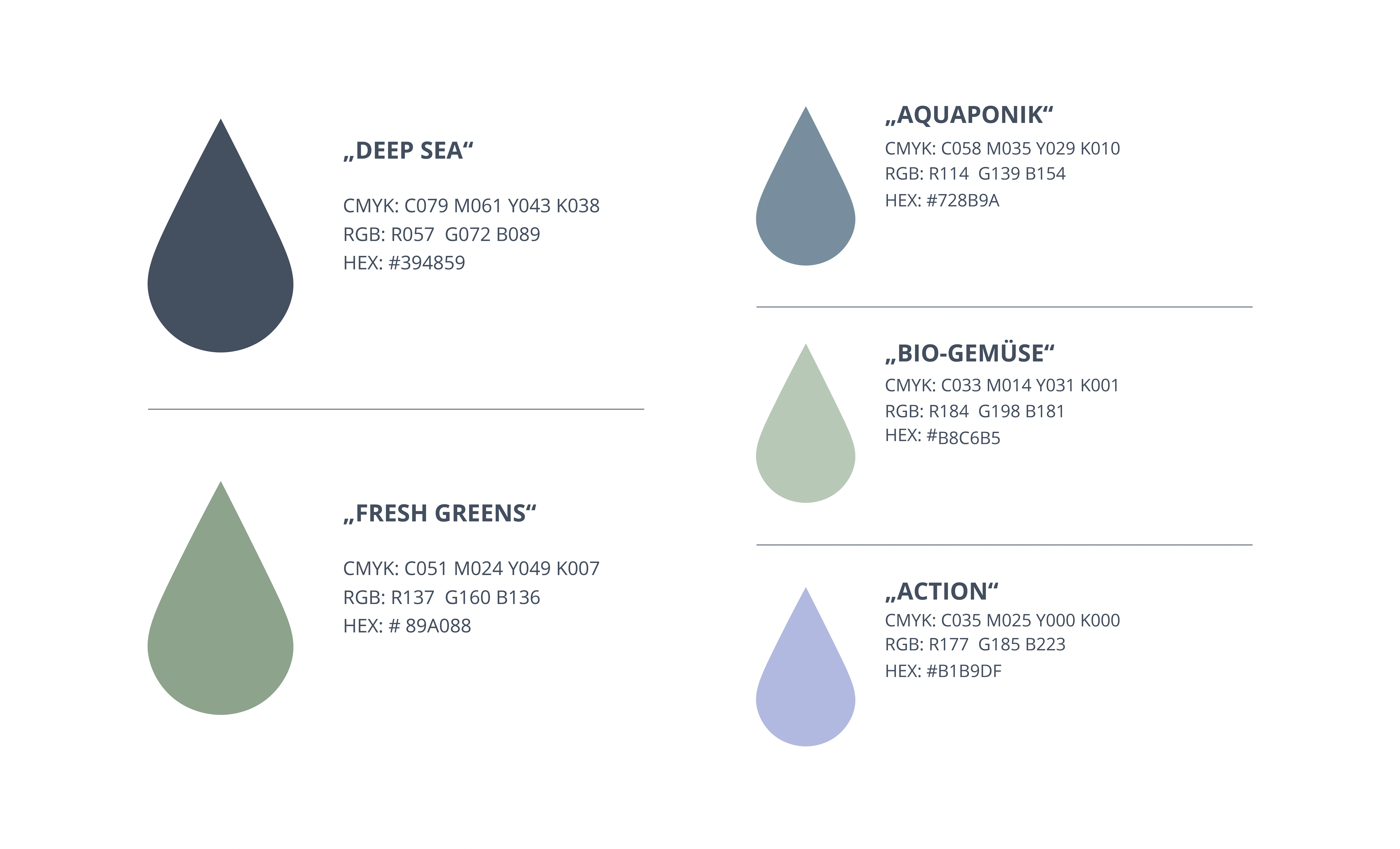
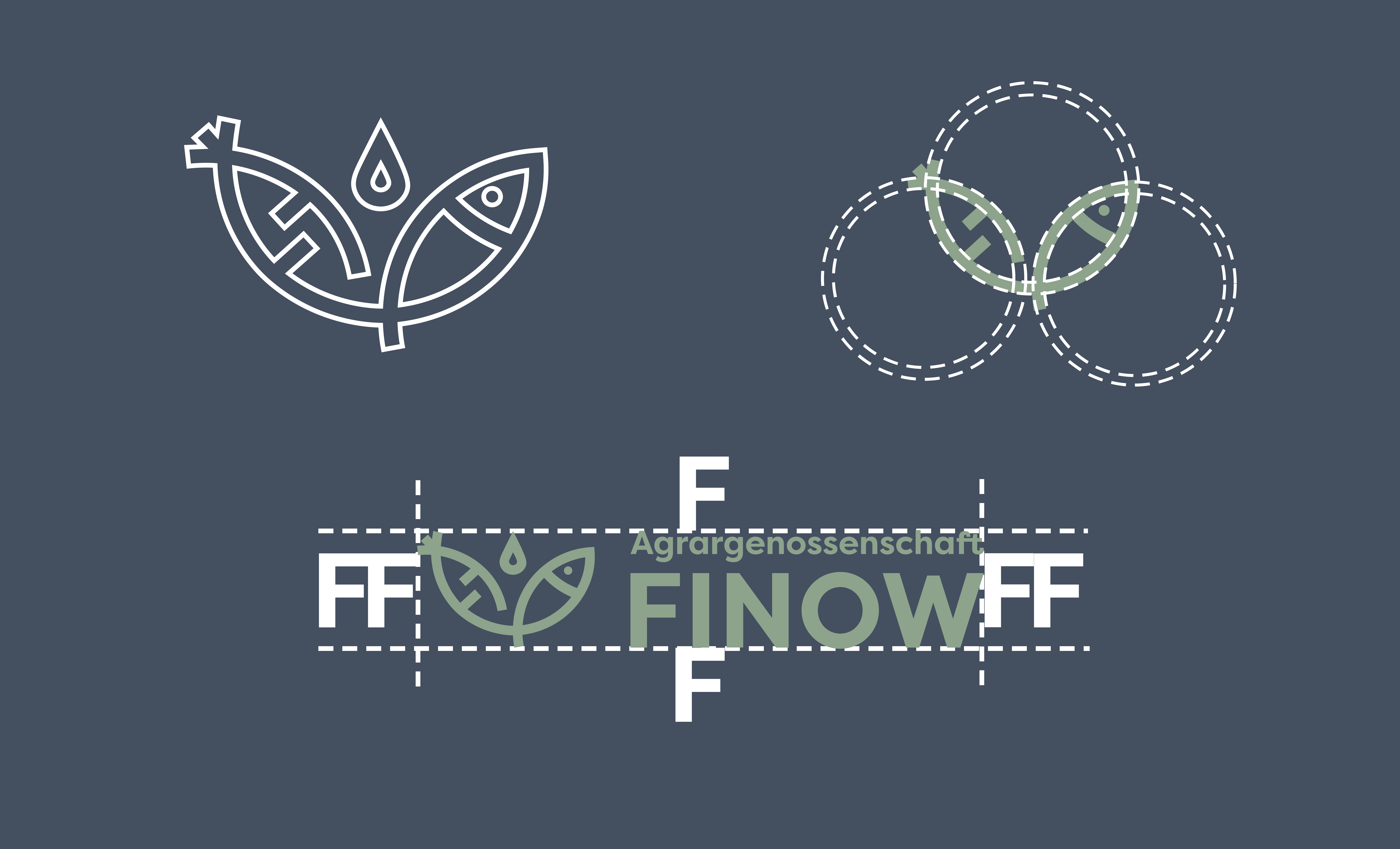
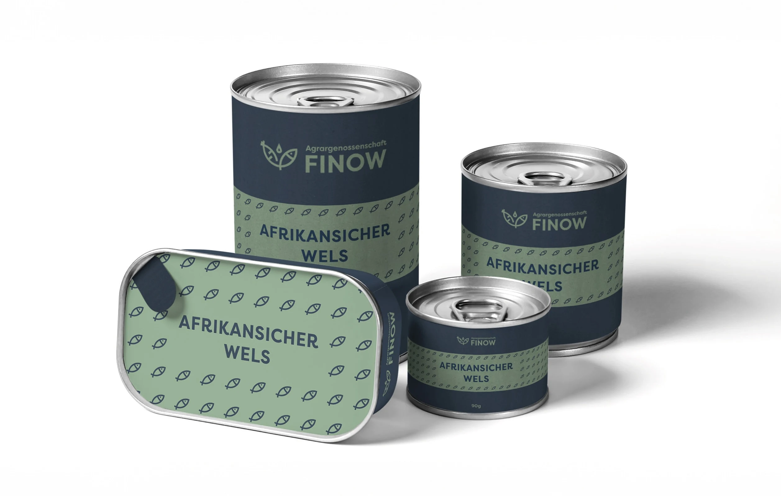
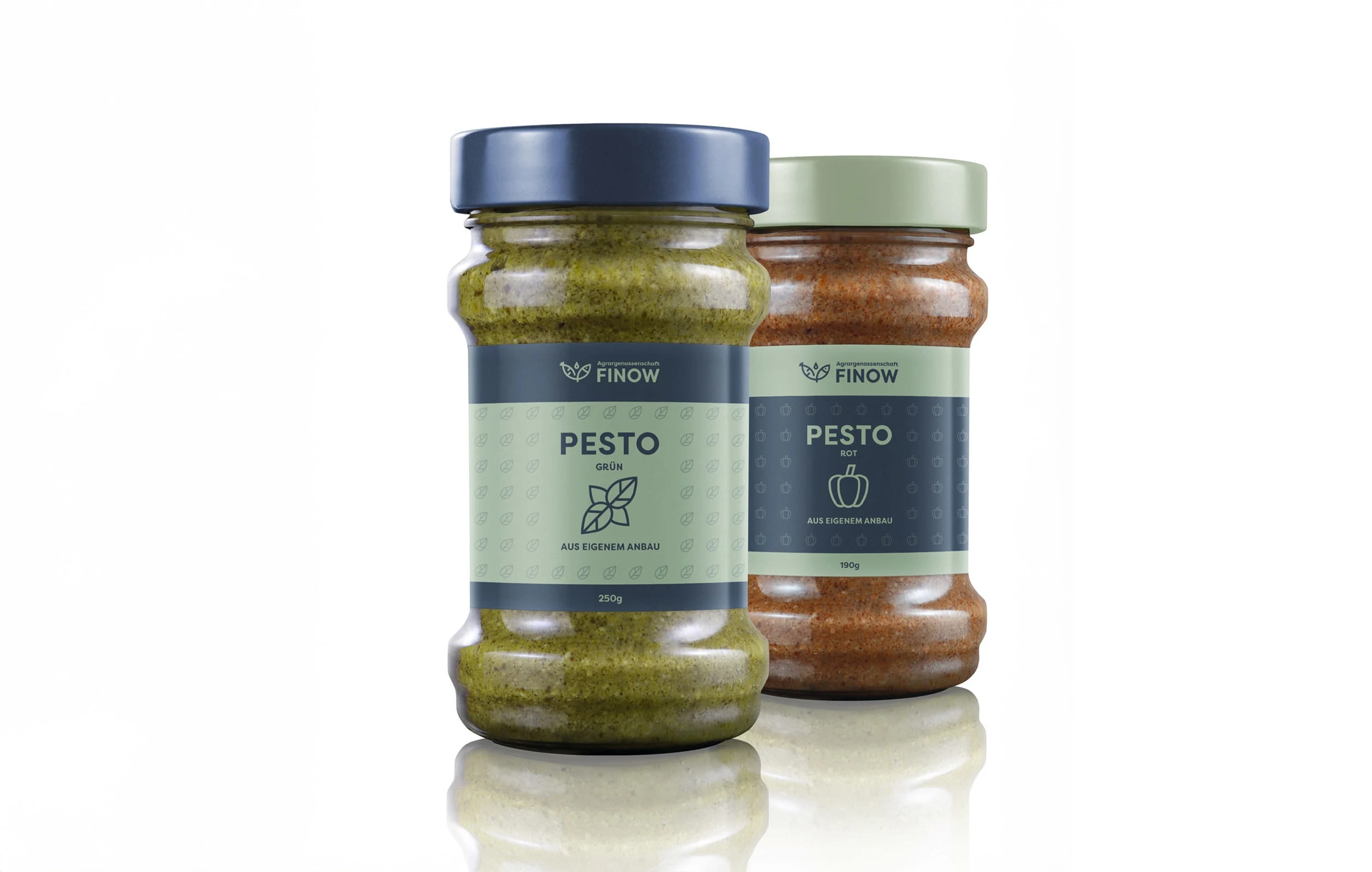
The design process centered on visually capturing the essence of aquaponics—integrating elements of water, fish, and plants into the logo with a green and blue color scheme. A rounded, futuristic yet playful font was chosen to appeal to a broad audience, embodying the innovative and accessible nature of their technology.
Outcome:
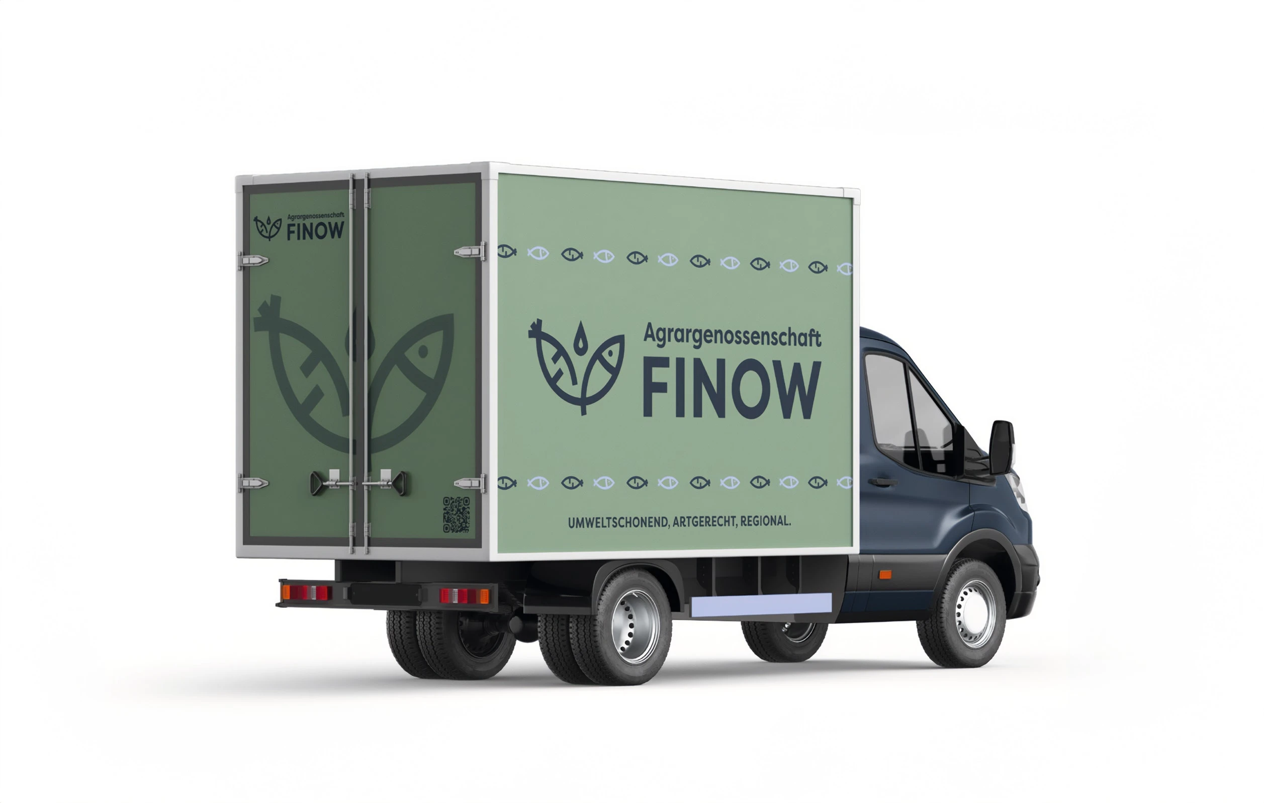
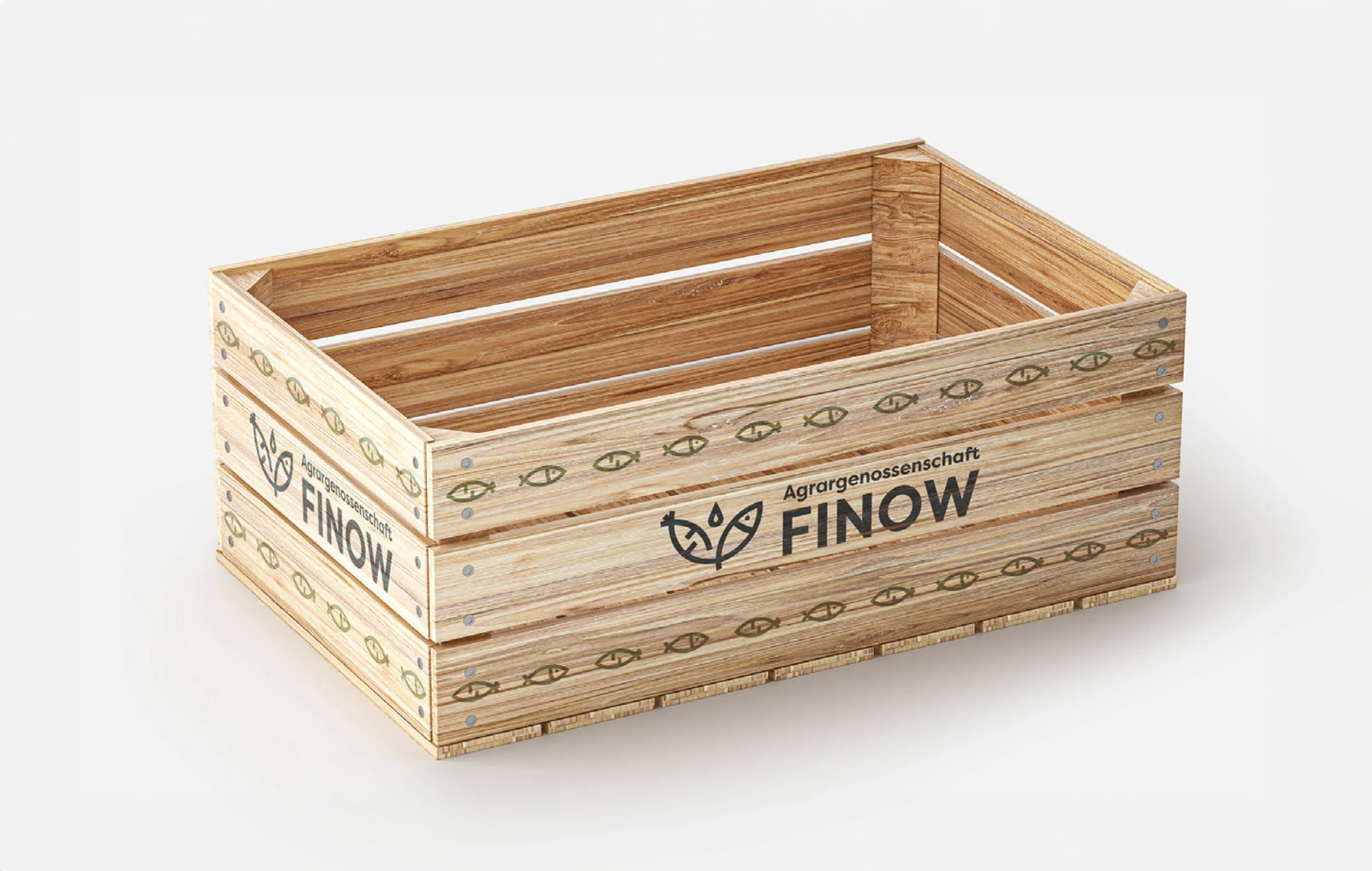
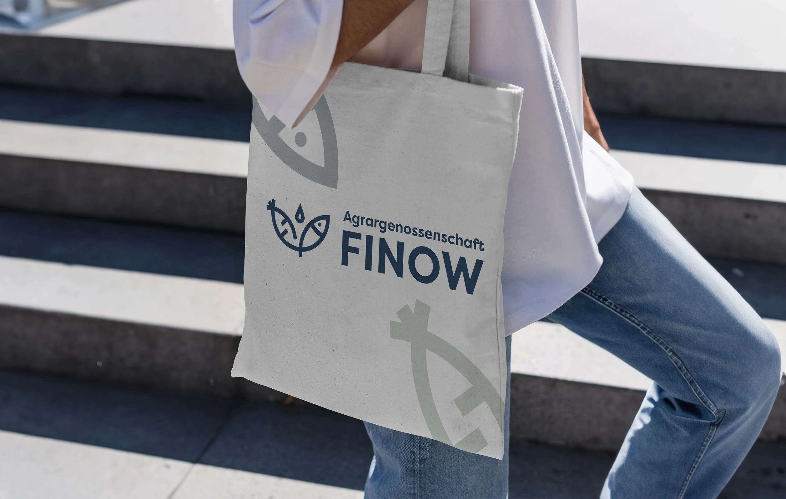
The rebranding successfully repositioned Agricultural Cooperative Finow with a modern, coherent visual identity, enhancing their appeal across diverse customer segments. Key deliverables included:
• A new logo symbolizing the synergy of aquaponics.
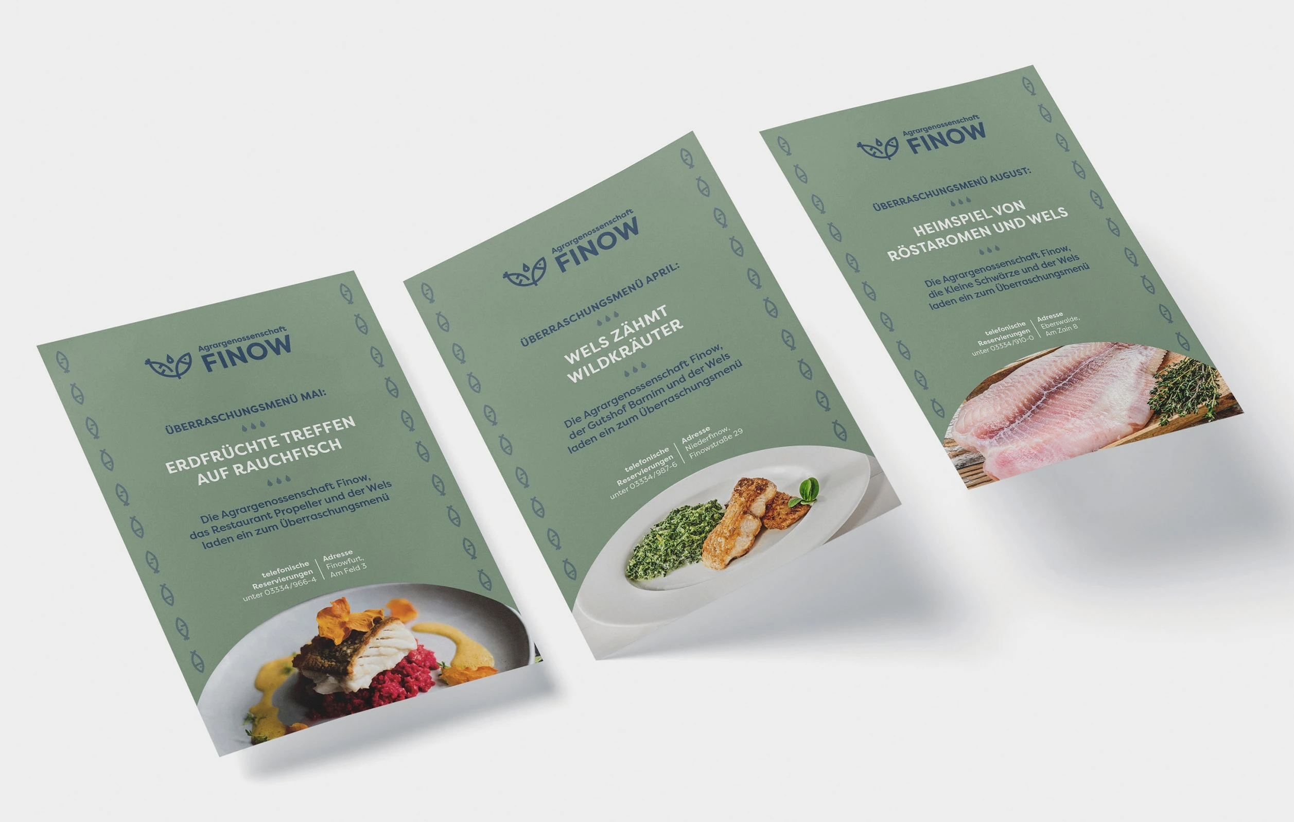
• Eco-friendly packaging and promotional materials.
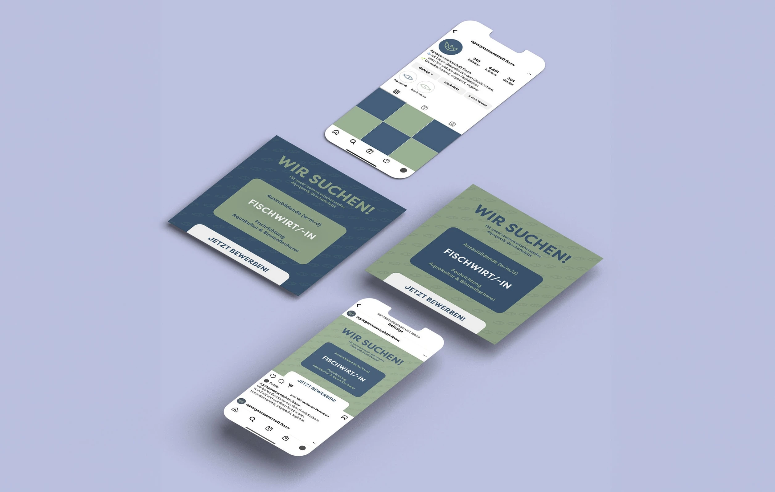
• Digital content for social media and seasonal menus.
Impact:
This initiative not only solidified the cooperative's brand presence but also underscored their dedication to sustainable agriculture. The refreshed brand identity effectively communicates their pioneering approach to farming, appealing to environmentally conscious consumers.
This concise rebranding case showcases the transformation of Agricultural Cooperative Finow's visual identity to align with their innovative and sustainable farming practices, making it more accessible and appealing to a wider audience.
Like this project
Posted Feb 7, 2024
Revitalized Agricultural Cooperative Finow's brand with a fresh brand identity and product designs, embodying sustainability.

