Personal Website
Joe Hendley
Personal website for myself
Project Objectives
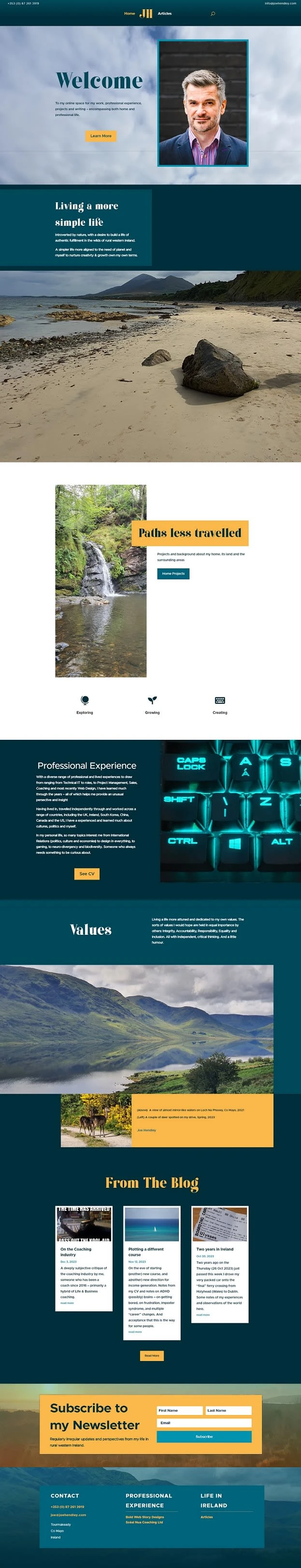
My own personal site to act as a place to showcase both my work, work history & experience (my CV), but also my home life, interests and personal blogs for cathartically expressing my perspectives from my own lived experience.
Also simply to share photographic updates and views around my home and its plot of land here in the wilds of rural western Ireland (Co Mayo) nestled on the outskirts of Connemara, the Western Lakes and the new local project of the Joyce Country Geopark.
In my personal life, I tend to be more quiet and introverted. My personal goals include building a simpler life, more in-line with the concepts of work/life balance, a safe sanctuary of “slow living” and self-sustainability over time.
Approach
The overall design concept was to project a slightly more sober, less vibrant colour scheme than those I gravitate towards in business goals.
I didn’t want the design to become too dull, however – so I am aiming for something still quite fresh, minimalistic (which is a challenge for me) with a little (hopefully!) classical look and feel to it using another script font for the titles and a clear typeface for the body texts. A combination of being not too old-fashioned but not overdoing any styles. I love blues and teals in terms of clothing and art – not cold tones either, with added splashes of colour to keep the design from veering into a monotone, in this case a shade of yellow taken from the influence of “Ecstatic” colours (The source links has since been updated, but the article was here), to quote:
“It’s easy to get overwhelmed in today’s economical and political landscape, and you only need to read the news to feel an instant hit of despair. It’s therefore important that while we actively fight for a better world, we also inject some light into the shade. These ecstatic colors do exactly that with their vibrant and highly-saturated hues.”
Another example, see these palettes’ yellows
There are plenty of other palette finders for a source of ideas, this being my current favourite: Coolors.co
Final Layout
Ready to talk?
Contact me now to discuss your requirements and to see if we are a good fit
Like this project
Posted Feb 15, 2024
My own personal site to act as a place to showcase both my work, work history & experience (my CV), but also my home life, interests and personal blogs
Likes
0
Views
22