Wix Freaks Collaboration | Wix Studio & Figma Design
Wix Freaks Homepage Hero Section
Wix Freaks, a digital agency specializing in Web development and business automation, approached me to redesign their website and implement complex animations using Wix Studio. As a UI/UX designer and Wix Studio developer, I was tasked with creating a visually striking and highly interactive website that would showcase their expertise in their services.
Project Goals:
The main objectives for the Wix Freaks website redesign were:
Create a modern, visually appealing design that reflects their brand identity
Implement complex animations to demonstrate their technical capabilities
Improve user engagement and navigation
Optimize the website for mobile devices
Design Process in Figma:
I began by creating a sitemap and content flow and low-fidelity mockups in Figma, focusing on the overall structure and user flow. After that I started aligning and documenting the design system and feedback sessions with the Wix Freaks team, we settled on a design direction that emphasized dev focused typography, ample white space, and strategic use of the brand colors explored during creation of design system.
The final design featured:
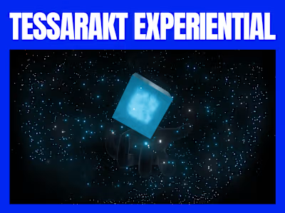
A dynamic hero section with a rotating 3D dev coin, demonstrating a visual and playful aspect related to technical development expertise.
An interactive portfolio showcase
Animated infographics to highlight key services and statistics
Animation Development in Wix Studio:
With the approved designs, I moved on to developing the website and its animations in Wix Studio.
Some of the complex animations I created included:
Smooth Scrolling of the website
Pitch page blur in out text effect
Reverse directional horizontal testimonials scrolling
Interactive hover effects on portfolio items
A custom loading animation using Jitter
Like this project
Posted Jul 11, 2024
Collaborated with the Wix Freaks team to help them with UI Design in Figma and complex animations on Wix Studio


