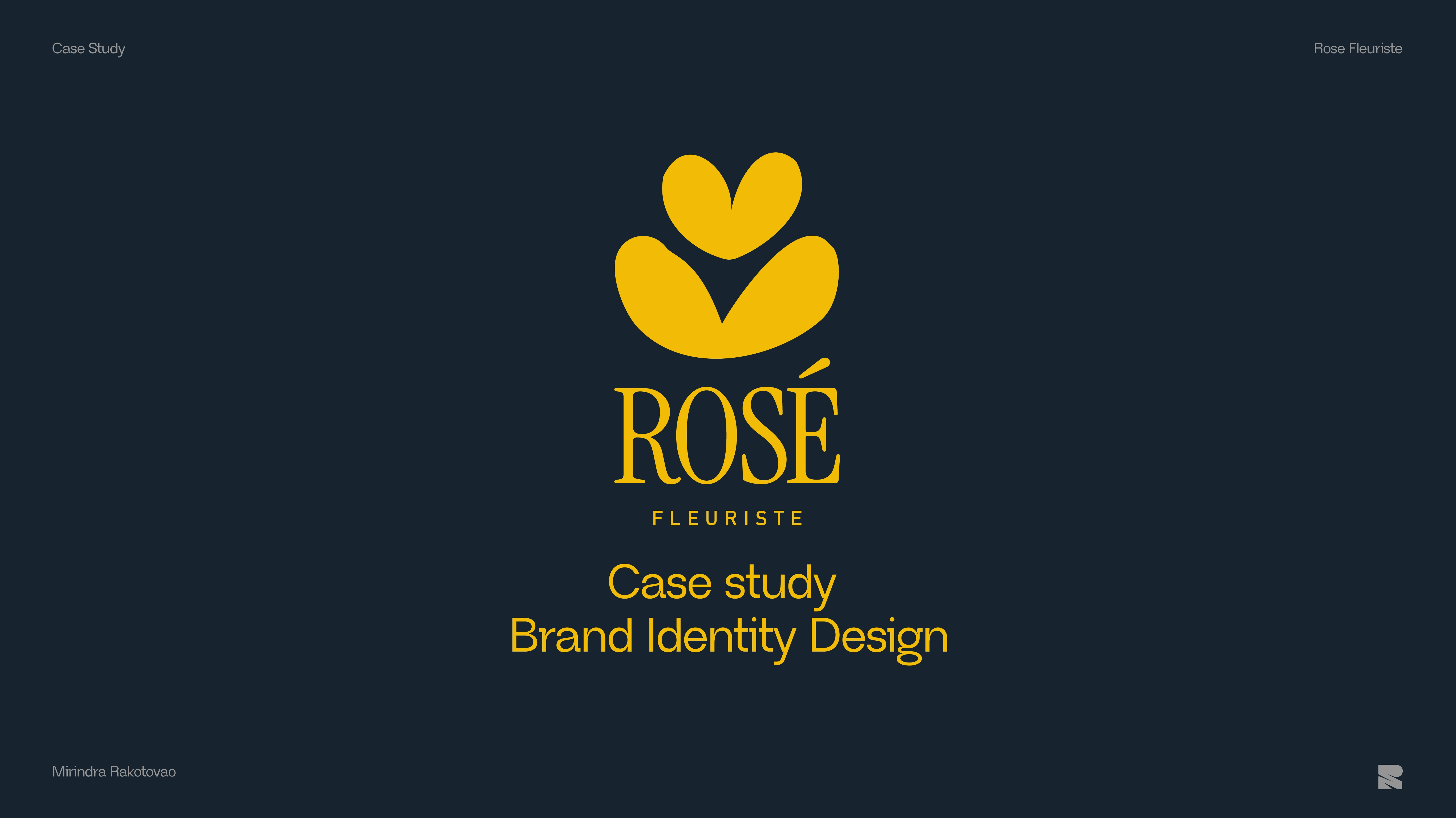
Rosé Fleurist Brand Identity Design
Mirindra Rakotovao
About
Client : Rosé Fleurist
Scope: Brand Identity Design
Work : Strategy, Logo Design, Visual Language, Social Assets, Brand Guidelines
Rosé Fleuriste is a modern florist studio that delivers bold, statement-making arrangements for events, weddings, and premium clients. The goal of this project was to create a visual identity that stands out from the traditional soft, romantic floral aesthetics while reflecting sophistication and contemporary design. Yet simple to include every level of the target audience.
Challenge
Most florists rely on delicate, pastel-heavy designs that feel safe and conventional. Rosé Fleuriste wanted to break away from these clichés and establish a brand identity that feels contemporary, bold, and sophisticated. The identity also needed to appeal to a wide range of clients, including event planners, couples, and premium buyers, without losing cohesion or clarity.
The Approach
We centered the design around an abstract tulip symbol that is both modern and chunky, providing a strong visual anchor for the brand. The color palette was carefully curated to be bold yet refined, moving away from traditional pink florals toward high-contrast, modern tones that enhance visibility and memorability. The overall visual system was developed to be flexible and versatile, allowing the symbol and colors to work across multiple platforms, including social media, event signage, packaging, and web applications. Every decision emphasized balance between boldness and elegance, ensuring that Rosé Fleuriste stands out in a crowded market while remaining approachable and sophisticated.
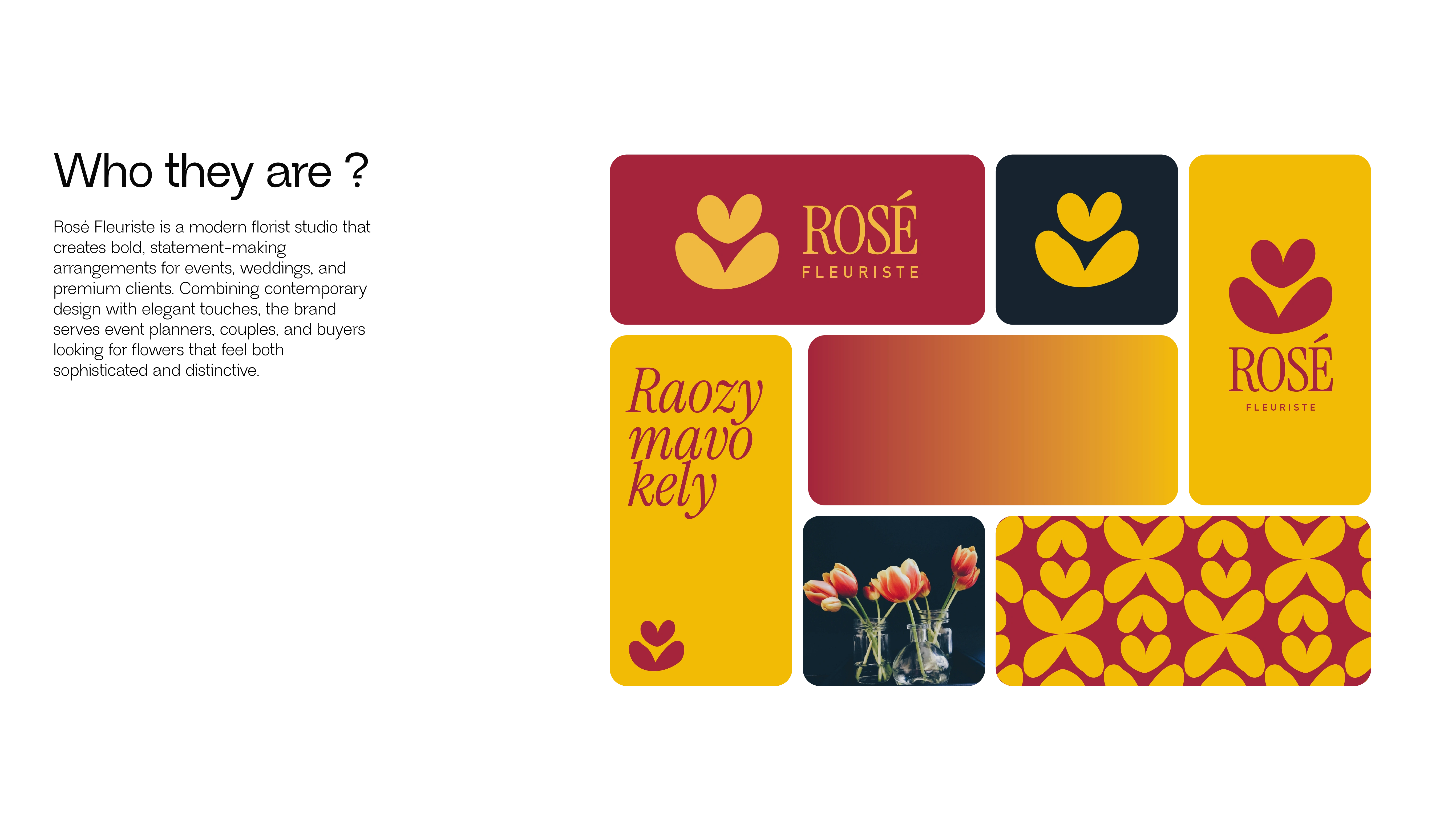
About the Client
Logo Design
The tulip was chosen as the core symbol for Rosé Fleuriste because of its strong, iconic silhouette that reads clearly at any size and across any application. Unlike other flowers, which can appear delicate or overly detailed, the tulip’s simple, geometric form allows for chunky abstraction, creating a bold visual anchor that can stand out in digital and physical formats.
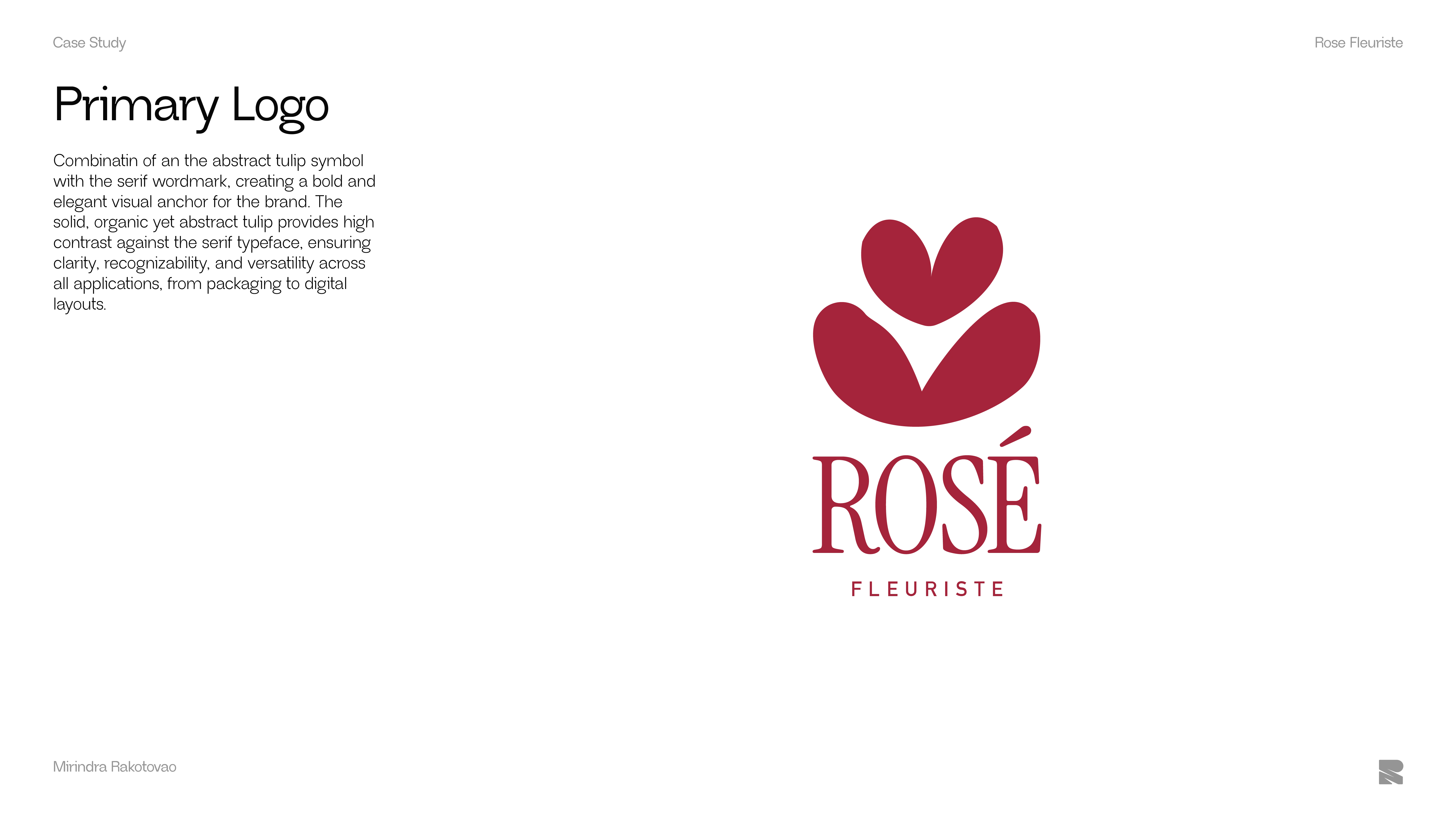
Primary logo design
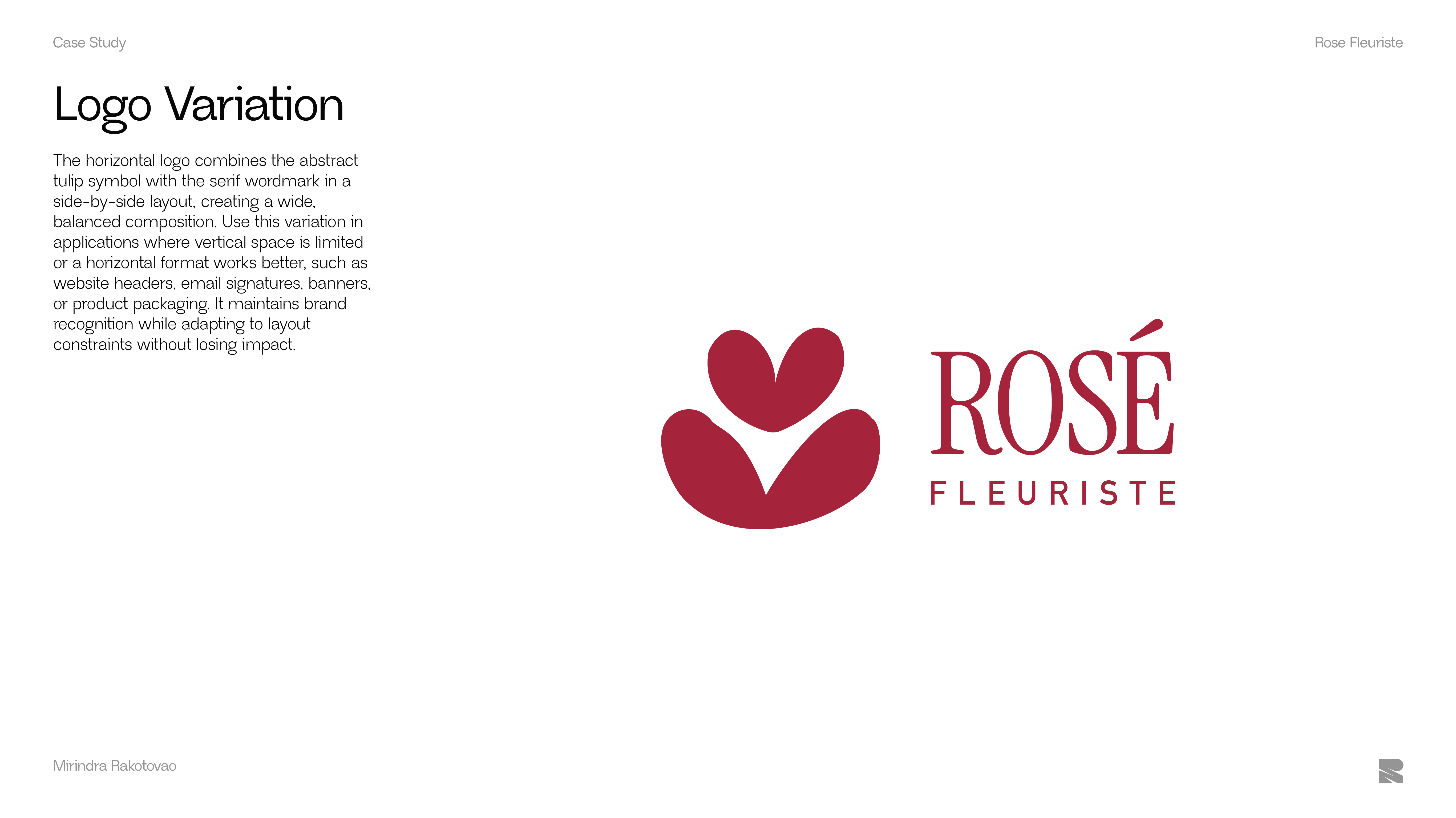
Logo Variation
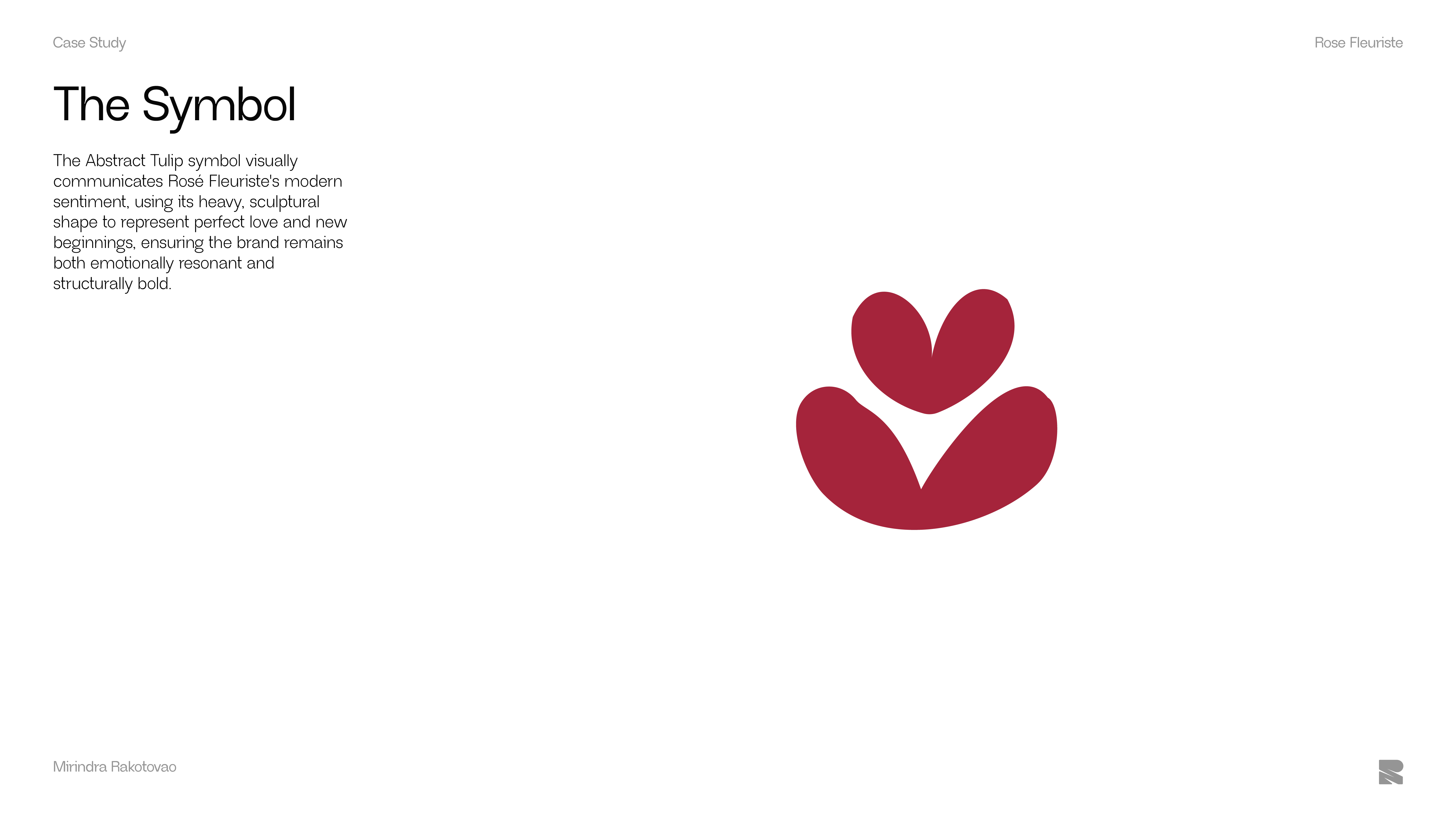
Rosé's Symbole
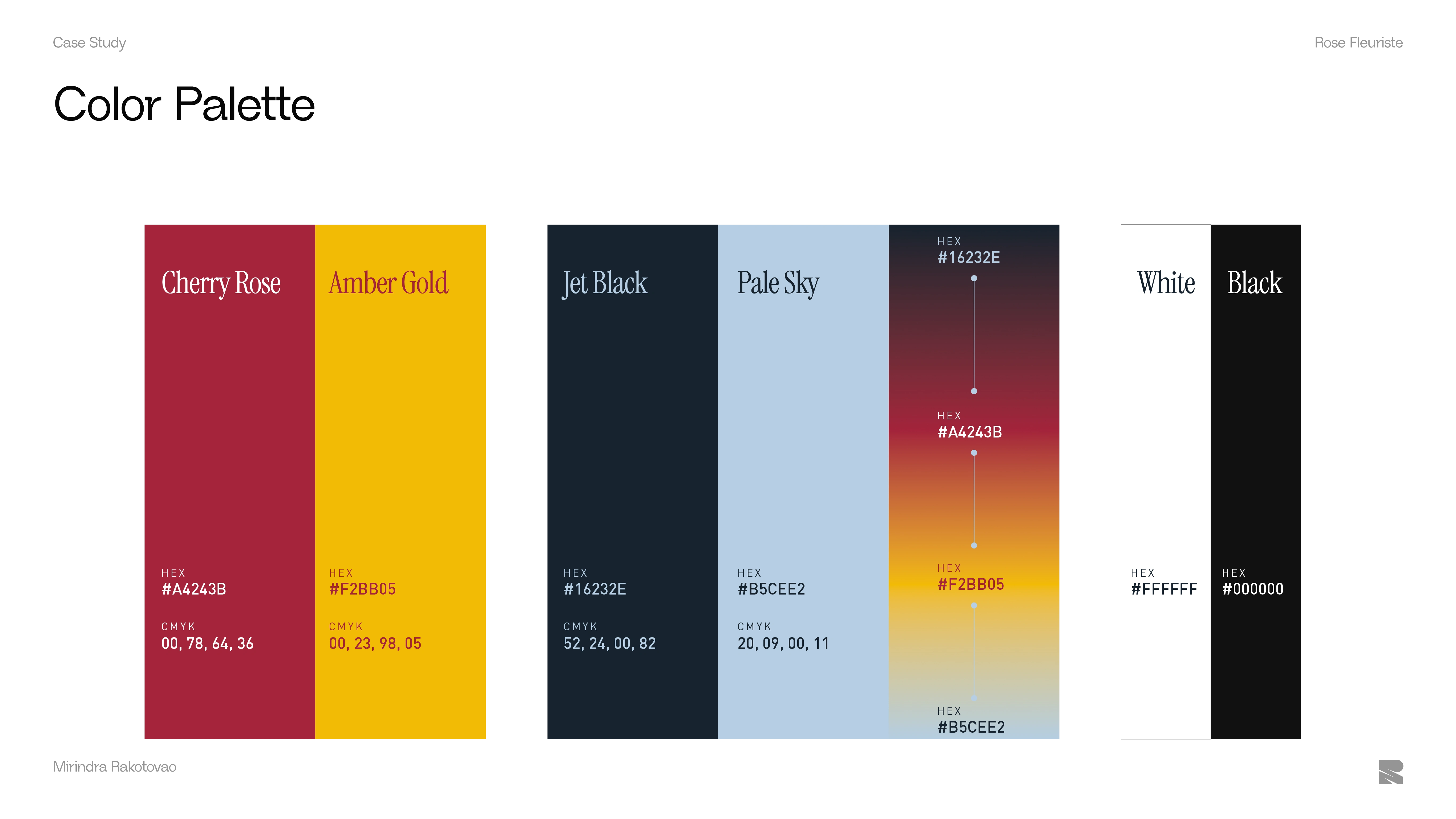
Color Palette
For the high-contrast identity the use of the deep red adds sophistication and presence, while the warm gold provides energy and a luxurious accent. Together, they give the brand a modern, memorable, and premium feel that stands out across both digital and physical applications.
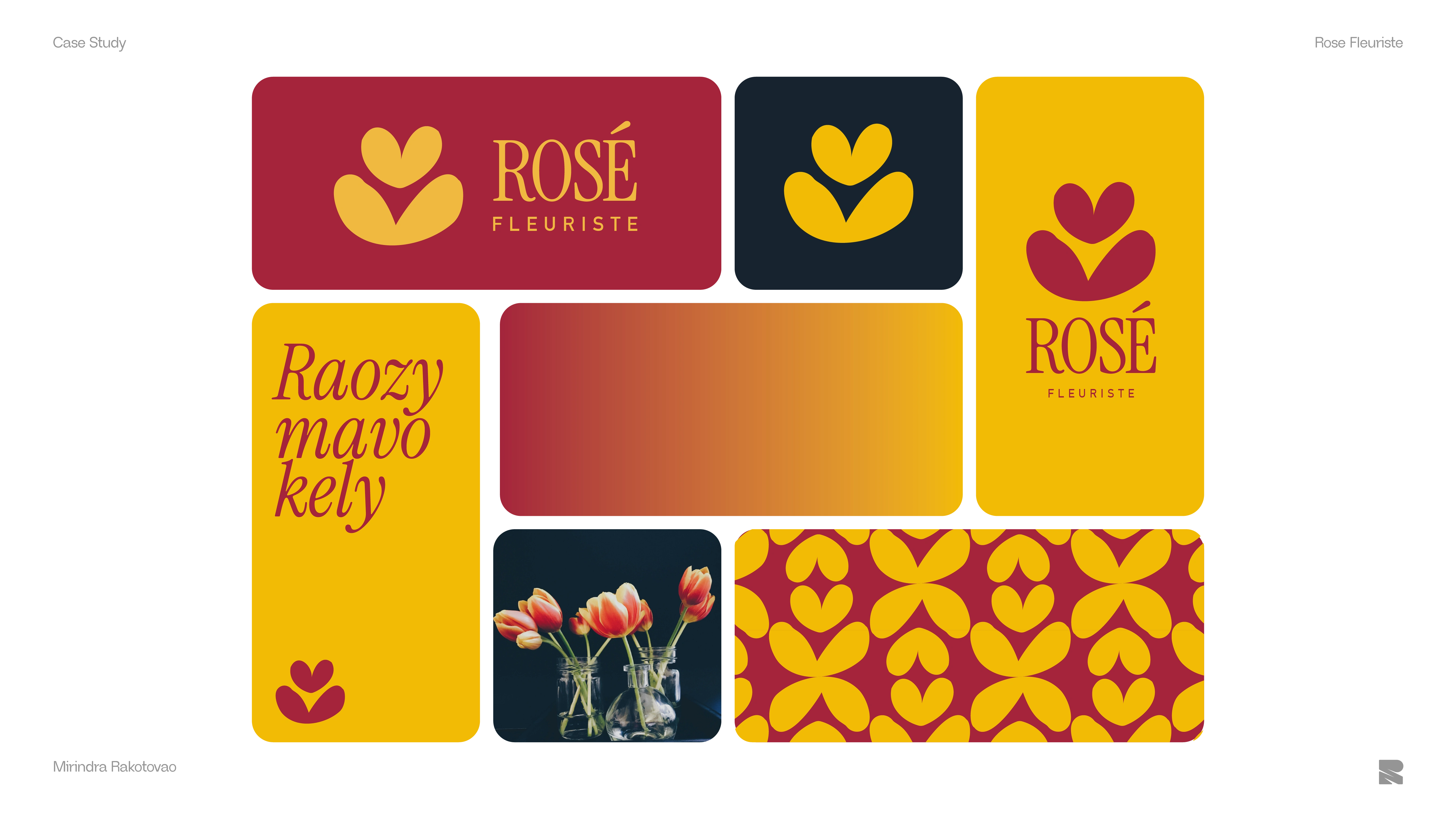
Color in use
Brand in Action
A global view
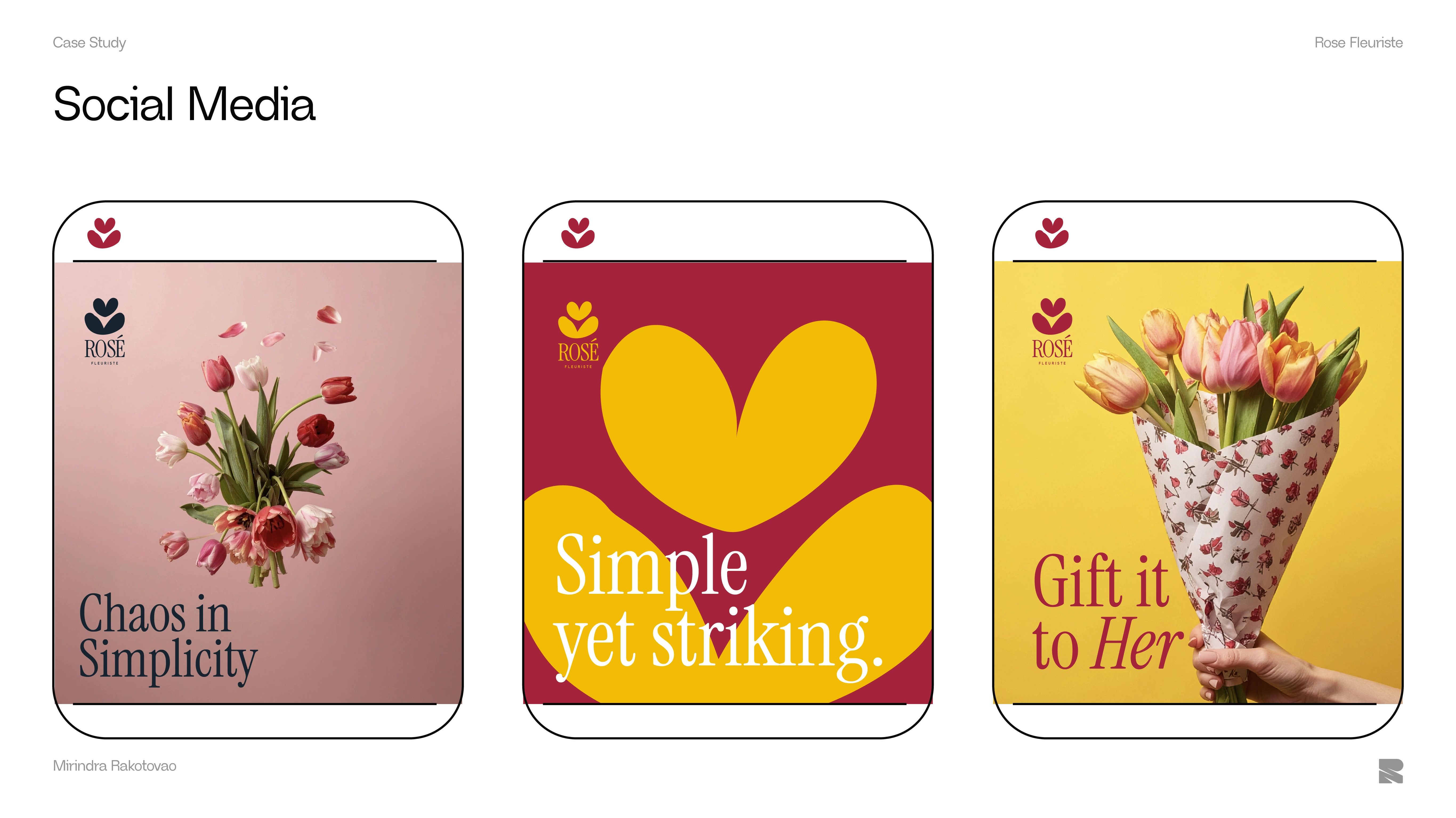
Social Media sample
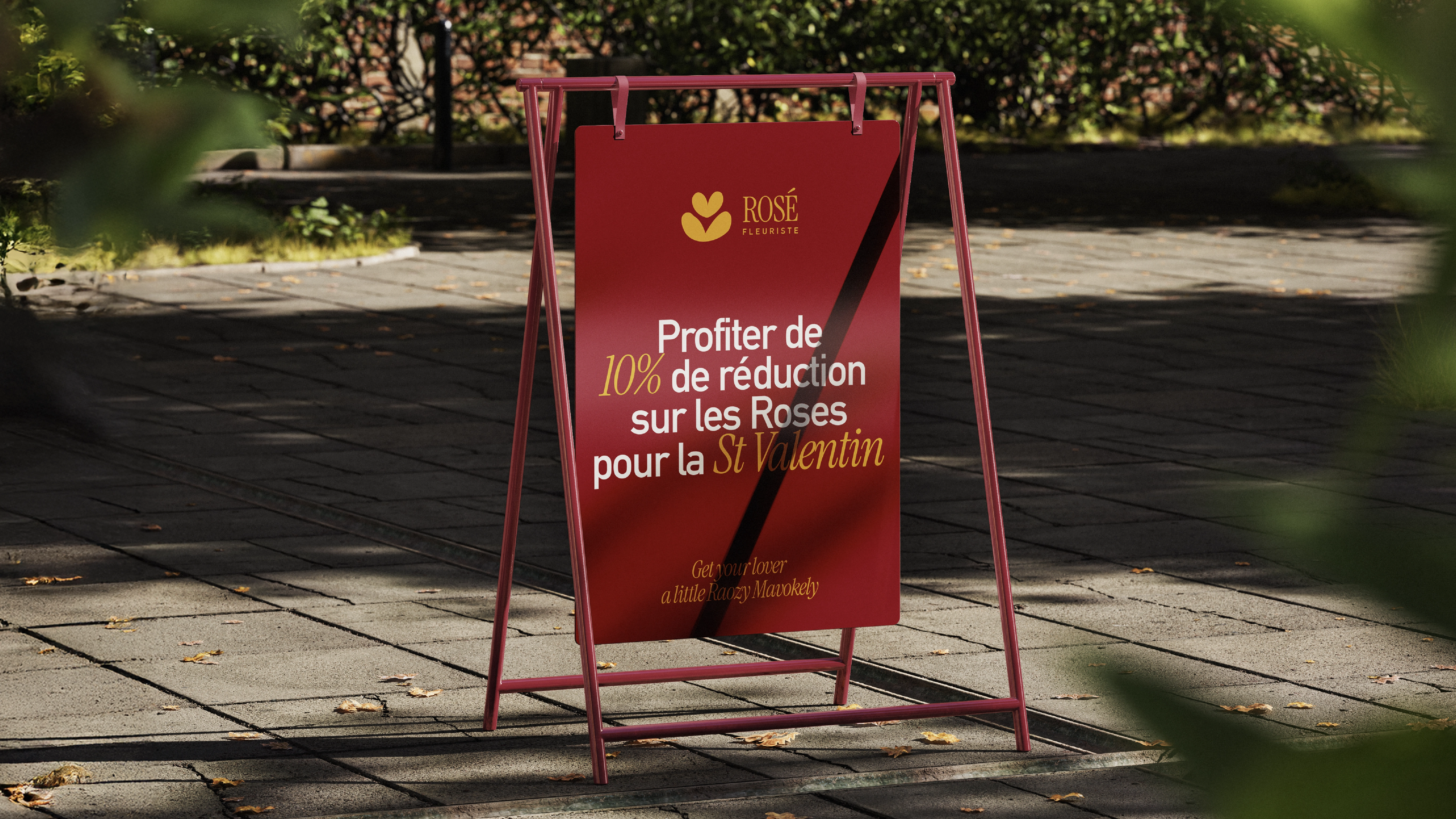
Stand
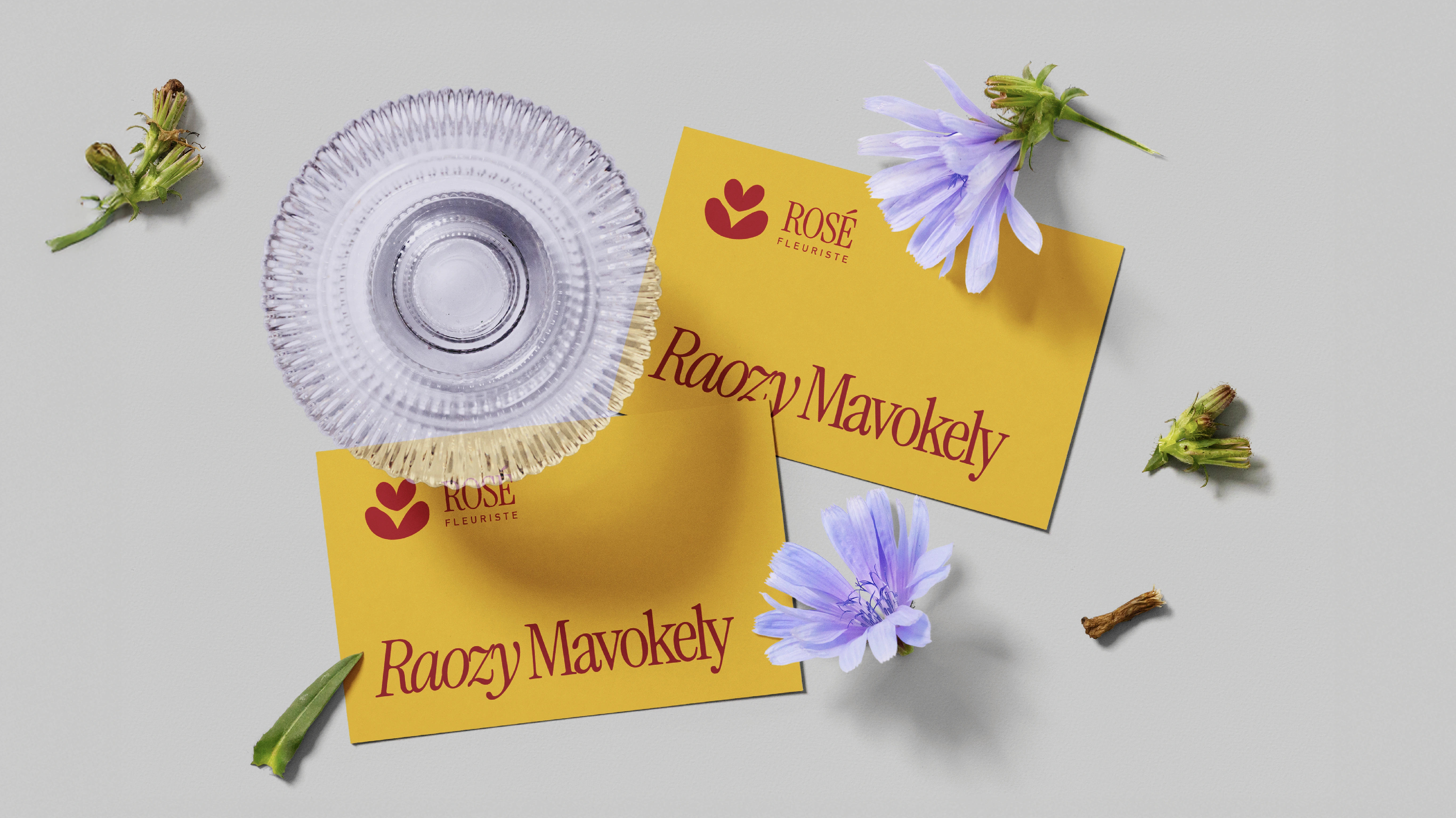
Business Card
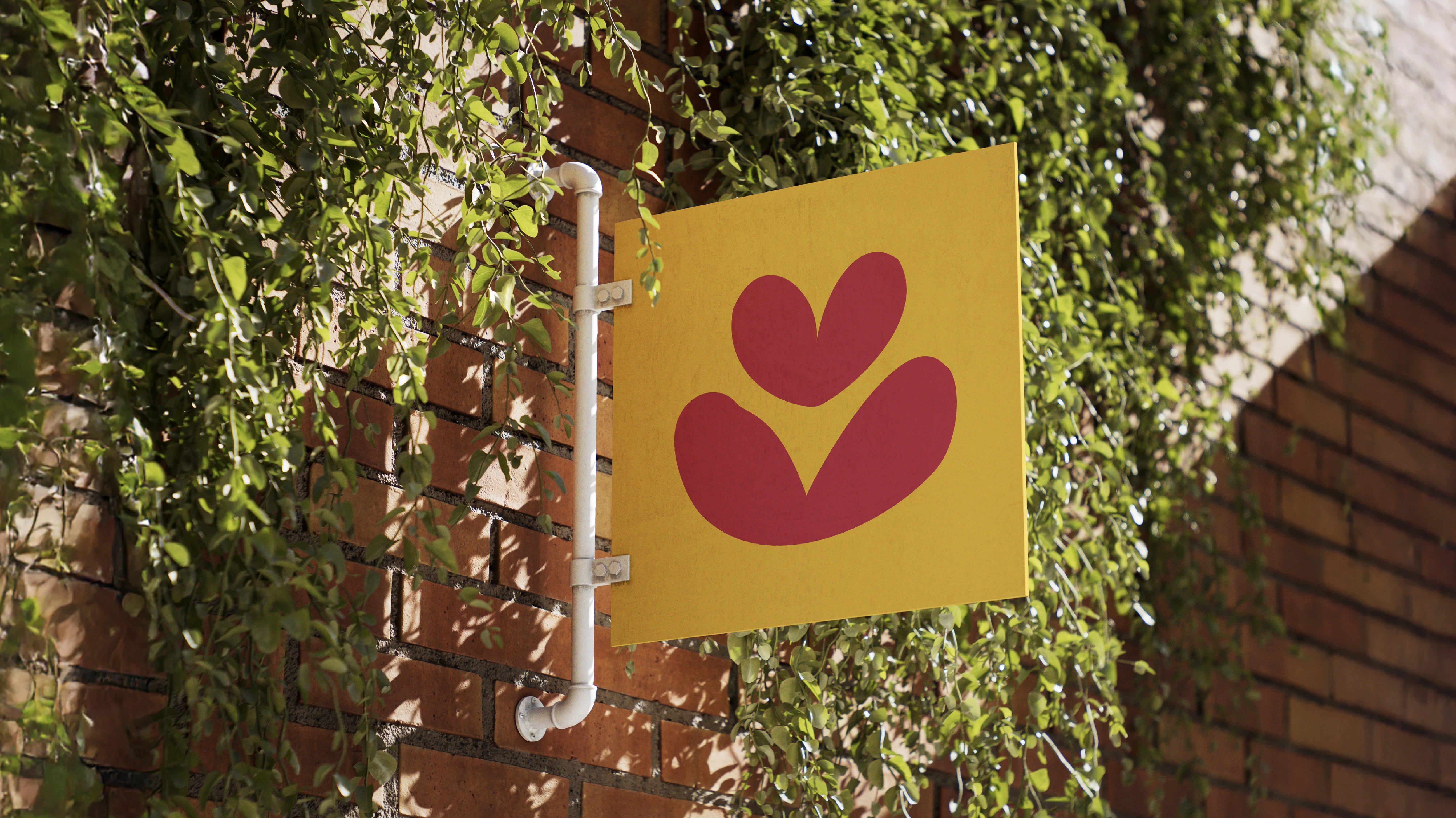
Signage
Like this project
Posted Dec 6, 2025
Rosé Fleuriste explores how a contemporary identity for a floral brand that is looking for curated look and feel rather than classic aesthetic .
Likes
1
Views
20
Timeline
Dec 1, 2025 - Dec 6, 2025