Flooqi - Indoor Navigation App
Sony Chandra
interactive indoor navigation app that simplifies mall navigation, addresses confusion, and enhances user experience.
My Roles & Responsibilities 🙌
• Conducting user research to understand pain points and needs.
• Designing wireframes, prototypes, and interactive elements.
• Developing a design system with reusable components for scalability.
• Collaborating with developers to ensure smooth implementation.
• Leading usability testing to refine the user experience.
• Creating visual assets for the app, including iconography and branding.
• Making the localization and dark mode using local variables.
Key Problem 🔑
💡 How might we make mall navigation simple and intuitive to enhance the shopping experience?
Why we chose to address this problem:
Navigating malls is a common struggle for visitors, often resulting in stress and wasted time. Existing solutions such as static maps or vague directions lack the interactivity and precision needed in modern shopping centers. Flooqi addresses this gap with a tailored digital solution that aligns with user expectations and the increasing digitization of physical spaces.
Several Solutions in the Market 🧐
Mall Directory 🖥️
Limited availability because users must walk to the kiosk.
Often outdated and lack real-time updates.
Visitors have to remember the route.
Asking Security 👮♂️
Relies on human avaiability and their knowledge of the layout.
Time-consuming and not practical for large crowds.
Signage 🚏
Static, cannot provide personalized directions.
May not be clear or visible from all points in the building.
But… All of this solutions is not good enough
While traditional solutions like mall directories, security personnel, printed maps, and general navigation apps provide some level of assistance in indoor navigation, they come with significant limitations. These methods are often static, time-consuming, and lack real-time accuracy, making it difficult for users to efficiently find their destinations. Additionally, existing digital solutions like Google Maps' indoor layouts or mall-specific apps are often incomplete, lack seamless navigation, and do not offer personalized experiences.
The Solution that We Chose is… 🧭
💡 Flooqi provides a seamless navigation experience for mall visitors.
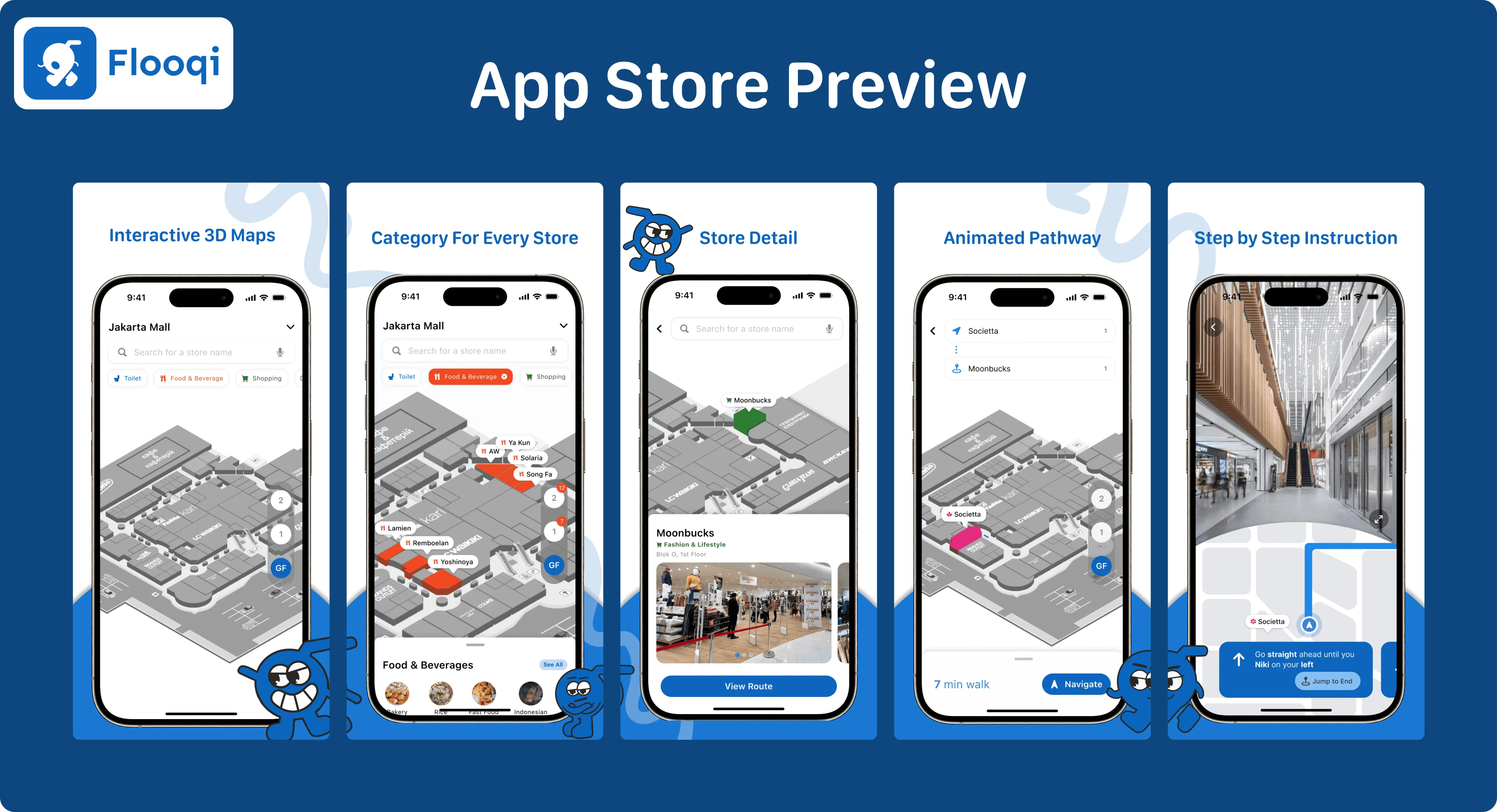
Flooqi Features 🛒
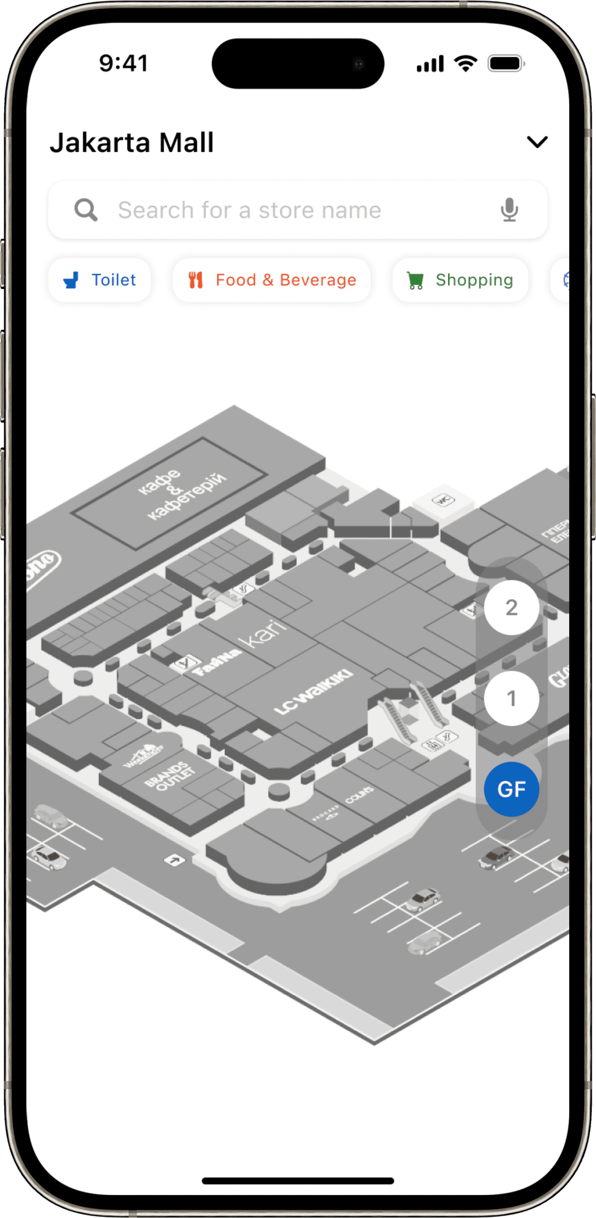
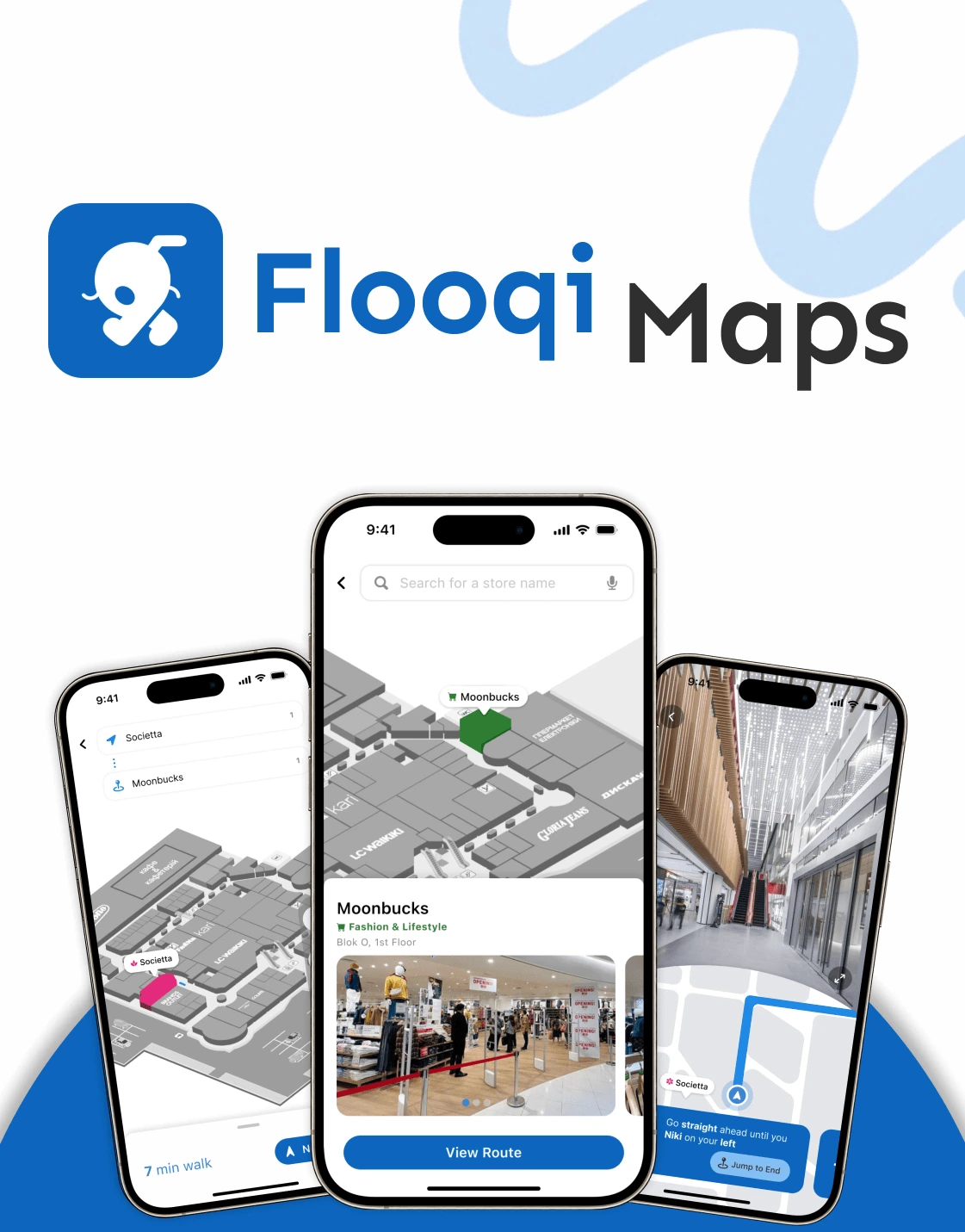
Interactive 3D Map 🗺️
A dynamic, real-time map designed to help users navigate indoor spaces effortlessly.
Users can zoom, pan, and explore specific areas of a mall to find stores, facilities, and amenities.
Highlighted routes guide users visually to their selected destinations.
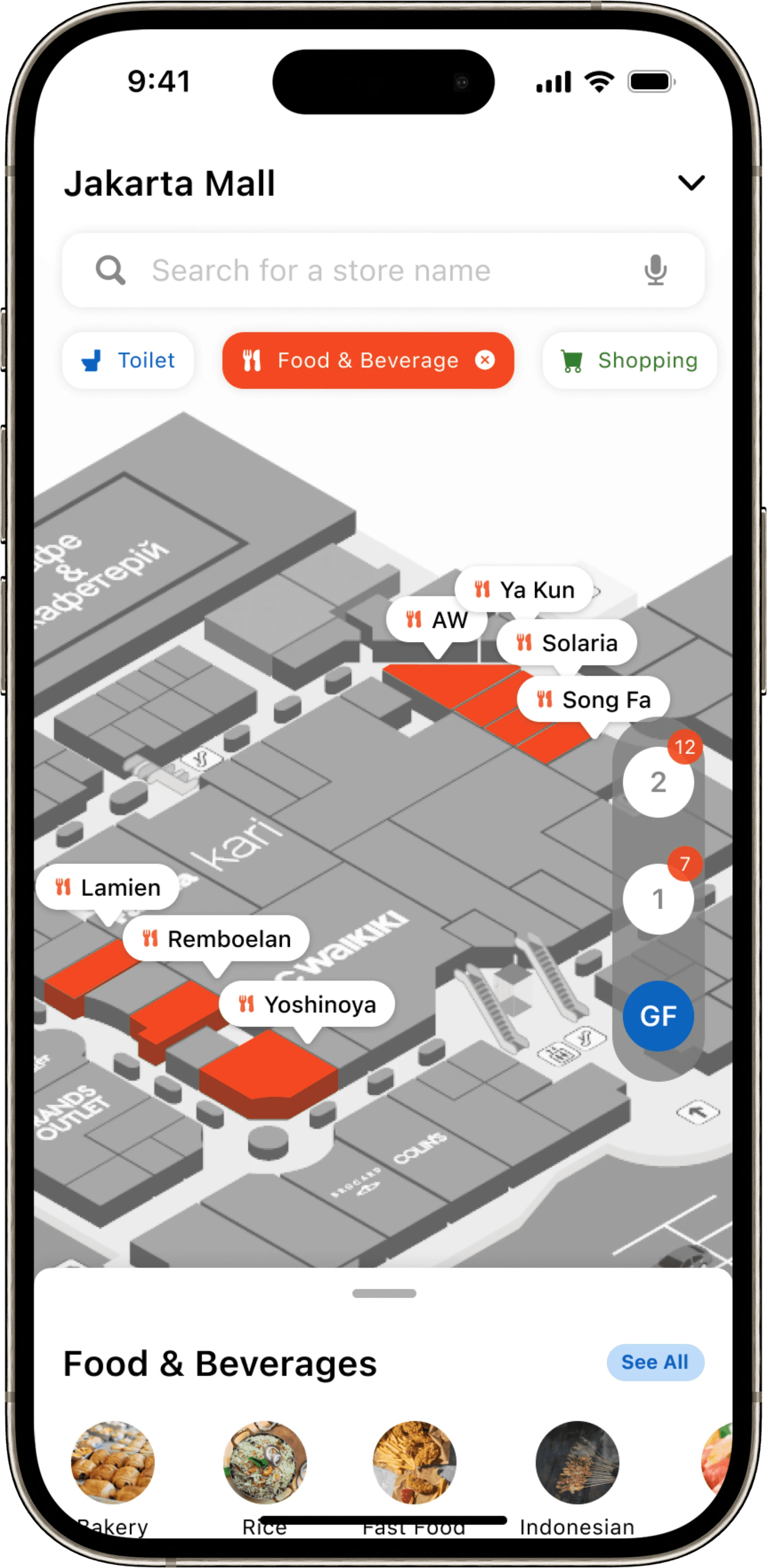
Categories 🛍️
An organized, easy-to-browse system that groups stores and locations into clear categories such as Food & Beverage, Fashion, Entertainment, and Services.
This feature enables users to quickly locate their desired type of store or facility without unnecessary scrolling.
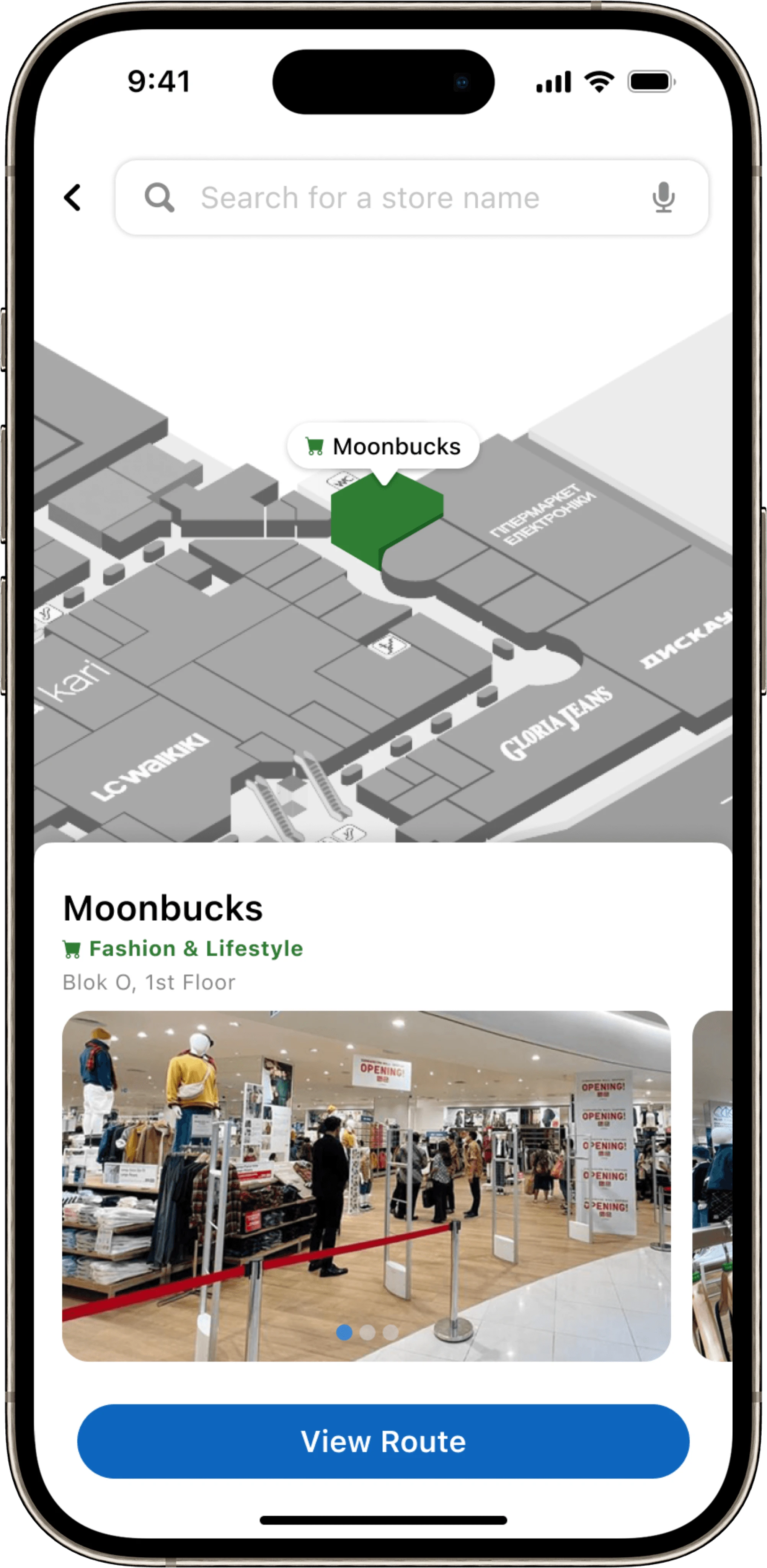
Store Details 🔍
Provides essential information about individual stores, including their exact location, operational hours, promotions, and contact details.
Helps users make informed decisions before visiting a store, improving convenience.
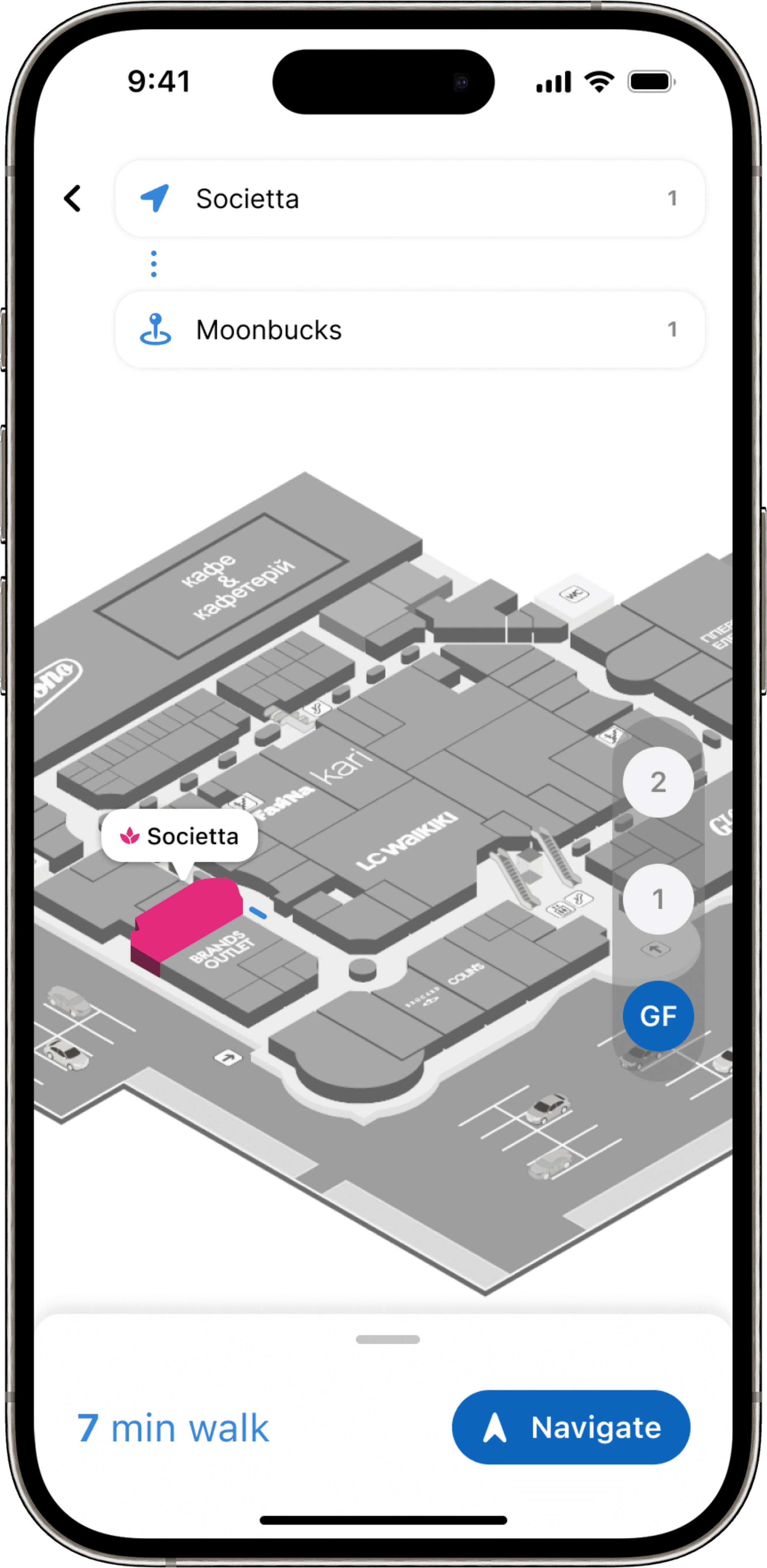
3D Animation 📍
An engaging feature that offers an animated visualization of the route to a selected destination.
It simplifies navigation by providing users with a clear and visually appealing representation of their path.
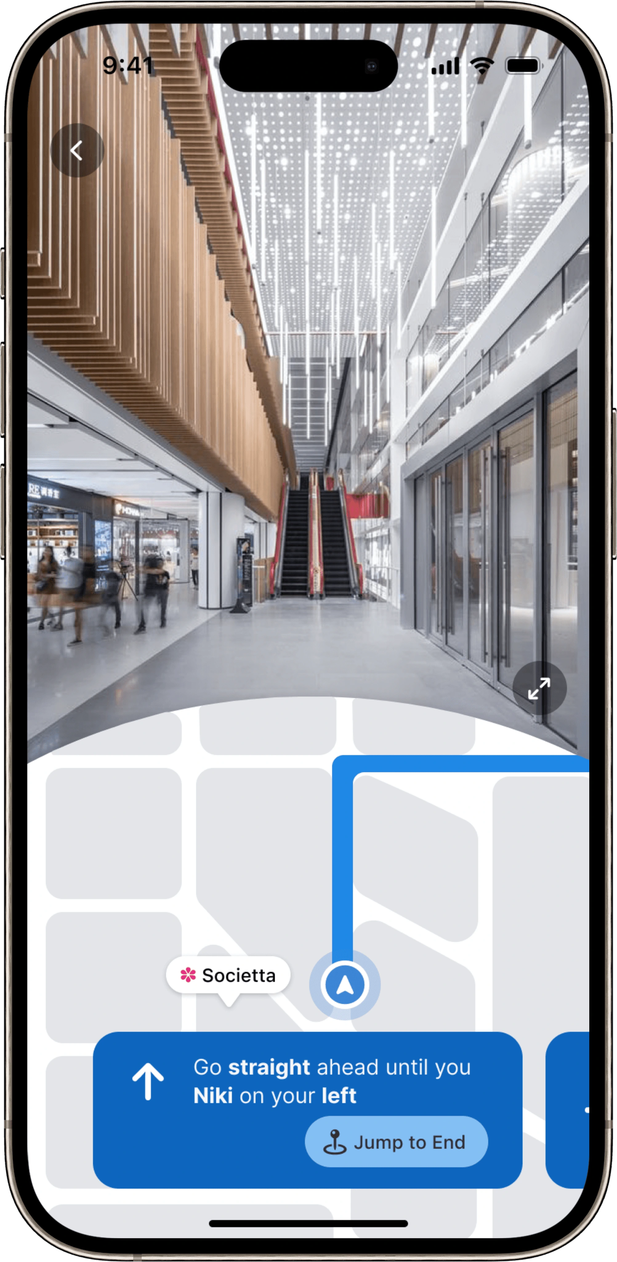
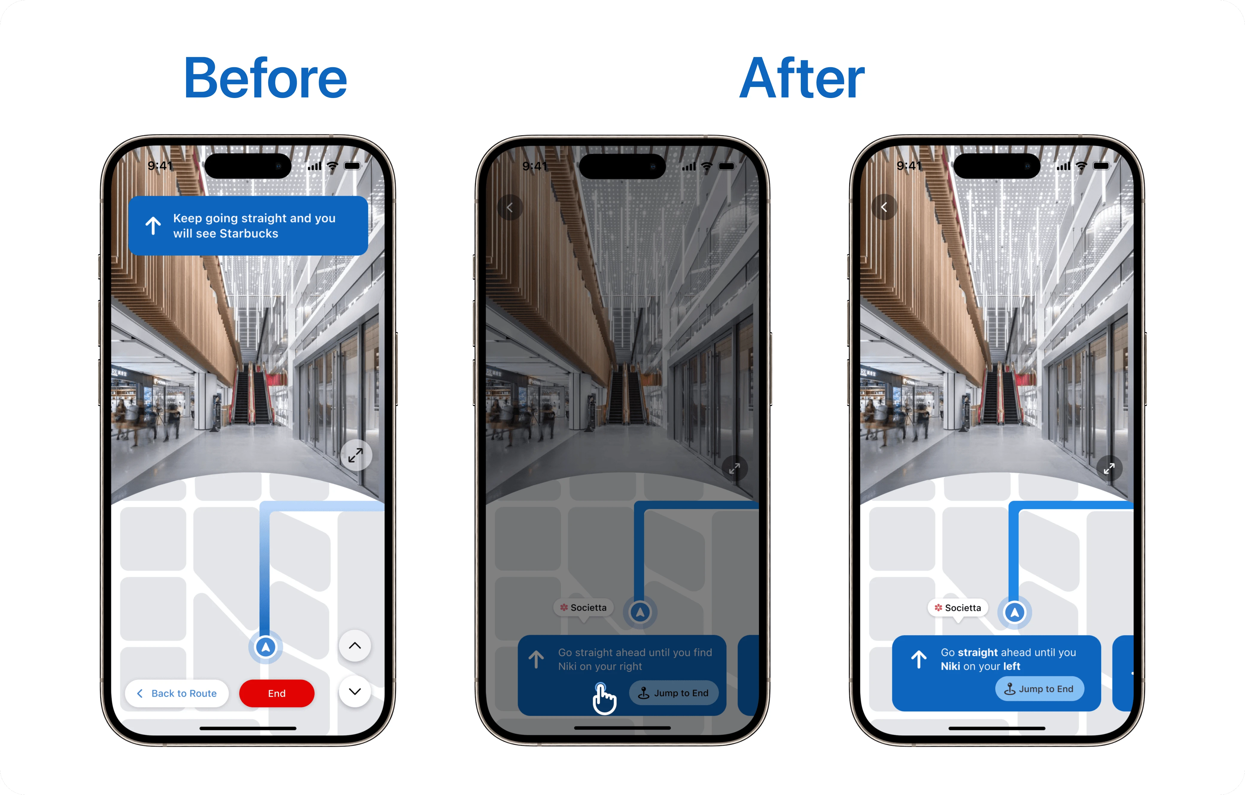
Instruction Mode ➡️
Includes directional arrows, distance metrics, and contextual prompts (e.g., “Take the escalator to the 2nd floor”) to ensure clarity and reduce confusion.
A step-by-step guidance system that breaks down the route into manageable instructions.
Design Iteration 🔁
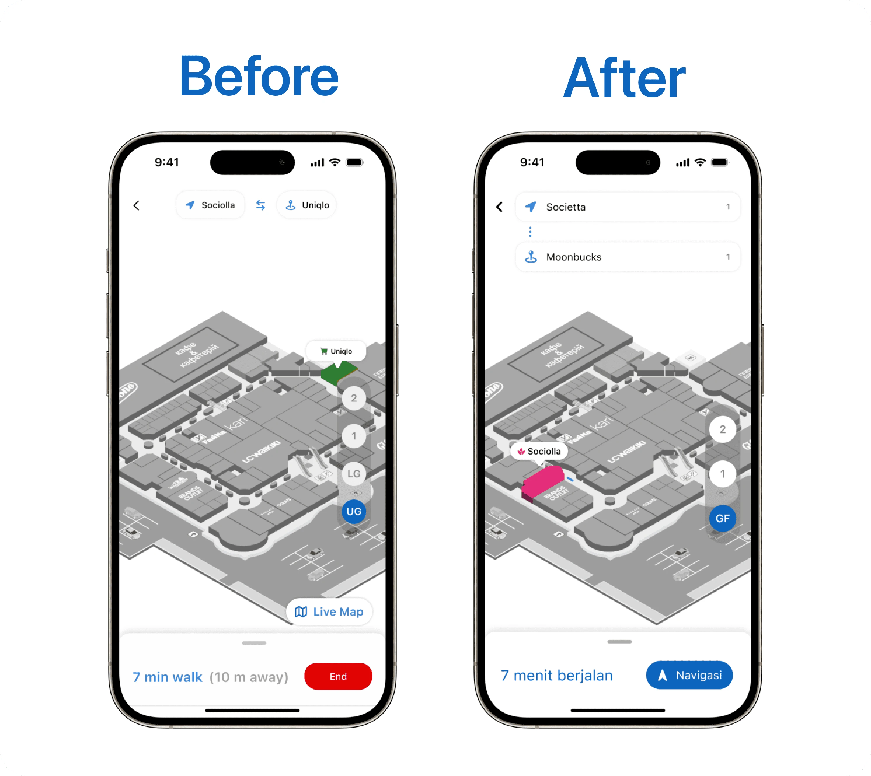
Animation Page 🧭
Before → User doesn’t familiar with the layout of the location box.After → We change the layout to make the user more familiar with the layout and add the floor information.
Before → User confused with the end button and the live map button unnoticeable.After → We replaced the end button with navigation button as an action button and make it more noticeable.
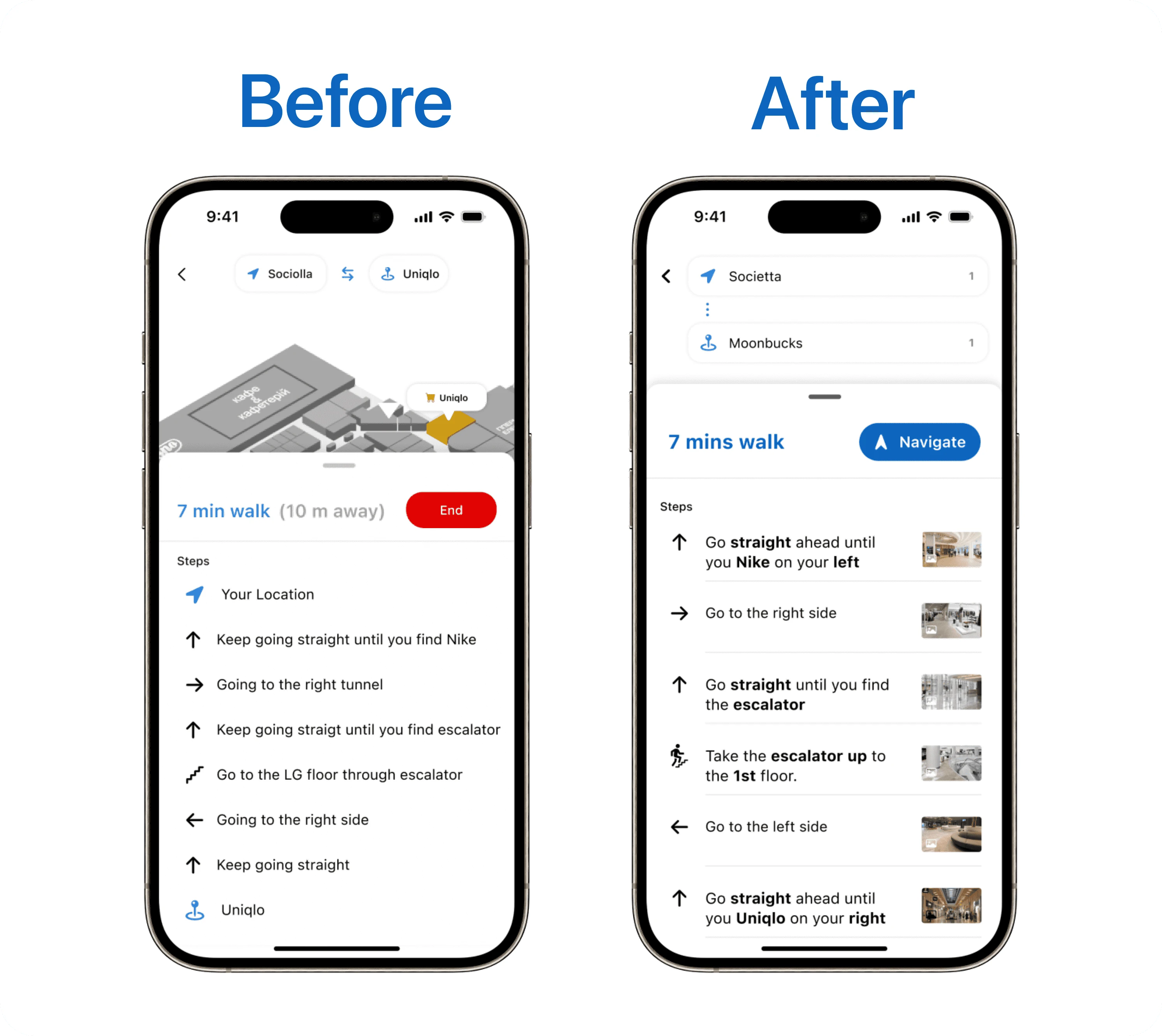
Instruction Sheet 🚏
Before → Some users think that the instruction is not to the point.After → We bold some key instruction.
Before → users still think that instruction only is not going to help them that much.After → We add some pictures that can be tapped by the users and get the direct instruction.
Instruction Page 🪧
Before -> after testing, user felt that in any condition they have to log yesterday cigarettes when they forgot.After -> We add day option in the log cigarette page
Before -> users don’t find it emergency when the smoking limit will surpass the daily limit.After -> We add visual cue such as warning icon and color changing when the user’s limit will surpass the daily limit.
App Store Preview ✨
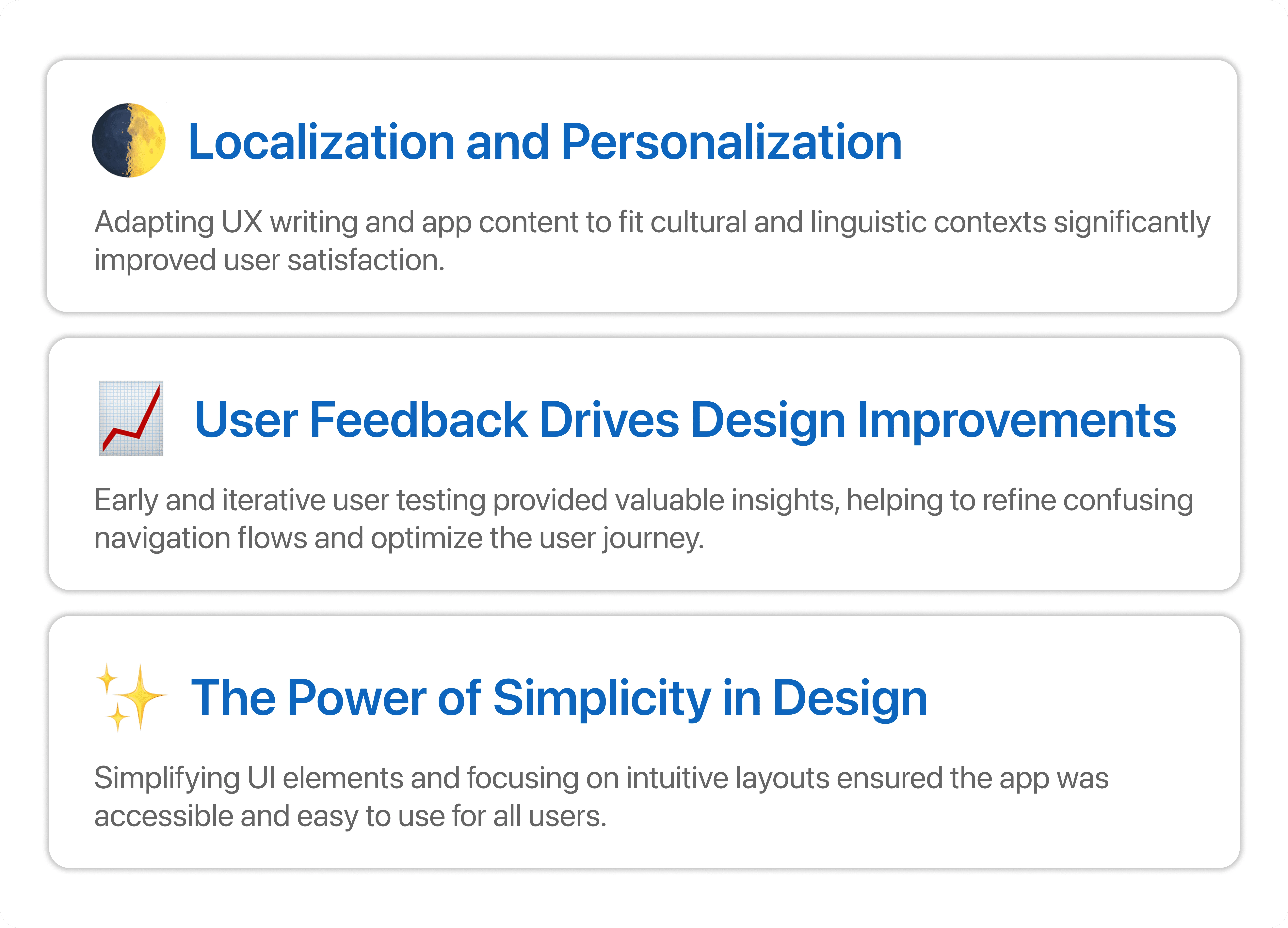
What I learned from this project 🤔
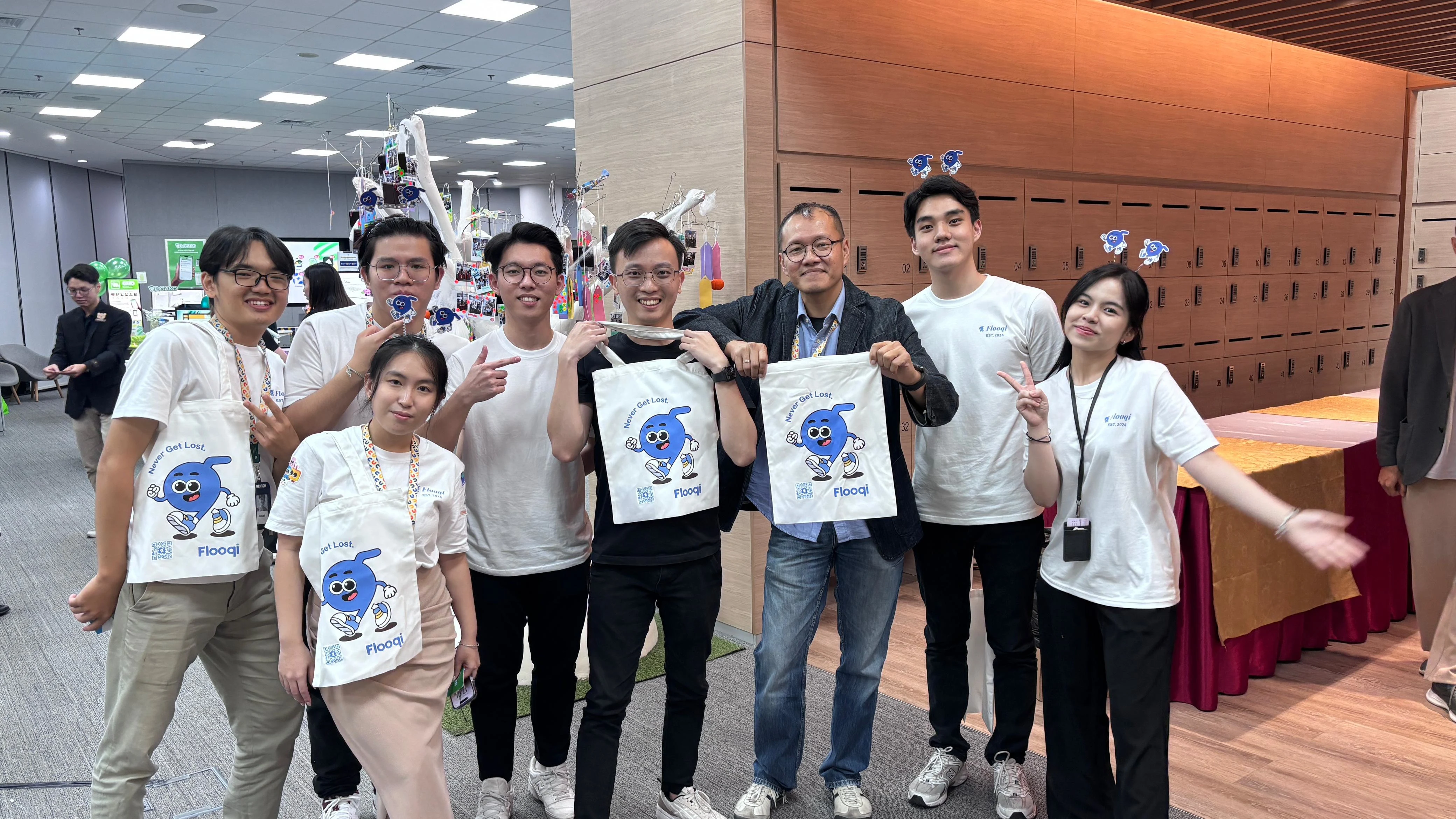
My lovely team & mentors 👫💙
Like this project
Posted Feb 27, 2025
interactive indoor navigation app that simplifies mall navigation, addresses confusion, and enhances user experience.
Likes
0
Views
8
Timeline
Sep 1, 2024 - Dec 1, 2024