Wellness App
Vittoria Anastasia Valentini
PROJECT DETAILS
My role
UX Researcher, UI Designer
Team
Maria Belen Vargas & I
Tools
Figma, Google Suite, Notion & Maze
REMOTE PROCESS
Everything was done remotely between my teammate, the other stakeholders, and I. We used almost constant zoom sessions every day between us, and we used other tools in order to be the most efficient possible during the project: Trello for project management, Google Suite for research, Maze for testing, and Figma for prototyping our solution.
For this project, we used the design thinking methodology.
OVERVIEW
We were tasked with developing a mobile wellness monitoring app to assist individuals in living a better lifestyle. Unlike previous projects, this time we had two weeks to complete it, which was good. This provided us with more time to conduct additional research and work on developing a wonderful high-resolution prototype of both an app and a landing page.
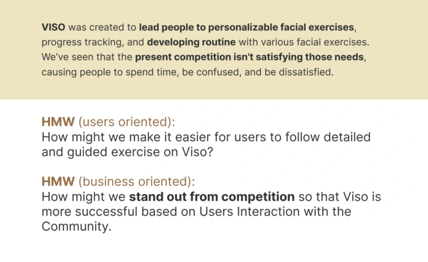
Alongside my companion, we explored our alternatives, but it was simple for us to select the winning topic — Face Yoga. I am a certified Face Yoga instructor who has been performing these exercises for some years now and also created a face oil brand line called VISO. I have been a bit pushy on this project as I wanted to elevate my brand to an affordable and remote exercise experience but I have not yet discovered THE APP to document all of my development and face evolution.
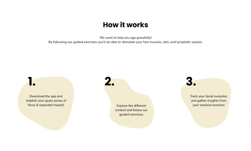
The aim is to design an app that would assist people in accepting the aging process in a natural way.
PROCESS OVERVIEW
1- EMPATHIZE: Survey & Interviews, Competitors Analysis, User Pain Point, User Persona
2- DEFINE: User Journey Map, HMW Statement, Key Feature, Problems & Hypothesis
3- IDEATE: Design Principles, Moodboard, Features, App Map & User Flow
4- PROTOTYPE: Logo Design, Design System, Style Tile, Mid-fi prototypes
5- TEST: Testing results, Iteration & Implementation, High-fi prototype, Next steps
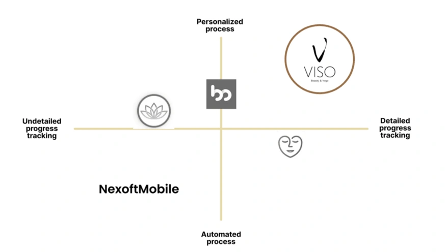
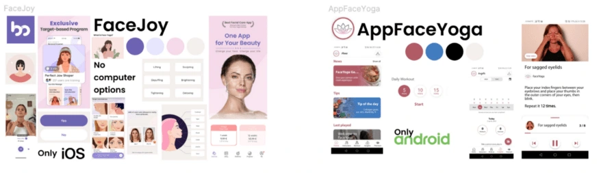
Competitors
We wanted to study the key Face Yoga rivals in the market — Android and iOS — before we started the Design Thinking process. We chose to concentrate our efforts on four brands: FaceJoy, FaceExercise, AppFaceYoga, and NexoftMobile. We realized that none of these solutions would provide a replacement for their competitor’s operating system.
We concentrated on studying the many features that each app provided and where their major value proposition was. With this information in hand, we had to understand where we should market place VISO- our ace Yoga App Solution and for this reason, we produced a market positioning chart.
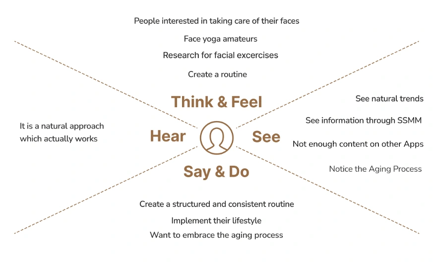
Research
Our initial aim was to perform User Research to determine the preferred natural alternatives to reverse-aging, as well as their understanding of face exercise and willingness to try it out.
We distributed our survey online in order to identify tendencies that might be useful during our interviews. We had a little issue collecting replies at first since we were attempting to identify individuals who already knew and did face yoga, but as we realized that our target audience might be much larger, we proceeded much faster.
Then, we conducted interviews with persons who had previously performed face yoga as well as those who were interested in discovering new anti-aging methods. This was the most interesting information we gathered:
80% of users are already aware of the term “facial exercise.”
60%+ are interested in knowing more about Face Yoga.
70%+ of respondents said they would undertake Face Yoga exercises many times per week.
80%+ said they would attempt guided Face Yoga.
By gathering those data, we managed to proceed in realizing our Empathy Map.
Define Stage — User Persona
We used all of the data we’d obtained so far to create our core User Persona, which was based on genuine data collected through surveys and interviews:
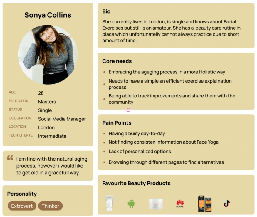
Sonya is a young Social Media Manager who is looking for a natural anti-aging solution that matches her lifestyle. Her sufferings and rewards are comparable to those depicted on the empathy map. Her statement is the following:
“As a Face Yoga practitioner, I’d want to discover tailored exercises and maintain track of my progress so that I can age gracefully.”
How might we be able to offer her Pain points? The next step is to construct a problem statement that ties everything together, as well as a hypothesis statement that will be used to evaluate our results.
Ideate
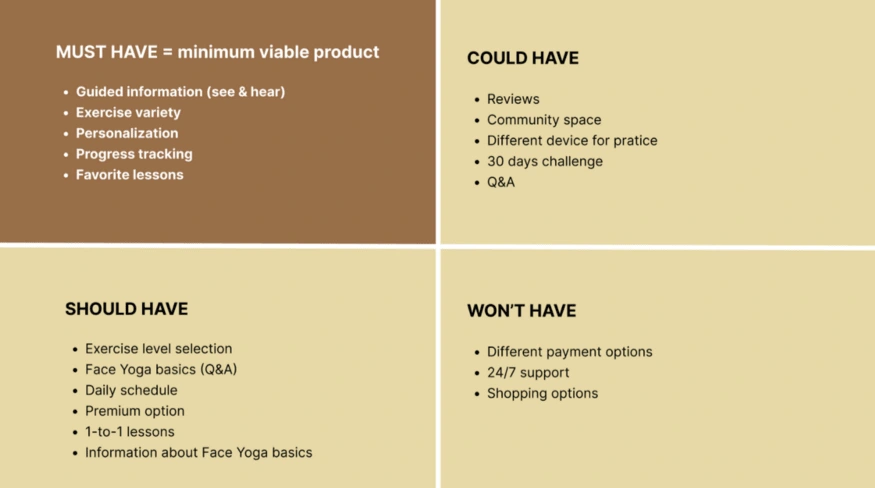
To establish the different characteristics we wanted to highlight in Viso, we established the Moscow Method, focusing on the MVP. The end outcome was as follows:
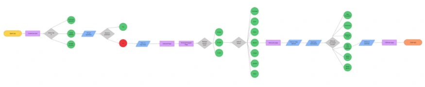
in order to provide a more clear vision of our App, we also made a rudimentary Site Map and User Flow to help us figure out which pages to include in our design:
Design Process
I already had prepared the logo and typography but I took this chance to enlarge my horizons by having professional feedback from my peer. Before diving into the prototyping phase, we wanted to review Viso’s theme and tone. Through a good UI, the user would be able to sense the correct values we wanted to convey when using the app.
Regardless of some of our key rivals, such as FaceJoy and AppFaceYoga, we wanted to emphasize the natural aspect of Face Yoga and how simple it is to incorporate into everyday life.
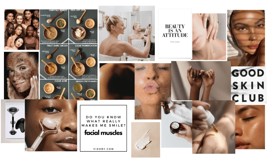
Moodboard
Before digging into the high-fi, we gathered some ideas for how we wanted the app to appear aesthetically. We discovered that we had comparable visions, which made putting up a combined mood board a breeze.
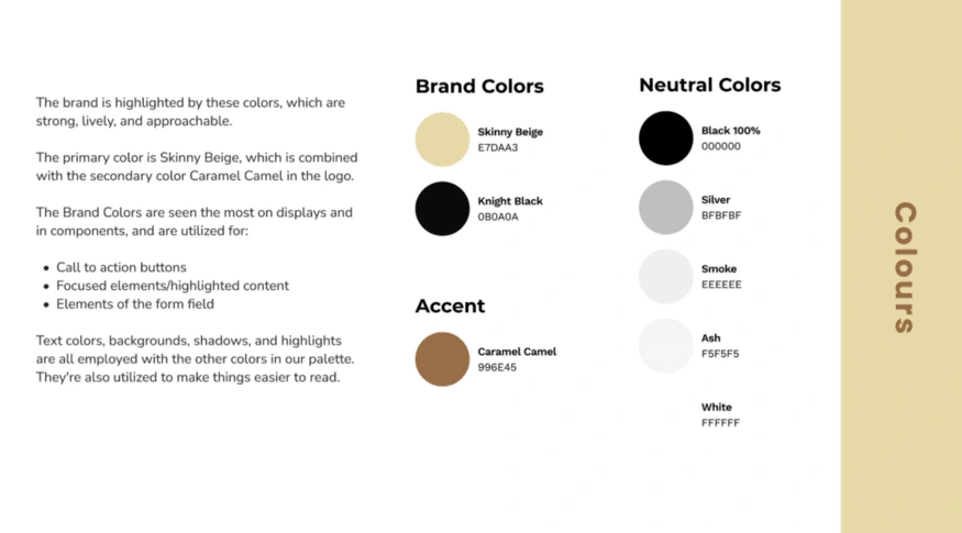
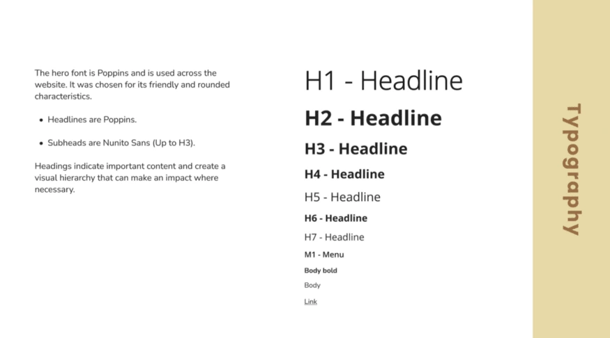
Style Guide
VISO’s style guides are inspired by the many natural skin tones that humans have because we feel that by doing so, we would be able to better communicate the natural essence we are aiming for.
Because we wanted to emphasize the significance of facial care and the role Face Yoga may play in elegant aging, we decided to keep the name of our App VISO, which means face in Italian.
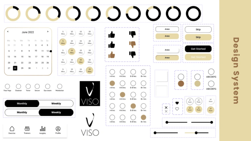
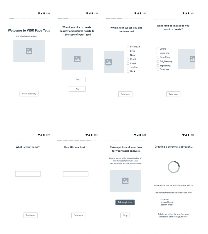
Prototyping Stage
We conducted desirability tests to ensure that we were on the correct track, allowing us to make modifications and determine the overall design of the app. We started from the usual Low-Fi for then moving to the Mid-Fi were we could see how users interact with our App.
At one stage point of our High-Fi prototype, we were unsure of which design was the best t pursue so we created a pool for our users where they could choose the most appealing design. Here below the options:
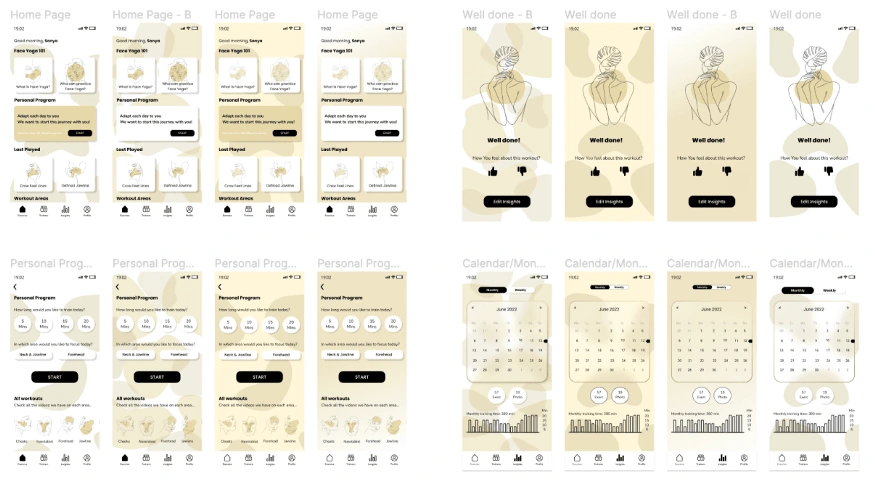
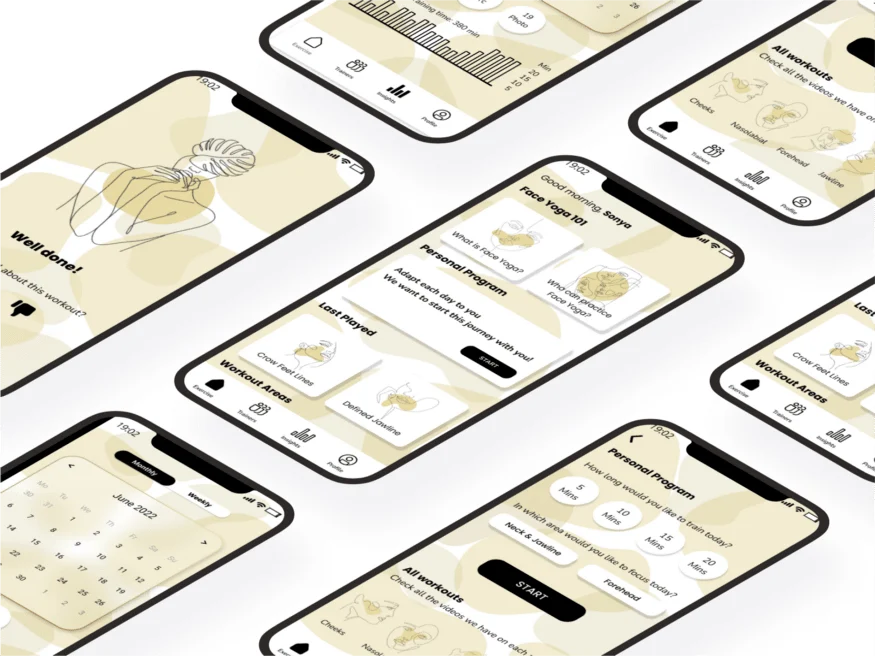
App look — High Fi
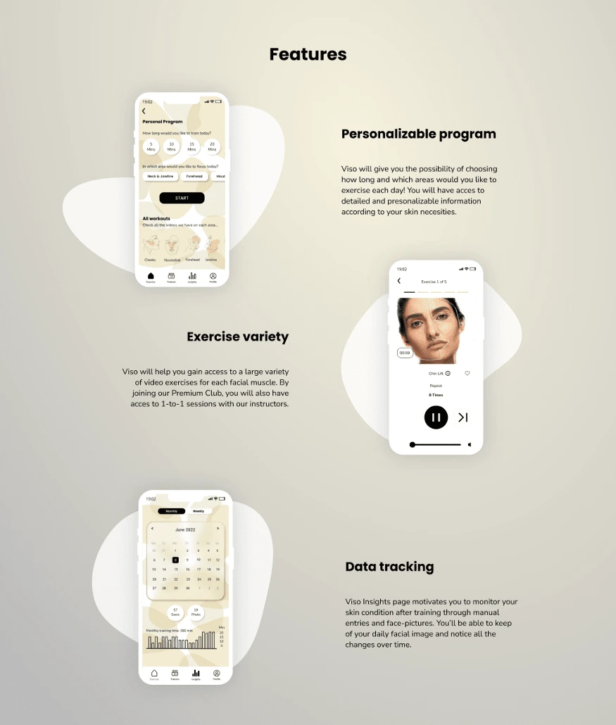
After retaining the data from our Users’ design preferences, we finally accomplished terminating our hi-fi prototype who takes you through Sonya’s User Flow, in which she establishes the focal areas she desires and the effect she anticipates. She also sifts through the app’s many choices in search of the Personalized Program. She may choose how long she wants to perform Face Yoga for that day, begin the guided exercises, and then snap images of her progress and collect statistics on her face progress in the insights area.
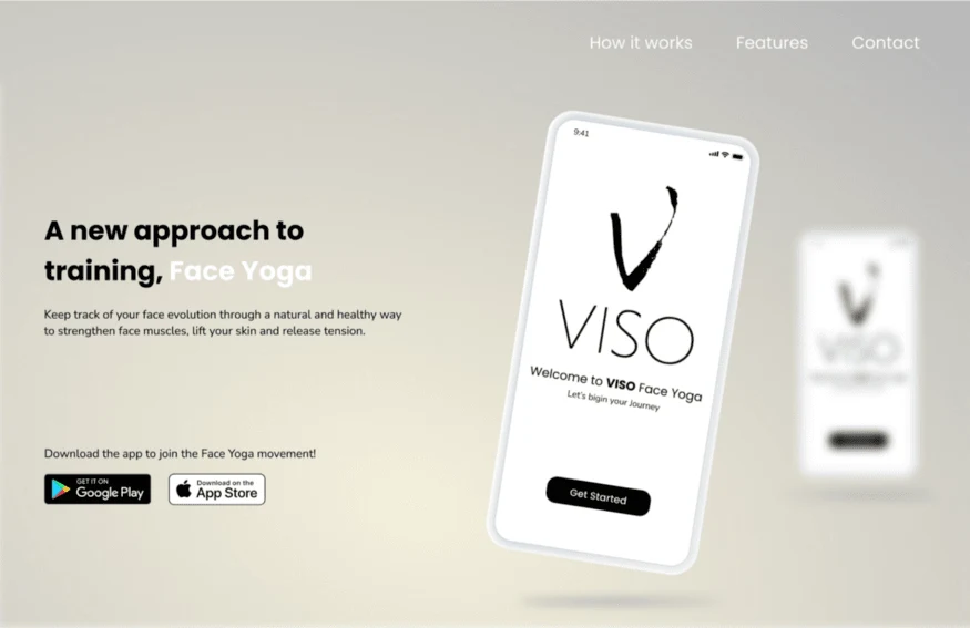
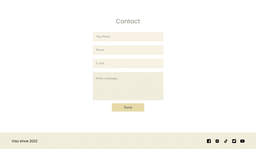
Landing Page
The other part of this 2 weeks assignment was to realize a landing page for our Wellness app. We designed a landing page to share with potential customers.
Key learnings and what to do next
Personally, I am really interested in bringing to life this project as I think it is time to shift my Hobby to a more important level so why not give it a shot?
This is what am currently working on:
Continue with content creation
Finding a web developer
Developing the app
Testing Viso app
Viso app launch
Keep implementing with user feedback
Wish me luck! :)
Marketing & Placing Chart for VISOEmpathy Map for VISOSonya Collins — User Persona for VISOHow Might We Statement for VISOMOSCOW Method for VISOUser Flow for VISOCompetitorsVISO’s MoodboardBrand ColorsViso’s TypographyViso’s Design SystemMid-Fi PrototypeHigh-fI OptionsVISO App overall lookVISO’s Landing Page
Like this project
Posted May 9, 2022
Designing a compelling Face Yoga Mobile App for a compelling Wellbeing Lifstyle
Likes
0
Views
258
Timeline
Apr 1, 2022 - Apr 30, 2022