
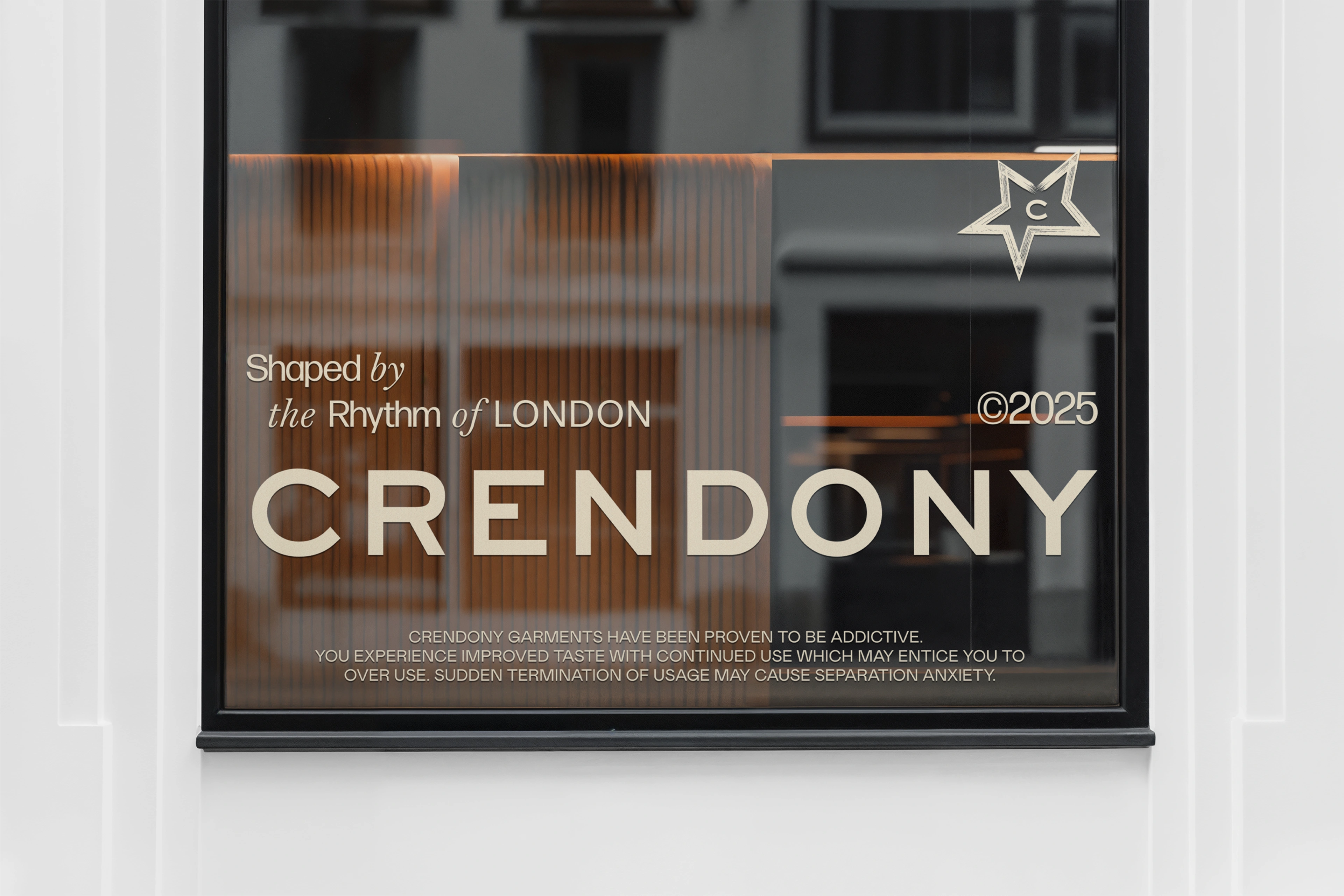
CRENDONY: A System of Subtle Signals
CRENDONY is not a trend-driven brand. It’s a streetwear label shaped by the rhythm of London, rooted in everyday style and built for those who move with intention. This is a brand for culturally aware individuals who see design as language, not decoration.
The Concept
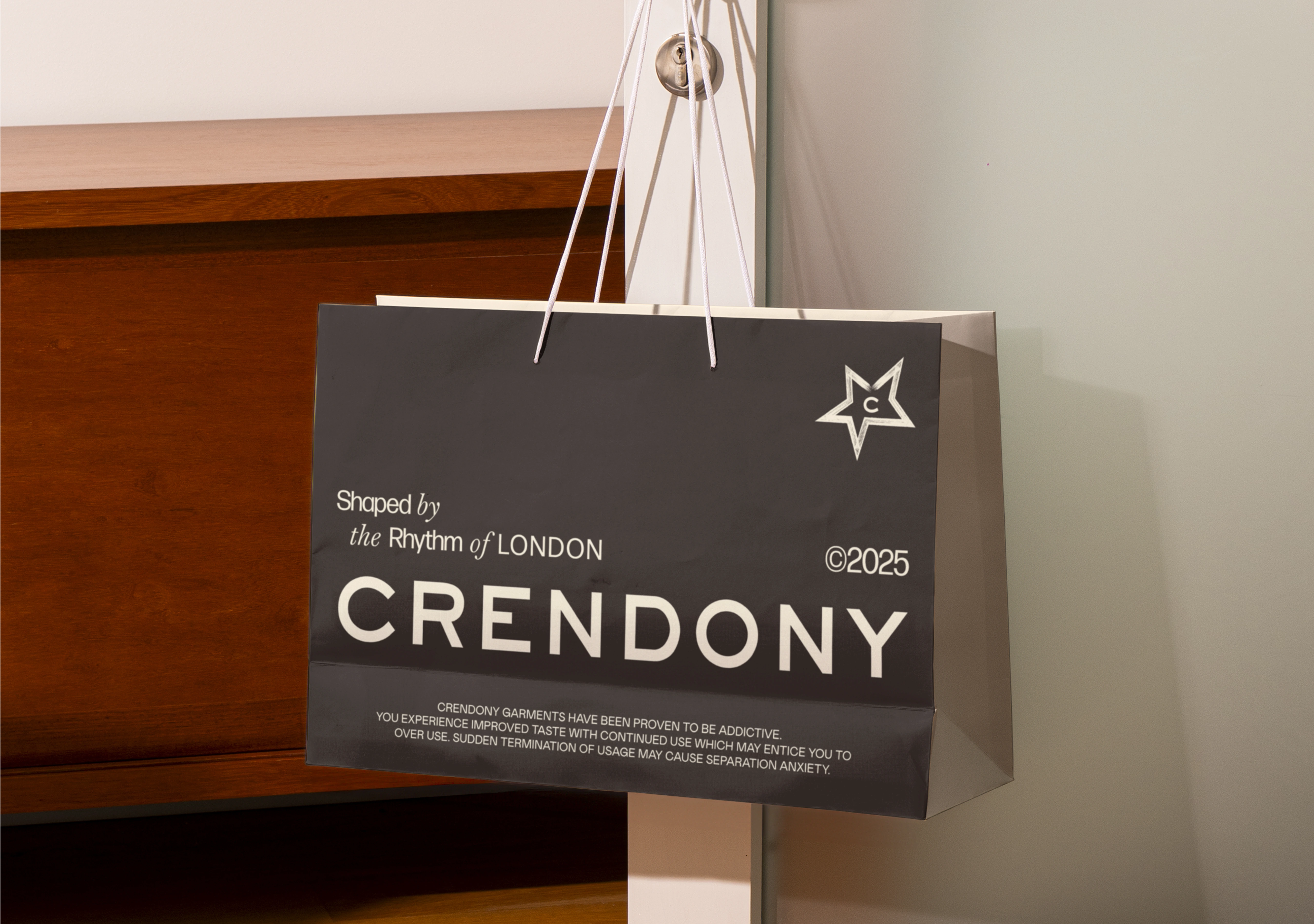
The visual identity draws inspiration from the city’s understated poetry: the rainy weather, the muddy streets, the imperfect patterns of tire lines. These references shaped a design language that feels both editorial and tactile, offbeat yet elegant, structured yet soft.
Symbol & Typography
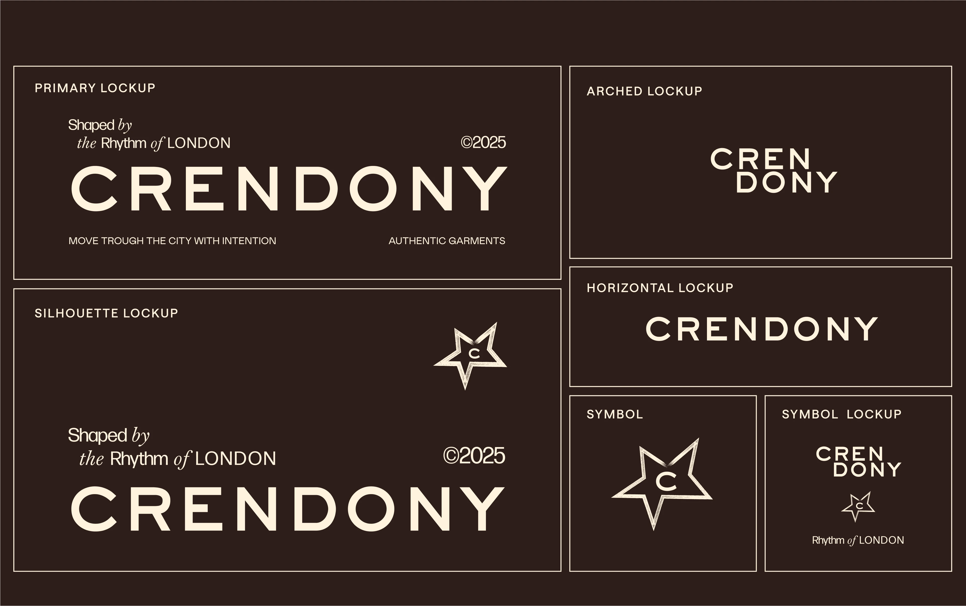
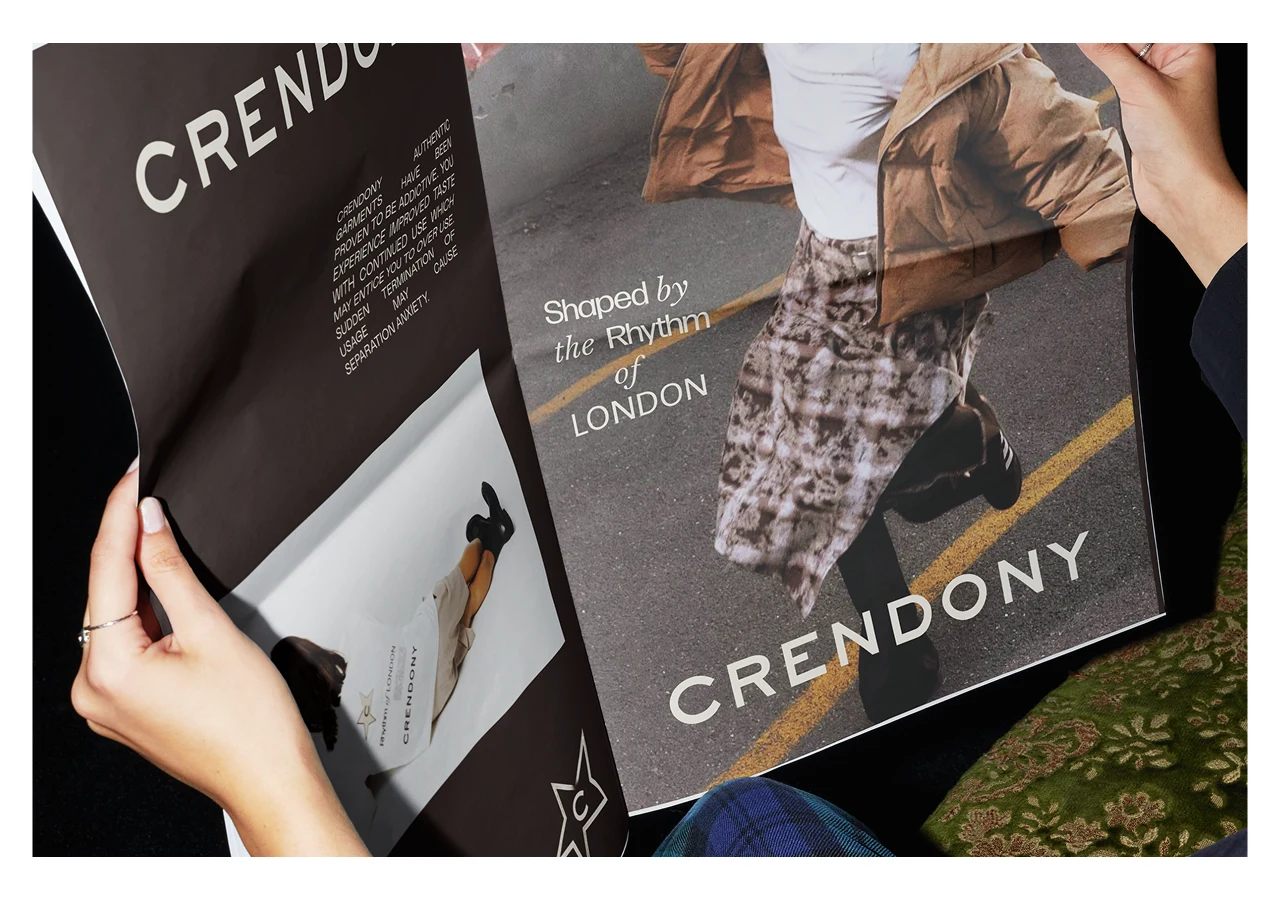
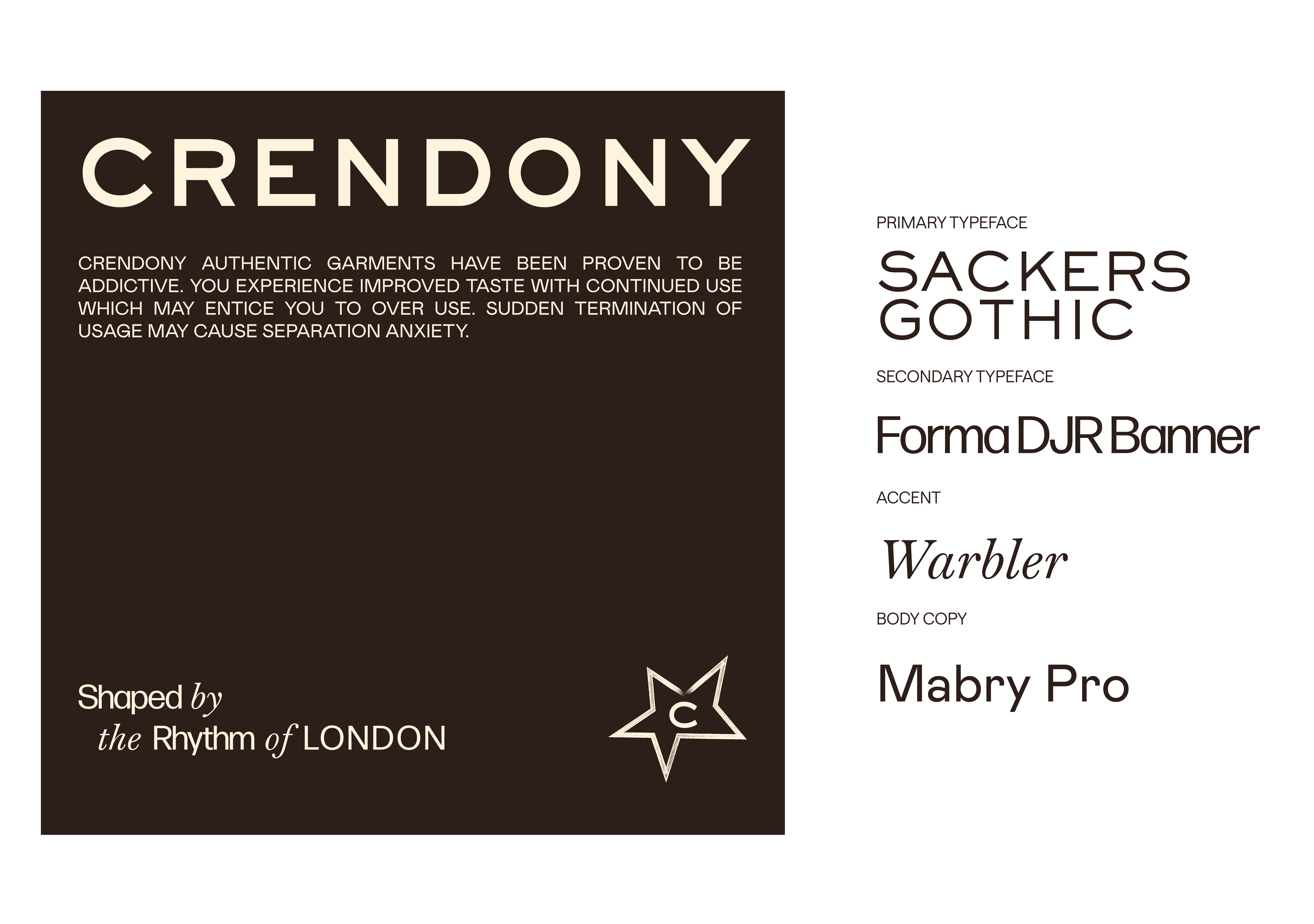
The symbol is compact, adaptable for both print and digital, carrying an energy that reflects London’s vibe. Typography choices reinforce this attitude: elegant and cool, creating an identity that feels intelligent and sharp but never loud.
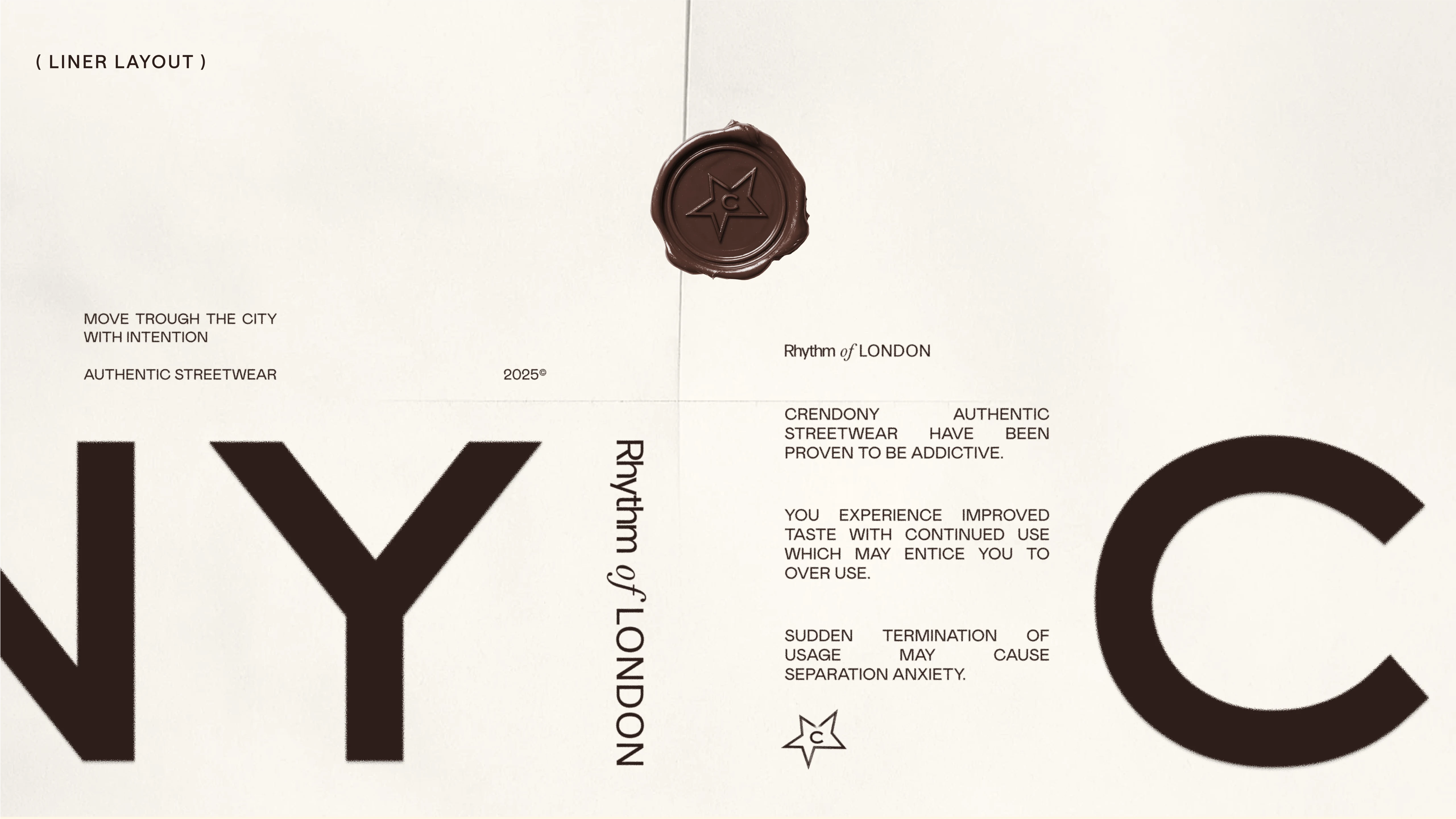
Color Palette
The color story leans into London’s natural tones: cool, elegant, and unconventional. These hues mirror the brand’s character: timeless and versatile, setting the tone for a visual system that’s both sophisticated and distinctive.
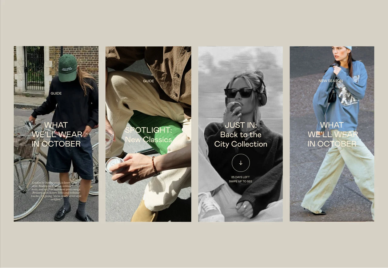
Voice & Character
CRENDONY speaks with wit and confidence, appealing to those who treat design as a statement. Its tone is editorial -> clear, concise, but layered with personality and cultural intelligence.
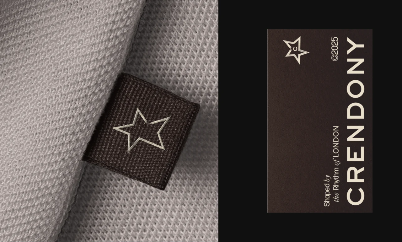
Every element works together to tell one story: a brand that feels like a lived-in thought, ready to evolve without losing its core.

3 likes · 28 views · Aug 4, 2025
A London-inspired streetwear label brand identity
Timeline
Jul 30, 2025 - Aug 4, 2025

