Sign-in screens usually get treated

Mykola Tanasiichuk


Sign-in screens usually get treated as plumbing. This one had a second job.
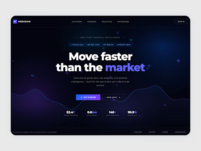
Roughly half the people landing here arrive from a shared link and don't have an account yet. So the left panel carries the pitch — live portfolio, twelve-month performance, $2.4B tracked — while the right stays purely functional. One surface, two audiences, split down the middle so neither gets in the other's way.
The trust markers sit below the form rather than above it. In fintech the anxiety spike happens while you're typing the password, not before - so SSL, SOC 2 and uptime land exactly where the eye goes next. Reassurance timed to the doubt rather than to the layout.
Like this project
Posted Jul 26, 2026
Sign-in screens usually get treated as plumbing. This one had a second job. Roughly half the people landing here arrive from a shared link and don't have an ...