DLX - Fleet Analytics & Reporting Dashboard The

Mykola Tanasiichuk


DLX - Fleet Analytics & Reporting Dashboard
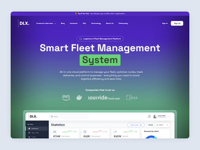
The reporting layer of a logistics platform, where fleet operators find out whether last month actually made money.
Most analytics screens default to whatever is easiest to chart - trips, distance, volume. The metrics here are the ones the industry actually runs on: margin per kilometre rather than revenue, and average payment time next to profit, because in freight a client who pays at ninety days can be less valuable than one who bills half as much and pays at thirty. Choosing those five numbers was most of the work, the charts came after.
Chart orientation follows the data rather than the layout. Trucks are vertical bars - short identifiers, many of them, easy to compare at a glance. Clients are horizontal, because company names are long and rotating labels to fit a grid is how dashboards become unreadable. Each chart also carries a secondary row beneath the axis - trip counts under trucks, margin percentages under clients - so a third dimension is available without a third chart.
Colour is assigned by metric family, not by aesthetics: revenue and profit keep one pair throughout, margin has its own, fuel has its own. When you're scanning six charts, colour is what tells you which one you're looking at before you read the title.
Like this project
Posted Jul 27, 2026
DLX - Fleet Analytics & Reporting Dashboard The reporting layer of a logistics platform, where fleet operators find out whether last month actually made mone...
Likes
0
Views
2