


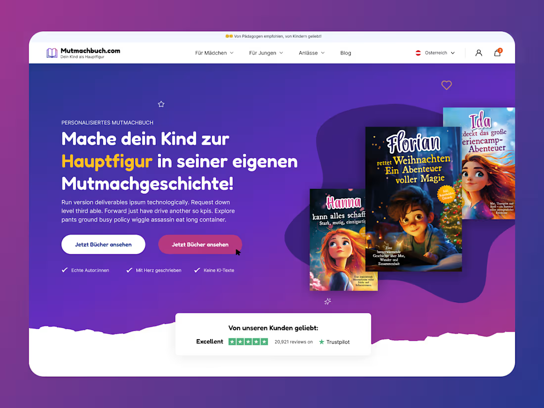
UI UX design website for a personalised children's book brand, German market.
The category has been flooded with AI-generated children's books over the last two years - which handed this brand its strongest trust signal by accident. "Keine KI-Texte," written by real authors: three years ago that would have been a strange thing to put in a hero. Now it's the differentiator, so it sits directly under the CTAs rather than on an about page.
Personalisation is demonstrated instead of described. Three covers, three different children's names, fanned so you read them as variants of one thing. No explanatory copy needed - the parent understands the product in about a second.
#webdesign #uiux #ecommerce #landingpage
2
71
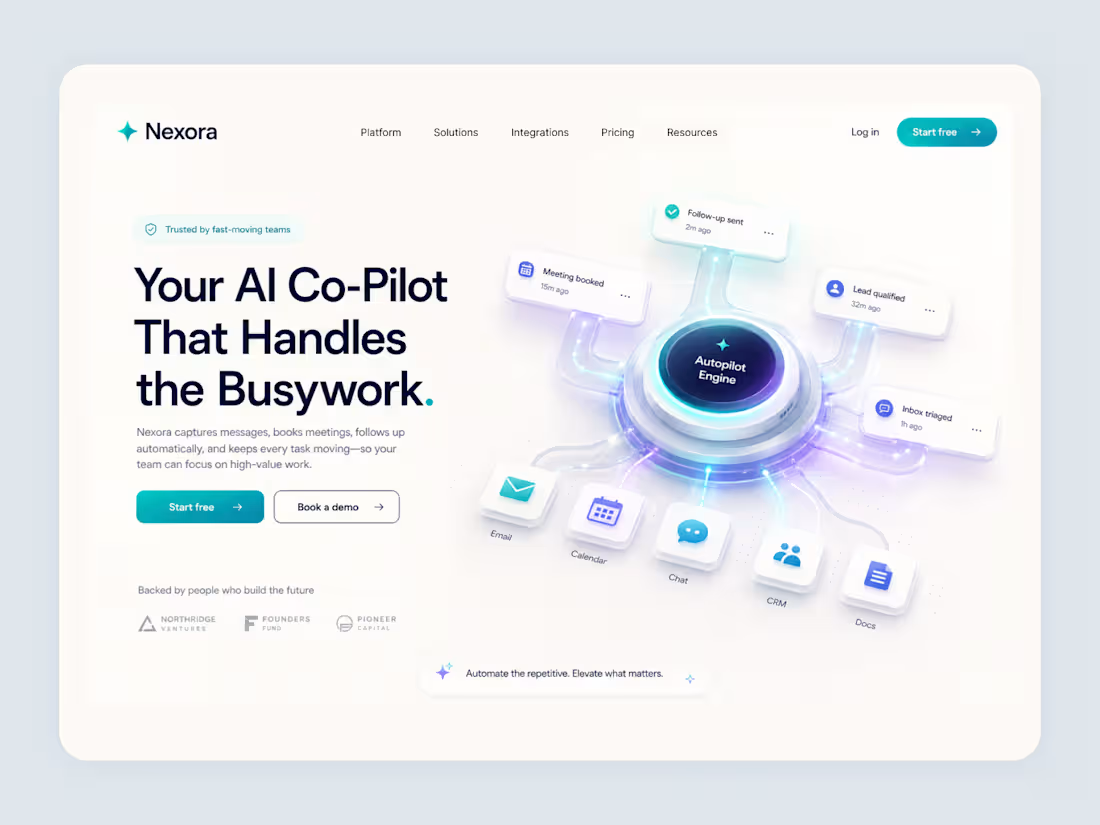
Landing page for an AI workflow automation product.
Most AI landing pages illustrate the technology - neural meshes, abstract nodes, particles. Which tells you nothing, because every product in the category can claim the same picture.
So the hero shows the output instead. Six integrations feed into the engine, and what comes back out are the four things the product actually did: meeting booked, follow-up sent, lead qualified, inbox triaged. Each with a timestamp. The claim isn't "we use AI" - it's "here's what happened in the last hour."
Timestamps are doing more work than they look like they are. "15m ago" implies the thing is running right now, unattended. That's the entire promise of the category, and it costs four words to make.
The rest stays deliberately calm - one warm off-white background, teal for actions, indigo for the automation layer. When the illustration is this busy, everything else has to get out of its way.
1
1
152
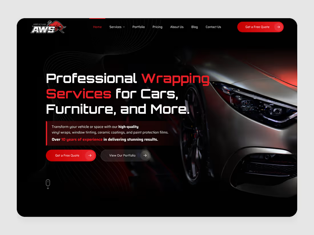
UI UX design website for a vehicle wrapping studio
In this category the product is a photograph. Someone choosing a wrap shop is judging finish quality - how light falls across the film, whether the edges are clean - so the interface mostly needs to get out of the way of the image.
Which meant everything sits in one left column against black, with the car holding the entire right half uninterrupted. Red does three jobs and no others: the two words that name the service, the primary CTA, and the years of experience. In a trade where the buyer's real fear is a bad application, that last one is the actual conversion lever - so it gets the same colour as the button.
0
144
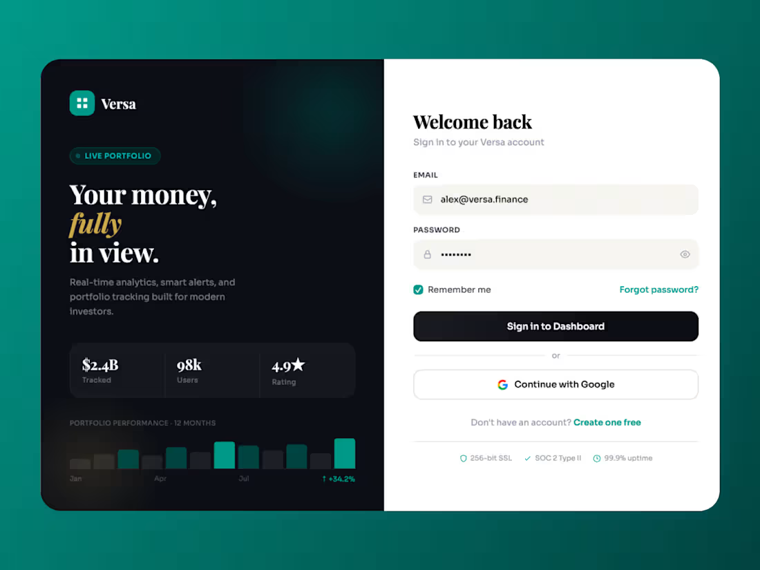
Sign-in screens usually get treated as plumbing. This one had a second job.
Roughly half the people landing here arrive from a shared link and don't have an account yet. So the left panel carries the pitch — live portfolio, twelve-month performance, $2.4B tracked — while the right stays purely functional. One surface, two audiences, split down the middle so neither gets in the other's way.
The trust markers sit below the form rather than above it. In fintech the anxiety spike happens while you're typing the password, not before - so SSL, SOC 2 and uptime land exactly where the eye goes next. Reassurance timed to the doubt rather than to the layout.
0
136