Mykola Tanasiichuk's Work | ContraWork by Mykola Tanasiichuk
Mykola Tanasiichuk
pro

Mykola Tanasiichuk

UI/UX Designer for SaaS & AI | Landing Pages & Dashboards

Ready for work

Mykola is ready for their next project!

Cover image for UI UX design website for
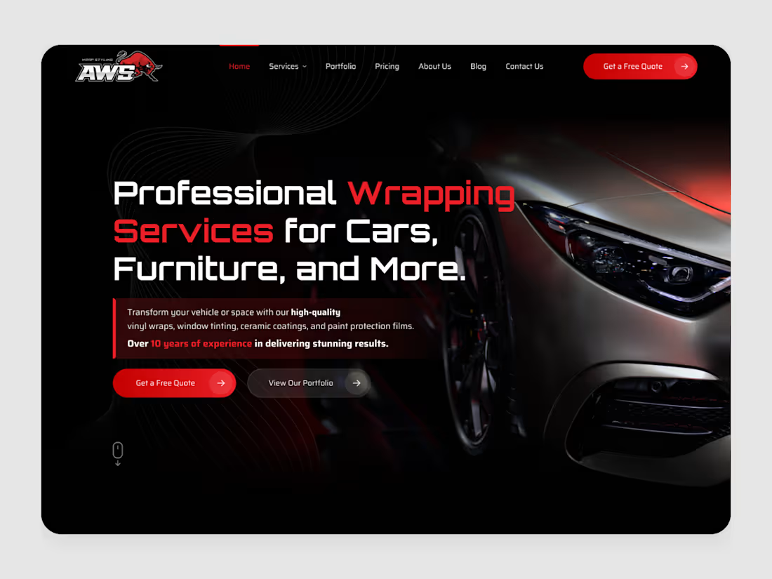
UI UX design website for a vehicle wrapping studio In this category the product is a photograph. Someone choosing a wrap shop is judging finish quality - how light falls across the film, whether the edges are clean - so the interface mostly needs to get out of the way of the image. Which meant everything sits in one left column against black, with the car holding the entire right half uninterrupted. Red does three jobs and no others: the two words that name the service, the primary CTA, and the years of experience. In a trade where the buyer's real fear is a bad application, that last one is the actual conversion lever - so it gets the same colour as the button.
0
45
Cover image for Sign-in screens usually get treated
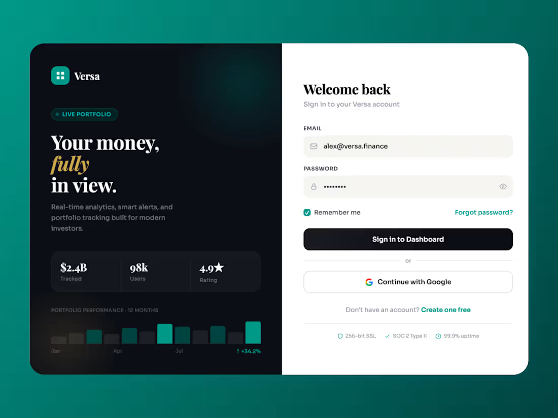
Sign-in screens usually get treated as plumbing. This one had a second job. Roughly half the people landing here arrive from a shared link and don't have an account yet. So the left panel carries the pitch — live portfolio, twelve-month performance, $2.4B tracked — while the right stays purely functional. One surface, two audiences, split down the middle so neither gets in the other's way. The trust markers sit below the form rather than above it. In fintech the anxiety spike happens while you're typing the password, not before - so SSL, SOC 2 and uptime land exactly where the eye goes next. Reassurance timed to the doubt rather than to the layout.
0
56
Cover image for UI UX design for Dolphin
UI UX design for Dolphin Pay - a wallet built for the Zimbabwe–South Africa corridor. The hard part wasn't the feature list. It was trust. In this market people have been burned by money apps before, so "we're licensed" can't live quietly in the footer. So regulatory proof got its own full-width section, and I split it into three separate cards - RBZ Tier 2 licence, bank sponsorship, PSP status. Three independent guarantees read stronger than one paragraph making the same claim. Same thinking behind the funding row: EcoCash, InnBucks, ZimSwitch and Omari shown as logos, not as text in a sentence. People trust the rails they already use - recognition does more work than description here.
0
124
Cover image for DLX - Fleet Analytics & Reporting Dashboard
The
DLX - Fleet Analytics & Reporting Dashboard The reporting layer of a logistics platform, where fleet operators find out whether last month actually made money. Most analytics screens default to whatever is easiest to chart - trips, distance, volume. The metrics here are the ones the industry actually runs on: margin per kilometre rather than revenue, and average payment time next to profit, because in freight a client who pays at ninety days can be less valuable than one who bills half as much and pays at thirty. Choosing those five numbers was most of the work, the charts came after. Chart orientation follows the data rather than the layout. Trucks are vertical bars - short identifiers, many of them, easy to compare at a glance. Clients are horizontal, because company names are long and rotating labels to fit a grid is how dashboards become unreadable. Each chart also carries a secondary row beneath the axis - trip counts under trucks, margin percentages under clients - so a third dimension is available without a third chart. Colour is assigned by metric family, not by aesthetics: revenue and profit keep one pair throughout, margin has its own, fuel has its own. When you're scanning six charts, colour is what tells you which one you're looking at before you read the title.
0
24
Cover image for Flight booking detail screen.
Most booking
Flight booking detail screen. Most booking UIs are built around the transaction - pick, pay, done. This one is built around the questions people actually have open in another tab while they book. Destination weather sits inside the flight card, because the moment you're choosing a date is the cheapest possible moment to answer "what do I pack." Seat pitch is drawn in inches against an illustrated seat instead of buried in a spec footnote, since legroom is the real anxiety in economy. Amenities appear twice at two densities - icons when the card is collapsed, labelled rows when it's open. And the search parameters stay as editable chips in the top bar, so changing your mind never means going back a step.
1
72
Cover image for Meridian - Real-Time Financial Intelligence
Meridian - Real-Time Financial Intelligence Platform Meridian is a market data and risk analytics platform for hedge funds, banks and fintechs - institutional-grade intelligence for teams where being second is the same as being wrong. The page argues speed by being fast, not by claiming to be. A live ticker sits above the headline, so the "real-time" promise is delivered in the first second, before a single word of copy is read. The stat row then puts 0.8ms latency next to $2.4T in assets tracked - framing speed as a function of scale rather than a spec. Dark isn't a style choice here. Trading desks run dark, so the interface matches the room the buyer actually works in. Everything stays monochrome except indigo, which is reserved for exactly four things: the last word of the headline, the primary CTA, and the units inside each metric. The units are what carry the meaning - T, ms, % - so they're the only numerals allowed to be coloured. The background waveform is a real market line, not a decorative blob. It runs behind the CTAs at low opacity so the page reads as a chart you're standing inside.
0
68
Cover image for DLX - Fleet Management SaaS
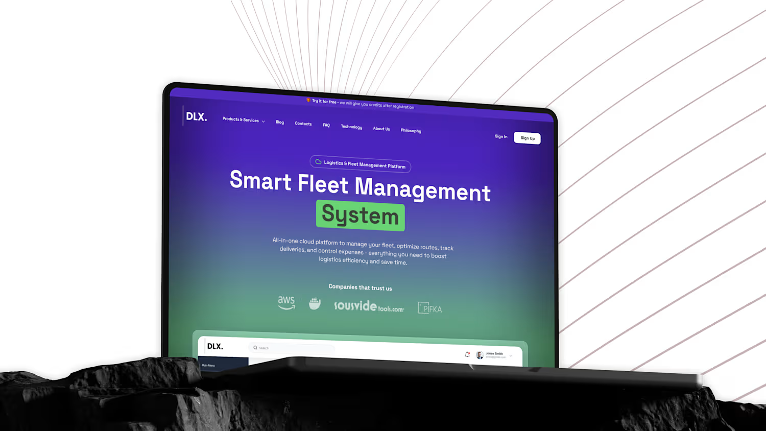
DLX - Fleet Management SaaS Platform DLX is a cloud platform for logistics companies - fleet tracking, route optimisation, delivery monitoring and expense control in one product. Fleet software usually sells itself on machinery: maps, trucks, GPS pins. But the person approving the purchase is a manager watching a cost line. So the page leads with money instead - the first thing visible in the product shot is revenue, expenses and net profit with trend deltas, not a map. The gradient carries the narrative. Deep purple at the top for platform and technology, resolving into green by the time you reach the product. Green then repeats as the highlight behind "System" and inside the dashboard's positive trends, so the colour reads as gain rather than decoration. Client logos sit unusually high - directly under the subhead, before the demo - because in B2B logistics trust is the first objection, not the last.
0
72
Cover image for Add-on screen for a telecom
Add-on screen for a telecom plan builder. Most upsell flows hide the running total until checkout. This one does the opposite - the summary panel recalculates the moment you tick anything, and the bundle discount sits in the same list as the charges, in green. Counterintuitive, but making cost more visible lowers abandonment. People rarely drop out because a plan is expensive. They drop out because they don't know what it's going to be. Every voucher is a logo rather than a description, too. Nobody reads "monthly streaming service credit." Everybody recognises the Spotify circle instantly.
2
91