CASA — Brand & Packaging Design
Bianca Santiago
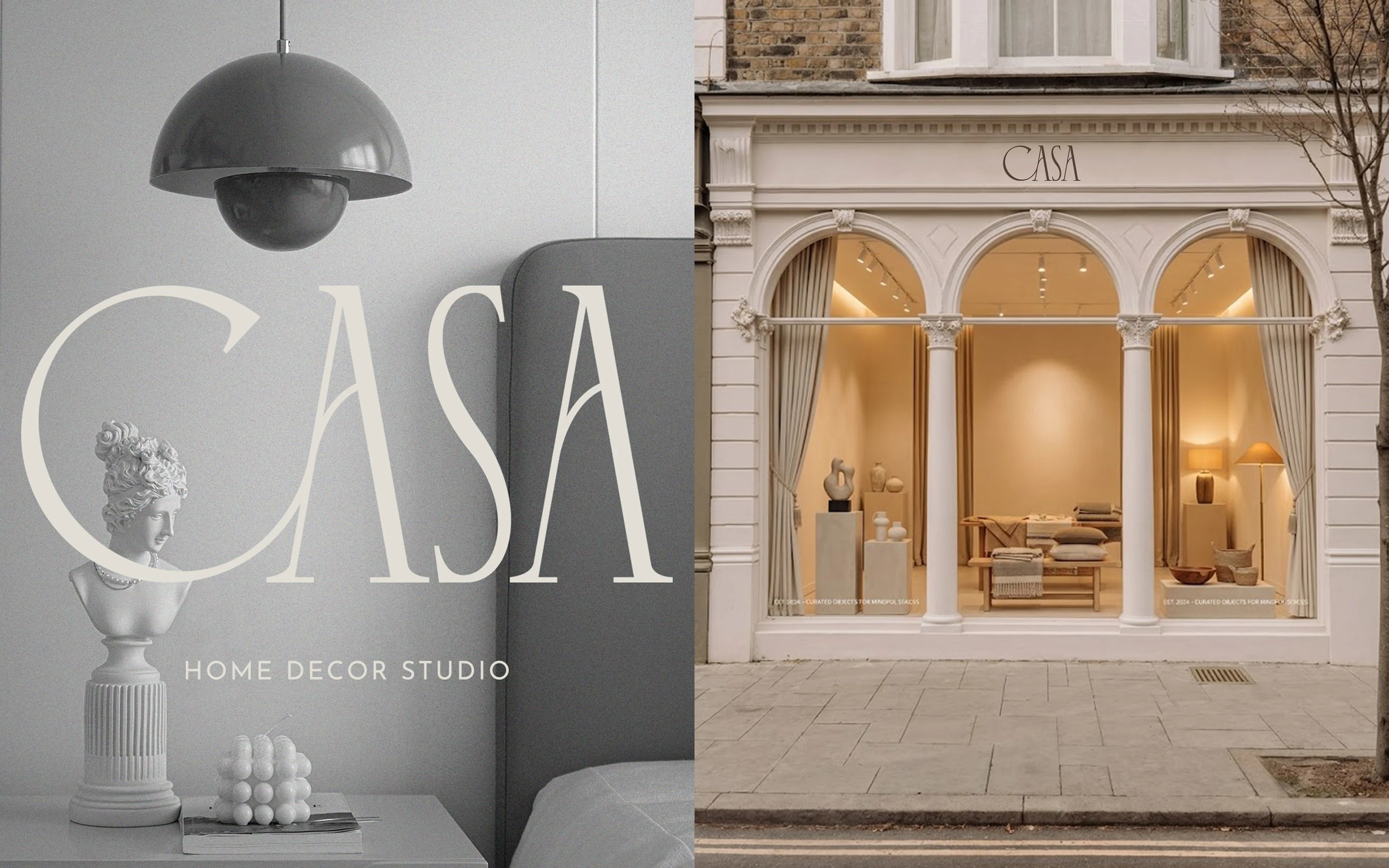
CASA — Rooms With Soul
About the Brand
Casa is a Portuguese home decor studio offering a curated range of decoration items including furniture, lighting, textiles, ceramics, wall art, and decorative objects. Every product is selected with intention, bridging old-world craft references with contemporary living. CASA serves both businesses and home decor enthusiasts who value spaces with warmth, history, and character.
Project Type
This is a concept branding project developed as part of a design challenge. The scope covers the full visual identity system for CASA, from strategy and logo design, to brand applications and marketing touchpoints.
Deliverables include
Brand strategy and mood-board, logo system (stacked, horizontal, and mark-only versions), colour palette, typography, pattern and texture assets, stationery suite, packaging, signage, social media templates, and brand guidelines.
Client
CASA / Home Decor Studio
Tagline
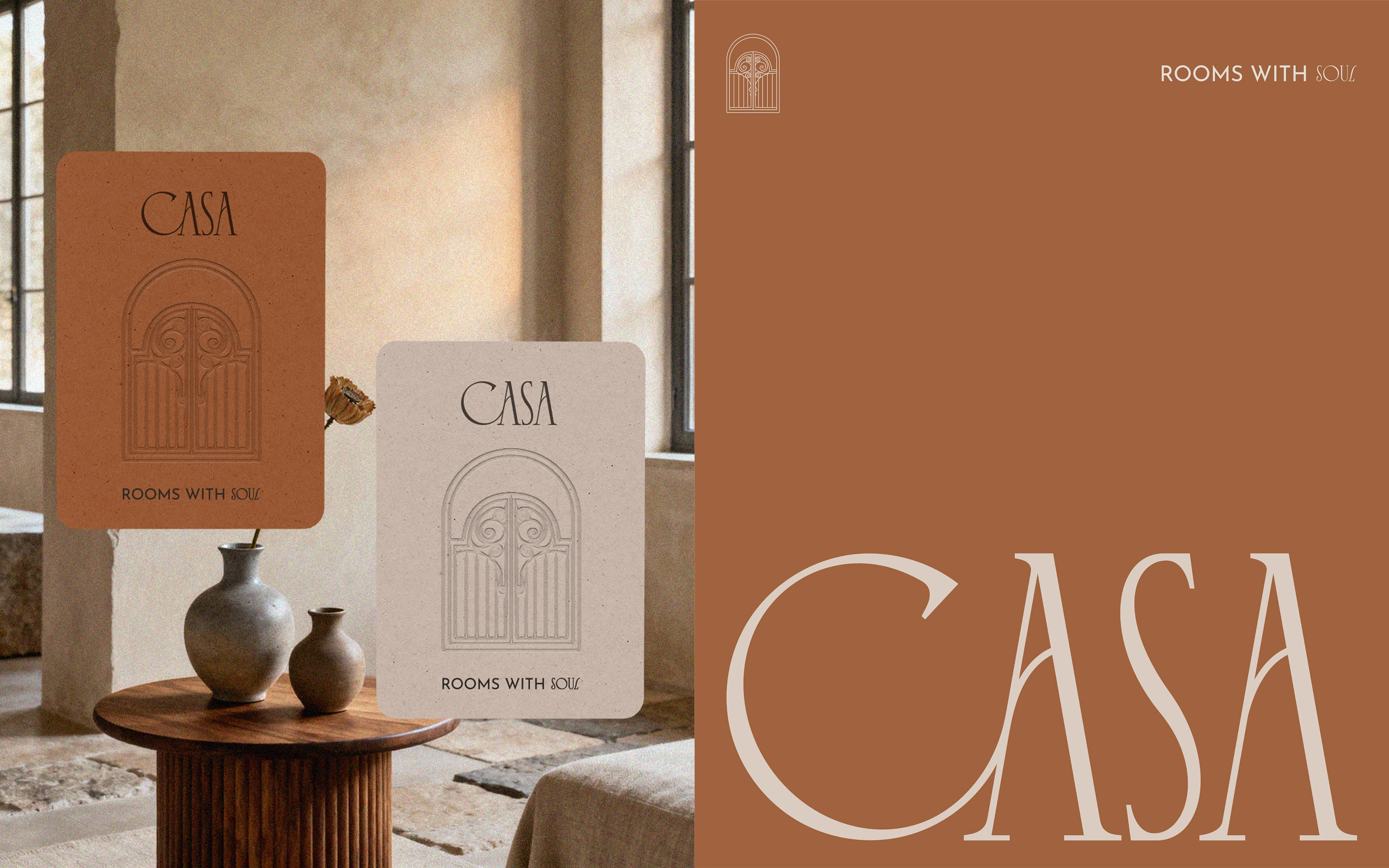
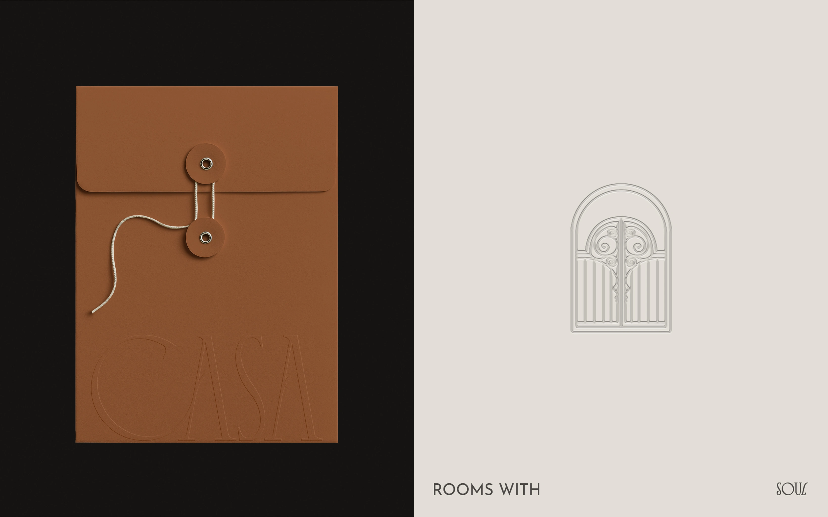
Rooms with soul
Project
Brand Identity & Art Direction
Location
Lisbon, Portugal
Established
2022
Credits
Mailing Box, Bag and Stationary mockups
YOP Design
Freepik
Other mockups created by myself
Photograph sources
Pexels, Unsplash and Lummi.
Brand Direction
The client wanted a visual identity rooted in elegance, craft, and a soft vintage sensibility. The three core brand keywords guiding all creative decisions are:
Warmth — the feeling of a lived-in, personal, and comfortable space
Craft — things made with care, intention, and visible quality
Heritage — a sense of history, place, and materials that carry character over time
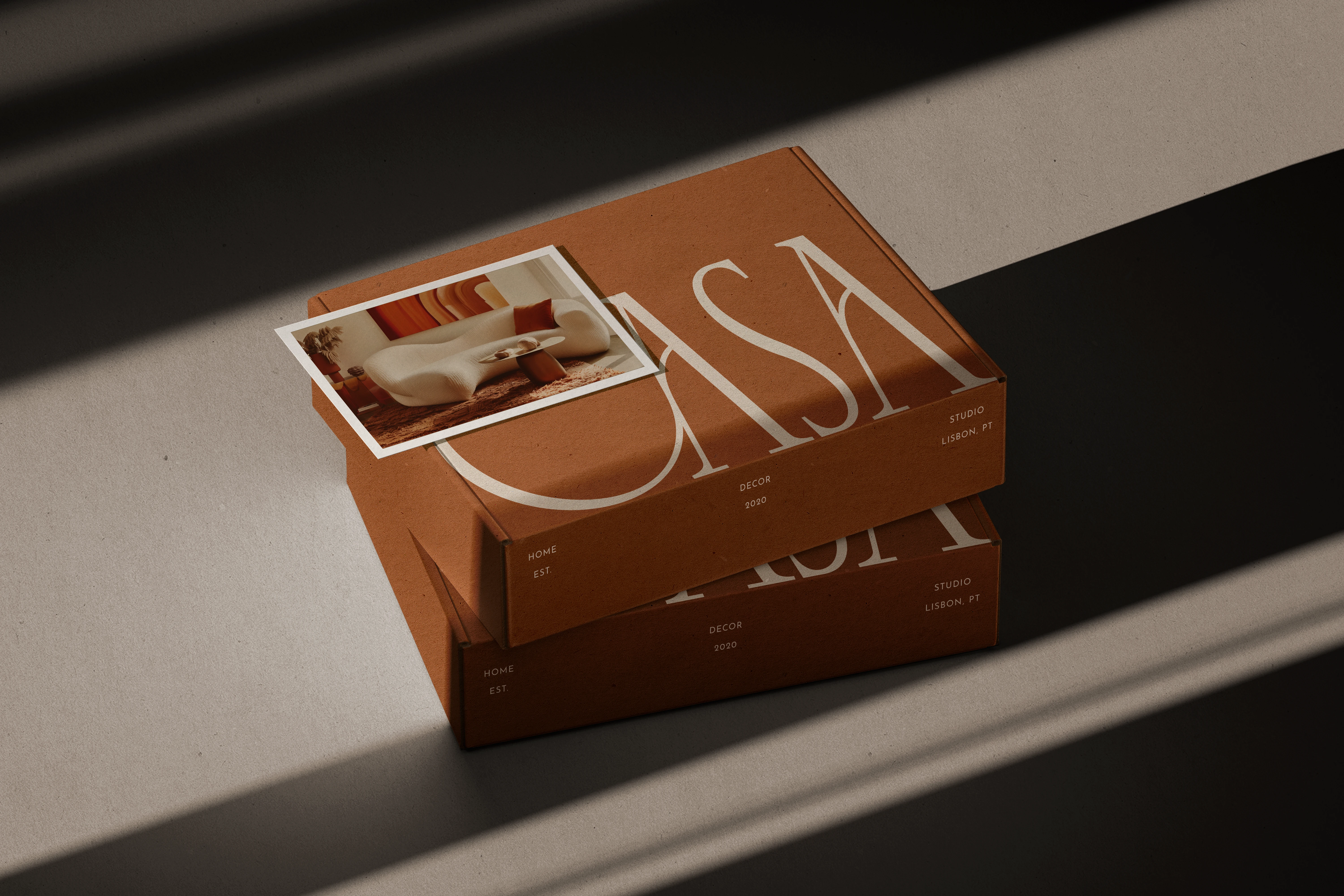
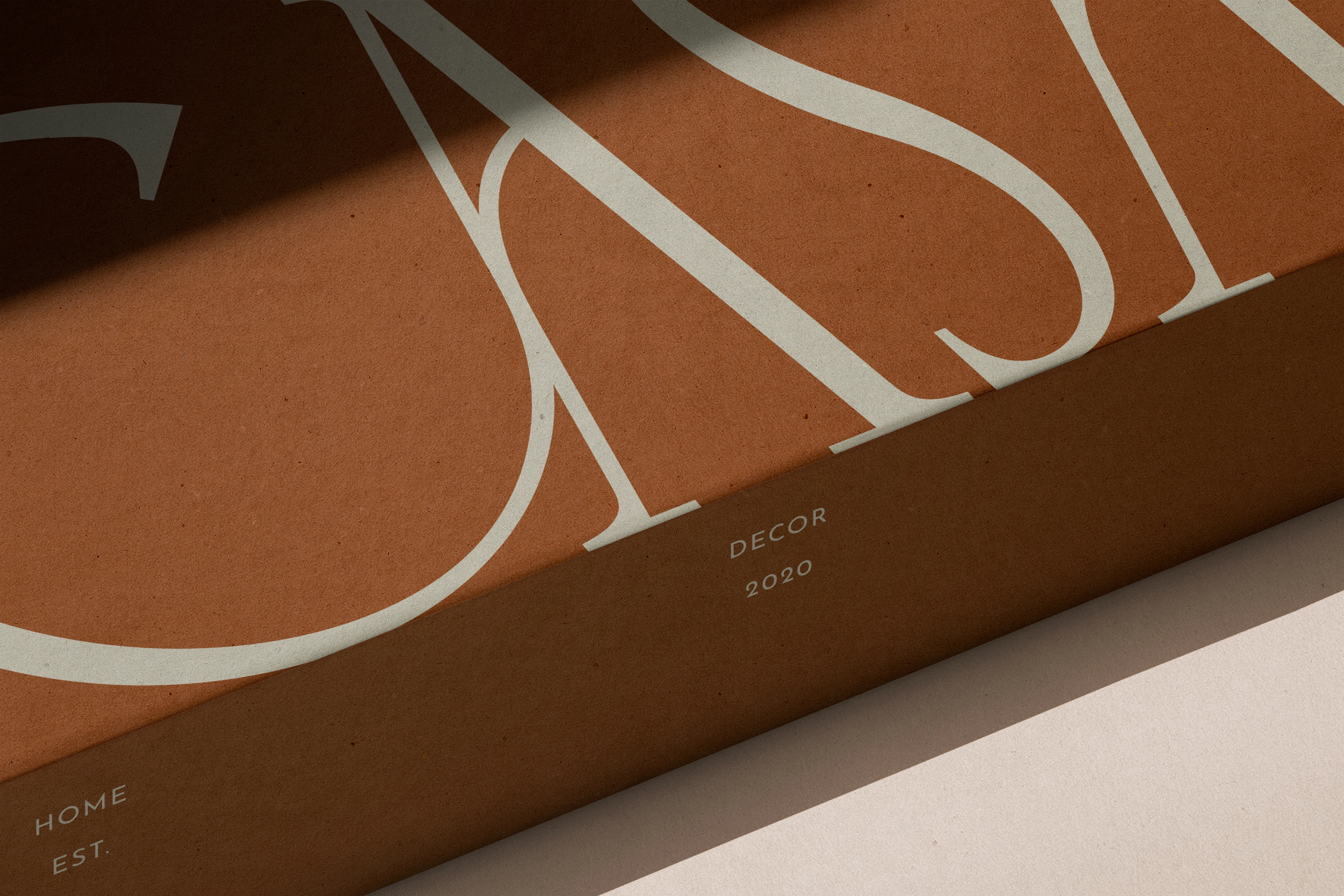
Colour Palette
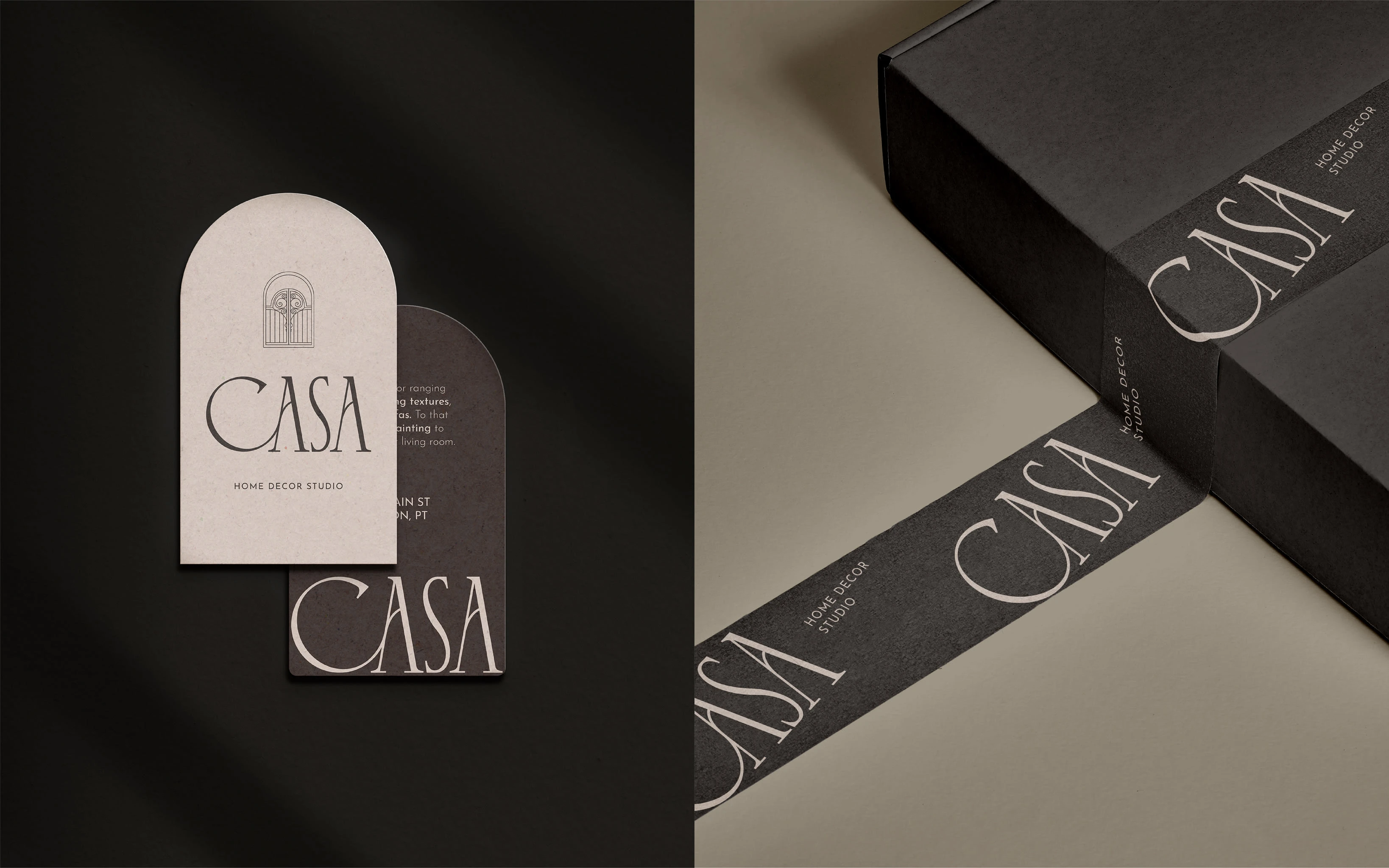
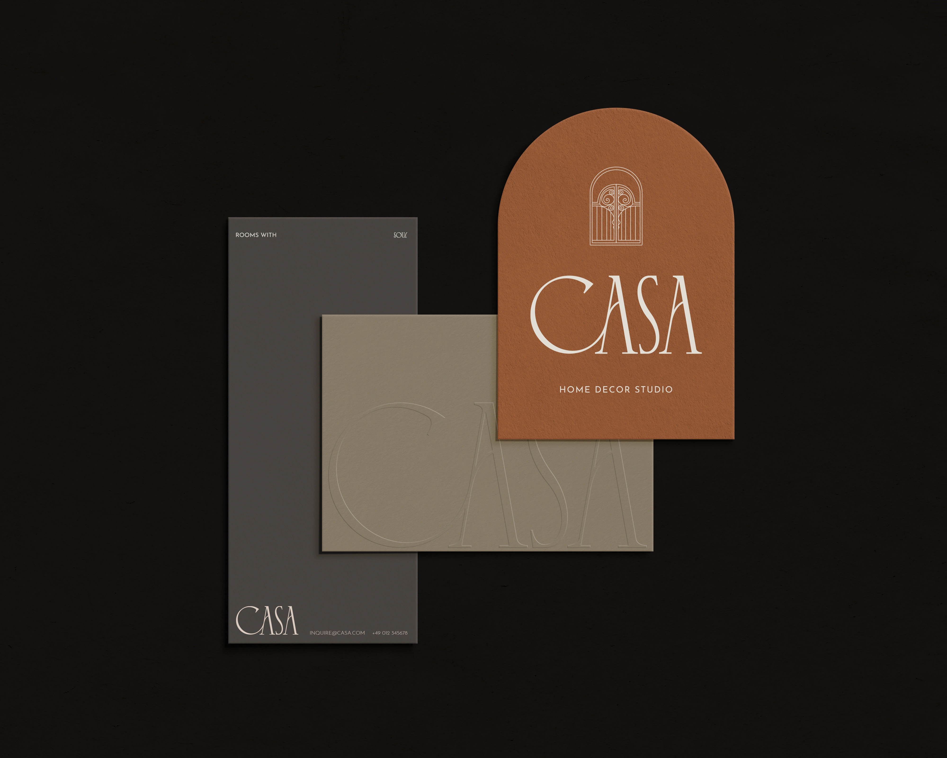
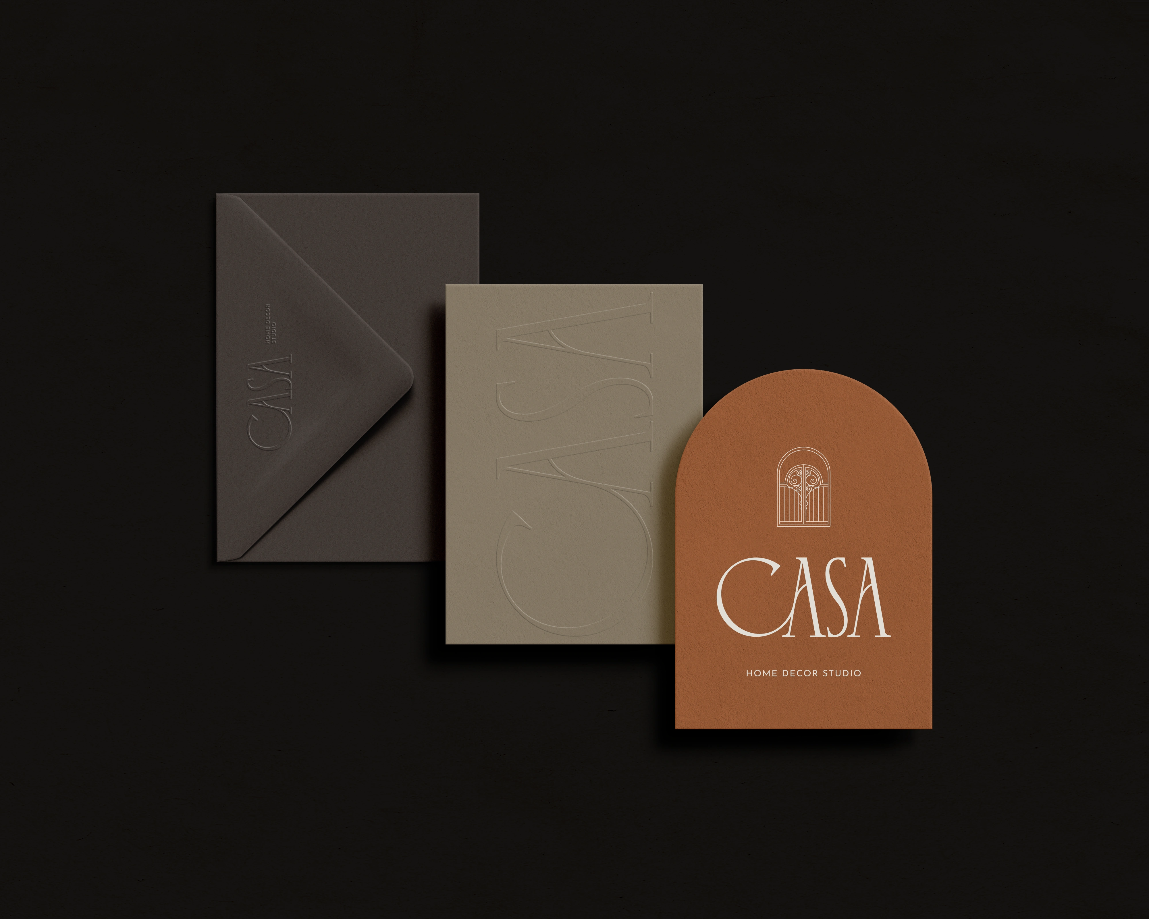
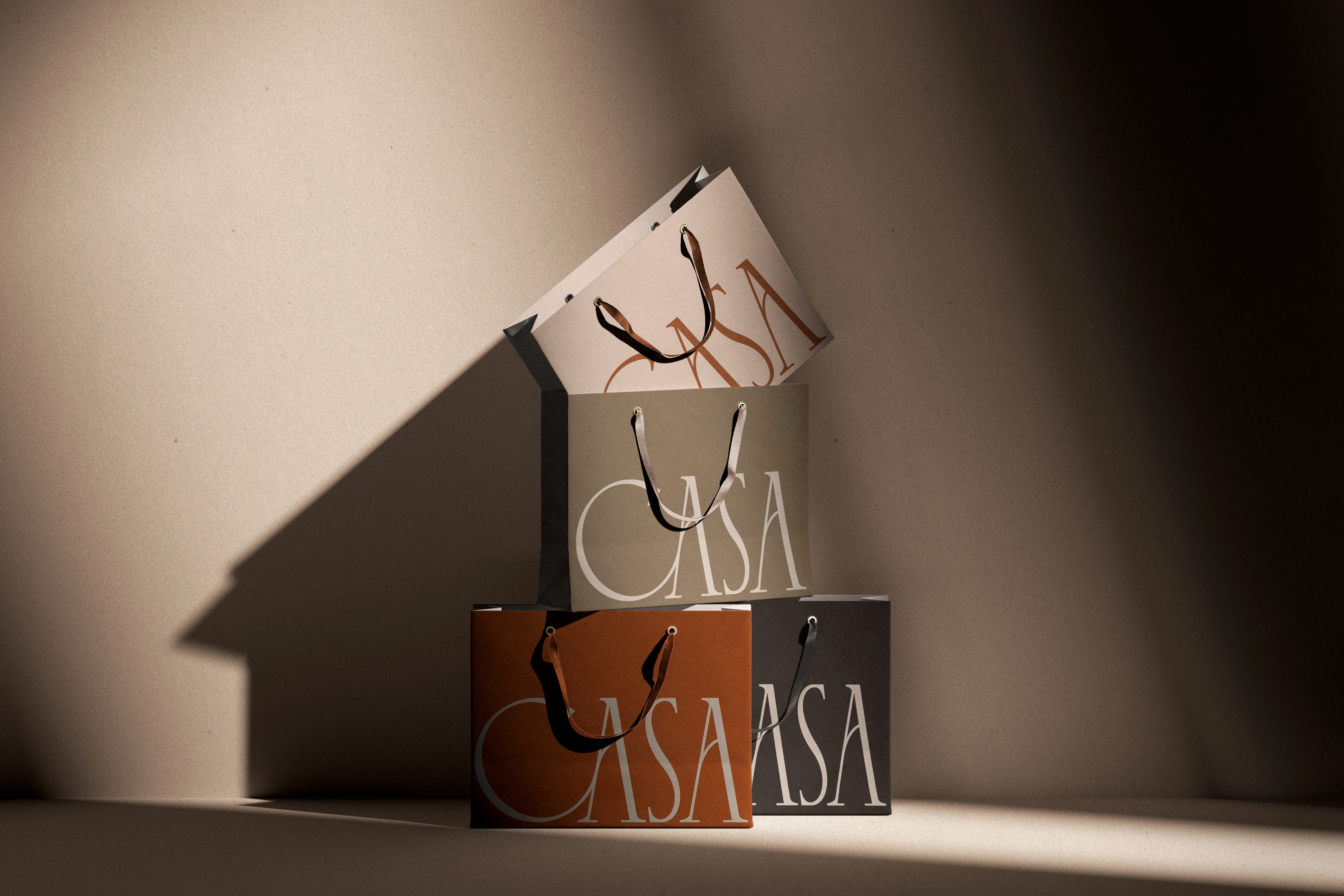
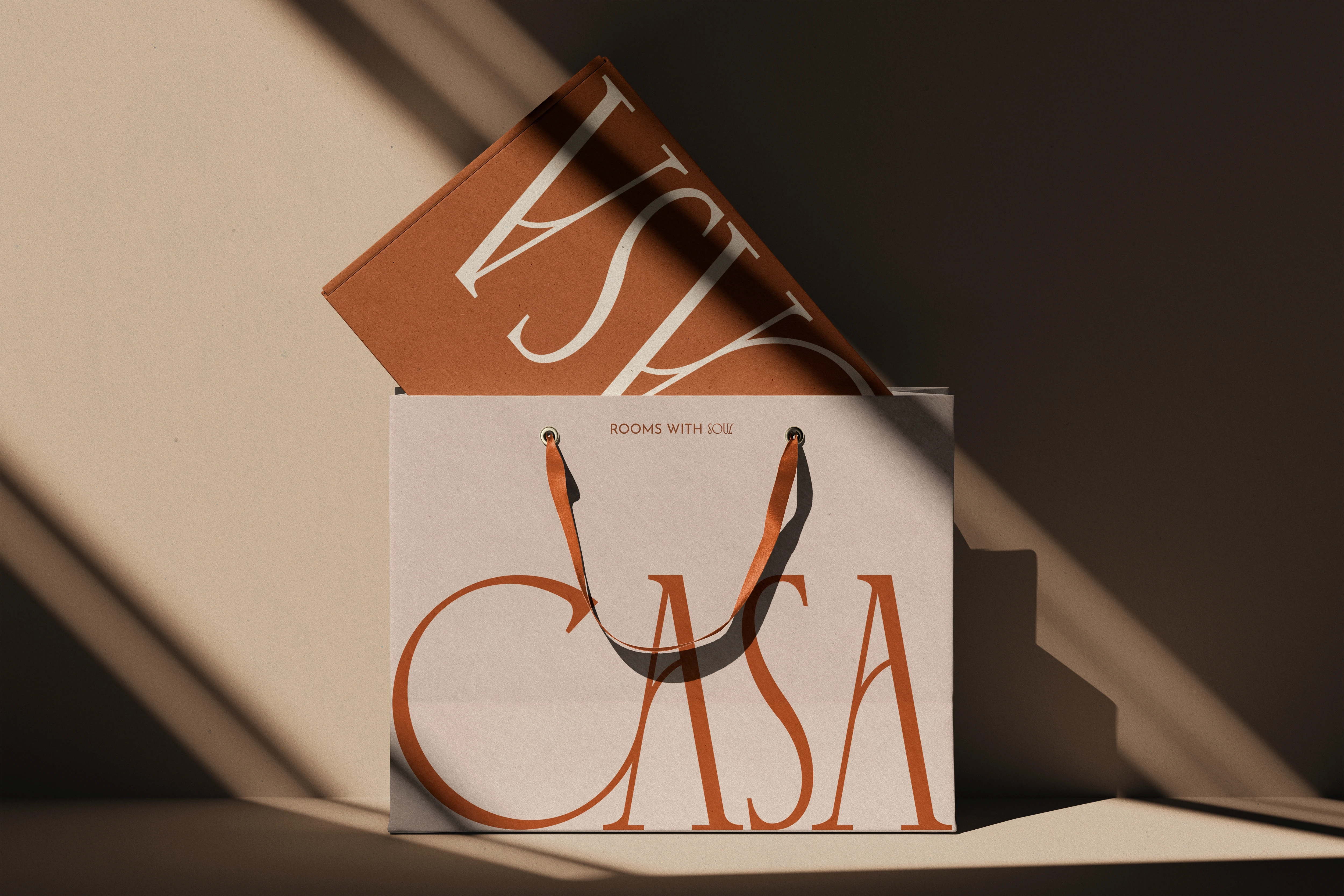
The palette moves from soft neutrals to warm earthy tones, communicating softness, elegance, and a quiet sense of history. The two anchoring colours across all physical touchpoints are Terracotta and Charcoal.
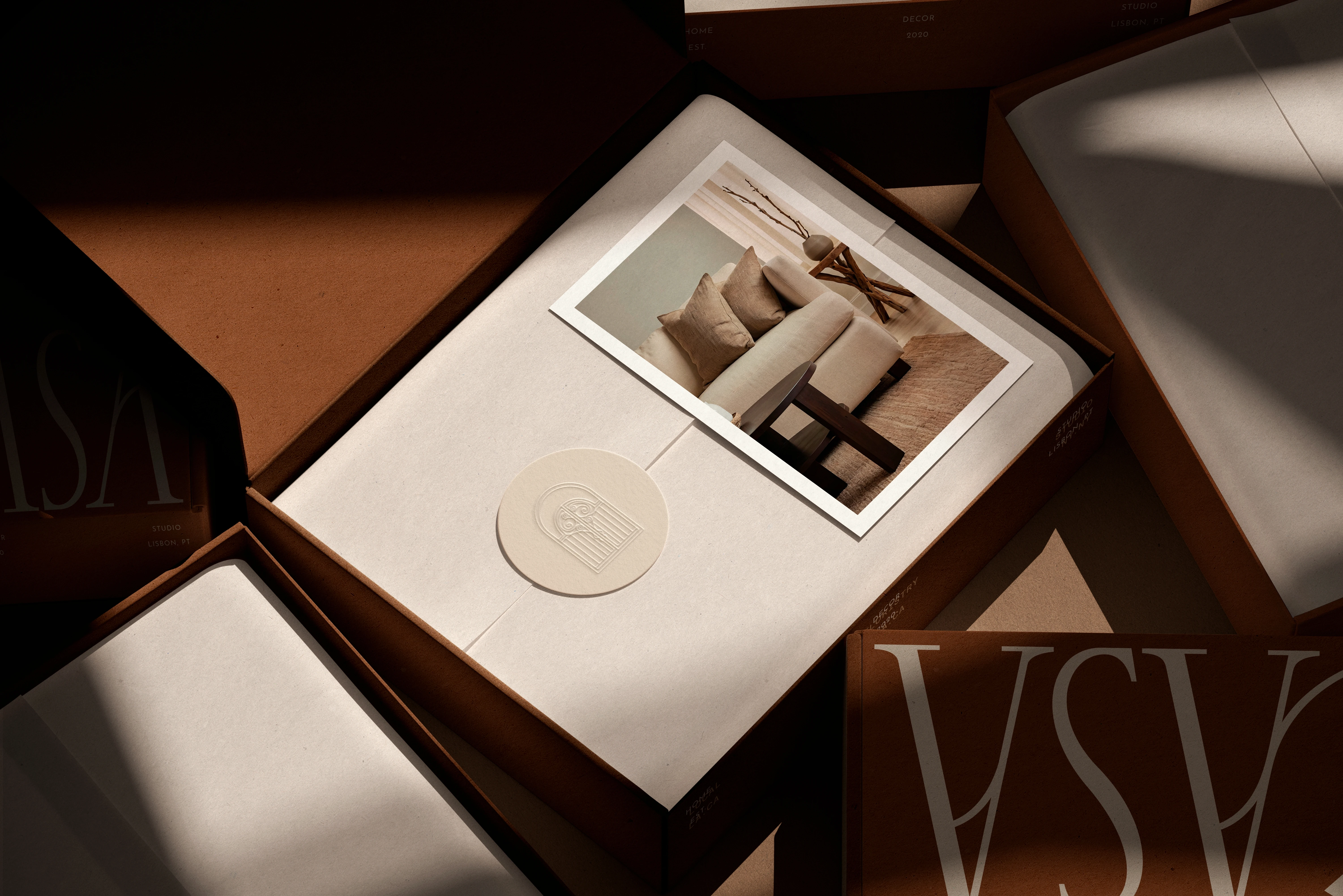
Typography
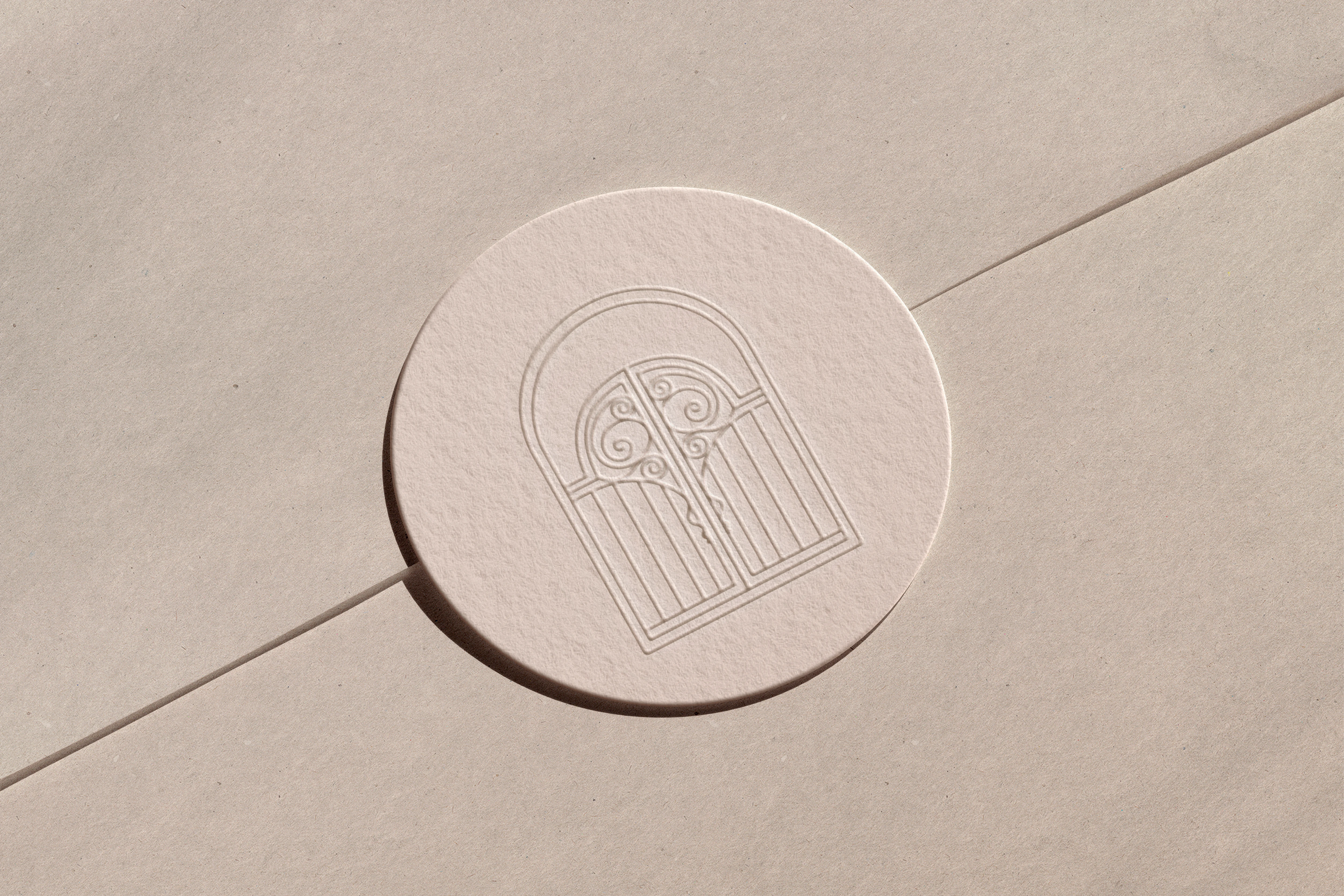
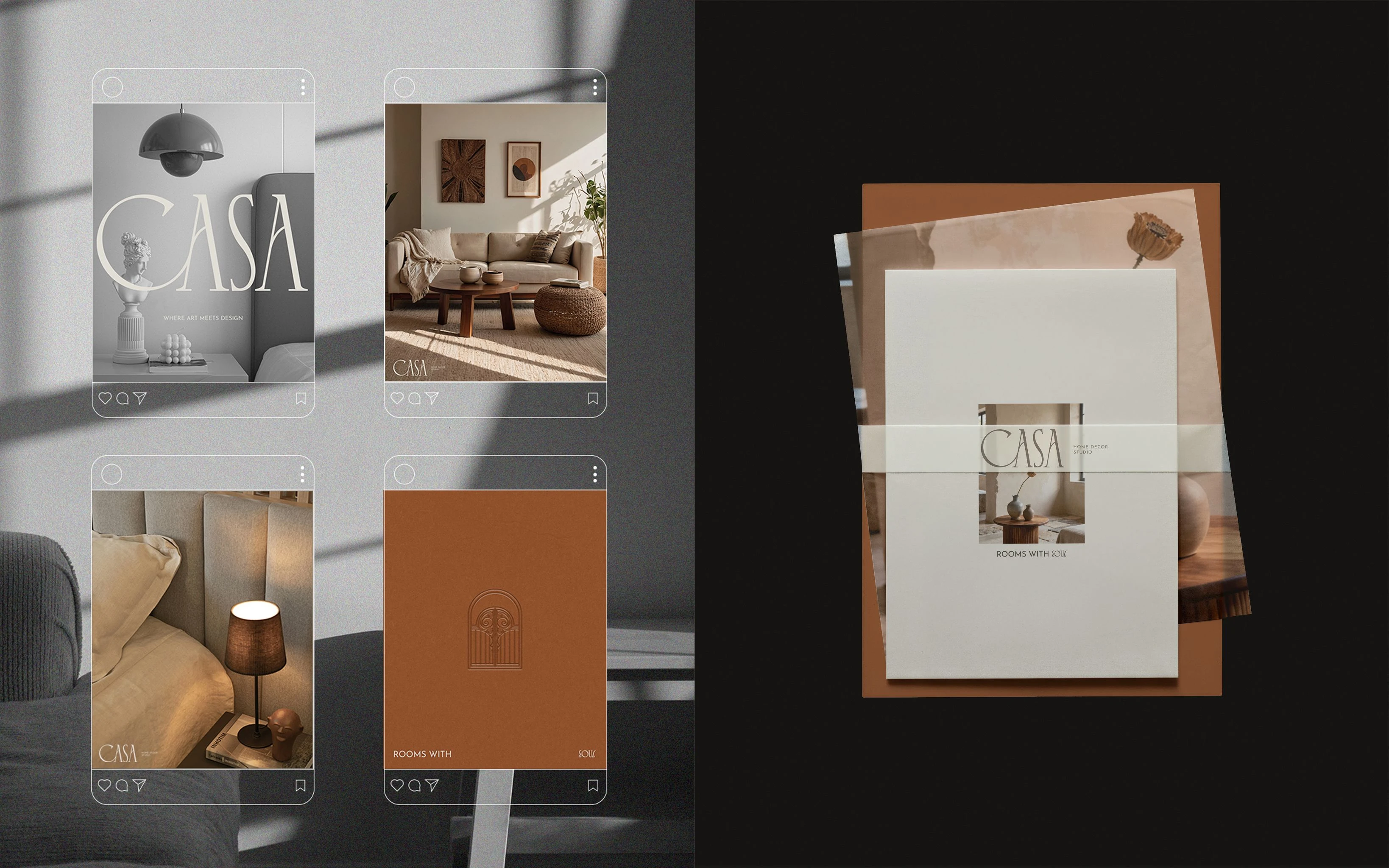
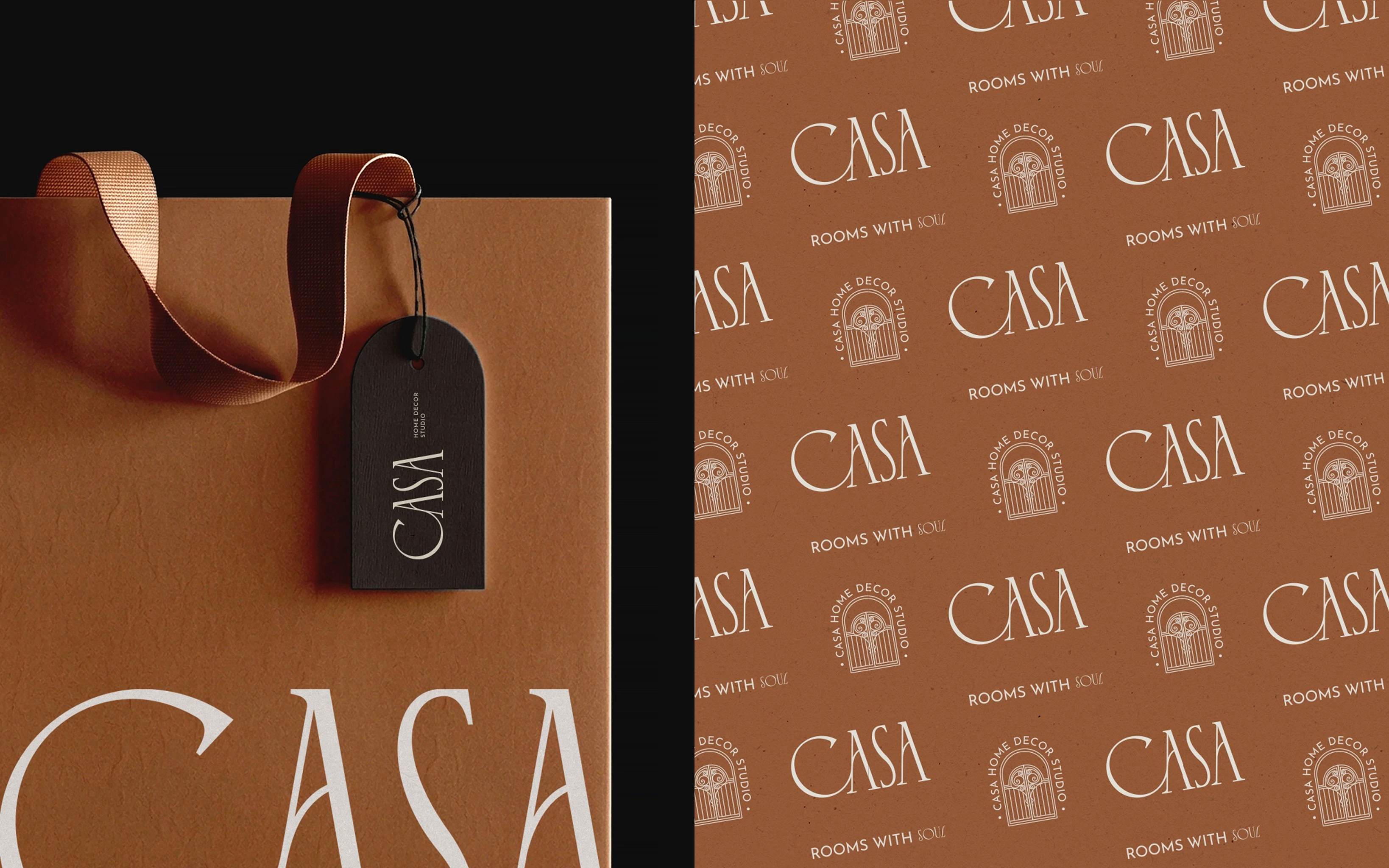
The wordmark uses a high-contrast serif typeface with elegant thin and thick stroke variation, chosen to complement the geometric and organic qualities of the gate illustration. Supporting text uses a refined sans-serif in spaced capitals, providing contrast and clarity across all applications.
Brand Applications & Deliverables
– Arch-shaped and standard business cards
– Stationery suite (letterhead, envelope, folder)
– Logo Suite (Wordmark, stacked and sub-mark versions)
– Shopping bag with wordmark logo
– Kraft tissue paper packaging
– Rigid gift box with debossed gate pattern
– Hang tags (arch die-cut)
– Storefront signage
– Brand Guidelines
Thank you for watching! <3
Please, leave an appreciation if you like it!
I'm open to new projects! ✨
If CASA resonates with you, feel free to send me a message and let's talk about your brand in more details.
Portfolio: biancasantiago.com | Instagram: @biancasantiago.design
Like this project
Posted Apr 14, 2026
Full brand identity for CASA, a Lisbon home decor studio. Logo, packaging, and art direction inspired by Art Nouveau details, earthy tones, and old-world craft.
Likes
0
Views
21
Timeline
Mar 2, 2026 - Apr 10, 2026