Genee Rebranding
Lauren Garnett
Genee
A mission-based startup that offers holistic career coaching for mid-career women.
Role
UI/UX Designer on a team of 5 including a Senior Designer
Process
Discovery, Research, Ideation, Design, Developer Handoff, Reflection
Tools
Monday, Perplexity, ChatGPT, Claude, Figma, Loom, Slack, Google Suite, Figjam
Project Overview
Construct a design system and rebrand a responsive website for mid-career women.
Genee, a holistic career coaching practice specializing in mid-career women professionals, needed to rebrand from their former name "Elevate" due to trademark conflicts. The company delivers research-backed, personalized action plans to help women advance their careers. I was tasked with developing a new brand identity and website that would showcase their unique coaching methodology.
Problem
Mid-career women (30-45) seeking career coaching need a trustworthy platform that reflects professionalism and understanding of their unique challenges. With Genee's outdated branding and unclear messaging, potential clients struggled to connect with their services. This lack of brand cohesion and professional presence was hindering client acquisition and trust-building, ultimately impacting conversion rates.
Solution
By developing a cohesive elevated brand identity and responsive website, my team was able to establish Genee as a trustworthy, professional resource that resonates with their target audience of mid-career women. The new digital presence showcases Genee's expertise, highlights their personalized coaching approach, and streamlines the user experience - ultimately driving increased client engagement and conversions.
Metrics over 2.5-Month Period
User engagement on site increased 620%
63.8% increase in active users the day of launch with trend of continued increase
2.3k views, a 264% increase from old site
Top Events over 2.5-Month Period
First visit: 1.1K
Scroll: 1K
Click: 401
Form Start: 22
Page view: 3.5K
User engagement: 2.1K
Session start: 1.8K


Client Takeaways
After a couple of calls with the client, it was important there was a tight deadline, about one month, and a lot to accomplish: a new design system, new logo, new responsive website. During our calls I learned more about the company: their goals and aspirations, and their users. To familiarize myself even more, I looked over some research from clients - surveys from previous cohorts, and a concept of a new brand and website. I decided to get started with branding while I connected the client with a team of UI/UX designers, whom I joined.
Discovery
Kickoff
I met the founder of Genee in a Facebook Group for UX women. She was looking for a concoction of help with her startup, specifically someone familiar with mission-based companies, startups, community, and interested in helping women. I introduced myself and shared my background which couldn't have been better aligned, and we jumped on a call. During the call, she said her co-founder was leaving and she wanted to rebrand and update the website. On a separate note, she was also looking for someone who could cover marketing and since I was in marketing in a prior life, I helped her find, hire, and mentor someone (you wear many hats when working on a startup!).
Research
Affinity Map
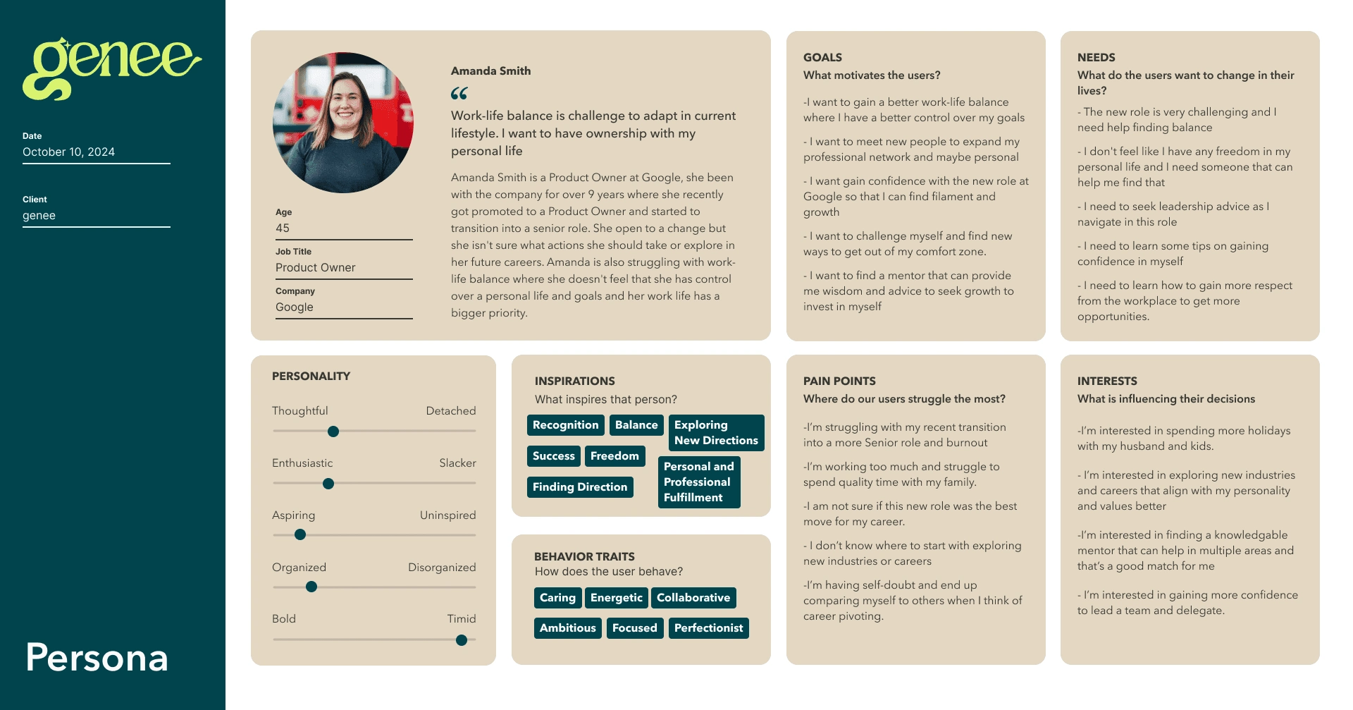
Genee had feedback from four cohort surveys they sent their previous clients. My teammate and I partnered up and created an Affinity Map in Figjam to sort through the responses. I plugged in each question with all its responses in ChatGPT and prompted it for an overview and key insights. Then, organizing those key insights, we created a user persona to get a better idea of who our users are, their goals, needs, interests, and pain points.
User Personas
The client and I already established the foundation of branding for Genee, what was needed was a formal flushed-out design system and responsive website layout. The client provided similar competitors and what they liked from each of their websites - the interactions, animations, information hierarchy, use of photos and illustrations, etc. I took a competitor and annotated their website, inspecting the code to better understand how they pieced the designs together.
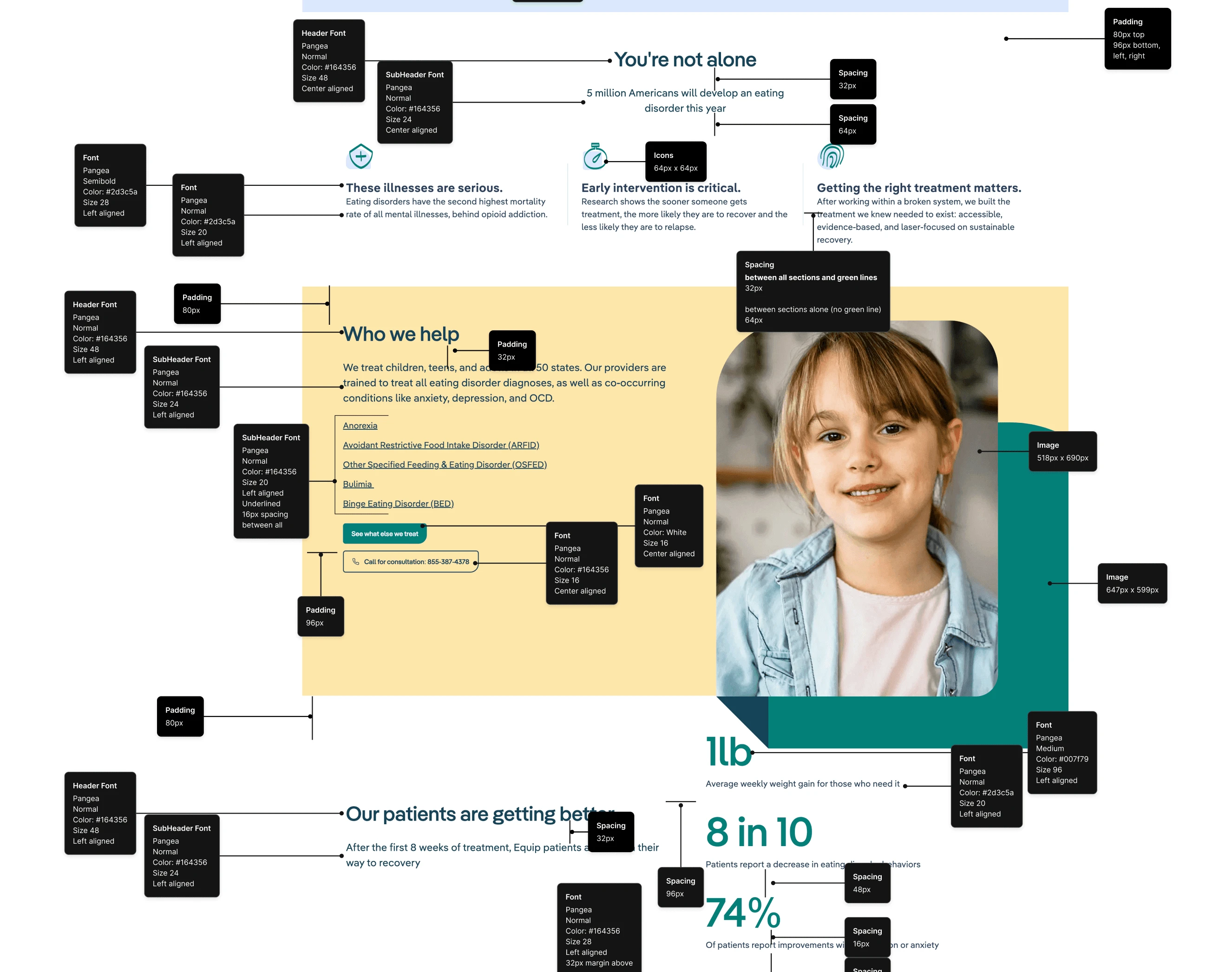
Annotated Inspirations
Our final method of research was annotating inspirational websites the client admired so we could gather some design ideas to implement into our own designs. The website I reviewed was Equip.health where I identified the details of fonts, padding, spacing, image sizes, icons, and additional components and elements.
Ideation
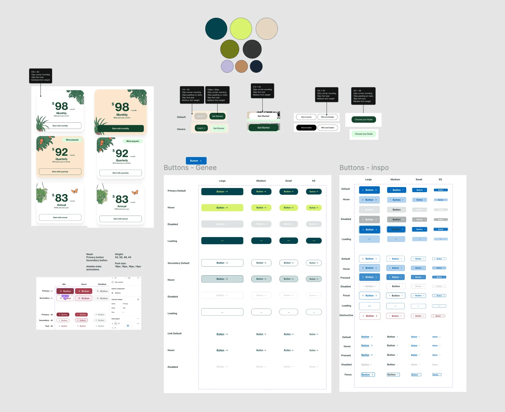
Design System Components
Each teammate was tasked with creating a component for the design system. My components were buttons. The client had one website in particular that they adored so I studied the buttons from that website and grabbed all their information: their colors, sizes, padding, fonts, uses, the sections they were in, and their animations with interaction. Taking all that information, I pulled our colors in and created a Genee version.
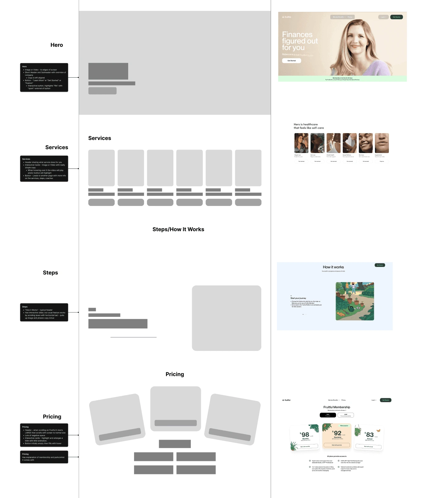
Lo-Fi Wireframes
I worked with my teammate on a UI iteration for the website, each of us focusing on particular sections. My focus was on the hero, their services, the process, and pricing. I went through my teammate's annotations and studied the competitor's websites, looking back through the features the client admired. I took screenshots of designs I thought could work for the Genee website and created two lo-fi options, leaving annotations with details on each section.
Design
Hi-Fi Wireframes
After creating hi-fi's of each version, the senior designer chose the first design to explore more. The evolution of sections was fast and drastic, each iteration getting better and more sophisticated. Animations were an absolute so designs were made with that in mind. The client was responsive and knew what they wanted, giving us pointed feedback, but also giving us the creative freedom to elevate the design.
Iteration 1: The first hi-fi was a combination of both wireframe ideas. Services changed from a single line to two lines to accommodate copy. Feedback from the Senior Designer was to change the design for The Genee Process, giving it more originality; so cards that would slide up as the user scrolled were added.
Iteration 2: The client provided feedback admiring a design that showed information regarding an individual in a photo, so that users can relate. So I made the hero a slider with a few images that highlighted different women ranging from 30-40 years of age with bubbles of copy revolved around them. The lineup of sections changed and I decided to add a little character with text involving some emojis, explaining a little more of what Genee does. I changed the first row of photos to illustrations based on the client’s feedback of wanting to incorporate more illustrations, to invoke an approachable feeling. A new section was also added - Meet the Coaches. My section was based on a combination of inspiration the Senior Designer and client shared of animated cards. The background was removed from Pricing since my teammate’s section already had a purple background, we decided it was best to give the section more white space.
Iteration 3: My designs were handed off to the team and Senior Designer while I was away on vacation. Two designs were brought before the client, the client chose their favorite sections from each. Before I left I updated the Statement, the team bringing together all the chosen sections and finalizing the designs while I was away during the second sprint.
Iteration 1
Combined with other designer's designs
Iteration 2
Combined with other designer's designs
Design System/Style Guide
I worked with the client before hiring and joining the UI/UX team, designing a logo and foundation for the style guide’s colors and fonts. We started with the logo, playing on the idea of a genie. We wanted the “G” to be able to stand alone as a badge. The “G was created to look as if a genie was coming up out of a lamp, with the loop of the “g” to represent smoke, like a wisp of a tail, and the ear representing the tassel of a djinn’s fez.
When choosing colors, we knew we wanted to go with a shade of green, so I complied a few different options and presented them to the client. Working closely together, we narrowed down the favorites, but were open to the UI/UX team making any necessary changes for accessibility and according to their expertise. The font was much easier. When comparing the old website with their shot at a new website (before hiring me), I actually really liked the header font of the new site, and paragraph font of the old - so we combined them and thought they looked great together! The headers were the sophisticated serif, Gazpacho, and the paragraphs would be kept the classic reliable sans serif, Helvetica.
Developer Handoff
Once the team finalized designs, I went in and left annotations for developers. I collaborated with the Senior Designer on animations for each section and, since this was a responsive website, each device. I also made sure all my layers and components in the style guide were named, organized, and up-to-date.
Reflection
Due to being short on time, there were a few shortcuts I took that brought me to the same outcome:
I learned to manipulate text in Figma instead of Illustrator for the logo of this project. I already knew how to outline and move paths and anchor points in Illustrator but with Figma it was much easier and user friendly.
Using ChatGPT and Perplexity to help synthesize data was a time-saver. I’ve used AI to help organize data in previous projects but this was a much larger amount that I needed to break down.
Doing a competitive analysis as annotations to gain a better understanding of how the client’s favorite website’s worked was a new technique for me. This was really helpful in seeing how different components changed in size and layout as the responsiveness of the website changed. I added a few new tools to inspect a site such as WhatFont, CSSPeeper, and GoFullPage extensions.
While working on a variety of designs with other designers wasn’t new, having the senior designer elevate designs was a first. There was one point where she shared an inspirational image for a section, I thought I recreated it accordingly but misunderstood. She sent me a Loom and watching her edits was thought-provoking and it was exciting to see her process.
Like this project
Posted May 25, 2026
Rebranded Genee’s website for mid-career women, increasing engagement by 620% in 2.5 months.
Likes
0
Views
5