Built with Webflow
Webflow redesign for database software company
Karol Polubinski
Here’s a recent project I’m really proud of — a full website redesign for DBPLUS, a company specializing in enterprise-grade software for database performance and replication.
I was responsible for everything from UX structure and UI design to supporting the dev team during implementation. The challenge? Turning a highly technical product into a website that feels fast, clear, and confident — without overwhelming the user.
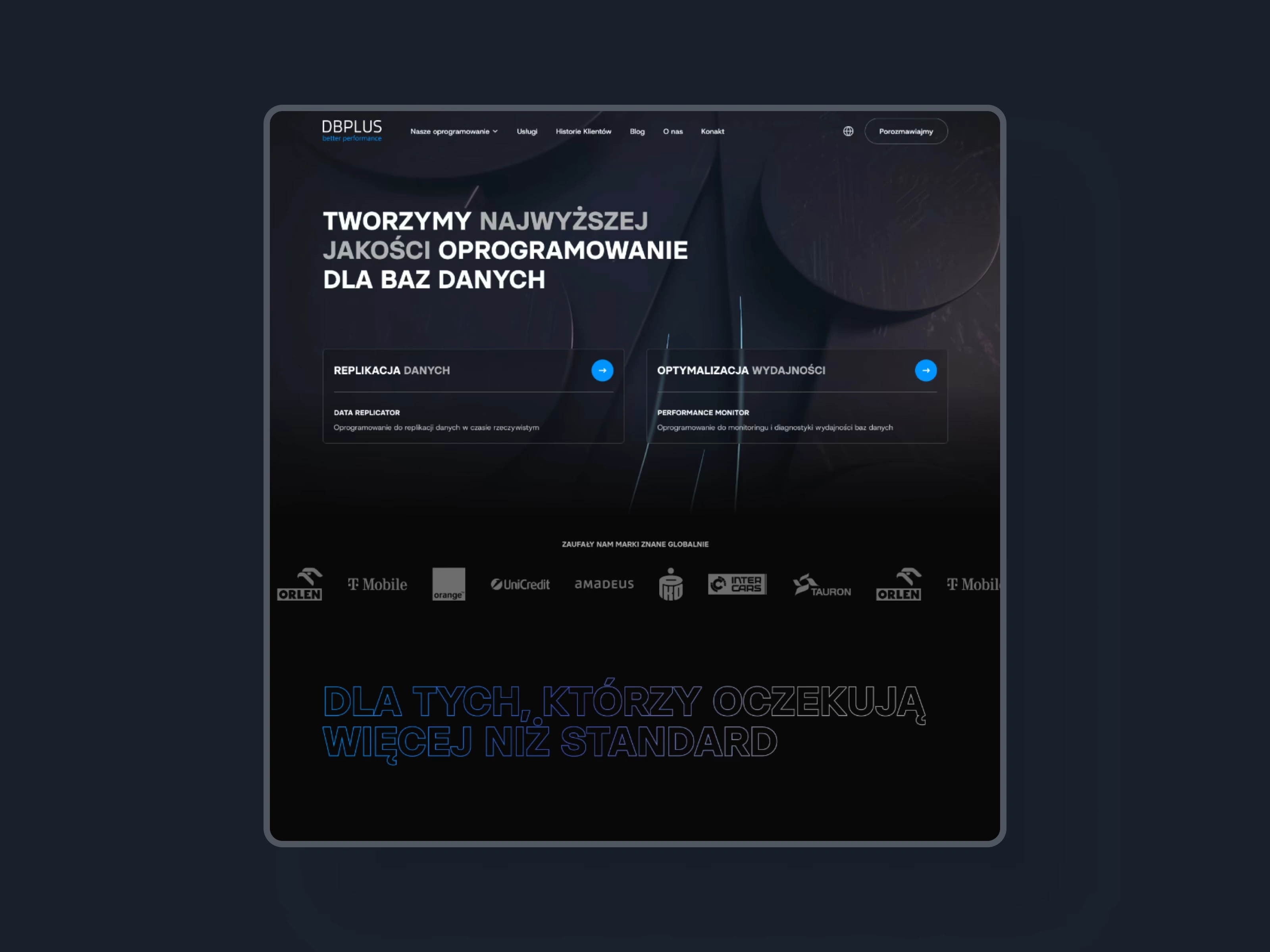
Homepage: Structured clarity with a product-led message
The redesigned homepage establishes a clear information hierarchy, built around the two main product lines. We used a wide layout with sharp typographic rhythm and high-contrast sections, guiding the user from introductory text to deep product exploration.
Call-to-action buttons are placed with intent, and we supported them with logical microcopy to improve click-through rates. The visual tone is technical but human — reflecting the brand's software expertise while remaining approachable.
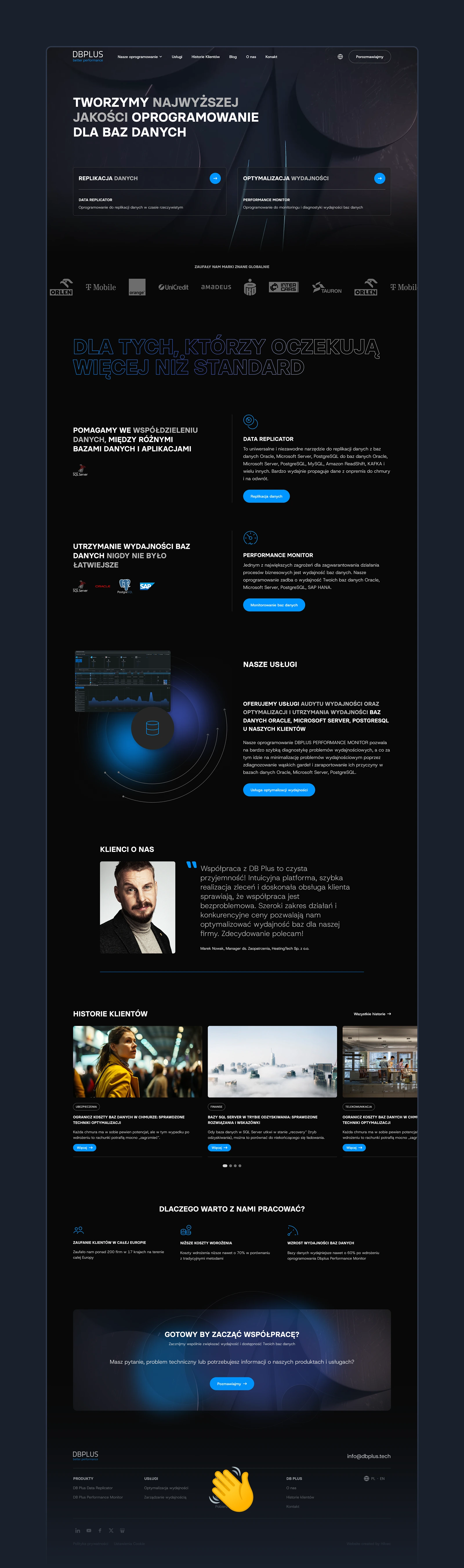
3D hero animation: Visualizing complexity in motion
To introduce users to DBPLUS with impact, we developed a subtle 3D animation for the hero section. The animation shows interconnected data blocks in motion, symbolizing real-time data flow and system performance. It adds a premium, tech-forward feel to the first screen while remaining lightweight and non-distracting.
This small detail helps communicate the core value of the product — advanced database processes — before a single word is read.
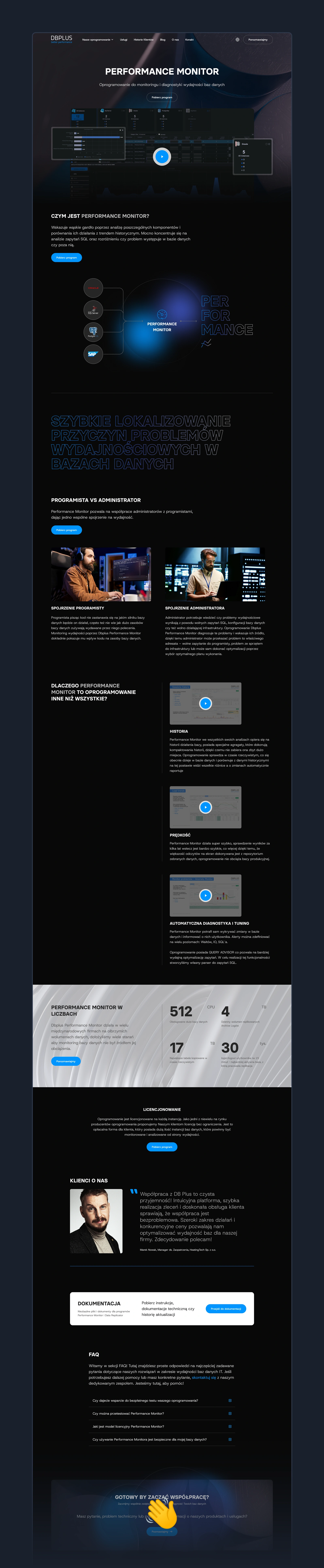
Performance Monitor: Feature-rich page for a feature-rich tool
The Performance Monitor product page was one of the most important views in the project. It includes:
A hero section explaining the use case with clarity
A full list of functionalities, grouped by theme
Data flow diagrams
Testimonials and support CTAs
The layout balances technical credibility with usability — we opted for a clean structure that lets potential clients explore the tool’s features without cognitive overload.
My Role & Involvement
I led the full design process:
→ Created the UX wireframes and architecture
→ Designed all UI views in Figma
→ Worked closely with the development team to support Webflow implementation
→ Created connection between Webflow, Make and MailerLite to make automation for Download page.
🚀 I designed this site to feel like the software it represents: smart, fast, and reliable.
Every layout, interaction, and message was crafted to support clarity and confidence. From marketing to conversion, the design is built to perform — just like the tools behind it.
Would love to hear what you think in the comments. And if you’re building a product that deserves a sharp digital face → visit my agency website www.hilvec.com
Credits:
3D: Michał Makowski
Webflow: Dawid Połaniewski
Webdesign & art direction: Karol Połubiński
Like this project
Posted Jul 25, 2025
Redesign of DBPLUS website with new UX/UI, multilingual support, and Webflow build for a global database software provider.
Likes
0
Views
13
Clients
DBPLUS